Reading List
The most recent articles from a list of feeds I subscribe to.
Ben Thompson on Tim Cook’s Legacy
Ben Thompson at Stratechery, “Tim Cook’s Impeccable Timing”:
Cook was, without question, an operational genius. Moreover, this was clearly the case even before he scaled the iPhone to unimaginable scale. When Cook joined Apple in 1998 the company’s operations — centered on Apple’s own factories and warehouses — were a massive drag on the company; Cook methodically shut them down and shifted Apple’s manufacturing base to China, creating a just-in-time supply chain that year-after-year coordinated a worldwide network of suppliers to deliver Apple’s ever-expanding product line to customers’ doorsteps and a fleet of beautiful and brand-expanding stores. There was not, under Cook’s leadership, a single significant product issue or recall.
That last sentence is something that Cook won’t get enough credit for. A major product defect or recall is just inherently more memorable than the lack of major defects or recalls. Compare and contrast to Samsung: 2016’s Note 7 was recalled for battery combustion; six other Samsung models caught fire in 2016 too; the early Galaxy Fold phones were an outright debacle. Nothing like that ever happened under Cook.
Cook also oversaw the introduction of major new products, most notably AirPods and Apple Watch; the “Wearables, Home, and Accessories” category delivered $35.4 billion in revenue last year, which would rank 128 on the Fortune 500. Still, both products are derivative of the iPhone; Cook’s signature 0 to 1 product, the Apple Vision Pro, is more of a 0.5.
I don’t think it’s worth discounting AirPods or Apple Watch as “derivative” of the iPhone. Yes, Apple Watch requires a paired iPhone, and while AirPods connect with Macs, iPads, and Apple TVs, they are of course primarily used paired with iPhones. But you can just as easily say that the iPhone was derivative of the iPod. And the iPod was derivative of iTunes. And iTunes was derivative of the Mac. And the iPhone was derivative of the Mac too, insofar as iOS and UIKit truly are stripped-down versions of MacOS and AppKit. Better, in my opinion, to simply give Tim Cook credit for overseeing the creation of two massively popular and successful new device platforms.
For Apple’s 2011 fiscal year, which covers the company’s last year under Steve Jobs, the company had $108 billion in total revenue. Inflation-adjusted that’s ~$159 billion in 2026 dollars. 2011 Mac revenue was $22 billion ($32 billion inflation-adjusted) and iPad revenue was $20 billion ($29 billion inflation-adjusted). iPhone revenue was $47 billion ($69 billion inflation-adjusted). So compared to where revenue was when Cook took the helm, the mostly-all-new-under-Cook Wearables category today is bigger than the Mac or iPad were under Jobs, and a very credible half the size of the iPhone.
Cook’s more momentous contribution to Apple’s top line was the elevation of Services. [...]
Last year Apple Services generated 26% of Apple’s revenue and 41% of the company’s profit; more importantly, Services continues to grow year-over-year, even as iPhone growth has slowed from the go-go years.
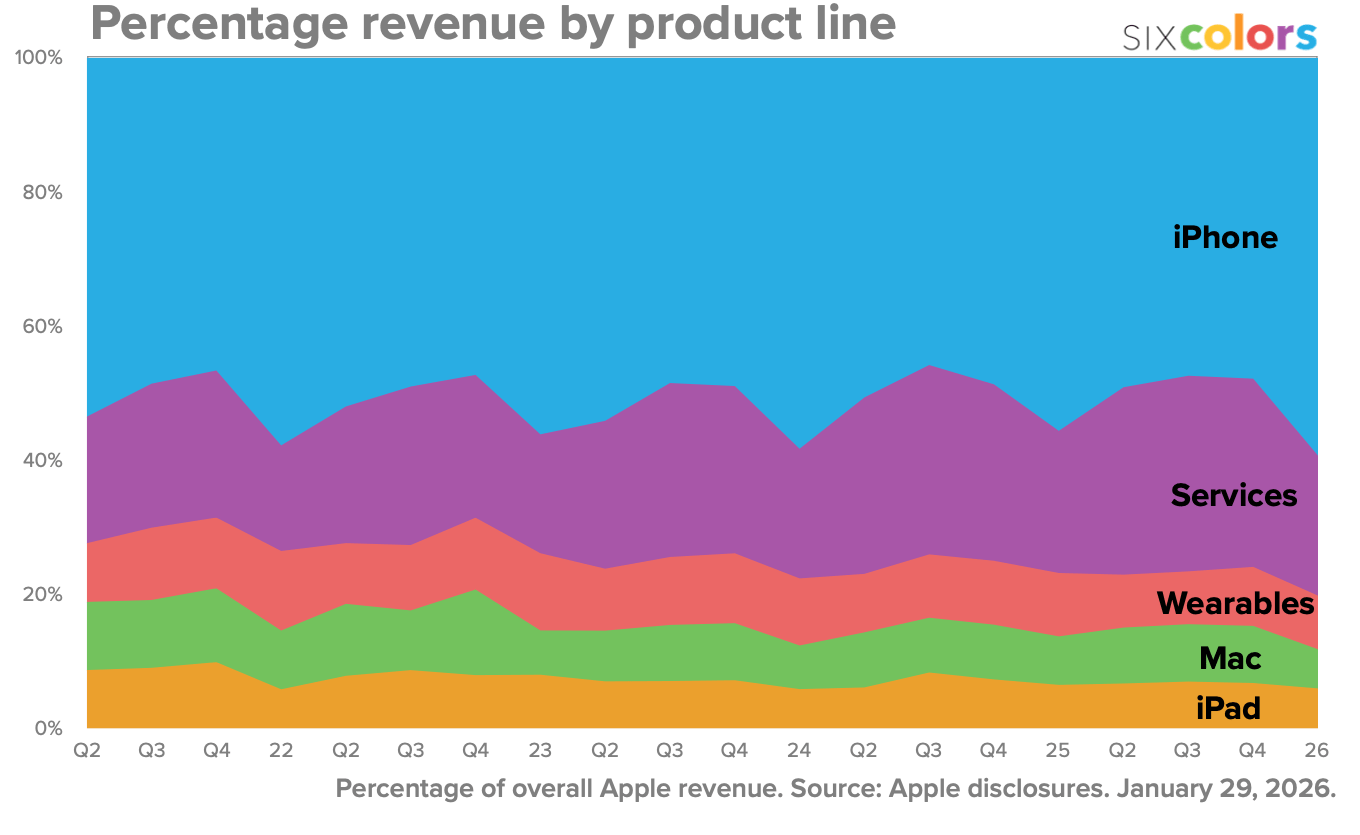
There was a legitimate widespread concern in the early years of the Cook era that the downside of the iPhone’s unprecedented success was that Apple’s financials were dangerously reliant on that single product. Even today the iPhone generates between 50–60 percent of Apple’s revenue each quarter, but it is quite obviously the growth of Services and Wearables that makes Apple’s overall revenue by product line look as balanced as it does. From Jason Snell’s report on Apple’s most recent quarter (the best in Apple’s entire history):
There’s a totally reasonable concern that the growth of Services will pervert Apple’s priorities away from hardware products. I think that’s why naming John Ternus, the head of hardware, as the new CEO is an important statement in and of itself regarding where Tim Cook sees Apple’s North Star: hardware products.
I believe that Cook’s focus on Services over the last decade was in no way about shifting the focus of the company away from its roots. Nor was it about growth for the sake of growth. I think it was about bringing balance to the balance sheet, to protect the company’s core mission of creating devices.
[Sponsor] Rec League
Rec League is a new app for sharing what you’re into. Catalog recommendations into tidy collections: your guide to Rome, your open tabs, your bookshelf. Follow people whose perspectives you trust, and discover brilliant, unexpected intel. Recently featured as the “Best New App” in the App Store. One user calls it “the only social media I feel better after using.” Download now to share what you love.
John Ternus Replaces Tim Cook
The Quadrant Was Now Complete
Trump on Tim Apple
The president of the United States, on his blog this morning (all capitalization, punctuation, and missing/wrong words verbatim):
I have always been a big fan of Tim Cook, and likewise, Steve Jobs, but if Steve was not taken from the Planet Earth so young, and ran the company instead of Tim, the company would have done well, but nowhere near as well as it has under Tim. For me it began with a phone call from Tim at the beginning of my First Term. He had a fairly large problem that only I, as President, could fix. Most people would have paid millions of dollars to a consultant, who I probably would not have known, but who would say that he knew me well. The fees would be paid but the job would not have gotten done. When I got the call I said, wow, it’s Tim Apple (Cook!) calling, how big is that? I was very impressed with myself to have the head of Apple calling to “kiss my ass.” Anyway, he explained his problem, a tough one it was, I felt he was right and got it taken care of, quickly and effectively. That was the beginning of a long and very nice relationship. During my five years as President, Tim would call me, but never too much, and I would help him where I could. Years latter, after 3 or 4 BIG HELPS, I started to say to people, anyone who would listen, that this guy is an amazing manager and leader. He makes these calls to me, I help him out (but not always, because he will, on occasion, be too aggressive in his ask!), and he gets the job done, QUICKLY, without a dime being given to those very expensive (millions of dollars!) consultants around town who sometimes get it done, and sometimes don’t. Anyway, Tim Cook had an AMAZING career, almost incomparable, and will go on and continue to do great work for Apple, and whatever else he chooses to work on. Quite simply, Tim Cook is an incredible guy!!! President DONALD J. TRUMP
Matthew Yglesias, on Twitter/X, first:
You can see in Trump’s take on Tim Cook what he really likes about tariffs, which is nothing to do with economics and everything about how it makes business leaders dependent on his goodwill.
and second:
Also appreciate that Trump threw in a hot take about Apple being better off without Steve Jobs.
The man loves to post!
Yglesias is exactly right re: Trump’s obsession with tariffs. There is zero underlying economic philosophy behind them. He likes tariffs because he sees them as a way to exert political power. I’d add only that Yglesias is being a tad deferential/euphemistic when he says “makes business leaders dependent on his goodwill”. Trump himself used the right phrase to describe why he likes tariffs — they get business leaders to “kiss his ass”. Trump’s own words.
Yglesias’s second point is directly related to the first. There’s no evidence that Trump and Jobs ever met, personally, but Trump admired Jobs and has an intuitive understanding that Jobs would not have kissed his ass, and to Trump, that’s the most important thing about Cook. Rightly or wrongly, Cook took/takes that one for the team. Jobs wouldn’t have (and, if he had lived, would have probably sent COO Tim Cook to do it), and Trump knows it.
Lastly, hat tip to Trump for the self-deprecating reference to his having mistakenly addressed Cook as “Tim Apple” at a public meeting back in 2019. He’s still funny when he’s in the right mood.
Bonus: Mekka Okereke color-coded each sentence of Trump’s post in four categories: (1) praise for Cook; (2) belittling other people; (3) self glorification; and (4) putting his own name in all caps.