Reading List
The most recent articles from a list of feeds I subscribe to.
With :focus-visible, you can have focus styles when it makes sense
Focus outlines are a great way to improve accessibility. They are traditionally set with the :focus pseudo class. That still works, but with :focus-visible we have a new way to only show focus styles when they make sense. How does that work?
The :focus-visible pseudo class has been in the works for over seven years and we recently got to a situation where it is now in stable versions of all modern browsers: Chrome/Edge (from 86), Safari (from 15.4) and Firefox (from 85).
What is focus-visible anyway?
The thing is, :focus-visible isn't a “indicate focus only to keyboard users” pseudo class, it is “indicate focus when the browser thinks it's right, based on some heuristics”.
“When it is right”, what does that even mean? Well, it has to do with when browsers decide to show their default outline. For example, most browsers show an outline when you press a button with a keyboard, but they don't when you click a button with a mouse. In other words, focus styles in browsers only show sometimes, in specific cases. The :focus-visible pseudo class is meant to match those cases.
This makes :focus-visible very different from :focus, which matches whatever the currently focused element is, regardless of whether it makes sense to highlight it or not. That's why you might see the styles you applied through :focus even if you click on something with a mouse, a behavior that could leave users confused and causes some developers to turn off highlights completely (but friends don't let friends do this, you would not do cursor: none either).
From CSS Selectors, Level 4, 9.4:
[
:focus-visibleallows] authors to change the appearance of the focus indicator without changing when a focus indicator appears.
So it lets you target the cases where browsers would normally apply focus styles, and, importantly, it excludes the cases where browsers don't paint their default outline, for instance when the user clicks on a thing with a mouse.
Consequently, browsers apply :focus-visible styles to more non-mouse cases than just keyboard users. Which cases are they?
There are lots of devices that are keyboard-like, as Eric Bailey explains in Focusing on focus styles:
Wands, sticks, switches, sip and puff devices, voice recognition, and eye tracking technology can all create input in a digital system. These devices will identify a content area and activate it. This is similar to how you can hit the tab key on a keyboard and the next cell in a spreadsheet will be highlighted, indicating that it has been moved to and is ready to be edited.
Some of these technologies present themselves as keyboards (like braille displays), they could fall under the focus-visible umbrella, others (like voice control) are more mouse-like and may not trigger these heuristics. Some assistive technologies also come with their own highlighting, like VoiceOver on iOS and the macOS Switch Control UI.
Pointers vs non-pointers
An example (non-normative) in the specification for :focus-visible suggests that :focus-visible should apply to interactions “via keyboard or some other non-pointing device”. This made me wonder what the exact difference is between a pointing device and a non-pointing device. The Pointer Events specification has some answers (thanks Bramus!).
Basically, there are input methods that can do mouse clicks and input methods that aren't really a mouse but can simulate mouse clicks, like touchscreens and pen input. Pointer Events tries to abstract all of those input methods into a new concept called “pointer”.
The definition of a pointer in that specification:
A hardware agnostic representation of input devices that can target a specific coordinate (or set of coordinates) on a screen, such as a mouse, pen, or touch contact.
I haven't found a definition for non-pointer devices, like keyboards, but my best bet at a description would be: non-pointing devices are devices that let you step between the different interactive parts of a user interface. Others also call it “sequential navigation”.
Examples of non-pointer or sequential navigation:
TAB/shift + TABor arrow keys when you use a keyboard- gestures when using VoiceOver on iOS, you flick between the different elements
- item mode in switch control (see Milan Patel's switch control demo, item mode demo at 3:59, note switch control has a pointer mode too, which Milan mentions he finds easier)
For the sake of completeless, there is also the concept of “spatial navigation”. This is similar to sequential navigation, but you don't just go back and forward—you can go up and down too, like when you select something to watch on a streaming service on your TV.
Input methods differ and overlap
Even with this distinction between pointing devices and non-pointing devices, none of this is very binary. There are users who always use a keyboard or users who never do, but most people will be somewhere in between. They could be switching between a mouse and a keyboard in one browser session, or use devices that allow for multiple input methods. Someone could connect a bluetooth keyboard to until-then touch-only tablet. Switch Control in iOS has both a point mode and an item mode.
And even if you could detect every type of device, people are not the same. You likely have users who use a mouse, but still benefit from seeing what currently has focus: users with low vision and users with cognitive disabilities.
In a comment discussing focus-visible, Jonathan Avila shares how he switches between modalities:
I often switch between input modalities such as by clicking and dragging off a button to set focus somewhere then use the keyboard to navigate from there. I may click on a radio button and then use arrows to select other radio buttons. I will switch between touch, mouse, keyboard, and many other settings such as large text, screen reader, or zoom depending on the situation.
The cool thing about :focus-visible is that it allows browsers to be smart about when to show focus styles. Browsers won't just hop into visible focus mode when you press any key, it takes things like using command/control + key combos into account, as Alice Boxhall explains in a recent Igalia Chats episode. The heuristics develop over time, too.
Ok, so what now?
This post turned out a little longer than I intended, but what I've tried to capture is what I started with: that and why :focus-visible is more than a way to show focus styles just to keyboard users.
If you want to hear more about :focus-visible from people who worked on this, the aforementioned recent Igalia Chats episode with Brian Kardell, Alice Boxhall and Rob Dodson covers some of the history and evolution.
Originally posted as With :focus-visible, you can have focus styles when it makes sense on Hidde's blog.
Two levels of customising <selectmenu>
The proposed <selectmenu> will have powerful styling options and full control over the different parts. In other words, there would be not one, but two levels of customisation. In this post, we'll look at what they are and when they are useful.
<selectmenu>, you ask? It's a proposed new HTML element that is like <select>, but fully customisable. Why? Because so many people are building their own selects, from scratch or with libraries, and that should be easier to do. With accessible defaults where possible and by leaving the parts that browsers are good at to the browser (like knowing where to position it, to place it on the top layer or to automatically dismiss it when appropriate (‘light dismiss’)).
For context, <selectmenu> is a proposal by the Open UI Community Group. This group was founded to study common components and controls that people build on the web (in design systems, see the component name matrix), and suggest Web Platform features to make it easier to build such controls. Think new HTML elements, CSS features or APIs, as well as things that surface across HTML, CSS and JS.
![]()
<selectmenu> doesn't ‘exist’ just yet, it is an idea that is being prototyped in Chromium, with other browser engines currently not opposed, but also not implementing it (as far as I'm aware). While you would't use it in projects yet, you can experiment with it in Chrome or Edge Canary with Experimental Web Platform Features flag on, and file issues if something doesn't work as expected or desired. For brevity, this post will refer to it as if it exists, to avoid saying ‘would’ in every sentence.
The anatomy of a <selectmenu>
The <selectmenu> element, as currently prototyped, is a lot like the <select> element that we've had for years. We can use it in a form, users can select an option out of many and their choice becomes part of the data that we process.
But where a <select> comes with free built-in styles that we can't change, <selectmenu> consists of some explicitly designed parts that can be changed (more on that a later). Often, the browser built-in styles of a <select> are just fine, sometimes they are not.
 In Sanity's Portable Text editor, the user can choose text types. Each option is styled like something of that type is commonly styled, and there is some shadows, rounded corners and arrows that a regular
 <select> can't have.
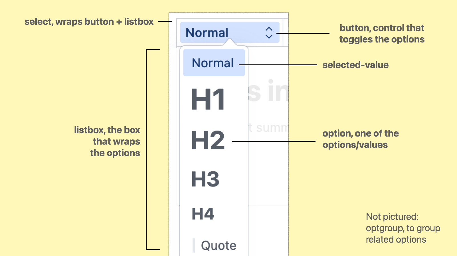
The parts are:
select, the root element, wrapping/containing all the partsbutton, the toggle/button the user activates to open the optionslistbox, the part that is toggled, it wraps the optionsoptgroup, a part that we can optionally use to group related options togetheroption, an actual choice, a value that a user can pickselected-value, the element that displays the currently selected value
(from: Anatomy of the selectmenu)
When using regular <select>s, it is possible to make the button part look however we want. In some browsers, we can also apply some specific styles to options, like background colours.
With <selectmenu>, these parts are not just parts in the colloquial sense, they are <part>s in the Web Component sense, meaning that they exist as elements in the shadow tree of the component. Consequently, all of these parts can be changed.
There are two levels to that: the first is to write CSS, where we can use all the power CSS has to offer, the second is to completely replace the DOM structure to what we want or need.
Option 1: CSS
In the <selectmenu> prototype, the options are part of the (light) DOM like they are in a <select> element, which means we can target them with CSS (and unlike with <select>, our styles will actually get applied).
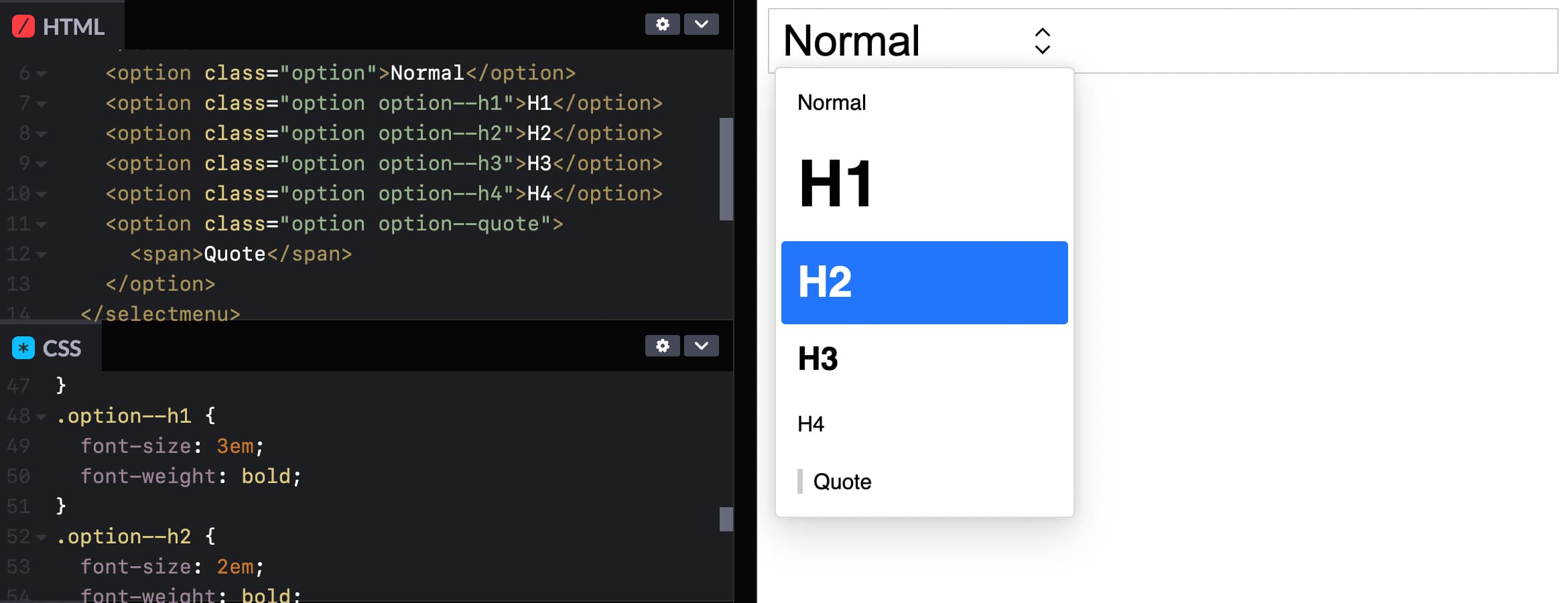 You could even give each option its own style! See Codepen (view in Canary with Experimental Web Platform Features flag on)
This is the most basic example of styling a selectmenu: you apply CSS to the options, like you would to any other HTML element.
The other parts of the selectmenu are targeted differently: we'll use a ::part() selector referencing the respective part name. For example, to style the button:
selectmenu::part(button) {
  // add any button styles
}
(Codepen of example with styled options)
To style other parts, you use that part's name instead, for instance ::part(listbox). Just last week, a resolution was passed to also expose the arrow as a part, to allow for easy styling or icon-replacing (part name to be decided).
In case you, like me, had not used the ::part selector, it is part (no pun intended) of the CSS Shadow Parts module.
For background: Web Components can have a light and a shadow DOM. The light DOM is part of the DOM like anything else and can be styled, but the shadow DOM is internal to the element. This a bit like public and private functions. For styling purposes, the CSS Shadow Parts module states that the creator of a Web Component can choose to expose parts of their shadow DOM by names. Developers provide a list of parts (element names) to be exposed, and then the elements can be targeted through ::part(partname). With <selectmenu>, we get a browser built in Web Component that has parts exposed (except for option, which is in the light DOM).
This is huge… I mean, being able to throw CSS at the different parts of a selectmenu unlocks a lot of possibilities. Many of us will likely just use it to round some corners, add some shadows, maybe a little color or typography. And that's fine, we never could unless we built or loaded a library for custom selects.
I'm excited about being able to add a few finishing touches to selects, alone. But CSS has numerous powerful features, so that's only the surface. With all of CSS at our fingertips, custom selectmenu styles are probably going to be used in more interesting ways than we can think of now.
Option 2: full control by replacing parts
If we need more than ‘just’ styles, it is also possible to replace entire parts with whatever we like. For instance, we could write our own button entirely, and tell the browser to use that instead.
Replacing a part is done with slots. Let's say we created a button with markup of our choice:
<button>select option</button>
We can then tell the browser that, actually, we want this to be what the button part is, adding slot="button" and behavior="button":
<button
  slot="button"
  behavior="button"
>select option</button>
(Codepen of example with replaced button part)
Now, the button will be what's used for the part called ‘button’ (as it is slotted into the right place with slot) and get the browser's select button behavior and accessibility accomodations (set through behavior). We could do the same for the other parts.
We could also do this in JavaScript, with Element.attachShadow(), so that the markup we want to use can live in our JS, and we only need one HTML element at the point of usage rather than one plus a few more for slotting.
But wait… if we're replacing all the parts with our own things, isn't this just like rolling our own selects entirely? Well, yes, it is the advanced option, and usually CSS should suffice. But even if we replace some or many parts, the selectmenu would still get a bunch of things from the browser for free, like positioning, being on the top layer and light dismiss, features that would be hard to impossible to code in JavaScript.
Accessibility risk: avoid unexpected nests
There is an important accessibility risk to be aware of for folks planning to replace parts in their selectmenus. Browsers and assistive technologies have certain expectations about what HTML is and does. If we divert from those expectations, we risk causing real problems for end users, which could include controls becoming unusable.
One example is what would happen if we would nest an interactive element like a link or button inside an option. Maybe one of our options has a tooltip? All of this should be avoided, at least for the time being (as far as I understand, this may change when secondary actions become a thing, see also w3c/aria#1440). The reason is: assistive technologies expect just text inside of options, not controls, so this would break badly and it could mean users wouldn't find those buttons or links, or wouldn't be able to interact with them. For this reason, it is strongly recommended to avoid interactive elements inside of options, i.e. do not add links or buttons in options.
Summing up
In this post, we looked at two ways to customise the parts of a selectmenu element. We can use CSS, which should cover a large amount of use cases and offer flexibility and room for creativity. Or we can replace entire parts with whatever we would like, the more advanced option that has accessibility risks if not thoroughly checked against specs and implementations. For a lot of the use cases that I see in design systems I have worked on, I feel CSS alone will cover all the needs. And it will do so very elegantly, often in literally a few lines of code.
Again, this is all in the future, the element is just being tested out. But, it may well be that this same pattern of having both CSS and parts-replacement for control customisation will come to other Open UI work, too. Generally, I am a fan of this layered approach. As a developer, I like the principle of being able to make things as simple or complex as I want.
If you want to see more demos, the Microsoft Edge team has built a series of cool <selectmenu> demos(as they note, pushing the limits and some with accessibility issues). You can see and play with these, using Edge or Chrome Canary with Experimental Web Platform Features turned on. These demos include a lot of part replacements, too. If you have feedback, want to follow this work more closely or chime in, head to Open UI issues on GitHub or join us on the Open UI Discord community.
Originally posted as Two levels of customising
Two levels of customising <selectlist>
The proposed <selectlist> will have powerful styling options and full control over the different parts. In other words, there would be not one, but two levels of customisation. In this post, we'll look at what they are and when they are useful.
<selectlist>, you ask? It's a proposed new HTML element that is like <select>, but fully customisable. Why? Because so many people are building their own selects, from scratch or with libraries, and that should be easier to do. With accessible defaults where possible and by leaving the parts that browsers are good at to the browser (like knowing where to position it, to place it on the top layer or to automatically dismiss it when appropriate (‘light dismiss’)).
For context, <selectlist> is a proposal by the Open UI Community Group. This group was founded to study common components and controls that people build on the web (in design systems, see the component name matrix), and suggest Web Platform features to make it easier to build such controls. Think new HTML elements, CSS features or APIs, as well as things that surface across HTML, CSS and JS.
![]()
<selectlist> doesn't ‘exist’ just yet, it is an idea that is being prototyped in Chromium, with other browser engines currently not opposed, but also not implementing it (as far as I'm aware). While you would't use it in projects yet, you can experiment with it in Chrome or Edge Canary with Experimental Web Platform Features flag on, and file issues if something doesn't work as expected or desired. For brevity, this post will refer to it as if it exists, to avoid saying ‘would’ in every sentence.
The anatomy of a <selectlist>
The <selectlist> element, as currently prototyped, is a lot like the <select> element that we've had for years. We can use it in a form, users can select an option out of many and their choice becomes part of the data that we process.
But where a <select> comes with free built-in styles that we can't change, <selectlist> consists of some explicitly designed parts that can be changed (more on that a later). Often, the browser built-in styles of a <select> are just fine, sometimes they are not.
In Sanity's Portable Text editor, the user can choose text types. Each option is styled like something of that type is commonly styled, and there is some shadows, rounded corners and arrows that a regular <select> can't have.
The parts are:
select, the root element, wrapping/containing all the partsbutton, the toggle/button the user activates to open the optionslistbox, the part that is toggled, it wraps the optionsoptgroup, a part that we can optionally use to group related options togetheroption, an actual choice, a value that a user can pickselected-value, the element that displays the currently selected value
(from: Anatomy of the selectmenu)
When using regular <select>s, it is possible to make the button part look however we want. In some browsers, we can also apply some specific styles to options, like background colours.
With <selectlist>, these parts are not just parts in the colloquial sense, they are <part>s in the Web Component sense, meaning that they exist as elements in the shadow tree of the component. Consequently, all of these parts can be changed.
There are two levels to that: the first is to write CSS, where we can use all the power CSS has to offer, the second is to completely replace the DOM structure to what we want or need.
Option 1: CSS
In the <selectlist> prototype, the options are part of the (light) DOM like they are in a <select> element, which means we can target them with CSS (and unlike with <select>, our styles will actually get applied).
You could even give each option its own style! See Codepen (view in Canary with Experimental Web Platform Features flag on)
This is the most basic example of styling a selectmenu: you apply CSS to the options, like you would to any other HTML element.
The other parts of the selectmenu are targeted differently: we'll use a ::part() selector referencing the respective part name.
Deprecation warning: this is currently under discussion; the final implementation will likely use elements and not ::part() to select parts of a selectlist
For example, to style the button:
selectmenu::part(button) {
  // add any button styles
}(Codepen of example with styled options)
To style other parts, you use that part's name instead, for instance ::part(listbox). Just last week, a resolution was passed to also expose the arrow as a part, to allow for easy styling or icon-replacing (part name to be decided).
In case you, like me, had not used the ::part selector, it is part (no pun intended) of the CSS Shadow Parts module.
For background: Web Components can have a light and a shadow DOM. The light DOM is part of the DOM like anything else and can be styled, but the shadow DOM is internal to the element. This a bit like public and private functions. For styling purposes, the CSS Shadow Parts module states that the creator of a Web Component can choose to expose parts of their shadow DOM by names. Developers provide a list of parts (element names) to be exposed, and then the elements can be targeted through ::part(partname). With <selectlist>, we get a browser built in Web Component that has parts exposed (except for option, which is in the light DOM).
This is huge… I mean, being able to throw CSS at the different parts of a selectmenu unlocks a lot of possibilities. Many of us will likely just use it to round some corners, add some shadows, maybe a little color or typography. And that's fine, we never could unless we built or loaded a library for custom selects.
I'm excited about being able to add a few finishing touches to selects, alone. But CSS has numerous powerful features, so that's only the surface. With all of CSS at our fingertips, custom selectmenu styles are probably going to be used in more interesting ways than we can think of now.
Option 2: full control by replacing parts
If we need more than ‘just’ styles, it is also possible to replace entire parts with whatever we like. For instance, we could write our own button entirely, and tell the browser to use that instead.
Replacing a part is done with slots. Let's say we created a button with markup of our choice:
<button>select option</button>We can then tell the browser that, actually, we want this to be what the button part is, adding slot="button" and behavior="button":
Deprecation warning: this will probably not work this way in the final implementation
<button
  slot="button"
  behavior="button"
>select option</button>(Codepen of example with replaced button part)
Now, the button will be what's used for the part called ‘button’ (as it is slotted into the right place with slot) and get the browser's select button behavior and accessibility accomodations (set through behavior). We could do the same for the other parts.
We could also do this in JavaScript, with Element.attachShadow(), so that the markup we want to use can live in our JS, and we only need one HTML element at the point of usage rather than one plus a few more for slotting.
But wait… if we're replacing all the parts with our own things, isn't this just like rolling our own selects entirely? Well, yes, it is the advanced option, and usually CSS should suffice. But even if we replace some or many parts, the selectmenu would still get a bunch of things from the browser for free, like positioning, being on the top layer and light dismiss, features that would be hard to impossible to code in JavaScript.
Accessibility risk: avoid unexpected nests
There is an important accessibility risk to be aware of for folks planning to replace parts in their selectmenus. Browsers and assistive technologies have certain expectations about what HTML is and does. If we divert from those expectations, we risk causing real problems for end users, which could include controls becoming unusable.
One example is what would happen if we would nest an interactive element like a link or button inside an option. Maybe one of our options has a tooltip? All of this should be avoided, at least for the time being (as far as I understand, this may change when secondary actions become a thing, see also w3c/aria#1440). The reason is: assistive technologies expect just text inside of options, not controls, so this would break badly and it could mean users wouldn't find those buttons or links, or wouldn't be able to interact with them. For this reason, it is strongly recommended to avoid interactive elements inside of options, i.e. do not add links or buttons in options.
Summing up
In this post, we looked at two ways to customise the parts of a selectmenu element. We can use CSS, which should cover a large amount of use cases and offer flexibility and room for creativity. Or we can replace entire parts with whatever we would like, the more advanced option that has accessibility risks if not thoroughly checked against specs and implementations. For a lot of the use cases that I see in design systems I have worked on, I feel CSS alone will cover all the needs. And it will do so very elegantly, often in literally a few lines of code.
Again, this is all in the future, the element is just being tested out. But, it may well be that this same pattern of having both CSS and parts-replacement for control customisation will come to other Open UI work, too. Generally, I am a fan of this layered approach. As a developer, I like the principle of being able to make things as simple or complex as I want.
If you want to see more demos, the Microsoft Edge team has built a series of cool <selectlist> demos, when these were published it was still called <selectmenu> (as they note, pushing the limits and some with accessibility issues). You can see and play with these, using Edge or Chrome Canary with Experimental Web Platform Features turned on. These demos include a lot of part replacements, too. If you have feedback, want to follow this work more closely or chime in, head to Open UI issues on GitHub or join us on the Open UI Discord community.
Originally posted as Two levels of customising
Two talks about documentation
In two recent conference talks, I learned about making better documentation. First, I heard Adrienne Tacke focus on the documentation's content, explaining how to make it more usable and effective. Then I saw Rich Harris go into how to build a documentation environment, showing a way to approach documentation of projects with a server-side components.
Both talks resonated with me. Good documentation is the backbone of every software project (and also crucial elsewhere, including for web standards like WCAG). For software companies there are countless business reasons to invest in documentation, and for anyone else, yes, improving documentation is still rewarding in many ways.
Types of documentation
To clarify what we're talking about here, Daniele Procida's Diátaxis framework for technical documentation, which I found out about in Rich's talk, identifies four types of documentation:
- tutorials, to teach people how to use the thing in the first place
- how-to guidess, to teach an experienced user how to do specific things with your tool
- explanation, to give a high level overview of concepts in your tool
- reference documentation, to provide matter-of-fact information about functions, APIs etc, to be consulted not read; can be automatically generated
Adrienne's and Rich's talks focused mostly on the first two: tutorials and how-tos.
Be concise and valuable
In her talk, Documentation: the missing pieces, Adrienne went into some very common problems in documentation. She showed how documentation can be unclear and unhelpful, and then went on to show how to be concise and valuable instead. The whole talk is a must watch, but here are some highlights:
- be more explicit, by expanding acronyms (they can depend on context and not all acronyms are familiar to everyone) and by using the German naming convention (if you can be more explicit in a variable name, do it)
- be aware of the steps in what you are teaching and avoid skipping steps at all times; this is another moment of stepping (no pun intended) into the shoes of the reader of your documentation, they don't know your project as well as you do, so you want to be explicit and list all gotchas
- avoid surprises, always tell readers what they will need to make their way through the tutorial (prerequisities, dependencies, paid plans, time)
- focus on the thing you want folks to learn and help abstract the unrelated setup and configuration stuff away, by creating a starter app, Docker container or sandboxed environment, anything that isn't core to the thing you're currently teaching, but still needs to exist in order for the reader to get started
Interactive tutorials with a server-side component
In his recent JS Nation talk (start at 40s to avoid the crypto advertisement edited into the video 🥲), Rich explained tutorials are essential, as they actually show users what to do, but they are often overlooked. He showed Learn Knockout, a very early example of a tutorial he loved, and which the Svelte Tutorial was later inspired by, and others, like Lit tutorial, that follow the same model.
For the documentation of Svelte and SvelteKit, the frameworks he created, Rich used four principles:
- create a sandboxed environment, so that it is safe to make mistakes
- help muscle memory by disabling copy/paste (controversial!)
- provide a way to get straight to the solution if you're stuck (Rich calls this “panic button”)
- meet users where they are (in Svelte/SvelteKit's case: the browser)
Sandboxes for “full stack” projects need both a client and a server component. Some services provide a way to access a virtual server from a sandbox (like CodeSandbox Containers), but they have authentication barriers, to avoid abuse (like bitcoin mining) and can come with some latency, Rich explained. Then he found that on Stackblitz, the server is, rather impressively, ran inside the browser by compiling Node to WebAssembly and running that inside the browser's security sandbox (this is called WebContainers). And that wasn't enough: as he found a StackBlitz environment is made for coding, not learning, Rich teamed up with the StackBlitz team to have some kind of headless version of StackBlitz in order to create what's now in beta as learn.svelte.dev.
Summing up
While these talks were about different aspects of documentation, the speakers were equally determined to ensure that users of their documentation would actually learn the thing easily. It's not easy, neither when creating the content, nor in technically setting up the environment, but it can clearly make a difference.
Originally posted as Two talks about documentation on Hidde's blog.
Two talks about documentation
In two recent conference talks, I learned about making better documentation. First, I heard Adrienne Tacke focus on the documentation's content, explaining how to make it more usable and effective. Then I saw Rich Harris go into how to build a documentation environment, showing a way to approach documentation of projects with a server-side components.
Both talks resonated with me. Good documentation is the backbone of every software project (and also crucial elsewhere, including for web standards like WCAG). For software companies there are countless business reasons to invest in documentation, and for anyone else, yes, improving documentation is still rewarding in many ways.
Types of documentation
To clarify what we're talking about here, Daniele Procida's Diátaxis framework for technical documentation, which I found out about in Rich's talk, identifies four types of documentation:
- tutorials, to teach people how to use the thing in the first place
- how-to guides, to teach an experienced user how to do specific things with your tool
- explanation, to give a high level overview of concepts in your tool
- reference documentation, to provide matter-of-fact information about functions, APIs etc, to be consulted not read; can be automatically generated
Adrienne's and Rich's talks focused mostly on the first two: tutorials and how-tos.
Be concise and valuable
In her talk, Documentation: the missing pieces, Adrienne went into some very common problems in documentation. She showed how documentation can be unclear and unhelpful, and then went on to show how to be concise and valuable instead. The whole talk is a must watch, but here are some highlights:
- be more explicit, by expanding acronyms (they can depend on context and not all acronyms are familiar to everyone) and by using the German naming convention (if you can be more explicit in a variable name, do it)
- be aware of the steps in what you are teaching and avoid skipping steps at all times; this is another moment of stepping (no pun intended) into the shoes of the reader of your documentation, they don't know your project as well as you do, so you want to be explicit and list all gotchas
- avoid surprises, always tell readers what they will need to make their way through the tutorial (prerequisities, dependencies, paid plans, time)
- focus on the thing you want folks to learn and help abstract the unrelated setup and configuration stuff away, by creating a starter app, Docker container or sandboxed environment, anything that isn't core to the thing you're currently teaching, but still needs to exist in order for the reader to get started
Interactive tutorials with a server-side component
In his recent JS Nation talk (start at 40s to avoid the crypto advertisement edited into the video 🥲), Rich explained tutorials are essential, as they actually show users what to do, but they are often overlooked. He showed Learn Knockout, a very early example of a tutorial he loved, and which the Svelte Tutorial was later inspired by, and others, like Lit tutorial, that follow the same model.
For the documentation of Svelte and SvelteKit, the frameworks he created, Rich used four principles:
- create a sandboxed environment, so that it is safe to make mistakes
- help muscle memory by disabling copy/paste (controversial!)
- provide a way to get straight to the solution if you're stuck (Rich calls this “panic button”)
- meet users where they are (in Svelte/SvelteKit's case: the browser)
Sandboxes for “full stack” projects need both a client and a server component. Some services provide a way to access a virtual server from a sandbox (like CodeSandbox Containers), but they have authentication barriers, to avoid abuse (like bitcoin mining) and can come with some latency, Rich explained. Then he found that on Stackblitz, the server is, rather impressively, ran inside the browser by compiling Node to WebAssembly and running that inside the browser's security sandbox (this is called WebContainers). And that wasn't enough: as he found a StackBlitz environment is made for coding, not learning, Rich teamed up with the StackBlitz team to have some kind of headless version of StackBlitz in order to create what's now in beta as learn.svelte.dev.
Summing up
While these talks were about different aspects of documentation, the speakers were equally determined to ensure that users of their documentation would actually learn the thing easily. It's not easy, neither when creating the content, nor in technically setting up the environment, but it can clearly make a difference.
Originally posted as Two talks about documentation on Hidde's blog.