Reading List
The most recent articles from a list of feeds I subscribe to.
ACT Rules CG published implementations
The ACT Rules Community Group (CG) writes testing rules for accessibility standards conformance. In the process, they find consensus in interpretation issues. This week, the CG published an “Implementations” page that shows these rules are not used in just one place, but in many: from manual methodologies to semi-automated (axe DevTools) and automated (axe-core, Alfa, Qualweb and more) tools.
Before going into why this is great, I will give some context. Accessibility standards like WCAG define criteria to conform with, they help makers of websites understand what a web without barriers means in practice. For instance, in WCAG, it means colours have sufficient contrast, pages have titles, buttons have names, and so on. In WAI-ARIA, it means elements with a cell role must be contained in or owned by an element with the row role, to name just one example. These, and all other requirements (“MUST”s) in standards, are testable requirements. This makes testing basically the process of finding out if you meet the standards (you, a product, a browser, a tool, an assistive technology, etc). It is a great lens to view accessibility through. and definitely a lens I use a lot when teaching.
But if you ever speak about the same issue with multiple accessibility specialists, you'll find that there can be differences in interpretation of these standards (see also: The Accessibility Interpretation Problem by Glenda Sims and Wilco Fiers). One way to avoid interpretation issues would probably be to have thousands of success criteria WCAG that allow for zero interpretation, but that imaginary world would be a much worse world. Instead, agreeing on how to test might be the best option we have.
The ACT Rules Community Group brings together makers of tools and other stakeholders to make testing accessibility standards more consistent, by finding agreement. They then write rules according to a format they specified. The rules that apply specifically to WCAG are also reviewed by AGWG, the group that produces WCAG.
This is tedious work and I, for one, am very pleased to see these rules now have implementations across different methodologies and tools. We'll probably see them more and more in the wild (I know I will in some tools I use). Congrats, Community Group, and keep up the great work!
Originally posted as ACT Rules CG published implementations on Hidde's blog.
My experience at Modern Frontends Live
This isn't a post I wanted to write, but alas, sometimes not staying silent matters. This week I spoke at Modern Frontends Live in London. I was disappointed to see the organiser lied and misrepresented what they offered, as it impacted attendees, speakers and sponsors that were involved (financially and mentally).
I didn't want to name names either, but my judgment after interacting with her and a number of people I trust, I fear Gen Ashley, the organiser, might try it again, potentially under a different event name and/or try to hide what happened. To inform other attendees, sponsors and speakers, I want to be sure to share my experience.
Below I'll list the misrepresentations that I found specifically problematic. Other writeups are available from Jo Franchetti, Cassie Evans, Kent C. Dodds, Todd Libby, Chris Perry, Mike Hartington, JD Hillen, Dylan Beattie, Niamh McCooey and Kilian Valkhof. There is also a video reflection from Tejas Kumar. Again, I don't think any of us intend to “pile on”, but speaking out matters, it shows that the issues aren't just one person's perspective.
First, some context (that shaped my thoughts on conferencing). I have been involved with Fronteers Conference for 5 years (until 2013), anything from sitting at registration and holding mics to curation, team chairing and organiser handbook author (writing down what PPK and Krijn largely shaped). I was also involved with CSS Day and Performance Now to help out with practical stuff like registration. I've also given over 50 talks. Long story short, I do notice stuff at events sometimes.
Second, not everything about the event was bad. I'm grateful the organisers put me in a decent hotel, served a tasty speaker's dinner and were friendly and treated me mostly with respect (but, for completeness, also broke promises to me, and treated others badly). I actually had a good time meeting friends, some for the first time. As a lot of my work is virtual, it was great to have lots of interesting conversations and relating to developers (my job is in developer relations), and to finally meet some of the Open UI and other W3C groups in person.
Wildly exaggerated attendee numbers
The conference website showed (and therefore promised) '3000+' attendees. There were a few hundred, to my best estimation. I asked Gen and the people manning the registration desk various times what the number of actual attendees was. She tried to dodge this question, said there were about 1000 tickets of which a number was free tickets, but she didn't know how many were attending as not everyone showed up.
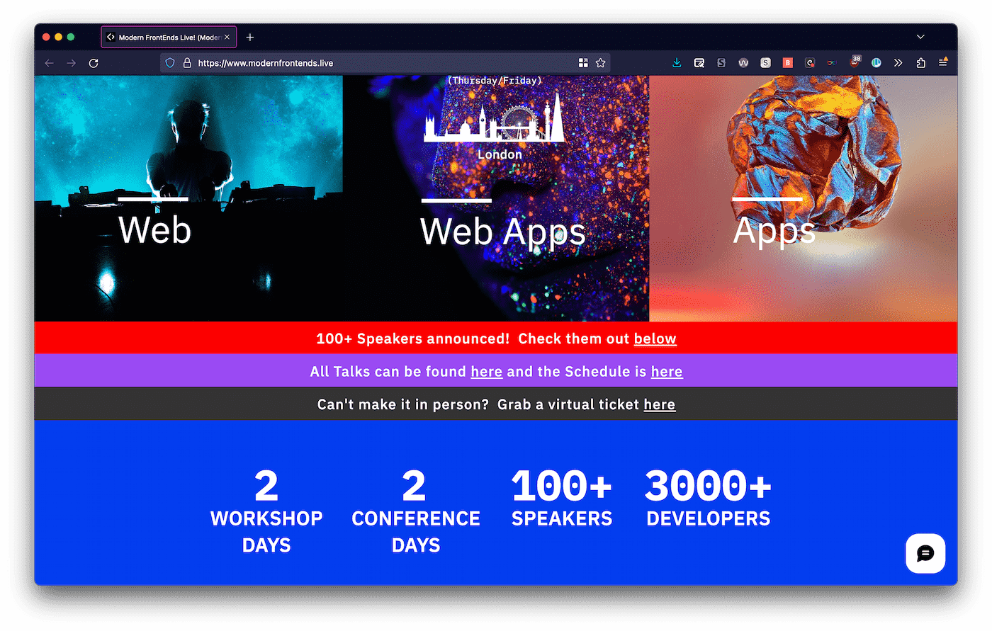 Screenshot of the homepage taken on 19 November 2022, the day after the conference
Conference registration systems show numbers and these badges are sent to a printing company. Health and safety people and catering need to know these numbers too. It seems nearly impossible to not know how many badges or you have.
Either way, a few hundred is not a little bit less than 3000, it is 5-10% of what was promised.
It's okay if ticket sales don't go as expected. It's not okay to stay silent about it and have everyone only find out on the event day. A few hundred is a small-ish event, 3000 is a huge event. Sponsors count on numbers to make their spend worthwhile, attendees count on numbers to estimate with how many people they could network. As a speaker, I need correct numbers to decide too, as there are a lot of events and me and my employer (if it's for work) are mindful about where we go. I don't mind speaking to 10 or 1000 people, but the number is one of the things I use to decide, especially when considerable travel time is involved.
Payment taken for a non-existent livestream
Livestream tickets were sold, but there were not cameras. These tickets (£42) were still on sale during the event, while there were no cameras. It was framed as ‘technical issues’. I've seen a lot of livestream-related technical issues, but they usually involve at least the presence of cameras.
I found out while attending a session and accidentally scrolling my Twitter timeline, as one does. People had paid for a stream, got no information regarding how to access it. Friends wondered if there were even cameras. I looked around in the room, noticed none. Asked the technician, confirmed there were none in that room. I felt a little sick, assuming there must be a misunderstanding, left the room (sorry speaker) and went to check all other rooms. No cameras.
Then I confronted Gen. She laughed at the idea that people had assumed cameras were needed for a livestream. Why did we assume such a thing, she wondered, and said they had planned to livestream with Streamyard. Maybe a possibility in theory, but it was halfway the first day and it hadn't happened yet, nor did I as a speaker receive instructions around setting that up (and anyone I checked with had not either).
It's ok if the livestream you planned fails or even if the camera team you hired all got covid on the day. It's not okay to not communicate about that, or promise videos, as this tweet suggests they did:
Just got an email. “Due to technical issues, we will not be streaming live, unless it gets fixed soon.”
If not resolved, We will share recordings at a later date”
Posted by @ukF1dev on November 17 2022
To my knowledge, after a lot of pressure the organiser have promised the people who bought a ticket a refund and a free ticket to “next year's event”.
Broken travel arrangement promises
Some speakers were not paid for travel, others were promised. Some paid thousands from their own pockets. I can personally say two hotel nights were covered for me by the conference. Travel reimbursement was promised to be paid before the event, after many reminders I am still waiting for that.
Update (23 November 2023): it's a week after the event started and I've received reimbursement for my travel costs.
I firmly believe an event should pay speakers' travel expenses as a minimum. Getting there and staying there should be paid from the conference budget, because speakers are an essential part of the event. They attract attendees and spend a lot of time to prepare, speak and attend. Exceptions could include events that are free to attend or that are (actually, like, really) community driven. I love those events and am usually happy to make time for them. Exceptions should not include events that charge attendees in the hundreds and sponsors in the thousands.
Somewhat controversially and socialistically, I feel this should apply equally between speakers, and also apply to speakers who work for very rich employers. This helps avoid power imbalance in a couple of ways. I know some organisers take speakers whose employer pays the travel and it helps with the budget, and I get that, events can be very costly.
It's okay if you don't want to pay any of the speaker's travel expenses, but do it fairly. It's also okay if you get so much email that you miss one of a speaker's three reminders, but communication is important. In my case they kept sending me emails and DMs to ask me to boost their event, but meanwhile ignored my requests to pay what they promised to pay.
Venue represented wrongly
Under a “The venue” heading, the website showed an enormous wall to wall screen and a very large audience. This isn't what the venue looked like. I understand a marketing website wants to persuade, but the gap between what this photo shows and the actual main room is too large. Was I naive to assume this reflected reality? I don't know, the screens at View Source (2019) in Amsterdam or JSConfEU (2019) in Berlin were a bit like the one shown on this photo. It's quite large for a developer conference, but it happens.
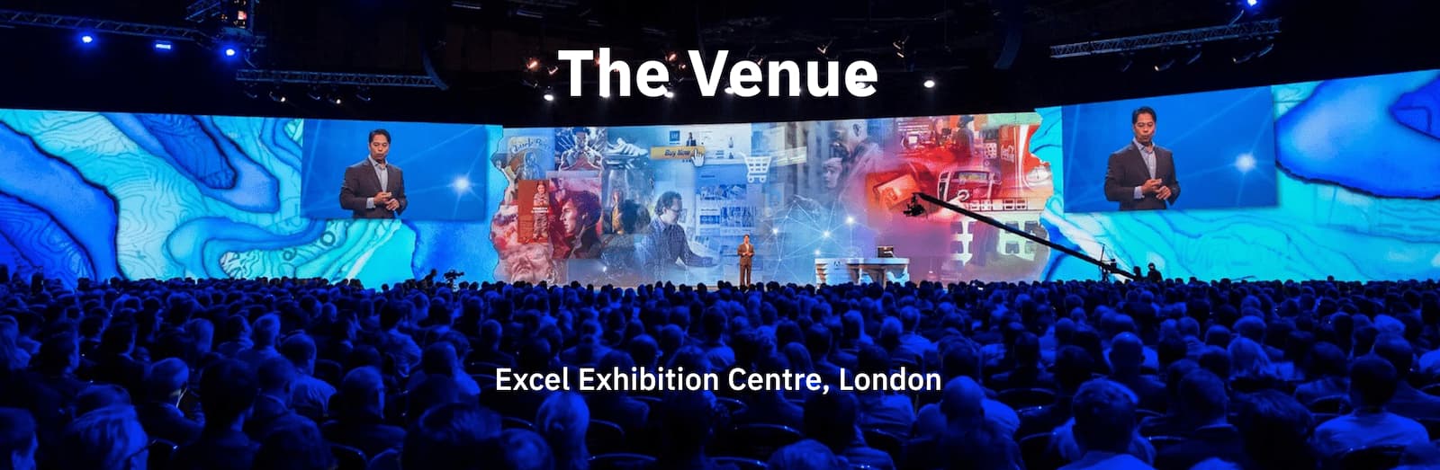 Another screenshot of the homepage taken on 19 November 2022, the day after the conference
In her post, Jo Franchetti describes the venue in more detail.
Conclusion
Organising events is hard, lonely and stressful. I have a lot of respect for conference organisers, I have done it myself (not without many mistakes, believe me) and have friends who do still do it. So, by default, I cut organisers a lot of slack and have a lot of understanding for the many ways it could go wrong in. I believe in good intentions, generally anyway. I am also grateful for the things the conference did do right, thanks for that.
There were red flags from the start (from the accessibility and front-end of the website to the lack of communication), but those did not stop me from going. The issues that emerged during the event did make me regret somewhat, but all I could do then is still try to enjoy it and deliver interesting content for the attendees that paid to come.
The specific issues I've put in this post cross the line between honest mistakes and bad behaviour. They cross the line, because they consistute fraud (the livestream) and because they impact attendees, sponsors and speakers. The front-end community doesn't deserve this, and I'm worried for people new to the industry, who get may assume this is normal or ok. It's not normal. In the last year I've spoken at a number of events that had a very high bar to make it great for attendees, sponsors and speakers (shoutout to Beyond Tellerrand, JSConf Budapest and State of the Browser).
In any case, if you were at the event, I encourage you to speak up, too.
Originally posted as My experience at Modern Frontends Live on Hidde's blog.
Dialogs and popovers seem similar. How are they different?
Web platform concepts can sometimes be quite different, yet seem very similar. Semantics, behaviours and characteristics can be tricky to distinguish. In addition to the <dialog> element, HTML now has a popover attribute. This post goes into the differences between dialogs, popovers, overlays and disclosure widgets. We'll also look at what it means when an element is modal. All somewhat related concepts that can seem very similar. At least they did to me. Let's dive in!
(If this is too long, I did a 40 minute talk version at All Day Hey and a 7 minute version at JS Nation (don't believe the ‘AI’ summary on that page))
In this post
- Introduction
- The characteristics (modality, light vs explicit dismiss, top layer presence, backdrop, constrained focus, keyboard dismissable/collapsible)
- The main patterns (dialogs, popovers, overlays, disclosure widgets)
- FAQ
- Summing up
popover is available:
- Chrome (116) and Edge (115)
- Safari (17)
- Firefox (125)
You can use it in production (there is popover polyfill), but be sure to test it well, it is new and there may be issues with support, including accessibility support.
Introduction
The thing with words is that not everyone uses them the same everywhere. The words in this post are no different. As a long time contractor I changed environments on the regular—phrases changed when I worked in different teams, companies, countries and even years (see also older resources, like the WHATWG wiki on dialogs). Meanings change over time, also in the world in general… this is normal! But in the case of these components, interpretation differences can lead to bad user experience.
A lot of the concepts I'll discuss in this post originated in operating systems: see Apple's Human Interface Guidelines, Microsoft's “Win32” guidelines (old) and Controls for Windows apps (newer). If we compare those with patterns in ARIA Authoring Practices Guide, we'll find similarities. Some similarities are on the surface, they just look the same. Others are similar for users of assistive technologies: the ergonomics of some ARIA components are designed to be similar to the corresponding operating system ergonomics, for better or for worse.
But OS-level guidelines or ARIA Authoring Practices (APG) aren't the best place for web developers to look for implementation guidance. OS-level guidelines are for OS-es, APG is to demo how to use ARIA (not how well it is supported).
For clarity, throughout this post, I will refer to the concepts of dialog, modality and popovers as they exist on the web, in languages like HTML, CSS and ARIA (note: popovers don't exist yet, just as a proposal). My definitions are meant to align with the relevant web specifications, they may be slightly different from what is used in other places and in individual teams.
Below, we'll start with characteristics that components can have, like modality, light dismiss, top layer presence and backdrops. Then we'll talk about what we get when these characteristics are used together in a website or web app: dialogs, popovers, overlays and disclosures. Hopefully, when we discuss the characteristics in detail first, it is easier to distinguish the components themselves.
The characteristics
Modality / inertness
Some design systems have a component named “modal”, but modality is more of a characteristic than a component itself.
So what does it mean for an element to be modal? Basically, when a modal component is open, it is the only thing that is not inert. Only the modal content can be interacted with, the rest of the page or application is made inert. Inert content is content that users cannot interact with. It is only really there visually, but you cannot Tab to it, click it, scroll it or access the content via assistive technologies.
Elements that are not modal are called non-modal or modeless.
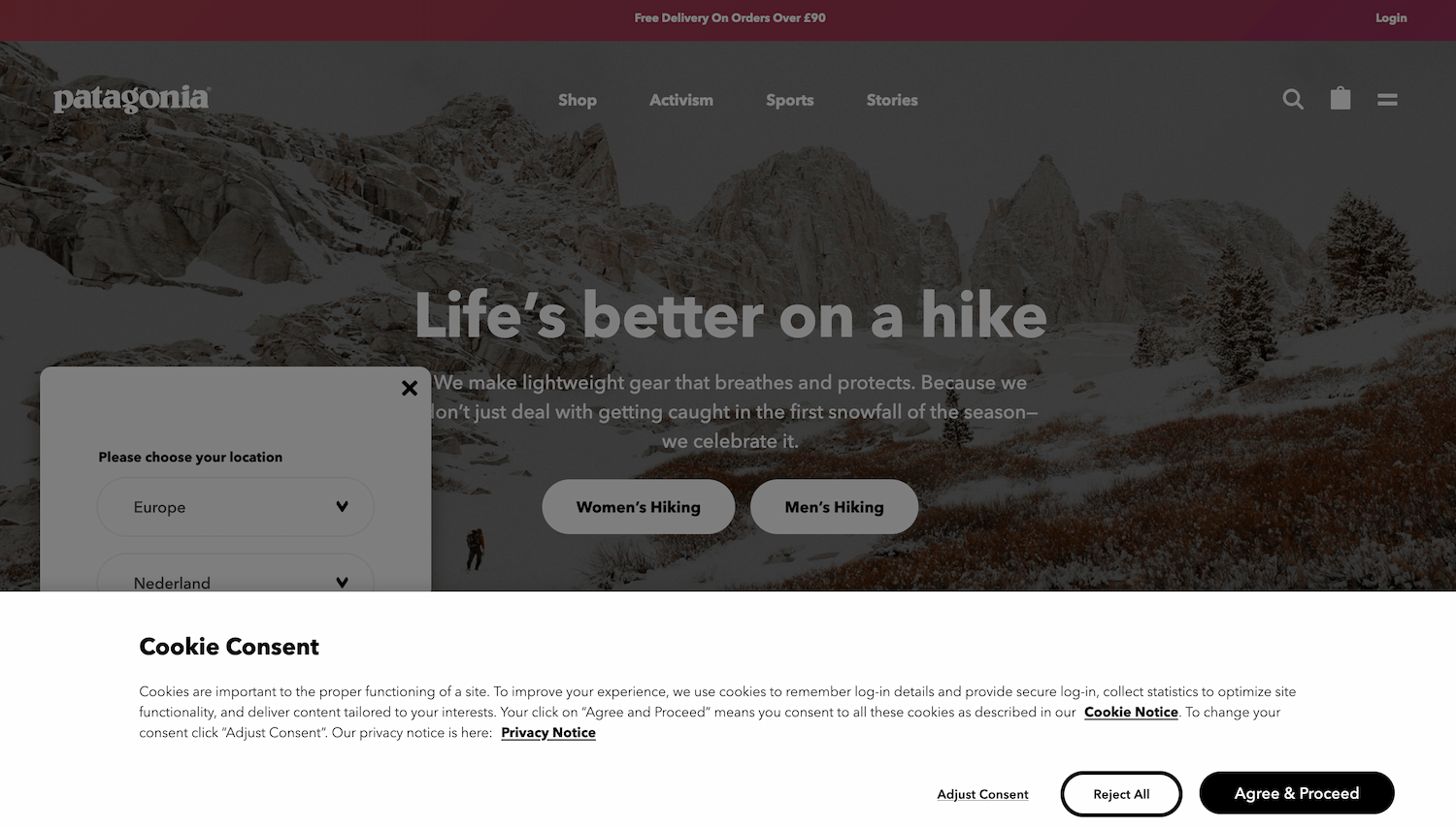 In this example, the dimmed background suggests a choice between accepting and refusing cookies has to be made before any other interaction can happen. (Note: on actual website, scrolling the background still works, it shouldn't)
Not everyone likes modality—as a UI concept, they are very disruptive. Use the pattern sparsely, only when disrupting is very much necessary. If you want to ask the user “Are you sure you want to delete all that?”, go ahead and make it disruptive. If you want to promote your newsletter sign-up or advertising, the disruption is unlikely to be appreciated.
In terms of implementation, you will need to make everything except your modal element inert. The <dialog> element (used with showModal()) does this for and would be the best to use.
If you cannot use <dialog> or are looking at an older code base that doesn't, here's an example of distinguishing between modal and inert content:
<body>
  <div class="modal" role="dialog">
    <!-- modal content -->
  </div>
  <div class="everything-else" inert>
    <!-- everything else -->
  </div>
</body>
The gist of it is that one element is modal and everything else inert: unavailable to any user or technology. As today, not all users will be on a browser that supports inert, best use the inert polyfill. Without inert or its polyfill, you would need to add aria-hidden="true" to the content outside of the modal (to make it unavailable for assistive technologies) and tabindex="-1" to any interactive elements that are not in the modal.
Just trapping focus in an element or adding a backdrop does not make it truly modal. With a focus trap, you only make the rest of the content unavailable via a keyboard. With a backdrop, you only make it unavailable visually.
Light vs explicit dismiss
Another aspect to consider is how users dismiss a component and whether that is affected by other elements: this can be via explicit dismiss or light dismiss.
With ‘explicit dismiss’, a component allows a user to dismiss it, for instance via a close button and the Escape key (when in doubt, best add both).
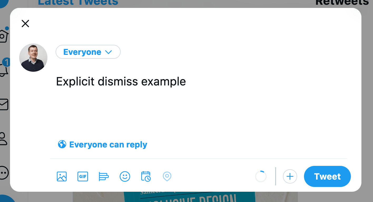 Explicit dismiss: if I don't want to send this tweet, I can press the close button or Escape to dismiss the dialog I'm presented with
With ‘light dismiss’, a component disappears automatically on certain conditions, like when users scroll, interact with something else or click outside of the component. Light dismiss doesn't happen when the user Tabs out of the element by default (but developers can add it if needed, see the discussion in openui/open-ui#415 for more details).
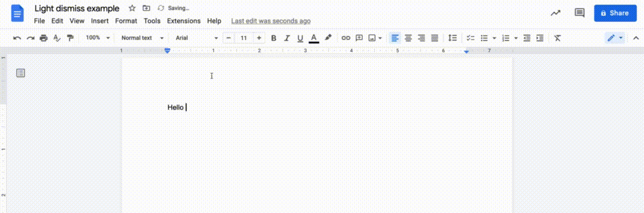 Light dismiss: if the font picker is open and I click in the text that I'm editing, the font picker will close automatically
Light dismiss is something we can already build in JavaScript today, a lot of websites have components that light dismiss. But with the popover attribute, the browser would do it for you (if you use popover="auto").
Top layer presence
By default, if multiple elements are positioned in the same location, they are painted by the browser in DOM order. The element that is first in the DOM is painted first, each subsequent element on top of the previous and the last one in the DOM is painted last, at the top. With the z-index property in CSS you can deviate from the default on a case by case basis. You basically decide your own layer order. This feature is defined in an appendix to CSS 2.1 called the Elaborate description of Stacking Contexts.
The top layer (as of July 2023, part of CSS's Positioned Layout Module, Level 4) is painted after the painting process described above, and the stuff within it is therefore on top of everything else. The top layer is not new in the web platform, but the ability for developers to promote elements to it is. Web pages have just one top layer. Within the top layer, elements are painted in the order they are added to the top layer (so shuffling them around involves adding/readding them).
Sometimes, developers add components just before the closing </body> tag to try and ensure that they are painted above other things (given nothing has a z-index > 0). The top layer introduces a new way to allow elements to be on top of everything else, regardless of where they are in the DOM or their z-index.
Another benefit of the top layer has to do with overflow. If your popup is in an element with overflow: hidden, that will cut it off. If it is promoted to the top layer, no cutting off will take place.
A downside of an element being in the top layer, is that it can't be positioned relative to things in the main document. I believe this is something modal dialogs usually don't need, but popovers would need a lot of the time. See also: Positioning anchored popovers.
Backdrop
In some cases, it makes sense for elements to have a backdrop. A backdrop usually serves as a visual cue that conveys content behind it is unavailable for interactions. Sometimes, it can be used as a way to help the user focus.
The ::backdrop pseudo element can be applied to top layer elements. It allows you to style the backdrop in any way you want.
Constrained focus
Sometimes focus is constrained to (or trapped in) a specific element, meaning that if focus is in this element and you press Tab or Shift + Tab, you will never go to elements outside of the element. This characteristic is also known as a “keyboard focus trap”. It is a side-effect of making everything else inert (which <dialog> does for you). (Note: trapping focus in an element does not make that element modal, but if it is truly modal, focus cannot be moved outside of it, because nothing outside of it is focusable).
Focus traps should be temporary until the element it applies to is closed or dismissed (they would fail WCAG 2.1.2 if it is not temporary and has no way to escape with a keyboard).
Keyboard dismissable/collapsible
If content can be dismissed or collapsed, users should also be able to dismiss or collapse it with just a keyboard.
When content can be dismissed, a common pattern is that pressing the Escape key dismisses the content. Usually dismissal is restricted to happen only when the user is focused on something inside of the component to close. If there are multiple things to close, like with nested components, you would press Escape multiple times and closing would happen component by component from most inner to most outer element.
When content can be collapsed, keyboard users should be able to use the same button that mouse users click to collapse content.
The main patterns
Let's look at some common patterns and how to distinguish between them.
Dialogs
What is it
A dialog is a component in a web page or app that usually contains an action or some task to perform (see: <dialog> in HTML specification). It is usually not part of the natural flow of other content, for that reason it can (and usually does) cover other content. MDN describes it as a “subwindow”, ARIA Authoring Practices defines it as a “window overlaid on either the primary window or another dialog window”.
A dialog is often displayed when users need to be made aware of something or when they need to choose. Do you want to continue, yes or no? If you want to open a new file, what shall we do with your current file, save or delete? How do you want to crop this image, where is the hot spot?
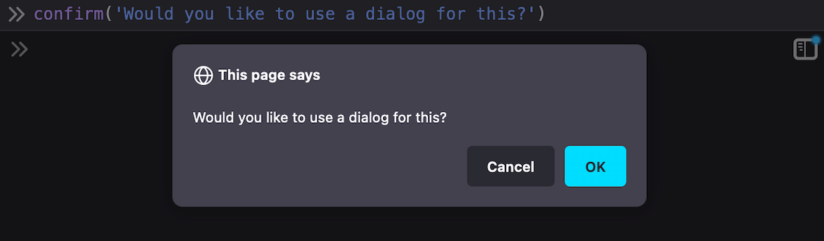 Browser dialogs /
 confirm()
Canonically, dialogs are a lot like window.confirm(), window.alert() and window.prompt(), which the HTML specification lists under ‘simple dialogs’. But unlike these browser built-in dialogs, custom dialogs offer more flexibility—you get to put whichever content and styling you want inside of them.
Dialogs have a role of dialog, which the browser will assign automatically for you when you use the <dialog> element.
You can also create dialogs with ARIA: apply role="dialog" to an element (like <div>). If it is a modal dialog, add aria-modal="true" when it shows, and remove it when it is dismissed. You will need to do all the modality work yourself (focus trap, making rest of content inert, etc). Note: aria-modal is not supported in IE11 (which may still be in use among your assistive technology users), there are issues with aria-modal in VoiceOver and it seems unsupported in Narrator.
You can put a form with method="dialog" in a dialog. This form will close its dialog when submitted.
Examples
 Modal dialog: add a link; nothing behind it can be interacted with while this modal dialog is open.
 Non modal dialog: while this chat widget is open, I can still access the forms and content underneath.
Characteristics
Dialogs can be modal (<dialog> when shown with dialog.showModal()) or non modal (<dialog> when shown with dialog.show()). To avoid quirks, you will want to choose which of the two your dialog is, and only call one of these methods per dialog.
When <dialog>s are modal, the browser will treat the content outside of the dialog as inert, and prevent keyboard focus from reaching web content outside of the dialog (if you use role="dialog", you have to do this yourself). If a <dialog> is not modal, the other content is not treated as inert. This makes modal dialogs a lot more disruptive, so use them only when you have to. You usually don't want to interrupt or disrupt a user's flow.
Dialogs are in the top layer only if they are modal (and only if the <dialog> element is used; other elements with role="dialog" will not go to the top layer).
Dialogs must have an accessible name (see WAI-ARIA 1.2, dialog role). Associate your dialog with the visible heading or message (if brief) using aria-labelledby on the <dialog> / <div role="dialog">. You could also use aria-label, but associating with visible text is ideal, because it creates parity between what folks see and what assistive tech call stuff.
WAI-ARIA specifies that when you're using role="dialog", you should include at least one focusable element and move focus to one of the focusable elements when it opens.
Browsers will close modal dialogs when users press Escape. Non-modal dialogs don't get this default behaviour, developers can add it where it makes sense.
Alert dialogs
WAI-ARIA defines a specific type of dialog, which is called “alert dialog”. It is meant for dialogs that contain a brief, important message. Their function is to alert the user—the browser will do that by firing a system alert event to accessibility APIs. They are the ARIA-equivalent of the browser alert() dialogs we discussed above.
Examples
- After you didn't interact with your online banking environment for 10 minutes, an alert dialog shows and says you will log out in 5 minutes, unless you press “Continue my session”
- You're editing some important content and accidentally press
Command + W, the shortcut to close the current tab. An alert dialog appears to ask if you really want to “Leave” now or perhaps “Save your changes” first.
Characteristics
Alert dialogs are always modal and have their focus trapped. They also require an accessible name. Like with dialogs, if there is a visible title, associate the title's id with the alert dialog's aria-labelledby attribute. If not, aria-label can also be added to an alert dialog.
Popovers
What is it
Popover is a set of behaviors that can be added to any element through the popover attribute (like tabindex or contenteditable). It is specified in HTML and there is a polyfill (why is it an attribute and not an element?).
The popover attribute is meant for UI components that are:
- on top of other page content
- not always visible (eg just when they are relevant), also described as “short lived” or “ephemeral”
- usually displayed one at the time
As opposed to <dialog>s, a popover doesn't come with a built-in role (this is partly why it is an attribute and not an element), you pick your own role. It can take on any role that makes sense, or none at all. Sometimes popovers could be (modeless) dialogs, in that case you could use <dialog popover>.
The popover attribute is planned to allow for two values, each of which give a slightly different set of characteristics:
popover=auto: light dismisses; when it opens, it force-closes other popovers and hints (except its anchestors); it or its anchestor would usually receive focuspopover=manual: explicit dismiss (via timer, close button or some other script); when it opens, it does not force close anything
(More types may follow)
Full screen content also forces popovers of the “auto” type to close.
Examples
An example of a popover is the listbox that shows when a select is opened (conceptually for <select> and literally for <selectmenu> as it is currently implemented in Chromium).
These are some common examples of components with popover behaviours:
- Datepickers / calendar widgets
- Tooltips and toggletips
- Teaching UI (e.g. to point out parts of your interface when it is first shown)
- Action menus (see example below), using
role="menu"
There are also popovers that users need to dismiss or that automatically dismiss (like toasts).
So yes, there are lots of different UI patterns that can have “popover” behaviour as a requirement. This is why popover is proposed not as one HTML element, but as an attribute that is meant to be used with an HTML and/or role that is most suitable for that pattern. For an action menu, that's a <div role="menu" popover>. A tooltip could be <div role="tooltip" popover> (depending on context and what it is). In any case: each of these patterns has its own UX expectations.
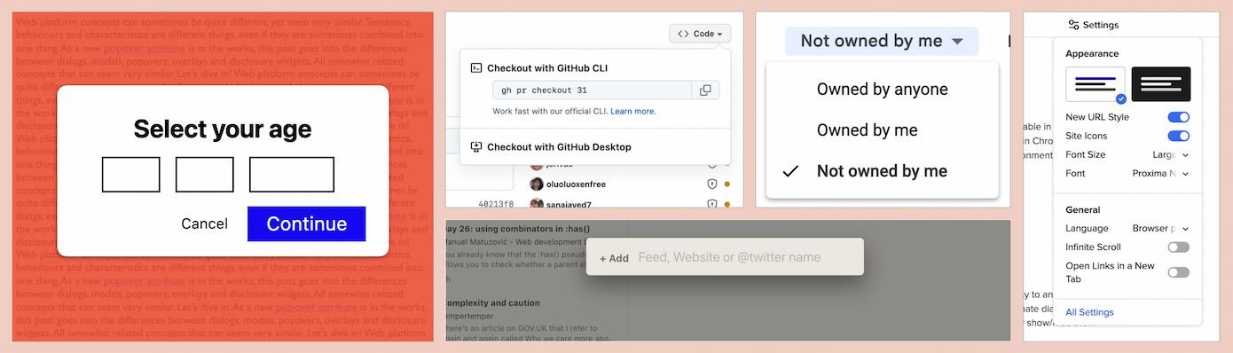
 This menu with image options is a popover. It disappears when you click outside of it.
Twitter's alternative text feature is another example of a popover (implementation has accessibility issues)
Characteristics
Popovers are not modal. This is another major difference between popovers and dialogs. For this reason, it will be rare (but not impossible) for them to have a backdrop or focus trap.
Popovers can have ‘light dismiss’ behaviour, meaning they close by themselves, except when they are of the “manual” type. Manual popovers could be things like a “toast” notification that is dismissed via a timer or manual button.
Popovers, even if rare, can have a backdrop, which obscures content outside of it. This does not make the popover modal—as mentioned, popovers are non-modal. My recommendation is that if you're considering adding a backdrop to your popover, to also consider ”oh wait, maybe this is a modal dialog instead”. It might well be. Having said that, there is a handful of use cases for popovers with backdrops that are not modal.
Popovers can have focus trapped in them, for instance in complex widgets where you want to avoid that people accidentally tab out of the widget. A focus trap does not make a popover modal, as users can still access everything else on the page, it is just something that can improve usability in certain cases.
 A “toast” notification that dismisses automatically after a couple of seconds and also has a close button in case you want it to go away now (most toasts just disappear, that's also fine; in either case their contents should be conveyed to assistive tech).
Popovers also can be opened, closed and toggled without JavaScript: with a <button> in HTML and the popovertarget attribute that points to the popover's ID, the browser can take care of showing, hiding and toggling.
An example:
<button
  type="button"
  popovertarget="datepicker"
>Pick date</button>
<dialog popover id="datepicker"></dialog>
In this case, the dialog is turned into a popover with the popover attribute, which adds the popover behaviours. The button will toggle the popover, because the popover's ID matches the button's popovertarget attribute.
The button can also be set op to just show or just hide, in this case use popovertargetaction with show or hide (the toggle value exists too, and is the default).
To open the popover when the page loads, set defaultopen on the popover. This is useful for teaching UI.
To move focus to a popover when it opens, set the autofocus attribute on the popover itself, or an element within it. Normally, this attribute sets focus on page load. But if it is used on or within popovers, it only sets focus when the popover is shown (this can be on page load if defaultopen is used).
To position a popover, a very exciting proposal called CSS Anchor Positioning is in the works. As far as I understand it today, it would allow us popovers that automagically position in the most suitable place, avoiding collisions with the edge of the window. A bit like the Popper library does today, but built into the browser.
If focus management, positioning, JavaScript-less toggling and light dismiss weren't enough, there is also a proposal for popovers to be transitionable using CSS, between [popover] and [popover]:popover-open (of course, you'll want to adhere to your users' motion settings using prefers-reduced-motion).
Overlays
Overlays are more of a characteristic than a component on their own. Often, when developers talk about overlays, they mean dialogs that are modal. In a literal sense, overlays are things that lay on top of other things. Popovers and dialogs can both overlay other things.
Disclosure widgets
What are they
Elements that show and hide things are often called ‘disclosure widget’, as Adrian Roselli describes in his post about various kinds popover-like controls. Almost everything in this post is a subset of disclosure widgets… as in, they are pretty much all things that can be shown and hidden. Adrian describes disclosure widgets in more detail in his post Disclosure widgets.
Disclosure widgets exist in HTML as <details>/<summary>, but can also be built with <div> and the appropriate ARIA attributes. This isn't entirely the same. In Details/summary, again, Scott O'Hara suggests that this is more consistent:
If your goal is to create an absolutely consistent disclosure widget behavior across browsers, i.e., ensuring that all
<summary>s are exposed as expand/collapse buttons, then you’d be better off creating your own using JavaScript and the necessary ARIA attributes.
But, he adds, your ARIA disclosure widget won't have some of the features <details>/<summary> brings, like in-page search (Chromium triggers a <details>'s element open state when an in-page search query is found in its content).
There isn't a specific role for disclosure widgets, but there is the aria-expanded attribute for triggers and aria-controls to connect triggers with the element they trigger. When using <details/summary, <dialog> and (in the future) popover, browsers take care of setting up these kinds of accessibility properties for you.
Examples
- a Frequently Asked Questions section where the answers are collapsed and you can expand them from the questions
- tables in which individual rows can be expanded (See Adrian Roselli's Table with Expando Rows)
- “Toggle tips”, like an “info” button that displays next to complex terminology to open a tooltip that explains the word
- “meganav” style navigation where the main navigation items open more navigations
 The show/hide functionality of sections within a category (displayed on the right) are a disclosure widget
Characteristics
There are a lot of different things that qualify as disclosure widgets. What they have in common is that they consist of two parts: one is a triggering element, the other is the triggered element.
Disclosure widgets do not trap focus, have no backdrops and are not modal. They are usually dismissed or collapsed with their trigger or a close-specific button.
FAQs
Where should focus move?
When a modal dialog opens, keyboard focus should move to the default action. If there's a form, it is probably the first form field. If there is multiple buttons, it could be the one that is least destructive, like if there's “Cancel” and “Confirm” button, a sensible default would be “Cancel”.
When a modal dialog closes: if the user triggered it, move focus back to the trigger. The browser does this automatically for <dialog>s. For popovers, it only does in cases “where it makes sense” (see the Popover Explainer). If the user did not trigger it, move it to an appropriate position earlier in the DOM.
For all other components (non-modal dialogs, popovers or disclosures), expected focus management differs case by case. The Popover Explainer's section on focus describes some of such cases.
Are all popovers dialogs?
Let's distinguish between three things we could mean by “dialog”:
- the
<dialog>element, an element with a built-in dialog role and dialog behaviours and possiblities (like, you can runshow()andshowModal()methods on it) - elements with
role="dialog": theroleattribute with thedialogvalue gives this a dialog role, but other than that, it comes with nothing, you would have to add your own behaviours to it - the word “dialog”: in your design system documentation, or in any casual conversation about components, you could be referring to dialogs and they could be none or one of the above
Sometimes, popovers use the <dialog> element or elements with a role="dialog". But not all of them. For instance, listboxes, menus, tooltips, grids, lists of links could all be components that require popover behaviours, but not the dialog role or the <dialog> element.
Are all dialogs popovers?
No, only non-modal dialogs are conceptually popovers (you can implement them with <dialog>/role="dialog" today). When the popover feature is stable and well-supported in browsers, it makes sense to use <dialog popover>, and would be the way to go if you want your non-modal dialog to appear in the top layer and leverage browser-provided light dismiss. In contrast, modal dialogs don't share the set of characteristics popovers have.
I'm building an X, should it be modal?
It depends. The question to ask is: is this component something that is the only thing your user may pay attention when it is open?
Country selector
You are building a check-out form for your online shop. In one of the fields, the user need to select a country. They eventually have to, because it is a required field. Still, while they select the country, they may scroll to something else, or decide to pop to the credit card stuff first. Maybe they need to read the label to check if you need country of birth or residence. This is best non-modal, because the user may want to look at other things.
Definition popover
You are building a toggle tip that can show definitions for complex words in your content. When the definition icon is clicked, it opens. Your user may want to scroll away or read other content or do other stuff. It is best to keep this non-modal.
Game over
The user has played some levels of your game, but they've lost and are now “game over”. They can't continue. It's really over and there's a dialog to tell them. There's no other thing they can interact with than this dialog. Modal it is.
Tracking consent
You are building a dialog that asks users if they want to agree that you track them. Your visitor is in an area where the law makes it illegal for you to do so without permission. In this case, there is no point in interacting with anything but the permission screen, so it would make sense to make it modal.
Fly-out navigation
You are building a “fly-out navigation”. It opens on the side of the viewport and is positioned on top of other content while it is open. When the user opens it, is this the only thing they want to see? This one is tricky, I feel modal could work, non-modal could work too.
Summing up / conclusions
OK, so, in summary: modality of a component is a state in which only that component can be used. When something is modal, everything else is inert: blocked from access in any way, unfocusable and usually obscured with a backdrop. Making something modal is a substantial decision, it should be used sparingly. Dialogs can be modal or non-modal (also called modeless). popovers are being proposed by Open UI as a new way to build non-modal dialogs with a specific set of behaviours and characteristics, like top layer presence, JS-less toggleability and browser-provided light dismiss. Unlike <dialog>, a popover does not have a built-in role: as a developer, you can add the popover attribute to the semantically most relevant element (see my other post on which role to use with your popover).
Most of the UI patterns that are mentioned in this post fall under the definition of overlays: content that can lay on top of other content (all dialogs and popovers). A lot also fall under the definition of disclosures, when they are patterns where one thing opens another thing.
That's all! Yes, I wrote this whole long post about definitions, only to conclude a lot of these are indeed different words for the same patterns. But there's nuance. Hopefully this post has helped you more clearly distinguish some of these patterns.
Further reading
- MDN -
<dialog> - WAI-ARIA: role=dialog
- Use the dialog element (reasonably) and Having an open dialog by Scott O'Hara on using
<dialog> - Stop using “pop-up” by Adrian Roselli, which offers clear distinction between various popup-like patterns
- Open UI issue 581: [popup] Add further clarity that popup is not (presently?) for modal dialogs
- Inert | The CSS Podcast with Una Kravets and Adam Argyle
Originally posted as Dialogs and popovers seem similar. How are they different? on Hidde's blog.
Is this the last exodus from Twitter?
There have been reasons to leave Twitter since its inception. But it is increasingly more compelling to do so.
Why read what random internet people are doing all day? In 2007, I wasn't sure why I would join Twitter that spring. All the cool web folks at SXSW that year had started using (and hyping) it. I worked at a small web agency and my colleagues convinced me, I think. So I made an account on this new website that had just one text field with the question ‘What are you doing?’.
When I started, I mostly shared things like that I drank a cup of tea or waited for a bus. Mentions and retweets didn't exist yet. For the first, maybe, 5 years, my account was private and I had way under 100 followers. I tweeted mostly in Dutch, even in Frisian sometimes. There was a generous API so you could trivially display tweets on your own site. There were local in-person Twitter meetups, at least where I live, to hang out with Twitter folks, including one that had Dries Roelvink perform.
In the years after, the platform expanded beyond the web developer crowd and interesting journalists, authors, musicians came. I used the platform more and more to follow folks I saw speak at conferences. Over the years I found a collection of hundreds of people whose stuff I really enjoyed reading. On web development, but also other interests. Some posted often, others occassionally. Either way, I learned so much from the tweets, links to other sites, discussions and what not. More people started following me too, and I managed to develop real friendships. My DMs got busier too.
There were always compelling reasons to leave, too. The platform and tweets became more engagement-focused, the Twittersphere attracted more and more grifters. The algorithmic timeline was introduced, although that could be turned off.
There was also the increasing abuse, especially towards minorities. Under Jack Dorsey's leadership, Twitter systematically failed to act on reports of racist, homophobic and misogynist accounts, making the platform more dangerous to anyone not a cis white male, even getting users in physical danger. Some of that was described in a 2018 Amnesty International report on Twitter called “A toxic place for women”, a document full of details on how the company failed to respect women's rights.
And then there was the risk of making content on a platform that you don't control. My friend Manuel got permanently suspended, for reasons unknown to him. I can only imagine what it was like for him to just lose access. A lot of us tried to change the minds of “@TwitterSupport”, but it wasn't resolved. For a lot of folks it was a wake up call to reconsider where they post. I realised my new ambition was to like, Zach, take ownership of my tweets.
Last week, I still didn't feel like leaving the platform just because the new owner was an arrogant troll with world views orthogonal to mine. I imagine this may be the case with more services I use, and had tried Mastodogn before without much success. I don't think I really believe in decentralised social networks, I would rather have all my friends in one pub than spread across pubs. But then that new owner fired Twitter's entire accessibility team and large parts of trust and safety folks working on problems that have very real life consequences (like meddling in elections, spreading of conspiracy theories, hate crimes, impersonation), he unfolded plans for a new ‘Verified’ program that made the feature for sale rather than for security and then he recklessly and cruelly fired half of the staff… so I decided to go ahead and hang out elsewhere, at least to put my content there.
That other place is ‘the Fediverse’.
the Fediverse is different: it isn’t trying to glue your eyeballs to the screen, and it’s harder for things to go viral. There is less media, fewer memes, no advertising. And there are humans explicitly in the loop: Mastodon instances are moderated on an instance-by-instance basis — and should an instance descend into a hellscape, it may find itself defederated. But because of all of this, there is also less opportunism, less trolling, less dunking on your enemies, less nastiness. So it also feels more relaxing, more earnest — and easier to put down.
(from Bryan Cantrill's Twitter, when the wall came down)
Maybe the decentralisation aspect could actually work. It's a bit like email.
It seems like the new owner and his behaviour is driving people in my bubble away from Twitter, towards the Fediverse, personal blogs, RSS and other platforms. Probably mostly in that bubble, but maybe it is a wider thing, time will have to tell.
I didn't suddenly stop caring about the people I follow on Twitter, so I will probably also stay on Twitter for the foreseable future. To catch up on tweets, to DM and to share posts like this one. But for the next while, I plan to hang around on Mastodon more.
Originally posted as Is this the last exodus from Twitter? on Hidde's blog.
Is this the last exodus from Twitter?
There have been reasons to leave Twitter since its inception. But it's increasingly compelling to post somewhere else.
Why read about what random people do all day? In the spring of 2007, I wasn't sure why I would join Twitter. All the cool web folks at that year's SXSW Interactive had started using (and hyping) it. I worked at a small web agency at the time. My colleagues convinced me, I think. So I made an account on this new website that had just one text field with the question ‘What are you doing?’.
When I started, I mostly bored my readers with facts like “I drank a cup of tea” or “waiting for a bus”. Mentions and retweets didn't exist yet. For the first, maybe, 5 years, my account was private and I had way under 100 followers. I tweeted mostly in Dutch, even in Frisian sometimes. There was a generous API so you could trivially display tweets on your own site. There were local in-person Twitter meetups, at least where I live, to hang out with Twitter folks, including one that had Dries Roelvink perform.
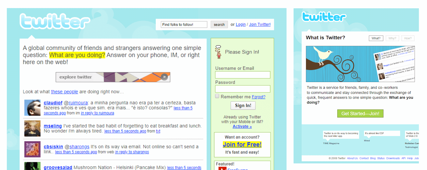 Twitter homepage in 2007, the logo was a piece of art
In the years after, the platform expanded beyond the web developer crowd and interesting journalists, authors, musicians came. I used the platform more and more to follow folks I saw speak at conferences. Over the years I found a collection of hundreds of people whose stuff I really enjoyed reading. On web development, but also other interests. Some posted often, others occassionally. Either way, I learned so much from the tweets, links to other sites, discussions and what not. More people started following me too, and I managed to develop real friendships. My DMs got busier too. Twitter, the platform got useful new features, but ultimately, it's the people that attracted me to the platform and people that kept me on there.
Yet, there were always compelling reasons to leave. The platform and tweets became more engagement-focused, the Twittersphere started to attract (and reward) grifters. The algorithmic timeline was introduced, although that could be turned off.
Abuse also increased, especially for minorities on the platform. Under Jack Dorsey's leadership, Twitter systematically failed to act on reports of racist, homophobic and misogynist accounts, it made Twitter more dangerous to anyone not a cis white male, even got users in physical danger. Some of that was described in a 2018 Amnesty International report on Twitter called “A toxic place for women”, a document full of details on how the company failed to respect women's rights.
And then there was the risk of making content on a platform that you don't control. My friend Manuel got permanently suspended, for reasons unknown to him. I can only imagine what it was like for him to lose access, just like that. A lot of us tried to change the minds of “@TwitterSupport”, but until today, it wasn't resolved. For a lot of folks this situation was a wake up call to reconsider where they post. I realised my new ambition was to like, Zach, take ownership of my tweets.
Last week, I still didn't feel like leaving the platform just because the new owner was an arrogant troll with world views orthogonal to mine. I imagine more services I use have unpleasant owners. Last time I tried Mastodon, I didn't stay. The thing is, I don't even think I really believe in decentralised social networks, I would rather have all my friends in one pub than spread across pubs. I will probably find out I'm wrong about this, as the web at large was designed to be decentralised and it is one of the charms of it and arguably what made it so successful.
But then that new owner fired Twitter's entire accessibility team, its ethical AI team and large parts of trust and safety folks working on problems that have very real life consequences (like meddling in elections, spreading of conspiracy theories, hate crimes, impersonation), he unfolded plans for a new ‘Verified’ program that made the feature for sale rather than for security and then he recklessly and cruelly fired half of the staff (and seems to be trying to get some back)… it's chaos!
So I decided to go ahead and hang out elsewhere, at least to put my content there. That other place is ‘the Fediverse’, and it has a different focus:
the Fediverse is different: it isn’t trying to glue your eyeballs to the screen, and it’s harder for things to go viral. There is less media, fewer memes, no advertising. And there are humans explicitly in the loop: Mastodon instances are moderated on an instance-by-instance basis — and should an instance descend into a hellscape, it may find itself defederated. But because of all of this, there is also less opportunism, less trolling, less dunking on your enemies, less nastiness. So it also feels more relaxing, more earnest — and easier to put down.
(from Bryan Cantrill's Twitter, when the wall came down)
Maybe the decentralisation aspect could actually work. It's a bit like email.
It seems like the new owner and his behaviour is driving people in my bubble away from Twitter, towards the Fediverse, personal blogs, RSS and other platforms. Probably mostly in that bubble, but maybe it is a wider thing, time will have to tell. It's probably not the last exodus.
I didn't suddenly stop caring about the people I follow on Twitter, I understand not everyone wants to leave, so I will also stay on Twitter for the foreseable future. To catch up on tweets, to DM and to share posts like this one. But for the next while, I plan to hang around on Mastodon more.
Originally posted as Is this the last exodus from Twitter? on Hidde's blog.