Reading List
The most recent articles from a list of feeds I subscribe to.
Positioning anchored popovers
Popovers are commonly positioned relative to their invoker (if they have one). When we use the popover attribute, anchoring is tricky, as these popovers are in the top layer, away from the context of their invoker. What options do we have?
See also: Hidde's talk on popovers, and other posts about popover accessibility, positioning popovers and the difference with dialogs and other components.
Basically, there are two ways to position popovers: one you can use today and one that will be available in the future. I'll detail them below, but first, let's look at why we can't use absolute positioning relative to a container shared by the invoker and the popover.
Not all popovers are anchored, but I expect anchored popovers to be among the most common ones. For popovers that are not anchored, such as toast-like elements, “bottom sheets” or keyboard-triggered command palettes, these positioning constraints do not apply.
 Examples of anchored popovers: map toggletip (Extinction Rebellion), date picker (European Sleeper), colour picker (Microsoft Word web app)
See also my other posts on popovers:
- Dialogs and popovers seem similar. How are they different
- Semantics and the popover attribute: what to use when?
- On popover accessibility: what the browser does and doesn't do (with Scott O'Hara)
Top layer elements lose their positioning context
One of the unique characteristics of popovers (again, the ones made with the popover attribute, not just any popover from a design system), is that they get upgraded to the top layer. The top layer is a feature drafted in CSS Positioning, Level 4. The top layer is a layer adjacent to the main document, basically like a bit like a sibling of <html>.
Some specifics on the top layer:
- It's above all
z-indexes in your document, top layer elements can't usez-index. Instead, elements are stacked in the order they are added to the top layer. - As developers, we can't put elements in the top layer directly, as it is browser controlled. We can only use certain elements and APIs that then trigger the browser to move an element to the top layer: the Full Screen API,
<dialog>s withshowModal()andpopover'ed elements, currently. - Top layer elements, quoting the specification, “don't lay out normally based on their position in the document”.
When I positioned my first popover, I tried (and failed): I put both the popover and its invoking element in one element with position: relative. Then I applied position: absolute to the popover, which I hoped would let me position relative to the container. It didn't, and I think the last item above explains why.
In summary, elements lose their position context when they are upgraded to the top layer. And that's okay, we have other options.
Option 1: position yourself (manually or with a library)
The first option is to position the popover yourself, with script. Because the fact that the top layer element doesn't know about the non-top layer element's position in CSS, doesn't mean you can't store the invoker's position and calculate a position for the popover itself.
There are some specifics to keep in mind, just like with popovers that are built without the popover attribute: what happens when there's no space or when the popover is near the window? Numerous libraries can help with this, such as Floating UI, an evolution of the infamous Popper library.
Let's look at a minimal example using Floating UI. It assumes you have a popover in your HTML that is connected to a button using popovertarget:
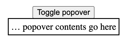
<button popovertarget="p">Toggle popover</button>
<div id="p" popover>… popover contents go here</div>
By default, browsers show the open popover in the center of the viewport:
 The popover is centered
The reason that this happens is that the UA stylesheet applies margin: auto to popovers. This will reassign any whitespace around the popover equally to all sides as margins. That checks out: if there's the same amount of whitespace left and right, it element will effectively be in the center horizontally (same for top and bottom, but vertically).
For anchored popovers, we want the popover to be near the button that invoked it, not in the center. Let's look at a minimal code example.
In your JavaScript, first import the computePosition function from @floating-ui:
import { computePosition } from '@floating-ui/dom';Then, find the popover:
const popover = document.querySelector('[popover]');Popovers have a toggle event, just like the <details> element, which we'll listen to:
popover.addEventListener('toggle', positionPopover); In our positionPopover function, we'll find the invoker, and then, if the newState property of the event is open, we'll run the computePosition function and set the results of its computation as inline styles.
function positionPopover(event) {
  const invoker = document.querySelector(`[popovertarget="${popover.getAttribute('id')}"`);

  if (event.newState === 'open') {
    computePosition(invoker, popover).then(({x, y}) => {
      Object.assign(popover.style, {
        left: `${x}px`,
        top: `${y}px`,
      });
    });
  }
}
To make this work, I also applied these two style declarations to the popover:
margin: 0, because the UA's auto margin's whitespace gets included in the calculation, with0we remove that whitespaceposition: absolute, because popovers getposition: fixedfrom the user agent stylesheet and I don't want that on popovers that are anchored to a button
It then looks something like this:
See it in action: Codepen: Positioning a popover with Floating UI.
In the Codepen, I also use some Floating UI config to position the popover from the left. In reality, you probably want to use more of Floating UI's features, to deal with things like resizing (see their tutorial).
Option 2: with Anchor Positioning
To make all of this a whole lot easier (and leave the maths to the browser), a new CSS specification is on the way: Anchor Positioning, Level 1. It exists so that:
a positioned element can size and position itself relative to one or more "anchor elements" elsewhere on the page
This, as they say, is rad, because it will let the browser do your sizing and positioning maths (even automatically- update 4 May 2024: looks like automatic anchoring was removed). It is also exciting, because it doesn't care where your elements are. They can be anywhere in your DOM. And, important for popovers, it also works across the top layer and root element.
Though popovers would get implicit anchoring, you can connect a popover with its invoker via CSS. To find out how all of this works in practice, I recommend Jhey Tompkins's great explainer on Chrome Developers (but note it's currently somewhat outdated, the editor's draft spec changed since that post, and has new editors). Roman Komarov covers his experiments and some interesting use cases in Future CSS: Anchor Positioning, and also wrote Anchor Positioning on 12 days of web.
The Anchor Positioning spec was recently updated, and is currently in the process of being implemented in browsers, hence the Option 1 in this article. But, excitingly, it is in the works. Chromium has already issued an intent to ship anchor positioning, and so did Mozilla/Gecko. The recent updates are still pending TAG review.
Wrapping up
So, in summary: if your popover needs to be anchored to something, like a button or a form field, you can't “just” use absolute positioning. Instead, you can use JavaScript (today), or, excitingly, anchor positioning (in the near-ish future, an Editor's Draft in CSS was published last year and a new version of that with new editors was released in April 2024.
Originally posted as Positioning anchored popovers on Hidde's blog.
Semantics and the popover attribute: which role to use when?
With the new popover attribute in HTML, we can put elements in the top layer and allow them to disappear with ‘light dismiss’. This attribute adds behaviour, not semantics: you're supposed to add your own role when it makes sense. In this post, we'll look at different roles that could make sense for your popover-behaved elements.
See also: Hidde's talk on popovers, and other posts about popover accessibility, positioning popovers and the difference with dialogs and other components.
Semantics?
Accessibility semantics are roles, states and properties that are exposed by by browsers for many HTML features, and then passed on to assistive technologies.
The ‘role’ of an element establishes what kind of element it is. Roles are built-in (‘implicit’) to some elements: a h1 has the heading role, an a has the link role and so forth. Roles can also be added with a role attribute explicitly. For some roles, that is the only way: there exists no corresponding element. If there's an element and a value for ‘role’, it doesn't really matter for end users which you use, but generally you don't want to overwrite implicit role. As mentioned, your user's browser or assistive technology may use the role to provide a UI. For instance, a screenreader may generate a list of links or headings, a reader mode may render list items with bullets.
Popovers have no default role
Whenever we add the popover attribute to an element, it continues to be that element semantically, just with some specific behaviours. Menus remain menus, dialogs remain dialogs, and so on. The popover attribute does not change an element's role. It's a bit like the contenteditable attribute in that sense. In addition to choosing that you want the popover behaviour, you need to decide if you add a role and, if so, which role.
The most basic example of a popover:
<button
  type="button"
  popovertarget="my-popover">
    Toggle popover
</button>
<div popover id="my-popover">
  ...
</div>
This is how it works:
- the
divwill be invisible on page load, because it has apopoverattribute and popovers are closed on page load by default - the
divwill also be toggleable via the button, as the button points to thediv's ID in itspopovertargetattribute
Potential roles for your popover
Let's now look at common roles for popovers: menu, dialog and listbox, and consider what to do about tooltips.
Menus: the menu role
Let's start with menus. The menu role is what you'd use when your component offers a list of choices to the user, specifically choices that are actions. (Note: menu is not for a list of links, like a navigation, it is only for a list of actions).
A menu with popover behaviour can be built with a menu role:
<button
  type="button"
  popovertarget="my-menu">
    Toggle menu
</button>
<div role="menu" popover id="my-menu">
    <button
      onclick="doThing()"
      role="menuitem"
      tabindex="-1"
      autofocus>Do thing</button>
    <button
      onclick="doAnotherThing()"
      role="menuitem"
      tabindex="-1">Do another thing</button>
  …
</div>
In a menu widget, there are also some keyboard and focus expectations. For instance, that users can use their arrow keys to cycle through the different buttons. As a developer, this is something you'd add with JavaScript yourself. The first button is focused when it opens (hence autofocus), the second and after would get focused moved to them when they're the next one and an arrow key is pressed (hence tabindex="-1": this takes the buttons out of tab order, because you make them reachable with arrow keys instead).
(Note: The menu role is not to be confused with the menu element, which has a list role and is “a semantic alternative to <ul>”)
Examples of when you would use role="menu":
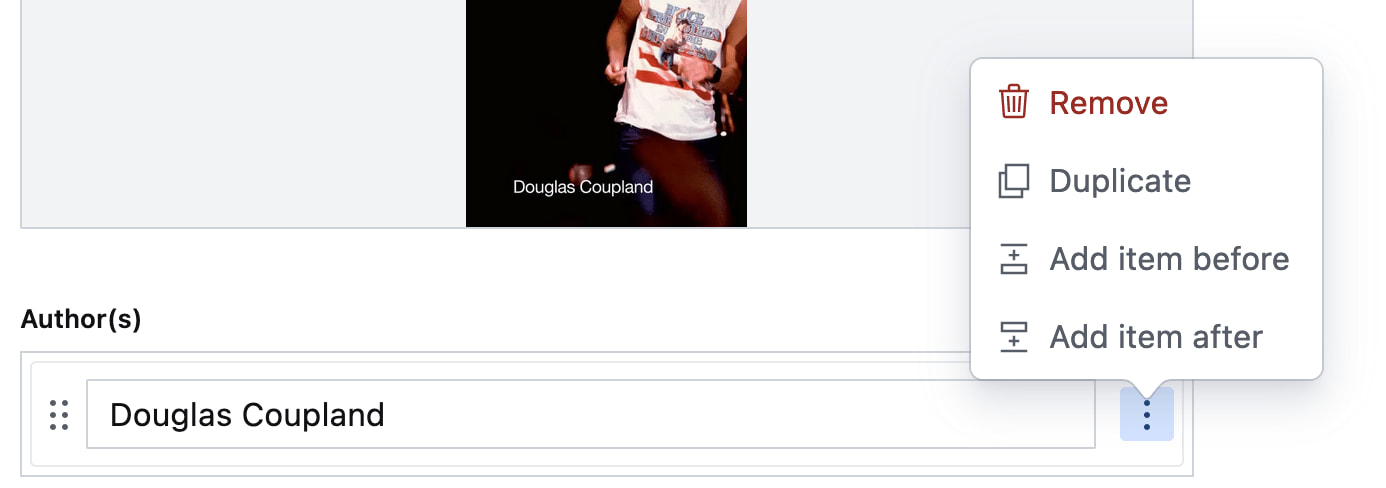 Your CMS manages a list of authors. The user can open a
 menu for each author with some actions (each action has a menuitem role)
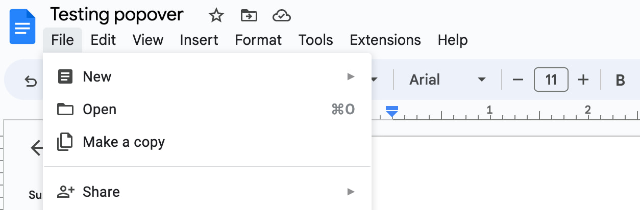 You're building a word processor. The “File” menu is a menu, the options (New, Open, etc) are
 menuitems._
See also: Marco Zehe on the menu role and “Menu control type” in Windows Accessibility Features documentation
Dialogs: the dialog role
A dialog role is what you add when an element is like a smaller window on top of the main web page. It can block interaction with the rest of the page or leave the rest of the page as it is, either way it is somewhat separate from the page, both in purpose and visually.
The <dialog> element implicitly has a dialog role, and comes with dialog methods and behaviours (like you can run element.showModal() to show it as a modal). You can also add the dialog role manually with role="dialog", but then you have to add the behaviours manually too.
A dialog with popover behaviour can be built like this:
<button
  type="button"
  popovertarget="my-dialog">
    Toggle dialog
</button>
<dialog id="my-dialog" popover>
  ...
</dialog>
You see, there's no explicit role attribute, because the dialog role comes with the <dialog> element.
If not using a button with popovertarget, you could open this dialog with script using the showPopover() method that works on any element that is a popover (by having a popover attribute present).
Note: because this specific popover example uses the <dialog> element, two other methods are also available (through the HTMLDialogElement): show() and showModal(). They have slightly different behaviours than showPopover() would. I recommend against using these two methods on dialogs that are popovers. In other words, if you're inclined to use them, you probably don't want the popover attribute, as that attribute's purpose would basically be defeated by show()/showModal() (also, in some cases you might get a console error if you try to run showModal() on a popover). Popover is really for non-modal dialogs; see also my post on dialogs vs popovers).
Other examples of elements that could have popover behaviour and a dialog role are:
- teaching UI
- pickers, like for a date, multiple dates, prices
- “mega navs” and other large navigational structures that cover a lot of the page (note: these should not use
role="menu", a navigation with links is semantically different from a menu with buttons)
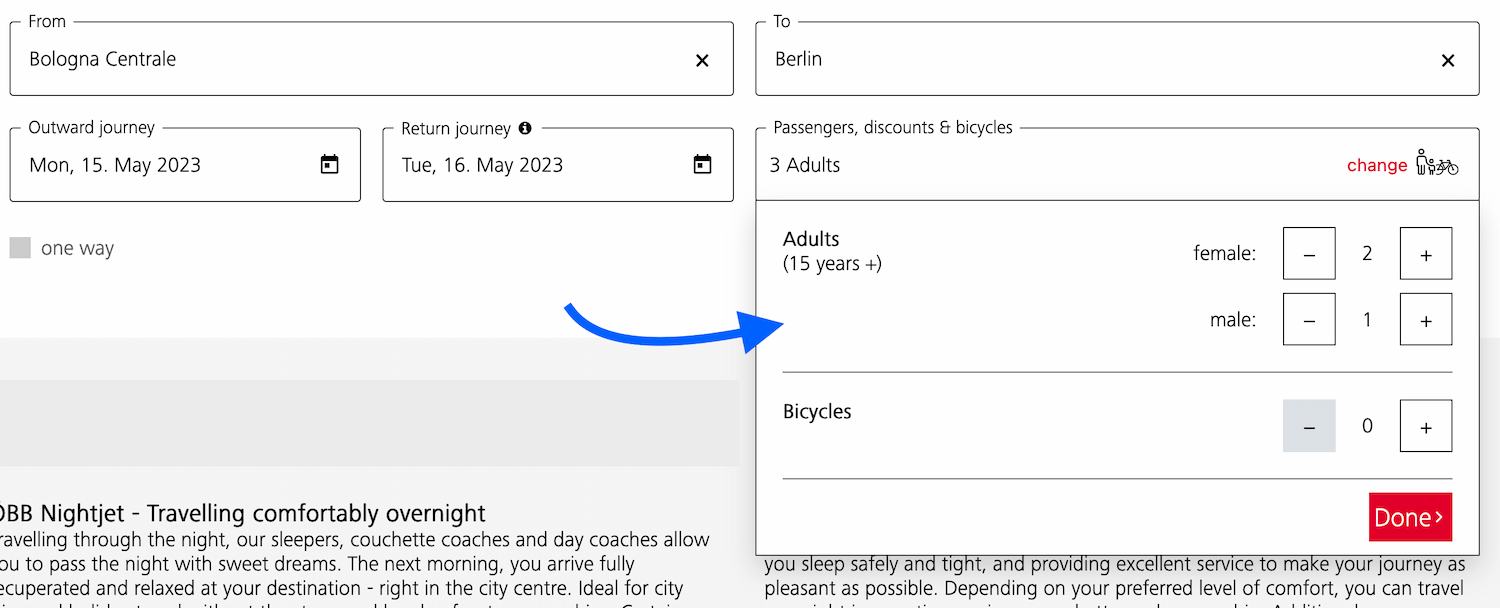 A dialog that allows the user to specify their travel group and amount of bicycles
 A dialog that teaches what the audio player is for
 A “meganav” that covers other content (note: this is a dialog, not a menu)
Listboxes / autocompletes: the listbox role
A listbox is for elements where the user gets to choose from one or more options, like a <select>. They can exist as single select (user can select one option) or multi select (user can select multiple options).
Listboxes are often part of an autocomplete or combobox widget, they are the part that contains the actual options. Like in this example:
 Select menus also use listboxes to allow users to pick an option from a list
For instance, in the following example, there is a component that pops over the page's content. It contains filter and sorting buttons, as well as a listbox with actual options. The element with popover is probably a dialog (and you could give it a dialog role), while the element that contains options would need a role of listbox:
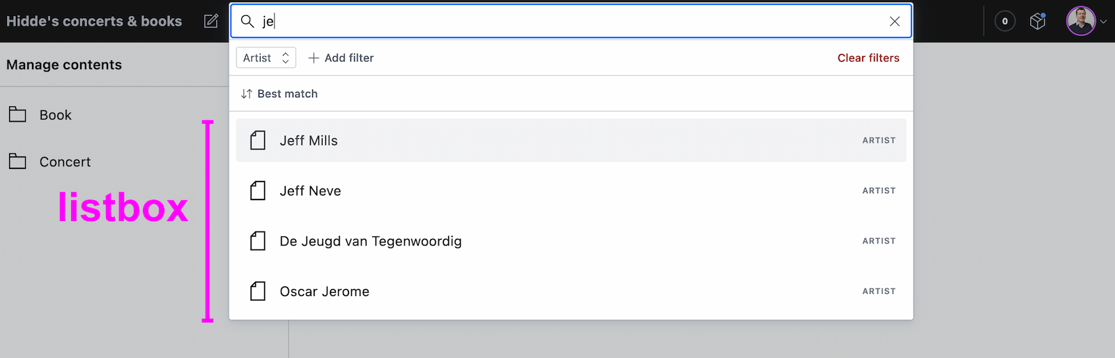 A listbox as part of a combobox
Tooltips/toggletips: tooltip (with caveats) or dialog
In their simplest form, tooltips are like the title element in HTML, that browers display on hover. These browser built-in tooltips are problematic in many ways, including that in most browsers, there is no way to get to the contents of title with just a keyboard. Let's call them “plain text tooltips”. They are often customised by developers, for instance to change their visual styles (currently from scratch, maybe via CSS in the future).
 Plain text tooltips that display on hover or focus of a triggering element, which they describe
Sometimes they are also found underneath input fields, to explain what that input does or what is expected, like some of Scott O'Hara's custom tooltips examples.
These custom “plain text tooltips” are what the tooltip role seems to be meant for. Note that role="tooltip" doesn't do much in terms of screen reader announcements as Sarah Higley explains in Tooltips in the time of WCAG 2.1, though there are cases where ARIA-provided labels and descriptions don't work across browsers and assistive technologies without the role (if they aren't interactive, iframe or img elements and also don't have a landmark or widget role). What is useful for accessibility of that kind of tooltip, going beyond roles for a moment: use aria-describedby to link up a tooltip that describes a thing with that thing, and never place essential content in them. Also ensure that the tooltip (1) stays visible when its content is hovered, (2) is dismissable (with Escape) and (3) persists until hover/focus removed, dismissed or irrelevant (all required to meet WCAG 1.4.13).
My advice would be that whenever tooltips contain more than just plain text, a non-modal dialog would be more appropriate (even if elements with tooltip role were apparently meant to also allow for interactive elements). Non-modal dialog tooltips could contain semantic elements (like a heading) or interactive elements (like a link or a button). In most cases it would be best to display them on click instead of hover + focus, in which case they are really “toggletips”. Of course, if there is interactive content, that also means you'll want to consider focus order.
Conclusion
In this post, we've covered some of the most common semantics you could choose to use with the popover behaviour: menu, dialog and listbox, plus looked at using tooltip for plain text tooltips or dialog for tooltips that contain anything more than plain text. Are you building components that don't really fall into any of these categories? I'm curious to learn more, slide in my DMs or email!
Originally posted as Semantics and the popover attribute: which role to use when? on Hidde's blog.
Back to freelance
I have returned to working as an independent front-end / accessibility / devrel person. My first project will be at the Dutch government's NL Design System team.
Leaving Sanity
I recently left Sanity, where I worked in the developer relations team. After doing some “developer relations”-like work at the W3C/WAI, this was my first full-time role in the space. I loved the variety: I could create tutorial videos, improve onboarding, facilitate content design workshops, help with meetups, inspire people to structure their content (more abstract than HTML) and just generally try to make complex stuff easier to understand. Among people I liked and bonded well with… how lucky I got!
It was also an opportunity for me to leave accessibility as my primary focus, at least for a while, and broaden my horizons. Well, leave accessibility as my primary focus… though my manager at WAI had warned me about this, calling it a bit of a Hotel California situation. He was, of course, correct. At Sanity, I did spend more time in the React community, learned lots about modern tooling and challenges like real-time content management. But I also ended up as the resident accessibility go-to person and did a preliminary accessibility conformance evaluation of the core product. It was appreciated, and I, in turn, appreciated having curious and dedicated colleagues to work with.
New beginnings
Having said that, my job at Sanity stopped existing. After some explorations, I'm going back to be a freelancer / independent. I've worked in that capacity for about 15 years, it feels like a comfort zone. I also have a very exciting project to start with, that manages to combine a number of my previous interests: developer relations, web accessibility and designs systems.
NL Design System
This month, I'm joining the NL Design System core team. This project doesn't just create a design system for use by Dutch government, it creates a space for collaboration on front-end components in the open. This is the sensible thing to do, because there are a lot of Dutch government websites and services (in the tens of thousands). Many of those have their own design systems, suppliers and ways of working. But they all need to meet the same accessibility standards and there is a lot of overlap in user experience needs. Collaboration in these areas should be super beneficial. Of course, it comes with challenges, too, and the team is ready… well, as far as one can be.
 The NL Design System website
I'm looking forward to help with:
- accessibility: of components, in documentation (I have opinions) and in applying standards well
- developer relations: technical writing, outreach between the core team and collaborating teams (current or future), improving the product based on developer feedback
This is a team that people have wanted for a long time serving needs that have gone unserved for a long time, too. There's a lot of realism to be had, because, of course, one design system or team cannot magically make all the websites better, but I strongly believe in design systems (and specifically this project) as a multiplier for accessibility efforts. I am, in other words, thrilled to become part of this particular team.
Workshops / talks
In addition, I will continue to do full day workshops and other public speaking about the web and web accessibility. Two things in particular:
- a full-day workshop called “Accessibility for design system teams”, which I've started to deliver to in-house teams that are keen to use their design system as a way to increase accessibility in their product(s) and want to understand what that means in theory and practice
- a talk on popovers and dialogs that I'll present at various conferences this year, the first one at CSS Day in Amsterdam, which is pretty much my favourite front-end event
 Workshopping at Sanoma Learning
Audits
Lastly, I also plan to do a small amount of accessibility conformance audits, focused on helping teams figure out which accessibility barriers their site has and how to fix them (I call this issue oriented reporting) (and sorry, that also means I will probably say no to teams whose only goal is a report).
Wrapping up
That's all. I hope my new freelance life will also allow me to do some more blogging on this website. The drafts folder isn't the issue, I guess 😁. For now, thanks for reading!
Originally posted as Back to freelance on Hidde's blog.
Neither artificial, nor intelligent
Large Language Models (LLMs) and tools based on them (like ChatGPT) are all some in tech talk about today. I struggle with the optimism I see from businesses, the haphazard deployment of these systems and the seemingly ever-expanding boundaries of what we are prepared to call “artificially intelligent”. I mean, they bring interesting capabilities, but arguably they are neither artificial, nor intelligent.
Atificial intelligence, as a field, isn't easily defined. There's many different things that fall under the umbrella. It attracts people with a wide range of interests. And it has all sorts of applications, from physical robots to neural networks and natural language processing. Today, there is a lot of hype around Language Models (LMs), a specific technique in the field of “artifical intelligence”, which Emily Bender and colleagues define as ‘systems trained on string prediction tasks’ in their paper ‘On the dangers of stochastic parrots: can language models be too big?’ (one of the co-authors was Timnit Gebru, who had to leave her AI ethics position at Google over it). Hype isn't new in tech, and many recognise the patterns in vague and overly optimistic thoughtleadership (‘$thing is a bit like when the printing press was invented’, ‘if you don't pivot your business to $thing ASAP, you'll miss out’). Beyond the hype, it's essential to calm down and understand two things: do LLMs actually constitute AI and are what sort of downsides could they pose to people?
Artificial intelligence, in one of its earliest definitions, is the study of things that are in language indistinguishable from humans. In 1950, Alan Turing famously proposed an imitation game as a test for this indistinguishability. More generally, AIs are systems that think or act like humans, or that think or act rationally. According to many, including OpenAI, the company behind ChatGPT and Whisper, large language models are AI. But that's a company: a non-profit with a for-profit subsidiary—of course they would say that.
Not artificial
In one sense, “artificial” in “AI” means non-human. And yes, of course, LLMs are non-human. But they aren't artificial in the sense that their knowledge has clear, non-artificial origins: the input data that they are trained with.
OpenAI stopped disclosing openly where they get their data since GPT-3 (how Orwellian). But it is clear that they gather data from all over the public web, places like Reddit and Wikipedia. Earlier they used filtered data
from Common Crawl.
First, there is the long term consequences for quality. If this tooling results in more large scale flooding the web with AI generated content, and it uses the contents of that same web to continue training the models, it could result in a “misinformation shitshow”. It also seems like a source that can dry up once people stop asking questions on the web to interact directly with ChatGPT.
Second, it seems questionable to build off the fruits of other people's work. I don't mean off your employees, that's just capitalism—I mean other people that you scrape input data from without their permission. It was controversial when search engines took the work from journalists, this is that on steroids.
Not intelligent
What about intelligence? Does it make sense to call LLMs and the tools based on them intelligent?
 Alan Turing
Alan Turing suggested (again, in 1950) that machines can be said to think if they manage to trick humans such that ‘an average interrogator will not have more than 70 per cent chance of making the right identification after five minutes of questioning’. So maybe he would have regarded ChatGPT as intelligent? I guess someone familiar with ChatGPT's weaknesses could easily ask the right questions and identify it as non-human within minutes. But maybe it's good enough already to fool average interrogators? And a web flooded with LLM-generated content would probably fool (and annoy) us all.
Still, I don't think we can call bots that use LLMs intelligent, because they lack intentions, values and a sense of the world. The sentences systems like ChatGPT generate today merely do a very good job at pretending.
The Stochastic Parrots paper (SP) explains why pretending works:
our perception of natural language text, regardless of how it was generated, is mediated by our own linguistic competence
(SP, 616)
We merely interpret LLMs as coherent, meaningful and intentional, but it's really an illusion:
an LM is a system for haphazardly stitching together sequences of linguistic forms it has observed in its vast training data, according to probabilistic information about how they combine, but without any reference to meaning: a stochastic parrot.
(SP, 617)
They can make it seem like you are in a discussion with an intelligent person, but let's be real, you aren't. The system's replies to your chat prompt aren't the result of understanding or learning (even if the technical term for the process of training these models is ‘deep learning’).
But GPT-4 can pass standardised exams! Isn't that intelligent? Arvind Narayanan and Sayash Kapoor explain the challenge of standardised exams happens to be one large language models are good at by nature:
professional exams, especially the bar exam, notoriously overemphasize subject-matter knowledge and underemphasize real-world skills, which are far harder to measure in a standardized, computer-administered way
Still great innovation?
I am not too sure. I don't want to spoil any party or take away useful tools from people, but I am pretty worried about large scale commercial adoption of LLMs for content creation. It's not just that people can now more easily flood the web with content they don't care about just to increase their own search engine positions. Or that the biases in the real world can now propagate and replicate faster with less scrutiny (see SP 613, which shows how this works and suggests more investment in curating and documenting training data). Or that criminals use LLMs to commit crimes. Or that people may use it for medical advice and the advice is incorrect. In Taxonomy of Risks Posed by Language Models, 21 risks are identified. It's lots of things like that, where the balance is off between what's useful, meaningful, sensible and ethical for all on the one hand, and what can generate money for the few on the other. Yes, both sides of that balance can exist at the same time, but money often impacts decisions.
And that, lastly, can lead to increased inequity. Monetarily, e.g. what if your doctor's clinic offers consults with an AI by default, but you can press 1 to pay €50 to speak to a human (as Felienne Hermans warned Volkskrant readers last week)? And also in terms of the effect of computing on climate change: most large language models benefit those who have the most, while their effect (on climate change) threatens marginalised communities (see SP 612).
Wrapping up
I am generally very excited about applications of AI at large, like in cancer diagnosis, machine translation, maps and certain areas of accessibility. And even of capabilities that LLMs and tools based on them bring. This is a field that can genuinely make the world better in many ways. But it's super important to look beyond the hype and into the pitfalls. As a lot of my feed naturally have optimist technologists, I have consciously added many more critical journalists, scientists and thinkers to my social feeds. If this piques your interest, one place to start could be the Distributed AI Research Institute (DAIR) on Mastodon. I also recommend the Stochastic Parrots paper (and/or the NYMag feature on Emily Bender's work). If you have any recommend reading or watching, please do toot or email.
Originally posted as Neither artificial, nor intelligent on Hidde's blog.
My ideal accessible components resource is holistic, well tested and easy to use
It would be easier to have an accessible web if all we did with it was publish documents. Blobs of text, images here and there. But modern sites (or “applications”) do a lot more than documents. Often for better, sometimes for worse. To improve accessibility of the web as it is today, I feel we dearly need accessibility guidance that is holistic, well tested and easy to use.
Web sites or applications often come with menus, tooltips, dialogs, drag and drop, tabs and emoji pickers. Some say this is unnecessary and argue interfaces must be simpler. Sometimes they are right—a lot of interfaces can benefit from being simpler. Yet, complex UI components are often genuinely helpful to users. Like, it's good if not all information is always visible at the same time. Hiding less important stuff in less prominent places can help hierarchy. It can be good if, instead of selecting a city from a <select> of thousands, there's some comboboxing going on. ‘No that's an input!’, you say… yeah, maybe, but it could be important for the business to have a city chosen out of a predefined list of options. And that can give certainties that are beneficial to users too.
So, complex UI patterns (widgets, components, etc) are sometimes needed. A lot of sites have them, for reasons ranging from good to bad. A lot of organisations hand-build these components as part of a design system effort, to make their investments reusable. Reusable components can have a huge impact on accessibilility. Because reuse means repetition: of good patterns, bad patterns, accessible patterns, inaccessible patterns… the stakes are high!
Over the years I've seen and heard a lot of developers talk about building components. I heard them speak about the developer experience of building these components. When I was working on guidance at WAI, I listened extra carefully. From what I gathered, many actually want to truly invest in the quality of their components, including the accessibility of those components. But the official guidance they can find is lacking: WCAG's supporting documents are often unclear (with reading levels, for what they are worth, up to professor grade), unpractical (a lot more words than concrete advice) and outdated (eg still recommending the title attribute). WCAG still works best for the web as a series of documents.
In other words, to better match the realities of people making websites, I feel the W3C's accessibility guidance should be more holistic, well-tested and easy to use.
Holistic
The closest to a guide on building accessible components is the ARIA Authoring Practices Guide (“APG”). It's a super useful resource for finding how to build components with ARIA, but it isn't “holistic”.
By holistic advice, I mean advice that considers the reader within their entire environment as a developer. Advice that builds on the best that can be done with HTML, CSS, JavaScript, WAI-ARIA and SVG (technologies websites commonly rely upon). The WAI-ARIA Authoring Practices Guide isn't holistic in that sense: it focuses on patterns built with ARIA only. From developer-who-wants-advice or user-who-needs-a-good-experience perspectives, that's not ideal. As accessibility specialists learn again and again, WAI-ARIA isn't what makes components accessible, it's merely one of the languages (ok, an ontology) that can help us build accessibly (see also: the first rule of ARIA). I don't mean to say any of these specificiations is inherently better, I mean the most accessible component is always some combination of these specs.
If that's the case, you may wonder, why does APG focus on ARIA only? There's no bad intent here… I think it is simply because it is written by a subgroup of the ARIA Working Group. That Working Group specifies ARIA and it has a deliverable to show how to use it. This makes good sense. But again, it isn't ideal if the intention is guidance that helps developers build the very best for users with disabilities (which I think is the goal we should really want to optimise for). Nobody seems to have that as a deliverable.
There is a W3C/WAI resource that is holistic in the way I described: WAI Tutorials. Shoutout to the great work of Eric Eggert and EOWG! It's a good resource, but it did not get expanded or updated much after the initial release.
There are resources outside of W3C/WAI that I can recommend, such as:
- Sarah Higley's posts on tooltips and custom selects
- Sara Soueidan on icon buttons and custom checkboxes/radiobuttons
- Accessible Components by Scott O'Hara
- Adrian Roselli's “Under-Engineered” series
- A complete guide to accessible front-end components by Vitaly Friedman
Well tested
Web accessibility ultimately is about whether people can use a thing. Some friends in the accessibility community like to emphasise that it's about people, not meeting standards. I get that sentiment, but there's a false dichotomy at play: making the web more usable for people with disabilities is a central goal for accessibility standards at organisations like W3C/WAI) They are a means to the same end. Either way, web accessibility is all about people. So, yes, user testing matters. We've got to find out which specific patterns are mostly to work well for people.
While it's essential and beneficial to involve people with disabilities in user tests, there can be challenges:
- just like one single user doesn't speak for all users, one person with a disability doesn't speak for everyone with that disability; you'll want larger samples;
- there are many disabilities; sometimes people with different disabilities could even have “competing” needs. For instance, high contrast benefits some, but could constitute a barrier to others;
- it may be more difficult to recruit users with disabilities and ensure the group you recruit for a given project is the right group in terms of what you want to test;
My friend Peter has documented some of his approach to testing with disabled users and WAI itself has a great page on involving users with disabilities too. Others have blogged about their user testing efforts: Fable tested Loom's video clipping functionality and the GOV.UK Design System team documented what they found testing conditionally revealing questions. These posts show there is a lot of nuance in determining if a complex pattern is accessible. But they also show this nuance can be described and help inform people.
As an aside: another aspect of testing guidance for accessible components is how well they perform across different browsers and assistive technologies. Bocoup, Meta and others are doing great work in this area in the ARIA-AT effort: they define tests (over a thousand drafted), but also pioneer ways to test assistive technologies automatically. I believe the plan is (was?) to show the results of this project next to code examples, which is great.
Easy to use
‘Developer experience’ is a phrase sometimes frowned upon, especially when contrasted with user experience. If we had to choose between them, of course, user experience would be the first choice. But the choice isn't binary like that. If the stars are aligned, one can lead to the other. Companies that make developer-focused products (like CMSes, versioning control, authentication, payment providers, databases etc) usually have a dedicated “developer experience” department that ensures developers can use the product well. Among other things, they try to reduce friction.
Friction could result in income loss for these companies. If the tool constantly displays unhelpful error messages, has code examples that are tricky to follow or documentation that is out of date, developers might look for a different tool. And the opposite is true too: if this payment provider makes it super easy to implement secure payments, a developer will likely want to use it again.
Friction could also cause a product to be “used wrong”. For instance, large groups of developers easily got started with this cool new authentication product, but the docs were so unclear that they missed important security steps? Or, in a CI/CD product, developers manage to get started quickly, but a majority does it in a way that uses way too many resources, because the example projects do? If the company charges overages unexpectedly, it may upset customers, if it doesn't, it could end up costing the company too much.
I'll admit it is a bit of a stretch: what if both of these frictions are at play with accessibility standards? And instead of looking for different standards, developers choose the “easier” route of inaccessibility? This could happen in places where leadership or organisational procedures don't enforce accessibility. They'll get away with it. It could also happen in places that do have a mature accessibility program or even a handful of accessibility-minded individual developers. If the most accessible solution isn't easy to learn (e.g. they get lost between different kinds of guidance), it could still result in inaccessibility, even with the best intentions.
I believe effective accessibility guidance answers “how easy will this make it for people to get it right”, and probably also ”how will this avoid that people take the wrong turn”.
Some examples of what could constitute good developer experience (dreaming aloud here):
- easy to copy examples that closely match real-world components people are building, like privacy setting banners and comboboxes (just to name two examples of major barriers I saw blind users encounters in a user test)
- full example projects for some popular frameworks and languages, eg here's how to build an accessible blog with Next.js, or how to report errors in a form in vanilla JS + 5 popular frameworks
- a specific focus on eliminating inconsistencies in documentation (“boring” work, maybe, but inconsistencies inevitably creep into any set of content—the more inconsistencies are avoided, the more effective documentation is)
While these examples are developer focused, the same kind of focus could be applied other roles like quality assurance and design (see also Roles involved in accessibility, which is a great document, though still in draft status).
I suspect many people with disabilities among us have a mental list or accessibility barriere they encounter most often. Many who do regular accessibility audits will have a list of things they find often. Many developers will have a list of components they are unsure how to build accessibly. Et cetera, et cetera. If I had a magic wand, I would try and put all of these people in one room.
In summary
In this post, I've tried to lay out what my ideal accessibility guidance looks like. The gist of it is: make it easier for people to get accessibility right. And the opposite, too: make it harder to get it wrong. I feel the closer we can get to that, the more accessible interfaces can become. I think this is the way to go: guidance that is holistic, well-tested and optimised for developer experience (or, more broadly, the experience of anyone touching web projects in a way that can make or break accessibility).
And to be clear, this is not an invite for people to care less or circumvent the responsibilities and duties they have. Accessibility needs to be part of one's MVP. But it is an invite for people to rethink our collective efforts in improving web accessibility: WCAG 3.0 may not be it, the world may benefit more from better guidance than from better testing methodologies.
My expectations are probably a tad unrealistic. I probably missed my chance to try and materialise them more when I worked for WAI. Yet, I hope the perspective is helpful to some. Get in touch if you have thoughts!
Originally posted as My ideal accessible components resource is holistic, well tested and easy to use on Hidde's blog.