Reading List
The most recent articles from a list of feeds I subscribe to.
Notes from the Internet Health Report 2019
This week I read (the print-version of) the Internet Health Report 2019, published by the Mozilla Foundation about issues that potentially stand in the way of a web that ‘puts people first’. With the phrase ‘putting people first’, the report means ensuring aspects like safety, openness, inclusion and control. Some of these things improved in the past years, some less so than one would have hoped.
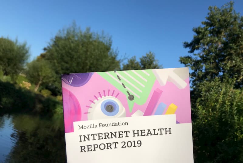 I read it by the waterside on my holiday
The Internet Health Report is edited by Solana Larsen for Mozilla Foundation and puts together input from hundreds of readers and experts in an extremely readable format. Or multiple formats, really, as there is the website, the ebook and (new this year) a printed edition. The print version definitely helped me read the full thing. Everyone is invited to participate:
this publication is neither a country-level index nor a doomsday clock. We invite you to join us in assessing what it means for the internet to be healthy, and to participate in setting an agenda for how we can work together to create an internet that truly puts people first
(From the README)
In his update, Mozilla Foundation’s Mark Surman calls out three things that improved: calls for privacy are becoming more mainstream, people start to speak up about and work on more responsible AI and a healthy discussion about big tech is taking place among more and more people. Some things also got worse, Surman writes: there is more internet censorship, biometrics are being abused and increased AI usage specifically affects minorities because of bias, despite efforts like ethics boards.
This post has some of the things that piqued my interest, with links. For the full content, including all sources and links, get the printed edition or visit the Mozilla Internet Health Report 2019 website, where you can read everything or just the things you’re interested in. There is also a PDF of the short version.
Data: this year’s spotlight
In the spotlight section, the Internet Health Report features three articles that all have something to do with data.
AI
‘Use of AI is skyrocketing (for fun, as well as for governance, military and business) and not nearly enough attention is paid to the associated risks’, says the report. Governments start to use AI in military, for immigration decisions and for surveilling citizens, places one can imagine (racial) bias can cause serious harm. OpenAI decided not to release a trained data set as they worried about malicious uses of the technology. Some companies founded ethics boards to govern their AI usage, but they are often big companies with, inevitably, competing priorities. See also: Let’s ask more of AI
Cities
Data is useful for cities to base their policies on, and are somewhat envious of the ‘data monopoly’ big tech companies like Uber and AirBnB have. Some only give permission to do business on the condition of getting access to businesses’ data. See also: The power of cities
Ads
Paying for products with your personal data threatens freedom and human rights, because the algorithms that let companies do targeted advertising, can also be exploited by people with bad intentions. Some change is happening: Facebook, Twitter and Google all took some action against abuse after public pressure and new legislations. Lots of browsers now protect against tracking and/or block ads. Companies also start to realise targeting and knowing everything about everyone doesn’t necessarily make them more effective. See also: Rethinking digital ads
Safety
More and more awareness around privacy on the web is raised; by the campaigns of non profits like the EFF and Mozilla, but also by numerous data leaks that got into mainstream news and GDPR, the European data protection legislation that affects pretty much all businesses that are online. Tracking protection has become something browsers compete on (Firefox and Safari are ahead in this game), and even Facebook’s CEO announced that they now care about privacy.
- While anonymity online can be abused by criminals, it is also absolutely worth defending and an important tool for whistleblowers reporting on corruption, or for people whose government oppresses them. See also: In defense of anonymity
- If you don’t want big tech to have your data, you just don’t give it, right? Well, Katarzyna Szymielewicz has a useful metaphor of three layers of data: the first is data you share and control, the second is behavioral data and metadata that others collect (if you want to control this, you need expertise) and the third is what machines think about you (we have no control, because they are the result of companies combining data with algorithms we often can’t see). See also: Show me my data and I’ll tell you who I am
Openness
The web has always been fundamentally open. Imagine starting a new website required a government issued permit, or that getting onto any website required a certain kind of education, nationality or payment… Worldwide, this openness is threatened, as there exist walled gardens, social media taxes and shutdowns.
- Governments who want to frustrate their citizens’ communications used to turn off the whole internet, but this was relatively easy to detect (for instance, by organisations protecting human rights), so they try out other tactics, like shutting down the internet in just one region or slow it down instead of turning it off. See also: Internet slowdowns are the new shutdowns
- Various African countries now have taxes on using social media and messaging apps (Uganda), VOIP (Zambia) and even blogging and vlogging (Tanzania). See also: Taxing social media in Africa
- Germany implemented a law against online hate speech and harrassment, which can force social media companies to take down certain content. Some call for web companies to be open about who reported content and how complaints are handled. See also: Inside Germany’s crackdown on hate speech
- Wikidata, a project by the non-profit behind Wikipedia, offers lots of volunteer-created structured data. Technology firms who make voice assistants get a lot of value from this. Despite that, vast majority of donations is still from individuals, and only 4% from corporations. See also: Wikidata gives wings to open knowledge
Inclusion
Is the internet a level playing field yet for people from all backgrounds? This question has multiple sides to it: it is about how online communities fight harrassment and abuse, and about the working conditions of people who make internet hardware.
- Women and women of colour in journalism are (still) much more likely to be harrassed online than men, various study showed. See more: Women journalists feel the brunt of online harassment
- Contributors to open source projects that power a lot of the world are often a homegeneous group. That’s bad as code is not neutral and i.e. biased towards the people who write it. Strictly enforced code of conducts are appreciated by underrepresented groups, have helped community members call out bad behaviour and are therefore a helpful instrument in trying to make open source communities more diverse. See also: Codes of Conduct now guide open source communities
Web literacy
Do people understand the web well enough to make informed choices about things like sharing baby photos and recognising fake news? Do we understand it well enough to use it to people’s benefit, for example as a platform for activists to collaborate on?
- 3101 people from 124 countries worked together analysing footage, interviews and expert analysis in a project called Decoded, to show that the US-led coalition’s bombing of the Syrian city of Raqqa costed not 23 civilian deaths, but over 1500. See also: Decoding images of war in Syria
- User tracking and targeting employed for manipulation of public opinion with fake news threatens democracy. Cambridge Analytica was not only involved with influencing the British and US electorates, but also worked in many other countries, including Kenya, Brazil and Mexico. For this year’s European Election, Google, Twitter, Facebook and Mozilla pledged to do somethimg about this, signing the European Commission’s Code of Practice on Disinformation. See also: The challenge of democracy in the digital era
- Are we addicted to the internet? Research that showed Americans spend 6 hours a day on their devices and (other research) showing maintaining a user’s attention as a design principle seem to suggest so. That’s probably not time well spent. In the meantime Apple and Facebook introduced features to limit screen time. See also: Breaking free of the addiction machine
Control
Should the web be controlled by few or many? In other words, should power lie with a couple of companies that everything centers around, or do we want the web to be more decentralised? The Internet Health Report 2019 contains lots of good arguments for decentralisation.
- There’s the question of ‘who (literally) controls the internet’. The cables deep under the sea that make the web work used to be built by telecom cariers in the early 90s, but are now invested in by private companies like Google, Facebook, Amazon and Microsoft (who, in 2018, owned or leased over 50% of these cables between them). See also: The new investors in underwater sea cables
- For Uber, and many ‘unicorn’ companies like it, the structure of ‘everything (taxi rides, etc) goes through our company’, ie centralisation, is what gets their investors’ hope for returns up. Fine, that’s capitalism. But the model gets in the way of others providing alternatives or putting users in control. This is an issue when such companies have become utilities, says Nathan Schneider. These companies would probaby do things very differently if their users owned them, in which case they would only have to consider user interests. See also: What if Facebook were owned by its users?
- The largest five internet companies make money by selling user’s attention to advertisers (Google, Facebook and Baidu), selling devices (Microsoft and Apple), being a middle man (Amazon and Alibaba) and doing lots of things from payments to in-app purchases to ads (WeChat parent company Tencent). See also: How do the biggest internet companies make money?
- Nextcloud is an effort to create an open source cloud, but unlike with traditional open source software it is not cheaper (free) compared to alternatives, it costs more (because you need to pay for hosting somewhere). See also: An open source alternative for “the cloud”
I learned a lot from reading the Internet Health Report 2019, from great new initiatives to serious problems that I wasn’t aware of. As a reader of this blog, I invite you to dive in yourself, too!
Originally posted as Notes from the Internet Health Report 2019 on Hidde's blog.
Book review: Zed
Zed by Joanna Kavenna is a dystopian satire, set in a future Great Britain, where a tech giant called Beetle runs most of society. Their ‘lifechain’ product is able to predict the future, which the justice department uses to prosecute people for future crimes (very Minority Report). They also deal in currency (BeetleBits), transport (Mercury cars), virtual assistents (Veeps) and VR (Real Virtuality).
Beetle’s CEO, Guy Matthias, is one of those tech CEOs that Sillicon Valley seems to have way too many of. Before he addresses a conference in Davos, he orders his robot to read Thomas Mann’s Magic mountain, and distill a funny opening from it. When he needs a date for a dinner party, he checks out the expected success rate.
Beetle takes pride in that they’ve created a reality where everything can be predicted and determined by smart algorithms… except it can’t, it sometimes fails. Of course it does. Those who insist we should compute every aspect of our lives clearly fail to truly understand every aspect of our lives.
Zed is an excellent novel about what could go wrong if big technology corporations have too much power and not enough humanities majors in their leadership. It is very resemblant of the real world: Facebook who want to introduce a currency, Uber who try to reinvent transport… the list goes on.
Someone on Goodreads called it ‘the fictional extension of Zuboff’s Surveillance Capitalism’, which I think is apt. I would warmly recommend this to people who are interested in a critical look at the tech industry. See also the review in The Observer.
Originally posted as Book review: Zed on Hidde's blog.
Managing accessibility in open source CMSes: a write-up
Last week, I attended a meetup that was about the accessibility of not just one CMS, but two: WordPress and Drupal. It brought together people from both communities to talk about their accessibility efforts. Because CMS accessibility can make a huge difference. It was kindly organised by Level Level, a WordPress consultancy in Rotterdam.
Disclaimer: I work on authoring tool accessibility at the W3C/WAI, this write-up is in my personal capacity, views are, as always, my own.
Short introductory talks were given by Rian Rietveld, former WordPress accessibility lead, and Mike Gifford, “godfather of Drupal accessibility”, who visited from Canada. They talked about how they moved their respective communities towards doing (a lot) more work on accessibility.
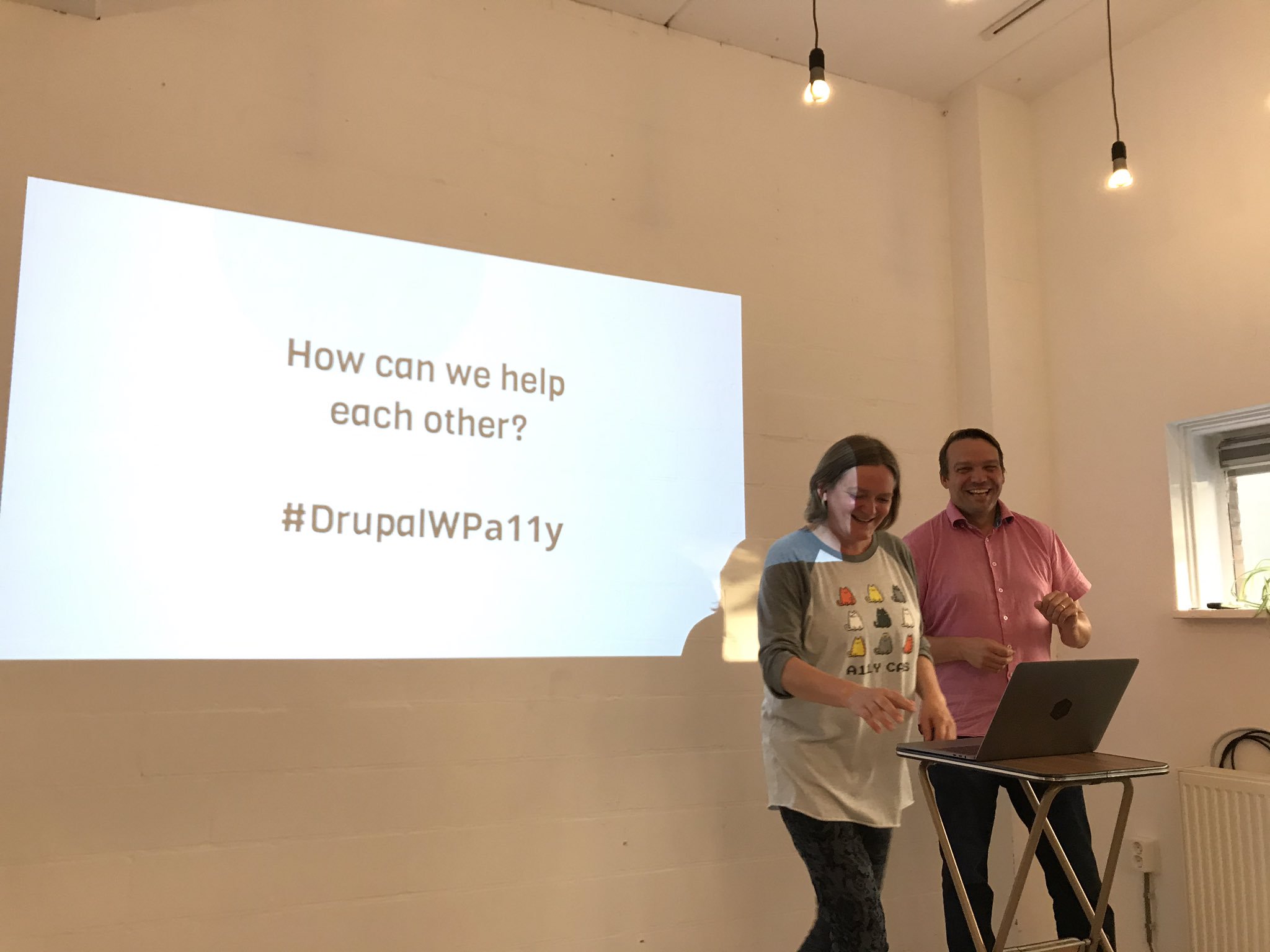 Rian and Mike
WordPress and catching up (Rian)
Rian explained that back in 2011 a lot of accessibility discussions in WordPress were still of the “why is it important” and “raising awareness” kind. Rian wanted it all to be more practical and focused on getting things done. The time seemed right, because more people got interested in the subject, partly because accessibility legislation was about to get stricter. Something else that helped was that the WordPress Slack community just started and turned out to be great for facilitating conversations. In 2016, WordPress announced:
All new or updated code released into WordPress core and bundled themes must conform with the WCAG 2.0 guidelines at level AA.
(see: WordPress goes WCAG)
Things got complicated around the release of Project Gutenberg, a new block based content editor. It was pushed by Automattic, the company of WordPress’ inventor Matt Mullenweg that also dedicates a lot of its developers to WordPress core, as it would strategically bring WordPress in line with other modernised forms of content editing. This type of content editing is hard to get right.
For the accessibility team, Gutenberg was extremely tricky, Rian explained, because of the process: first features were developed, then designed, then accessibility checked. This order of things made that the accessibility team would always have to play catch up, in a fast moving project. The accessibility team warned about issues in the editor from the very start, but it was hard to catch up with the speed of development and convince people of the need for accessibility. Rian left the team when it became clear that Gutenberg would be included into WordPress without the accessibility issues addressed.
An accessibility audit of the Gutenberg editor was then crowdsourced, hundreds of issues were found and filed in GitHub. They are being addressed, but there are still many issues, and the catch up problem seems to have remained unsolved. Monique, who is in the core design team now, mentioned that she notices more designers and developers ask accessibility questions earlier on in the process, which is hopeful.
Others mentioned the active accessibility community on WordPress Slack, that makes a difference by checking core code as well as plug-ins and themes. This is something WordPress has had for a while, but it is still “catching up” rather than “considered from the start”, which one would hope WordPress would do more, as it often ends up being cheaper and easier. The WordPress governance project, that includes accessibility, may help with this, and improve how the efforts of the accessibility team are supported.
Drupal and ATAG (Mike)
Mike talked about how, in 2008/2009, he started looking into Drupal accessibility, because he had known people in the disability rights scene for years and wanted to apply what he knew to Drupal. He filed accessibility issues, and found it oddly addictive to tag them and get them in the issue queue.
Mike explained that, some years ago, Drupal’s founder Dries Buytaert had identified a number of “gates” for Drupal quality control:
Core changes must pass through a series of “gates” to ensure their quality is up to standards. Gates are essentially “checklists” that can be used to evaluate a patch’s readiness, by both developers and patch reviewers/core committers.
(see: Drupal core gates)
Accessibility is one of those gates, others include performance and usability. Needless to say, being one of the gates helped ensure accessibility throughout the ecosystem.
Drupal publicly committed to being WCAG AA, see Drupal’s commitment to accessibility on Dries Buytaert’s blog. Mike said accessibility work in Drupal was focused on not just the front-end, but also the back-end (just like in WordPress): they want to make Drupal itself accessible. The standard to follow for that kind of accessibility is ATAG, which Mike put a lot of effort in promoting within the Drupal community.
For those who are unfamiliar, ATAG has two parts: part A is about accessibility of the CMS so that content editors with disabilities can use it, part B is about improving the accessibility of output, so that web users with disabilities can use the resulting website. In Drupal 7, Mike said, they more or less met part A of ATAG, in Drupal 8, they tried to incorporate as much as possible of part B.
A major driver for improving accessibility in Drupal, Mike explained, was the idea of scale: rather than do work to fix one website, they did work to fix a platform that is used on 3% of the web. Yes, this is awesome about making CMSes more accessible: you’re potentially improving a lot of sites at once. This also gives the team some leverage when, say, talking to a browser vendor about a specific bug, then you would normally have as the owner of just one site.
Challenges and solutions
After hearing Rian and Mike talk about their experiences in their respective community, we talked about various interesting subjects:
- is it possible to educate all developers in the world about basic accessibility, or should we ensure that’s built into libraries and CMSes? The latter could be super effective and help teach people where they are
- adding to the previous question, Mike said governments could take this up: as they use a lot of open source software and are paid with tax money, why not spend some of their resources on contributing accessibility improvements (as in: code) back to the open source projects they use?
- in procuring websites and CMSes, is it sufficient to ask for WCAG compliance? Mike suggests to ask more questions than that, see his Accessibility Contracting Best Practices
- what’s the role of ATAG in this? Mike said we give content editors a lot of power, but not enough guidance. Implementing the B part of ATAG in CMSes can help here. It does seem harder to do than WCAG, he said, because the effects of (and investment in) ATAG improvements are much earlier in the process, they are about what it’s like for the content editor and how they are encouraged.
- Mallory, in the audience, mentioned the work that Greg Whitworth is doing on standardising form controls, people were excited for the potential of this project to make one common accessibility issue go away
- we talked briefly about Dragon Naturallyspeaking, an assistive technology that is often forgotten about when testing the accessibility of user interfaces
It was an interesting and constructive evening, with many experiences shared and plenty to think about. It’s clear that CMSes can play a huge role in making the web more accessible. One the one hand, for end users of the web: by encouraging and explaining content editors, implementing automated checks and high quality HTML output (this depends on many things, like templates used and also the very nature of WYSIWYG). On the other hand for content editors, by being usable for content editors with disabilities.
Originally posted as Managing accessibility in open source CMSes: a write-up on Hidde's blog.
Equality: a reading list
The world isn’t as equal as it may seem to people who are white, heterosexual and able-bodied. This is a reading list about the inequality that they experience a lot less of. It has books about the everyday experiences of people who are underprivileged, what identity means, how racism and sexism manifest themselves and what we can do about that.
A quick disclaimer: I’m not an expert in any of these subjects, just an interested reader. This selection is by no means exhaustive, but I hope it is helpful to others.
Goldfish in bowls don’t know what water looks like, because they’re in water. That they cannot leave their bowl is a fact of their lives. The thing is… people sometimes have the same problem. When they look at society, they don’t always see all structures that exist within it. Structures like racism and sexism, for instance.
The problem that is a common theme throughout all books in this list: people who aren’t affected by bad structures, often have a wildly unrealistic idea of what they mean and how common they are. Unlike goldfish though, those people have it relatively easy to peek outside of their bubble. Listening to or reading about what people with different perspectives experience is a good habit, and what I would encourage anyone with privilege to do.
(If, reading this, you find yourself thinking “but I’m not privileged”, but you are white, male and/or heterosexual, you most likely are. Sorry.)
When you’re better aware of inequality, you’re better equipped to speak up against it. Why do I post this on my mostly tech blog? Well, if a majority of tech workers is unaware of inequality and creates technology, we risk ending up with tech that reinforces inequality. That’s bad.
Sexism is everywhere and always
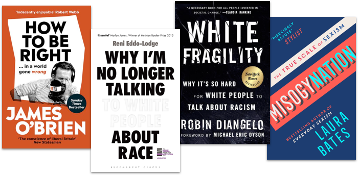
Laura Bates started the Everyday Sexism project, which collects experiences from women around the world. Misogynation is a collection of her essays about sexism, many of which draw from the experiences she collected as well as solid statistics. She answers a wide range of questions people may have about sexism, and provides excellent analysis of the phenomenon in the workplace, on our streets, at home, in healthcare, in politics and in education. I admire how she combines serious and humorous. Many feminists, Bates explains, get attacked for being ‘oversensitive’ and ‘too negative’, but this kind of response ’normalises and engrains the treatment of women as second class citizens, opening the door for everything else’. Yes. Providing an enormous range of examples, Bates shows that gender inequality is very real, often pretty ridiculous and that we should and can fight it successfully.
Misogynation by Laura Bates (for some of the essays, see also: Laura Bates on sexism in The Guardian)
Racism is a system
Teaching workshops about racism in workplaces around the world, Robin DiAngelo noticed certain patterns in the attitudes of white people when confronted with racism and their part in it (everone has a part in it). They get defensive, angry and upset. She calls this white fragility: the phenomenon of white people unable to deal their racial stress. It’s painful to read about this, especially when compared to the actual problem: the experiences of people who are affected by racism itself.
Racism is not a badly intended person being racist to another per se, it is the system, DiAngelo explains. It is our society in which wealth is not equally distributed between people from different races, and in which prejudice is concealed in euphemisms like “bad neighbourhood”. That system is shaped best for white people, therefore it you are white you benefit, whether you like (or want) it or not. DiAngelo explains it much better than I can, so I would really urge you to pick it up, and/or read Alice Bartlett’s notes about White Fragility, which inspired me to read it.
White fragility: why it’s so hard for white people to talk about racism by Robin DiAngelo
Blame the liars, not the lied to
James O’Brien is a radio presenter who talks to people phoning in from all across the UK. He found that a lot of his callers have been lead to believe falsehoods by cheap journalists that prioritise clicks and paper sales above truthseeking. His book How to be right in a world gone wrong is fundamentally about challenging their bogus arguments. This takes patience and confidence, neither of which O’Brien lacks in. If we don’t share them, we owe it to ourselves to challenge beliefs, myths and lies about subjects like LGBT rights, islam and Brexit.
Blame the liars, not the lied to, is the lesson in this book: O’Brien blames the media more than individuals who rely on them. If you can stand it that O’Brien is sometimes a bit full of himself —I think he does sufficient self-reflection, but that may be me being a non-native speaker of English— this is a very entertaining read. It may help in convincing less enlightened family, friends or acquaintances.
How to be right in a world gone wrong, by James O’Brien
A British perspective on race
In Why I’m no longer talk to white people about race, Reni Eddo-Lodge confronts us with a comprehensive account of the history of (British) racism and slavery, and describes heartbreaking accounts of racism in cities like Bristol. The reason that this is important, she explains, is that too many (white) people think there is no racism problem, which is largely because history of racism isn’t taught in most British schools and people don’t do enough self-study. If the title puts you off, definitely read it. The problem of talking to white people about race, Eddo-Lodge explains, is that they tend to not accept racism exist and make it about themselves instead. That wastes the time of people who want to fight racism, because they now need to spend it on arguments irrelevant to the actual issue. Eddo-Lodge kindly takes the time to articulate why there’s no such thing as reverse racism (true racism requires power) and what’s wrong with being colour blind (‘I don’t care which colour people are’ can easily be an attitude of denying racism, which only works if it doesn’t affect you, i.e. you have the privilege to be white).
Like DiAngelo, Eddo-Lodge explains the fight against racism isn’t one against specific persons, i.e. nobody should feel personally threatened. It is about racism as a structure that has devastating consequences for people of colour, including lower grades, less benefit of the doubt, lower pay and less representation in the media.
Why I’m no longer talking to white people about race by Reni Eddo-Lodge (see also: Eddo-Lodge’s original blog post)
Racist search engines and algorithms
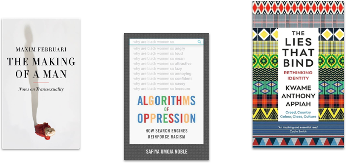
When a friend told Safiya Umoja Noble to do an online search for ‘black girls’, she was shocked to see what other suggested terms came up, and how that compared to searching for, say, ‘white girls’. It is excruciating. In her book Algorithns of oppression, Safiya Umoja Noble shows numerous shocking examples of how search engines contribute to more racism. She seems to put the blame on companies like Google for capitalising on racism, but with Ockham’s razor in mind I feel that could be unrelated, wouldn’t anyone who tries to index the web, also index the racism on it? But that’s not the point: when the first few pages of many search results in the largest search engine reinforce racial bias, a lot of people’s online information gets racially biased. Search engines could do something about this problem and have both the technical possibilities and moral obligation. Especially because the problem is likely to be much bigger when applied to other algorithms. Racial bias in systems that make decisions for the police for example, for instance, see also Inspecting algorithms for bias in MIT Technology Review and When algorithms discriminate in The New York Times. The author’s point is solid, but I wasn’t a big fan of the argumentation or writing style.
Algorithms of oppression: how search engines reinforce racism, by Safiya Umoja Noble (see also: Safiya Umoja Noble’s TED talk)
Making of a man
Trans people get asked odd questions, philosopher/writer Maxim Februari explains in De maakbare man (in Dutch, translations available), so he decided to write this short book to answer some of them. While he’s at it, he also critiques various legal and administrative burdens trans people face, and how our world is shaped by specific norms when it comes to sex and gender. Februari’s first person account is a great introduction to transsexuality. Interesting notes on the absolute inappropriateness of certain questions, the difference between sex and gender and what some of his environment’s responses were to Februari’s transition.
De maakbare man: notities over transseksualiteit by Maxim Februari (Dutch, available in English as Making of a man)
Are identities a lie?
People feel part of their identity, behave according to it and are treated in specific ways because of it. Yet, as the Ghanese-British philosopher Kwame Appiah shows in The lies that bind, reality is more complex than identities based on gender, class, creed (religion), colour, country and culture suggest. They bind people together, but they are also made up. In his very eloquent book, Appiah shows that none of these concepts refer really to one thing: there’s no such thing as having an English, gay or Muslim identity, because all three can vary wildly depending on time and place. He can know it, as someone who has many different identities. While many of the books in this list talk in terms of identity, this one provides excellent and thought-provoking analysis of what that means.
The lies that bind by Kwame Anthony Appiah (see also: Appiah’s Reed lectures about the same subject, also available as a podcast)
Originally posted as Equality: a reading list on Hidde's blog.
Meaning without markup: Accessibility Object Model
Meaningful markup is essential for accessibility, because it brings semantics. In short, it tells the browser what things are. Proposals for the Accessibility Object Model include a new way to convey semantics: without markup, directly in JavaScript. In this post, we will look at the proposals and their current status.
Beyond the scope of HTML
To get a more detailed overview of how the quality of our markup impacts end users, see my previous post How accessibility trees inform assistive tech. To summarise: our markup gets used to construct accessibility trees, which inform assistive technologies (AT) about what things are on our pages. With this information, AT can offer features like ‘browse by heading’ and advanced table navigation.
There are plenty of semantic elements to choose from when we build a component. The set of HTML elements is enormous. Even if you build a new thing for which no semantic element exists, custom components that combine existing HTML elements let you have at least some of your semantics for free.
Sometimes the set of HTML elements really does not cut it. You’ve created an interface concept for which reasonably no semantic tag exists in HTML. This is where WAI-ARIA comes in: it lets you provide accessibility-relevant information to the browser using standardised attributes, including semantics, states and labels.
Some examples of effective ARIA:
- with
aria-expanded="true|false", you can set the state of a button that expands/collapses content - with
role="alert"you can turn an element into a live region: when content is updated, the update is announced to AT users
There is also ARIA that can turn elements into elements for which there are already existing HTML equivalents, such as buttons and links. This is not recommended, because apart from changing semantics, it also makes affordances like keyboard behavior the developer’s responsibility. For instance, instead of <span role="button">, it is much safer to use <button type="button"> and get the keyboard behaviour for free. In 2019, styling native buttons is no longer a problem. Certainly not one that warrants accessibility bugs like reduced keyboard support.
How AOM will help
So, let’s say you are making something that passes the first rule of ARIA (paraphrased: “don’t use ARIA if it is not needed”). You could use markup for this: just add the appropriate attributes. Once the Accessibility Object Model is implemented, you could also apply ARIA without markup.
The proposed Accessibility Object Model (AOM) will be “a JavaScript API to allow developers to modify (and eventually explore) the accessibility tree for an HTML page”. In other words: it gives developers direct access to the accessibility tree. In a way, that’s a bit like what Service Workers do for the network and Houdini for style: give developers control over something that was previously done only by the browser. All in the name of an extensible web: control over these low-level features enables developers to experiment and create new things without waiting for the standards process. Perhaps, with AOM, people could define Web Components that don’t exist in HTML just yet.
Having access to low-level features like these, gives developers power (yay!). But at the same time, they also give developers more direct responsibility, regarding aspects like security, performance and accessibility. It can be tricky and time-consuming to implement best practices and fulfill all those responsibilities. Admittedly, is it easier, and often sensible, to use browser defaults. Extending the web like this is probably most practical for teams that are able to invest the time.
AOM is currently developed by people from across Mozilla, Google and Apple. They’ve defined four phases for the project. Let’s look at some of the plans and how they help.
No more ‘sprouting’
Interfaces with a lot of advanced controls can quickly become a sea of attributes, which the HTML spec calls “sprouting”. Even a simple disabled button might require role, aria-label and aria-disabled attributes. That’s a lot of attributes, not just to add, but also to maintain (in markup). To solve this, AOM will let developers set accessibility attributes of an element directly in JavaScript.
For example, to set aria-expanded on an element, you could do it on the element directly:
el.ariaExpanded = true;Previously, we could only set this attribute to expanded by switching the value of the attribute in the markup. With AOM, the set of ARIA attributes will also exist as properties that DOM nodes can have, so called IDL (Interface Definition Language) attributes. The IDL attributes are said to reflect attributes in the markup. In the above example, that means that upon setting el.ariaExpanded to true, an attribute (if it does not yet exist) is added to el and it is set to true.
The mapping of ARIA attributes to IDL attributes is defined in the ARIA 1.2 specification.
Note that in applications that have some form of virtual DOM, like those built with frameworks including React and Vue, best practices prescribe “don’t touch the DOM, let the framework deal with DOM changes”. In those applications, defining semantics in the markup or a template will probably still be the go-to approach.
Relationships without IDs
In HTML, the id attribute uniquely identifies an element. Form labels make use of this: we associate label attributes with their corresponding input by pointing the label’s for to the input’s id. In ARIA, there are a number of properties that need to point to an id (or multiple ids), like aria-controls (this element controls that element) and aria-describedby (this element is described by this element/these elements).
With AOM, one can associate elements with other elements directly, by assigning them like this:
formField.ariaLabelledBy = formLabel;Non-DOM nodes in the accessibility tree
In some very specific cases, a web application may contain content that does not exist as DOM nodes. For instance: drawing a train station’s map of available elevators on a canvas. Each elevator has a label, and also a informational popup that can be expanded. This information would currently be lost to assistive technologies. With AOM, you could define an accessibility tree containing all the labels and expanded states. These would then be conveyed to AT, so that users can understand them.
Good for testing
The AOM also aims to bring reading accessibility attributes. The intended use case: testing! With AOM, you would be able to access the names, roles and states of your HTML nodes directly in tests.
Tests can already access an element’s ARIA information by reading out attributes today. With AOM, they would read out what something has actually computed to in the browser’s accessibility tree. This functionality has the potential to make tests better.
Accessibility Events
In JavaScript, we have a number of useful events that let us act on user input like clicks, keyboard presses and touch. In some cases, there is a discrepancy between such events and input from users of assistive technologies.
In her talk Web Components and the AOM at JSConf Asia 2019, Léonie Watson explained that actions like “swipe up” and “swipe down” mean different things to users of VoiceOver on iOS:
When you have a screenreader running on a touch screen, the flick up and flick down gestures [developers] would probably use for adjusting the value of a slider, are already used for screenreader specific commands.
Because screenreader users already use “swipe up” and “swipe down” gestures to trigger screenreader specific commands, it would be impossible for them to use the same gestures for something else in the app you’re developing.
This is why AOM aims to bring events that are specific to assistive technologies, so that AT can design consistent ways to let the user perform certain actions. Apple calls these semantic events.
Some examples of accessibility events:
incrementanddecrementfor going to the next item in a custom slider (like using up and down arrow keys)dismissfor closing a modal overlay (like pressingESCkey)
There is a large privacy concern associated with AT-specific events: malicious site owners could use them to detect if someone has a visual or mobility impairment.
Current status
The specifications for AOM are still in progress, and so are implementations. Various browsers have implemented (parts of) AOM). The part that seems to have most implementations is attribute reflection. This feature works for most attributes in Chrome and Edge (enable via about:config) and Safari (pick ‘Accessibility Object Model’ from Experimental Features setting in Developer menu). There is currently no AOM support not in Firefox.
If you look at the IDL tests with AOM flags enabled, you can see how much your browser supports of the attribute reflection part of the specification.
Wrapping up
Simple solutions are often the easiest way to get your product to work for as many people as possible. For example, when for a date of birth field, you decide against a fancy, complex datepicker and rely on a clearly labelled input[type=text] instead. Standard, boring HTML goes a long way. Chances are it will work well for users and make your accessibility auditors happy. But if your product has custom controls that just don’t exist in HTML, you will want to convey the right accessibility properties to assistive technologies.
AOM is an interesting new proposal in which accessibility information gets its own APIs beyond existing DOM methods like setAttribute and getAttribute. Those methods set and get out values that compute into properties of accessibility trees, but they don’t deal with those properties directly. It’s a subtle difference. With direct access to accessibility info, we could set accessibility properties without markup, we could create accessibility trees for things that don’t exist in the DOM (like for contents of canvas elements) and testing accessibility may improve.
Originally posted as Meaning without markup: Accessibility Object Model on Hidde's blog.