Reading List
The most recent articles from a list of feeds I subscribe to.
The Hurricane Web
As Hurricane Florence makes its way across the US southeast coast, many people are stuck in areas with severe flooding. These people rely on outside information, yet have limited bandwidth and power.
To help them, news platforms like CNN and NPR provide text-only versions of their sites:
We have a text-only version of our website for anyone who needs to stay up-to-date on Hurricane Florence news and keep their battery and data usage to a minimum: https://t.co/n2UDDKmlja
— NPR (@NPR) September 14, 2018
That’s a great thing. Here’s how it looks:

Less is More
Permalink to “Less is More”Text-only sites like these are usually treated as a MVP of sorts. A slimmed-down version of the real site, specifically for emergencies.
I’d argue though that in some aspects, they are actually better than the original. Think about it- that simple NPR site gets a lot of points right:
- It’s pure content, without any distractions
- It’s almost completely fail-safe
- It’s responsive by default and will work on any device
- It’s accessible
- It’s search engine friendly
- It’s machine readable and translatable
- It has close to perfect performance scores:

Most importantly, it’s user friendly. People get what they came for (the news) and are able to accomplish their tasks.
The only thing missing here might be a few sensible lines of CSS to set better typography rules. Those could still be inlined in the head though, easily coming in under the 14KB limit for the first connection roundtrip.
This is the web as it was originally designed. Pure information, with zero overhead. Beautiful in a way.

The “full” NPR site in comparison takes ~114 requests and weighs close to 3MB on average. Time to first paint is around 20 seconds on slow connections. It includes ads, analytics, tracking scripts and social media widgets.
Meanwhile, the actual news content is roughly the same. The articles are identical - apart from some complementary images, they convey exactly the same information.
If the core user experience can be realized with so little, then what is all that other stuff for?
The Cost of Comfort
Permalink to “The Cost of Comfort”Of course the main NPR site offers a lot more than just news, it has all sorts of other features. It has live radio, podcasts, video and more. Articles are preloaded via AJAX. It’s a much richer experience - but all that comes at a price.
I recently read this great article by Alex Russel, in which he compares Javascript to CO2 - in the sense that too much of it can be harmful to the ecosystem.
Javascript enables us to do amazing things and it can really enhance the user experience, if done right. But it always has a cost. It’s the most expensive way to accomplish a task, and it’s also the most fragile. It’s easy to forget that fact when we develop things on a highspeed broadband connection, on our state-of-the-art devices.
That’s why websites built for a storm do not rely on Javascript. The benefit simply does not outweigh the cost. They rely on resilient HTML, because that’s all that is really necessary here.
That NPR site is a very useful thing that serves a purpose, and it does so in the simplest, most efficient way possible. Personally, I’d love to see more distilled experiences like this on the web.
… “Well, this might work for a news site - but not every usecase is that simple.”, I hear you say.
True. The web is a text-based medium, and it works best with that type of content. But the basic approach is still valid in any other scenario:
Figure out what the main thing is people want from your site and deliver it - using the simplest, least powerful technology available. That’s what “the rule of least power” tells us, and it’s still the best strategy to a make a website truly resilient.
Make it withstand hurricanes.
Connection-Aware Components
Over the last decade, we have learned to embrace the uncertainty of developing for the web.
We don’t design sites for specific screen dimensions anymore, we make them responsive. We don’t assume ideal browsers and devices, we use progressive enhancement. When it comes to connectivity though, we still treat that as a binary choice: you’re either on- or offline.
Real connections are not that simple. Depending on your location, network condition or data plan, speeds can range from painfully slow to blazingly fast. The concept of “online” can be a drastically different experience for different users, especially on mobile.
What if there was a way to adapt websites based on our users connections, just like we do for varying display widths and browser capabilities? The Network Information API might enable us to do so.
The Network Information API
Permalink to “The Network Information API”This API is an editor’s draft by the WICG and currently available in Chrome. It can be accessed through the read-only property navigator.connection (MDN), which exposes several properties that provide information about a user’s current connection:
connection.type:
Returns the physical network type of the user agent as strings like “cellular”, “ethernet” or “wifi”.
connection.downlink:
An effective bandwidth estimate (in Mb/s), based on recently observed active connections.
connection.rtt:
An estimate of the average round-trip time (in milliseconds), based on recently observed active connections.
connection.saveData:
Returns true if the user has requested “reduced data mode” in their browser settings.
connection.effectiveType:
This is a combined estimation of the network quality, based on the round-trip time and downlink properties. It returns a string that describes the connection as either: slow-2g, 2g, 3g or 4g. Here’s how these categories are determined:

Responding to Changes
Permalink to “Responding to Changes”There is also an Event Listener available on the connection property that fires whenever a change in the network quality is detected:
function onConnectionChange() {
    const { rtt, downlink, effectiveType } = navigator.connection
    console.log(`Round Trip Time: ${rtt}ms`)
    console.log(`Downlink Speed: ${downlink}Mb/s`)
    console.log(`Effective Type: ${effectiveType}`)
}
navigator.connection.addEventListener('change', onConnectionChange)
Support
Permalink to “Support”
👉 Be aware that all of this is still experimental. Only Chrome and Samsung Internet browsers have currently implemented the API. It’s a very good candidate for progressive enhancement though - and support for other platforms is on the way.
Connection-aware components
Permalink to “Connection-aware components”So how could this be used? Knowing about connection quality enables us to custom-fit resources based on network speed and data preferences. This makes it possible to build an interface that dynamically responds to the user’s connection - a “connection-aware” frontend.
By combining the Network Information API with React, we could write a component that renders different elements for different speeds. For example, a <Media /> component in a news article might output:
- offline: a placeholder with alt text
- 2g / reduced data mode: a low-resolution image, ~30kb
- 3g: a high resolution retina image, ~200kb
- 4g: a HD video ~1.8MB

Here’s a (very simplified) example of how that might work:
class ConnectionAwareMedia extends React.Component (
    constructor(props) {
        super(props)
        this.state = {
            connectionType: undefined
        }
    }

    componentWillMount() {
        // check connection type before first render.
        if (navigator.connection && navigator.connection.effectiveType) {
            const connectionType = navigator.onLine
                ? navigator.connection.effectiveType
                : 'offline'
            this.setState({
                connectionType
            })
        }
    }

    render() {
        const { connectionType } = this.state
        const { imageSrc, videoSrc, alt } = this.props

        // fallback if network info API is not supported.
        if (!connectionType) {
            return <Image src={imageSrc.hires} alt={alt} />
        }

        // render different subcomponents based on network speed.
        switch(connectionType) {
            case 'offline':
                return <Placeholder caption={alt} />

            case '4g':
                return <Video src={videoSrc} />

            case '3g':
                return <Image src={imageSrc.hires} alt={alt} />

            default:
                return <Image src={imageSrc.lowres} alt={alt} />
        }
    }
)
Using a Higher-Order Component
Permalink to “Using a Higher-Order Component”The above example makes our component a bit unpredictable - it renders different things, even when given the same props. This makes it harder to test and maintain. To simplify it and enable reuse of our logic, moving the network condition check into a separate higher-order component might be a good idea.
Such a HoC could take in any component we want and make it connection-aware, injecting the effective connection type as a prop.
function withConnectionType(WrappedComponent, respondToChange = false) {
    return class extends React.Component {
        constructor(props) {
            super(props)
            this.state = {
                connectionType: undefined
            }
            // Basic API Support Check.
            this.hasNetworkInfoSupport = Boolean(
                navigator.connection && navigator.connection.effectiveType
            )
            this.setConnectionType = this.setConnectionType.bind(this)
        }

        componentWillMount() {
            // Check before the component first renders.
            this.setConnectionType()
        }

        componentDidMount() {
            // optional: respond to connectivity changes.
            if (respondToChange) {
                navigator.connection.addEventListener(
                    'change',
                    this.setConnectionType
                )
            }
        }

        componentWillUnmount() {
            if (respondToChange) {
                navigator.connection.removeEventListener(
                    'change',
                    this.setConnectionType
                )
            }
        }

        getConnectionType() {
            const connection = navigator.connection
            // check if we're offline first...
            if (!navigator.onLine) {
                return 'offline'
            }
            // ...or if reduced data is preferred.
            if (connection.saveData) {
                return 'saveData'
            }
            return connection.effectiveType
        }

        setConnectionType() {
            if (this.hasNetworkInfoSupport) {
                const connectionType = this.getConnectionType()
                this.setState({
                    connectionType
                })
            }
        }

        render() {
            // inject the prop into our component.
            // default to "undefined" if API is not supported.
            return (
                <WrappedComponent
                    connectionType={this.state.connectionType}
                    {...this.props}
                />
            )
        }
    }
}

// Now we can reuse the function to enhance all kinds of components.
const ConnectionAwareMedia = withConnectionType(Media)
👉 This small proof-of concept is also available on CodePen, if you want to play around.
Further Reading
Permalink to “Further Reading”- Network Information API Draft - WICG
- Dev Thread in Chromium Forum- Intent to Ship
- Official Example for Chrome - shows all currently available properties
The Layouts of Tomorrow
If you’ve been to any web design talk in the last couple of years, you’ve probably seen this famous tweet by Jon Gold:
which one of the two possible websites are you currently designing? pic.twitter.com/ZD0uRGTqqm
— Jon Gold (@jongold) 2. Februar 2016
It mocks the fact that a lot of today’s websites look the same, as they all follow the same standard layout practices that we’ve collectively decided to use. Building a blog? Main column, widget sidebar. A marketing site? Big hero image, three teaser boxes (it has to be three).
When we look back at what the web was like in earlier days, I think there’s room for a lot more creativity in web design today.
Enter CSS Grid
Permalink to “Enter CSS Grid”Grid is the first real tool for layout on the web. Everything we had up until now, from tables to floats to absolute positioning to flexbox - was meant to solve a different problem, and we found ways to use and abuse it for layout purposes.
The point of these new tools is not to build the same things again with different underlying technology. It has a lot more potential: It could re-shape the way we think about layout and enable us to do entirely new, different things on the web.
Now I know it’s hard to get into a fresh mindset when you’ve been building stuff a certain way for a long time. We’re trained to think about websites as header, content and footer. Stripes and boxes.
But to keep our industry moving forward (and our jobs interesting), it’s a good idea to take a step back once in a while and rethink how we do things.
If we didn’t, we’d still be building stuff with spacer gifs and all-uppercase <TABLE> tags. 😉
So, how could things look?
Permalink to “So, how could things look?”I went over to dribbble in search of layout ideas that are pushing the envelope a bit. The kind of design that would make frontend developers like me frown at first sight.
There’s a lot of great work out there - here’s a few of my favorites:
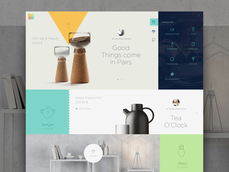
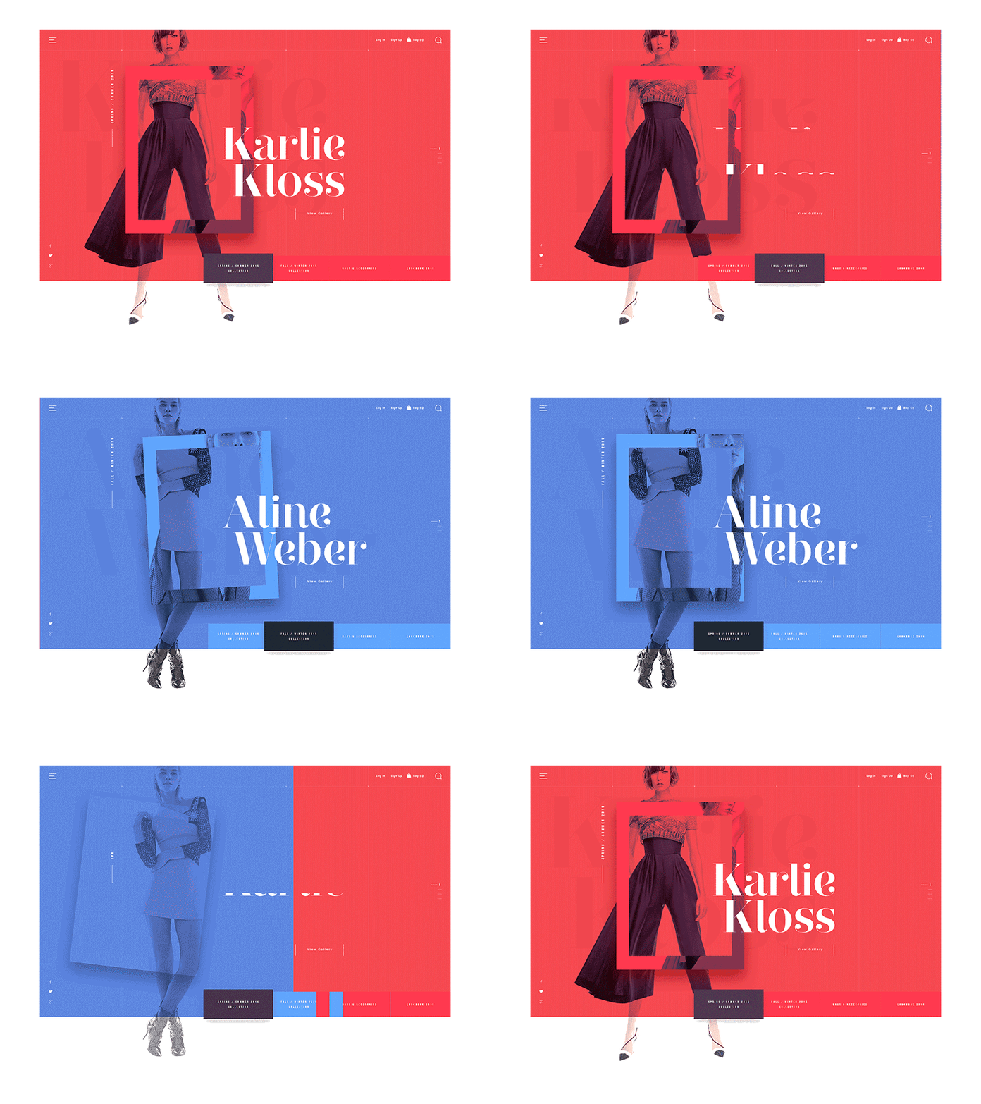
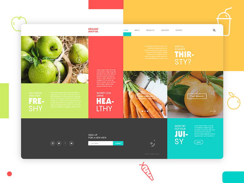
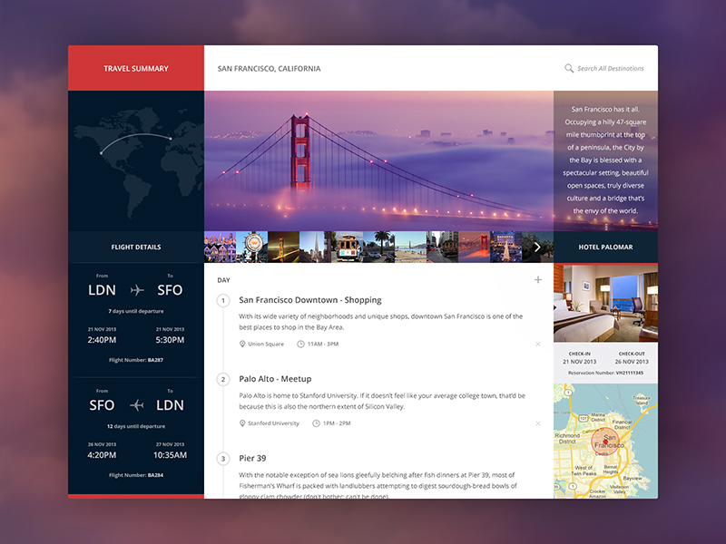
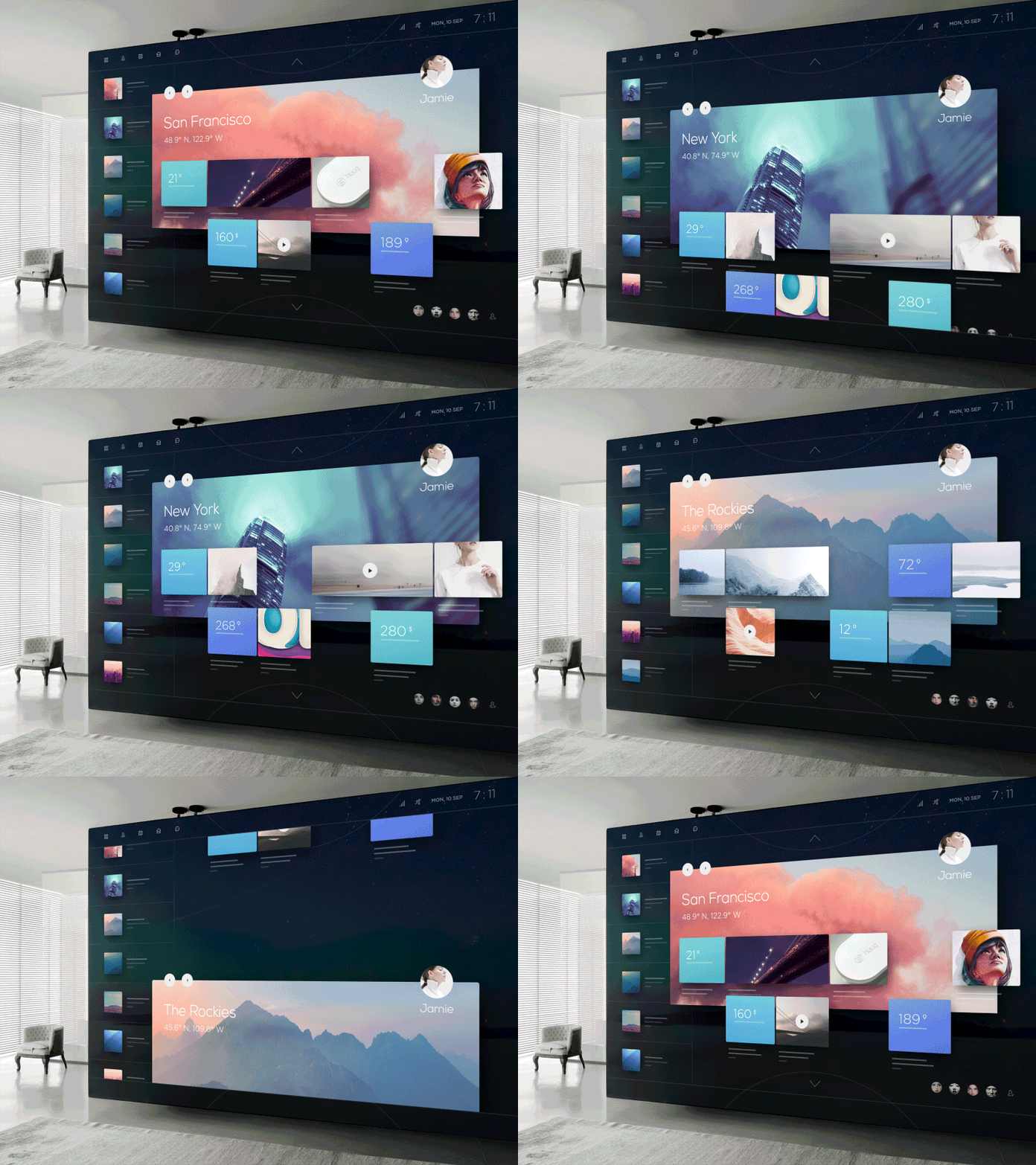
I especially like that last one. It reminds me a bit of the “Metro Tiles” that were all the rage in Windows 8. Not only is this visually impressive, its very flexible too - I could see this working on a phone, a tablet, even on huge TV screens or in augemented reality, as suggested by the designer.
How hard is it to make something like this, given the tools we have today? I wanted to find out and started building a prototype.
I tried to approach this with real production constraints in mind. So the interface had to be responsive, performant and accessible. (It’s not required to be pixel-perfect everywhere though, cause you know - that’s not a real thing.)
Here’s how it turned out:
You can check out the final result on Codepen.
Since this is just for demo purposes, I did not include fallbacks and polyfills for older browsers. My goal was to test the capabilities of modern CSS here, so not all features have cross-browser support (read below). I found that it works best in recent versions of Firefox or Chrome.
Some of the things that made this interesting:
Layout
Permalink to “Layout”Unsurprisingly, the essential factor for the “Metro Tiles” is the grid. The entire layout logic fits inside this block:
.boxgrid {
    display: grid;
    grid-template-columns: repeat(auto-fit, minmax(150px, 1fr));
    grid-auto-rows: minmax(150px, auto);
    grid-gap: 2rem .5rem;

    &__item {
        display: flex;

        &--wide {
            grid-column: span 2;
        }
        &--push {
            grid-column: span 2;
            padding-left: 50%;
        }
    }
}
The magic is mostly in the second line there. repeat(auto-fit, minmax(150px, 1fr)) handles the column creation responsively, meaning it will fit as many boxes as possible in a row to make sure they align with the outer edges.
The --push modifier class is used to achieve the design’s effect where some boxes “skip” a column. Since this is not easily possible without explicitly setting the grid lines, I opted for this trick: The actual grid cell spans two columns, but only allows enough space for the box to fill have the cell.
Animation
Permalink to “Animation”The original design shows that the section backgrounds and the tile grid move at different speeds, creating the illusion of depth. Nothing extraordinary, just some good old parallax.
While this effect is usually achieved by hooking into the scroll event and then applying different transform styles via Javascript, there’s a better way to do it: entirely in CSS.
The secret here is to leverage CSS 3D transforms to separate the layers along the z-axis. This technique by Scott Kellum and Keith Clark essentially works by using perspective on the scroll container and translateZ on the parallax children:
.parallax-container {
  height: 100%;
  overflow-x: hidden;
  overflow-y: scroll;

  /* set a 3D perspective and origin */
  perspective: 1px;
  perspective-origin: 0 0;
}

.parallax-child {
  transform-origin: 0 0;
  /* move the children to a layer in the background, */
  /* then scale them back up to their original size */
  transform: translateZ(-2px) scale(3);
}
A huge benefit of this method is the improved performance (because it doesn’t touch the DOM with calculated styles), resulting in fewer repaints and an almost 60fps smooth parallax scroll.
Snap Points
Permalink to “Snap Points”CSS Scroll Snap Points are a somewhat experimental feature, but I thought it would fit in nicely with this design. Basically, you can tell the browser scroll to “snap” to certain elements in the document, if it comes in the proximity of such a point. Support is quite limited at the moment, your best bet to see this working is in Firefox or Safari.
There are currently different versions of the spec, and only Safari supports the most recent implementation. Firefox still uses an older syntax. The combined approach looks like this:
.scroll-container {
    /* current spec / Safari */
    scroll-snap-type: y proximity;

    /* old spec / Firefox */
    scroll-snap-destination: 0% 100%;
    scroll-snap-points-y: repeat(100%);
}
.snap-to-element {
    scroll-snap-align: start;
}
The scroll-snap-type tells the scroll container to snap along the y axis (vertical) with a “strictness” of proximity. This lets the browser decide whether a snap point is in reach, and if it’s a good time to jump.
Snap points are a small enhancement for capable browsers, all others simply fall back to default scrolling.
Smooth Scroll
Permalink to “Smooth Scroll”The only Javascript involved is handling the smooth scroll when the menu items on the left, or the direction arrows on top/bottom are clicked. This is progressively enhanced from a simple in-page-anchor link <a href="#vienna"> that jumps to the selected section.
To animate it, I chose to use the vanilla Element.scrollIntoView() method (MDN Docs). Some browsers accept an option to use “smooth” scrolling behaviour here, instead of jumping to the target section right away.
The scroll behaviour property is currrently a Working Draft, so support is not quite there yet. Only Chrome and Firefox support this at the moment - However, there is a polyfill available if necessary.
Think outside the box(es)
Permalink to “Think outside the box(es)”While this is just one interpretation of what’s possible, I’m sure there are countless other innovative ideas that could be realized using the tools we have today. Design trends may come and go as they always have; but I truly think it’s worth remembering that the web is a fluid medium. Technologies are constantly changing, so why should our layouts stay the same? Go out there and explore.
Further Resources
Permalink to “Further Resources”- Invision “Design Genome” Site - Awesome Grid Layout
- Layout Land - Jen Simmons’ Youtube Channel
- The New CSS Layout - Rachel Andrew (A Book Apart)
Semantic JSX
The React JSX Syntax offers a layer of abstraction that's very useful for component-based systems - but it's easy to forget that everything you write ultimately compiles down to HTML.
Encapsulating pieces of UI this way makes it easier to compose larger systems, but it also hides the “bare bones” structure of an application. That’s not a bad thing - but I feel like it’s one of the reasons why people learning frontend today can get a distorted understanding of web development.
If you’re writing code for a browser, you’re writing HTML. That’s why it’s important to know your semantics, and choose the correct element for the task at hand.
Here are a few tips how that can be done.
Look past the surface
Permalink to “Look past the surface”The most important rule when you’re trying to decide which element to use is: don’t rely on the visual appearance. Everything can be made to look like anything else.
Instead, choose elements based on behaviour and meaning. As a quick check, you can try to disable all CSS in your devtools and take a look at the page in the browser’s default style. Does it still make sense?
Quiz Time
Permalink to “Quiz Time”Here’s a little quiz: Imagine you’re building an App for we rate dogs™ that provides a searchable database of dog pics. What element would you use to build the <Tag /> component seen here?

In this case, clicking the tags leads you to another page, so they’re links. Easy.
OK, how about now?

Here, the tags are choices a user can make to select multiple values from a predefined set of options. So the underlying element is actually an <input type="checkbox">. The clickable part is the input label, and the actual checkbox is hidden with CSS.
It might be tempting to use the same <Tag> component for both situations. Have it render a neutral <span> and pass it an onClick function via props to handle the different behaviour.
But not only would that strip the component of its semantics, we would miss out on all the things the browser just does for free when we use the correct tag.
Seize the Props
Permalink to “Seize the Props”One of the strenghts of components is their reusability, and the ability to configure them through props. So why not use that to our advantage?
By using the props supplied to our component, we can conditionally decide which HTML element to render. For example a <Tag href={url} /> could result in a link, while <Tag value={id} /> might render an input. The visual appearance could be the same in both cases, but the context alters the semantic meaning.
Use Buttons
Permalink to “Use Buttons”Most of the time, the element you’re looking for to trigger an arbitrary action is a <button>. Whenever you find yourself attaching an onClick handler to a <div>, think twice. Is that really the best choice?
The same goes for “empty” links that do not change the URL in some way: If you find something like this in your code:
<a href="#" onClick={someFunction}>
Make it a button instead.
If the thing you’re building isn’t supposed to look like a button, again - don’t rely on visual appearance here. “Clickable divs” are often only used because they come with no default styles of their own - but removing those from a button can be achieved in 3 lines of CSS.
By the way, it’s also perfectly valid for a button to wrap a larger block of content. It is not limited to just text or icons.
Mapping Data to JSX
Permalink to “Mapping Data to JSX”Say our dog rating app has an API. You request some data and it gives you something like this:
[
    {
        id: '216df16ca8b1',
        title: 'Shiba Inu',
        image: '/assets/img/shibainu.jpg',
        description: 'Such shibe, very dog. wow',
        url: '/doggos/shiba-inu'
    },
    {
        id: '5ea3621cf16',
        title: 'Alaskan Malamute',
        image: '/assets/img/malamute.jpg',
        description: 'The Malamutes floof is very sof.',
        url: '/doggos/alaskan-malmute'
    },
    {...}
]
Now your job is to transform that data into a card UI.
Most of the time when you want to map() an array of items to a JSX structure, the semantically correct way to do it is a list. Depending on the type of data, this could be an <ol> if the order is important (for example in a comments thread). If not, go with <ul>.
Here’s a useful pattern:
const CardList = ({ items, title }) => (
    <ul className="cardlist" aria-label={title}>
        {items.map(item => (
            <li key={item.id} className="cardlist__item">
                <Card {...item} />
            </li>
        ))}
    </ul>
)

<CardList items={doggos} title="Todays Doggos" />
Why is this better than simply returning an array of <Card />s?
By making this two dedicated components, you can separate layout from content.
The container could be styled as a list, grid, or a slider - and it can dynamically change columns on different breakpoints. The Card component doesn’t have to care about its context. It can just be dropped into any wrapper and adopt its width.
Screenreaders will announce this as “Todays doggos, list, 5 items” or similar.
Fight the Divs
Permalink to “Fight the Divs”As of React v16, you can use <React.Fragment> (or the shorthand <>...</> if you feel like a 1337 hacker). This lets you return multiple sibling DOM nodes without having to wrap them in an unnecessary div. The Fragment does not render to anything tangible in HTML, and you don’t have to pass unique key properties to the elements it contains.
It’s awesome - use it.
return (
    <React.Fragment>
        <h1>Multiple Siblings without a wrapper!</h1>
        <MyComponent />
    </React.Fragment>
)
Further Resources
Permalink to “Further Resources”CSS Grid Admin Dashboard
Good News! CSS Grid has been out for some time now, and browser support is very good. If you're building stuff on the web, this is definitely a tool you should have on your belt.
Not only is grid worth checking out, it’s also ready to be used in production, today. You know - on the real web.

So, what can we build with this? I’ve used grid on several projects now, and I found that it really makes building layouts a lot easier. I’ve put together a small demo here to show possible applications of CSS grids and how to make them work cross-browser.
👉 Only after the code? You can find the full demo on Codepen.
Building an Admin Interface
Permalink to “Building an Admin Interface”We’re going to build a pretty common layout for the backend of an application, where admins or editors can manage their content:

By looking at the design above, we can already imagine the underlying grid. Unlike “regular” websites, these admin screens often have a lot of fixed UI elements that span the entire viewport, and only the main content area is scrollable.
Defining the basic layout is pretty straightforward - we just need to set our rows and columns. Basically, the interface consists of four parts:
- Header
- Navigation
- Main Content Area
- Footer
$admin-header-height: 70px;
$admin-footer-height: 70px;
$admin-nav-width: 250px;

.admin {
  display: grid;
  height: 100vh;

  grid-template-rows:     $admin-header-height 1fr $admin-footer-height;
  grid-template-columns:  $admin-nav-width 1fr;
  grid-template-areas:    "header  header"
                          "nav    main"
                          "footer footer";
}
We can define the heights and widths using the grid-template-rows and grid-template-columns properties. The 1fr (= one fraction) in there is similar to flex-grow: it tells the browser to distribute any leftover space equally to the middle row, so the main content takes up all available space.
Finally, the grid-template-areas is just a convienience rule to let us name the parts of our grid to something a bit more readable. After doing that, we can assign all grid-items to their position on the grid.
.header {
  grid-area: header;
}
.navigation {
  grid-area: nav;
}
// ...you get the idea.
Remember: The visual placement should generally follow the source order, to keep the document accessible.
Nested Grids: The Dashboard
Permalink to “Nested Grids: The Dashboard”We can nest another grid inside our main content area to display the dashboard. This will be a separate grid instance though, not connected to the main layout. (Sidenote: connected grids or “subgrids” are not yet possible, but the spec for it is already in development, and subgrids are likely to land with Grid Level 2).
Here’s a common design pattern where different statistics and widgets are displayed in a card grid:

This time, rather than explicitly defining our rows and columns, we’ll leave that open. We’ll just tell the browser how many columns we want, and to space them out evenly. When more items are placed on the grid, the container can just generate additional grid tracks on the fly. This “implicit” grid will accommodate any amount of content we may want to display.
💡 Pro Tip: By using a CSS custom property for the column count, we can easily switch from a 2-col to a 4-col grid on larger screens.
.dashboard {
  --column-count: 2;

  display: grid;
  grid-template-columns: repeat(var(--column-count), 1fr);
  grid-gap: 2rem;

  &__item {
    // per default, an item spans two columns.
    grid-column-end: span 2;

    // smaller items only span one column.
    &--half {
      grid-column-end: span 1;
    }
    // full-width items span the entire row.
    // the numbers here refer to the first and last grid lines.
    &--full {
      grid-column: 1 / -1;
    }
  }

  @media screen and (min-width: 48rem) {
    --column-count: 4;
  }
}
But what about {legacy browser} ?
Permalink to “But what about {legacy browser} ?”Yes, yes I know, we need to support IE11. We need to support older mobile browsers. That’s why we can’t have nice things.
Fortunately, it’s possible to build a Flexbox fallback and progressively enhance from there! The layout remains usable, and more capable browsers get all that grid goodness 👌.
We dont even need a media query here, as the grid properties will simply override all flexbox definitions, if they’re supported. If not, the browser will ignore them.
.admin {
  // define flexbox fallback first.
  display: flex;
  flex-wrap: wrap;

  // then add the grid definition.
  display: grid;
  ...

  &__header,
  &__footer {
    flex-basis: 100%;
  }
  &__nav {
    flex-basis: $admin-nav-width;
  }
  &__main {
    flex: 1;
  }
}
For the dashboard card grid fallback, things are slightly more complex. We have to account for the missing grid-gap property, so we’ll have to fake the spacing with margins and paddings:
.dashboard {
  display: flex;
  flex-wrap: wrap;
  // offset the outer gutter with a negative margin.
  margin: 0 -1rem;

  &__item {
    flex: 1 1 50%;
    // this will add up to a 2rem gap between items.
    padding: 1rem;
  }
}
Since these fallback gaps will mess with our layout if we do have grid support, we need a small reset to restore the original grid. Detecting support can be done using the @supports rule:
@supports (display: grid) {
  .dashboard {
    margin: 0;
  }
  .dashboard__item {
    padding: 0;
  }
}
👉 Check out the full demo on Codepen!
Further Reading
Permalink to “Further Reading”- Rachel Andrew: “The New CSS Layout” (A book apart)
- Una Kravets: “Grid To Flex”, Common layouts built with grid
- Manuel Matuzović: Progressively Enhancing CSS Layout: From Floats To Flexbox To Grid