Reading List
The Layouts of Tomorrow from Max Böck RSS feed.
The Layouts of Tomorrow
If you’ve been to any web design talk in the last couple of years, you’ve probably seen this famous tweet by Jon Gold:
which one of the two possible websites are you currently designing? pic.twitter.com/ZD0uRGTqqm
— Jon Gold (@jongold) 2. Februar 2016
It mocks the fact that a lot of today’s websites look the same, as they all follow the same standard layout practices that we’ve collectively decided to use. Building a blog? Main column, widget sidebar. A marketing site? Big hero image, three teaser boxes (it has to be three).
When we look back at what the web was like in earlier days, I think there’s room for a lot more creativity in web design today.
Enter CSS Grid
Permalink to “Enter CSS Grid”Grid is the first real tool for layout on the web. Everything we had up until now, from tables to floats to absolute positioning to flexbox - was meant to solve a different problem, and we found ways to use and abuse it for layout purposes.
The point of these new tools is not to build the same things again with different underlying technology. It has a lot more potential: It could re-shape the way we think about layout and enable us to do entirely new, different things on the web.
Now I know it’s hard to get into a fresh mindset when you’ve been building stuff a certain way for a long time. We’re trained to think about websites as header, content and footer. Stripes and boxes.
But to keep our industry moving forward (and our jobs interesting), it’s a good idea to take a step back once in a while and rethink how we do things.
If we didn’t, we’d still be building stuff with spacer gifs and all-uppercase <TABLE> tags. 😉
So, how could things look?
Permalink to “So, how could things look?”I went over to dribbble in search of layout ideas that are pushing the envelope a bit. The kind of design that would make frontend developers like me frown at first sight.
There’s a lot of great work out there - here’s a few of my favorites:
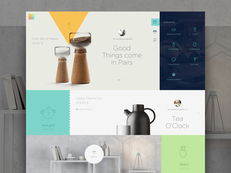
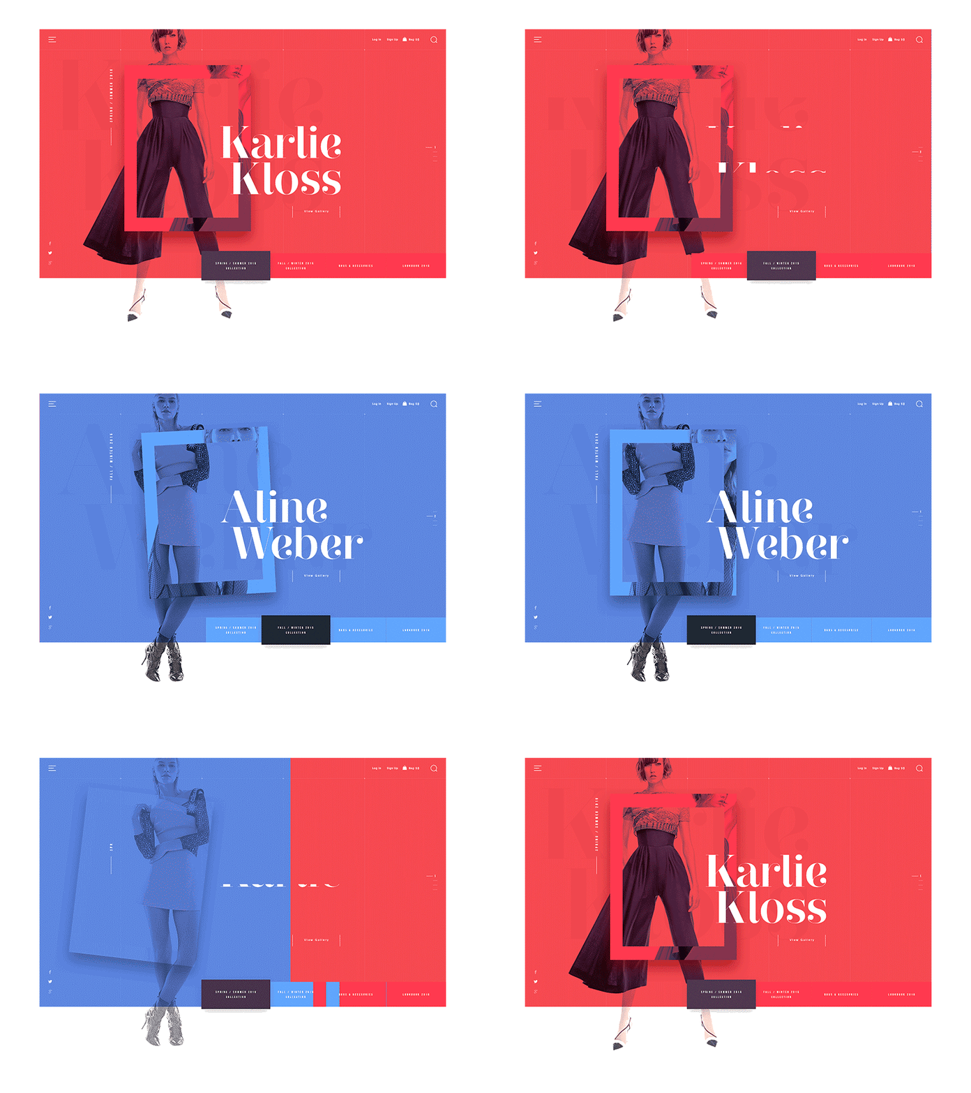
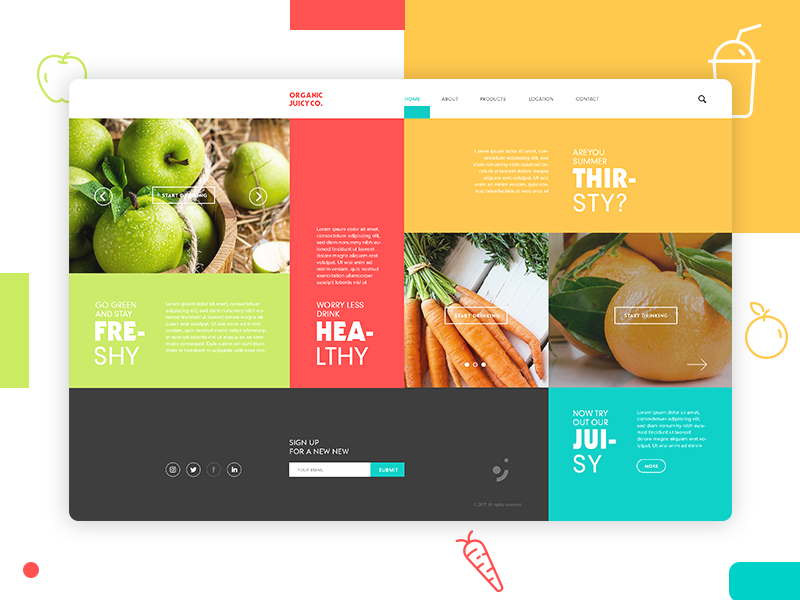
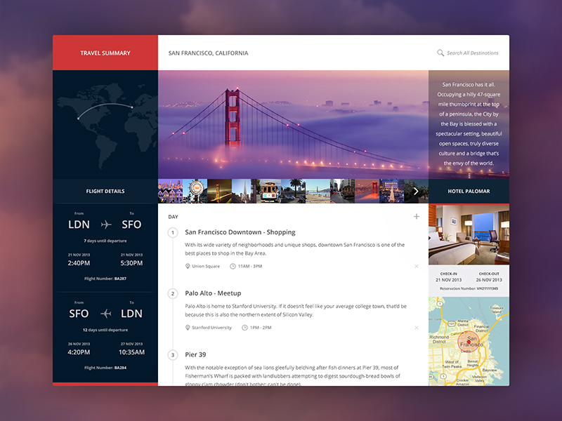
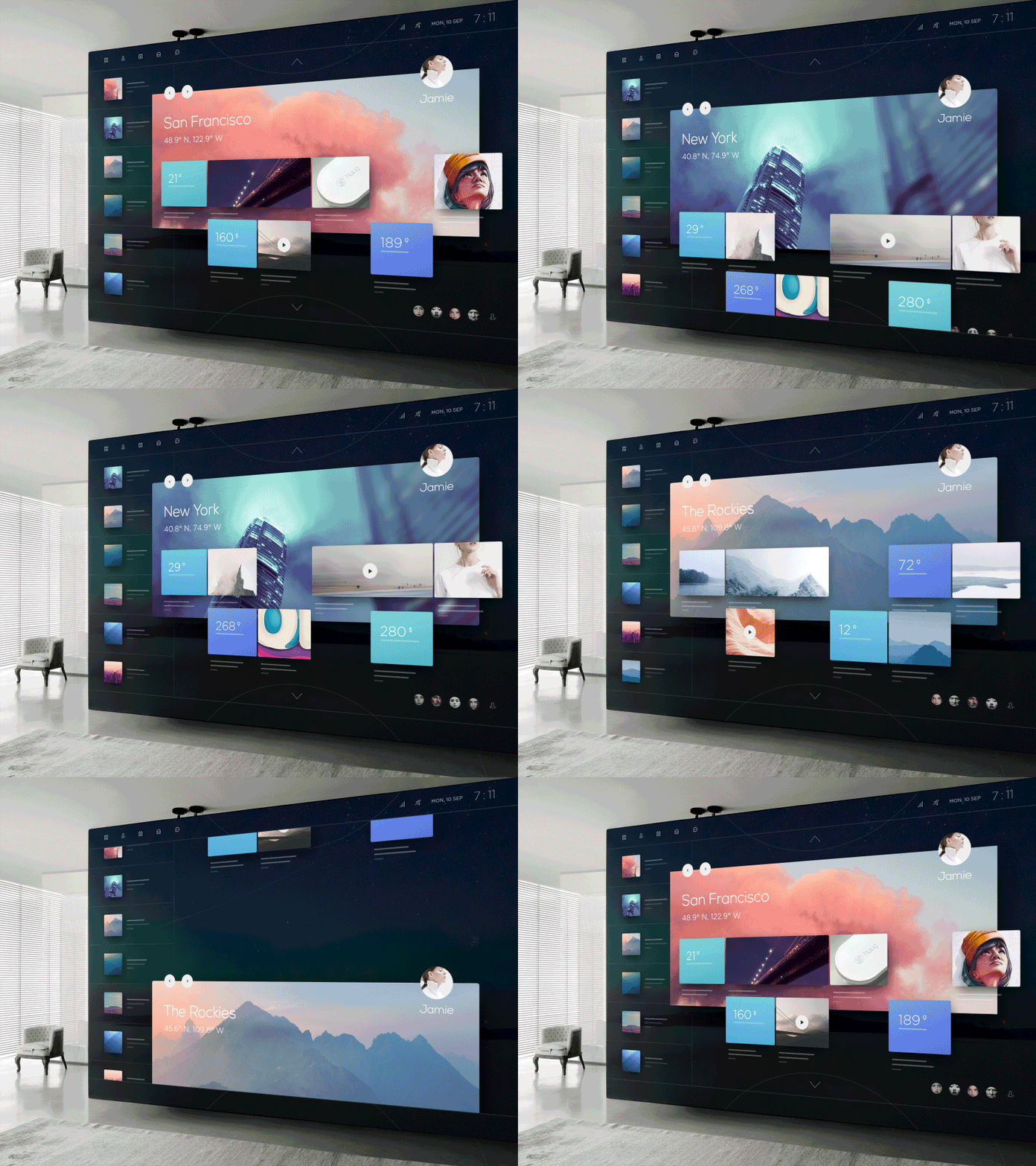
I especially like that last one. It reminds me a bit of the “Metro Tiles” that were all the rage in Windows 8. Not only is this visually impressive, its very flexible too - I could see this working on a phone, a tablet, even on huge TV screens or in augemented reality, as suggested by the designer.
How hard is it to make something like this, given the tools we have today? I wanted to find out and started building a prototype.
I tried to approach this with real production constraints in mind. So the interface had to be responsive, performant and accessible. (It’s not required to be pixel-perfect everywhere though, cause you know - that’s not a real thing.)
Here’s how it turned out:
You can check out the final result on Codepen.
Since this is just for demo purposes, I did not include fallbacks and polyfills for older browsers. My goal was to test the capabilities of modern CSS here, so not all features have cross-browser support (read below). I found that it works best in recent versions of Firefox or Chrome.
Some of the things that made this interesting:
Layout
Permalink to “Layout”Unsurprisingly, the essential factor for the “Metro Tiles” is the grid. The entire layout logic fits inside this block:
.boxgrid {
    display: grid;
    grid-template-columns: repeat(auto-fit, minmax(150px, 1fr));
    grid-auto-rows: minmax(150px, auto);
    grid-gap: 2rem .5rem;

    &__item {
        display: flex;

        &--wide {
            grid-column: span 2;
        }
        &--push {
            grid-column: span 2;
            padding-left: 50%;
        }
    }
}
The magic is mostly in the second line there. repeat(auto-fit, minmax(150px, 1fr)) handles the column creation responsively, meaning it will fit as many boxes as possible in a row to make sure they align with the outer edges.
The --push modifier class is used to achieve the design’s effect where some boxes “skip” a column. Since this is not easily possible without explicitly setting the grid lines, I opted for this trick: The actual grid cell spans two columns, but only allows enough space for the box to fill have the cell.
Animation
Permalink to “Animation”The original design shows that the section backgrounds and the tile grid move at different speeds, creating the illusion of depth. Nothing extraordinary, just some good old parallax.
While this effect is usually achieved by hooking into the scroll event and then applying different transform styles via Javascript, there’s a better way to do it: entirely in CSS.
The secret here is to leverage CSS 3D transforms to separate the layers along the z-axis. This technique by Scott Kellum and Keith Clark essentially works by using perspective on the scroll container and translateZ on the parallax children:
.parallax-container {
  height: 100%;
  overflow-x: hidden;
  overflow-y: scroll;

  /* set a 3D perspective and origin */
  perspective: 1px;
  perspective-origin: 0 0;
}

.parallax-child {
  transform-origin: 0 0;
  /* move the children to a layer in the background, */
  /* then scale them back up to their original size */
  transform: translateZ(-2px) scale(3);
}
A huge benefit of this method is the improved performance (because it doesn’t touch the DOM with calculated styles), resulting in fewer repaints and an almost 60fps smooth parallax scroll.
Snap Points
Permalink to “Snap Points”CSS Scroll Snap Points are a somewhat experimental feature, but I thought it would fit in nicely with this design. Basically, you can tell the browser scroll to “snap” to certain elements in the document, if it comes in the proximity of such a point. Support is quite limited at the moment, your best bet to see this working is in Firefox or Safari.
There are currently different versions of the spec, and only Safari supports the most recent implementation. Firefox still uses an older syntax. The combined approach looks like this:
.scroll-container {
    /* current spec / Safari */
    scroll-snap-type: y proximity;

    /* old spec / Firefox */
    scroll-snap-destination: 0% 100%;
    scroll-snap-points-y: repeat(100%);
}
.snap-to-element {
    scroll-snap-align: start;
}
The scroll-snap-type tells the scroll container to snap along the y axis (vertical) with a “strictness” of proximity. This lets the browser decide whether a snap point is in reach, and if it’s a good time to jump.
Snap points are a small enhancement for capable browsers, all others simply fall back to default scrolling.
Smooth Scroll
Permalink to “Smooth Scroll”The only Javascript involved is handling the smooth scroll when the menu items on the left, or the direction arrows on top/bottom are clicked. This is progressively enhanced from a simple in-page-anchor link <a href="#vienna"> that jumps to the selected section.
To animate it, I chose to use the vanilla Element.scrollIntoView() method (MDN Docs). Some browsers accept an option to use “smooth” scrolling behaviour here, instead of jumping to the target section right away.
The scroll behaviour property is currrently a Working Draft, so support is not quite there yet. Only Chrome and Firefox support this at the moment - However, there is a polyfill available if necessary.
Think outside the box(es)
Permalink to “Think outside the box(es)”While this is just one interpretation of what’s possible, I’m sure there are countless other innovative ideas that could be realized using the tools we have today. Design trends may come and go as they always have; but I truly think it’s worth remembering that the web is a fluid medium. Technologies are constantly changing, so why should our layouts stay the same? Go out there and explore.
Further Resources
Permalink to “Further Resources”- Invision “Design Genome” Site - Awesome Grid Layout
- Layout Land - Jen Simmons’ Youtube Channel
- The New CSS Layout - Rachel Andrew (A Book Apart)