Reading List
The most recent articles from a list of feeds I subscribe to.
Media Queries in Times of @container
With container queries now on the horizon - will we need media queries at all? Is there a future where we build responsive interfaces completely without them?
Ethan, who coined the term responsive web design over a decade ago, has recently said that media-query-less layouts are certainly within bounds:
Can we consider a flexible layout to be “responsive” if it doesn’t use any media queries, but only uses container queries? [...] I’d be inclined to answer: yes, absolutely.
Over at CSS-Tricks, Chris had similar thoughts. He issued a challenge to examine how and where media queries are used today, and if they will still be necessary going forward:
A common refrain, from me included, has been that if we had container queries we’d use them for the vast majority of what we use media queries for today. The challenge is: look through your CSS codebase now with fresh eyes knowing how the @container queries currently work. Does that refrain hold up?
Fair enough.
I took the bait and had a look at some of my projects - and yes, most of what I use @media for today can probably be accomplished by @container at some point. Nevertheless, I came up with a few scenarios where I think media queries will still be necessary.
For page layout
Permalink to “For page layout”While container queries can theoretically be used to control any element, they really shine when applied to reusable, independent components. The canonical example is a card component: a self-contained piece of UI you can put anywhere.
Page layouts, on the other hand, are better suited for media queries in my opinion. Page layouts are usually at the very top level of the DOM, not nested in another container. I’ve never encountered a case where the main page layout had to adapt to any other context than the viewport.
.layout {
    display: grid;
}
@media (min-width: 60em) {
    .layout {
        grid-template-rows: 4rem 1fr auto;
        grid-template-columns: 25% 1fr;
        grid-template-areas:
            "header header"
            "sidebar main"
            "footer footer";
    }
}
For global tokens
Permalink to “For global tokens”Another good usecase for media queries is to set global design tokens, like spacing or font-sizes. With CSS custom properties it’s now much easier to have fine-grain control over global styles for different devices.
For example, you might want to have bigger text and more whitespace on a large TV than you want for a mobile screen. A larger screen means the user’s head will be physically farther away.
It only makes sense to use a media query there - since the reason for the change is the size of the device itself, not the width of any specific element.
:root {
    /* Font Sizes */
    --font-size-headline-l: 1.875rem;
    --font-size-headline-m: 1.75rem;
    --font-size-headline-s: 1.5rem;
    --font-size-copy-l: 1.125rem;
    --font-size-copy-s: 0.875rem;

    /* Global Spacing */
    --spacing-x: 1rem;
    --spacing-y: 1rem;
}
@media (min-width: 48em) {
    :root {
        --font-size-headline-l: 2.5rem;
        --font-size-headline-m: 2rem;
        --font-size-headline-s: 1.75rem;
        --font-size-copy-l: 1.25rem;
        --font-size-copy-s: 1rem;

        --spacing-x: 2rem;
        --spacing-y: 2rem;
    }
}
For user preference and actual “media” queries
Permalink to “For user preference and actual “media” queries”Screen dimensions are not the only things we can detect with media queries. The Media Queries Level 4 Spec (with Level 5 currently a working draft) lists many different queries related to user preference, like:
prefers-reduced-motionprefers-contrastprefers-reduced-transparencyprefers-color-schemeinverted-colors- and others
We can use these to better tailor an experience to the current user’s specific needs.
Other media queries allow for micro-optimizations based on a device’s input method (i.e. touch or mouse):
/* fine pointers (mouse) can hit smaller checkboxes */
@media (pointer: fine) {
  input[type="checkbox"] {
    width: 1rem;
    height: 1rem;
    border-width: 1px;
    border-color: blue;
  }
}

/* coarse pointers (touch) need larger hit areas */
@media (pointer: coarse) {
  input[type="checkbox"] {
    width: 2rem;
    height: 2rem;
    border-width: 2px;
  }
}
Finally, there are actual “media type” queries like @media print that won’t go anywhere. And there are experimental ideas being discussed for new media queries, like this one for “foldable” devices:

:root {
    --sidebar-width: 5rem;
}
/* if there's a single, vertical fold in the device's screen,
   expand the sidebar width to cover the entire left side. */
@media (spanning: single-fold-vertical) {
    :root {
        --sidebar-width: env(fold-left);
    }
}
main {
    display: grid;
    grid-template-columns: var(--sidebar-width) 1fr;
}
BTW: You can read more about this in "The new responsive: Web design in a component-driven world" by Una Kravets.
For fixed-to-window stuff
Permalink to “For fixed-to-window stuff”Components that are taken out of the normal document flow don’t have to care about their containers. Some UI elements are fixed to the viewport itself, usually oriented along an edge of the screen.
Have a look at Twitter’s “Messages” tab at the bottom of the screen for example. Its relevant container is the window, so it makes sense to use a media query here and only apply position: fixed at some breakpoint.
For heights
Permalink to “For heights”The current implementation of @container only allows querying the width of an element (its “inline” axis), not its height.
👉 Update: Miriam tells me that it is possible to query the height of containers, provided they are defined as size rather than inline-size. The exact value name of this is still in flux at the time of writing.
Style adjustments in relation to width are probably the primary use case for most UI elements anyway, but there are still cases where screen height is an issue. Here’s an example from a “hero image” component:
.hero {
    display:flex;
    flex-direction: column;
    height: 100vh;
}
/* if the screen is really tall, don't fill all of it */
@media (min-height: 60em) {
    .hero {
        height: 75vh;
    }
}
Mix Container Queries and Media Queries
Permalink to “Mix Container Queries and Media Queries”While I think container queries will eventually replace most “low level” responsive logic, there are still a lot of good usecases for trusty media queries.
A combination of both techniques will probably be the best way forward. @media can handle the big picture stuff, user preferences and global styles; @container will take care of all the micro-adjustments in the components themselves.
A perfect team!
Container Queries in Web Components
Container Queries are one of the most anticipated new features in CSS. I recently got a chance to play with them a bit and take the new syntax for a spin.
I came up with this demo of a book store. Each of the books is draggable and can be moved to one of three sections, with varying available space. Depending on where it is placed, different styles will be applied to the book. The full source code is up on Codepen. Here’s how it looks:
This demo currently only works in Chrome Canary. Download the latest version, then enable Container Queries under chrome://flags to see them in action.
Here’s what’s going on
Permalink to “Here’s what’s going on”Each of these books is a custom element, or “web component”. They each contain a cover image, a title and an author. In markup they look like this:
<book-element color="#ba423d">
    <img slot="cover" src="/books/1984.avif" alt="cover by shepard fairey" />
    <span slot="title">1984</span>
    <span slot="author">George Orwell</span>
</book-element>
This then gets applied to a template which defines the internal Shadow DOM of the component. The <slot> elements in there will get replaced by the actual content we’re passing in.
<template id="book-template">
    <style></style>
    <article class="book">
        <div class="front">
            <slot name="cover"></slot>
        </div>
        <div class="meta">
            <h2 class="title"><slot name="title"></slot></h2>
            <p class="author"><slot name="author"></slot></p>
        </div>
    </article>
</template>
Alright, nothing too fancy yet, just some basic structure.
The magic happens when we apply some internal styling to this. Everything inside that <style> tag will be scoped to the component - and since styles can not leak out of the shadow DOM and we can’t (easily) style its contents from the outside, we have real component encapsulation.
Container Queries are one of the last few missing puzzle pieces in component-driven design. They enable us to give components intrinsic styles, meaning they can adapt themselves to whatever surroundings they are placed in.
The new key property there is container-type - it lets us define an element as a container to compare container queries against. A value of inline-size indicates that this container will response to “dimensional queries on the inline axis”, meaning we will apply different styles based on its width.
We can also give our container a name using the container-name property. It is optional in this example, but you can think of it in the same way that grid-area lets you define arbitrary names to use as references in your code later.
<template id="book-template">
    <style>
    /* Use Web Component Root as the Layout Container */
    :host {
        display: block;
        container-type: inline-size;
        container-name: book;
    }
    </style>
    ...
</template>
In the bookstore demo, I created three variants that depend on the width of the component’s :host (which translates to the <book-element> itself). I’ve omitted some of the styling for brevity here, but this part is where we define the multi-column or 3D book styles.
/* Small Variant: Simple Cover + Title */
@container (max-width: 199px) {
    .book {
        padding: 0;
    }
}
/* Medium Variant: Multi-Column, with Author */
@container (min-width: 200px) and (max-width: 399px) {
    .book {
        display: grid;
        grid-template-columns: 1fr 1fr;
        gap: 1rem;
    }
}
/* Large Variant: 3D Perspective */
@container (min-width: 400px) {
    .book {
        position: relative;
        transform-style: preserve-3d;
        transform: rotateY(-25deg);
    }
}
By adding Dragula.js to enable drag-and-drop functionality, we can then move the individual components around. As soon as they’re moved to a different section in the DOM, its internal styles are re-calculated to match the new environment, and the corresponding CSS block is applied. Magic!
The Bento Box Idea
Permalink to “The Bento Box Idea”Now theoretically, we could have achieved a similar effect by using the cascade itself. We could for example apply the 3D styles to all .books inside .stage. But that would have some problems:
- it wouldn’t be responsive - if
.stageever gets too narrow, it would break - it would create an unwanted dependency context between parent and child
- it would break component encapsulation and mix layout with content styles
It’s generally a good idea in CSS to separate “layout” from “content” components and let each handle their own specific areas of responsibility. I like to think of Japanese bento boxes as a metaphor for this: a container divided into specific sections that can be filled with anything.
For example, the layout for our bookstore looks like this:
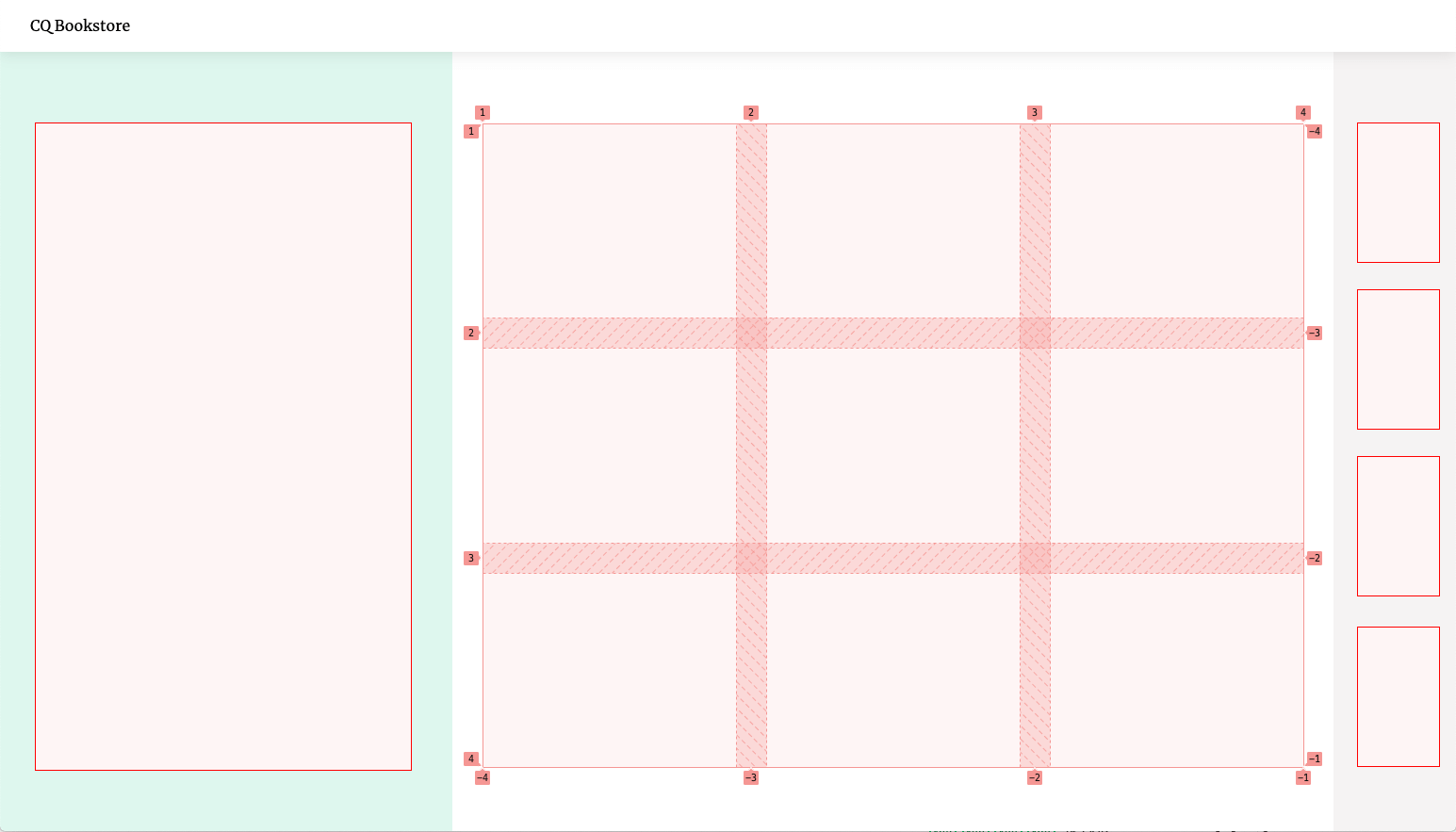
It’s a grid divided into three sections, the middle one containing a nested flexible grid itself.
<div class="layout">
    <div class="stage"></div>
    <main class="content">
        <ul class="itemlist"></ul>
    </main>
    <div class="cart"></div>
</div>
/* main layout sections */
.stage,
.content,
.cart {
padding: var(--spacing);
}
/* nested sub-grid */
.itemlist {
display: grid;
grid-template-columns: repeat(auto-fill, minmax(200px, 1fr));
gap: var(--spacing);
}
/* desktop layout */
@media (min-width: 1024px) {
.layout {
display:grid;
height: 100vh;
grid-template-columns: 480px 1fr 130px;
}
}The parts of the layout are only concerned with the alignment and dimensions of boxes. They have no effect whatsoever on their children other than giving them a certain amount of space to fill. Just like a bento box, it doesn’t care what we put into it, so we could easily re-use the layout for a completely different product. It is content-agnostic.
That’s why Container Queries pair so well with Web Components. They both offer ways to encapsulate logic to build smart, independent building blocks. Once they’re defined, they can be used anywhere.
Container Queries bring us one step closer to “Intrinsic Layouts” and a future of truly independent, component-driven design. Exciting stuff ahead!
Further Reading
Permalink to “Further Reading”- CSS Container Queries - MDN
- Container Queries Explainer & Proposal - Miriam Suzanne
- Component-level art direction with CSS Container Queries - Sara Soueidan
- Discussion about Container Queries in srcset and sizes - CSSWG on Github
Asset Pipelines in Eleventy
"Asset Pipeline" is a fancy way of describing a process that compiles CSS, Javascript or other things you want to transform from a bunch of sources to a production-ready output file.
While some static site generators have a standardized way of handling assets, Eleventy does not. That’s a good thing - it gives you the flexibility to handle this any way you want, rather than forcing an opinionated way of doing things on you that might not fit your specific needs.
That flexibility comes at a price though: you need to figure out your preferred setup first. I’ve tinkered with this a lot, so I wanted to share my learnings here. BTW: My personal setup “Eleventastic” is also available on Github.
The most common requirement for an asset pipeline is to build CSS and Javascript. That process can have different flavors - maybe you need to compile your stylesheets through Sass or PostCSS? Maybe you want Tailwind? Maybe your Javascript is “transpiled” in Babel (translated from modern ES6 to the more compatible ES5 syntax) or bundled by webpack? Or maybe you want to do something entirely different, like build SVG icon sprites or optimize images?
Whatever you want to achieve, it usually involves plugging some tool into your Eleventy workflow. I’ve looked at several ways to tackle that problem - here are a few possible approaches you can take.
NPM scripts for everything
Permalink to “NPM scripts for everything”One solution is to let Eleventy handle just the SSG part (producing HTML) and define other processes to take care of your assets outside of it. The most common way to do this is through npm scripts. If you’re not familiar with these, they are essentially shortcuts to run node commands, defined in your package.json file.
Some examples using this approach:
- Hylia by Andy Bell
- 11ty-netlify-jumpstart by Stephanie Eckles
- pack11ty by Nicolas Hoizey
So if you wanted to i.e. compile your CSS from a bunch of Sass files, you could set up your NPM scripts like this:
// package.json

"scripts": {
  "watch:sass": "sass --watch _src/sass:_site/assets/styles",
  "build:sass": "sass _src/sass:_site/assets/styles",
  "watch:eleventy": "eleventy --serve",
  "build:eleventy": "eleventy",
  "start": "npm-run-all build:sass --parallel watch:eleventy watch:sass",
  "build": "npm-run-all build:eleventy build:sass"
}
The watch:sass and build:sass scripts here both run the Sass compilation command, just with a different configuration depending on context.
With utilities like npm-run-all, you can even run multiple scripts at once. So one “main command” like npm start will run Eleventy and simultaneously start watching your Sass files for changes, and recompile them when they do.
This solution is extremely flexible. There are node tools for everything, and there’s no limit to what you can do. However depending on how complex your build is, the setup can get a bit unwieldy. If you want to manage multiple asset pipelines that have to run in a specific order with a specific configuration, it’s not that easy to keep track of things.
And since each of these scripts is a separate process that runs outside of Eleventy, it has no knowledge about any of them. You can tell Eleventy to watch for changes that these external builds cause, but things can get complex if tasks depend on each other. You can also run into situations where multiple passes are required to achieve the desired output, and since Eleventy can’t optimize for processes outside of itself, large pages can take longer to build.
Manage build tasks with Gulp
Permalink to “Manage build tasks with Gulp”Another popular solution is to use Gulp to manage assets. Although it is not the hottest new tech on the block anymore (pssst: it’s OK to use tools that are older than a week), it’s still a perfect tool for the job: Gulp takes in a bunch of source files, runs them through any transformations you want and spits out static files at the end. Sounds exactly right!
Some examples using this approach:
- hawksworx.com by Phil Hawksworth
- 11ty-base by Andy Bell
- Smix Eleventy Starter by Ru Singh
Gulp is a node-based task runner lets you define your asset pipelines as functions in a “Gulpfile” like this:
// Gulpfile.js

const gulp = require('gulp')
const sass = require('gulp-sass')

// define sass compilation task
gulp.task('styles', function() {
    return gulp
        .src('/main.scss')
        .pipe(
            sass({
                precision: 10,
                outputStyle: 'expanded'
            }).on('error', sass.logError)
        )
        .pipe(gulp.dest('/assets/styles'))
})

// define script bundling task
gulp.task('scripts', ...)

// Run the different tasks in the asset pipeline
gulp.task('assets', gulp.parallel('styles', 'scripts', 'icons', 'whatever'))
Then you kick things off from a single npm script like this:
"scripts": {
    "assets": "gulp:assets",
    "build": "eleventy --serve",
    "start": "npm-run-all --parallel build assets"
}
This is more readable and versatile than npm scripts, but really you’re doing the same thing under the hood. Gulp runs all the different processes behind the scenes and outputs the finished .css or .js files into our build folder.
The drawback here is that it locks you into the Gulp world of doing things. You often need gulp-wrapper packages for popular tools (e.g. gulp-sass instead of node-sass) to work with the “streaming” nature of it. Plus you’re still running external builds, so all of the pitfalls that come with npm scripts still apply.
One build to rule them all
Permalink to “One build to rule them all”The underlying issue with both these methods is the same: they need external build processes. That’s why some Eleventy setups are going a slightly different route: instead of running asset pipelines on the outside, they teach Eleventy itself to handle them. That way everything runs through a single, integrated process.
Some examples using this approach:
- EleventyOne by Phil Hawskworth
- Supermaya by Mike Riethmuller
- Eleventastic by me
Think of your assets as just another static “page” here. Instead of markdown, a template takes Sass or ES6 as input, and instead of generating HTML, it runs it through a tool like node-sass or webpack and outputs CSS or JS.
By leveraging Javascript templates, you can configure Eleventy to process almost any file you want. To use them, first add the 11ty.js extension to the list of recognized input formats in your .eleventy.js config file:
// .eleventy.js

module.exports = function (eleventyConfig) {
    // add "11ty.js" to your supported template formats
    return {
        templateFormats: ['njk', 'md', '11ty.js']
    }
}
Now you can set up your asset pipeline by making a new template somewhere in your input folder. Let’s call it styles.11ty.js for example. It could look something like this:
// styles.11ty.js

const path = require('path')
const sass = require('node-sass')

module.exports = class {
    // define meta data for this template,
    // just like you would with front matter in markdown.
    async data() {
        return {
            permalink: '/assets/styles/main.css',
            eleventyExcludeFromCollections: true,
            entryFile: path.join(process.cwd(), '/main.scss')
        }
    }

    // custom method that runs Sass compilation
    // and returns CSS as a string
    async compileSass(options) {
        return new Promise((resolve, reject) => {
            const callback = (error, result) => {
                if (error) reject(error)
                else resolve(result.css.toString())
            }
            return sass.render(options, callback)
        })
    }

    // this function is mandatory and determines the contents of the
    // generated output file. it gets passed all our "front matter" data.
    async render({ entryFile }) {
        try {
            return await this.compileSass({ file: entryFile })
        } catch (error) {
            throw error
        }
    }
}
The permalink property here lets you define which file the template generates and where to put it. You can use any type of data as input, then transform it somehow and return it in the render method. We’ve essentially done the same thing as defining a Sass task in Gulp, but this time it’s part of the Eleventy build itself!
This gives you even more control over the process. For example - if the compilation fails, you can use that information in the build. You can catch errors in the Sass code and display a message as an overlay in Eleventy’s dev server:

Check out the Eleventastic source to see how to achieve this. (HT to “Supermaya” by Mike Riethmuller for the idea)
A single template can also build multiple files this way. Using Eleventy’s pagination feature, you can i.e. generate different Javascript bundles from different source files:
// scripts.11ty.js

const ENTRY_POINTS = {
    app: 'app.js',
    comments: 'comments/index.js',
    search: 'search/index.js'
}

module.exports = class {
    // again, the data() function does esentially the same
    // as defining front matter in a markdown file.
    async data() {
        return {
            // define a custom property "entryPoints" first
            entryPoints: ENTRY_POINTS,

            // then take each of the files in "entryPoints"
            // and process them separately as "bundleName"
            pagination: {
                data: 'entryPoints',
                alias: 'bundleName',
                size: 1
            },

            // for each bundle, output a different Javascript file
            permalink: ({ bundleName }) => `/assets/scripts/${bundleName}.js`,

            // keep the scripts.11ty.js itself out of collections
            eleventyExcludeFromCollections: true
        }
    }

    // a custom helper function that will be called with
    // each separate file the template processes.
    async compileJS(bundleName) {
        const entryPoint = path.join(process.cwd(), ENTRY_POINTS[bundleName])
        // do compilation stuff inhere like
        // run file through webpack, Babel, etc
        // and return the result as a string

        // --- omitted for brevity ---

        return js
    }

    // output the compiled JS as file contents
    render ({ bundleName }) {
        try {
            return await this.compileJS(bundleName)
        } catch (err) {
            console.log(err)
            return null
        }
    }
}
I personally prefer the fully-integrated way of doing things, because it’s easier for my brain to think of assets this way. HTML, CSS, JS, SVG: it’s all handled the same. However, your personal preference might differ. That’s OK - there really is no “right way” of doing this.
The beauty of unopinionated tools like Eleventy is that you get to choose what fits you best. If it works, it works! 😉
Medium-Style Share Highlights in Eleventy
I took a stab at building a plugin for Eleventy that lets me highlight selected pieces of text and provide users with an easy way to share them.
This feature was first made popular by Medium, where authors can pick a “top highlight” in a post and hovering it will show a tooltip with sharing options. I wanted something like this for independent blogging too, so I came up with a custom solution.
Here’s how that looks in action:
How it works
Permalink to “How it works”The base of this feature is a <mark> tag wrapped in a custom <share-highlight> element.
If the Web Share API is supported (currently in Safari, Edge and Android Chrome), clicking the element will bring up your share options and insert the quoted text and a link to the current page. You can share it on any platform that registers as a share target.

If the API is not supported, the component will fall back to sharing on Twitter via tweet intent URL. The tooltip will show the Twitter icon and clicking the highlight opens a new tab with a pre-filled tweet:

How to use it
Permalink to “How to use it”If you want to use this on your own site, follow these steps. (keep in mind that this is an early version though, and there are probably still some issues to sort out.)
- Download the plugin with NPM by running
npm i eleventy-plugin-share-highlight --saveon the command line in your project’s root folder (where the package.json file is). - Add the plugin to your
.eleventy.jsconfiguration file:
// .eleventy.js
const pluginShareHighlight = require('eleventy-plugin-share-highlight');

module.exports = function (eleventyConfig) {
    eleventyConfig.addPlugin(pluginShareHighlight, {
        // optional: define the tooltip label.
        // will be "Share this" if omitted.
        label: "Teilen"
    })
}- This will register the
highlightshortcode. You can use it in your templates or markdown files like this:
<!-- blogpost.md -->
{% highlight %}Here's some highlighted text you can share!{% endhighlight %}
This will highlight the containing text in a <mark> tag and wrap it in the custom element <share-highlight>. So the output HTML will look something like this:
<share-highlight label="Share this">
    <mark>Here's some highlighted text you can share!</mark>
<share-highlight>
If Javascript or Custom Elements are not supported, or if your post is displayed e.g. in an RSS reader, the <mark> tag will still be valid and give the highlighted text the correct semantics.
- To further enhance that with the instant sharing function, you need to add the custom element definition first. Depending on your setup, you can either include that as part of a bundle by importing it directly:
import 'eleventy-plugin-share-highlight/share-highlight'…or copy the file and add it directly to your HTML with something like:
<head>
    <script src="/js/share-highlight.js" async defer></script>
</head>- To style the highlight, add this piece of CSS and customize it to match your design:
/* general styles for text highlight */
mark {
    background-color: yellow;
}
/* styling if webcomponent is supported */
share-highlight {
    /* default state */
    --share-highlight-text-color: inherit;
    --share-highlight-bg-color: yellow;
    /* hover/focus state */
    --share-highlight-text-color-active: inherit;
    --share-highlight-bg-color-active: orange;
    /* tooltip */
    --share-highlight-tooltip-text-color: white;
    --share-highlight-tooltip-bg-color: black;
}
Accessibility Considerations
Permalink to “Accessibility Considerations”This is my first Eleventy plugin and also my first web component. I’m fairly confident that the Eleventy part is sound, but I don’t have much experience with web components, and I have some concerns.
My biggest issue with this is accessibility. I want the element to be keyboard-accessible, so I made it focusable and added keyboard listeners to trigger it with the Enter key. The tooltip label also doubles as the aria-label property for the component, but I don’t quite know how screenreaders handle custom elements with no inherent semantics.
I guess the cleanest option would be to use an actual <button> to trigger the share action, but I also need the element to be inline-level, so the highlighting doesn’t break text flow.
If you know your way around webcomponents and have a suggestion on how to improve this thing, please feel free to submit a PR!
Space Jam
The iconic 1996 "Space Jam" website was recently relaunched to promote the new movie. Thankfully, the developers still kept the old site around to preserve its intergalactic legacy.
It’s not often that a website stays up mostly unchanged for 25 years. So out of curiosity, I ran a quick check on both sites.
Unsurprisingly, the new site is a lot heavier than the original: with 4.673KB vs. 120KB, the new site is about 39 times the size of the old one. That’s because the new site has a trailer video, high-res images and a lot more Javascript:

This is keeping with the general trend of websites growing heavier every year, with the average site weighing in at around 1.900KB now.
But since our connection speeds and device capabilities are significantly better now - that’s fine. Everything is way faster now than it was back in the days of Michael Jordan’s first Looney Tunes adventure.
Is it though? Let’s find out.
Party like it’s 1996
Permalink to “Party like it’s 1996”1996 was a different time. The Spice Girl’s “Wannabe” was in anti-shock discmans everywhere, and the most common network connection was 56k dial-up modems. So of course the original developers had a smaller performance budget to work with, and the site is much lighter. Fair enough - so how long did it take to load the original Space Jam site back then?
I ran a webpagetest with a simulated '96 connection: dial-up on an average desktop computer. Dial-up had a maximum speed of 56 kbit/s, but in reality it came in at something around 40-50 kbit/s.
Here’s how that looked (fire up the dial-up noise in another tab for the full experience):
Test Summary | Film Strip View
We can see the first content (the “press box shuttle” menu item) after 4 seconds. The other menu items -all separate GIF images- come in slowly after that. Since the HTML renders as soon as it is parsed, you could theoretically already click on the items before the rest of the page has finished though. The whole site is done after 28.1 seconds in this test.
Back to the Future: 2021
Permalink to “Back to the Future: 2021”Now let’s look at the current, futuristic state of the web. Luckily we don’t use dial-up anymore. The most common connection these days is a mobile 3G network, and the most common device is an Android phone (a Moto G4 in this test). A typical 3G connection comes in at around 1.5 Mbp/s, so it is roughly 30 times faster than dial-up. This shouldn’t take long:
Test Summary | Film Strip View
Funnily enough, the first meaningful paint also shows up after about 4 seconds. It’s not actual content though, it’s the loading screen, informing us that we’ve now loaded 0% of the site.
We reach 100% at 12 seconds, but the first real piece of content is not rendered until 21.5 seconds: it’s a youtube video in a modal window. The site is finally ready after 26.8 seconds, although actually playing the video would take some more loading time.
Results
Permalink to “Results”Right. So after 25 years of technological progress, after bringing 4.7 billion people in the world online, after we just landed a fifth robot on Mars, visiting the Space Jam website is now 1.3 seconds faster. That seems… underwhelming.
__
I know that this is just a movie promo site. And of course the requirements for a website are different now - people expect rich content. But I think this speaks to a larger point:
We just keep filling the available space, jamming up the pipes in the process so nothing actually gets faster. Well, at least the dial-up sound is gone now.