Reading List
Container Queries in Web Components from Max Böck RSS feed.
Container Queries in Web Components
Container Queries are one of the most anticipated new features in CSS. I recently got a chance to play with them a bit and take the new syntax for a spin.
I came up with this demo of a book store. Each of the books is draggable and can be moved to one of three sections, with varying available space. Depending on where it is placed, different styles will be applied to the book. The full source code is up on Codepen. Here’s how it looks:
This demo currently only works in Chrome Canary. Download the latest version, then enable Container Queries under chrome://flags to see them in action.
Here’s what’s going on
Permalink to “Here’s what’s going on”Each of these books is a custom element, or “web component”. They each contain a cover image, a title and an author. In markup they look like this:
<book-element color="#ba423d">
    <img slot="cover" src="/books/1984.avif" alt="cover by shepard fairey" />
    <span slot="title">1984</span>
    <span slot="author">George Orwell</span>
</book-element>
This then gets applied to a template which defines the internal Shadow DOM of the component. The <slot> elements in there will get replaced by the actual content we’re passing in.
<template id="book-template">
    <style></style>
    <article class="book">
        <div class="front">
            <slot name="cover"></slot>
        </div>
        <div class="meta">
            <h2 class="title"><slot name="title"></slot></h2>
            <p class="author"><slot name="author"></slot></p>
        </div>
    </article>
</template>
Alright, nothing too fancy yet, just some basic structure.
The magic happens when we apply some internal styling to this. Everything inside that <style> tag will be scoped to the component - and since styles can not leak out of the shadow DOM and we can’t (easily) style its contents from the outside, we have real component encapsulation.
Container Queries are one of the last few missing puzzle pieces in component-driven design. They enable us to give components intrinsic styles, meaning they can adapt themselves to whatever surroundings they are placed in.
The new key property there is container-type - it lets us define an element as a container to compare container queries against. A value of inline-size indicates that this container will response to “dimensional queries on the inline axis”, meaning we will apply different styles based on its width.
We can also give our container a name using the container-name property. It is optional in this example, but you can think of it in the same way that grid-area lets you define arbitrary names to use as references in your code later.
<template id="book-template">
    <style>
    /* Use Web Component Root as the Layout Container */
    :host {
        display: block;
        container-type: inline-size;
        container-name: book;
    }
    </style>
    ...
</template>
In the bookstore demo, I created three variants that depend on the width of the component’s :host (which translates to the <book-element> itself). I’ve omitted some of the styling for brevity here, but this part is where we define the multi-column or 3D book styles.
/* Small Variant: Simple Cover + Title */
@container (max-width: 199px) {
    .book {
        padding: 0;
    }
}
/* Medium Variant: Multi-Column, with Author */
@container (min-width: 200px) and (max-width: 399px) {
    .book {
        display: grid;
        grid-template-columns: 1fr 1fr;
        gap: 1rem;
    }
}
/* Large Variant: 3D Perspective */
@container (min-width: 400px) {
    .book {
        position: relative;
        transform-style: preserve-3d;
        transform: rotateY(-25deg);
    }
}
By adding Dragula.js to enable drag-and-drop functionality, we can then move the individual components around. As soon as they’re moved to a different section in the DOM, its internal styles are re-calculated to match the new environment, and the corresponding CSS block is applied. Magic!
The Bento Box Idea
Permalink to “The Bento Box Idea”Now theoretically, we could have achieved a similar effect by using the cascade itself. We could for example apply the 3D styles to all .books inside .stage. But that would have some problems:
- it wouldn’t be responsive - if
.stageever gets too narrow, it would break - it would create an unwanted dependency context between parent and child
- it would break component encapsulation and mix layout with content styles
It’s generally a good idea in CSS to separate “layout” from “content” components and let each handle their own specific areas of responsibility. I like to think of Japanese bento boxes as a metaphor for this: a container divided into specific sections that can be filled with anything.
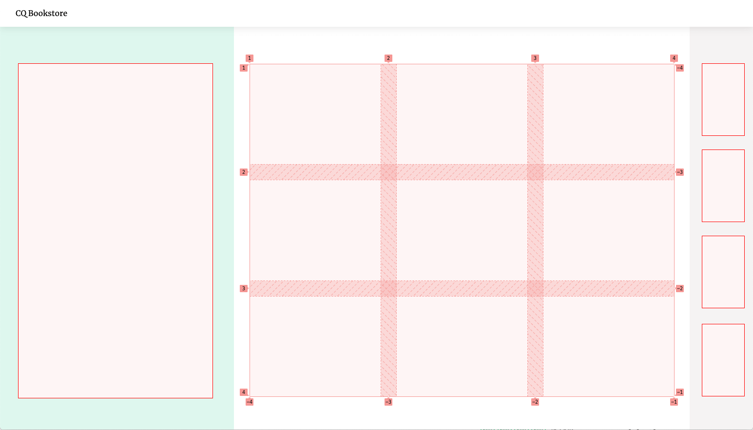
For example, the layout for our bookstore looks like this:

It’s a grid divided into three sections, the middle one containing a nested flexible grid itself.
<div class="layout">
    <div class="stage"></div>
    <main class="content">
        <ul class="itemlist"></ul>
    </main>
    <div class="cart"></div>
</div>
/* main layout sections */
.stage,
.content,
.cart {
padding: var(--spacing);
}
/* nested sub-grid */
.itemlist {
display: grid;
grid-template-columns: repeat(auto-fill, minmax(200px, 1fr));
gap: var(--spacing);
}
/* desktop layout */
@media (min-width: 1024px) {
.layout {
display:grid;
height: 100vh;
grid-template-columns: 480px 1fr 130px;
}
}The parts of the layout are only concerned with the alignment and dimensions of boxes. They have no effect whatsoever on their children other than giving them a certain amount of space to fill. Just like a bento box, it doesn’t care what we put into it, so we could easily re-use the layout for a completely different product. It is content-agnostic.
That’s why Container Queries pair so well with Web Components. They both offer ways to encapsulate logic to build smart, independent building blocks. Once they’re defined, they can be used anywhere.
Container Queries bring us one step closer to “Intrinsic Layouts” and a future of truly independent, component-driven design. Exciting stuff ahead!
Further Reading
Permalink to “Further Reading”- CSS Container Queries - MDN
- Container Queries Explainer & Proposal - Miriam Suzanne
- Component-level art direction with CSS Container Queries - Sara Soueidan
- Discussion about Container Queries in srcset and sizes - CSSWG on Github