Reading List
The most recent articles from a list of feeds I subscribe to.
Google’s $100 Fitbit Air has no screen. The product it is actually selling is a $10-a-month AI health coach.
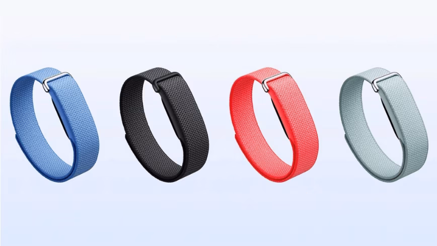
Google spent 2.1 billion dollars buying Fitbit in 2021, three years dismantling the brand, and on Thursday launched a 100 dollar device with no screen, no buttons, and no independent functionality to bring it back. The Fitbit Air is a soft fabric band with a five-gram sensor pack underneath that tracks heart rate, steps, […]
This story continues at The Next Web
Spotify launches Save to Spotify, a command-line tool that allows AI agents to upload AI-generated audio summaries and personal podcasts to a user's account (Terrence O'Brien/The Verge)

![]() Terrence O'Brien / The Verge:
Terrence O'Brien / The Verge:
Spotify launches Save to Spotify, a command-line tool that allows AI agents to upload AI-generated audio summaries and personal podcasts to a user's account — A new command-line tool lets AI agents save audio alongside your other podcasts. … Save to Spotify is a new command-line tool …
World Video Game Hall of Fame inducts Angry Birds, FIFA for 2026 class
Google rebrands Fitbit Premium as Google Health Premium, adding Gemini-powered coaching and other features, and raises its annual price from $79.99 to $99.99 (Adamya Sharma/Android Authority)

![]() Adamya Sharma / Android Authority:
Adamya Sharma / Android Authority:
Google rebrands Fitbit Premium as Google Health Premium, adding Gemini-powered coaching and other features, and raises its annual price from $79.99 to $99.99 — The rebranded service includes Gemini-powered coaching, adaptive fitness plans, deeper sleep insights, and more. — • — TL;DR