Reading List
The most recent articles from a list of feeds I subscribe to.
A data model for Git (and other docs updates)
Hello! This past fall, I decided to take some time to work on Git’s documentation. I’ve been thinking about working on open source docs for a long time – usually if I think the documentation for something could be improved, I’ll write a blog post or a zine or something. But this time I wondered: could I instead make a few improvements to the official documentation?
So Marie and I made a few changes to the Git documentation!
a data model for Git
After a while working on the documentation, we noticed that Git uses the terms “object”, “reference”, or “index” in its documentation a lot, but that it didn’t have a great explanation of what those terms mean or how they relate to other core concepts like “commit” and “branch”. So we wrote a new “data model” document!
You can read the data model here for now. I assume at some point (after the next release?) it’ll also be on the Git website.
I’m excited about this because understanding how Git organizes its commit and branch data has really helped me reason about how Git works over the years, and I think it’s important to have a short (1600 words!) version of the data model that’s accurate.
The “accurate” part turned out to not be that easy: I knew the basics of how Git’s data model worked, but during the review process I learned some new details and had to make quite a few changes (for example how merge conflicts are stored in the staging area).
updates to git push, git pull, and more
I also worked on updating the introduction to some of Git’s core man pages. I quickly realized that “just try to improve it according to my best judgement” was not going to work: why should the maintainers believe me that my version is better?
I’ve seen a problem a lot when discussing open source documentation changes where 2 expert users of the software argue about whether an explanation is clear or not (“I think X would be a good way to explain it! Well, I think Y would be better!”)
I don’t think this is very productive (expert users of a piece of software are notoriously bad at being able to tell if an explanation will be clear to non-experts), so I needed to find a way to identify problems with the man pages that was a little more evidence-based.
getting test readers to identify problems
I asked for test readers on Mastodon to read the current version of documentation and tell me what they find confusing or what questions they have. About 80 test readers left comments, and I learned so much!
People left a huge amount of great feedback, for example:
- terminology they didn’t understand (what’s a pathspec? what does “reference” mean? does “upstream” have a specific meaning in Git?)
- specific confusing sentences
- suggestions of things things to add (“I do X all the time, I think it should be included here”)
- inconsistencies (“here it implies X is the default, but elsewhere it implies Y is the default”)
Most of the test readers had been using Git for at least 5-10 years, which I think worked well – if a group of test readers who have been using Git regularly for 5+ years find a sentence or term impossible to understand, it makes it easy to argue that the documentation should be updated to make it clearer.
I thought this “get users of the software to comment on the existing documentation and then fix the problems they find” pattern worked really well and I’m excited about potentially trying it again in the future.
the man page changes
We ended updating these 4 man pages:
git add(before, after)git checkout(before, after)git push(before, after)git pull(before, after)
The git push and git pull changes were the most interesting to me: in
addition to updating the intro to those pages, we also ended up writing:
- a section describing what the term “upstream branch” means (which previously wasn’t really explained)
- a cleaned-up description of what a “push refspec” is
Making those changes really gave me an appreciation for how much work it is
to maintain open source documentation: it’s not easy to write things that are
both clear and true, and sometimes we had to make compromises, for example the sentence
“git push may fail if you haven’t set an upstream for the current branch,
depending on what push.default is set to.” is a little vague, but the exact
details of what “depending” means are really complicated and untangling that is
a big project.
on the process for contributing to Git
It took me a while to understand Git’s development process. I’m not going to try to describe it here (that could be a whole other post!), but a few quick notes:
- Git has a Discord server with a “my first contribution” channel for help with getting started contributing. I found people to be very welcoming on the Discord.
- I used GitGitGadget to make all of my contributions. This meant that I could make a GitHub pull request (a workflow I’m comfortable with) and GitGitGadget would convert my PRs into the system the Git developers use (emails with patches attached). GitGitGadget worked great and I was very grateful to not have to learn how to send patches by email with Git.
- Otherwise I used my normal email client (Fastmail’s web interface) to reply to emails, wrapping my text to 80 character lines since that’s the mailing list norm.
I also found the mailing list archives on lore.kernel.org hard to navigate, so I hacked together my own git list viewer to make it easier to read the long mailing list threads.
Many people helped me navigate the contribution process and review the changes: thanks to Emily Shaffer, Johannes Schindelin (the author of GitGitGadget), Patrick Steinhardt, Ben Knoble, Junio Hamano, and more.
(I’m experimenting with comments on Mastodon, you can see the comments here)
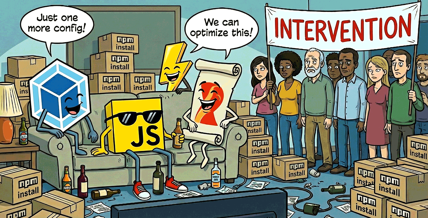
Web dependencies are broken. Can we fix them?
Abstraction is the cornerstone of modern software engineering. Reusing logic and building higher-level solutions from lower-level building blocks is what makes all the technological wonders around us possible. Imagine if every time anyone wrote a calculator they also had to reinvent floating-point arithmetic and string encoding!
And yet, the web platform has outsourced this fundamental functionality to third-party tooling. As a result, code reuse has become a balancing of tradeoffs that should not have existed in the first place.
In NodeJS, you just npm install and reference specifiers straight away in your code.
Same in Python, with pip install.
Same in Rust with cargo add.
In healthy ecosystems you don’t ponder how or whether to use dependencies.
The ecosystem assumes dependencies are normal, cheap, and first-class.
You just install them, use them, and move on.
“Dependency-free” is not a badge of honor.
Instead, dependency management in the web platform consists of bits and bobs of scattered primitives, with no coherent end-to-end solution. Naturally, bundlers such as Webpack, rollup, and esbuild have picked up the slack, with browserify being the one that started it all, in 2012.
There is nothing wrong with bundlers when used as a performance optimization to minimize waterfall effects and overhead from too many HTTP requests. You know, what a bundler is supposed to do. It is okay to require advanced tools for advanced needs, and performance optimization is generally an advanced use case. Same for most other things bundlers and build tools are used for, such as strong typing, linting, or transpiling. All of these are needs that come much later than dependency management, both in a programmer’s learning journey, as well as in a project’s development lifecycle.
Dependency management is such a basic and ubiquitous need, it should be a part of the platform, decoupled from bundling. Requiring advanced tools for basic needs is a textbook usability cliff. In other ecosystems, optimizations happen (and are learned) after dependency resolution. On the web, optimization is the price of admission! This is not normal.
Bundlers have become so ubiquitous that most JS developers cannot even imagine deploying code without them. READMEs are written assuming a bundler, without even mentioning the assumption. It’s just how JS is consumed. My heart breaks for the newbie trying to use a drag and drop library, only to get mysterious errors about specifiers that failed to resolve.
However, bundling is not technically a necessary step of dependency management. Importing files through URLs is natively supported in every browser, via ESM imports. HTTP/2 makes importing multiple small files far more reasonable than it used to be — at least from a connection overhead perspective. You can totally get by without bundlers in a project that doesn’t use any libraries.
But the moment you add that first dependency, everything changes. You are suddenly faced with a huge usability cliff: which bundler to use, how to configure it, how to deploy with it, a mountain of decisions standing between you and your goal of using that one dependency. That one drag and drop library. For newcomers, this often comes very early in their introduction to the web platform, and it can be downright overwhelming.
Dependencies without bundlers, today?
It is technically possible to use dependencies without bundlers, today. There are a few different approaches, and — I will not sugarcoat it — they all suck.
There are three questions here:
- Use specifiers or URLs?
- How to resolve specifiers to URLs?
- Which URL do my dependencies live at?
There is currently no good answer to any of them, only fragile workarounds held together by duct tape.
Using a dependency should not need any additional song and dance besides “install this package” + “now import it here”. That’s it. That’s the minimum necessary to declare intent. And that’s precisely how it works in NodeJS and other JS runtimes. Anything beyond that is reducing signal-to-noise ratio, especially if it needs to be done separately for every project or worse, for every dependency.
You may need to have something to bite hard on while reading the next few sections. It’s going to be bad.
Rawdogging node_modules/ imports
Typically, package managers like npm take care of deduplicating compatible package versions and may use a directory like node_modules to install packages.
In theory, one could deploy node_modules/ as part of their website and directly reference files in client-side JS.
For example, to use Vue:
import { createApp } from "../node_modules/vue/dist/vue.esm-browser.js";
It works out of the box, and is a very natural thing to try the first time you install a package and you notice node_modules.
Great, right?
No. Not great.
First, deploying your entire node_modules directory is both wasteful, and a security risk. In fact, most serverless hosts (e.g. Netlify or Vercel) automatically remove it from the publicly deployed files after the build is finished.
Additionally, it violates encapsulation: paths within a package are generally seen as an implementation detail of the package itself, and packages expose specifier exports like vue or colorjs.io/fn that they map to internal paths.
If you decide to circumvent this and link to files directly, you now need to update your import paths whenever you update the package.
It is also fragile, as not every module is installed directly in node_modules/ — though those explicitly marked as app dependencies are.
Importing from public CDNs
Another common path is importing from CDNs like Unpkg and JSDelivr. For Vue, it would look like this:
import { createApp } from "https://unpkg.com/vue@3/dist/vue.esm-browser.js";
It’s quick and easy. Nothing to install or configure! Great, right?
No. Not great.
It is always a bad idea to introduce a dependency on a whole other domain you do not control, and an even worse one when linking to executable code.
First, there is the obvious security risk. Unless you link to a specific version, down to the patch number and/or use SRI, the resource could turn malicious overnight under your nose if the package is compromised. And even if you link to a specific version, there is always the risk that the CDN itself could get compromised. Who remembers polyfill.io?
But even supply-chain attacks aside, any third-party domain is an unnecessary additional point of failure. I still remember scrambling to change JSDelivr URLs to Unpkg during an outage right before one of my talks, or having to hunt down all my repos that used RawGit URLs when it sunset, including many libraries.
The DX is also suboptimal.
You lose the immediacy and resilience of local, relative paths.
Without additional tooling (Requestly, hosts file edits, etc.), you now need to wait for CDN roundtrips even during local development.
Wanted to code on a flight?
Good luck.
Needed to show a live demo during a talk, over clogged conference wifi?
Maybe sacrifice a goat to the gods first.
And while they maintain encapsulation slightly better than raw file imports, as they let you reference a package by its name for its default export,
additional specifiers (e.g. packagename/fn) typically still require importing by file path.
“But with public CDNs, I benefit from the resource having already been cached by another website the user visited!”
Oh my sweet summer child.
I hate to be the one to break it to you, but no, you don’t, and that has been the case since about 2020.
Double keyed caching obliterated this advantage.
node_modules imports locally + rewrite to CDN remotely
A quick and dirty way to get local URLs for local development and CDN URLs for the remote site is to link to relative ./node_modules URLs, and add a URL rewrite to a CDN if that is not found.
E.g. with Netlify rewrites this looks like this:
node_modules/:modulename/* https://cdn.jsdelivr.net/npm/:modulename@latest/:splat 301
Since node_modules is not deployed, this will always redirect on the remote URL,
while still allowing for local URLs during development.
Great, right?
No. Not great.
Like the mythical hydra, it solves one problem and creates two new ones.
First, it still carries many of the same issues of the approaches it combines:
- Linking to CDNs is inherently insecure
- It breaks encapsulation of the dependencies
Additionally, it introduces a new problem: the two files need to match, but the naïve approach above would always just link to the latest version.
Sure, one could alleviate this by building the _redirects file with tooling, to link to specific versions, read from package-lock.json.
But the point is not that it’s insurmountable, but that it should not be this hard.
Copy packages or exports to local directory
Another solution is a lightweight build script that copies either entire packages or specific exports into a directory that will actually get deployed. When dependencies are few, this can be as simple as an npm script:
{
	"scripts": {
		"lib": "cp node_modules/vue/dist/vue.esm-browser.js common/lib/vue.js",
		"build": "npm run lib"
	}
}
So now we have our own nice subset of node_modules/ and we don’t depend on any third-party domains.
Great, right?
No. Not great.
Just like most other solution, this still breaks encapsulation, forcing us to maintain a separate, ad-hoc index of specifiers to file paths.
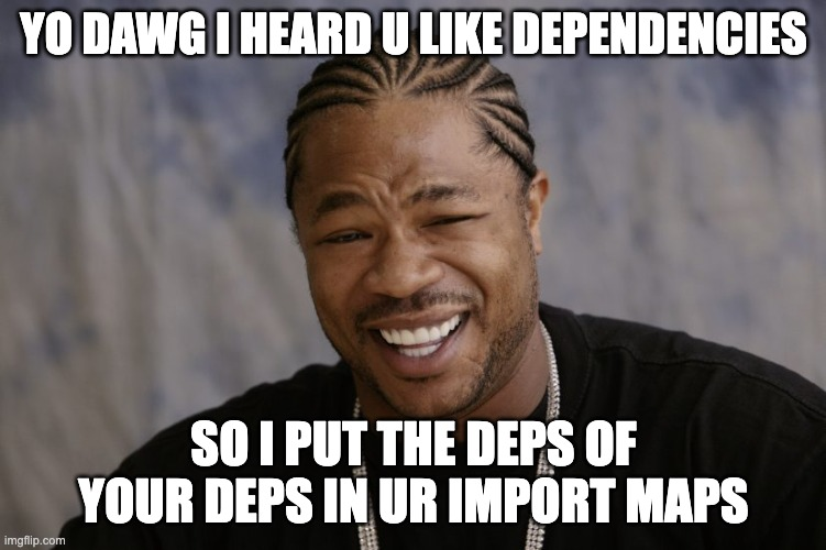
Additionally, it has no awareness of the dependency graph. Dependencies of dependencies need to be copied separately. But wait a second. Did I say dependencies of dependencies? How would that even work?
Dependencies that use dependencies
In addition to their individual flaws, all of the solutions above share a major flaw: they can only handle importing dependency-free packages. But what happens if the package you’re importing also uses dependencies? It gets unimaginably worse my friend, that’s what happens.
There is no reasonable way for a library author to link to dependencies without excluding certain consumer workflows. There is no local URL a library author can use to reliably link to dependencies, and CDN URLs are highly problematic. Specifiers are the only way here.
So the moment you include a dependency that uses dependencies, you’re forced into specifier-based dependency management workflows, whether these are bundlers, or import map flavored JSON vomit in every single HTML page (discussed later).
“Browser” bundles
As a fig leaf, libraries will often provide a “browser” bundle that consumers can import instead of their normal dist, which does not use specifiers.
This combines all their dependencies into a single dependency-free file that you can import from a browser.
This means they can use whatever dependencies they want, and you can still import that bundle using regular ESM imports in a browser, sans bundler.
Great, right?
No. Not great.
It’s called a bundle for a reason. It bundles all their dependencies too, and now they cannot be shared with any other dependency in your tree, even if it’s exactly the same version of exactly the same package. You’re not avoiding bundling, you’re outsourcing it, and multiplying the size of your JS code in the process.
And if the library author has not done that, you’re stuck with little to do, besides a CDN that rewrites specifiers on the fly like esm.sh, with all CDN downsides described above.
As someone who regularly releases open source packages (some with billions of npm installs), I find this incredibly frustrating. I want to write packages that can be consumed by people using or not using bundlers, without penalizing either group, but the only way to do that today is to basically not use any dependencies. I cannot even modularize my own packages without running into this! This doesn’t scale.
But won’t import maps solve all our problems?
Browsers can import specifiers, as long as the mapping to a URL is explicitly provided through an import map. Import maps look like this:
<script type="importmap">
{
	"imports": {
		"vue": "./node_modules/vue/dist/vue.runtime.esm-bundler.js",
		"lodash": "./node_modules/lodash-es/lodash.js",
	}
}
</script>
Did you notice something? Yes, this is an HTML block. No, I cannot link to an import map that lives in a separate file. Instead, I have to include the darn thing in. Every. Single. Page. The moment you decide to use JS dependencies, you now need an HTML templating tool as well. 🙃
“💡 Oh I know, I’ll generate this from my library via DOM methods!” I hear you say.
No, my sweet summer child.
It needs to be present at parse time.
So unless you’re willing to document.write() it (please don’t), the answer is a big flat NOPE.
Edit: I’ve never been happier to be wrong! Turns out injecting import maps via DOM methods actually works in all browsers (as long as it is done by a non-module script that runs before any modules are fetched)! In fact, JSPM 4.0 uses it! 🎉 This is a gamechanger.
“💡 Ok, at least I’ll keep it short by routing everything through a CDN or the same local folder” No, my sweet summer child. Go to sleep and dream of globs and URLPatterns. Then wake up and get to work, because you actually need to specify. Every. Single. Mapping. Yes, transitive dependencies too.
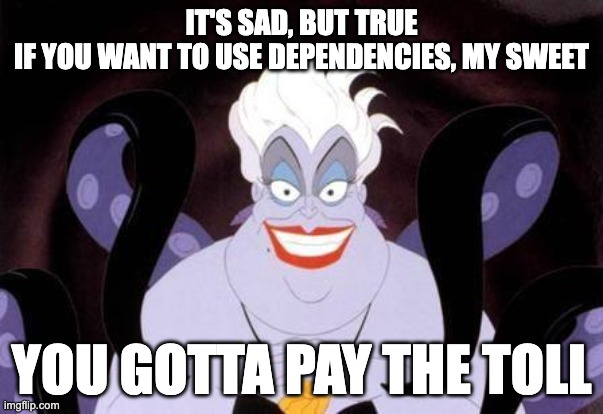
You wanted to use dependencies? You will pay with your blood, sweat, and tears. Or, well, another build tool.
So now I need a build tool to manage the import map, like JSPM. It also needs to talk to my HTML templating tool, which I now had to add so it can spit out these import maps on. Every. Single. HTML. Page.
There are three invariants that import maps violate:
- Locality: Dependency declarations live in HTML, not JS. Libraries cannot declare their own dependencies.
- Composability: Import maps do not compose across dependencies and require global coordination
- Scalability: Mapping every transitive dependency is not viable without tooling
Plus, you still have all of the issues discussed above, because you still need URLs to link to. By trying to solve your problem with import maps, you now got multiple problems.
To sum up, in their current form, import maps don’t eliminate bundlers — they recreate them in JSON form, while adding an HTML dependency and worse latency.
Are bundlers the lesser evil?
Given the current state of the ecosystem, not using bundlers in any nontrivial application does seem like an exercise in masochism. Indeed, per State of JS 2024, bundlers were extremely popular, with Webpack having been used by 9 in 10 developers and having close to 100% awareness! But sorting by sentiment paints a different picture, with satisfaction, interest, and positivity dropping year after year. Even those who never question the status quo can feel it in their gut that this is not okay. This is not a reasonable way to manage dependencies. This is not a healthy ecosystem.
Out of curiosity, I also ran two polls on my own social media. Obviously, this suffers from selection bias, due to the snowball sampling nature of social media, but I was still surprised to see such a high percentage of bundle-less JS workflows:
- Twitter/X poll: 17.6% of respondents
- Mastodon poll: 40% (!) of respondents
I’m very curious how these folks manage the problems discussed here.
Oftentimes when discussing these issues, I get the question “but other languages are completely compiled, why is it a problem here?”. Yes, but their compiler is official and always there. You literally can’t use the language without it.
The problem is not compilation, it’s fragmentation. It’s the experience of linking to a package via a browser import only to see errors about specifiers. It’s adding mountains of config and complexity to use a utility function. It’s having no clear path to write a package that uses another package, even if both are yours.
Abstraction itself is not something to outsource to third-party tools. This is the programming equivalent of privatizing fundamental infrastructure — roads, law enforcement, healthcare — systems that work precisely because everyone can rely on them being there.
Like boiling frogs, JS developers have resigned themselves to immense levels of complexity and gruntwork as simply how things are. The rise of AI introduced swaths of less technical folks to web development and their overwhelm and confusion is forcing us to take a long hard look at the current shape of the ecosystem — and it’s not pretty.
Few things must always be part of a language’s standard library, but dependency management is absolutely one of them. Any cognitive overhead should be going into deciding which library to use, not whether to include it and how.
This is also actively harming web platform architecture.
Because bundlers are so ubiquitous, we have ended up designing the platform around them, when it should be the opposite.
For example, because import.meta.url is unreliable when bundlers are used, components have no robust way to link to other resources (styles, images, icons, etc.) relative to themselves, unless these resources can be part of the module tree.
So now we are adding features to the web platform that break any reasonable assumption about what HTML, CSS, and JS are, like JS imports for CSS and HTML, which could have been a simple fetch() if web platform features could be relied on.
And because using dependencies is nontrivial, we are adding features to the standard library that could have been userland or even browser-provided dependencies.
To reiterate, the problem isn’t that bundlers exist — it’s that they are the only viable way to get first-class dependency management on the web.
JS developers deserve better. The web platform deserves better.
Where do we go from here?
As a web standards person, my first thought when spotting such a lacking is “how can the web platform improve?”. And after four years in the TAG, I cannot shake the holistic architectural perspective of “which part of the Web stack is best suited for this?”
Specifiers vs URLs
Before we can fix this, we need to understand why it is the way it is. What is the fundamental reason the JS ecosystem overwhelmingly prefers specifiers over URLs?
On the surface, people often quote syntax, but that seems to be a red herring.
There is little DX advantage of foo (a specifier) over ./foo.js (a URL), or even ./foo (which can be configured to have a JS MIME type).
Another oft-cited reason is immutability: Remote URLs can change, whereas specifiers cannot.
This also appears to be a red herring: local URLs can be just as immutable as specifiers.
Digging deeper, it seems that the more fundamental reason has to do with purview.
A URL is largely the same everywhere, whereas foo can resolve to different things depending on context.
A specifier is app-controlled whereas a URL is not.
There needs to be a standard location for a dependency to be located and referenced from, and that needs to be app-controlled.
Additionally, specifiers are universal. Once a package is installed, it can be imported from anywhere, without having to work out paths. The closest HTTP URLs can get to this is root-relative URLs, and that’s still not quite the same.
Specifiers are clearly the path of least resistance here, so the low hanging fruit would be to make it easier to map specifiers to URLs, starting by improving import maps.
Improving import maps
An area with huge room for improvement here is import maps. Both making it easier to generate and include import maps, and making the import maps themselves smaller, leaner, and easier to maintain.
External import maps
The biggest need here is external import maps, even if it’s only via <script type=importmap src>.
This would eliminate the dependency on HTML templating and opens the way for generating them with a simple build tool.
This was actually part of the original import map work, and was removed from the spec due to lack of implementer interest, despite overwhelming demand. In 2022, external import maps were prototyped in WebKit (Safari), which prompted a new WHATWG issue. Unfortunately, it appears that progress has since stalled once more.
Import maps without HTML?
External import maps do alleviate some of the core pain points, but are still globally managed in HTML, which hinders composability and requires heavier tooling.
What if import maps could be imported into JS code?
If JS could import import maps, (e.g. via import "map.json" with { type: "importmap" }), this would eliminate the dependency on HTML altogether, allowing for scripts to localize their own import info,
and for the graph to be progressively composed instead of globally managed.
Edit: Turns out that injecting import maps via DOM methods actually works in all browsers (as long as certain conditions are met)! 🎉 This alleviates the need for external import maps as a regular JS file can just inject them.
Import maps via HTTP header?
Going further, import maps via an HTTP header (e.g. Link) would even allow webhosts to generate them for you and send them down the wire completely transparently.
This could be the final missing piece for making dependencies truly first-class.
Imagine a future where you just install packages and use specifiers without setting anything up, without compiling any files into other files, with the server transparently handling the mapping!
Deploying dependencies to URLs
However, import maps need URLs to map specifiers to, so we also need some way to deploy the relevant subset of node_modules to public-facing URLs, as deploying the entire node_modules directory is not a viable option.
clientDependencies in package.json?
One solution might be a way to explicitly mark dependencies as client side, possibly even specific exports. This would decouple detection from processing app files: in complex apps it can be managed via tooling, and in simple apps it could even be authored manually, since it would only include top-level dependencies.
Figuring out the dependency graph
Even if we had better ways to mark which dependencies are client-side and map specifiers to URLs, these are still pieces of the puzzle, not the entire puzzle. Without a way to figure out what depends on what, transitive dependencies will still need to be managed globally at the top level, defeating any hope of a tooling-light workflow.
The current system relies on reading and parsing thousands of package.json files to build the dependency graph.
This is reasonable for a JS runtime where the cost of file reads is negligible, but not for a browser where HTTP roundtrips are costly.
And even if it were, this does not account for any tree-shaking.
Defining specifiers as a type of URL?
Think of how this works when using URLs: modules simply link to other URLs and the graph is progressively composed through these requests. What if specifiers could work the same way? What if we could look up and route specifiers when they are actually imported?
Here’s a radical idea: What if specifiers were just another type of URL, and specifier resolution could be handled by the server in the same way a URL is resolved when it is requested?
They could use a specifier: protocol, that can be omitted in certain contexts, such as ESM imports.
How would these URLs be different than regular local URLs?
- Their protocol would be implied in certain contexts — that would be how we can import bare specifiers in ESM
- Their resolution would be customizable (e.g. through import maps, or even regular URL rewrites)
- Despite looking like absolute URLs, their resolution would depend on the request’s
Originheader (thus allowing different modules to use different versions of the same dependency). A request to aspecifier:URL without anOriginheader would fail. - HTTP caching would work differently; basically in a way that emulates the current behavior of the JS module cache.
Architecturally, this has several advantages:
- It bridges the gap between specifiers and URLs. Rather than having two entirely separate primitives for linking to a resource, it makes specifiers a high-level primitive and URLs the low-level primitive that explains it.
- It allows retrofitting specifiers into parts of the platform that were not designed for them, such as CSS
@import. This is not theoretical: I was at a session at TPAC where bringing specifiers to CSS was discussed. With this, every part of the platform that takes URLs can now utilize specifiers, it would just need to specify the protocol explicitly.
Obviously, this is just a loose strawman at this point, and would need a lot of work to turn into an actual proposal (which I’d be happy to help out with, with funding), but I suspect we need some way to bridge the gap between these two fundamentally different ways to import modules.
Too radical? Quite likely. But abstraction is foundational, and you often need radical solutions to fix foundational problems. Even if this is not the right path, I doubt incremental improvements can get us out of this mess for good.
But in the end, this is about the problem. I’m much more confident that the problem needs solving, than I am of any particular solution. Hopefully, after reading this, so are you.
So this is a call to action for the community. To browser vendors, to standards groups, to individual developers. Let’s fix this! 💪🏼
Thanks to Jordan Harband, Wes Todd, and Anne van Kesteren for reviewing earlier versions of this draft.
In fact, when I was in the TAG, Sangwhan Moon and I drafted a Finding on the topic, but the TAG never reached consensus on it. ↩︎
2025 was the year of no sleep and pushing through
The last time I wrote a year in review was in 2019. I ended it with “have a healthy 2020” and we all know how that went. Since it does feel like we’ve been living in hell since 2020 I somehow stopped writing yearly reviews. But I have been itching to capture more of my life and I did have an okay 2025 so here it is.
The struggle is, I am a glass half empty person. I’d hate to sound like I am always moaning and complaining but with the current state of the world, I just can’t justify, nor do I feel content, excited or feel allowed to feel joy. It’s disheartening to feel this hopeless. I don’t want to gaslight myself but I can’t drown myself either. I’m struggling to find a balance.
No sleep
Note: the following section will describe a medical emergency involving a child
Expand
In December 2024, I did my usual routine before going to bed by checking my daughter in her bed. It wasn’t late but I found her covered in sick on her side and not responding. The worst seconds of my life, I immediately assumed she had passed. My husband dialed 999 and the 17 minutes for their arrival were the longest 17 minutes of my life. During those 17 minutes she started to have a seizure that started by moving some of her limbs uncontrollably.
I am deeply ashamed of how I reacted because I panicked. I started to pack bags of clothes to take to the hospital while wailing and my husband was following the instructions from the 999 operator. I remember thinking “I’m not going to survive this”. The paramedics gave her an injection to slow down her body and get her out of the seizure state. But, by coincidence, she also had a possible rare complication with it which involved CPR.
Eventually, she was stable enough to be moved to the hospital and recovered. I don’t remember much. I mostly avoided remembering that night. I remember asking the doctor “what would have happened if I didn’t go to her room?” and the doctor replied “let’s not think about that”.
Coming home was hard. I much prefer a hospital setting where everything is being monitored. At this point we didn’t have a diagnosis of what happened yet but we had to stay alert. We moved the baby monitor to be as close to her as possible and I started to sleep with it next to my ear as loud as possible. I don’t know what I was hoping to hear to alert me. But I just struggled to sleep. In the follow-up appointments, the doctors expressed concern with my lack of sleep. How could I sleep?
After tests she was diagnosed with SeLEAS. Over two-thirds of seizures in SeLEAS begin during sleep.
This was the year I was the most physically and mentally exhausted outside the newborn phase. I didn’t tell a lot of people this happened as I just wanted to push through.
TLDR: I haven’t slept properly in over a year because I’ve kept trying to monitor my child’s sleep as they’ve been diagnosed with a type of epilepsy that mostly occurs in their sleep.
I spoke at conferences!
Thankfully I wrote about this already! But yes, I did go around and speak about refactoring and modernising CSS! Which was great yet very emotional for me. Sleeping abroad wasn’t easy and I constantly checked my phone and cameras to check on my daughter.
As if I wasn’t tired enough, I also got a few more side quests and I did two IndieWeb adjacent talks. A shorter version for MKGN and a longer version for LoopConf. Both about using your personal website as a personal online third space.

I think they landed well with people and even some blog posts came out of it which is the absolute dream!
I did enjoy doing these talks and every day I think of things to add to it. This is a topic I can speak from the heart and without slides. I don’t have any speaking plans and I am not planning on writing anything brand new for some time so if this topic is something you’re keen on hearing let me know.
Things I would like to do in 2026
I am attending a few lovely conferences and I have one engagement planned for the year too. But I would like to focus more on writing here, guest writing and playing with video format. Not necessarily to become a “content creator” (ergh) but because the advice to encourage blogging also applies to video content. I do have a degree in video and multimedia and I would like to put it to use.
A new home
If you’ve seen my CSS talk, you know this already. But yes, in late January we’ve moved into a new home and I’ve been the project manager, interior decorator and DIYer (where possible) of the whole place. I love doing things with my bare hands and being away from screens. And to be frank, space and time to not worry about the first topic of this blog post.
This year I am planning to get the bathroom re-done and the patio. I will leave the bathroom with the professionals though.
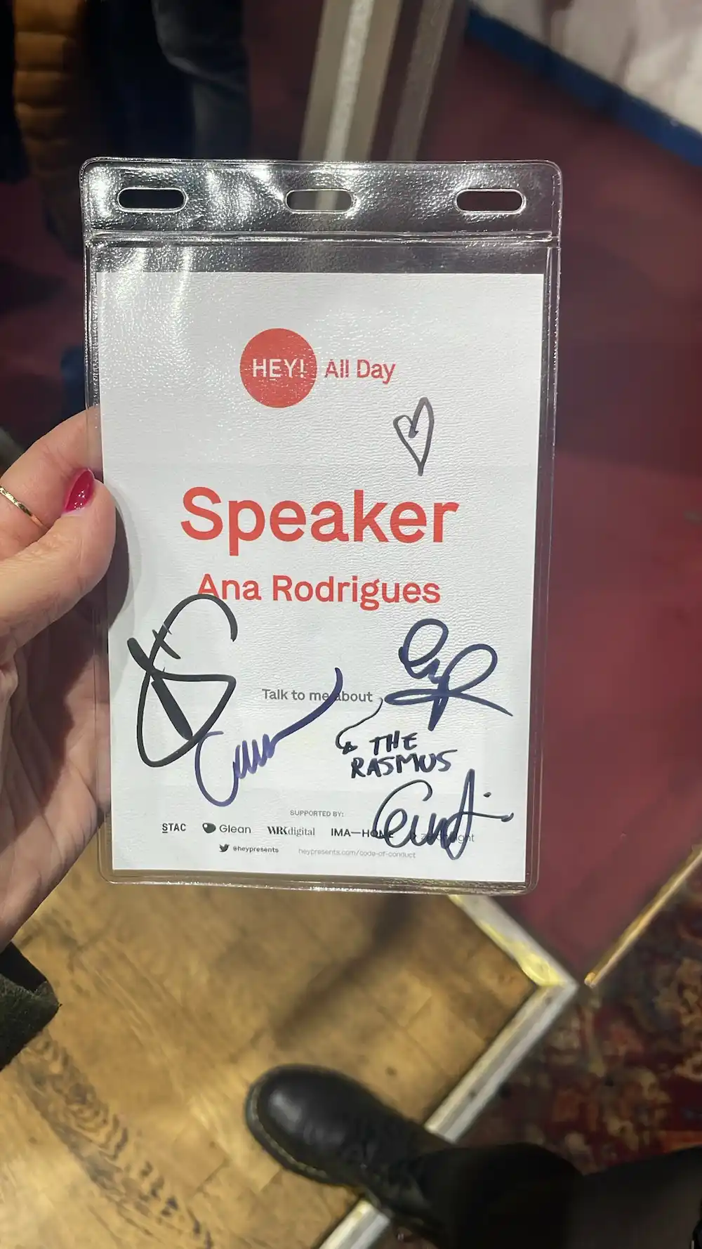
Still a fan
I always find it so funny when people who have known me for many years comment “you still like The Rasmus??” as if they would ask a man how come they still support the same football team they have since they were a child. Anyway, the band did a tour this year and I was able to go to the meet and greets and in it I explained how they were the inspiration for my karaoke talk that I did in 2022 and 2023. I asked them to sign the lanyard for All Day Hey! where my name shows (evidence!!) and it still had plenty of room for signatures. I didn’t cry but I was so overwhelmed and spoke too fast like a proper dork. It’s so much easier to speak to a crowd of hundreds of strangers!


This was such a highlight for me as I was able to hang out with one of my oldest friends and make new ones.
Miscellaneous notes
I didn’t take enough leave this year and guess what? I felt like absolute shit towards the end of the year. That’s a mistake I won’t make in 2026 and I started my year by planning and booking some leave already.
I was gifted a zookeeper for a day experience and I loved it so much! I fed a rhino, giraffe and elephants (and more but these were the big boys)! Who can say that? (I also cleaned their poop)

I went to the gym at least once a week in 2025 and I know I moan a bit about my goals to the people close to me but I’m actually happy to have settled into a routine. My girl is quite a tall girl for her age and my goal in life is to be able to pick her up and be healthy and fit to be here for her. On the same topic I need to reduce my TikTok and Instagram usage as it is severely damaging how I view myself too.
I tried art classes, more crafts and even visits to museums and this is something I am planning to carry on and increase in 2026. I need to be even more away from screens however I want to find a balance to still engage with people and communities I care about.
For 2026 I just want to be happy, more grateful, content and safe. And I wish that to you too.
You are already behind by not having read this post.
Gott Nytt År
Happy New Year!
It’s been an interesting year. Mostly very happy, in some ways very sad - but then, aren’t most years like that for most people? Nothing can be all good all the time. There have been many highlights, and the ones I’m taking with me into 2026 are: