Reading List
The most recent articles from a list of feeds I subscribe to.
New playground: memory spy
Hello! Today we’re releasing a new playground called “memory spy”. It lets you run C programs and see how their variables are represented in memory. It’s designed to be accessible to folks who don’t know C – it comes with bunch of extremely simple example C programs that you can poke at. Here’s the link:
This is a companion to the “how integers and floats work” zine we’ve been working on, so the goal is mostly to look at how number types (integers and floats) are represented.
why spy on memory?
How computers actually represent variables can seem kind of abstract, so I wanted to make it easy for folks to see how a real computer actually represents variables in memory.
why is it useful to look at C?
You might be wondering – I don’t write C! Why should I care how C programs represent variables in memory?
In this playground I’m mostly interested in showing people how integers and floats are represented. And low-level languages generally all represent integers and floats in the same way – a 32-bit unsigned int is going to be the same in C, C++, Rust, Go, Swift, etc. The exact name of the type is different, but the representation is the same.
In higher-level languages like Python it’s a little different, but under the
hood a float in Python contains a C double, so the C representation is
still pretty relevant.
you don’t have to know C
It uses C because C is the language where it’s the most straightforward to map between “the code in your program” and “what’s in your computer’s memory”.
But if you’re not comfortable with C, this playground is still for you! We put together a bunch of example programs where you can run them and look at each variable’s value.
None of the example programs use any fancy features of C – a lot of the code
is extremely simple, like char byte = 'a';. So you should be mostly
able to understand what’s going on even if you don’t know C at all.
how does it work?
Behind the scenes, there’s a server that:
- compiles the program with
clang - runs the program with the C debugger
lldb(using a Python lldb script) - returns a JSON file with the values of the variable on every line, as an array of bytes
Then the frontend formats the array of bytes so you can look at it. The display logic isn’t very fancy – ultimately it’s a pretty thin wrapper around lldb.
some limitations
The two main limitations I can think of right now are:
- there’s no support for loops (it’ll run them, but it’ll only tell you the value of the variable the first time through the loop)
- it only supports defining one variable per line
There are probably more, it’s a very simple project.
the inspiration
Python Tutor by Philip Guo was a huge inspiration. It has a different focus – it also lets you step through programs in a debugger, but it’s more focused on helping the user build a mental model for how variables and control flow work.
what about security?
In general my approach to running arbitrary untrusted code is 20% sandboxing and 80% making sure that it’s an extremely low value attack target so it’s not worth trying to break in.
Programs are terminated after 1 second of runtime, they run in a container with no network access, and the machine they’re running on has no sensitive data on it and a very small CPU.
some notes on the tech stack
The backend is in Go, plus a Python script to script the interactions with lldb. (here’s the source for the lldb script and the source for the Go server right now). I’m using bubblewrap to sandbox lldb.
As always the frontend is using Vue. You can see the frontend source with “view source” if you want.
The main fancy thing that happens on the frontend is that I use tree sitter to figure out which lines of the code have variables defined on them.
some design notes
As usual these days, I built this project with Marie Claire LeBlanc Flanagan. I think the design decision I’m the happiest with is how we handled navigating the program you’re running. Instead of using next/previous arrows to step through the code one line at a time, you can just click on a line to view its variables.
This “click on a line” design wouldn’t make sense in a normal debugger context because usually you have loops and a line might be run more than once. But our focus here isn’t on control flow, and none of the example programs have loops.
The other thing I’m happy with is the decision to use regular links like (<a href="#example=hexadecimal">) for all the navigation. There’s an
onhashchange Javascript event that takes care of making sure we update the
page to match the new URL.
I think there were more design struggles but I forget what they were right now.
that’s all!
Here’s the link again:
Let me know on Twitter or Mastodon if you notice any problems.
PGX + sqlc v4 to v5 upgrade notes
pgx/v4 to pgx/v5 driver (the hard part).
CSS Tutorial
I just did a test to apply as a front end developer – and things aren’t going well
Semantics and the popover attribute: which role to use when?
With the new popover attribute in HTML, we can put elements in the top layer and allow them to disappear with ‘light dismiss’. This attribute adds behaviour, not semantics: you're supposed to add your own role when it makes sense. In this post, we'll look at different roles that could make sense for your popover-behaved elements.
See also: Hidde's talk on popovers, and other posts about popover accessibility, positioning popovers and the difference with dialogs and other components.
Semantics?
Accessibility semantics are roles, states and properties that are exposed by by browsers for many HTML features, and then passed on to assistive technologies.
The ‘role’ of an element establishes what kind of element it is. Roles are built-in (‘implicit’) to some elements: a h1 has the heading role, an a has the link role and so forth. Roles can also be added with a role attribute explicitly. For some roles, that is the only way: there exists no corresponding element. If there's an element and a value for ‘role’, it doesn't really matter for end users which you use, but generally you don't want to overwrite implicit role. As mentioned, your user's browser or assistive technology may use the role to provide a UI. For instance, a screenreader may generate a list of links or headings, a reader mode may render list items with bullets.
Popovers have no default role
Whenever we add the popover attribute to an element, it continues to be that element semantically, just with some specific behaviours. Menus remain menus, dialogs remain dialogs, and so on. The popover attribute does not change an element's role. It's a bit like the contenteditable attribute in that sense. In addition to choosing that you want the popover behaviour, you need to decide if you add a role and, if so, which role.
The most basic example of a popover:
<button
  type="button"
  popovertarget="my-popover">
    Toggle popover
</button>
<div popover id="my-popover">
  ...
</div>
This is how it works:
- the
divwill be invisible on page load, because it has apopoverattribute and popovers are closed on page load by default - the
divwill also be toggleable via the button, as the button points to thediv's ID in itspopovertargetattribute
Potential roles for your popover
Let's now look at common roles for popovers: menu, dialog and listbox, and consider what to do about tooltips.
Menus: the menu role
Let's start with menus. The menu role is what you'd use when your component offers a list of choices to the user, specifically choices that are actions. (Note: menu is not for a list of links, like a navigation, it is only for a list of actions).
A menu with popover behaviour can be built with a menu role:
<button
  type="button"
  popovertarget="my-menu">
    Toggle menu
</button>
<div role="menu" popover id="my-menu">
    <button
      onclick="doThing()"
      role="menuitem"
      tabindex="-1"
      autofocus>Do thing</button>
    <button
      onclick="doAnotherThing()"
      role="menuitem"
      tabindex="-1">Do another thing</button>
  …
</div>
In a menu widget, there are also some keyboard and focus expectations. For instance, that users can use their arrow keys to cycle through the different buttons. As a developer, this is something you'd add with JavaScript yourself. The first button is focused when it opens (hence autofocus), the second and after would get focused moved to them when they're the next one and an arrow key is pressed (hence tabindex="-1": this takes the buttons out of tab order, because you make them reachable with arrow keys instead).
(Note: The menu role is not to be confused with the menu element, which has a list role and is “a semantic alternative to <ul>”)
Examples of when you would use role="menu":
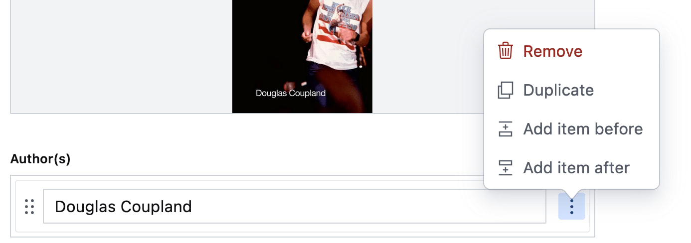 Your CMS manages a list of authors. The user can open a
 menu for each author with some actions (each action has a menuitem role)
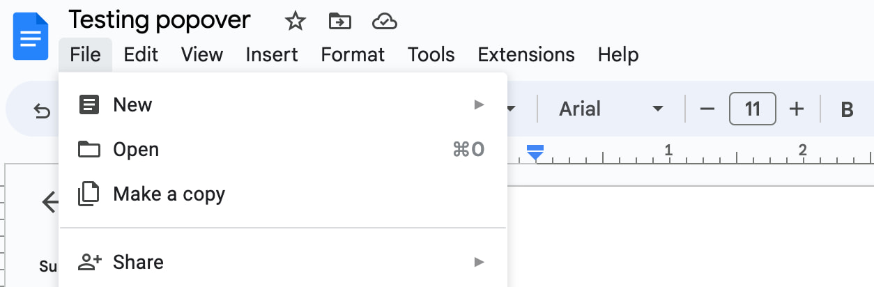 You're building a word processor. The “File” menu is a menu, the options (New, Open, etc) are
 menuitems._
See also: Marco Zehe on the menu role and “Menu control type” in Windows Accessibility Features documentation
Dialogs: the dialog role
A dialog role is what you add when an element is like a smaller window on top of the main web page. It can block interaction with the rest of the page or leave the rest of the page as it is, either way it is somewhat separate from the page, both in purpose and visually.
The <dialog> element implicitly has a dialog role, and comes with dialog methods and behaviours (like you can run element.showModal() to show it as a modal). You can also add the dialog role manually with role="dialog", but then you have to add the behaviours manually too.
A dialog with popover behaviour can be built like this:
<button
  type="button"
  popovertarget="my-dialog">
    Toggle dialog
</button>
<dialog id="my-dialog" popover>
  ...
</dialog>
You see, there's no explicit role attribute, because the dialog role comes with the <dialog> element.
If not using a button with popovertarget, you could open this dialog with script using the showPopover() method that works on any element that is a popover (by having a popover attribute present).
Note: because this specific popover example uses the <dialog> element, two other methods are also available (through the HTMLDialogElement): show() and showModal(). They have slightly different behaviours than showPopover() would. I recommend against using these two methods on dialogs that are popovers. In other words, if you're inclined to use them, you probably don't want the popover attribute, as that attribute's purpose would basically be defeated by show()/showModal() (also, in some cases you might get a console error if you try to run showModal() on a popover). Popover is really for non-modal dialogs; see also my post on dialogs vs popovers).
Other examples of elements that could have popover behaviour and a dialog role are:
- teaching UI
- pickers, like for a date, multiple dates, prices
- “mega navs” and other large navigational structures that cover a lot of the page (note: these should not use
role="menu", a navigation with links is semantically different from a menu with buttons)
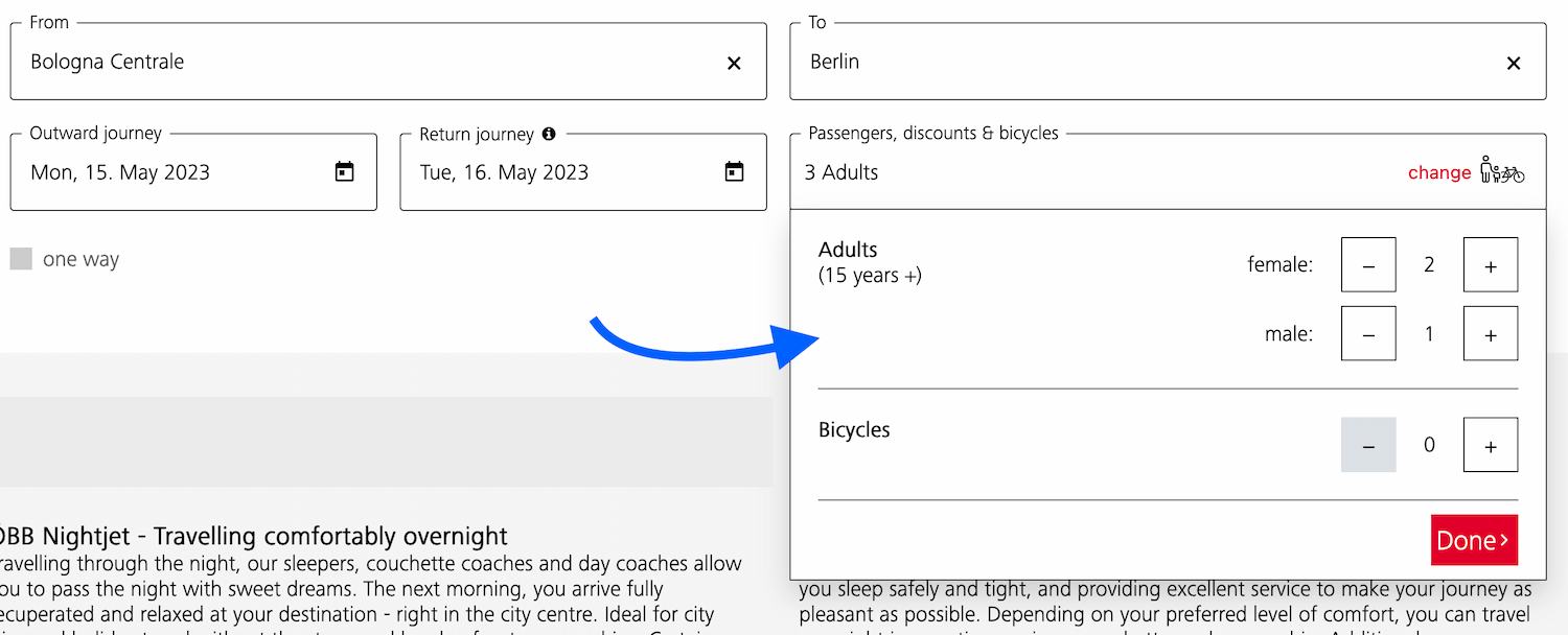 A dialog that allows the user to specify their travel group and amount of bicycles
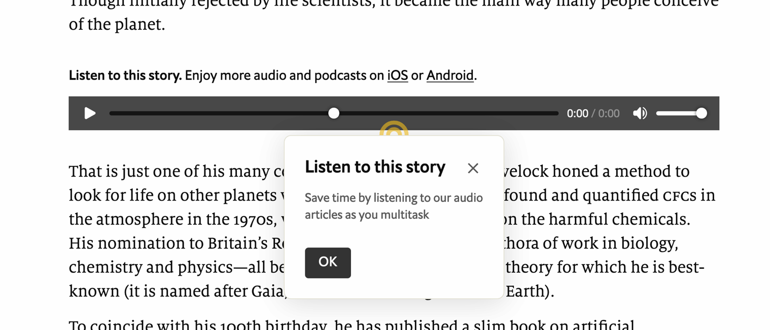 A dialog that teaches what the audio player is for
 A “meganav” that covers other content (note: this is a dialog, not a menu)
Listboxes / autocompletes: the listbox role
A listbox is for elements where the user gets to choose from one or more options, like a <select>. They can exist as single select (user can select one option) or multi select (user can select multiple options).
Listboxes are often part of an autocomplete or combobox widget, they are the part that contains the actual options. Like in this example:
 Select menus also use listboxes to allow users to pick an option from a list
For instance, in the following example, there is a component that pops over the page's content. It contains filter and sorting buttons, as well as a listbox with actual options. The element with popover is probably a dialog (and you could give it a dialog role), while the element that contains options would need a role of listbox:
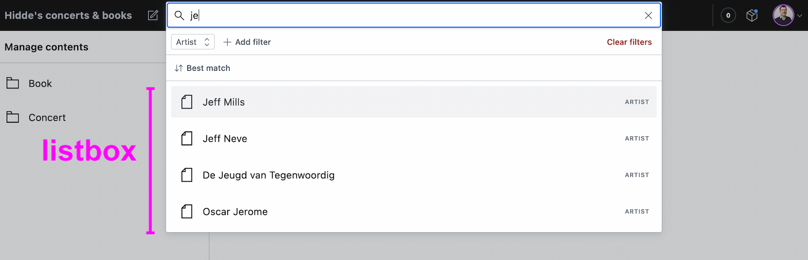 A listbox as part of a combobox
Tooltips/toggletips: tooltip (with caveats) or dialog
In their simplest form, tooltips are like the title element in HTML, that browers display on hover. These browser built-in tooltips are problematic in many ways, including that in most browsers, there is no way to get to the contents of title with just a keyboard. Let's call them “plain text tooltips”. They are often customised by developers, for instance to change their visual styles (currently from scratch, maybe via CSS in the future).
 Plain text tooltips that display on hover or focus of a triggering element, which they describe
Sometimes they are also found underneath input fields, to explain what that input does or what is expected, like some of Scott O'Hara's custom tooltips examples.
These custom “plain text tooltips” are what the tooltip role seems to be meant for. Note that role="tooltip" doesn't do much in terms of screen reader announcements as Sarah Higley explains in Tooltips in the time of WCAG 2.1, though there are cases where ARIA-provided labels and descriptions don't work across browsers and assistive technologies without the role (if they aren't interactive, iframe or img elements and also don't have a landmark or widget role). What is useful for accessibility of that kind of tooltip, going beyond roles for a moment: use aria-describedby to link up a tooltip that describes a thing with that thing, and never place essential content in them. Also ensure that the tooltip (1) stays visible when its content is hovered, (2) is dismissable (with Escape) and (3) persists until hover/focus removed, dismissed or irrelevant (all required to meet WCAG 1.4.13).
My advice would be that whenever tooltips contain more than just plain text, a non-modal dialog would be more appropriate (even if elements with tooltip role were apparently meant to also allow for interactive elements). Non-modal dialog tooltips could contain semantic elements (like a heading) or interactive elements (like a link or a button). In most cases it would be best to display them on click instead of hover + focus, in which case they are really “toggletips”. Of course, if there is interactive content, that also means you'll want to consider focus order.
Conclusion
In this post, we've covered some of the most common semantics you could choose to use with the popover behaviour: menu, dialog and listbox, plus looked at using tooltip for plain text tooltips or dialog for tooltips that contain anything more than plain text. Are you building components that don't really fall into any of these categories? I'm curious to learn more, slide in my DMs or email!
Originally posted as Semantics and the popover attribute: which role to use when? on Hidde's blog.