Reading List
The Performance Inequality Gap, 2023 from Infrequently Noted RSS feed.
The Performance Inequality Gap, 2023
Last month, I had the honour of joining what seemed like the entire web performance community at performance.now() in Amsterdam.
The talks are up on YouTube behind a paywall, but my slides are mirrored here1:
The talk, like this post, is an update on network and CPU realities this series has documented since 2017. More importantly, it is also a look at what the latest data means for our collective performance budgets.
2023 Content Targets
In the interest of brevity, here's what we should be aiming to send over the wire per page in 2023 to reach interactivity in less than 5 seconds on first load:23
- ~150KiB of HTML, CSS, images, and render-blocking font resources
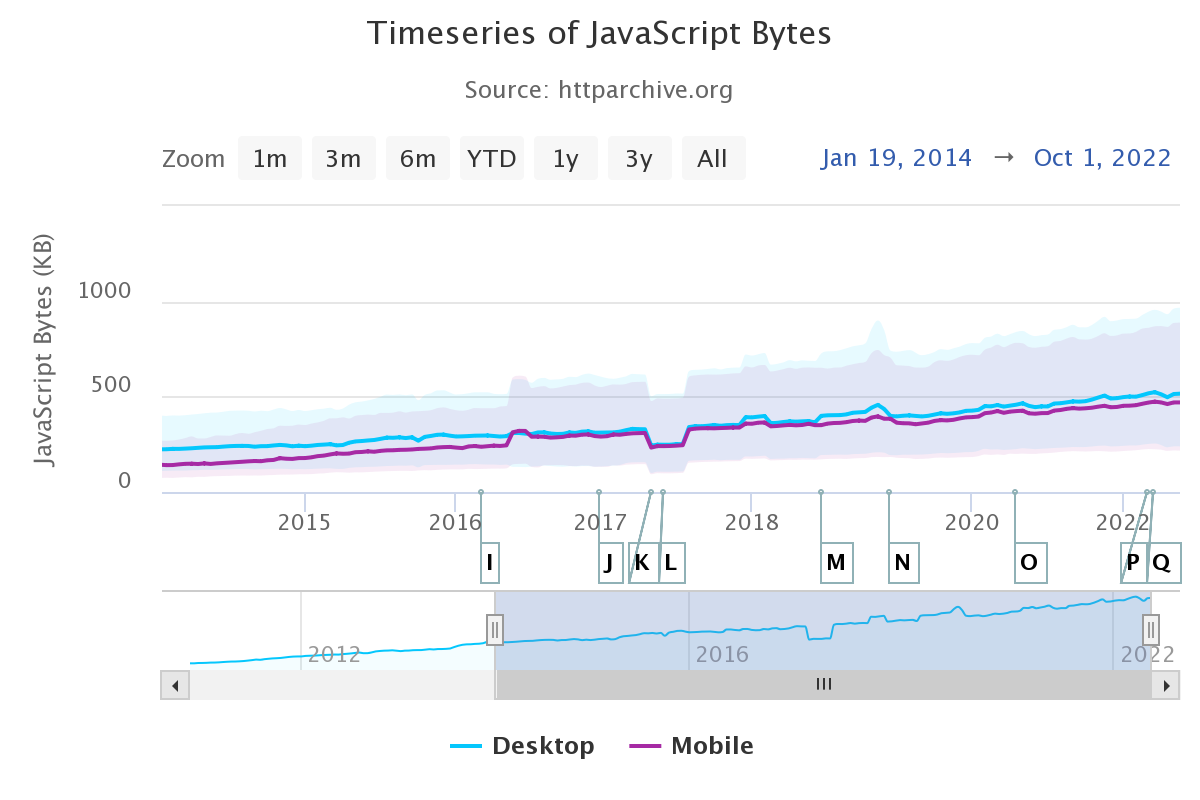
- No more than ~300-350KiB of JavaScript
This implies a heavy JS payload, which most new sites suffer from for reasons both bad and beyond the scope of this post. With a more classic content profile — mostly HTML and CSS — we can afford much more in terms of total data, because JavaScript is still the costliest way to do things and CPUs at the global P75 are not fast.
These estimates also assume some serving discipline, including:
- No more than two HTTP connections, implying HTTP/2
- Compressing text resources
- Reasonable content structure
These targets are anchored to global estimates for networks and devices at the 75th percentile4.
More on how those estimates are constructed in a moment, but suffice to say, it's messy. Where the data is weak, we should always prefer conservative estimates.
Based on trends and historical precedent, there's little reason for optimism that things are better than they seem. Indeed, misplaced optimism about disk, network, and CPU resources is the background music to frontend's lost decade.
It is not an exaggeration to say that modern frontend is so enamoured of post-scarcity fairy tales that it is mortgaging the web's future for another night drinking at the JavaScript party.
We're burning our inheritance and polluting the ecosystem on shockingly thin, perniciously marketed claims of "speed" and "agility" and "better UX" that have not panned out at all. Instead, each additional layer of JavaScript cruft has dragged us further from living within the limits of what we can truly afford.

This isn't working for users or for businesses that hire developers hopped up Facebook's latest JavaScript hopium. A correction is due.
Desktop
In years past, I haven't paid as much attention to the situation on desktops. But researching this year's update has turned up sobering facts that should colour our collective understanding.
Devices
From Edge's telemetry, we see that nearly half of devices fall into our "low-end" designation, which means that they have:
- HDDs (not SSDs)
- 2-4 CPU cores
- 4GB RAM or less
Add to this the fact that desktop devices have a lifespan between five and eight years, on average. This means the P75 device was sold in 2016.
As this series has emphasised in years past, Average Selling Price (ASP) is performance destiny. To understand our P75 device, we must imagine what the ASP device was at the P75 age.5 That is, what was the average device in 2016? It sure wasn't a $2,000 M1 MacBook Pro, that's for sure.
No, it was a $600-$700 device. Think (best-case) 2-core, 4-thread married to slow, spinning rust.
Networks
Desktop-attached networks are hugely variable worldwide, including in the U.S., where the shocking effects of digital red-lining continue this day. And that's on top of globally uncompetitive service, thanks to shockingly lax regulation and legalised corruption.
As a result, we are sticking to our conservative estimates for bandwidth in line with WebPageTest's throttled Cable profile of 5Mbps bandwidth and ~25ms RTT.
Speeds will be much slower than advertised in many areas, particularly for rural users.
Mobile
We've been tracking the mobile device landscape more carefully over the years and, as with desktop, ASPs today are tomorrow's performance destiny. Thankfully, device turnover is faster, with the average handset surviving only three to four years.
Devices
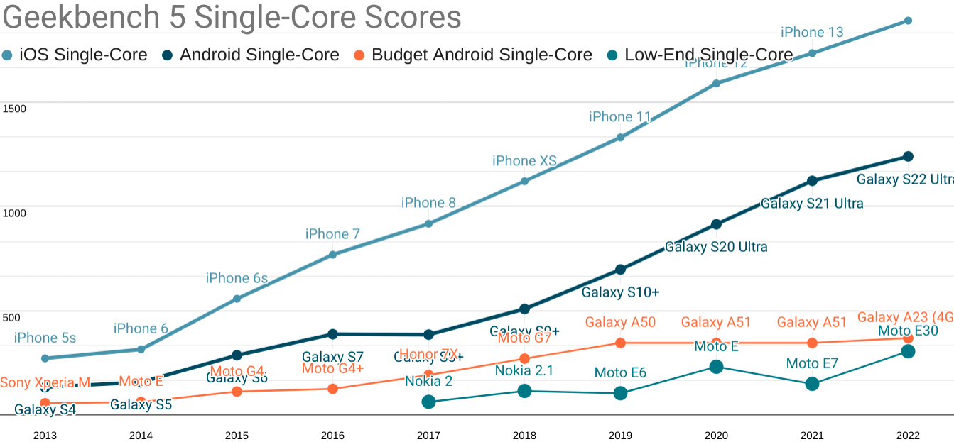
Without beating around the bush, our ASP 2019 device was an Android that cost between $300-$350, new and unlocked. It featured poor single and multi-core performance, and the high-end experience has continued to pull away from it since:

Updated Geekbench five single-core scores for each mobile price point. TL;DR: your iPhone isn't real life.

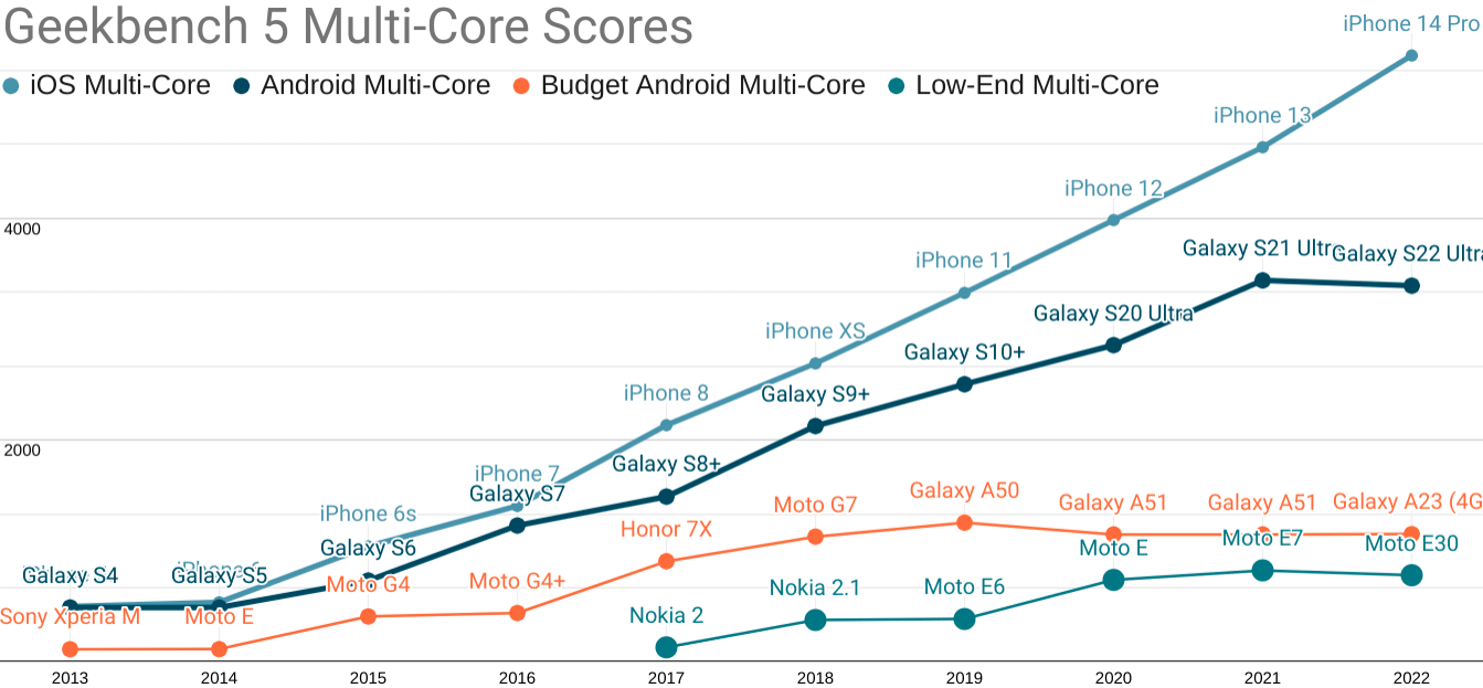
Android ecosystem SoCs fare slightly better on multi-core performance, but the Performance Inequality Gap is growing there, too.
As you can see, the gap is widening, in part because the high end has risen dramatically in price.
The best analogue you can buy for a representative P75 device today are ~$200 Androids from the last year or two, such as the Samsung Galaxy A50 and the Nokia G11.
These devices feature:
- Eight slow, big.LITTLE ARM cores (A75+A55, or A73+A53) built on last-generation processes with very little cache
- 4GiB of RAM
- 4G radios
These are depressingly similar specs to devices I recommended for testing in 2017. Qualcomm has some 'splainin to do.
5G is still in its early diffusion phase, and the inclusion of a 5G radio is hugely randomising for device specs at today's mid-market price-point. It'll take a couple of years for that to settle.
Networks
Trustworthy mobile network data is challenging to acquire. Geographic differences create huge effects that we can see as variability in various global indexes. This variance forces us towards the bottom of the range when estimating our baseline, as mobile networks are highly contextual.
Triangulating from both speedtest.net and OpenSignal data (which has declined markedly in usefuleness), we're also going to maintain our global network baseline from last year:
- 9Mbps bandwidth
- 170ms RTT
This is a higher bandwidth estimate than might be reasonable, but also a higher RTT to cover the effects of high network behaviour variance. I'm cautiously optimistic that we'll be able to bump one or both of these numbers in a positive direction next year. But they stay put for now.
Developing Your Own Targets
You don't have to take my word for it. If your product behavior or your own team's data or market research suggests different tradeoffs, then it's only right to set your own per-product baseline.
For example, let's say you send more HTML and less JavaScript, or your serving game is on lock and all critical assets load over a single H/2 link. How should your estimates change?
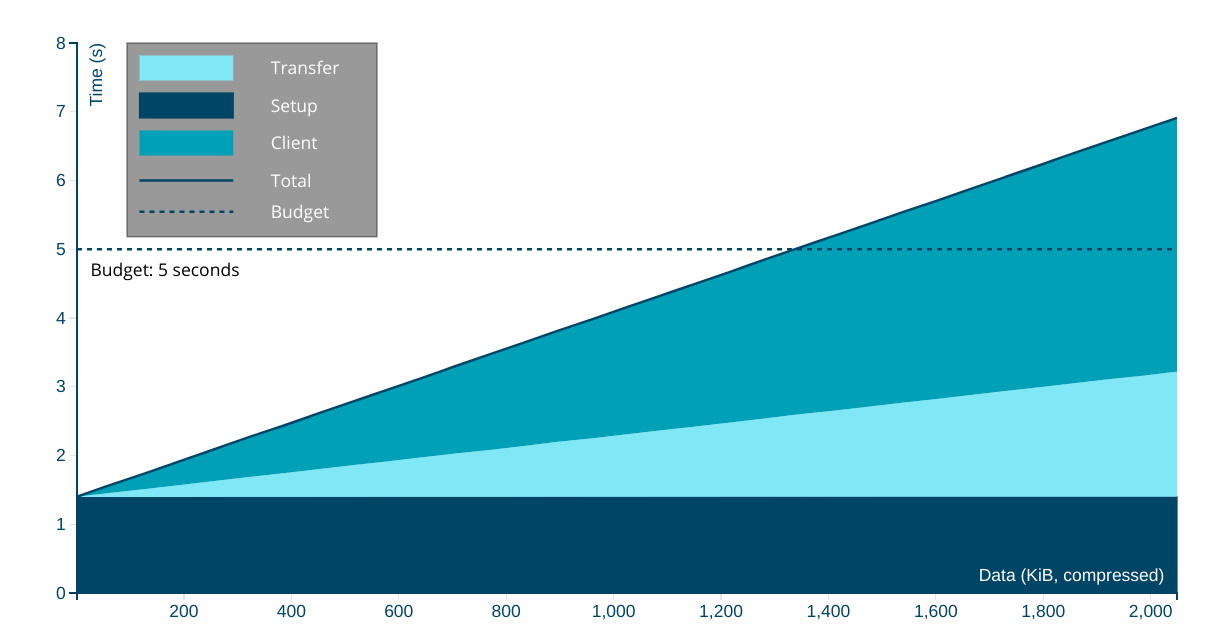
Per usual, I've also updated the rinky-dink live model that you can use to select different combinations of device, network, and content type.

The Performance Inequality Gap is Growing
Essential public services are now delivered primarily through digital channels in many countries. This means what the frontend community celebrates and promotes has a stochastic effect on the provision of those services — which leads to an uncomfortable conversation because, taken as a whole, it isn't working.
Pervasively poor results are part of why responsible public sector organisations are forced to develop HTML-first, progressive enhancement guidance in stark opposition to the "frontend consensus".
This is an indictment: modern frontend's fascination with towering piles of JavasScript complexity is not delivering better experiences for most users.
For a genuinely raw example, consider California, the state where I live. In early November, it was brought to my attention that CA.gov "felt slow", so I gave it a look. It was bad on my local development box, so I put it under the WebPageTest microscope. The results were, to be blunt, a travesty.
How did this happen? Well, per the new usual, overly optimistic assumptions about the state of the world accreted until folks at the margins were excluded.
In the case of CA.gov, it was an official Twitter embed that, for some cursed reason, had been built using React, Next.js, and the full parade of modern horrors. Removing the embed, along with code optimistically built in a pre-JS-bloat era that blocked rendering until all resources were loaded, resulted in a dramatic improvement:
This is not an isolated incident. These sorts of disasters have been arriving on my desk with shocking frequency for years.
Nor is this improvement a success story, but rather a cautionary tale about the assumptions and preferences of those who live inside the privilege bubble. When they are allowed to set the agenda, folks who are less well-off get hurt.
It wasn't the embed engineer getting paid hundreds of thousands of dollars a year to sling JavaScript who was marginalised by this gross misapplication of overly complex technology. No, it was Californians who could least afford fast devices and networks who were excluded. Likewise, it hasn't been those same well-to-do folks who have remediate the resulting disasters. They don't even clean up their own messes.
Frontend's failure to deliver in today's mostly-mobile, mostly-Android world is shocking, if only for the durability of the myths that sustain the indefensible. We can't keep doing this.
As they say, any trend that can't continue won't.
FOOTNOTES
Apologies for the lack of speaker notes in this deck. If there's sufficient demand, I can go back through and add key points. Let me know if that would help you or your team over on Mastodon. ⇐
Since at least 2017, I've grown increasingly frustrated at the way we collectively think about the tradeoffs in frontend metrics. Per this year's post on a unified theory of web performance, it's entirely possible to model nearly every interaction in terms of a full page load (and vice versa).
What does this tell us? Well, briefly, it tells us that the interaction loop for each interaction is only part of the story. Recall the loop's phases:
- Interactive (ready to handle input)
- Receiving input
- Acknowledging input, beginning work
- Updating status
- Work ends, output displayed
- GOTO 1
Now imagine we collect all the interactions a user performs in a session (ignoring scrolling, which is nearly always handled by the browser unless you screw up), and then we divide the total set of costs incurred by the number of turns through the loop.
Since our goal is to ensure users complete each turn through the loop with low latency and low variance, we can see the colourable claim for SPA architectures take shape: by trading off some initial latency, we can reduce total latency and variance. But this also gives rise to the critique: OK, but does it work?
The answer, shockingly, seems to be "no" — at least not as practised by most sites adopting this technology over the past decade.
The web performance community should eventually come to a more session-depth-weighted understanding of metrics and goals. Still, until we pull into that station, per-page-load metrics are useful. They model the better style of app construction and represent the most actionable advice for developers. ⇐
The target that this series has used consistently has been reaching a consistently interactive ("TTI") state in less than 5 seconds on the chosen device and network baseline.
This isn't an ideal target.
First, even with today's the P75 network and device, we can aim higher (lower?) and get compelling experiences loaded and main-thread clean in much less than 5 seconds.
Second, this target was set in covnersation back in 2016 in preparation for a Google I/O talk, based on what was then possible. At the time, this was still not ambitious enough, but the impact of an additional connection shrunk the set of origins that could accomplish the feat significantly.
Lastly, P75 is not where mature teams and developers spend their effort. Instead, they're looking up the percentiles and focusing on P90+, and so for mature teams looking to really make their experiences sing, I'd happily recommend that you target 5 second TTI at P90 instead. It's possible, and on a good stack with a good team and strong management, a goal you can be proud to hit. ⇐
Looking at the P75 networks and devices may strike mature teams and managers as a sandbagged goal and, honestly, I struggle with this.
On the one hand, yes, we should be looking into the higher percentiles. But weaker goals aren't within reach for most teams today. If we moved the ecosystem to a place where it could reliably hit these limits and hold them in place for a few years, the web would stand a significantly higher chance of remaining relevant.
On the other hand, these difficulties stack. Additive error means that targeting the combination P75 network and P75 device likely puts you north of P90 in the experiential distribution, but it's hard to know. ⇐
Data-minded folks will be keenly aware that simply extrapolating from average selling price over time can lead to some very bad conclusions. For example, what if device volumes fluctuate significantly? What if, in more recent years, ASPs fluctuate significantly? Or what if divergence in underlying data makes comparison across years otherwise unreliable.
These are classic questions in data analysis, and thankfully the PC market has been relatively stable in volumes, prices, and segmentation, even through the pandemic.
As covered later in this post, mobile is showing signs of heavy divergence in properties by segment, with the high-end pulling away in both capability and price. This is happening even as global ASPs remain relatively fixed, due to the increases in low-end volume over the past decade. Both desktop and mobile are staying within a narrow Average Selling Price band, but in both markets (though for different reasons), the P75 is not where folks looking only at today's new devices might expect it to be.
In this way, we can think of the Performance Inequality Gap as being an expression of Alberto Cairo's visual data lessons: things may look descriptively similar at the level of movement of averages between desktop and mobile, but the underlying data tells a very different story. ⇐