Reading List
The most recent articles from a list of feeds I subscribe to.
Is the current tab active?
Today I ran into an interesting problem. Interesting because it’s one of those very straightforward, deceptively simple questions, that after a fair amount of digging, does not appear to have a definite answer (though I would love to be wrong!).
The problem was to determine if the current tab is active. Yes, as simple as that.
Why? (i.e. my use case)
I was working on my slide deck framework, Inspire.js. There is a presenter mode plugin, which spawns a new window with your slides (“projector view”), whereas your current window becomes a “presenter view”, with open notes, preview of the next slide, optional progress indicator for time etc.
However, this plugin was not very good. The two windows are synced, but only if you use presenter view to navigate slides. If you use the projector view to advance slides, the syncing breaks. Why would you use the projector mode? Many reasons, e.g. to interact with a live demo, or even play a video. If you have a live demo heavy presentation, you may even want to mirror your screen and only ever interact with the projector mode, while having the presenter mode on a secondary screen, just to look at.
The way the plugin worked was that every time the slide changed in the presenter view, it propagated the change in the projector view. To make the syncing bidirectional, it would be good to know if the current window is the active tab, and if so, propagate all slide navigation to the other one, regardless of which one is the projector view and which one is the presenter view.
And this, my friends, is how I ended up in this rabbit hole.
(Yes, there are other solutions to this particular problem. I could just always propagate regardless and have checks in place to avoid infinite loops. But that’s beside the point.)
What about the Visibility API?
In most resources around the Web, people were rejoicing about how the Visibility API makes this problem trivial. “Just use document.hidden!” people would gleefully recommend to others.
Yes, the Visibility API is great, when you want to determine whether the current tab is visible. That is not the same as whether it is active.
You may have two windows side by side, both visible, but only one of them is active. You may even have a window entirely obscuring another window, but you can still tab through to it and make it active. Active and visible are entirely orthogonal states, which are only loosely correlated.
In my use case, given that both the projector view and presenter view would be visible at all times, this is a no-go that doesn’t even solve a subset of use cases.
What about focus and blur events on window?
The other solution that was heavily recommended was using the focus and blur events on window. This does get us partway there. Indeed, when the current tab becomes active, the focus event fires. When another tab becomes active, the blur event fires.
Notice the emphasis on “becomes”. Events notify us about a state change, but they are no help for determining the current state. If we get a focus or blur event, we know whether our tab is active or not, but if we don’t get any, we simply don’t know. A tab can start off as active or not, and there is no way to tell.
How can a tab possibly start off as inactive? One easy way to reproduce this is to hit Return on the address bar and immediately switch to another window. The tab you just loaded just starts off as inactive and no blur event is ever fired.
What about document.activeElement?
The document.activeElement property will always return the currently focused element in a page. Can we use it to determine if a window currently has focus? Nope, cause that would be too easy.
Run setTimeout(() => console.log(document.activeElement), 2000) in the console and quickly switch windows. Return >2 seconds later and see what was logged. It’s the <body> element!
Wait, maybe we can assume that if the currently focused element is a <body> element then the current window is inactive? Nope, you get the same result in an active tab, if you simply haven’t focused anywhere.
What about document.hasFocus()?
When I discovered document.hasFocus() I thought that was the end of it. Surely, this is exactly what I need?!? The spec made it sound so promising. I quickly switched to my about:blank tab that I use for trying things out, and ran it in the console.
> document.hasFocus()
< false
🤦🏽♀️🤦🏽♀️🤦🏽♀️
Neeeext!
Edit: document.hasFocus() may be the solution after all! As pointed out to me on Twitter, the problem above was that unlike I did with document.activeElement, I ran this synchronously in the console and it returned false because the console as the active window. An asynchronous log while I make sure the actual window is focused would do the trick.
The anti-climactic conclusion
Edit: I left this section in because the moral is still valid for other cases, but it looks like document.hasFocus() was the solution after all.
If you’re expecting this to end with a revelation of an amazing API that I had originally missed and addresses this, you will be disappointed. If there is such a silver bullet, I did not find it. Maybe someone will point it out to me after publishing this blog post, in which case I will update it so that you don’t struggle like I did.
But in my case, I simply gave up trying to find a general solution. Instead, I took advantage of the knowledge my code had in this specific situation: I knew what the other window was, and I primarily cared which one of the two (if any) had focus.
// Track whether presenter or projector is the active window
addEventListener("focus", _ => {
	Inspire.isActive = true;

	// If this window is focused, no other can be
	if (Inspire.projector) {
		Inspire.projector.Inspire.isActive = false;
	}
	else if (Inspire.presenter) {
		Inspire.presenter.Inspire.isActive = false;
	}
});

addEventListener("blur", _ => {
	Inspire.isActive = false;

	// If this window is not focused,
	// we cannot make assumptions about which one is.
});
Given that the presenter view calls window.focus() after opening the projector view, in practice this was pretty bulletproof.
What’s the moral of this story?
- Sometimes simple questions do not have a good answer when it comes to the Web Platform
- If your code cannot answer the general question correctly in all cases, maybe it can answer a specific one that solves your particular problem, even if that leads to a less elegant solution.
That’s it folks.
82% of developers get this 3 line CSS quiz wrong
82% of developers get this 3 line CSS quiz wrong
82% of developers get this 3 line CSS quiz wrong
(I always wanted to do a clickbait title like this and when this chance came along I could not pass it up. 😅 Sorry!)
While putting my ideas into slides for my Dynamic CSS workshop for next week, I was working on a slide explaining how the CSS wide keywords work with custom properties. inherit, initial, unset I had used numerous times and knew well. But what about revert? How did that work? I had an idea, but quickly coded up a demo to try it out.
The code was:
:root {
    --accent-color: skyblue;
}

div {
    --accent-color: revert;
    background: var(--accent-color, orange);
}
Phew, I was correct, but the amount of uncertainty I had before seeing the result tipped me that I might be on to something.
Before you read on, take a moment to think about what you would vote. Warning: Spoilers ahead!
🤔
🤔
🤔
🤔 So I posted a quiz on Twitter:
https://twitter.com/LeaVerou/status/1395379573190168576
These were the results after the 24 hours it ran for:
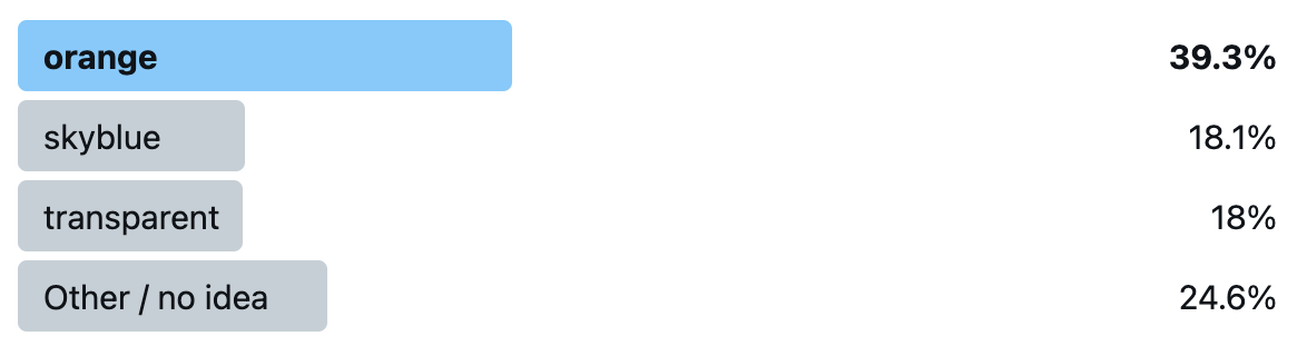
orange was the clear winner, and the actual correct answer, skyblue only got 18.1%, nearly the same as transparent!
If you got it wrong, you’re in very good company: not only did 82% of poll respondents get it wrong as well, but even the editor of the CSS Variables spec and co-editor of CSS Cascading and Inheritance (which defines revert), Tab Atkins, told me privately that he got it wrong too: he voted for orange! (Yes, I did get his permission to mention this)
So what actually happens? Why do we get skyblue? I will try to explain as best as I can.
Let’s start by what revert does: It reverts the cascaded value of the property from its current value to the value the property would have had if no changes had been made by the current style origin to the current element.
This means it cancels out any author styles, and resets back to whatever value the property would have from the user stylesheet and UA stylesheet. Assuming there is no --accent-color declaration in the user stylesheet, and of course UA stylesheets don’t set custom properties, then that means the property doesn’t have a value.
Since custom properties are inherited properties (unless they are registered with inherits: false, but this one is not), this means the inherited value trickles in, which is — you guessed it — skyblue. You can see for yourself in this codepen.
What if our property were registered as non-inheriting? Would it then be orange? Nice try, but no. When we register a custom property, it is mandatory to provide an initial value. This means that the property always resolves to a value, even --accent-color: initial does not trigger the fallback anymore. You can see this for yourself in this codepen (Chrome only as of May 2021).
Liked this? Then you will love the workshop! There are still a few tickets left!