Please note that the concept of a North Star UI has no relation to the North Star Metric. While both serve as a guiding light for product decisions, and both are important, the North Star UI guides you in designing the product, whereas the North Star Metric is about evaluating success. To avoid confusion, I’ll refer to it as “North Star UI”, although it’s not about the UI per se, but the product vision on a deeper level.
Reading List
The most recent articles from a list of feeds I subscribe to.
The Hovercar Framework for Deliberate Product Design
You may be familiar with this wonderful illustration and accompanying blog post by Henrik Kniberg about good MVPs:
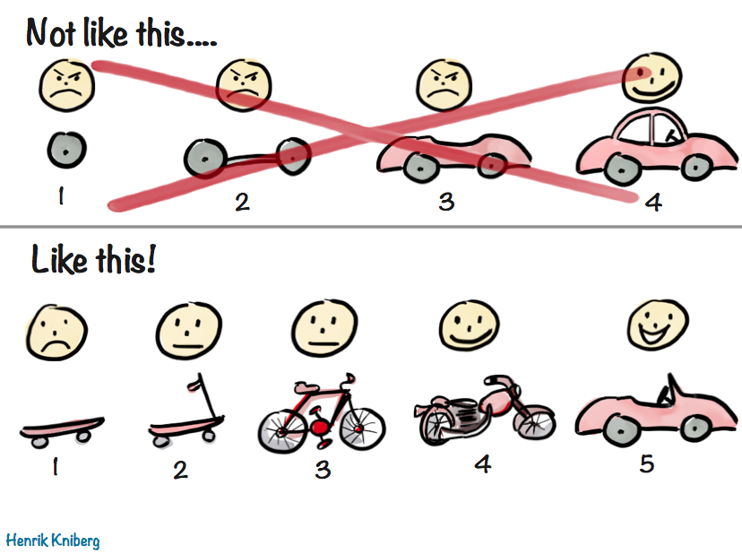
It’s a very visual way to illustrate the age-old concept that that a good MVP is not the one developed in isolation over months or years, grounded on assumptions about user needs and goals, but one that delivers value to users as early as possible, so that future iterations can take advantage of the lessons learned from real users.
From Hovercar to Skateboard
I love Henrik’s metaphor so much, I have been using a similar system to flesh out product requirements and shipping goals, especially early on. It can be immediately understood by anyone who has seen Henrik’s illustration, and I find it can be a lot more pragmatic and flexible than the usual simple two tiered system (core requirements and stretch goals). Additionally, I find this fits nicely into a fixed time, variable scope development process, such as Shape Up.
- 🛹 The Skateboard aka the Pessimist’s MVP
- What is the absolute minimum we can ship, if need be? Utilitarian, bare-bones, and somewhat embarrassing, but shippable — barely. Anything that can be flintstoned gets flintstoned.
- 🛴 The Scooter aka the Realist’s MVP
- The minimum product that delivers value. Usable, but no frills. This is the target.
- 🚲 The Bicycle aka the Optimist’s MVP
- Stretch goals — UX polish, “sprinkles of delight”, nonessential but high I/E features. Great if we get here, fine if we don’t.
- 🏍️ The Motorcycle
- Post-launch highest priority items.
- 🚗 The Car
- Our ultimate vision, taking current constraints into account.
- 🏎️ The Hovercar aka the North Star UI
- The ideal experience — unconstrained by time, resources, or backwards compatibility. Unlikely to ship, but a guiding light for all of the above.
The first three stages are much more concrete and pragmatic, as they directly affect what is being worked on. The more we go down the list, the less fleshed out specs are, as they need to allow room for customer input. This also allows us to outline future vision, without having to invest in it prematurely.
The most controversial of these is the last one: the hovercar, i.e. the North Star UI. It is the very antithesis of the MVP. The MVP describes what we can ship ASAP, whereas the North Star describes the most idealized goal, one we may never be able to ship.
It is easy to dismiss that as a waste of time, a purely academic exercise. “We’re all about shipping. Why would we spend time on something that may not even be feasible?” I hear you cry in Agile.
Stay with me for a moment, and please try to keep an open mind. Paradoxical as it may sound, fleshing out your North Star can actually save you time. How? Start counting.
Core Idea
At its core, this framework is about breaking down tough product design problems into three more manageable components:
- North Star: What is the ideal solution?
- Constraints: What prevents us from getting there right now?
- Compromises: How close can we reasonably get given these constraints?
One way to frame it is is that 2 & 3 are the product version of tech debt.[1]
It’s important to understand what constraints are fair game to ignore for 1 and which are not. I often call these ephemeral or situational constraints. They are constraints that are not fundamental to the product problem at hand, but relate to the environment in which the product is being built and could be lifted or change over time. Things like:
- Engineering resources
- Time
- Technical limitations (within reason)
- Performance
- Backwards compatibility
- Regulatory requirements
Unlike ephemeral constraints, certain requirements are part of the problem description and cannot be ignored. Some examples from the case studies below:
- Context Chips Survey UI: Efficiency and discoverability
- CSS Nesting Syntax: Conciseness and readability
While these may be addressed differently in different solutions, it would be an oxymoron to have a North Star that did not take them into account.
Benefits
1. It makes hard product problems tractable
Nearly every domain of human endeavor has a version of divide and conquer: instead of solving a complex problem all at once, break it down into smaller, manageable components and solve them separately. Product design is no different.
This process really shines when you’re dealing with the kinds of tough product problems where at least two of these questions are hard, so breaking it down can do wonders for reducing complexity.
2. It makes the product design process robust and adaptable
By solving these components separately, our product design process becomes can more easily adapt to changes.
I have often seen “unimplementable” solutions become implementable down the line, due to changes in internal or external factors, or simply because someone had a lightbulb moment.
By addressing these components separately, when constraints get lifted all we need to reevaluate is our compromises. But without this modularization, our only solution is to go back to the drawing board. Unsurprisingly, companies often choose to simply miss out on the opportunity, because it’s cheaper (or seems cheaper) to do so.
3. It facilitates team alignment by making the implicit, explicit
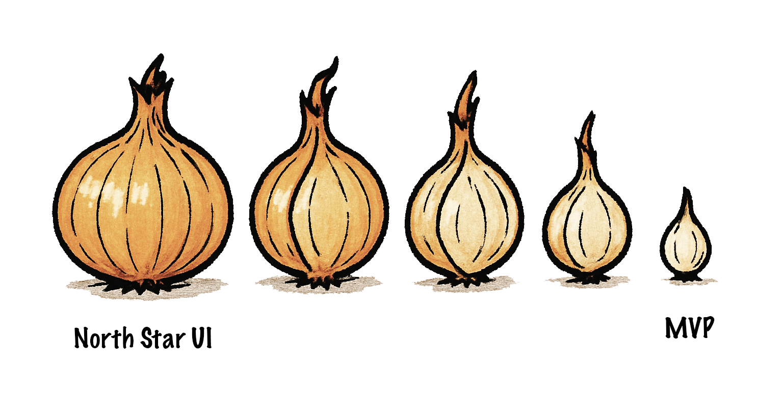
Whether you realize it or not, every shipping goal is always derived from the North Star, like peeling layers off an onion. In some contexts the process of breaking down a bigger shipping goal into milestones that can ship independently is even called layering.
The process is so ingrained, so automatic, that most product designers don’t realize they are doing it. They go from hovercar to car so quickly they barely realize the hovercar was there to begin with. Thinking about the North Star is taboo — who has time for daydreaming? We must ship, yesterday!
But the hovercar is fundamental. Without it, there is no skateboard — you can’t reduce the unknown. When designing it is not an explicit part of the process, the result is that the main driver of all product design decisions is something that can never be explicitly discussed and debated like any other design decision. In what universe is that efficient?
A skateboard might be a good MVP if your ultimate vision is a hovercar, but it would be a terrible minimum viable cruise ship — you might want to try a wooden raft for that.
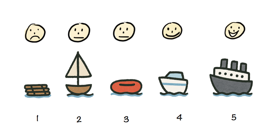
A skateboard may be a great MVP for a car, but a terrible MVP for a cruise ship.
Making the North Star taboo doesn’t make it disappear (when did that ever work?).
It just means that everyone is following a different version of it. And since MVPs are products of the North Star, this will manifest as difficulty reaching consensus at every step of the way.
The product team will disagree on whether to ship a skateboard or a wooden raft, then on whether to build a scooter or a simple sailboat, then on whether to work on a speedboat or a yacht, and so on. It will seem like there is so much disconnect that every decision is hard, but there is actually only one root disconnect that manifests as multiple because it is never addressed head on.
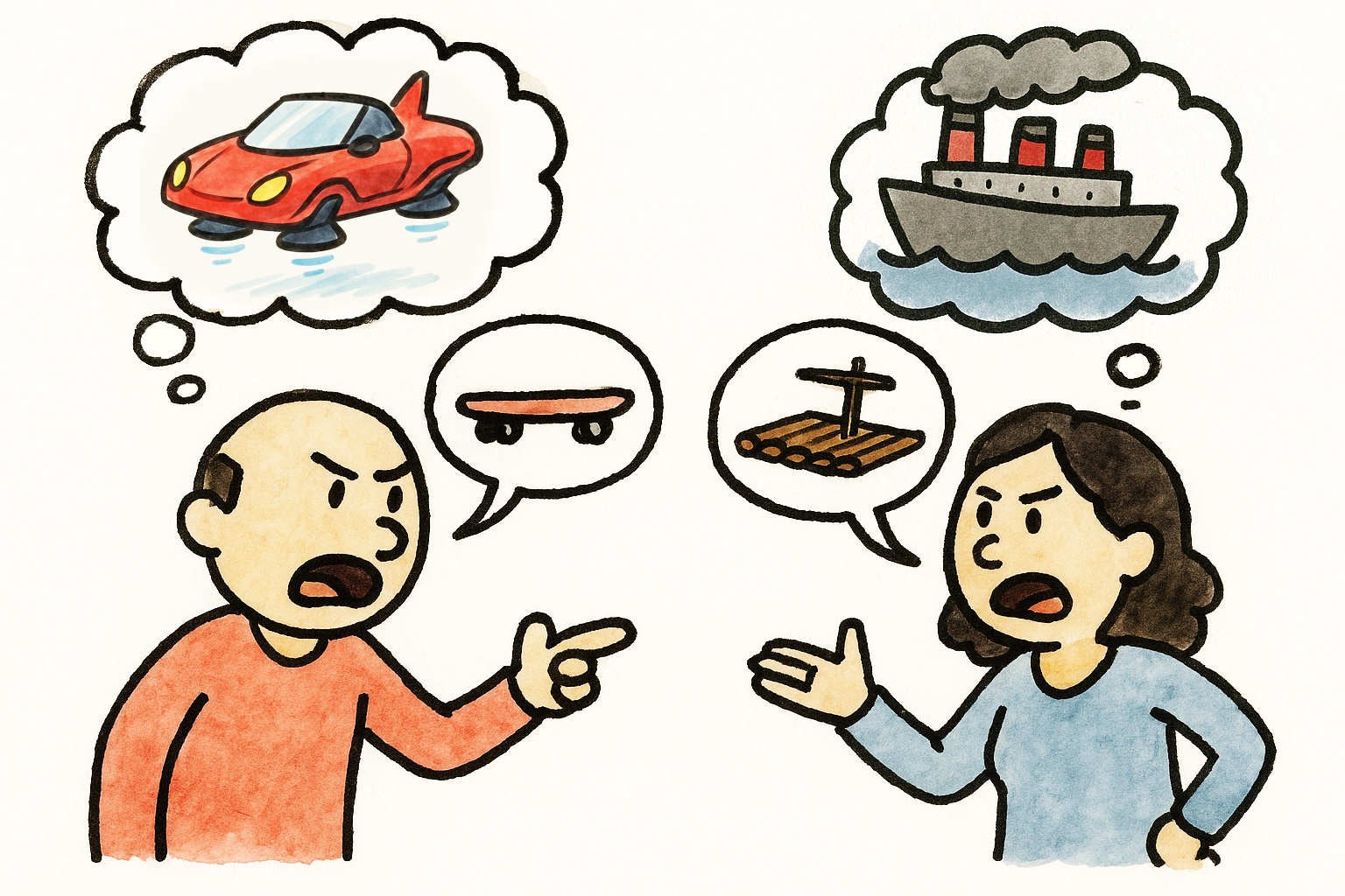
When the North Star is not clearly articulated, everyone has their own.
Here is a story that will sound familiar to many readers:
A product team is trying to design a feature to address a specific user pain point. Alice has designed an elegant solution that addresses not just the problem at hand, but several prevalent longstanding user pain points at once — an eigensolution. She is aware it would be a little trickier to implement than other potential solutions, but the increase in implementation effort is very modest, and easily offset by the tremendous improvement in user experience. She has even outlined a staged deployment strategy that allows it to ship incrementally, adding value and getting customer feedback earlier.
Excited, she presents her idea to the product team, only to hear engineering manager Bob dismiss it with “this is scope creep and way too much work, it’s not worth doing”. However, what Bob is actually thinking is “this is a bad idea; any amount of work towards it is a waste”. The design session is now derailed; instead of debating Alice’s idea on its merits, the discussion has shifted towards costing and/or reducing effort. But this is a dead end because the amount of work was never the real problem. In the end, Alice wants to be seen as a team player, so she backs off and concedes to Bob’s “simpler” idea, despite her worries that it is overfit to the very specific use case being discussed, and the product is now worse.
Arguing over effort feels safer and less confrontational than debating vision — but is often a proxy war. Additionally, it is not productive. If the idea is poor, effort is irrelevant. And once we know an idea is good and believe it to our core, we have more incentive to figure out implementation, which often proves to be easier than expected once properly investigated. Explicitly fleshing out the Hovercar strips away the noise and brings clarity.
When we answer the questions above in order and reach consensus on the North Star before moving on to the compromises, we know what is an actual design decision and what is a compromise driven by practical constraints. Articulating these separately, allows us to discuss them separately. It is very hard to evaluate tradeoffs collaboratively if you are not on the same page about what we are trading off and how much it’s worth. You need both the cost and the benefit to do a cost-benefit analysis!
Additionally, fleshing the North Star out separately ensures that everyone is on the same page about what is being discussed. All too often have I seen early design sessions where one person is discussing the skateboard, another the bicycle, and a third one the hovercar, no-one realizing that the reason they can’t reach consensus is that they are designing different things.
4. It can improve the MVP via user testing
Conventional wisdom is that we strip down the North Star to an MVP, ship that, then iterate based on user input. With that process, our actual vision never really gets evaluated and by the time we get to it, it has already changed tremendously.
But did you know you can actually get input from real users without writing a single line of code?
Believe it or not, you don’t need to wait until a UI is prototyped to user test it. You can even user test a low-fi paper prototype or even a wireframe. This is widely known in usability circles, yet somehow entirely unheard of outside the field. The user tells you where they would click or tap on every step, and you mock the UI’s response by physically manipulating the prototype or showing them a wireframe of the next stage.
Obviously, this works better for some types of products than others. It is notably hard to mock rich interactions or UIs with too many possible responses. But when it does work, its Impact/Effort ratio is very high; you get to see whether your core vision is on the right track, and adjust your MVP accordingly.
It can be especially useful when there are different perspectives within a team about what the North Star might be, or when the problem is so novel that every potential solution is low-confidence. No-one’s product intuition is always right, and there is no point in evaluating compromises if it turns out that even the “perfect” solution was not actually all that great.
5. It paves the way for future evolution
So far, we have discussed the merits of designing our North Star, assuming we will never be able to ship it. However, in many cases, simply articulating what the North Star is can bring it within reach. It’s not magic, just human psychology.
Once we have a North Star, we can use it to evaluate proposed solutions: How do they relate to it? Are they a milestone along a path that ends at the North Star? Do they actively prevent us from ever getting there? Prioritizing solutions that get us closer to the North Star can be a powerful momentum building tool.
Humans find it a lot easier to make one more step along a path they are already on, than to make the first step on an entirely new path. This is well-established in psychology and often used as a technique for managing depression or executive dysfunction. However, it applies on anything that involves humans — and that includes product design.
Once we’re partway there, it naturally begs the question: can we get closer? How much closer? Even if we can’t get all the way there, maybe we can close enough that the remaining distance won’t matter. And often, the closer you get, the more achievable the finish line gets.
In fact, sometimes simply reframing the North Star as a sequence of milestones rather than a binary goal can be all that is needed to make it feasible. For an example of this, check out the CSS Nesting case study below.
Case studies
In my 20 years of product design, I have seen ephemeral constraints melt away so many times I have learned to interpret “unimplementable” as “kinda hard; right now”. Two examples from my own experience that I find particularly relevant below, one around Survey UI, and one around a CSS language feature.
Context Chips and the Power of Engineering Momentum
The case study is described at length in Context Chips in Survey Design: “Okay, but how does it feel?”. In a nutshell, the relevant bits are:
- Originally, I needed to aggressively prioritize due to minimal engineering resources, which led me to design an extremely low-effort solution which still satisfied requirements.
- The engineer hated the low-effort idea so much, he prototyped a much higher-effort solution in a day, backend and all. Previously, this would have been entirely out of the question.
- Once I took the ephemeral constraints out of the question, I was able to design a much better, novel solution, but it got pushback on the basis of effort.
- Prototyping it allowed us to user test it, which revealed it performed way better than alternatives.
- Once user testing built engineering momentum and the implementation was more deeply looked into, it turned out it did not actually require as much effort as initially thought.
Here is a dirty little secret about software engineering (and possibly any creative pursuit): neither feasibility nor effort are fixed for a given task. Engineers are not automatons that will implement everything with the same energy and enthusiasm. They may implement product vision they disagree with, but you will be getting very poor ROI out of their time.
Investing the time and energy to get engineers excited can really pay dividends. When good engineers are excited, they become miracle workers.
In fact, engineering momentum is often, all that is needed to make the infeasible, feasible. It may seem hard to fit this into the crunch of OKRs and KPIs but it’s worth it; the difference is not small, it is orders of magnitude. Things that were impossible or insurmountable become feasible, and things that would normally take weeks or months get done in days.
One way to build engineering momentum is to demonstrate the value and utility of what is being built. All too often, product decisions are made in a vacuum, based on gut feelings and assumptions about user needs. Backing them up with data, such as usability testing sessions is an excellent way to demonstrate (and test!) their basis. When possible, having engineers observe user testing sessions firsthand can be much more powerful than secondhand reports.
Relaxed CSS Nesting and the Power of Evolution
Sometimes high effort things just take a lot of hard work and there is no way around it. Other times, feasibility is just one good idea away.
One of my favorite examples, and something I’m proud to have helped drive is the relaxed CSS Nesting syntax, now shipped in every browser. It is such an amazing case study on the importance of having an explicit and consensus-backed North Star UI [2].
In a nutshell, CSS nesting was a (then new) CSS syntax that let developers better organize their code through reducing repetition.
table.browser-support {
	border-collapse: collapse;
}
table.browser-support th,
table.browser-support td {
	border: 1px solid silver;
}
@media (width < 600px) {
	table.browser-support,
	table.browser-support tr,
	table.browser-support th,
	table.browser-support td {
		display: block;
	}
}
table.browser-support th {
	border: 0;
}
table.browser-support td {
	background: yellowgreen;
}
table.browser-support td:empty {
	background: red;
}
table.browser-support td > a {
	color: inherit;
}
table.browser-support {
	border-collapse: collapse;

	@media (width < 600px) {
		&, tr, th, td {
			display: block;
		}
	}

	th, td {
		border: 1px solid silver;
	}
	th {
		border: 0;
	}
	td {
		background: yellowgreen;

		&:empty {
			background: red;
		}

		> a {
			color: inherit;
		}
	}
}
This is one of the rare cases where the North Star was well known in advance, since the syntax was already well established in developer tooling (CSS preprocessors). Instead, the big challenge was navigating the practical constraints, since CSS implemented in browsers has different performance characteristics, so a syntax that is feasible for tooling may be out of reach for a browser. In this case, the North Star syntax had been ruled out by browser engineers due to prohibitive parsing performance [3], so we had to design a different, more explicit syntax that could be parsed more efficiently.
At this point, it is important to note that CSS Nesting is a feature that is very heavily used once available. Conciseness and readability are paramount, especially when conciseness is the sole purpose of the feature in the first place!
Initial attempts for a syntax that satisfied these technical requirements introduced a lot of noise,
making the syntax tedious to write and noisy to read.
Even worse, these attempts were actively incompatible with the North Star syntax, as well as other parts of the language (namely, the @scope rule).
This meant that even if the North Star syntax became feasible later,
CSS would need to forever support syntax that would then have no purpose,
and would only exist as a wart from the past, just like HTML doctypes.
Once Google became very keen to ship Nesting (driven by State of CSS 2022, which showed it as the top missing CSS feature), a small subset of the CSS Working Group, led by Elika Etemad and myself met to explore alternatives, and produced four competing proposals. The one that the group voted to adopt [4] was the one I designed explicitly to answer the question: If the North Star syntax is out of the question right now, what is the largest subset of it that is feasible?
Once we got consensus on this intermediate syntax, I started exploring whether we could get any closer to the 🌟, even proposing an algorithm that would reduce the number of cases that required the slower parsing to essentially an edge case. A few other WG members joined me, with my co-TAG member Peter Linss being most vocal.
This is a big advantage of North Star compatible designs: it is much easier to convince people to move a little further along on the path they are already on, than to move to a completely different path. With a bit of luck, you may even find yourself implementing an “infeasible” North Star without even realizing it, one little step at a time.
We initially faced a lot of resistance from browser engineers, until eventually a brilliant Google engineer, Anders Ruud and his team experimented with variations of my proposed algorithm and actually closed in on a way to implement the North Star syntax in Chrome. The rest, as they say, is history. 🌟
Conclusion
Hopefully by now you’re convinced about the value of investing time in reaching alignment on an explicit North Star that has buy-in from the entire product team.
A common misconception is that the North Star is a static goal that prevents you from adapting to new data, such as customer feedback. But often, your North Star will change a lot over time, and that’s okay. Having an initial destination does not take away your ability to course correct. That’s not giving up, it’s adapting.
And yes, it’s true that many product teams do use a vision-led approach — they just start from the car, not the hovercar. While that confers some of the benefits above, there is still an implicit reduction happening, because the hovercar is still there in the back of their mind.
Note that for this framework to be beneficial, it is important that everyone is on the same page and understands the steps, benefits, and goals of this approach. Co-designing a North Star with a team that sees the process as a pointless thought experiment will only add friction and will not confer any of these benefits. Also, this is a mindset that can only work when applied top-down. If you are not a decision-maker at your place of work and leadership is not on board, you will have a very hard time if you try to push this ad hoc, without first getting leadership buy-in. You can try sending them a link to this blog post!
If this post resonated, please share your own case studies in the comments. Or, if you decide to give this framework a try, I’d love to hear how it went!
Indeed, looks like I’m not the first to draw a parallel between the two! ↩︎
I even did an entire talk about it at Web Unleashed, with a lot more technical detail than what I have included here. ↩︎
for any Compilers geeks out there that want all the deets: it required potentially unbounded lookahead since there is no fixed number of tokens a parser can read and be able to tell the difference between a selector and a declaration. ↩︎
Originally dubbed “Lea’s proposal”, and later “Non-letter start proposal”, but became known as Option 3 from its position among the five options considered (including the original syntax). ↩︎
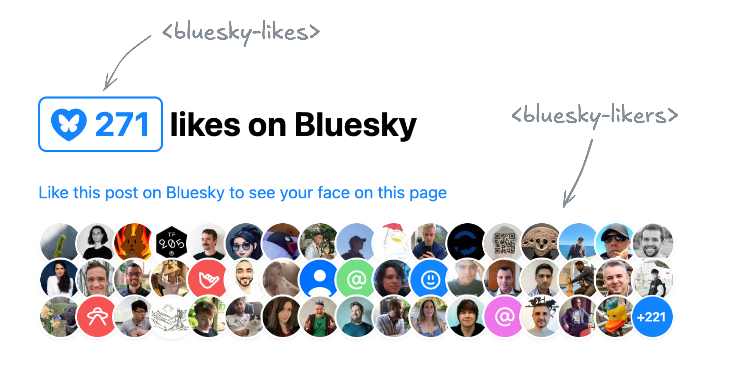
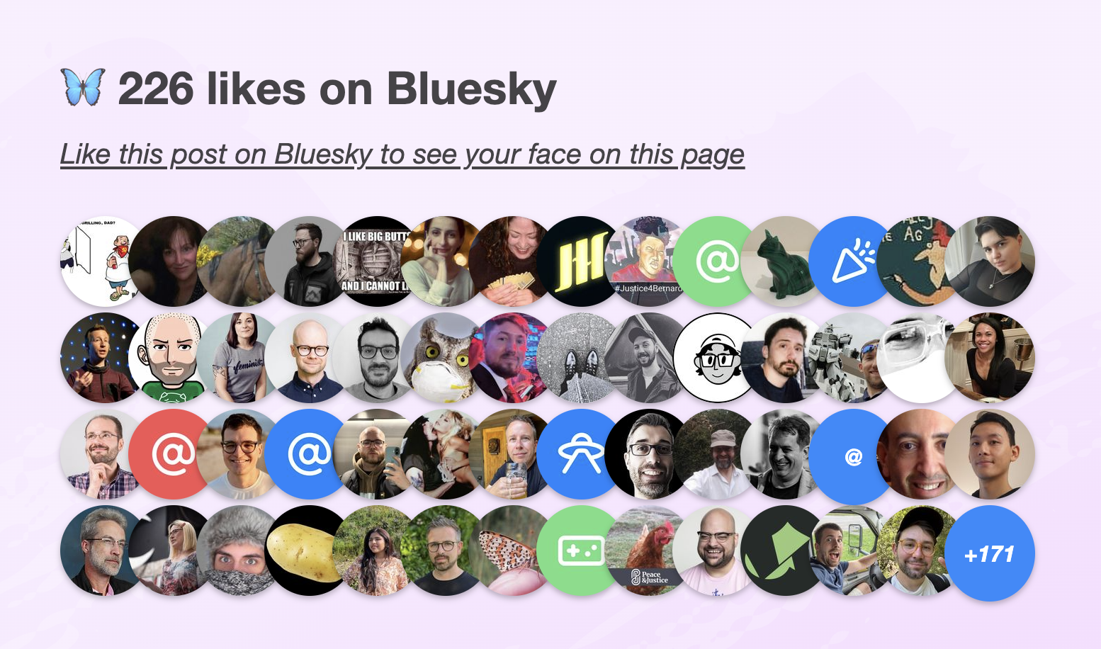
Bluesky Likes Web Components
A love letter to the Bluesky API
I’m old enough to remember the golden Web 2.0 era, when many of today’s big social media platforms grew up. A simpler time, when the Web was much more extroverted. It was common for websites to embed data from others (the peak of mashups), and prominently feature widgets from various platforms to showcase a post’s likes or shares.
Especially Twitter was so ubiquitous that the number of Twitter shares was my primary metric for how much people were interested in a blog post I wrote. Then, websites started progressively becoming walled gardens, guarding their data with more fervor than Gollum guarding the Precious. Features disappeared or got locked behind API keys, ridiculous rate limits, expensive paywalls, and other restrictions. Don’t get me wrong, I get it. A lot of it was reactionary, a response to abuse — the usual reason we can’t have nice things. And even when it was to stimulate profit — it is understandable that they want to monetize their platforms. People gotta eat.
I was recently reading this interesting article by Salma Alam-Naylor. The article makes some great points, but it was something else that caught my eye: the widget of Bluesky likes at the bottom.
I mentioned it to my trusty apprentice Dmitry who discovered the API was actually much simpler than what we’ve come to expect. Later, it turned out Salma has even written an entire post on how to implement the same thing on your own site.
The openness of the API was so refreshing. Not only can you read public data without being authenticated, you don’t even need an API key! Major nostalgia vibes.
It seemed the perfect candidate for a web component that you can just drop in to a page, give it a post URL, and it will display the likes for that post. I just had to make it, and of course use it right here.
Web Components that use API data have been historically awkward.
Let’s set aside private API keys or APIs that require authentication even for reading public data for a minute.
Even for public API keys, where on Earth do you put them?!
There is no established pattern for passing global options to components.
Attributes need to be specified on every instance, which is very tedious.
So every component invents their own pattern: some bite the bullet and use attributes, others use static class fields, data-* attributes on any element or on specific elements, separate ES module exports, etc.
None of these are ideal, so components often do multiple.
Not to mention the onboarding hassle of creating API keys if you want to try multiple APIs.
The Bluesky API was a breath of fresh air: just straightforward HTTP GET requests with straightforward JSON data responses.
Sing with me!
🎶 all you need is fetch 🎺🎺🎺
🎶 all you need is fetch 🎺🎺🎺
🎶 all you need is fetch, fetch 🎶
🎶 fetch is all you need 🎶
Building a component that used it was a breeze.
Two Components for displaying Bluesky likes
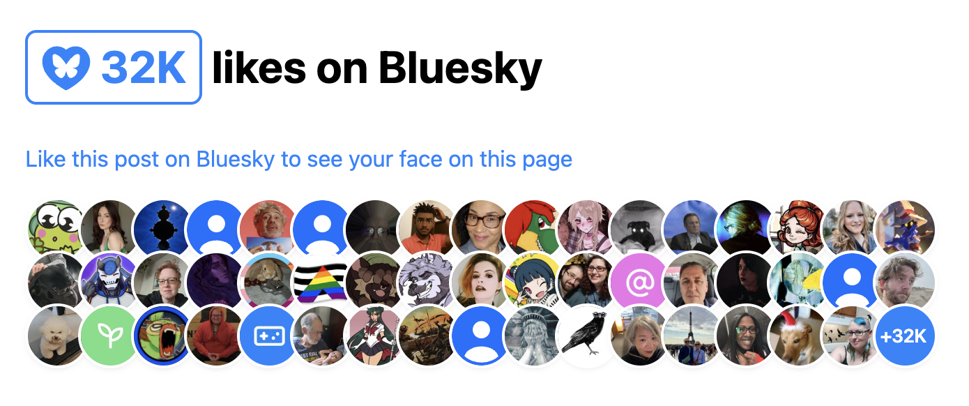
In the end I ended up building two separate components, published under the same bluesky-likes npm package:
<bluesky-likes>— displays the number of likes for a post, and<bluesky-likers>— displays the list of users who liked a post.
They can be used separately, or together. E.g. to get a display similar to Salma’s widget, the markup would look like this:
<script src="https://unpkg.com/bluesky-likes" type="module"></script>

<h2>
	<bluesky-likes src="https://bsky.app/profile/lea.verou.me/post/3lhygzakuic2n"></bluesky-likes>
	likes on Bluesky
</h2>

<p>
	<a href="https://bsky.app/profile/lea.verou.me/post/3lhygzakuic2n">Like this post on Bluesky to see your face on this page</a>
</p>

<bluesky-likers src="https://bsky.app/profile/lea.verou.me/post/3lhygzakuic2n"></bluesky-likers>
And the result would be similar to this:
I started by making a single component that did both, but it quickly became clear that it was better to split them up. It provided a lot more flexibility with only a tiny bit more effort for the common case, and it allowed me to simplify the internal structure of each component.
Requests are aggressively cached across component instances, so the fact that it’s two separate components doesn’t mean you’ll be making duplicate requests. Additionally, these ended up pretty lightweight: the whole package is ~2.5 KB minified & gzipped and dependency-free.
API Design for Web Components
Design Principles
Per my usual API design philosophy, I wanted these components to make common cases easy, complex cases possible, and not have usability cliffs, i.e. the progression from the former to the latter should be smooth.
What does that mean for a web component?
Common use cases should be easy
You should have a good result by simply including the component and specifying the minimum input to communicate your intent, in this case, a Bluesky post URL.
- You should not need to write CSS to make it look decent
- You should not need to write JavaScript to make it work
- You should not need to slot content for things that could have sensible defaults
- You should not need to specify things it can figure out on its own from things you’ve already specified
Complex use cases should be possible
If you’re willing to put more work into it, the sky should be the limit. You should be able to completely restyle it, customize nearly every part of its UI etc, but the UX of these things doesn’t need to be optimized.
For example:
- Extensibility over encapsulation: If something doesn’t need to be hidden away, expose it as a part. Don’t be frugal with your parts. The downsides of exposing too many parts are few and small, but not exposing enough parts can make certain styling impossible.
- Don’t be frugal with slots: use slots with fallback content liberally. That way people can customize content or even entire parts of the UI.
- Expose states for conditional styling. Yes, it’s Baseline now.
You can style the <slot> element itself, to avoid adding (and thus, having to expose) additional wrapper divs.
And yes, you can expose a <slot> via a part as well.
Just be mindful that that part will be available whether the slot has slotted content or not.
For these components, as a proof of concept, in addition to parts and slots all component styles and templates are exposed as static properties on the component class that you can modify or replace, either directly on it, or in your own subclass, for extreme customizability.
No usability cliffs
Making common things easy and complex things possible is not enough for a good API. Most use cases fall somewhere in between the two extremes. If a small increase in use case complexity throws users off the deep end in terms of API complexity, they’re gonna have a bad time.
The API should have enough customization hooks that common customizations do not require going through the same flow as full customization and recreating everything.
For web components, this might mean:
- Ideally, standard CSS properties on the host should work. This is also part of the principle of least astonishment. However, sometimes this is simply not feasible or it would require unacceptable tradeoffs, which brings us to…
- Exposing enough custom properties that basic, common customizations don’t require parts.
- Nest slots liberally: You should not have to replace an entire part of the UI just to customize its content. Nested slots allow you to provide UI extension points at different levels of abstraction.
The 99-99 rule of Web Components
The Ninety-Ninety Rule tells us that the last 10% of the work takes 90% of the time. I would argue that for web components, it’s more like a 99-99 Rule.
Take these components as an example. They are the poster child for the kind of straightforward, simple component that does one thing well, right? But web components are a bit like children: if most people realized upfront how much work they are, way fewer would get made. 😅
Even when the core functionality is straightforward, there are so many other things that need to be done:
- Dynamically responding to changes (in attributes, slots, nested content, etc) like regular HTML elements takes work, especially if you want to do it 100% properly, which is rarely a good idea (more on that below). Libraries like Lit make some of it easier, but not trivial.
- Accessibility and i18n often take orders of magnitude more work than core functionality, especially together.
- Designing & implementing style and UI customization hooks
- Figuring out the right tradeoffs between performance and all of the above
And this is without any additional functionality creeping up.
Some battle scars examples below.
Customizing the link in <bluesky-likes>
A good component has sensible defaults, but allows customization of everything users may reasonably want to customize. There is nothing more annoying than finding a web component that does almost what you want, but doesn’t allow you to customize the one thing you really need to customize.
My first prototype of <bluesky-likes> always had an internal link in its shadow DOM that opened the full list of likers in a new tab.
This opened it up to usability, accessibility, and i18n issues:
- What if you want it to link to the post itself, or even an entirely different URL?
- How to customize the link attributes, e.g.
relortarget? - a11y: The link did not have a
titleat the time, only the icon had alt text. This meant assistive technologies would read it like “Butterfly blue heart fifteen”. How to word the link title to best communicate what the link does to assistive technologies without excessive verbosity? - And then, how to allow users to customize the link title for i18n?
Often components will solve these types of problems the brute force way, by replicating all <a> attributes on the component itself,
which is both heavyweight and a maintenance nightmare over time.
Instead, we went with a somewhat unconventional solution:
the component detects whether it’s inside a link, and removes its internal <a> element in that case.
This solves all four issues at once; the answer to all of them is to just wrap it with the link of your choice.
This allowed us to just pick a good default title attribute, and not have to worry about it.
It’s not perfect: now that :host-context() is removed,
there is no way for a component to style itself differently when it’s inside a link,
to e.g. control the focus outline.
And the detection is not perfect, because doing it 100% perfectly would incur a performance penalty for little gain.
But on balance, it so far seems the tradeoffs are worth it.
The pain of creating accessible components
My first prototype of <bluesky-likers> wrapped all avatars with regular links (they just had rel="nofollow" and target=_blank").
Quite reasonable, right?
And then it dawned on me: this meant that if a keyboard user had the misfortune of stumbling across this component in their path,
they would have needed to hit Tab 101 (!) times in the worst case to escape it.
Yikes on bikes! 😱
So what to do? tabindex="-1" would remove the links from the tabbing order, fixing the immediate problem.
But then how would keyboard users actually access them?
A bigger question is “Do they need to?”.
These links are entirely auxiliary;
in Salma’s original widget avatars were not links at all.
Even if someone wants to explore the profiles of people who liked a post for some reason,
the Bluesky “Liked By” page (already linked via <bluesky-likes>) is a much better fit for this.
When using a pointing device, links are free. If you don’t interact with them, they don’t get in your way, so you may as well have them even if few users will need them. But when something is part of the tabbing order, there is now a cost to it. Is the value of being able to tab to it outweighed by the friction of having to tab past it?
On the other hand, it feels wrong to have links that are not exposed at all to keyboard and assistive tech users. Even if they are auxiliary, making them entirely inaccessible feels like we’re talking away their agency.
I decided to err on the side of exposing the links to keyboard users,
and added a description, via a description slot with default fallback content, to explain to SR users what is being displayed,
and a skip link after it, which is visible when focused.
Why not use the default slot for the description?
The default slot can be very convenient when nothing else is slotted. However, it is very annoying to slot things in other slots without slotting anything in the default slot. Consider this:
<bluesky-likers src="...">
     <div slot="empty">No likers :(</div>
</bluesky-likers>
It may not look like it, but here we’ve also slotted a few blank text nodes to the default slot, which would obliterate the SR-accessible default description with no visible signs to the developer. And since 2/5 devs don’t test at all for screen readers, they would be unlikely to notice.
Default slots are great because they allow users to specify content without having to understand slots — it’s just how HTML works. However, because of this issue, I mainly recommend using them for things one nearly always wants to specify when using the component. If actual content is slotted into it, the additional blank nodes are not a problem. You could also choose to go for the default slot if you don’t have any other slots, though that’s a little more dangerous, as you may always want to add more slots later.
It’s still not an ideal user experience though. A skip link offers you the choice of skipping only at the beginning. What happens if you tab through 30 links, and then decide you’ve had too much? Or when you’re tabbing backwards, via Shift+Tab? Then you’re still stuck wading through all links with no escape and no respite.
In the end, perhaps I should bite the bullet and implement more sophisticated keyboard navigation,
similar to how native form controls work (imagine a <select> having tab stops for every <option>!).
But I have already spent more than is reasonable on these components, so it’s time to let them ride the trains,
and leave the rest to PRs.
For now, I implemented Home and End keys to jump to the first and last link respectively, so that at least users have an out.
But as a former TAG member, I can’t help but see this as a gap in the platform. It should not be this hard to create accessible components. It should not require jumping through hoops, and the process should not be a minefield. Good keyboard accessibility benefits everyone, and the primitives the web platform currently provides to enable that are egregiously insufficient.
The pain of creating localizable web components
Difficulty jumps to eleven when you want to make a component localizable. As a minimum, it means any UI text, no matter where it appears, must be customizable. This is desirable anyway for customizability, but it becomes essential for localization. The quick and dirty way is to provide slots for element content and attributes for content that appears in attributes (e.g. titles, aria-labels, etc).
Avoid providing attributes as the only way to customize content. This means they cannot contain HTML, which is often necessary for localization, and always desirable for customization. That said, attributes are totally fine as a shortcut for making common cases easy. E.g. a common pattern is to provide both an attribute and a label with the same name for commonly customizable things (e.g. labels).
However, this is often not enough.
For example, both components display formatted numbers:
<bluesky-likes> displays the total number of likes, and <bluesky-likers> displays the number of likes not shown (if any).
The web platform thankfully already provides a low-level primitive for formatting numbers: Intl.NumberFormat,
which you can also access via number.toLocaleString().
For example, to format 1234567 as 1.2M , you can do
// Try it in the console!
(1234567).toLocaleString("en", {notation: "compact"})
This is great for English UIs, but what about other languages?
If you answered “Oh, we’ll just pass this.lang to instead of a hardcoded "en"”,
you’d be wrong, at least for the general case.
That gives you the element language only when it’s directly specified on the element via a lang attribute.
However, usually the lang attribute is not specified on every element,
but on an ancestor, and it inherits down.
Something like is a good compromise:
const lang = this.lang
			|| this.parentNode.closest("[lang]")?.lang
			|| this.ownerDocument.documentElement.lang
			|| "en";
This gets you the element’s language correctly if it’s:
- specified on the element itself
- specified on an ancestor element within the same shadow tree
- specified on the root element of the document
This is what these components use.
It’s not perfect, but it covers a good majority of cases with minimal performance impact.
Notably, the cases it misses is when the component is inside a shadow tree but is getting its language from an element outside that shadow tree, that is also not the root element.
I’d wager that case is very rare, and there is always the escape hatch of specifying the lang attribute on the component itself.
What would doing it 100% properly entail?
If the route above is a shortcut and misses some cases, you may be wondering what it would take to cover every possible case. Maybe it’s just for the lulz, or maybe you’re working under very strict guidelines that require you to fully emulate how a native element would behave.
I advise against following or even reading this section. Proceed at your own risk. Or save your mental health and skip it. Unless you’re in the WHATWG, in which case please, go ahead.
So what would doing it 100% properly look like? First, we’d want to take nested shadow roots into account, using something like this, which you might want to abstract into a helper function.
let lang = this.lang;
if (!lang) {
	let langElement = this;
	while (!(langElement = langElement.closest("[lang]"))) {
		let root = langElement.getRootNode();
		let host = root.host ?? root.documentElement;
		langElement = host;
	}

	lang = langElement?.lang || "en";
}
But, actually, if you really needed to do it properly, even now you wouldn’t be done!
What about dynamically reacting to changes?
Any element’s lang attribute could change at any point.
Er, take my advice and don’t go there. Pour yourself a glass of wine (replace with your vice of choice if wine is not your thing), watch an episode of your favorite TV show and try to forget about this.
Some of you will foolishly continue. I hear some voices at the back crying “But what about mutation observers?”.
Oh my sweet summer child. What are you going to observe?
The element with the lang attribute you just found?
WRONG.
What if a lang attribute is added to an element between that ancestor and your component?
I.e. you go from this:
<div lang="el" id="a">
	<div id="b">
		<bluesky-likes src="..."></bluesky-likes>
	</div>
</div>
To this:
<div lang="el" id="a">
	<div lang="es" id="b">
		<bluesky-likes src="..."></bluesky-likes>
	</div>
</div>
Your component language is now es, but nothing changed in the element you were observing (#a), so nothing notified your component.
What is your recourse?
I told you to not think about it. You didn’t listen. It’s still not too late to skip this section and escape the horrors that lie ahead.
Still here? Damn, you’re stubborn. Fine, here’s how to do it with mutation observers if you really need to. But be warned, it’s going to hurt.
Mutation observers cannot observe ancestors, so the only way to detect changes that way would be to observe not just the element with the lang attribute
but also its entire subtree.
Oh and if the path from your component to that ancestor involves shadow trees, you need to observe them separately,
because mutation observers don’t reach past shadow trees (proposal to change that).
😮💨 Surely, that should do it, right? WRONG again. I told you it would hurt.
Consider the scenario where the ancestor with the lang attribute is removed.
Mutation observers cannot observe element removal (proposal to fix that),
so if you go from this:
<body lang="el">
	<div lang="el" id="a">
		<div id="b">
			<bluesky-likes src="..."></bluesky-likes>
		</div>
	</div>
</div>
To this:
<body lang="el">
	<div id="b">
		<bluesky-likes src="..."></bluesky-likes>
	</div>
</div>
…nothing will notify your component if you’re just observing #a and its descendants.
So the only way to get it right in all cases is to observe the entire tree, from the document root down to your component, including all shadow trees between your component and the root. Feeling nauseous yet?
There is one alternative.
So, the browser knows what the element’s language is, but the only way it exposes it is the :lang() pseudo-class,
which doesn’t allow you to read it, but only check whether an element matches a given language.
While not ideal, we can hack this to observe language changes.
Coupled with the earlier snippet to detect the current language, this allows us to detect changes to the component’s language without the huge performance impact of observing the entire page.
How can we do that?
Once you’ve detected the component language, generate a rule that sets a CSS variable.
E.g. suppose you detected el, you’d add this to your shadow DOM:
:host(:lang(el)) {
	--lang: el;
}
Then, we register the --lang property,
and observe changes to it via Style Observer or just raw transition events.
When a change is detected, run the detection snippet again and add another CSS rule.
When registering component CSS properties, make sure to register them globally (e.g. via CSS.registerProperty()),
as @property does not currently work in shadow DOM.
This is already spec’ed, but not yet implemented by browsers.
Now, should you do this? Just because you can, doesn’t mean you should. In the vast majority of cases, a few false positives/negatives are acceptable, and the tradeoff and performance impact of introducing all this complexity is absolutely not worth it. I can only see it being a good idea in very specific cases, when you have a reason to strive for this kind of perfection.
Most of web components development is about making exactly these kinds of tradeoffs between how close you want to get to the way a native element would behave, and how much complexity and performance impact you’re willing to sacrifice for it. But going all the way is rarely a good balance of tradeoffs. That said, this should be easier. Reading a component’s language should not require balancing tradeoffs for crying out loud!
There is some progress on that front. In September at TPAC we got WHATWG consensus on standardizing a way to read the current language / direction and react to future changes. To my knowledge, not much has happened since, but it’s a start. Perhaps this dramatic reenactment generates some empathy among WHATWG folks on what web components developers have to go through.
🚢 it, squirrel!
It’s all fun and games and then you ship.
Hopefully, I have demonstrated that if you’re not careful, building a web component can become a potentially unbounded task. Some tasks are definitely necessary, e.g. accessibility, i18n, performance, etc, but there comes a point where you’re petting.
So here they are: Demo Repo NPM
They’re far from perfect. Yes, they could be improved in a number of ways. But they’re good enough to use here, and that will do for now. If you want to improve them, pull requests are welcome (check with me for big features though). And if you use them on a for-profit site, I do expect you to fund their development. That’s an ethical and social expectation, not a legal one (but it will help prioritization, and that’s in your best interest too).
If you’ve used them, I’d love to see what you do with them!
Thanks to Léonie Watson for some of the early a11y feedback, and to Dmitry Sharabin for helping with the initial API exploration.
Construction Lines
I recently stumbled across The Oatmeal’s series on Creativity. While all of it is spot on, the part on erasers hit especially hard.
“There is a lot of shame associated with backpedaling; things like quitting your job, getting a divorce, or simply starting over are considered shameful.
But forward isn’t always progress.
And backward isn’t always regress.
Sometimes going down the wrong path isn’t a mistake — it’s a construction line.”
It was exactly what I needed to hear. You see, only a few days prior, Font Awesome and I had parted ways — the end of a short, but transformative chapter. I’m proud of what we built together, and grateful for what I learned along the way. But it was time to move on.
Jobs are a lot like relationships. They often start with infatuation — and end with the realization that you’re simply not compatible, and that’s no-one’s fault. Letting go always stings, even when it’s the right call. There’s always grief: when you’re not ready to move on, you grieve the bond; when you are, you grieve your expectations. But every ending leaves behind clarity — about who you are, and what makes you happy.
The pursuit of happiness
Today is my 39th birthday — and this summer marks 20 years since I first dipped my toes into this industry. Naturally, I’ve been doing a lot of reflection.
As is typical for ADHDers, I have done a ton of different things, and built a diverse skillset as a result. But what made me happiest? The list of highs went a bit like this:
- Entrepreneurship: Co-founding a startup and driving it to become a household name (in Greece — this was 2008!)
- Consulting: Being a full-time consultant, speaker, and author, traveling the world and jumping from one exciting gig to another
- Academia:[1] Pushing the boundaries of Human-Computer Interaction at MIT and teaching MIT CS students to care about people.
All had three things in common: autonomy, breadth, and impact.
These three things have been the biggest predictors of happiness for me — far more than income [2] or work-life balance, which are the usual suspects.
I used to aspire to work-life balance in the same way I aspired to frequent exercise — because it was good for me, not because it gave me joy. Eventually I realized that what makes me happy isn’t working less, it’s loving what I do, and feeling it matters. Working less cannot transform how your work makes you feel; it can only dampen the effects. But dilution doesn’t turn misery into joy — at best it just makes it tolerable. Don’t get me wrong, poor WLB can absolutely make you miserable; when long hours are an externally imposed expectation, not an internal drive fueled by passion. As with many things in life, it’s enthusiastic consent that makes all the difference.
Then there’s breadth. Most jobs try to box you in: PM or engineer? Scientist or practitioner? UX Researcher or designer? DevRel or standards? And I’m like…
Aurora is my spirit animal 🫶🏼 Source
It’s silly that people are forced to choose, and present themselves as less than to seem more attractive to hiring managers. To use myself as an example:
- Web architecture: I have designed several web technologies that have shipped across all browsers. I’ve spent 4 years in the TAG, reviewing new web technologies across the web platform, and eventually leading the Web Platform Design Principles effort.
- Product/usability/HCI: Prior to working as Product Lead at Font Awesome, I’ve earned a PhD at MIT in Human-Computer Interaction with a minor in Entrepreneurship & Innovation. I published peer reviewed papers in top-tier HCI conferences, and co-created/taught a course on usability & web technologies that is now a permanent subject. I have run user research for scientific and industry projects. I have started several open source projects, some used by millions. In the more distant past, I co-founded a (then) well-known social startup in my home country, Greece and ran product, engineering, and design for three years (six if you count pre-incorporation).
- DevRel: I’ve given over 100 conference talks, published a bestselling book on CSS, and was the first devrel hire at W3C back in 2012. I have built dozens of apps and polyfills that stimulated developer interest in new Web features and drove browser adoption.
Should I present myself as a web architecture expert, a usability/product person, an HCI researcher, or a Developer Advocate?
What a pointless dilemma if I ever saw one!
Combining skills across different areas is a strength to be celebrated, not a weakness to be swept under the rug. The crossover between skills is where the magic happens. Off the top of my head:
- Understanding usability principles has made me a far better web standards designer.
- Web standards work is product design on hard mode. After the impossibly hard constraints and tradeoffs you deal with when designing APIs for the Web platform, regular product problems seem like a cakewalk (we have versions? And we can actually change things?? And we have reliable metrics?!? And the stakeholders all work at the same company?!? 🤯).
- They often feed into each other: DevRel work made me a better communicator in everything I do. Usability made me a better speaker and educator[3], so a better developer advocate too.
- Leading the Web Platform Design Principles convinced me that explicit design principles are immensely useful for all product work.
- Web standards taught me that contrary to popular belief, you do not need a benevolent dictator to ship. But then you do need a good process. Consensus does not magically grow on trees, building consensus is its own art.
Lastly, impact does not have to be about solving world hunger or curing cancer. Making people’s lives a little better is meaningful impact too. It all boils down to:
You can achieve the same total impact by improving the lives of a few people a lot, or the lives of many people a little. For example, my work on web standards has been some of the most fulfilling work I’ve ever done. Its Individual Impact is small, but the Reach is millions, since all front-end developers out there use the same web platform.
What’s next?
Since consulting and entrepreneurship have been my happiness peaks, I figured I’d try them again. Yes, both at once, because after all, we’ve already established that WLB is a foreign concept 🤣
My apprentice Dmitry and I have been in high gear building some exciting things, which I hope to be able to share soon, and I feel more exhilarated than I have in years. I had missed drawing my own lines.
In parallel, I’m taking on select consulting work, so if you need help with certain challenges, or to level up your team around web architecture, CSS, or usability, get in touch.
Don’t get me wrong, I’m not closing the door to full-time roles. I know there are roles out there that value passion and offer the kind of autonomy, breadth, and impact that would let me thrive. It’s the ROI of digging through rubble to find them that gives me pause — as a product person at heart, I/E tradeoffs are top of mind. But if you have such a unicorn, I’m all ears.
I also finally took a few small steps to make my pro bono work financially sustainable, a long overdue todo item. Both pages still need work, but you can now support my writing via ko-fi[4], and my open source work via GitHub Sponsors. I made separate pages for my two most popular projects, Prism (nearing 1.8 billion total npm installs! 🤯) and Color.js. This is as much about prioritization as it is about sustainability: money is an excellent signal about what truly matters to people.
I don’t have a polished “next” to announce yet.
But I’m exactly where I need to be.
Sometimes the clearest lines are the ones drawn after you erase.
Many things wrong with academia, but the intellectual freedom is unparalleled, and it makes up for a lot. ↩︎
See also Alan Watts’ “What if money was no object?” — a classic, but still relevant. ↩︎
Teaching is absolutely a form of UI design — a UI that exposes your knowledge to students — the users. There are many similarities between how good educators design their material and how good UI designers design interfaces. ↩︎
Thanks Dan Abramov for the wording inspiration (with permission). These things are so hard. ↩︎
Style-observer: JS to observe CSS property changes, for reals
I cannot count the number of times in my career I wished I could run JS in response to CSS property changes, regardless of what triggered them: media queries, user actions, or even other JS.
Use cases abound. Here are some of mine:
- Implement higher level custom properties in components, where one custom property changes multiple others in nontrivial ways (e.g. a
--variant: dangerthat sets 10 color tokens). - Polyfill missing CSS features
- Change certain HTML attributes via CSS (hello
--aria-expanded!) - Set CSS properties based on other CSS properties without having to mirror them as custom properties
The most recent time I needed this was to prototype an idea I had for Web Awesome, and I decided this was it: I’d either find a good, bulletproof solution, or I would build it myself.
Spoiler alert: Oops, I did it again
A Brief History of Style Observers
The quest for a JS style observer has been long and torturous. Many have tried to slay this particular dragon, each getting us a little bit closer.
The earliest attempts relied on polling, and thus were also prohibitively slow.
Notable examples were ComputedStyleObserver by Keith Clark in 2018
and StyleObserver by PixelsCommander in 2019.
Jane Ori first asked “Can we do better than polling?” with her css-var-listener in 2019. It parsed the selectors of relevant CSS rules, and used a combination of observers and event listeners to detect changes to the matched elements.
Artem Godin was the first to try using transition events such as transitionstart to detect changes, with his css-variable-observer in 2020.
In fact, for CSS properties that are animatable, such as color or font-size, using transition events is already enough.
But what about the rest, especially custom properties which are probably the top use case?
In addition to pioneering transition events for this purpose, Artem also concocted a brilliant hack to detect changes to custom properties:
he stuffed them into font-variation-settings, which is animatable regardless of whether the axes specified corresponded to any real axes in any actual variable font, and then listened to transitions on that property.
It was brilliant, but also quite limited: it only supported observing changes to custom properties whose values were numbers (otherwise they would make font-variation-settings invalid).
The next breakthrough came four years later, when Bramus Van Damme pioneered a way to do it “properly”, using the (then) newly Baseline transition-behavior: allow-discrete after an idea by Jake Archibald.
His @bramus/style-observer was the closest we’ve ever gotten to a “proper” general solution.
Releasing his work as open source was already a great service to the community, but he didn’t stop there. He stumbled on a ton of browser bugs, which he did an incredible job of documenting and then filing. His conclusion was:
Right now, the only cross-browser way to observe Custom Properties with @bramus/style-observer is to register the property with a syntax of “
<custom-ident>”. Note that<custom-ident>values can not start with a number, so you can’t use this type to store numeric values.
Wait, what? That was still quite the limitation!
My brain started racing with ideas for how to improve on this. What if, instead of trying to work around all of these bugs at once, we detect them so we only have to work around the ones that are actually present?
World, meet style-observer
At first I considered just sending a bunch of PRs, but I wanted to iterate fast, and change too many things.
I took the fact that the domain observe.style was available as a sign from the universe, and decided the time had come for me to take my own crack at this age-old problem, armed with the knowledge of those who came before me and with the help of my trusty apprentice Dmitry Sharabin (hiring him to work full-time on our open source projects is a whole separate blog post).
One of the core ways style-observer achieves better browser support is that
it performs feature detection for many of the bugs Bramus identified.
This way, code can work around them in a targeted way, rather than the same code having to tiptoe around all possible bugs.
As a result, it basically works in every browser that supports transition-behavior: allow-discrete,
i.e. 90% globally.
- Safari transition loop bug (#279012):
StyleObserverdetects this and works around it by debouncing. - Chrome unregistered transition bug (#360159391):
StyleObserverdetects this bug and works around it by registering the property, if unregistered. - Firefox no initial
transitionstartbug (#1916214): By design,StyleObserverdoes not fire its callback immediately (i.e. works more likeMutationObserverthan likeResizeObserver). In browsers that do fire an initialtransitionstartevent, it is ignored. - In addition, while working on this, we found a couple more bugs.
Additionally, besides browser support, this supports throttling, aggregation, and plays more nicely with existing transitions.
Since this came out of a real need, to (potentially) ship in a real product, it has been exhaustively tested, and comes with a testsuite of > 150 unit tests (thanks to Dmitry’s hard work).
If you want to contribute, one area we could use help with is benchmarking.
That’s all for now! Try it out and let us know what you think!
Gotta end with a call to action, amirite?
- Docs: observe.style
- Repo: leaverou/style-observer
- NPM: style-observer
Context Chips in Survey Design: “Okay, but how does it _feel_?”

One would think that we’ve more or less figured survey UI out by now. Multiple choice questions, checkbox questions, matrix questions, dropdown questions, freeform textfields, numerical scales, what more could one possibly need?!
And yet, every time Google sponsored me to lead one of the State Of … surveys, and especially the inaugural State of HTML 2023 Survey, I kept hitting the same wall; I kept feeling that the established options for answering UIs were woefully inadequate for balancing the collection good insights with minimal friction for end-users.
The State Of surveys used a completely custom survey infrastructure, so I could often (but not always) convince engineering to implement new question UIs. After joining Font Awesome, I somehow found myself leading yet another survey, despite swearing never to do this again. 🥲 Alas, building a custom survey UI was simply not an option in this case; I had to make do with the existing options out there [1], so I felt this kind of pain to my core once again.
So what are these cases where the existing answering UIs are inadequate, and how could better ones help? I’m hoping this case study to be Part 1 of a series around how survey UI innovations can help balance tradeoffs between user experience and data quality, though this is definitely the one I’m most proud of, as it was such a bumpy ride, but it was all worth it in the end.
The Problem
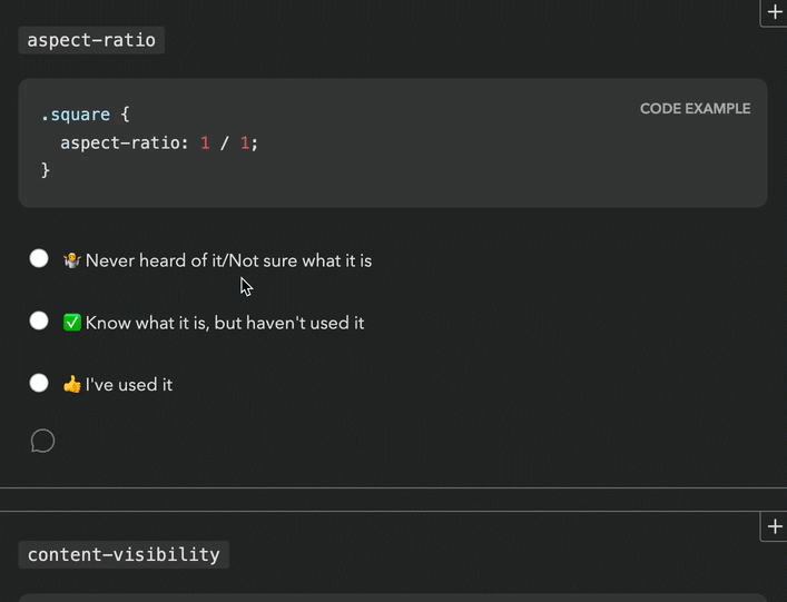
For context, the body of State Of surveys is a series of “Feature questions”, which present the respondent with a certain web platform feature and ask if they had heard of it or used it. Feature questions look like this:
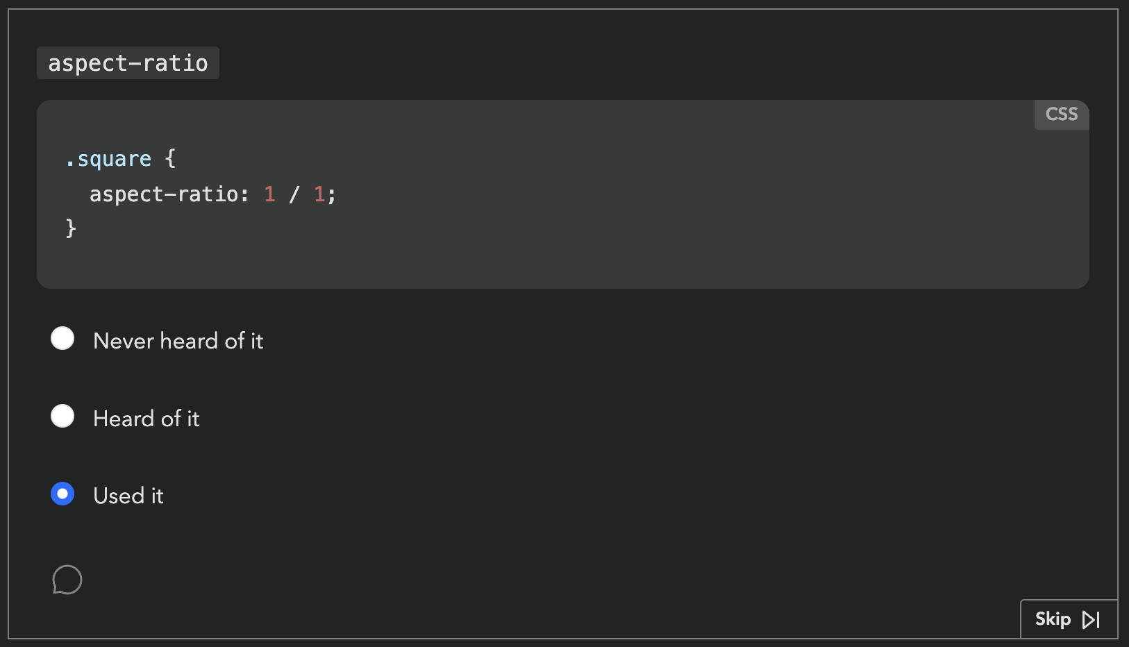
Respondents get a score in the end, based on how many of these they had heard of or used. Each survey had dozens of these questions. Based on initial estimates, State of HTML was going to have at least fifty.
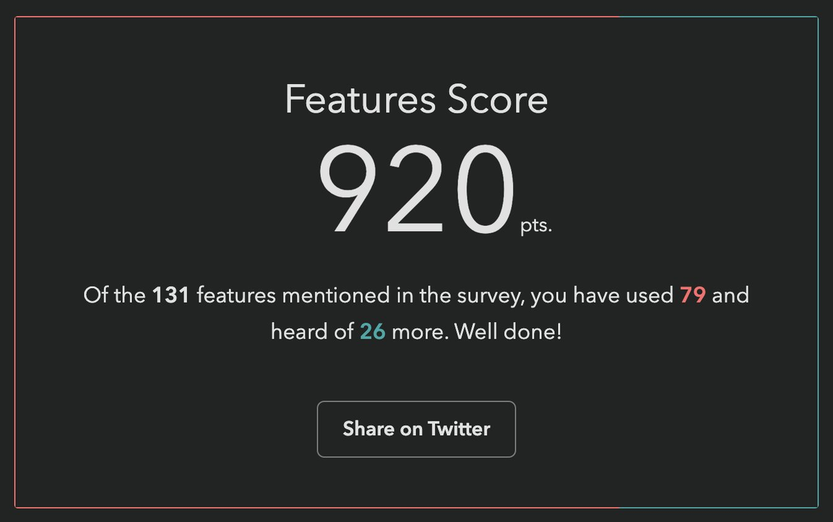
Respondents love these questions. They learn about new things they may not have heard of, and get to test their knowledge. But also, from the survey designer’s perspective, they gamify a (very long) survey, increasing completion rates, and provide users incentive to share their score on social media, spreading the word.
One would expect that they also provide valuable data, yet browser vendors had repeatedly mentioned that this data was largely useless to them. Surveys were all about what people felt, not what they knew or had used — they had better ways to gauge those. Instead, the reason they funneled thousands into funding these surveys every year was the 1-2 pain points questions towards the end. That was it. Survey data on experience and awareness could be useful, but only if it was accompanied with subjective sentiment data: if they hadn’t used it or heard about it, were they interested? If they had used it, how did it feel?
As an attempt to address this feedback, a button that opened a freeform comment field had been introduced the year prior, but response rates were abysmally low, starting from 0.9% for the first question [2] and dropping further along the way. This was no surprise to me: freeform questions have a dramatically lower response rate than structured questions, and hidden controls get less interaction (“out of sight, out of mind”). But even if they had a high response rate, freeform comments are notoriously hard to analyze, especially when they are so domain specific.
Ideation
Essentially, the data we needed to collect was a combination of two variables: experience and sentiment. Collecting data on two variables is common in survey design, and typically implemented as a matrix question.
| 🤷 | 👍 | 👎 | |
|---|---|---|---|
| Never heard of it | |||
| Heard of it | |||
| Used it |
Indeed, if there were only a couple such questions, a matrix could have been acceptable. But …could you imagine filling out 50 of these?
An acceptable solution needed to add minimal friction for end-users: there were at least 50 such questions, so any increase in friction would quickly add up — even one extra click was pushing it. And we needed a sufficiently high response rate to have a good CI. But it also needed to facilitate quantitative data analysis. Oh, and all of that should involve minimal engineering effort, as the (tiny) engineering team was already stretched thin.
Did I hear anyone say overconstrained? 😅
Idea 1: Quick context
Initially, I took these constraints to heart. Misguided as it may have been, the comment field and the infrastructure around it already existed, so I designed a UI that revealed relevant positive/negative sentiment options using contextual progressive disclosure. These inserted predefined responses into the comment field with a single click.
Being a purely client-side interaction meant it could be implemented in a day, and it still kept end-user friction at bay: providing sentiment was optional and only required a single click.
In theory, quantitative data analysis was not optimally covered, as freeform responses are notoriously hard to analyze. However, based in the psychology of user behavior, I hypothesized that the vast majority of users would not edit these at all, a minority would append context, and an even tinier minority would actually edit the responses. This meant we could analyze them via simple string matching and only lose a few false negatives.
I was very proud of myself: I had managed to design a solution that satisfied all constraints, a feat that initially seemed impossible! Not to mention this design gently guided users towards using the comment field, which could motivate them to add even more context.
Yet, when I presented my mocks to the team, engineering hated it with a passion. The lead engineer (who was also the project founder) found the idea of turning a structured interaction into unstructured data deeply unsettling. So much it motivated him to implement a whole backend to store these followups properly, something I had initially thought was out of the question.
So now what? Back to the drawing board, but with one constraint lifted!
Ideas 2 & 3: Followups and sentiment radios
This new backend came with a UI proposal that raised red flags for both me and the Google PM I was collaborating with (one of the survey’s core stakeholders, but not the main one). Even seeing the followup UI required an extra click, so it was guaranteed to have a low response rate. It would have been better than the 0.9% of the comment field (clicking is easier than typing!), but still pretty low (I would estimate < 15%). And even when users were intrinsically motivated to leave feedback, two clicks and a popover was a steep price to pay.
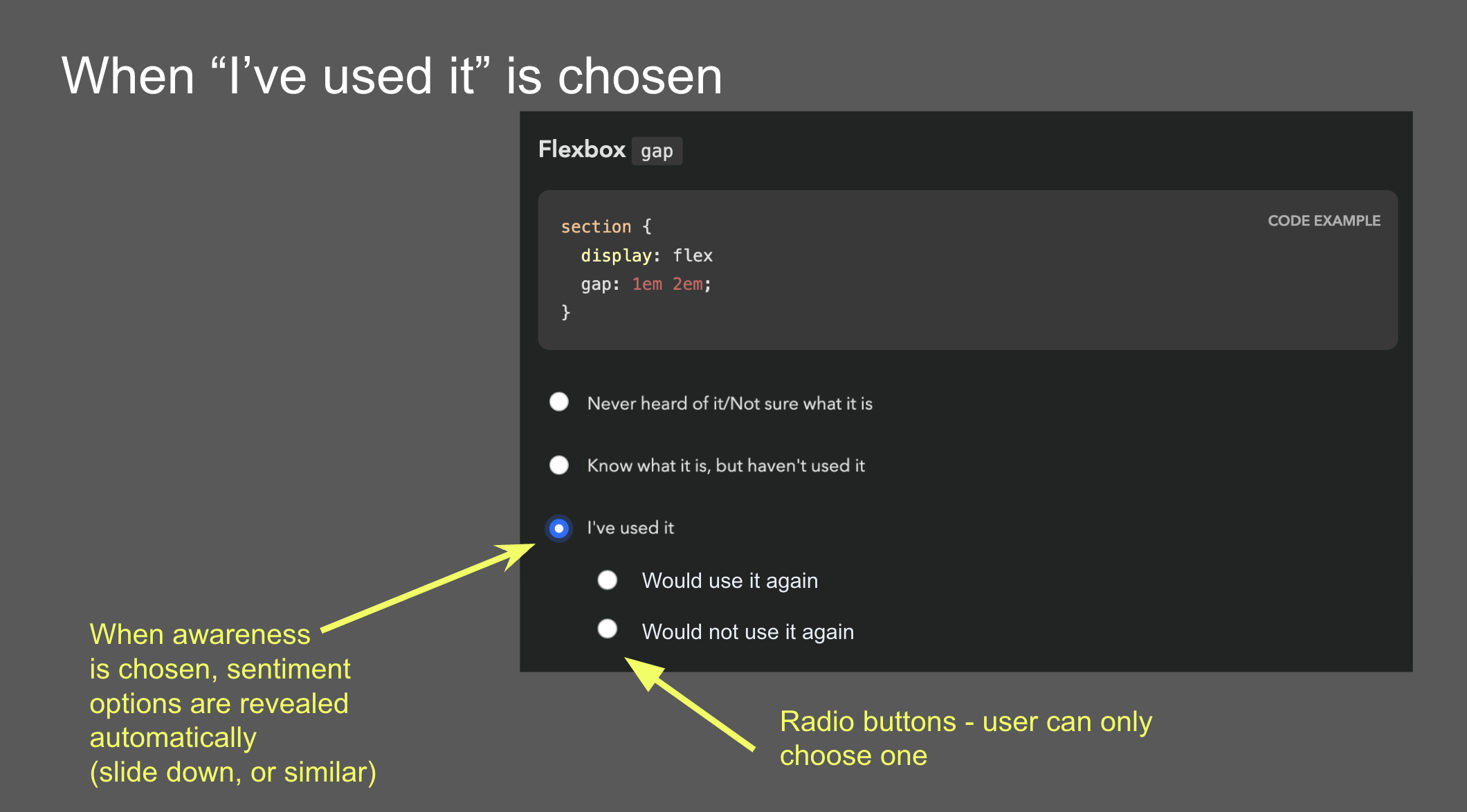
Another idea came from the Google PM: sentiment radios. It was an attempt to simplify the interaction by framing it as a two step process: first experience, then sentiment, through radio buttons that slid down once a main answer was selected. However, I was very concerned that such a major UI shift after every single answer would quickly become overwhelming over the course of the survey.
Idea 4: Context chips
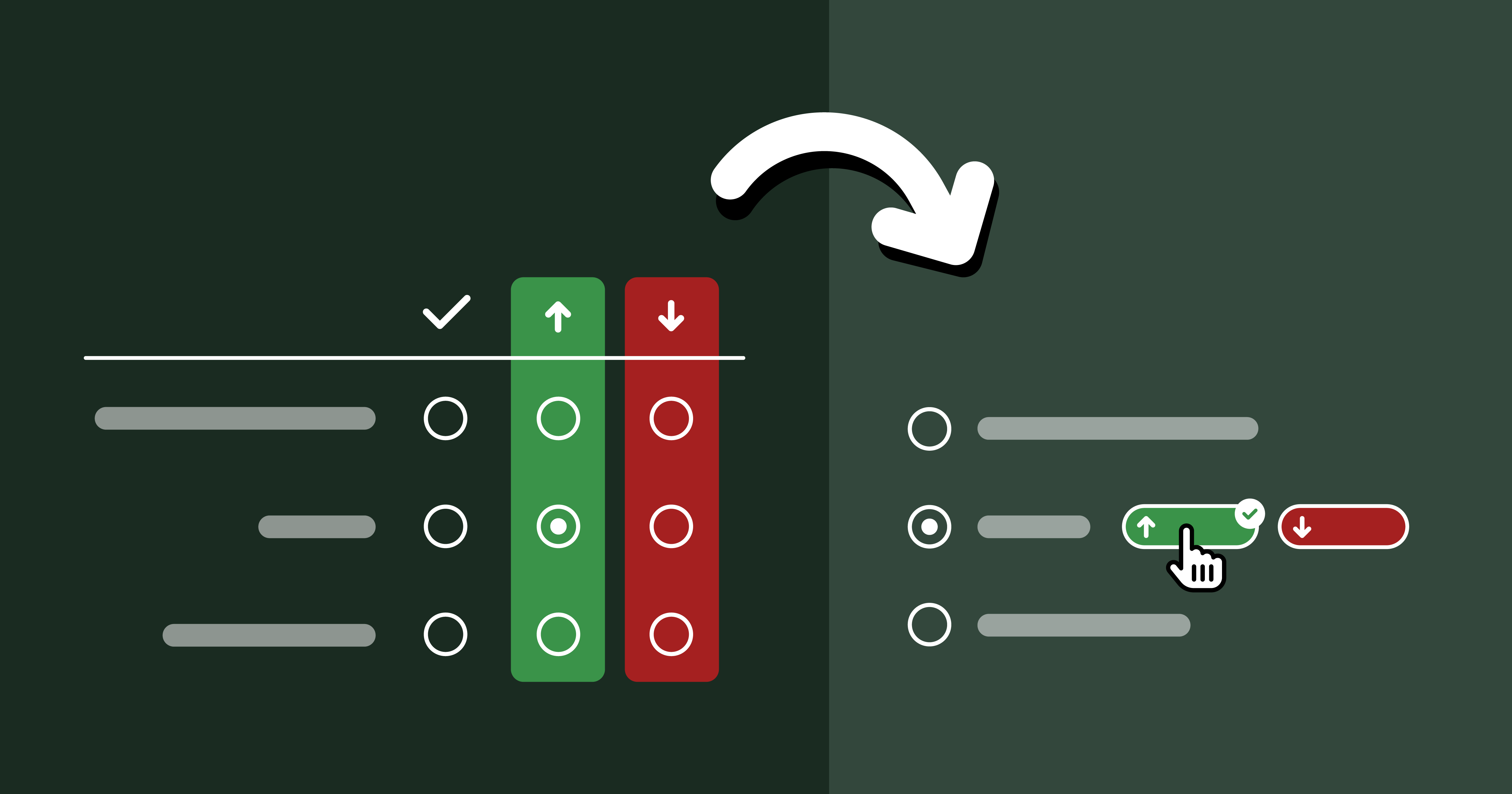
Back to the drawing board, I asked myself: if I had infinite engineering resources, what UI would I design? The biggest challenge was reducing friction. All ideas so far had required at least one extra (optional) click to select sentiment. Could we do better? What if users could select both experience and sentiment with a single click?
Guided by this, I designed a UI where selecting sentiment is done via “context chips” which are actually part of the answer, so clicking them also selects the answer they are accompanying, allowing users to express an answer across both variables with a single click, or just select the answer itself to express no sentiment. To reduce visual clutter, these only faded in on hover. Additionally, clicking on the selected chip a second time would deselect it, fixing a longstanding UX issue with radio buttons [3].
Over the course of designing this, I became so convinced it was the right solution, that I implemented a high fidelity prototype myself, complete with code that could be easily adapted to the infrastructure used by the survey app.
The context chips prototype on desktop and mobile.
There were so many things I loved about this design, even beyond the core idea of answering both variables with a single click. There were no layout shifts, the followups were in close proximity to the main answer, and the styling of the chips helped build a visual association to reduce friction even more as you go. I was not a huge fan of the mobile version, but I couldn’t think of a much better way to adapt this UI to mobile.
Early alternative concept that supported followups. This was deemed too complicated and was abandoned early on.
Reception of context chips was not what I had hoped at first. I had expected pushback due to the engineering effort needed, but folks also had other concerns: that users would find things appearing on hover distracting and feel “ambushed”, that the UI was too “weird”, that users would not discover the 1-click interaction and use it as a two-step process anyway, and that response rate would be low because these chips were not visible upfront.
Mini-feature questions: Context Chips + Checkboxes?
Around the same time as designing context chips, I had a relevant realization: we don’t actually need to know both awareness and usage for all features.
For old, widely supported features, awareness doesn’t matter, because even when it’s low, it has plateaued. And for features that are so new they have not yet been implemented in browsers, usage is largely meaningless. For these cases, each feature only has two states, and thus experience can be expressed with a checkbox! This would allow us to combine questions about multiple features in one, and we could still use context chips, albeit a little differently:
The mini features prototype on desktop and mobile.
While these could be used for questions that either discern usage or awareness, we decided to stick to the former, as there was a (valid) concern that having mini-feature questions whose checked state meant different things could be confusing and lead to errors. That way, only old, lower-priority features would be relegated to this template, and new features which tend to be higher priority for browser vendors would still get the full UI, comments and all. Instead, to improve the experience for cutting edge features, we introduced a “Not implemented” tag next to the “Used it” option.
One disadvantage of the mini feature UI is that due to the way context chips work, it is not possible to select sentiment for features you have not used: once you click on a chip, it also selects the feature, as if you had clicked on its label. I guess it could be possible to click on a chip and then uncheck the feature, but that would be a very weird interaction.
Idea 5: Existing 5-point question template
At this point, the lead engineer dredged up a question template that had been used in other surveys to ask about the respondent’s experience with various types of tooling. Instead of separating experience and sentiment, it used a 5-point scale where each answer except the first answered both questions.
The existing 5-point question template.
The eng lead was sold: zero engineering effort! The Google PM was also sold: 100% response rate! (since it was not possible to avoid expressing sentiment for features you had heard or used).
I had serious reservations.
- There are arguments for even numbered Likert scales (no neutral option), but these always involve scales of at least 4 points. If you force people to select between two states, positive or negative, you’re simply going to get garbage data. Neutral votes get pushed into positive votes, and the data around positive sentiment becomes useless.
- These did not allow users to express sentiment for features they had not heard of, despite these questions often including enough info for users to know whether they were interested.
- I was worried that increasing the number of upfront answers to 5 would increase cognitive load too much — and even scrolling distance, by 66%!
A UX researcher we were working with even did a heuristic evaluation that somewhat favored the 5-point template mainly on the basis of being a more familiar UI. The odds seemed stacked against context chips, but the upcoming usability testing could still tip the scales in their favor.
Usability Testing to the Rescue!
Despite the lead engineer being unconvinced about the merits of context chips and being adamant that even adapting my fully functional prototype was too much work, since the prototype existed, we decided to user test it against the 5-point question and see how it compared.
We ran a within-subjects usability study with 6 participants (no, they are not too few) recruited via social media. Half of the survey used the 5-point template, the other half context chips. The order of the conditions was randomized to avoid order effects.
In addition to their actual experience, we also collected subjective feedback at the end of the survey, showing them a screenshot of each answering UI and asking how each felt.
What worked well: Context Chips
I have run many usability studies in the last ten years, and I have never seen results as resounding as this one. So much that we unanimously agreed to switch to context chips after the 5th participant, because the scales were so tipped in favor of context chips that nothing that happened in the last session could have tipped them the other way.
The lead engineer observed some of the sessions, and this was instrumental in changing his mind. This was not a coincidence: when engineering is unconvinced that a certain UI is worth the implementation complexity, it can be a good strategy to have them observe usability testing sessions. Not only does it help prove the value to them, it also builds long-term user empathy, which makes future consensus easier. Given the unfortunate lack of HCI prioritization in Computer Science curricula, this may even be their first exposure to usability testing.
All of my concerns about the 5-point template were brought up by participants on their own accord, repeatedly:
- All participants really liked being able to express sentiment, and were vocal about their frustration when they could not express it.
- All but one participant (4/5) complained about being forced into selecting a sentiment when they had no opinion.
- Some participants even mentioned that the 5-point template felt overwhelming.
Furthermore, none of the concerns about context chips were validated:
- No-one found the chips appearing on hover distracting or felt “ambushed”.
- No-one struggled to understand how to use them.
- Everyone discovered the 1-click interaction pretty fast (typically within the first 2-3 questions). But interestingly, they still chose to use it as a two-step process for some of the questions, presumably to reduce cognitive load for difficult to answer questions by breaking down the decision into two smaller ones. The fact that this UI allowed users to make their own efficiency vs cognitive load tradeoffs was an advantage I had not even considered when designing it!
- Response rate was generally high — when people did not select sentiment, it was because they genuinely had no opinion, not because they couldn’t be bothered.
What worked okay: Mini-feature Questions
Mini-feature questions did successfully help cut down response time per feature by 75%, though this came at a cost: Once more, we saw that participants really wanted to express sentiment, and were frustrated when they couldn’t, which was the case for features they had not used. Regardless, we agreed that the tradeoff was worth it for the low-priority questions we were planning to use mini-features for.
What did not work: Context Chips on Mobile
A blind spot in our testing was that we did not test the UI on mobile. Usability tests were conducted remotely via video call, so it was a lot easier to get participants to use their regular computers. Additionally, stats for previous surveys showed that mobile use was a much smaller percentage in these surveys than for the web in general (~25%), so we did not prioritize it.
This was a mistake in itself: using current usage stats to inform prioritization may seem like a great idea, but it can be prone to reverse causality bias. Meaning, are people not using these surveys on mobile very much because they genuinely don’t need to, or because the experience on mobile is subpar? We often see this with accessibility too: people claim that it doesn’t matter because they don’t have users with disabilities, but often they don’t have users with disabilities because their site is not accessible!
But even if 75% of users genuinely preferred to take these surveys on desktop (which is plausible, since they are long and people often do them in increments), we should at least have done a few sessions on mobile — 25% is not negligible!
Once responses started coming in, we realized that participants had trouble understanding what the up and down arrows meant, since on mobile these are shown without labels until selected. This would have been an easy fix had it had been caught early, e.g. thumbs up/down icons could have been used instead. This was not a huge issue, as their purpose becomes clear when selected, but it definitely adds some friction.
Aftermath: Context Chips in the Wild
In our usability testing, we had seen a high response rate for sentiment (% of question respondents who selected sentiment), but that is no guarantee things will play out that way post-launch as well. When participants know they are being watched they are always more willing to engage and pay a lot more attention, no matter how much you emphasize that they should act naturally when briefing them. That’s not their failing; it’s simply human nature.
Indeed, sentiment response rates in the real-world were lower than those observed in the usability study, but still high — ranging from 24% to 59% and averaging 38% (with the same median) per question, meaning that out of every ten participants that answered each question, approximately four also provided a sentiment. This was more than enough to draw conclusions. In fact, context chips were deemed such a success they were later adopted by all other State Of surveys, even at the cost of continuity with previous years.
Against expectations, participants were just as likely to express sentiment for features they had never heard of, and in fact marginally more likely than for features they had simply heard of. In general response rates were pretty uniform across all experiences:
| Experience | Sentiment response rate (average) | Sentiment response rate (median) |
|---|---|---|
| Never heard of it | 37.3% | 37.4% |
| Heard of it | 37.3% | 36.9% |
| Used it | 39.0% | 40.1% |
| Overall | 37.6% | 37.9% |
Sentiment response rates overall and by experience (per question).
As we had observed in the user study as well, participants were far more likely to express positive rather than negative sentiment (possibly a case of acquiescence bias). Here are some interesting stats:
- The feature with the most negative sentiment overall across all experiences (
<model>) still only had 10% of respondents expressing negative sentiment for it, and still had 2.4x more positive sentiment than negative (24.7% vs 10.4%)! - In contrast, the feature with the most positive sentiment (
<datalist>) got a whopping 55% of respondents expressing positive sentiment (and only 4% negative). - In fact, even the feature with the least positive sentiment (Imperative Slot Assignment 🤔) still had way more positive sentiment (17.24%) than
<model>had negative sentiment (10%)! - If we look at the ratio of positive over negative sentiment, it ranged from 64x (!) more positive than negative sentiment (45% vs 0.7% for landmark elements) to a mere 2.4x times more positive sentiment (24.7% vs 10.4% for
<model>), and was 11x on average (8x median).
The analysis presented in this section includes data from 20K respondents, which was most of the whole dataset (around 90%) but not all, as it was done before the survey closed.
Results Visualization
Presenting all this data was another challenge. When you have two variables, ideally you want to be able to group results by either. E.g. you may be more interested in the total negative sentiment for a feature, or how many people had used it, and the results visualization should support both. How do we design a results display that facilitates this? Thankfully the visualizations for State Of surveys were already very interactive so interactivity was not out of the question.
I was no longer involved by then but consulted in a volunteer capacity. My main advice was to use proximity for clear visual grouping, and to use a consistent visual association for bars that represented the same bit of data, both of which they followed. This was the rendering they settled on for the results:
I think in terms of functionality this works really well. The visual design could be improved to communicate IA better and appear less busy at first glance, but given there is no dedicated designer in the team, I think they did a fantastic job.
Generalizability
While this UI was originally designed to collect sentiment about the selected option in a multiple choice question, I think it could be generalized to improving UX for other types of two variable questions. Generally, it can be a good fit when we have questions that collect data across two variables and:
- The second variable is optional and lower priority than the first
- The first variable is exclusive (single) choice, i.e. not checkbox questions.
The core benefit of this approach is the reduction in cognitive load. It is well established that matrix questions are more overwhelming. This design allows questions to initially appear like a simple multiple choice question, and only reveal the UI for the second variable upon interaction. Additionally, while matrix questions force participants to decide on both variables at once, this design allows them to make their own tradeoff of cognitive load vs efficiency, treating the UI as single step or two step as they see fit.
Another benefit of this design is that it allows for option labels to be context-dependent for the second variable, whereas a matrix limits you to a single column header. In the sentiment case, the labels varied depending on whether the feature had been used (“Positive experience” / “Negative experience”) or not (“Interested” / “Not interested”).
The more such questions a survey has, the bigger the benefits — if it’s only about a couple questions, it may not be worth the implementation complexity, though I’m hoping that survey software may eventually provide this out of the box so that this is no longer a tradeoff.
That said, matrix questions do have their benefits, when used appropriately, i.e. when the two requirements listed above are not met.
Matrix questions have an big edge when users need to make a single selection per row, especially when this may be the same answer for multiple rows, which means they can just tick down a whole column. Context chips do not allow users to build this positional association, as they are not aligned vertically. THey are placed right after the answer text, and thus their horizontal position varies per answer. To mitigate this, it can be useful to color-code them and maintain the same color coding consistently throughout the survey so that participants can build a visual association [4].
Context chips also enforce a clear prioritization across the two variables: the question is presented as a multiple choice question across the first variable, with the chips allowing the respondent to provide optional additional context across a second variable. Matrix questions allow presenting the two variables with the same visual weight, which could be desirable in certain cases. For example, there are cases when we don’t want to allow the respondent to provide an answer to the first variable without also providing an answer to the second.
Lessons Learned
In addition to any generalizable knowledge around survey design, I think this is also an interesting product management case study, and teaches us several lessons.
Never skimp on articulating the north star UI
Start any product design task by ignoring ephemeral constraints (e.g. engineering resources) and first reach consensus on what the optimal UI is, before you start applying constraints. Yes, you read that right. I want to write a whole post about the importance of north star UIs, because this is one of many cases over the course of my career where tight implementation constraints were magically lifted, either due to a change of mind, a change in the environment, or simply someone’s brilliant idea. Without consensus on what the north star UI is (or even a clear idea about it) you then have to go back to the drawing board when this happens.
User testing is also a consensus-building tool
You probably already know that usability testing is a great tool for improving user experience, but there is a second, more strategic hidden utility to it: consensus building.
I’ve been in way, way too many teams where UI decisions were made by hypothesizing about user behavior, which could not only be missing the mark, but also there is no way forwards for disagreements. What do you do, hypothesize harder? When there is user testing data, it is much harder to argue against it.
This is especially useful in convincing engineering that a certain UI is worth the implementation complexity, and having engineers observe usability testing sessions can be an educational experience for many.
Heuristic evaluations are not a substitute for usability testing
There are many things to like about heuristic evaluations and design reviews. They can be done by a usability expert alone and can uncover numerous issues that would have taken multiple rounds of usability testing, especially if they are also a domain expert. Fixing the low hanging fruit issues means user testing time can be spent more efficiently, uncovering less obvious problems. That are are also certain types of issues that can only be uncovered by a heuristic evaluation, such as _“death by a thousand paper cuts” type issues: small issues that are not a big deal on their own and are too small to observe in a user study, but add up to more friction.
However, a big downside of these is that they are inherently prone to bias. They can be excellent for finding problems that may have been overlooked and are often obvious once pointed out. However (unless the number of evaluators is large), they are not a good way to decide between alternatives.
Unlike Devographics, surveys are not FA’s core business, so the Impact/Effort tradeoff simply wasn’t there for a custom UI, at least at this point in time. I ended up going with Tally, mainly due to the flexibility of its conditional logic and its support for code injection (which among other things, allowed me to use FA icons — a whopping 120 different ones!). ↩︎
Meaning out of the people who responded to that question about their experience with a feature, only 0.9% left a comment. ↩︎
A radio group with all buttons off cannot be returned to that state by user interaction. ↩︎
The ~9% of people with atypical color vision won’t benefit, but that’s okay in this case, as color is used to add an extra cue, and not an essential part of the interface. ↩︎