Reading List
The most recent articles from a list of feeds I subscribe to.
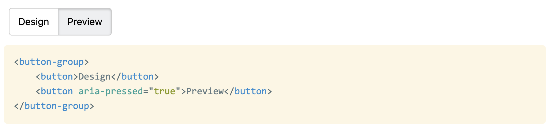
What is the best way to mark up an exclusive button group?
A few days ago I asked Twitter a seemingly simple question (I meant aria-pressed, not aria-selected but Twitter doesn’t allow edits…):
https://twitter.com/LeaVerou/status/1545712667515654144
For background, I was implementing a web component for an app I’m working on at work and I was getting into some pretty weird rabbit holes with my approach of generating radios and labels.
Unsurprisingly, most people thought the best solution is radio buttons and labels. After all, it works without CSS, right? Progressive enhancement and everything?
That’s what I thought too. I had contorted my component to generate labels and radios in the Shadow DOM from buttons in the light DOM, which resulted in awkward code and awkward CSS, but I felt I was fighting the good fight and doing the best thing for accessibility.
All this was challenged when the actual accessibility expert, Léonie Watson chimed in. For those of you who don’t know her, she is pretty much the expert when it comes to web accessibility and standards. She is also visually impaired herself, giving her a firsthand experience many other a11y aficionados lack. Her recommendation was contrary to what most others were saying: https://twitter.com/LeonieWatson/status/1545745436740313089
She went on to make the point that if a design looks like buttons, it should act like buttons, otherwise there are mismatched expectations and poor UX for AT users:
https://twitter.com/LeonieWatson/status/1545762058339319808
https://twitter.com/LeonieWatson/status/1545757022645325824
In case you were wondering if state would be equally noticeable with aria-pressed and buttons, it is:
https://twitter.com/LeonieWatson/status/1545763493412052992
And some advice on grouping:
https://twitter.com/LeonieWatson/status/1545745923011117057
In theory doing this in Shadow DOM and/or using ElementInternals implicit roles should be fine, though in practice we’ve had some trouble with that.
Today I posted my attempt to implement what we’ve discussed in a <button-group> component, which restarted the discussion.
Its implementation is right here if you want to improve it further! And make sure to check out the actual Twitter thread, as there is a lot of good stuff I couldn’t include in this!
Edit: Léonie wrote a blog post too, Perceived affordances and the functionality mismatch. It’s a great read.
Introducing Rety: live coding, without the stress
Introducing Rety: live coding, without the stress
I recently spoke at CSS Day in Amsterdam. It was only my second f2f talk after the pandemic. It went down really well, both in person, and recently that the video was released:
https://www.youtube.com/watch?v=ZuZizqDF4q8
Here is a sample of tweets about it that made me particularly warm and fuzzy inside: https://twitter.com/CSSDayConf/status/1542778793219301376
https://twitter.com/jonpearse/status/1542490268322103296
https://twitter.com/StuRobson/status/1542461048791384066
https://twitter.com/vlh/status/1544483583544463361
https://twitter.com/pawelgrzybek/status/1546861605824126980
https://twitter.com/parker\_codes/status/1547055116221497344
https://twitter.com/polarbirke/status/1547202631315214338
https://twitter.com/unistyler/status/1544619175796252672
There’s a lot more where these came from too.
This was not just my second post-pandemic talk, but my first talk using Rety, which is what this post is about.
As you may know, I love live coding as a teaching tool, and over the years it has become part of my trademark speaking style.
When combined with some kind of interactive preview, it allows the speaker to demonstrate not only the final state of a coding snippet, but also how you get there, and what the intermediate results are. Live coding is to programming what a blackboard is to math or physics.
But it does create a unique challenge: My live coded slides don’t make sense without me. This may be acceptable for a conference talk, which is usually recorded, but not in other contexts, such as teaching a university course, where all instructors need to be able to teach all lectures, and students need to be able to quickly refer to examples shown.
Back in the fall of 2021, when we were preparing for the second iteration of our course, Design for the Web: Languages and User Interfaces, this came up as a pressing issue. The current state of the course required me to be there to teach my lectures, and this may well be the last year I teach it, since I’m finishing up my PhD soon.
I didn’t want to completely remove live coding from my slides, as I truly believe it is the perfect implementation of the “show, don’t tell” teaching adage for certain things, so I thought instead: what if I could record my live coding, and make it replayable?
Doing so manually seemed like cruel and unusual punishment. And thus, Rety was born (pronounced like the “rety” in “retype”).
While originally the plan was for me to still live code, and have the Rety functionality there for students and future instructors, I ended up using it during my own lectures as well, as I concluded that a well crafted Rety script was strictly superior to me doing the live coding:
- Same progressive development as a live demo
- It still affords unplanned demonstrations (e.g. to answer a question), since Rety still works with the same editors, and I could always pause it and take over if needed.
- I could record myself and edit the script to maximize education value and minimize typos, delays, fumbling etc.
- People can consume typed text far faster than people can type text. This is why most video tutorials speed up the typing. With Rety, typing speed is adjustable, and doesn’t need to match mine.
After test driving it for our course the entire spring 2022 semester, it went through the ultimate test in June 2022: I used it for my CSSDay conference talk. You can watch the talk here (first live demo at 7:15).
Right now Rety is just a set of two classes: Recorder and Replayer, which are used entirely independently. The exact UI is left up to the Rety user. E.g. to use it in my slides, I integrated it with the Live Demo plugin of Inspire.js (it is automatically included if a <script class="demo-script" type="application/json"> is found in a live demo slide).
The library could use more docs and some tests and I have doubts about the API, but I figured I should release it it earlier rather than later (it’s already been sitting in a repo for 7 months). After all, what best time to release it than when the first Rety talk is still making the rounds?
My vision is to ultimately evolve and standardize the Rety script format, so that it can be used to describe a coding interaction across a variety of tools. There are so many possibilities!
- Wouldn’t it be cool if CodePen and similar playgrounds supported embedding a Rety script into a pen?
- What if you could store Rety scripts in a repo and editors like VS Code recognized them and let you replay them?
Enjoy: Rety