I’m linking to issues in standards repos in the interest of transparency. Please don’t spam them, even with supportive comments (that’s what reactions are for). Also keep in mind that the vast majority of import map improvements are meant for tooling authors and infrastructure providers — nobody expects regular web developers to author import maps by hand.
Reading List
The most recent articles from a list of feeds I subscribe to.
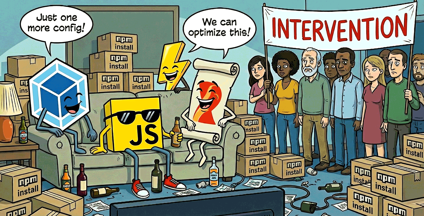
External import maps, today!
A few weeks ago, I posted Web dependencies are broken. Can we fix them?. Today’s post is a little less gloomy: Turns out that the major limitation that would allow centralized set-it-and-forget-it import map management can be lifted today, with excellent browser support!
The core idea is that you can use DOM methods to inject an import map dynamically, by literally creating an <script type="importmap"> element in a classic (blocking) script and appending it after the injector script. 💡
This is a gamechanger. It makes external import maps nice-to-have sugar instead of the only way to have centralized import map management decoupled from HTML generation.
All we need to do is build a little injector script, no need for tightly coupled workflows that take over everything.
Once you have that, it takes a single line of HTML to include it anywhere.
If you’re already using a templating system, great! You could add <script src="importmap.js"></script> to your <head> template for every page.
But you don’t need a templating system: even if you’re rawdogging HTML (e.g. for a simple SPA), it’s no big deal to just include a <script src="importmap.js"></script> in there manually.
This is not even new: when the injector is a classic (non-module) script placed before any modules are fetched, it works in every import map implementation, all the way back to Chrome 89, Safari 16.4+, and Firefox 108+!
Turns out, JSPM made the same discovery: JSPM v4 uses the same technique. It is unclear why it took all of us so long to discover it but I’m glad we got there.
How does it work?
Basic import map injector script
First, while there is some progress around making import maps more resilient, your best bet for maximum compatibility is for the injector script to be a good ol’ blocking <script> that comes before everything else.
This means no type="module", no async, no defer — you want to get it in before any modules start loading or many browsers will ignore it.
Then, you literally use DOM methods to create a <script type="importmap"> and append it after the script that is injecting the import map (which you can get via document.currentScript).
This is a minimal example:
(()=>{
	const map = {
		/* elided */
	};
	const script = Object.assign(document.createElement("script"), {
		type: "importmap",
		textContent: JSON.stringify(map)
	});
	document.currentScript.after(script);
})();
Fixing relative URLs
Remember, this literally injects inline import maps in your page. This means that any relative URLs will be interpreted relative to the current page!
If you’re building an SPA or your URLs are all absolute or root-relative, that’s no biggie. But if these are relative URLs, they will not work as expected across pages. You need to compute the absolute URL for each mapped URL and use that instead. This sounds complicated, but it only adds about 5 more lines of code:
(()=>{
	const map = {
		/* elided */
	};
	const mapUrl = document.currentScript.src;
	const rebase = m => { for (let k in m) m[k] = new URL(m[k], mapUrl).href; return m; };
	rebase(map.imports);
	for (let scope in (map.scopes ?? {})) {
		rebase(map.scopes[scope]);
	}
	const script = Object.assign(document.createElement("script"), {
		type: "importmap",
		textContent: JSON.stringify(map)
	});
	document.currentScript?.after(script);
})();
Error handling
Note that document.currentScript is null in module scripts, since the same module can be loaded from different places and different scripts.
Once it becomes possible to inject import maps from a module script, you could use import.meta.url to get the URL of the current module.
Until then, you can use a bit of error handling to catch mistakes:
(()=>{
	const map = {
		/* elided */
	};
	const mapUrl = document.currentScript?.src;
	if (!mapUrl) {
		throw new Error("Import map injector script must be a classic (non-module) script");
	}
	const rebase = m => { for (let k in m) m[k] = new URL(m[k], mapUrl).href; return m; };
	rebase(map.imports);
	for (let scope in (map.scopes ?? {})) {
		rebase(map.scopes[scope]);
	}
	const script = Object.assign(document.createElement("script"), {
		type: "importmap",
		textContent: JSON.stringify(map)
	});
	document.currentScript?.after(script);
})();
This is the minimum, since the script literally breaks if document.currentScript is null.
You could get more elaborate and warn about async/defer attributes, or if type="module" scripts are present before the current script.
These are left as an exercise for the reader.
Do we still need external import maps?
While this alleviates the immediate need for external import maps, the DX and footguns make it a bit gnarly, so having first-class external import map support would still be a welcome improvement.
But even if we could do <script type="importmap" src="..."> today, the unfortunate coupling with HTML is still at the receiving end of all this, and creates certain limitations,
such as specifiers not working in worker scripts.
My position remains that HTML being the only way to include import maps is a hack. I’m not saying this pejoratively. Hacks are often okay — even necessary! — in the short term. This particular hack allowed us to get import maps out the door and shipped quickly, without getting bogged down into architecture astronaut style discussions that can be non-terminating.
But it also created architectural debt.
These types of issues can always be patched ad hoc, but that increases complexity, both for implementers and web developers.
Ultimately, we need deeper integration of specifiers and import maps across the platform.
<script type="importmap"> (with or without an src attribute) should become a shortcut, not the only way mappings can be specified.
In my earlier post, I outlined a few ideas that could help get us closer to that goal and make import maps ubiquitous and mindless. Since they were well received, I opened issues for them:
- Linking to import maps via an HTTP header (
Link?) specifier:URLs to bridge the gap between specifiers and URLs- Since import maps as an import attribute proved out to be tricky, I also filed another proposal for a synchronous import map API.
The hope is also that better platform-wide integration can pave the way for satisfying the (many!) requests to expand specifiers beyond JS imports. Currently, the platform has no good story for importing non-JS resources from a package, such as styles, images, icons, etc.
But even without any further improvement, simply the fact that injector scripts are possible opens up so many possibilities! The moment I found out about this I started working on making the tool I wished had existed to facilitate end-to-end dependency management without a build process (piggybacking on the excellent JSPM Generator for the heavy lifting), which I will announce in a separate post very soon [1]. Stay tuned!
But if you’re particularly curious and driven, you can find it even before then, both the repo and npm package are already public 😉🤫 ↩︎
Web dependencies are broken. Can we fix them?
Abstraction is the cornerstone of modern software engineering. Reusing logic and building higher-level solutions from lower-level building blocks is what makes all the technological wonders around us possible. Imagine if every time anyone wrote a calculator they also had to reinvent floating-point arithmetic and string encoding!
And yet, the web platform has outsourced this fundamental functionality to third-party tooling. As a result, code reuse has become a balancing of tradeoffs that should not have existed in the first place.
In NodeJS, you just npm install and reference specifiers straight away in your code.
Same in Python, with pip install.
Same in Rust with cargo add.
In healthy ecosystems you don’t ponder how or whether to use dependencies.
The ecosystem assumes dependencies are normal, cheap, and first-class.
You just install them, use them, and move on.
“Dependency-free” is not a badge of honor.
Instead, dependency management in the web platform consists of bits and bobs of scattered primitives, with no coherent end-to-end solution. Naturally, bundlers such as Webpack, rollup, and esbuild have picked up the slack, with browserify being the one that started it all, in 2012.
There is nothing wrong with bundlers when used as a performance optimization to minimize waterfall effects and overhead from too many HTTP requests. You know, what a bundler is supposed to do. It is okay to require advanced tools for advanced needs, and performance optimization is generally an advanced use case. Same for most other things bundlers and build tools are used for, such as strong typing, linting, or transpiling. All of these are needs that come much later than dependency management, both in a programmer’s learning journey, as well as in a project’s development lifecycle.
Dependency management is such a basic and ubiquitous need, it should be a part of the platform, decoupled from bundling. Requiring advanced tools for basic needs is a textbook usability cliff. In other ecosystems, optimizations happen (and are learned) after dependency resolution. On the web, optimization is the price of admission! This is not normal.
Bundlers have become so ubiquitous that most JS developers cannot even imagine deploying code without them. READMEs are written assuming a bundler, without even mentioning the assumption. It’s just how JS is consumed. My heart breaks for the newbie trying to use a drag and drop library, only to get mysterious errors about specifiers that failed to resolve.
However, bundling is not technically a necessary step of dependency management. Importing files through URLs is natively supported in every browser, via ESM imports. HTTP/2 makes importing multiple small files far more reasonable than it used to be — at least from a connection overhead perspective. You can totally get by without bundlers in a project that doesn’t use any libraries.
But the moment you add that first dependency, everything changes. You are suddenly faced with a huge usability cliff: which bundler to use, how to configure it, how to deploy with it, a mountain of decisions standing between you and your goal of using that one dependency. That one drag and drop library. For newcomers, this often comes very early in their introduction to the web platform, and it can be downright overwhelming.
Dependencies without bundlers, today?
It is technically possible to use dependencies without bundlers, today. There are a few different approaches, and — I will not sugarcoat it — they all suck.
There are three questions here:
- Use specifiers or URLs?
- How to resolve specifiers to URLs?
- Which URL do my dependencies live at?
There is currently no good answer to any of them, only fragile workarounds held together by duct tape.
Using a dependency should not need any additional song and dance besides “install this package” + “now import it here”. That’s it. That’s the minimum necessary to declare intent. And that’s precisely how it works in NodeJS and other JS runtimes. Anything beyond that is reducing signal-to-noise ratio, especially if it needs to be done separately for every project or worse, for every dependency.
You may need to have something to bite hard on while reading the next few sections. It’s going to be bad.
Rawdogging node_modules/ imports
Typically, package managers like npm take care of deduplicating compatible package versions and may use a directory like node_modules to install packages.
In theory, one could deploy node_modules/ as part of their website and directly reference files in client-side JS.
For example, to use Vue:
import { createApp } from "../node_modules/vue/dist/vue.esm-browser.js";
It works out of the box, and is a very natural thing to try the first time you install a package and you notice node_modules.
Great, right?
No. Not great.
First, deploying your entire node_modules directory is both wasteful, and a security risk. In fact, most serverless hosts (e.g. Netlify or Vercel) automatically remove it from the publicly deployed files after the build is finished.
Additionally, it violates encapsulation: paths within a package are generally seen as an implementation detail of the package itself, and packages expose specifier exports like vue or colorjs.io/fn that they map to internal paths.
If you decide to circumvent this and link to files directly, you now need to update your import paths whenever you update the package.
It is also fragile, as not every module is installed directly in node_modules/ — though those explicitly marked as app dependencies are.
Importing from public CDNs
Another common path is importing from CDNs like Unpkg and JSDelivr. For Vue, it would look like this:
import { createApp } from "https://unpkg.com/vue@3/dist/vue.esm-browser.js";
It’s quick and easy. Nothing to install or configure! Great, right?
No. Not great.
It is always a bad idea to introduce a dependency on a whole other domain you do not control, and an even worse one when linking to executable code.
First, there is the obvious security risk. Unless you link to a specific version, down to the patch number and/or use SRI, the resource could turn malicious overnight under your nose if the package is compromised. And even if you link to a specific version, there is always the risk that the CDN itself could get compromised. Who remembers polyfill.io?
But even supply-chain attacks aside, any third-party domain is an unnecessary additional point of failure. I still remember scrambling to change JSDelivr URLs to Unpkg during an outage right before one of my talks, or having to hunt down all my repos that used RawGit URLs when it sunset, including many libraries.
The DX is also suboptimal.
You lose the immediacy and resilience of local, relative paths.
Without additional tooling (Requestly, hosts file edits, etc.), you now need to wait for CDN roundtrips even during local development.
Wanted to code on a flight?
Good luck.
Needed to show a live demo during a talk, over clogged conference wifi?
Maybe sacrifice a goat to the gods first.
And while they maintain encapsulation slightly better than raw file imports, as they let you reference a package by its name for its default export,
additional specifiers (e.g. packagename/fn) typically still require importing by file path.
“But with public CDNs, I benefit from the resource having already been cached by another website the user visited!”
Oh my sweet summer child.
I hate to be the one to break it to you, but no, you don’t, and that has been the case since about 2020.
Double keyed caching obliterated this advantage.
node_modules imports locally + rewrite to CDN remotely
A quick and dirty way to get local URLs for local development and CDN URLs for the remote site is to link to relative ./node_modules URLs, and add a URL rewrite to a CDN if that is not found.
E.g. with Netlify rewrites this looks like this:
node_modules/:modulename/* https://cdn.jsdelivr.net/npm/:modulename@latest/:splat 301
Since node_modules is not deployed, this will always redirect on the remote URL,
while still allowing for local URLs during development.
Great, right?
No. Not great.
Like the mythical hydra, it solves one problem and creates two new ones.
First, it still carries many of the same issues of the approaches it combines:
- Linking to CDNs is inherently insecure
- It breaks encapsulation of the dependencies
Additionally, it introduces a new problem: the two files need to match, but the naïve approach above would always just link to the latest version.
Sure, one could alleviate this by building the _redirects file with tooling, to link to specific versions, read from package-lock.json.
But the point is not that it’s insurmountable, but that it should not be this hard.
Copy packages or exports to local directory
Another solution is a lightweight build script that copies either entire packages or specific exports into a directory that will actually get deployed. When dependencies are few, this can be as simple as an npm script:
{
	"scripts": {
		"lib": "cp node_modules/vue/dist/vue.esm-browser.js common/lib/vue.js",
		"build": "npm run lib"
	}
}
So now we have our own nice subset of node_modules/ and we don’t depend on any third-party domains.
Great, right?
No. Not great.
Just like most other solution, this still breaks encapsulation, forcing us to maintain a separate, ad-hoc index of specifiers to file paths.
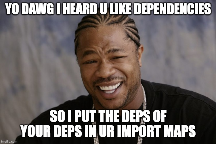
Additionally, it has no awareness of the dependency graph. Dependencies of dependencies need to be copied separately. But wait a second. Did I say dependencies of dependencies? How would that even work?
Dependencies that use dependencies
In addition to their individual flaws, all of the solutions above share a major flaw: they can only handle importing dependency-free packages. But what happens if the package you’re importing also uses dependencies? It gets unimaginably worse my friend, that’s what happens.
There is no reasonable way for a library author to link to dependencies without excluding certain consumer workflows. There is no local URL a library author can use to reliably link to dependencies, and CDN URLs are highly problematic. Specifiers are the only way here.
So the moment you include a dependency that uses dependencies, you’re forced into specifier-based dependency management workflows, whether these are bundlers, or import map flavored JSON vomit in every single HTML page (discussed later).
“Browser” bundles
As a fig leaf, libraries will often provide a “browser” bundle that consumers can import instead of their normal dist, which does not use specifiers.
This combines all their dependencies into a single dependency-free file that you can import from a browser.
This means they can use whatever dependencies they want, and you can still import that bundle using regular ESM imports in a browser, sans bundler.
Great, right?
No. Not great.
It’s called a bundle for a reason. It bundles all their dependencies too, and now they cannot be shared with any other dependency in your tree, even if it’s exactly the same version of exactly the same package. You’re not avoiding bundling, you’re outsourcing it, and multiplying the size of your JS code in the process.
And if the library author has not done that, you’re stuck with little to do, besides a CDN that rewrites specifiers on the fly like esm.sh, with all CDN downsides described above.
As someone who regularly releases open source packages (some with billions of npm installs), I find this incredibly frustrating. I want to write packages that can be consumed by people using or not using bundlers, without penalizing either group, but the only way to do that today is to basically not use any dependencies. I cannot even modularize my own packages without running into this! This doesn’t scale.
But won’t import maps solve all our problems?
Browsers can import specifiers, as long as the mapping to a URL is explicitly provided through an import map. Import maps look like this:
<script type="importmap">
{
	"imports": {
		"vue": "./node_modules/vue/dist/vue.runtime.esm-bundler.js",
		"lodash": "./node_modules/lodash-es/lodash.js",
	}
}
</script>
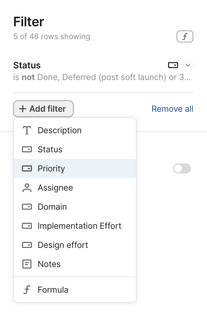
Did you notice something? Yes, this is an HTML block. No, I cannot link to an import map that lives in a separate file. Instead, I have to include the darn thing in. Every. Single. Page. The moment you decide to use JS dependencies, you now need an HTML templating tool as well. 🙃
“💡 Oh I know, I’ll generate this from my library via DOM methods!” I hear you say.
No, my sweet summer child.
It needs to be present at parse time.
So unless you’re willing to document.write() it (please don’t), the answer is a big flat NOPE.
Edit: I’ve never been happier to be wrong! Turns out injecting import maps via DOM methods actually works in all browsers (as long as it is done by a non-module script that runs before any modules are fetched)! In fact, JSPM 4.0 uses it! 🎉 This is a gamechanger.
“💡 Ok, at least I’ll keep it short by routing everything through a CDN or the same local folder” No, my sweet summer child. Go to sleep and dream of globs and URLPatterns. Then wake up and get to work, because you actually need to specify. Every. Single. Mapping. Yes, transitive dependencies too.
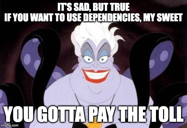
You wanted to use dependencies? You will pay with your blood, sweat, and tears. Or, well, another build tool.
So now I need a build tool to manage the import map, like JSPM. It also needs to talk to my HTML templating tool, which I now had to add so it can spit out these import maps on. Every. Single. HTML. Page.
There are three invariants that import maps violate:
- Locality: Dependency declarations live in HTML, not JS. Libraries cannot declare their own dependencies.
- Composability: Import maps do not compose across dependencies and require global coordination
- Scalability: Mapping every transitive dependency is not viable without tooling
Plus, you still have all of the issues discussed above, because you still need URLs to link to. By trying to solve your problem with import maps, you now got multiple problems.
To sum up, in their current form, import maps don’t eliminate bundlers — they recreate them in JSON form, while adding an HTML dependency and worse latency.
Are bundlers the lesser evil?
Given the current state of the ecosystem, not using bundlers in any nontrivial application does seem like an exercise in masochism. Indeed, per State of JS 2024, bundlers were extremely popular, with Webpack having been used by 9 in 10 developers and having close to 100% awareness! But sorting by sentiment paints a different picture, with satisfaction, interest, and positivity dropping year after year. Even those who never question the status quo can feel it in their gut that this is not okay. This is not a reasonable way to manage dependencies. This is not a healthy ecosystem.
Out of curiosity, I also ran two polls on my own social media. Obviously, this suffers from selection bias, due to the snowball sampling nature of social media, but I was still surprised to see such a high percentage of bundle-less JS workflows:
- Twitter/X poll: 17.6% of respondents
- Mastodon poll: 40% (!) of respondents
I’m very curious how these folks manage the problems discussed here.
Oftentimes when discussing these issues, I get the question “but other languages are completely compiled, why is it a problem here?”. Yes, but their compiler is official and always there. You literally can’t use the language without it.
The problem is not compilation, it’s fragmentation. It’s the experience of linking to a package via a browser import only to see errors about specifiers. It’s adding mountains of config and complexity to use a utility function. It’s having no clear path to write a package that uses another package, even if both are yours.
Abstraction itself is not something to outsource to third-party tools. This is the programming equivalent of privatizing fundamental infrastructure — roads, law enforcement, healthcare — systems that work precisely because everyone can rely on them being there.
Like boiling frogs, JS developers have resigned themselves to immense levels of complexity and gruntwork as simply how things are. The rise of AI introduced swaths of less technical folks to web development and their overwhelm and confusion is forcing us to take a long hard look at the current shape of the ecosystem — and it’s not pretty.
Few things must always be part of a language’s standard library, but dependency management is absolutely one of them. Any cognitive overhead should be going into deciding which library to use, not whether to include it and how.
This is also actively harming web platform architecture.
Because bundlers are so ubiquitous, we have ended up designing the platform around them, when it should be the opposite.
For example, because import.meta.url is unreliable when bundlers are used, components have no robust way to link to other resources (styles, images, icons, etc.) relative to themselves, unless these resources can be part of the module tree.
So now we are adding features to the web platform that break any reasonable assumption about what HTML, CSS, and JS are, like JS imports for CSS and HTML, which could have been a simple fetch() if web platform features could be relied on.
And because using dependencies is nontrivial, we are adding features to the standard library that could have been userland or even browser-provided dependencies.
To reiterate, the problem isn’t that bundlers exist — it’s that they are the only viable way to get first-class dependency management on the web.
JS developers deserve better. The web platform deserves better.
Where do we go from here?
As a web standards person, my first thought when spotting such a lacking is “how can the web platform improve?”. And after four years in the TAG, I cannot shake the holistic architectural perspective of “which part of the Web stack is best suited for this?”
Specifiers vs URLs
Before we can fix this, we need to understand why it is the way it is. What is the fundamental reason the JS ecosystem overwhelmingly prefers specifiers over URLs?
On the surface, people often quote syntax, but that seems to be a red herring.
There is little DX advantage of foo (a specifier) over ./foo.js (a URL), or even ./foo (which can be configured to have a JS MIME type).
Another oft-cited reason is immutability: Remote URLs can change, whereas specifiers cannot.
This also appears to be a red herring: local URLs can be just as immutable as specifiers.
Digging deeper, it seems that the more fundamental reason has to do with purview.
A URL is largely the same everywhere, whereas foo can resolve to different things depending on context.
A specifier is app-controlled whereas a URL is not.
There needs to be a standard location for a dependency to be located and referenced from, and that needs to be app-controlled.
Additionally, specifiers are universal. Once a package is installed, it can be imported from anywhere, without having to work out paths. The closest HTTP URLs can get to this is root-relative URLs, and that’s still not quite the same.
Specifiers are clearly the path of least resistance here, so the low hanging fruit would be to make it easier to map specifiers to URLs, starting by improving import maps.
Improving import maps
An area with huge room for improvement here is import maps. Both making it easier to generate and include import maps, and making the import maps themselves smaller, leaner, and easier to maintain.
External import maps
The biggest need here is external import maps, even if it’s only via <script type=importmap src>.
This would eliminate the dependency on HTML templating and opens the way for generating them with a simple build tool.
This was actually part of the original import map work, and was removed from the spec due to lack of implementer interest, despite overwhelming demand. In 2022, external import maps were prototyped in WebKit (Safari), which prompted a new WHATWG issue. Unfortunately, it appears that progress has since stalled once more.
Import maps without HTML?
External import maps do alleviate some of the core pain points, but are still globally managed in HTML, which hinders composability and requires heavier tooling.
What if import maps could be imported into JS code?
If JS could import import maps, (e.g. via import "map.json" with { type: "importmap" }), this would eliminate the dependency on HTML altogether, allowing for scripts to localize their own import info,
and for the graph to be progressively composed instead of globally managed.
Edit: Turns out that injecting import maps via DOM methods actually works in all browsers (as long as certain conditions are met)! 🎉 This alleviates the need for external import maps as a regular JS file can just inject them.
Import maps via HTTP header?
Going further, import maps via an HTTP header (e.g. Link) would even allow webhosts to generate them for you and send them down the wire completely transparently.
This could be the final missing piece for making dependencies truly first-class.
Imagine a future where you just install packages and use specifiers without setting anything up, without compiling any files into other files, with the server transparently handling the mapping!
Deploying dependencies to URLs
However, import maps need URLs to map specifiers to, so we also need some way to deploy the relevant subset of node_modules to public-facing URLs, as deploying the entire node_modules directory is not a viable option.
clientDependencies in package.json?
One solution might be a way to explicitly mark dependencies as client side, possibly even specific exports. This would decouple detection from processing app files: in complex apps it can be managed via tooling, and in simple apps it could even be authored manually, since it would only include top-level dependencies.
Figuring out the dependency graph
Even if we had better ways to mark which dependencies are client-side and map specifiers to URLs, these are still pieces of the puzzle, not the entire puzzle. Without a way to figure out what depends on what, transitive dependencies will still need to be managed globally at the top level, defeating any hope of a tooling-light workflow.
The current system relies on reading and parsing thousands of package.json files to build the dependency graph.
This is reasonable for a JS runtime where the cost of file reads is negligible, but not for a browser where HTTP roundtrips are costly.
And even if it were, this does not account for any tree-shaking.
Defining specifiers as a type of URL?
Think of how this works when using URLs: modules simply link to other URLs and the graph is progressively composed through these requests. What if specifiers could work the same way? What if we could look up and route specifiers when they are actually imported?
Here’s a radical idea: What if specifiers were just another type of URL, and specifier resolution could be handled by the server in the same way a URL is resolved when it is requested?
They could use a specifier: protocol, that can be omitted in certain contexts, such as ESM imports.
How would these URLs be different than regular local URLs?
- Their protocol would be implied in certain contexts — that would be how we can import bare specifiers in ESM
- Their resolution would be customizable (e.g. through import maps, or even regular URL rewrites)
- Despite looking like absolute URLs, their resolution would depend on the request’s
Originheader (thus allowing different modules to use different versions of the same dependency). A request to aspecifier:URL without anOriginheader would fail. - HTTP caching would work differently; basically in a way that emulates the current behavior of the JS module cache.
Architecturally, this has several advantages:
- It bridges the gap between specifiers and URLs. Rather than having two entirely separate primitives for linking to a resource, it makes specifiers a high-level primitive and URLs the low-level primitive that explains it.
- It allows retrofitting specifiers into parts of the platform that were not designed for them, such as CSS
@import. This is not theoretical: I was at a session at TPAC where bringing specifiers to CSS was discussed. With this, every part of the platform that takes URLs can now utilize specifiers, it would just need to specify the protocol explicitly.
Obviously, this is just a loose strawman at this point, and would need a lot of work to turn into an actual proposal (which I’d be happy to help out with, with funding), but I suspect we need some way to bridge the gap between these two fundamentally different ways to import modules.
Too radical? Quite likely. But abstraction is foundational, and you often need radical solutions to fix foundational problems. Even if this is not the right path, I doubt incremental improvements can get us out of this mess for good.
But in the end, this is about the problem. I’m much more confident that the problem needs solving, than I am of any particular solution. Hopefully, after reading this, so are you.
So this is a call to action for the community. To browser vendors, to standards groups, to individual developers. Let’s fix this! 💪🏼
Thanks to Jordan Harband, Wes Todd, and Anne van Kesteren for reviewing earlier versions of this draft.
In fact, when I was in the TAG, Sangwhan Moon and I drafted a Finding on the topic, but the TAG never reached consensus on it. ↩︎
In the economy of user effort, be a bargain, not a scam

Alan Kay [source]
One of my favorite product design principles is Alan Kay’s “Simple things should be simple, complex things should be possible”. [1] I had been saying it almost verbatim long before I encountered Kay’s quote. Kay’s maxim is deceptively simple, but its implications run deep. It isn’t just a design ideal — it’s a call to continually balance friction, scope, and tradeoffs in service of the people using our products.
This philosophy played a big part in Prism’s success back in 2012, helping it become the web’s de facto syntax highlighter for years, with over 2 billion npm downloads. Simple things were easy: All it took to highlight code on a webpage was including two files, a JS file and a CSS file. No markup changes. No JS glue code. Styling used readable CSS class names. Even adding new languages — the most common “complex” use case — required far less knowledge and effort than alternatives. At the same time, highly complex things were possible: Prism exposed a deep extensibility model so plugin authors could patch internals and dramatically alter behavior. These choices were not free. The friendly styling API increased clash risk, and deep extensibility reduced encapsulation. These were conscious, hard, tradeoffs.
Since Alan Kay was a computer scientist, his quote is typically framed as a PL or API design principle, but that sells it short. It applies to a much, much broader class of interfaces.
This distinction hinges on the distribution of use cases. Products often cut scope by identifying the ~20% of use cases that drive ~80% of usage — aka the Pareto Principle. Some products, however, have such diverse use cases that Pareto doesn’t meaningfully apply to the product as a whole. There are common use cases and niche use cases, but no clean 20-80 split. The tail of niche use cases is so long, it becomes significant in aggregate. For lack of a better term, I’ll call these long‑tail UIs.
Nearly all creative tools are long-tail UIs. That’s why it works so well for programming languages and APIs — both are types of creative interfaces. But so are graphics editors, word processors, spreadsheets, and countless other interfaces that help humans create artifacts — even some you would never describe as creative.
Example: Google Calendar
You wouldn’t describe Google Calendar as a creative tool, but it is a tool that helps humans create artifacts (calendar events). It is also a long-tail product: there is a set of common, conceptually simple cases (one-off events at a specific time and date), and a long tail of complex use cases (recurring events, guests, multiple calendars, timezones, etc.).
Indeed, Kay’s maxim has clearly been used in its design. The simple case has been so optimized that you can literally add a one hour calendar event with a single click (using a placeholder title). A different duration can be set after that first click through dragging [2]. But almost every edge case is also catered to — with additional user effort.
The Pareto Principle is still useful for individual features, as they tend to be more narrowly defined. E.g. there is a set of spreadsheet formulas (actually much smaller than 20%) that drives >80% of formula usage.
While creative tools are the poster child of long-tail UIs, there are long-tail components in many transactional interfaces such as e-commerce or meal delivery (e.g. result filtering & sorting, product personalization interfaces, etc.).

Filtering UIs are another big category of long-tail UIs, and they involve so many tradeoffs and tough design decisions you could literally write a book about just them. Airbnb’s filtering UI here is definitely making an effort to make simple things easy with (personalized! 😍) shortcuts and complex things possible via more granular controls.
It’s all about the curve
Picture a plane with two axes: the horizontal axis being the complexity of the desired task (from the user’s perspective), and the vertical axis the cognitive and/or physical effort users need to expend to accomplish their task using a given interface.
Following Kay’s maxim guarantees these two points:
- Simple things being easy guarantees a point on the lower left (low use case complexity → low user effort).
- Complex things being possible guarantees a point somewhere on the far right. The lower down, the better — but higher up is acceptable.
But even if we get these two points — what about all the points in between? There are infinite different ways to connect them, and they produce vastly different overall user experiences. How does your interface fare when their use case gets slightly more complex? Are users yeeted into the deep end of interface complexity (bad), or do they only need to invest a proportional, incremental amount of additional effort to achieve their goal (good)?
Meet the complexity-to-effort curve, the most important usability metric you’ve never heard of.
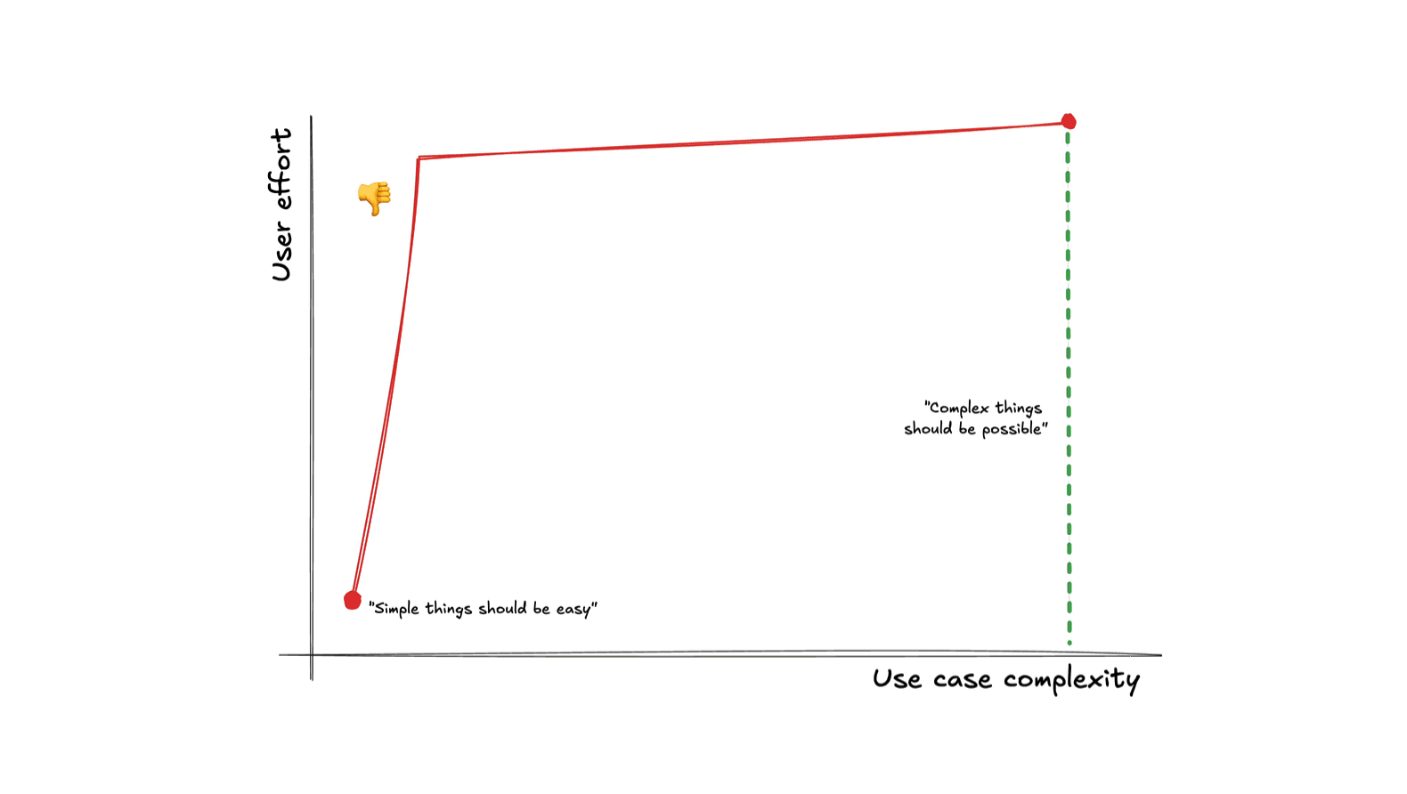
For delightful user experiences, making simple things easy and complex things possible is not enough — the transition between the two should also be smooth.
You see, simple use cases are the spherical cows in space of product design. They work great for prototypes to convince stakeholders, or in marketing demos, but the real world is messy. Most artifacts that users need to create to achieve their real-life goals rarely fit into your “simple” flows completely, no matter how well you’ve done your homework. They are mostly simple — with a liiiiitle wart here and there.
For a long-tail interface to serve user needs well in practice, we need to consciously design the curve, not just its endpoints.
User effort as a currency
A model with surprising predictive power is to treat user effort as a currency that users are spending to buy solutions to their problems. Nobody likes paying it; in an ideal world software would read our mind and execute perfectly with zero user effort. Since we don’t live in such a world, users understand to pay a bit of effort to achieve their goals, and are generally willing to pay more when they feel their use case warrants it.
Just like regular pricing, actual user experience often depends more on the relationship between cost and budget than on the absolute cost itself. If you pay more than you expected, you feel ripped off. You may still pay it because you need the product in the moment, but you’ll be looking for a better deal in the future. And if you pay less than you had budgeted, you feel like you got a bargain, with all the delight and loyalty that entails.
Avoid usability cliffs
Suppose you’re ordering pizza. You want a simple cheese pizza with ham and mushrooms. You use the online ordering system, and you notice that adding ham to your pizza triples its price. We’re not talking some kind of fancy ham where the pigs were fed on caviar and bathed in champagne, just a regular run-of-the-mill pizza topping. You may still order it if you’re really craving ham on your pizza and no other options are available, but how does it make you feel?
It’s not that different when the currency is user effort. The all too familiar “But I just wanted to _________, why is it so hard?”.
When a small increase in use case complexity results in a disproportionately large increase in user effort cost, we have a usability cliff. Usability cliffs make users feel resentful, just like the customers of our fictitious pizza shop.
A usability cliff is when a small increase in use case complexity requires a large increase in user effort.
Usability cliffs are very common in products that make simple things easy and complex things possible through entirely separate flows with no integration between them: a super high level one that caters to the most common use case with little or no flexibility, and a very low-level one that is an escape hatch: it lets users do whatever, but they have to recreate the solution to the simple use case from scratch before they can tweak it.
Example: The HTML video element
Simple things are certainly easy: all we need to get a video with a nice sleek set of controls that work well on every device is a single attribute: controls.
We just slap it on our <video> element and we’re done with a single line of HTML:
<video src="videos/cat.mp4" controls></video>
➡️

Now suppose use case complexity increases just a little. Maybe I want to add buttons to jump 10 seconds back or forwards. Or a language picker for subtitles. Or just to hide the volume control on a video that has no audio track. None of these are particularly niche, but the default controls are all-or-nothing: the only way to change them is to reimplement the whole toolbar from scratch, which takes hundreds of lines of code to do well.
Simple things are easy and complex things are possible. But once use case complexity crosses a certain (low) threshold, user effort abruptly shoots up. That’s a usability cliff.
Example: Instagram editor
For Instagram’s photo editor, the simple use case is canned filters, whereas the complex ones are those requiring tweaking through individual low-level controls. However, they are implemented as separate flows: you can tweak the filter’s intensity, but you can’t see or adjust the primitives it’s built from. You can layer both types of edits on the same image, but they are additive, which doesn’t work well.
Ideally, the two panels would be integrated, so that selecting a filter would adjust the low-level controls accordingly, which would both facilitate incremental tweaking and serve as a teaching aid for how filters work.
Example: Filtering in Coda
My favorite end-user facing product that gets this right is Coda, a cross between a document editor, a spreadsheet, and a database. All over its UI, it supports entering formulas instead of raw values, which makes complex things possible.
To make simple things easy, it also provides the GUI you’d expect even without a formula language. But here’s the twist: these presets generate formulas behind the scenes that users can tweak! Whenever users need to go a little beyond what the UI provides, they can switch to the formula editor and adjust what was generated — far easier than writing it from scratch.
Another nice touch: “And” is not just communicating how multiple filters are combined, but is also a control that lets users edit the logic.
Defining high-level abstractions in terms of low-level primitives is a great way to achieve a smooth complexity-to-effort curve, as it allows you to expose tweaking at various intermediate levels and scopes. The downside is that it can sometimes constrain the types of high-level solutions that can be implemented. Whether the tradeoff is worth it depends on the product and use cases.
Maximize signal-to-noise ratio
If you like eating out, this may be a familiar scenario:
— I would like the rib-eye please, medium-rare.
— Thank you sir/ma’am. How would you like your steak cooked?
Annoying, right? And yet, this is how many user interfaces work; expecting users to communicate the same intent multiple times in slightly different ways.
If incremental value should require incremental user effort, an obvious corollary is that things that produce no value should not require user effort. Using the currency model makes this obvious: who likes paying without getting anything in return?
Respect user effort. Treat it as a scarce resource — just like regular currency — and keep it close to the minimum necessary to declare intent. Do not require users to do work that confers them no benefit, and could have been handled by the UI. If it can be derived from other input, it should be derived from other input.

Source: NNGroup (adapted).
A once ubiquitous example that is thankfully going away, is the credit card form which asks for the type of credit card in a separate dropdown. Credit card numbers are designed so that the type of credit card can be determined from the first four digits. There is zero reason to ask for it separately.
Beyond wasting user effort, duplicating input that can be derived introduces an unnecessary error condition that you now need to handle: what happens when the entered type is not consistent with the entered number?
User actions that meaningfully communicate intent to the interface are signal. Any other step users need to take to accomplish their goal, is noise. This includes communicating the same input more than once, providing input separately that could be derived from other input with complete or high certainty, transforming input from their mental model to the interface’s mental model, and any other demand for user effort that does not serve to communicate new information about the user’s goal.
Some noise is unavoidable. The only way to have 100% signal-to-noise ratio would be if the interface could mind read. But too much noise increases friction and obfuscates signal.
Example: Programmatic Element removal
The two web platform methods to programmatically remove an element from the page provide a short yet demonstrative example of this for APIs. To signal intent in this case, the user needs to communicate two things: (a) what they want to do (remove an element), and (b) which element to remove. Anything beyond that is noise.
The modern element.remove() DOM method has an extremely high signal-to-noise ratio.
It’s hard to imagine a more concise way to signal intent.
It replaced the older parent.removeChild(child) method, which had much worse ergonomics.
The older method was framed around removing a child, so it required two parameters: the element to remove, and its parent.
But the parent is not a separate source of truth — it would always be the child node’s parent!
As a result, its actual usage involved boilerplate, where
developers had to write a much noisier if (element.parentNode) element.parentNode.removeChild(element)
[3].
Of course, it was usually encapsulated in utility functions, which provided a similar signal-to-noise ratio as the modern method. However, user-defined abstractions don’t come for free, there is an effort (and learnability) tax there, too.
Boilerplate is repetitive code that users need to include without thought, because it does not actually communicate intent. It’s the software version of red tape: hoops you need to jump through to accomplish your goal, that serve no obvious purpose in furthering said goal except for the fact that they are required of you.
In case of parent.removeChild() above, the amount of boilerplate may seem small, but when viewed as a percentage of the total amount of code, the difference is staggering.
The exact ratio (81% vs 20% here) varies based on the specifics of the API (variable names, method wording, etc.),
but when the difference is meaningful, it transcends these types of low-level details.
Think of it like big-O notation for API design.
Improving signal-to-noise ratio is also why the front-end web industry gravitated towards component architectures over copy-pasta snippets: components increase signal-to-noise ratio by encapsulating boilerplate and exposing a much higher signal UI. They are the utility functions of user interfaces. As an exercise for the reader, try to calculate the signal-to-noise ratio of a Bootstrap accordion (or any other complex component in any UI library that expects you to copy-paste snippets).
Instead of syntax, visual interfaces have micro-interactions. There are various models to quantify the user effort cost of micro-interactions, such as KLM.
You cannot uncover friction by asking users
When pointing out friction issues in design reviews, I have sometimes heard “users have not complained about this”. This reveals a fundamental misunderstanding about the psychology of user feedback.
Users are much more vocal about things not being possible, than about things being hard. The reason becomes clear if we look at the neuroscience of each.
Friction is transient in working memory; after completing the task, details fade from the user’s prefrontal cortex. However, the negative emotions persist in the limbic system and build up over time. Filing a complaint requires prefrontal engagement, which for friction is brief or absent. Users often can’t even articulate why the software feels unpleasant: the specifics vanish; the feeling remains.
Hard limitations, on the other hand, persist as conscious appraisals. The trigger doesn’t go away, since there is no workaround, so it’s far more likely to surface in explicit user feedback.
Both types of pain points cause negative emotions, but friction is primarily processed by the limbic system (emotion), whereas hard limitations remain in the prefrontal cortex (reasoning). This also means that when users finally do reach the breaking point and complain about friction, you better listen.
Second, user complaints are filed when there is a mismatch in expectations. Things are not possible but the user feels they should be, or interactions cost more user effort than the user had budgeted, e.g. because they know that a competing product offers the same feature for less (work). Often, users have been conditioned to expect poor user experiences, either because all options in the category are high friction, or because the user is too novice to know better [4]. So they begrudgingly pay the price, and don’t think they have the right to complain, because it’s just how things are.
You might ask, “If all competitors are equally high-friction, how does this hurt us?” An unmet need is a standing invitation to disruption that a competitor can exploit at any time. Because you’re not only competing within a category; you’re competing with all alternatives — including nonconsumption (see Jobs‑to‑be‑Done). Even for retention, users can defect to a different category altogether (e.g., building native apps instead of web apps).
Historical examples abound. When it comes to actual currency, a familiar example is Airbnb: Until it came along, nobody would complain that a hotel of average price is expensive — it was just the price of hotels. If you couldn’t afford it, you just couldn’t afford to travel, period. But once Airbnb showed there is a cheaper alternative for hotel prices as a whole, tons of people jumped ship.
It’s no different when the currency is user effort. Stripe took the payment API market by storm when it demonstrated that payment APIs did not have to be so high friction. iPhone disrupted the smartphone market when it demonstrated that no, you did not have to be highly technical to use a smartphone. The list goes on.
Unfortunately, friction is hard to instrument. With good telemetry you can detect specific issues (e.g., dead clicks), but there is no KPI to measure friction as a whole. And no, NPS isn’t it — and you’re probably using it wrong anyway. Instead, the emotional residue from friction quietly drags many metrics down (churn, conversion, task completion), sending teams in circles like blind men touching an elephant. That’s why dashboards must be paired with product vision and proactive, first‑principles product leadership.
Steve Jobs exemplified this posture: proactively, aggressively eliminating friction presented as “inevitable.” He challenged unnecessary choices, delays, and jargon, without waiting for KPIs to grant permission. Do mice really need multiple buttons? Does installing software really need multiple steps? Do smartphones really need a stylus? Of course, this worked because he had the authority to protect the vision; most orgs need explicit trust to avoid diluting it.
So, if there is no metric for friction, how do you identify it?
- Usability testing lets you actually observe firsthand what things are hard instead of having them filtered through users’ memories and expectations.
- Design reviews/audits by usability experts is complementary to usability testing, as it often uncovers different issues. Design reviews are also great for maximizing the effectiveness of usability testing by getting the low-hanging fruit issues out of the way before it.
- Dogfooding is unparalleled as a discovery tool — nothing else will identify as many issues as using the product yourself, for your own, real needs. However, it’s important to keep in mind that you’re a huge power user of your own product. You cannot surface learnability issues (curse of knowledge) and you will surface issues no-one else has. Dogfooding is a fantastic discovery tool, but you still need user research to actually evaluate and prioritize the issues it surfaces.
User needs come first
Reducing friction rarely comes for free, just because someone had a good idea. These cases do exist, and they are great, but it usually takes sacrifices. And without it being an organizational priority, it’s very hard to steer these tradeoffs in that direction.
The most common tradeoff is implementation complexity. Simplifying user experience is usually a process of driving complexity inwards and encapsulating it in the implementation. Explicit, low-level interfaces are far easier to implement, which is why there are so many of them. Especially as deadlines loom, engineers will often push towards externalizing complexity into the user interface, so that they can ship faster. And if Product leans more data-driven than data-informed, it’s easy to look at customer feedback and conclude that what users need is more features (it’s not).


The first faucet is a thin abstraction: it exposes the underlying implementation directly, passing the complexity on to users, who now need to do their own translation of temperature and pressure into amounts of hot and cold water. It prioritizes implementation simplicity at the expense of wasting user effort.
The second design prioritizes user needs and abstracts the underlying implementation to support the user’s mental model. It provides controls to adjust the water temperature and pressure independently, and internally translates them to the amounts of hot and cold water. This interface sacrifices some implementation simplicity to minimize user effort.
This is why I’m skeptical of blanket calls for “simplicity.”: they are platitudes. Everyone agrees that, all else equal, simpler is better. It’s the tradeoffs between different types of simplicity that are tough.
In some cases, reducing friction even carries tangible financial risks, which makes leadership buy-in crucial. This kind of tradeoff cannot be made by individual designers — only when eliminating friction is an organizational priority.

The Oslo airport train ticket machine is the epitome of a high signal-to-noise interface. You simply swipe your credit card to enter and you swipe your card again as you leave the station at your destination. That’s it. No choices to make. No buttons to press. No ticket. You just swipe your card and you get on the train. Today this may not seem radical, but back in 2003, it was groundbreaking.
To be able to provide such a frictionless user experience, they had to make a financial tradeoff: it does not ask for a PIN code, which means the company would need to absorb the financial losses from fraudulent charges (stolen credit cards, etc.).
When user needs are prioritized at the top, it helps to cement that priority as an organizational design principle to point to when these tradeoffs come along in the day-to-day. Having a design principle in place will not instantly resolve all conflict, but it helps turn conflict about priorities into conflict about whether an exception is warranted, or whether the principle is applied correctly, both of which are generally easier to resolve. Of course, for that to work everyone needs to be on board with the principle. But here’s the thing with design principles (and most principles in general): they often seem obvious in the abstract, so it’s easy to get alignment in the abstract. It’s when the abstract becomes concrete that it gets tough.
The Web Platform has its own version of this principle, which is called Priority of Constituencies:
“User needs come before the needs of web page authors, which come before the needs of user agent implementors, which come before the needs of specification writers, which come before theoretical purity.”
This highlights another key distinction: the hierarchy of user needs is more nuanced than just users over developers.
Consumers over Producers
While users over developers is a good starting point, it is not sufficient to fully describe the hierarchy of user needs for many products. A more flexible framing is consumers over producers; developers are just one type of producer.
- Consumers are typically more numerous than producers, so this minimizes collective pain.
- Producers are typically more advanced, and can handle more complexity than consumers. I’ve heard this principle worded as “Put the pain on those who can bear it”, which emphasizes this aspect.
- Producers are typically more invested, and less likely to leave
The web platform has multiple tiers of producers:
- Specification writers are at the bottom of the hierarchy, and thus, can handle the most pain (ow! 🥴)
- Browser developers (“user agent implementors” in the principle) are consumers when it comes to specifications, but producers when it comes to the web platform
- Web developers are consumers when it comes to the web platform, but producers when it comes to their own websites
Even within the same tier there are often producer vs consumer dynamics. E.g. when it comes to web development libraries, the web developers who write them are producers and the web developers who use them are consumers.
This distinction also comes up in extensible software, where plugin authors are still consumers when it comes to the software itself, but producers when it comes to their own plugins. It also comes up in dual sided marketplace products (e.g. Airbnb, Uber, etc.), where buyer needs are generally higher priority than seller needs.
Life by a thousand ✨ sprinkles of delight ✨
In the economy of user effort, the antithesis of overpriced interfaces that make users feel ripped off are those where every bit of user effort required feels meaningful and produces tangible value to them. The interface is on the user’s side, gently helping them along with every step, instead of treating their time and energy as disposable. The user feels like they’re getting a bargain: they get to spend less than they had budgeted for! And we all know how motivating a good bargain is.
User effort bargains don’t have to be radical innovations; don’t underestimate the power of small touches. A zip code input that auto-fills city and state, a web component that automatically adapts to its context without additional configuration, a pasted link that automatically defaults to the website title (or the selected text, if any), a freeform date that is correctly parsed into structured data, a login UI that remembers whether you have an account and which service you’ve used to log in before, an authentication flow that takes you back to the page you were on before. Sometimes many small things can collectively make a big difference. In some ways, it’s the polar opposite of death by a thousand paper cuts: Life by a thousand sprinkles of delight! 😀
Conclusion
In the end, “simple things simple, complex things possible” is table stakes. The key differentiator is the shape of the curve between those points. Products win when user effort scales smoothly with use case complexity, cliffs are engineered out, and every interaction declares a meaningful piece of user intent. That doesn’t just happen by itself. It involves hard tradeoffs, saying no a lot, and prioritizing user needs at the organizational level. Treating user effort like real money, forces you to design with restraint. A rule of thumb is place the pain where it’s best absorbed by prioritizing consumers over producers. Do this consistently, and the interface feels delightful in a way that sticks. Delight turns into trust. Trust into loyalty. Loyalty into product-market fit.
Kay himself replied on Quora and provided background on this quote. Don’t you just love the internet? ↩︎
Yes, typing can be faster than dragging, but minimizing homing between input devices improves efficiency more, see KLM ↩︎
Yes, today it would have been
element.parentNode?.removeChild(element), which is a little less noisy, but this was before the optional chaining operator. ↩︎When I was running user studies at MIT, I’ve often had users exclaim “I can’t believe it! I tried to do the obvious simple thing and it actually worked!” ↩︎
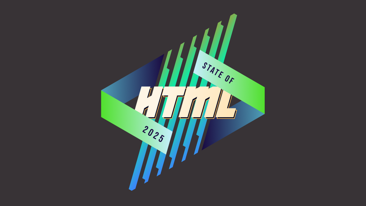
State of HTML 2025 now open!
tl;dr: State of HTML 2025 survey is now open! Take it now
About two weeks ago, I announced that I was back leading this year’s State of HTML 2025 survey, after a one year hiatus. We are grateful for all the suggestions that poured in, they were immensely helpful in shaping the survey. After two weeks of hard work from a small team spanning three continents, we are finally ready to launch!
I would urge each and every one of you that works with the web platform to fill out this survey. It’s a unique opportunity to have your voice heard in the browser vendors’ decision-making process. Survey results are used by browsers to prioritize roadmaps — the reason Google is funding this. The results from State of … surveys directly feed into prioritization for next year’s Interop project.
Time spent thoughtfully filling them out is an investment that can come back to you tenfold in the form of seeing features you care about implemented, browser incompatibilities being prioritized, and gaps in the platform being addressed. In addition to browsers, several standards groups are also using the results for prioritization and decision-making.
Additionally, you get to learn about new and upcoming features you may have missed, and get a personalized, sharable score at the end to see how you compare to other respondents!
Take State of HTML 2025 Survey
While the survey will be open for about a month, responses entered within the first two weeks (until end of July) will have a much higher impact on the Web, as preliminary data will be directly used to inform Interop 2026.
Acknowledgements
I would like to thank the following people for their help in fleshing out the survey:
- Sacha Greif for actually implementing the survey and tirelessly discussing my ideas
- My apprentice Dmitry Sharabin for various fixes and improvements
- My Google contacts, Philip Jägenstedt and Kadir Topal for making my involvement possible
- And everyone who responded to my earlier call for suggestions — these were invaluable in shaping the survey, and I wish I could include them all!
FAQ
What’s new this year?
We spent a lot of time thinking about which features we are asking about and why. As a result, we added 35 new features, and removed 18 existing ones to make room. This is probably one of the hardest parts of the process, as we had to make some tough decisions.
We are also using the Web Components section to pilot a new format for pain points questions, consisting of a multiple choice question with common pain points, followed by the usual free form text list:
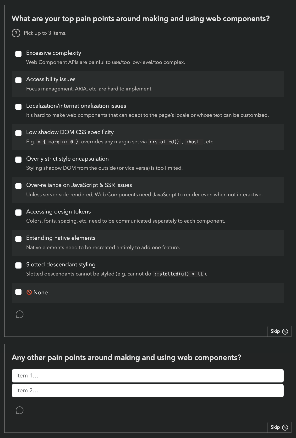
While this increases the number of questions, we are hoping it will reduce survey fatigue by allowing participants to skip the freeform question more frequently (or spend less time on it) if most of their pain points have already been covered by the multiple choice question.
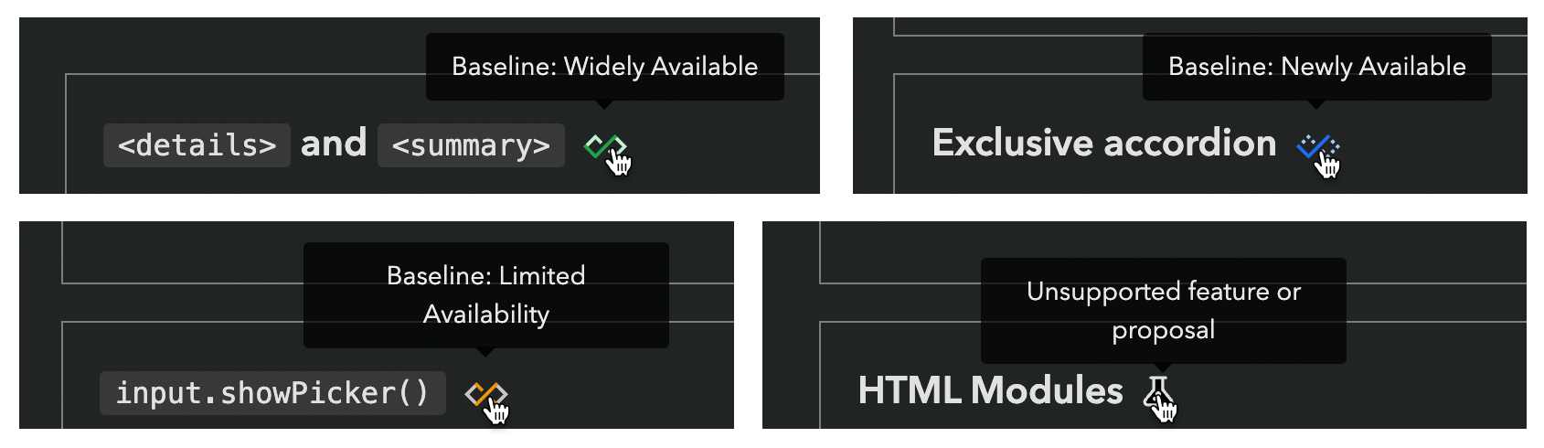
Last but not least, we introduced browser support icons for each feature, per popular request:
Can I edit my responses?
Absolutely! Do not worry about filling it out perfectly in one go. If you create an account, you can edit your responses for the whole period the survey is open, and even fill it out across multiple devices, e.g. start on your phone, then fill out some on your desktop, etc. Even if you’re filling it out anonymously, you can still edit responses on your device for some time, so you can have it open in a browser tab and revisit it periodically.
Why are there JS questions in an HTML survey?
This question comes up a lot every year.
For the same reason there are JS APIs in the HTML standard: many JS APIs are intrinsically related to HTML. We mainly included JS APIs that are in some way related to HTML, such as:
- APIs used to manipulate HTML dynamically (DOM, interactivity, etc.)
- Web Components APIs, used to create custom HTML elements
- PWA features, including APIs used to access underlying system capabilities (OS capabilities, device capabilities, etc.)
The only two exceptions to this are two Intl APIs,
which were mainly included because we wanted to get participants thinking about any localization/internationalization pain points they may have.
However, if you don’t write any JS, we absolutely still want to hear from you! In fact, I would encourage you even more strongly to fill out the survey, as people who don’t write JS are very underrepresented in these surveys. All questions are optional, so you can just skip any JS-related questions.
There is also a question at the end, where you can select that you only write HTML/CSS:
Why are some features included that are early stage proposals with no browser support?
While proposals with no browser support are not good candidates for immediate prioritization by browsers, their context chips give browser vendors and standards groups invaluable insight into what matters to developers, which also drives prioritization decisions.
However, we heard you loud and clear: when mature and early stage features are mixed together, you felt bait-and-switched. So this year, we are including icons to summarize browser support of each feature we ask about:
We are hoping this will also help prevent cases where participants confuse a new feature they have never heard of, with a more established feature they are familiar with.
Is the survey only available in English?
Absolutely not! Localization has been an integral part of these surveys since the beginning. Fun fact: None of the people working on these surveys is a native English speaker.
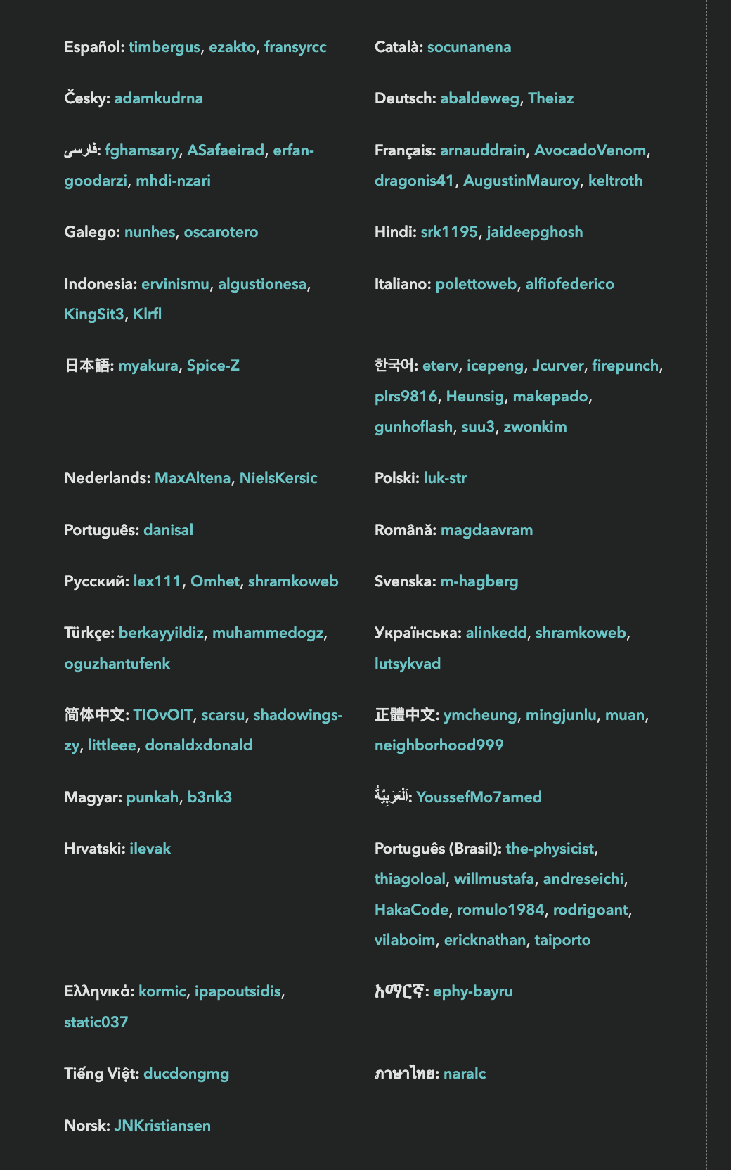
State of HTML 2024 had translations for 31 languages.
However, since translations are a community effort, they are not necessarily complete, especially in the beginning. If you are a native speaker of a language that is not yet complete, please consider helping out!
I found a bug, what should I do?
Please file an issue so we can fix it!
Influence the State of HTML 2025 Survey!
Two years ago, I was funded by Google to design the inaugural State of HTML survey. While I had led State of … surveys before (also graciously sponsored by Google), that was by far the most intense, as 0→1 projects often are. In addition to the research, content, and analysis work that goes into every State of … survey, the unique challenges it presented were a forcing function for finally tackling some longstanding UX issues with these surveys. As a result, we pioneered new survey interaction UIs, and validated them via usability testing. This work did not just affect State of HTML, but had ripple effects on all subsequent State of … surveys.
The results made it all worth it. Turnout was the highest ever for a new Devographics [1] survey: 21 thousand participants, which remains a record high for State of HTML. The survey findings heavily influenced Interop 2024 (hello Popover API and Declarative Shadow DOM!) and helped prioritize several other initiatives, such as stylable selects. Despite lower 2024 participation, the survey still significantly influenced Interop 2025; notably, View transitions was added after being prominent in the survey for two years in a row.
This is the goal of these surveys: to drive meaningful change in the web platform. Sure, getting a shareable score about what you know and seeing how you compare to the rest of the industry is fun, but the reason browser vendors pour thousands of dollars into funding these surveys is because they provide unique vendor-neutral insights into developer pain points and priorities, which helps them make better decisions about what to work on. And this ultimately helps you: by getting your voice heard, you can directly influence the tools you work with. It’s a win-win: developers get better tools, and browser vendors get better roadmaps.
State of HTML 2025
Last year, I was too busy to take the lead again. Wrapping up my PhD and starting a new job immediately after, there was no time to breathe, let alone lead a survey. I’m happy to be returning to it this year, but my joy is bittersweet.
When I was first asked to lead this year’s survey a few months ago, I was still too busy to take it on. Someone else from the community accepted the role — someone incredibly knowledgeable and talented who would have done a fantastic job. But they live in the Middle East, and as the war escalated, their safety and their family’s well-being were directly impacted. Understandably, leading a developer survey became the least of their concerns. In the meantime, I made a few decisions that opened up some availability, and I was able to step in at the last minute. It’s a sobering reminder that events which feel far away can hit close to home — shaping not just headlines, but the work and lives of people we know.
Web Platform Features at the verge of Interop
A big part of these surveys is “feature questions”: respondents are presented with a series of web platform features, and asked about their familiarity and sentiment towards them. At the end, they get a score based on how many they were familiar with that they can share with others, and browser vendors and standards groups get signal on which upcoming features to prioritize or improve.
You can see which features were included in last year’s survey here or in [2] the table below.
State of HTML Features
I believe that co-designing these surveys with the community is the best way to avoid blind spots. While the timeline is tighter than usual this year (the survey is launching later this month!), there is still a little time to ask:
👉🏼 Which upcoming HTML features or Web APIs are currently on your radar? 👈🏼
What does “on your radar” mean? Features you’re excited about and would love to see progress on.
Why focus on upcoming features? The best candidates for these surveys are features that are mature enough to be fleshed out (at least a mature proposal, ideally a spec and WPT tests), but not so mature they have already been implemented in every browser. These are the features for which a survey such as this can drive meaningful impact.
If it’s so early for a feature that it’s not yet fleshed out, it’s hard to make progress via initiatives such as Interop. Interest is still useful signal to help prioritize work on fleshing it out, but it’s a bit of a longer game. And for features that are already implemented everywhere, the only thing that can improve things further is passage of time — a problem for which I unfortunately have no solution (yet).
Obviously we’re looking at all the usual suspects already, and initiatives such as webstatus.dev and Web platform features explorer provide a treasure trove of data which makes this task infinitely easier than it used to be. But this kind of preliminary signal is also useful for filtering and prioritization — to give you a sense, my list of candidate new features to ask about already has 57 items (!). Given that State of HTML 2024 asked about 49 features, that will need some very heavy pruning.
While the title is “State of HTML”, anything that wouldn’t fit better in State of CSS or State of JS is fair game. This includes topics such as accessibility, browser APIs, web components, templating, static site generation, media formats, and more. This may seem strange at first, but is no different than how the HTML specification itself covers a lot more than just HTML markup.
Any way to reach me works fine. You can post in the comments here (preferred), or reply on BlueSky, Mastodon, Threads, LinkedIn, or Twitter. Make sure to check the other replies first, and 👍 those with features you care about. Looking forward to your ideas and comments!
Devographics is the company behind “State of …” surveys. ↩︎
As an Easter egg, this widget is just a
<details>element with custom CSS. Inspect it to see how it works! It works best in Chrome and Safari, as they fully support::details-content. Chrome also supportscalc-size(), which enables a nice animation, while the interaction in Safari is more abrupt. In terms of a11y, the summary gets spoken out as a regular<summary>element, with “Show more” or “Show less” at the end of its content. It seems ok-ish to me, but I’d love to hear from those with more expertise in this area. ↩︎