Reading List
The most recent articles from a list of feeds I subscribe to.
200
It's meta blogging time, because this is my 200th post. Vanity metrics, I know, but sometimes you've got to celebrate milestones. Even the merely numerical ones. When I wrote my 150th post two years ago, I described why I blog and what about. This time, I want to focus on how I do it and look at the subjects of the last 50.
A lot of posts start on my phone
There are plenty of tools for writing. Fancy physical notebooks, favourite text editors, and what not. I do use both, but usually I start a post on my phone. It somehow is my least distracting device, and very portable. My setup is that I have iA Writer, which I love for its radical simplicity and advanced typography, on my phone and computers. I've got a couple of folders that are synced through iCloud, including for posts and talk ideas. They are literally folders—iA Writer just picks them up and displays them as folders in their UI. When I start a post, I create a file. Sometimes it stays around for days, weeks or months, sometimes I finish a draft in half an hour.
When the post is almost ready, I'll usually do another round on a computer. This is essential if the post needs images or code examples, sometimes I can skip it if a post is just text. This is usually also the time when I start adding it into my website and reach out to people for feedback, if it's the kind of post that very much needs review.
Having my posts exist in a cloud service has been a game changer, because it means I can blog when inspiration strikes. When I used to go swimming, I would sometimes think up a blog post while in the water and write up a quick structure of first draft in the changing room or the cafe nearby. Sometimes I revise a draft when I sit on a tram or bus, or add some more examples when I arrived early for an appointment. Sometimes I return to it on a computer, then a phone, then a tablet.
As for the format: I use Markdown processed by Eleventy. I am aware of the disadvantages, but this is a one-person-who is-a-developer-and-very-comfy-in-a-text-editor blog kind of use case. Still, I am pondering re-introducing a CMS so that it can manage images and history in a way that doesn't involve me committing into git (who needs commits for typos?) or compressing images by hand.
Getting the words flowing
A friend asked how I manage to write on this blog regularly, alongside other responsibilities. I don't know the secret, but I can offer two thoughts.
Firstly, my writing is usually a way to clarify my thinking, it sort of defragments thoughts, if that makes sense. It doesn't really add much to the time I would need for defragmenting thoughts anyway, if anything it speeds that process up. If I spiral in circles about a subject, jotting my thoughts down helps me get out of that spiral. Sometimes the result is I find out I was very wrong, sometimes I get to a post I deem worthy of publishing and often I end up somewhere in between.
Secondly, I try and add ideas to drafts when they come up. Like, I had a file with ‘200’ in it for a while that eventually got a few bullets and then became this post. When I feel like making a thread on social media, I force myself to make a draft post here instead. Occassionally, like when I haven't written for a while, I'll go through the drafts. There isn't really a magic trick here either, it's a habit if anything. And I guess it helps words come to me naturally, like numbers do for others.
Thirdly, a bonus one: it helps me to keep things very simple and stay away from tweaking too many things (eg I only switched tech stack once in 15 years and kept the design roughly the same). I won't say I'm not tempted, I mean it is fun to try out new things and this blog is definitely a playground for me to test new Web Platform features, but I try and focus on the posts.
My 50 most recent posts
The cool thing about having your own blog is that it doesn't need to have a theme per se. Mine follows some of my interests and things I care about: the web, components and accessibility.
On web platform features, I wrote about spicy sections (out of date now as I updated my site and there are some different ideas and solutions for tabs on the web), selectmenu and dialogs.
As I used Eleventy more, I wrote about using it for WCAG reports and for photo blogging.
A lot of my posts were also about web accessibility, like this primer on ATAG, two posts about low-hanging fruit issues (part 1, part 2) , what's new in WCAG 2.2 and the names section of ARIA. These posts usually start because I had to give some advice in an accessibility audit report I wrote, or because I couldn't find a blog post sized answer to a question I personally had.
I also covered some events, like dConstruct 2022, documentation talks at JSConf and JSNation, Beyond Tellerrand 2021 and an on-stage interview with Cecilia Kang on her fascinating book An Ugly Truth. These kinds of posts help me process what I learned at the event. While I write, I usually look up URLs speakers mentioned or try out features they discussed, so it's a bit of experiencing the whole thing twice.
This year, I hope to write more about CSS and other UI features in the browser. I did one post about using flex-grow for my book site, but want to dive deeper into subjects like scroll snapping, container queries and toggles. Even if Manuel has already covered every single CSS subject ever in the last few months (congrats, my friend!). I also want to cover design systems and Web Components more. I have some other subjects in mind too, and am open to suggestions too, just leave a comment or slide in my DMs. Thanks for reading my blog!
Originally posted as 200 on Hidde's blog.
Browser built-in search and ATAG A.3.5.1
The Authoring Tool Accessibility Guidelines (ATAG) are guidelines for tools that create web content. While reviewing this week, I wondered if the Text Search criterion (A.3.5.1) is met as soon as users can use browser built-in search. You know, Ctrl/⌘ + F. Turns out: yes, if the tool is browser-based and the UI contains all the necessary content in a way that CTRL+F can find it.
Let's look into a bit more detail. The criterion requires that text content in editing views can be searched:
A.3.5.1 Text Search: If the authoring tool provides an editing-view of text-based content, then the editing-view enables text search, such that all of the following are true: (Level AA)
(a) All Editable Text: Any text content that is editable by the editing-view is searchable (including alternative content); and
(b) Match: Matching results can be presented to authors and given focus; and
(c) No Match: Authors are informed when no results are found; and
(d) Two-way: The search can be made forwards or backwards.
(From: ATAG 2.0)
True accessibility depends on a combination of factors: browsers, authoring tools, web developers and users—they can all affect how accessible something is. ATAG is about authoring tools specifically, so my initial thinking was that for an authoring tool to meet this criterion, it would need to build in a text search functionality.
However, reading the clauses, it sounded a lot like what Ctrl + F/Cmd + F in browsers already facilitate. Great news for authoring tools that are browser-based (sorry for those that are not). Browser built-in search finds all visible text in a page (as well invisible text in details/summary browsers), matching results are presented, “no match” is indicated and search works two ways. It doesn't find alternative text of rendered images, but if you have text input for alternative text, it finds the contents of that.
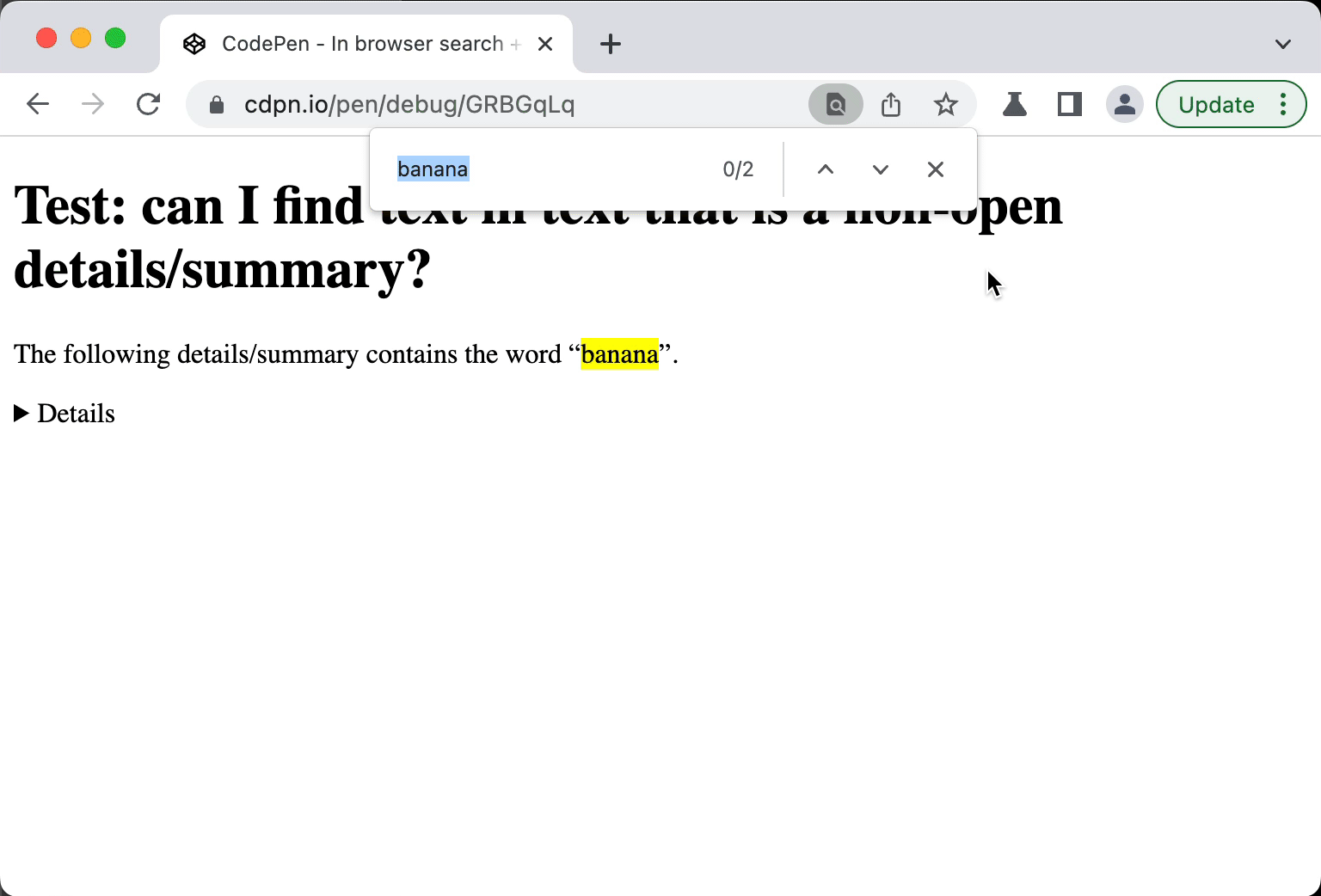 In Chromium, when the “hidden” part of a
 details/summary contains the word you search for, it goes to open state (this is per spec, but Firefox and Safari don't do this yet)
Note: in screenreaders, the experience of in page search is not ideal. I have not tested extensively and am not a screenreader user myself, but quick tests in VoiceOver + Safari and VoiceOver + Firefox indicated to me that one can't trivially move focus to a result that is found and “no match” is not announced, it needs cursor movement to find. This seems not ideal, but again, I am not a screenreader user and may be missing something.
All in all, the in-browser seems to satisfy the requirements. Lack of matches is indicated (though not announced) and matches can be given focus (though the browser doesn't do it; not sure how that would work either as the matches will most likely not be focusable elements so that would be a bit hacky and it would not solely have advantages). These caveats are accessibility issues. I feel they'd be best addressed in browser code, not individual websites/apps, so that the solution is consistent.
Ok, so if the browser built-in search meets the criteria, let's return to the question I started with: should an authoring tool merely make sure it works with built-in search, or should it implement its own in-page search?
The unanimous answer I got from various experts: yes, in this case the browser built-in is sufficient to meet the criterion. It also seems reasonably user friendly and likely better than some tool-specific in-page search (but note the caveats in this post, especially that all alternative text would need to be there as visible text). Of course, most authoring tools have more search tools available, e.g. to let users search across all the content they can author. In today's world, they seem like an essential way to complement in-page search, especially as a lot of authoring tools aren't really page-based anymore.
Originally posted as Browser built-in search and ATAG A.3.5.1 on Hidde's blog.
Data-informed flex-grow for illustration purposes
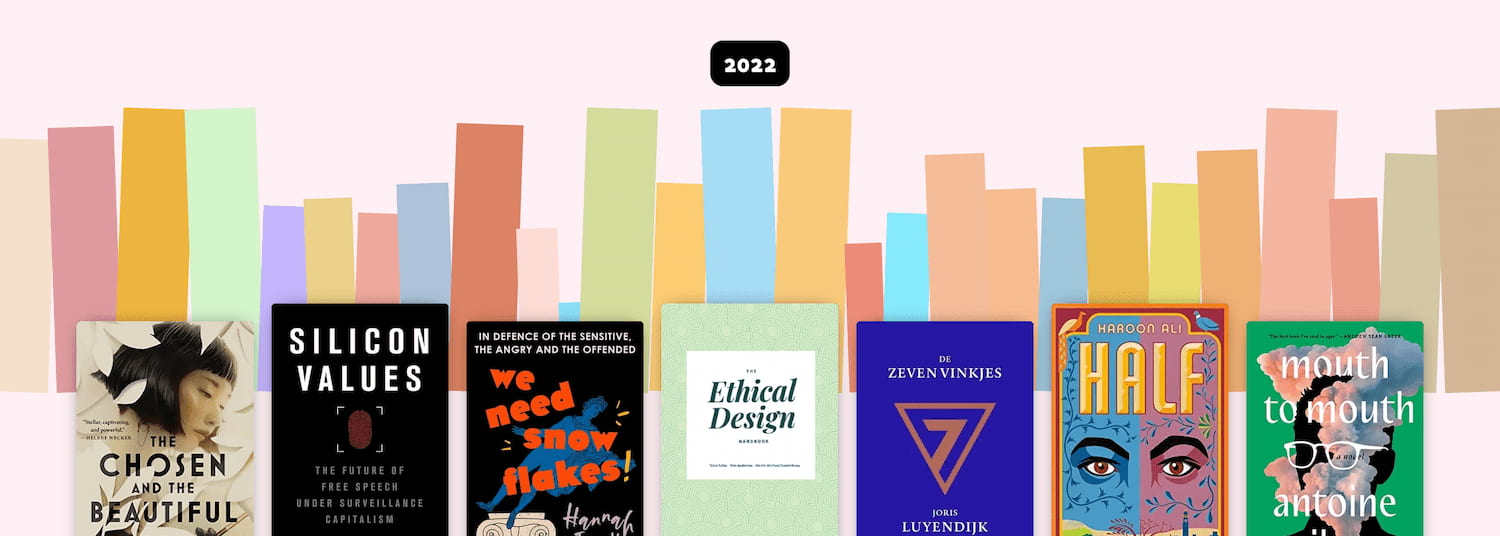
I have this web page to display the books I've read. Book covers often bring back memories and it's been great to scroll past them on my own page. It's also an opportunity to play around with book data. This week, I added a bit of page count-based visualisation for fun.
This is what it looks like: rectangles with colours based on book covers. Each relates to a specific book, and its size is based on that book's page count.
What's flex-grow?
Flex grow is part of the CSS's flex layout mode. When you add display: flex to a HTML element, it becomes a flex container, and with that, its direct children become flex items. Flex items behave differently from block or inline level children. The difference is that flex items can be layed out in a specific direction (horizontal or vertical) and sized flexibly. This system is called “flexible layout box model” or simply flexbox. It comes with sensible defaults as well as full control via a range of properties.
One of those properties is flex-grow. This is what it does:
[flex-grow] specifies the flex grow factor, which determines how much the flex item will grow relative to the rest of the flex items in the flex container when positive free space is distributed
(from: CSS Flexible Box Layout Module Level 1)
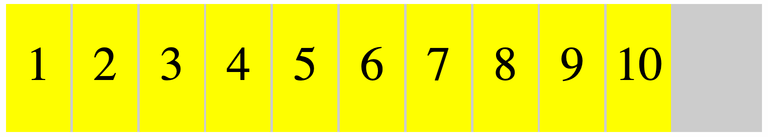
So let's say you have ten spans in div, where the div is a flex container and the spans flex items:
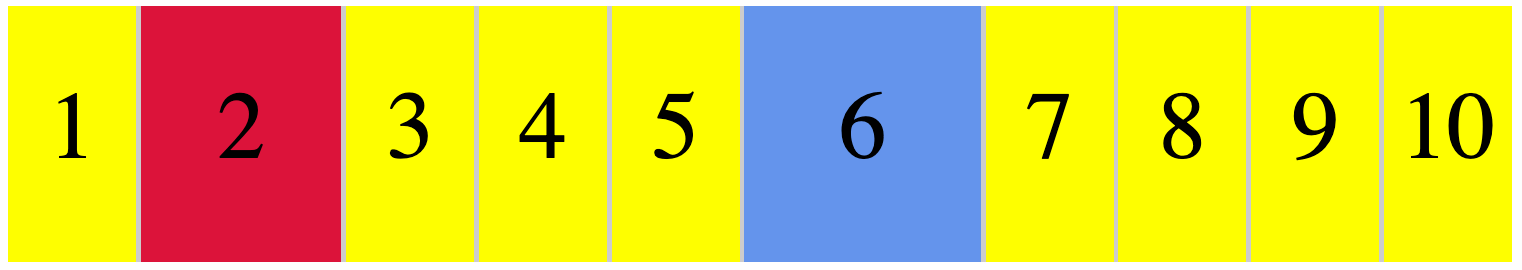
If you want one to proportionally take up double the space and another to take up triple the space, you'll give them a flex-grow value of 2 or 3, respectively:
/* item 2 */
span:nth-child(2) {
  flex-grow: 2; /* takes up double */
  background: crimson;
}

/* item 6 */
span:nth-child(6) {
  flex-grow: 3; /* takes up triple */
  background: cornflowerblue;
}
The others will then each take up one part of the remaining space (as if set to 1):
The specification recommends generally using flex instead of flex-grow. This shorthand can take three numbers: a flex-grow factor (how much should it be able to grow), flex-shrink factor (how much should it be able to shrink) and a flex-basis factor (what size should we start with before applying grow or shrink factors.
We can also give flex just one positive number, to use that number as flex-grow, and a default of “1” as flex-shrink and “0” as the basis (meaning no initial space is assigned, all of the size is a result from the grow or shrink factor). In our case, we'll use that flex shorthand, it's a sensible default.
Flex-grow for widths, aspect ratio for heights
My sites displays, like, 50 books for a given year. Each with a different amount of pages. Some are just over 100 pages, others are over 500. I wanted to use that number as the flex-grow factor. This means some books claim space of 113, others claim 514:
[a-113-page-book] {
  flex: 113;
}

[a-514-page-book] {
	flex: 514;
}
So that will claim 113 worth of space for the one book and 514 worth of space for the other. I used little magic for this, I just applied an inline style attribute to each book in my template (Nunjucks), setting flex dynamically. When they all have a number, they all take a proportion, and when all the numbers are similar amounts, you'll see that the size they take up is quite similar, except for a few outliers.

As mentioned above, these numbers represent a proportion of the total available space. You might wonder: which space? Flexbox can work in horizontal and vertical direction. Or, really, in inline and block direction, where inline is the direction in which inline elements appear (like em, strong) and block the direction in which block-level elements appear (eg paragraphs and headings).
Flexbox only takes space in one direction. For my illustration, I used the default, which is the inline direction or flex-flow: row (this is shorthand for a flex-direction: row and flex-wrap: nowrap). This means my flex-grow values are about a proportion of “inline” space, in my site's case, this means horizontal space.
I also want each book to take up some vertical space, as with only a width, we would not actually see anything. I could set a fixed height (in fact, I did that for the screenshot above). But in this case, I want the height to have a fixed relationship to the width. The aspect-ratio property in CSS is made for that: if an item has a size in one dimension, the browser figures out what the other dimension's size needs to be to meet a ratio you provide. In this case, the browser finds a height based on the width that it calculated for our proportion.
Ok, so let's add an aspect ratio:
.book {
  /* flex: [set for this book as inline style] */
  aspect-ratio: 1 / 4;
}
I also added a background-color that I have available in my template (it's a piece of image metadata that I get for free from Sanity).
Oh, but wait… they still have the same height! That's because by default, items are aligned to ”stretch”, they take up all available space in the opposite direction (block if items flow in inline direction, inline if items flow in block direction). When items stretch, remaining space is assigned back to them. In this case, that means they'll get the same height. Often super useful and quite hard to do pre-flexbox. But in this case, we don't want that, so we'll use align-items to set our items to align at the “end” (also can be set to “start”, “center” and “baseline”):
 What the books looks like for different values of align-items
In my case, I also added a max-width to avoid extreme outliers and I addded opposite rotate transforms to even and odd items for funs:
.book {
  transform: rotate(-2deg);
}
.book:nth-child(odd) {
  transform: rotate(2deg);
}
This works with grids too
When I shared this, Vasilis rightly noted you could pull the same trick with grids. If you add display: grid to an element it becomes a grid container and its children grid items. That sounds a lot like flexbox, but the main difference is that sizing isn't done from the items, it is done from the container. For a grid, you define columns (and/or rows) that have a size. The fr is one of the units you can use for this, it's short for “fraction”. Pretty much like proportions in flexbox, fr will let you set column/row size that is a proportion of the available space. If you set all your columns with fr, each one will be a proportion of all available space in the relevant direction.
Summing up
I usually use flexbox with much lower numbers, often under 10. But it turns out, it works fine with larger numbers, too. I have not done extensive performance testing with this though, there may be issues if used for larger sites with more complex data.
Originally posted as Data-informed flex-grow for illustration purposes on Hidde's blog.
2022 in review
With only a few days left 2022, I wanted to review some of my 2022, including speaking, reading, music, writing and travel. Let's go!
Note: like in 2021, 2020, 2019, 2018 and 2017, in this public post I mostly sum up “highlights“, stuff I liked about the year etc. Of course, life is more complex and less structured than posts like this make it out to be.
Work
From February, I started working full time at Sanity.io, we focus on making content management pleasant for everyone involved. I'm in the developer relations team, with a focus on things like documentation, starters, videos and workshops. The problems are intriguing, they are both technical (like real time multiplayer content editing) and organisational (like cross functional collaboration). I'm enjoying being in a place where I can learn a lot and contribute a lot of my experience at the same time. I feel lucky with great colleagues. Some things we released this year: Sanity Studio v3 (customisable SPA to edit content), GROQ 1.0 (language to query content) and an /accessibility page following an accessibility review of Sanity Studio.
This year I did only minimal accessibility consulting. including reviews and presentations for UWV, a Dutch governmental organisation focused on employment and unemployment, DigiD, the Dutch digital government identity and MDN/Mozilla.
I am also still involved in Open UI CG, where I try to learn and contribute: I scribe sometimes, join discussions where I can and talk about the work at events. This year, we got a lot done on <selectmenu> and popover. See my posts on customisable selects and dialogs vs popovers.
Speaking
This year had many more in person events, and I have loved speaking in person at JSConf in Budapest, EuroIA in Marseille and State of the Browser in London. Most talks were about accessibility, some about CSS, HTML and content.
In 2023 I want to talk about the nitty gritty of building popovers and the power of systems that use composability as design principle (see the Speaking page).
These are the talks I did in 2022:
- The Next Web on why that's not “Web3” for SendCloud (remote)
- A toolkit for web accessibility on the “toolkit” edition of Beyond Tellerrand's Stay Curious event (where Stephanie presented her awesome toolkit for CSS) (remote)
- It's the markup that matters at JSConf Budapest and Modern Front-ends Live
- Shifting left, or: making accessibility easier by doing it earlier at DevOps Amsterdam (remote), the Sanity July meetup (remote) and State of the Browser
- Editor experiences that your team will love, a workshop, at React India (remote) and React Summit Amsterdam (remote)
- More to give than just the div: semantics and how to get them right at Frontmania
- Your CMS is an accessibility assistant at IAAP-EU (remote)
- Cross-functional collaboration for structured content, a workshop at EuroIA and Structured Content Conference, developed by my colleague Carrie Hane, co-facilitated by my colleague Simeon Griggs
- Styling selects? You've got options!, a lightning talk at CSS Day + CSS Café
Reading
In total, I read about 30 books this year, still a mix of physical, ebooks and audiobooks.
On technology, I loved Blockchain chicken farm by Xiaowei Wang. “Hustle culture” isn't just a Silicon Valley thing, it's there in rural China. From “e-commerce villages” that solely focus on producing for Taobao to free range chicken on the blockchain (of course it added no value). Awesome mix of technology, travels, encounters, food and how the world and life works from an original thinker. Original thinking was also in Ways of being by James Bridle, about artificial intelligence, ecology and the relationship between the humans and the ‘more than human’ world. He critiques the idea that the world, all of the world, can be computed and represented in data points. He shows why that would be a limited way of thinking. It's a little vague sometimes, according to Cory Doctorow that's because the book argues against crisp articulations themselves.
Two books I liked about identity and cultures were Takeaway and If I surivive you. Takeaway by Angela Hui is about what it's like to grow up in rural Wales when your parents run a takeaway. Often entertaining, often touching tale of family relationships, finding identy and racial abuse. Food is a central theme too, the recipe each chapter ends with was a nice touch. I found If I survive you, by James Escoffery, a very well written collection of short stories about a Jamaican family in America, about existing between two cultures, capitalism and being black in America.
I also thoroughly enjoyed Erasmus: dwarsdenker a biography of the philosopher/theologician Erasmus (in Dutch). Didn't know Erasmus spent lots of time begging patrons to fund him, so that he could write, travelled a lot (UK, Germany, Belgium and France, by horse and ship), got ‘jobs’ in the church that came with a livelong salary without requiring him to actually do the job (this was a thing at the time, Erasmus had his in Aldington, UK and Kortrijk, Belgium) and Erasmus had criticasters who published their criticisms anonymously and circulated lists of criticisms on his New Testament, mixed with gossip about his life and history. Glad we don't do any of that anymore. Oh wait…
Music
This year I listened a lot to:
- Kendrick Lamar's new album Mr Morale and the Big Steppers, which was my first introduction to his music and got me ready to explore all the earlier albums that everyone had been raving about. A colleague recommended the Dissect podcast, which explains To Pimp a Butterfly track by track in hour long episodes.
- Nubya Garcia's Source remix album: saw her live in Rotterdam and have had her Tiny Desk and BBC Proms (posted last month) gigs on repeat
- WIES, Froukje, Joost Klein and Hang Youth: there has been a resurge in Dutch artists performing in Dutch (English has been more common), loved the Bandje pun on the Dutch Prime Minister's dismissive attitude towards the performing arts and ‘Met je Ako ideologie’ on getting one's world view from the train station's best selling non fiction (not making this up)
- Robert Glasper's Black Radio 3 was my favourite album, where jazz and hiphop meet. Beautiful spoken word on a Radiohead-esque melody in the opening track and lots of collaborations with people like Esparanza Spalding and A Tribe Called Quest's Q-Tip (on one track) throughout.
Writing
I finally added some more useful categories to this blog, moved to a veey short domain (it's just hidde.blog) and published about 30 posts this year. I'm most happy with:
- Dialogs, modals and popovers seem different: how are they different: a deep dive into these common patterns, with many thanks to Adrian Roselli and Scott O'Hara for their review help
- “That's not accessible!” and other statements about accessibility
- ATAG: the standard for the accessibility of content creation, I learned a lot about ATAG while I was at W3C and this was my personal plain language version
- The web doesn't have version numbers, the industry continued to surprise me with its dreams of making everything about money and ‘on’ an inefficient database (I'm also feel the ‘metaverse’ is a non-sensical investment)
Cities
San Francisco, Budapest, Düsseldorf, Cologne, Oslo, Paris, Marseille, London (5 times), Brighton, Antwerp, Lille, various towns in Normandy and Taipei.
It's especially been nice to meet international internet friends in person, many for the first time, like Nicole, Tantek, Yulia, Vadim, HJ, Adam, Una, Gift, Adrian, Manjula, Ana, Jeremy, Michelle, Mu-An, Bruce, Andy, Sophie, Léonie, Anuradha, Jhey and Patrick. Plus almost all of my colleagues.
Conclusion
That's all for this year, thanks all for reading my posts, liking subcribing, disagreeing via email, everything! If you've posted a year in review, let me know, I'd love to read it!
Originally posted as 2022 in review on Hidde's blog.
Mostly on Mastodon
I'm mostly on Mastodon now (I'm @hdv). What I mean by that I try and keep up with what people share on their Mastodon timeline and no longer do so on Twitter.
In the past weeks, I've gone to “mostly Mastodon” from “partially Mastodon and partially Twitter”. I did join a Twitter Space and still post every now and then, but it feels increasingly uncomfortable. I also monitor DMs, but will give out iMessage/LINE/Signal info to any mutual who wants a better way to contact me.
I wrote about reasons to leave Twitter earlier, new reasons pile up:
- a lot of the people I care about are now on Mastodon or stopped posting on Twitter (yay)
- quality matters more than quantity
- Mastodon has open ways to syndicate your content (it's been long since Twitter had open APIs)
- Twitter is mostly ChatGPT screenshots these days anyway (only partially kidding)
- the new owner tweets a lot about “woke” as if it is a bad thing
- the new owner doesn't seem to understand basic concepts like truth and free speech, but, and this is my main issue, continues to make bold claims about them, while running and making decisions about Twitter
- the new owner spreads misinformation including about public health, again, while running and making decisions about Twitter
So, I'm mostly not spending time on Twitter.
I'm mostly on Mastodon, instead. What does that mean? I post there primarily and only occassionally (and manually) cross-post to Twitter. I consciously choose Mastodon when engaging with cross-posted tweets, sometimes this means looking up a toot-version of a tweet, which is a bit of a nuisance, but fine. I've put my Mastodon presence on slide decks instead or in addition to Twitter, and added it to the footer of posts.
Maybe you wonder why I don't just go, why I share all this? Touché. Well, it's been a non trivial decision for me, after decades on Twitter and making lots of connections there, the start of many professional and not-so-professional relationships and friendships. I can imagine it's the same for you. If you're reading this and are still mostly on Twitter, may I ask you to consider spending more time on Mastodon? It isn't as hard to use as sceptics make it out to be. Together we impact which place is more worthwhile.
Originally posted as Mostly on Mastodon on Hidde's blog.