Reading List
The most recent articles from a list of feeds I subscribe to.
Review: the Mobile Web Handbook
Peter-Paul Koch, famous for PPK on JavaScript, Quirksmode.org and more recently as a co-organiser of various Amsterdam-based web conferences just released his new book: the Mobile Web Handbook, published by Smashing Magazine.
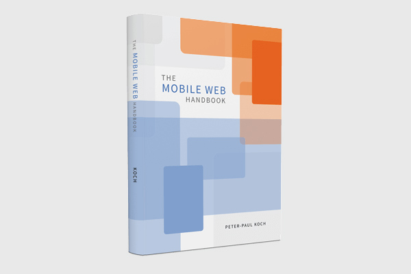 ! I have read the book on a recent train trip from Bristol to Brighton. It is 227 pages and beautifully illustrated.
Websites have been developed for more than one screen for a few years now. This inevitably followed from the rise of lots of different screen sizes. New phones, phablets, tablets, laptops and desktops with excellent and not so excellent browsers have come out and users simply started using those to visit our websites. As a response to the explosion of screen widths in our browser statistics, website owners could do nothing but adapt. Websites had to work on mobile.
Why we (still) need a handbook for mobile
By now, most of us have worked on websites made for lots of different screens. There are heaps of talks and articles out there to help. But development for mobile is complex, and untangling this complexity is important. The pixels, viewports and touch events that are discussed in the Mobile Web Handbook may be things we already use every day, but it is incredibly useful to see the concepts explained and annotated by someone with a lot of experience in testing browsers and mobile devices.
The book
The book starts with an introduction of the mobile world, which goes into things like market shares, OSes, stats (and how to interpret them) and strategies of device vendors, operators and browser makers. It gives a lot of useful background information, essential stuff to understanding the mobile world. More context of the mobile world is given throughout the book, for example in the chapter about (the politics of) Android.
After this first chapter the book goes into the more technical aspects of mobile development: from browsers and viewports to pseudo class selectors in CSS and touch/pointer events in JavaScript.
Towards the end of the book, a chapter is devoted to acquiring devices, with some useful hints as to which devices (not) to buy. This chapter, I found, is easier to read than to bring in practice. The argument for having real devices to test on is clear to me, but spending a hundred pounds every month on new devices would not work for me. As a freelancer, I prefer to use a combination of my own real devices, an Open Device Lab (like the Bristol ODL) and even emulators.
Last but not least, the last chapter is about the future of mobile web development, and contains various predictions on what to expect next.
Buy this book
If you’re not sure what the differences are between the visual viewport and the layout viewport, or between device pixels and CSS pixels, you have to read this book! The same goes if you would like to have better insight in the mobile landscape and the politics of (mobile-related) web standards. The ebook is available for direct download, and it seems that hard copies are going to be shipped sometime this month.
Originally posted as Review: the Mobile Web Handbook on Hidde's blog.
Breakpoints based on language
In responsive web design, many of us think of breakpoints as related to the width of lay-outs. But there are other points that can break a website, like language.
Breakpoints: more than just widths and heights
In Responsive Design Workflow, Stephen Hay encourages readers to think about breakpoints regardless of specifics like widths or lay-out. Stephen says breakpoints are ‘the points when certain aspects of a website or web application change depending on specified conditions’ (RDW, page 92). This definition includes lay-out, but it also leaves room for many other aspects to be breakpoints.
Thinking of breakpoints in this more abstract way, they can be added for any change of condition. Width-based breakpoints optimise for width conditions. If a lay-out breaks on wide screens, a breakpoint is added. There can be breakpoints for conditions like ‘JavaScript is available’ and ‘JavaScript is not available’; some websites break without JavaScript. Certain aspects can be implemented differently to accommodate this: a form that gives validation feedback as you tab through it, versus a form that is able to show such information , but only after submission to the server.
Between the conditions ‘screen is greyscale’ and ‘screen is full colour’ is another breakpoint. Maybe they require different logos.
Breakpoints based on language
Recently, I worked on a project for Transition前進樂團, a Bristol-based band that performs in Taiwan and China. They recently launched their first all Chinese album. Naturally, they needed their website to support both languages. We explored the option of building separate sites in Chinese and English. But the cool thing about the band is that they are English, but sing in Chinese. Bilinguality is an essential part of their identity. Showing the two languages side by side would probably work ok, especially since the two languages look quite different. We decided to give it a go.
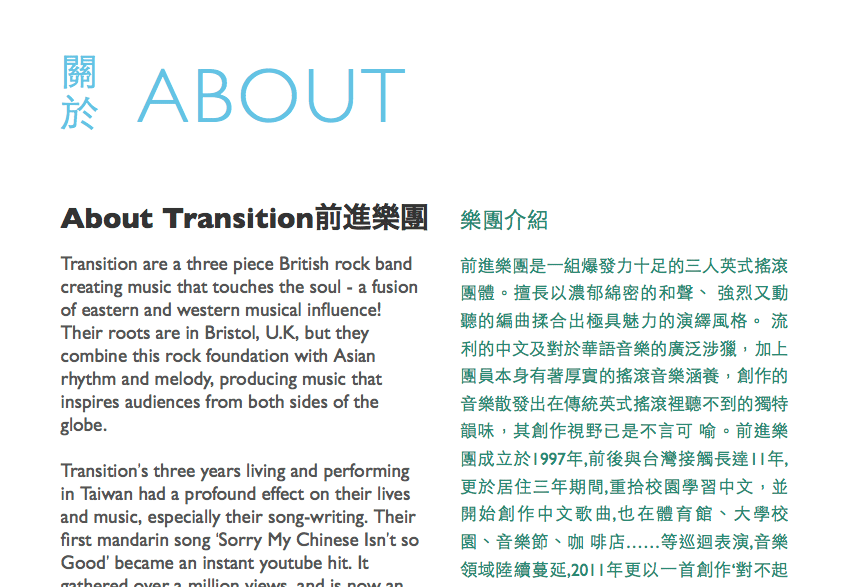 The Transition前進樂團 website has two languages side by side
HTML allows for language attributes, so that authors can define in which language content is written. Most people add one to the <html> element. The attribute can be useful for browsers, search engines and screen readers. For example, it can help a browsers suggest “This page is in Chinese. Can we translate this page to English for you?”, or help a screen reader decide to use a Chinese voice.
This website uses:
<html lang="en">In the Transition site, pages contain both English and Chinese. I added lang="en" to the HTML element, and lang="zh-TW" to all bits of Chinese content. Content that is not in the page’s main language can be a breakpoint, especially if it’s in a non-Western language. Chinese text is much easier to read if it is aligned justified. Likewise, right-to-left reading language may require optimisations too.
Language breakpoints in CSS
If the Chinese content is in elements with the correct language attribute, they can be styled with simple CSS. There are no language media queries, but there is something that works just as well: attribute selectors.
Let’s say content in the default language is marked up like this:
<div class="content-part"></div>And styled like this:
.content-part {
  text-align: left;
  color: black;
}
The Chinese text is marked up the same, but with a lang attribute:
<div class="content-part" lang="zh-TW"></div>For the Chinese bits, we would like the text to appear justified. And in purple, because we can. Chinese characters are all the same width, so justified alignment can make them more readable. We can do this by adding [lang|=zh] to the style rule. This applies to all content parts with a language attribute that starts with zh, i.e. all different kinds of Chinese.
.content-part[lang|=zh] {
  text-align: justify;
  color: purple;
}
Other options
There is also the :lang() selector, which can be used to apply style rules to content in a specific language. Differences:
- It does not only (?) look at the language attribute, it can also uses browser technology to decide what language content is in. Depending on the situation, this may be useful.
- It does not accept regular expressions, so in the case of Chinese, it does not let you write the rule for all different kinds of Chinese (zh-TW, zh-CN)
Alternatively, one could also add classnames to content in a different language, and use those to style. See also: Styling using language attributes by the W3C.
Conclusion
Like screen width conditions, language conditions can be adapted to with simple CSS rules. This is what makes the web such a great medium: if your document is well structured, there are a lot things you can do depending on specific conditions. Really, this is just progressive enhancement.
Originally posted as Breakpoints based on language on Hidde's blog.
Responsive Day Out 2 - the squishening
Last year I experienced Responsive Day Out through its audio podcast (RSS), this year I decided to buy a ticket and travel from Bristol to Brighton for the real thing. It was a varied day, with room for aspects like design, business, information architecture and even CSS specs.
The day was structured in three blocks of three speakers talking for 20 minutes, plus one block of Ethan Marcotte, who came up with the term ‘responsive web design’. The event’s social media hash tag, #beepcheeks, was named after him.

Part 1: Stephen Hay, Sally Jenkinson and Ida Aalen
In the first session, Stephen Hay introduced us to the method of ’sculpting text’, Sally Jenkinson discussed aspects of responsive web design beyond just designing for different screen widths and Ida Aalen shared her experience working on a large responsive project for the Norwegian cancer association.
Sculpting text
Stephen Hay explained that text is what underlies the web. Structured text, to be more precise. Structured text is portable, it can stay the same regardless of which device you use to access a web page. It exposes inappropriate and irrelevant content more easily than a full fledged web design comp would. Web designers have been designing containers to fill with text for ages, so that text would be the last step in their project work flows. But if text is the most portable, shouldn’t we really start with text first? Stephen argued we should.
Increase screen size, until you feel the layout breaks, at which point you add a breakpoint
The method of sculpting text, Stephen explained, consists in adding layers of CSS rules to structured text. It can start with styling text on a small width, a ‘single column grid’ if you will. Start simple. To structured text on a narrow screen you can do things like colour, typography, spacing, et cetera first. Then you increase screen size, until you feel the layout breaks, at which point you can add a breakpoint. You can then introduce things like columns. Sketching is helpful when trying to come up with solutions for larger screen widths.
Sculpting text first and coming up with a canvas later in the process, rather than designing a canvas to put content in afterwards, will help designers understand what they are designing. As a methodology, it helps us cope with the multi device world they design for, Stephen argued.
A more in-depth discussion of responsive design workflow, can be found in Stephen’s book with the same name, which I recommend reading, or have a look at his slides.
Responsive planning
Sally Jenkinson emphasised that responsive design is not only about designing for multiple screen widths, it is also about being very good at planning, not being afraid to experiment and making the right choices.
Our choices have great impact
The choices web designers and developers face, Sally argued, can have large philosophical and ethical impact. A developer often makes choices that impact what a user experiences. This can include ‘invisible requirements’, like progressive enhancement. The decision to make a website ask for a user’s location, may feel awkward or unnecessarily invade their privacy, especially if the app does not evidently require location.
Sometimes we should make choices or do things that aren’t part of our job descriptions. Planners can try out new technologies, rather than solving problems with solutions that we happen to be used to. Choices should not be about what is beneficial to us as designers, developers or businesses, they should be made with the bigger picture in mind. It is about end users ultimately, we should avoid ‘narcissistic web design’, Sally advocated. And we should avoid making choices that invade our users’ privacy.
The core model
Ida Aalen described the ‘core model’ for information architecture, and spelled out how it benefited her team when working on the website for the Norwegian Cancer Society (lang=no). (Slides)
In information architecture, which is a lot about users navigating, it is important to note users will often not (want to) navigate your site. They often just look at one page, coming in following a Google search or a link on Facebook.
Core pages serve both business and user needs
Ida talked about the overlap between business needs and user needs. Some pages only serve one of the two, some serve both. Those are core content pages. An example she discussed is a page about lung cancer: it serves business goals (informing people, sharing knowledge) as well as user needs (getting to know more about symptoms, prevention and treatments). From core content pages, one can think about pages that precede it, and those that can lead a user to elsewhere. The core content is the same on all pages, regardless of device used.
For the Cancer Society, a lot of time was spent on mobile. Ida shared some data on usage. Users visiting with small screens spent roughly the same amount of time on the site as those with large screens. Conversion rates did not differ much between screen sizes used, so it was worthwhile to spend time on designing for all screens.
Part 2: Rachel Andrew, Dan Donald and Inayaili de León Persson
In the second session, Rachel Andrew talked about the CSS Grid Layout Spec, Dan Donald considered the flexible web and Inayaili de León Persson shared her experience of making ubuntu.com responsive.
CSS Grid Layout
Rachel Andrew discussed the new CSS Grid Layout spec. Since it was originally proposed by Microsoft and used in IE10, it evolved a lot.
Rachel discussed different ways of defining grids in CSS, using Grid Layout. There is line based positioning, and the use of grid area names, also known as ‘defining grids in ascii art’. For components you specify in which areas they should be displayed. Then, on the wrapper they are in, you define where those areas are. To see how it works, have a look at her code examples or her blogpost about the subject.
She also explained how grid layout differs from flexbox: whereas the former is most suitable for full page layout, the latter works best for smaller UI components.
The flexible web and element queries
Dan Donald talked about building for a flexible web. In particular, he talked about flexible components using element queries.
Element queries are media queries that respond not on a document level, but on a component or element level.
Element queries are media queries that respond not on a document level, but on a component or element level. Currently, they exist mostly as a concept, i.e. there is no standard with browser support. Nevertheless, it is possible to use the concept in web pages today. Dan explained how he did so in a project for BBC, using data attributes to specify queries, a bit of JavaScript to make them more flexible and, of course, CSS to define what to do at breakpoints.
Realistic responsive design
Inayaili de Léon Persson showed us what she learned when working on the responsive version of Ubuntu.com. At the time, the team did not have the luxuries of starting from scratch, or working on it full time. The mark-up and content had to stay the same, and the team had to squeeze the project in between their other duties.
Inayaili explained that when making a site responsive, it is often not only about just that, there are many priorities, goals and needs. The team behind Ubuntu.com benefited from buying some of the most used devices, using Basecamp to document as much as they could and making clever use of stuff others had done, inside and outside the organisation.
An interesting step in the process that Inayaili described was the writing of ‘responsive rules’, like ‘Content that is divided in half or thirds should convert into single column when it becomes too narrow’. See also Setting the rules in the series Making Ubuntu responsive on the Ubuntu site.
Part 3: Oliver Reichenstein, Kirsty Burgoine and Stephanie Rieger
In the third session, Oliver Reichenstein proposed a better way of structuring websites, which his company recently employed for The Guardian, Kirsty Burgoine shared how her responsive web design process developed and Stephanie Rieger dived into new media queries.
The container model
Oliver Reichenstein explained that making information easy to find for users is hard. Most information architecture starts from the homepage down, with lots of diverging branches. These kind of trees can be very sturdy. Home pages and sidebars are often full of stuff, because of politics.
The alternative [to sturdy information architecture] is the container model
 Oliver Reichenstein explains the container model (photo by Marc Thiele)
The alternative is the container model: have containers with specific content and decide where to put them. Containers are full width and horizontal, pages can have a series of containers stacked up.1 Containers are self sufficient and can appear anywhere. On a news site, a container can be a world cup section, or a top news section. The article is a container, the comment section is a container. Container based design is without columns, but you can put content next to each other, if the content is comparable, for example a top sport section next to top politics.
The container model is to avoid pages where lots of unrelated bits of information are placed next to each other, just because there is a sidebar that can be filled with content. Responsive design or mobile first forces us to have priorities. We should stick to those priorities when working up to larger screens. If you work up from mobile to larger screen, you should still not put lots of random content to fill up space.
Oliver’s company Information Architects helped newspaper The Guardian implementing the container system on their new site, which is currently in beta. But the model is not only useful on news sites, it works for e-commerce and corporate sites, too, Oliver stressed.
1 Blogpost about the container model at The Guardian
Responsive deliverables
Kirsty Burgoine shared various approaches her business tried when making responsive websites. She also discussed the importance of trust.
All approaches shared that the website was going to be responsive. The first approach was not telling the client, and surprising them with the fact that the website worked on mobile. It resulted in happy clients, but it had a steep learning curve and caused unbilled time. The second approach was to tell them about responsive design, but not to promise anything. The good thing was that her workflow could stay roughly the same. The downside, that it required a lot of trust from clients. The third approach was to dive straight into code, and do HTML early. It made Kirsty happy as a developer, but clients would have hardly any deliverables. The client would have to have trust, without seeing what was being done.
The fourth and final approach was a very practical one. It embraced the chaos that making responsive websites can be. There were lots of different deliverables, or in lieu of them, sharing of ideas. Regular meetings were held to make sure the client was still on board.
The future of CSS media queries
Stephanie Rieger went into some of the new media queries that are being discussed.
There are proposals and drafts for media queries based on user’s JavaScript support, light level, the kind or lack of pointer, ability to hover, screen’s update frequency and overflowing capabilities.
Stephanie also discussed additional media queries that she thought could be useful, including one to see what language a device can use (Chinese interfaces need less space for words then Western ones, as less characters are needed).
Another interesting thought Stephanie shared was that of a browser built-in navigation system, that would just expose the page’s nav items via a control that is best for the device. For example, a phone could have a built-in hamburger icon to open it, a Google Glass could have a speech command to request it.
Part 4: @beep
The last talk of the day was delivered by Ethan Marcotte, who gave the idea of designing flexible web pages its thoughtful name. His talk, which I was lucky enough to see him do at CSS Day earlier this month, was about being lazy. Or, as I would rephrase it: keeping things simple. According to Ethan, being lazy is the only response to the increasingly complex web we work on, with its multitude of devices, connection speeds and interaction models.
He showed some ideas for being lazy about lay-out: the padding trick and nth-child for infinite grids with relatively simple CSS. He also discussed frameworks. On the web they are often too descriptive, too ‘heavy’. In a broader sense, there are examples of great ‘frameworks’: Disney’s 12 principles of animation (video), the Whitney museum with its logo that can have infinite variants, all based on one simple rule, and Karl Gernsters idea of set of solutions rather than just solutions.
Ethans talk made a lot of sense to me. The multitude of devices, connection speeds and interaction models is a fact. There are roughly two ways of dealing with this fact: designing a solution for each of them, or designing a few simple rules that automatically deal with all of them. The latter works for Disney or the Whitney museum, and it is sensible to say it will work best for us, working on responsive web design.
Round-up
Throughout the talks it became clear that responsive web design is now just web design. The great variety in devices people view the web with has influenced web design a lot. In a good way. It has lead many of us to do away with assumptions, and begin to build more solid websites. The idea of separating structure, style and behaviour is definitely not new, but seems to have become inevitable at last. It is key to a great responsive workflow. This starts with structured text, as Stephen explained. Responsive web design also lead us to radically change workflow and planning, as Kirsty, Sally and Inayaili discussed. The surge of small devices with browsers forced web makers to think about priorities in content and navigation, as Ida and Oliver discussed. New standards and ideas, like those discussed by Rachel, Dan and Stephanie, will help us cater even better for a multitude of devices, but we should not just use new technologies for the sake of it, like Sally emphasised.
Responsive Day Out 2 was one of my favourite events this year. It was simple: no lunch, no WiFi, no coffee, no after parties, but also: a low price. And admittedly, good coffee or food is never really far away in Brighton anyway. The format, 20-minute talks, worked well. It resulted in a great variety of subjects. There was a good balance of theoretical/conceptual talks and practical case-study like talks.
Originally posted as Responsive Day Out 2 - the squishening on Hidde's blog.
Museums Get Mobile!
“Museums Get Mobile!” was a one day event on designing mobile experiences, aimed at managers, curators and consultants in the cultural sector. It was organised by the UK Museums Computer Group in MShed, Bristol.
The day kicked off with a welcome from the organisers and a short talk from the sponsor, about the advantages of apps. This was followed by the first keynote: Clearleft’s Andy Budd.
Andy Budd – Responsive design is easy
Andy Budd started off by claiming that responsive design is actually quite easy, quickly adding ‘as long as you have been paying attention’.
He took us through the various stages of the history of web design, going for flexible to fixed to flexible and responsive. He showed the very first web page, that was just text, had no CSS and was therefore already responsive. It could be accessed from any kind if device. This is no accident, as the web was envisioned with universality as its underlying principle. Paraphrasing Tim Berners-Lee, it should be accessible from any kind of hardware that can connect to the internet. Along came designers, and they messed it up. Designers have been breaking responsiveness by placing content in fixed width containers.
Embrace the flexibility of the web
There have always been voices that we should embrace the flexibility of the web, most notably John Allsopp in his [classic] article A Dao of Web Design: “we should embrace the fact that the web doesnt have the same constraints [as print], and design for its flexibility”.
Just like people thought tableless CSS sites would never become the norm, some people still think responsive design never will. Andy emphasised responsive design definitely is the future, as it is the most sensible thing to do.
Andy briefly discussed apps versus websites, and was in favour of the web, arguing from statistics. The chance someone will visit your website is much higher than that someone will go through the whole process of finding, downloading and installing your app, especially if they rarely ever visit. Secondly, a problem with apps is that there are a lot of different ecosystems: iOS, Android, Windows Phone, Blackberry, and so on.
Responsive web design can be regarded as a logical next step in the history of web design. There were fluid sites, then fixed sites designed for fixed widths, then half fluid sites and now fully fluid and adaptive sites that are meant to work everywhere.
It started to be used in personal projects first, and quickly made its way into commercial sites, The Boston Globe being one of the first. A great example of a responsive museum website is that of the Rijksmuseum [see also the case study of the new Rijksmuseum website at Fronteers 2013.
Being such a logical next step, for front-end developers, responsive design is not so hard, especially if you have been paying attention to things like fluid design. If you haven’t, it may snuck on you. Learning responsive design from scratch is probably hard and scary, as there is a lot involved.
Organisations have to make their sites responsive. “Wait and see” is not a great strategy, your competitors will get ahead of you. “It’s hard” is not a valid argument. Yes, it will take extra time (and budget), in our [Clearleft’s] experience about 10% more. But if 50% of your visitors visit from mobile, which is likely to be the statistic in 2014, is spending 10% more to reach 50% more people really so bad? Why spend 100% of the money on 50% of the people that access your site? As a museum, you would not discriminate against sex or race, why discriminate mobile users?
Responsive design is not designing three versions for mobile, tablet and desktop respectively. It is a way to pour your content in as many as possible ‘glasses’ (Andy visualised content as water, and devices as glasses). Responsive design demands you understand your content.
Our job is not to dictate design, it is to hint design
In responsive design, never think of devices, think of breakpoints instead: optimise where the layout breaks, not where a specific device is used. You have no control over what devices a visitor uses to access your website, what browser they have, what font size they set. Our job is not to dictate design, it is to hint design.
In a responsive design process, developers and designers should work closely together and talk to each other.
Responsive retro-fitting, the process of making an existing website responsive, does not work well, as it fails to address content problems and does not have the benefits of starting with mobile first. Companies like the Guardian started with a responsive mobile site from scratch, built next to the existing site. It was initially only shown on mobile devices, whilst it was being optimised for bigger screens. It is planned to replace the existing site sometime this year.
Mobile first is a very useful conception to think of, as it can helps focusing attention. There is less space available, so it forces content, marketing and design people to prioritise.
Jeremy Keith would hate me for saying this, but I prefer tablet first, it is a nice midground. You start from a tablet version, them scale up a bit for larger screens and scale down a bit for smaller screens. We are currently taking this approach working with a client.
There are still a lot of issues to resolve with responsive design, an important one being how to deal with images. yay for <picture>
The question shouldn’t be, “when should I make my site responsive?”, it should be “when can I make my site responsive?”
Q: How do you deal with people within the organisation that are convinced they need an app?
A: Mobile apps are part of a healthy ecosystem, but responsive web design is a sensible and logical approach to take. Irregular visitors of your museum will not take the hassle of searching for and installing your app, fans of the museum may like app. You don’t need to talk your boss out of apps, but you should be doing responsive web design as a default.
Ask for forgiveness, not permission
Q: How to ask for budget to do responsive design?
A: Use statistics. Personally, I prefer to ask for forgiveness, not permission. In the project description, don’t make a big deal about it being responsive, maybe call it “has to work on a variety of devices”. That is just very sensible, no one can argue against that. And then when it launches and happens to work across lots of devices, everyone is happy.
Designing for changing museum audiences in-gallery and online
Ivan Teage
Ivan Teage of the Natural History Museum (NHM) explained how the NHM’s approach to mobile caters for the basic needs of visitors.
NHM offers WiFi, which is activated through a splash page that comes up when users try to connect. On this page, NHM can get the visitor’s attention. Analytics are used to see what people are doing and test different content.
NHM research shows 77% of visitors have a smart phone. Many have a tablet, but they don’t bring it to the museum. Before visiting, 1 in 3 visitors research their visit on their phone.
Nearly 10% of the visitors, uses the WiFi, making it a big hit, especially since no efforts were made to promote it. Most use it not to find information related to the museum, but for Facebook.
In 2014, on average, websites will have more mobile visits than desktop visits
As Andy said before, in 2014, on average websites will have more mobile visits than desktop visits. The website of the NHM currently hovers around 44%. There is also a notable difference between pages, some pages are much more popular on mobile, others on desktop.
One of the great challenges NHM faces is that there are a lot of different priorities within the organisation, some “nondigital”.
Frankly green + webb
The biggest aspect in mobile is the organisation. There is a lot of making things for mobile just for the sake of making things for mobile, those are the most challenging projects to work on.
Some regard mobile as a tool. Working on mobile, people tend to focus on choosing tools first, rather than on the actual project. Maybe because it is not very physical, mobile is often called “an experience”.
Let’s look at defining what we have to design before we choose the tool to design it with.
For a specialist (…) it can be heart-breaking to be asked to summarise something in three sentences
For a specialist, for example, a curator who studied 15 years on a subject, it can be heart-breaking to be asked to summarise something in three sentences, they would probably prefer more detail.
Digital services often exist of more than just a website. As they often involve with physical services as well, [like a physical box office in the case of a museum], there are lots and lots of people involved in any given project. It will be hard to get them on the same line, or in the same meeting room.
Two tools to deal with this complexity:
- a digital services manifesto, a set of shared objective like the one GDS released, can be a great tool to push a project in an organisation
- a visitor journey, an outline of every step a visitor can be involved in, to try to understand what the whole experience is like. There are a lot of examples of visitor maps on the internet, from companies like Lego and Starbucks.
Léonie Watson
Léonie Watson talked about accessibility (on the web).
Accessibility is not boring, we can creative visually exciting and creative experiences that are accessible. It is not difficult, it is no rocket science, but there may be unfamiliarity.
Accessibility is usability for all of us.
Everybody benefits from accessibility
Who benefits:
- You do. You can make your content available to more people, you open it up to a larger audience, which makes a great feal of sense.
- We do (us being people with disabilities, like sight, hearing, learning, cognitive).
- Everybody does. The real minority in the world, are just regular people. People surfing the internet wearing glasses or with a hangover, or people who are tired, because their young kids kept them up all night.
There are accessibility guidelines that make sure we can find out what to do, and help to make things testible. BBC recently launched their Mobile Accessbiblity Guidelines.
There is accessibility testing. Some things can be automated, but putting your content in front of people with disabilities will likely be more effective.
There is also legislation. In some countries more than others. In the UK, there is the Equality Act. It does not have any requirements for accessibility, it only says “digital services have to be accessible”, it doesn’t specify to which standard.
Accessibility does generally cost a little bit more. If your people are good and used to accessible best practices, they can do optimisations at no extra cost. But if you want to do testing, which you probably should, it can cost more than other usability testing, for example transport costs.
Retrofitting accessibility is probably just as hard as retrofitting responsive design
It is best to ‘do’ accessibility throughout all stages of the projects. Keep an eye on it as the project goes. It works with waterfall and agile. Test as often as possible, fix as quickly as possible. It is easier and perhaps cheaper to fix things in early versions than it is in live sites. Retrofitting accessibility is probably just as hard as retrofitting responsive design, which Andy discussed. It will cost much more and probably achieves less.
Accessibility is forever, not just for launch. Keep an eye on accessibility after the project goes live, maybe monthly or yearly.
Andy Budd: Five to six years ago, developers were very involved with accessibility, do you think that is decreasing now?
Léonie: Yes, it does get lost in the buzz sometimes, but there are still a lot of efforts and generally the situation is quite good.
Making responsive design a reality: accessibility and content strategies and commissioning content strategies
Andrew Lewis – thinking holistically about mobile-responsive services
Andrew Lewis of the Victoria & Albert museum discussed how they think about responsive web design. A responsive web service is one that adjusts content to your audience.
V&A did a responsive retrofit in 2012.
Responsive design is not about technology, it really is about social behaviour.
Situations in which people use their phone:
- preplanning a visit
- visual diary
- comfy sofa time
Mobile users and tablet users are often the same people. The V&A website optimises for different contexts, orientations and screen sizes.
Dan Goodwin – Collaborative discovery: commissioning a big web project when you’re not sure what you want
Dan Goodwin, UX Director at Bristol-and Cornwall based agency fffunction, talked about kicking off a big web project.
It is difficult to choose the right agency for the job. A traditional commissioning approach could include asking within your network, send out request for proposals, asking agencies to come up with quotes.
But an important thing to note is: in the process of building a website, requirements are going to change. That is a given. The problem with the traditional commissioning approach is that nobody really knows 100% what’s needed.
Working on the Bristol Museums websites, fffunction did a collaborative discovery phase, to make sure all the different requirements were analysed and looked into.
They did a stakeholder workshop, a get together with a selected number of shareholders, getting them to put post it notes on the wall, with things like target audience, principles, content ideas and potential features. It gave a great insight into the scope of the project and what needed addressing. They also did user interviews, which helped testing their assumptions.
During the Q&A, some pros and cons of working agile were discussed. Working with flexible requirements is one thing, agreeing to or getting permission for flexible pricing another.
Shelley Mannion – Learning from mobile experiences in museums
Shelley Mannion from the British Museum showed how (people) interacted with various kinds of devices and experiences within the British Museum.
Contrary to other speakers before, Shelley did have some good experience with apps. Some webbased, some native.
In statistics of the British Museum website, mobile has also grown a lot. It increases reasonably quickly, but not as fast as the first graph showed.
In her talk, Shelley challenged some common assumptions, like “It has to be the latest device”, this really depends on the device you are using. Another assumption she challenged: “the bigger the screen, the more people can stand around it” . They found the maximum seems to be about 3-4 people around a screen, regardless of how big the screen is.
Shelley showed a couple of very interesting examples of projects in which visitors interact with exhibitions. Imagery, videos and URLs will be in the slides, but they were unavailable at the time of writing.
Conclusion
Some important takeaways of the day were that mobile is here to stay, that it will be bigger than desktop in 2014, and it would be ideal to make things universally accessible, embrace the flexibility of the web and have a flexible workflow. It became clear that those things can be difficult and scary, but they will be beneficial in the long run. Some solutions were discussed: more research —into visitors/users as well as into the project scope—, better teams in which designers, developers and content people work well together and always keep challenging your assumptions.
Originally posted as Museums Get Mobile! on Hidde's blog.
Keeping it simple
When trying to improve front-end skills, we should improve our knowledge of HTML, CSS and JavaScript first and our knowledge of specific tools later.
Most of the web is written in three simple yet powerful languages: HTML, CSS and JavaScript. Terminology in job ads and portfolios comprises a lot more: LESS, Sass, grunt, Foundation, Bootstrap, jQuery and the like. They are mentioned alongside the big three, but they really are quite different. The former are the foundation of the web, the latter are ‘just’ tools to do stuff with them. Tools that have their merits, surely. But the only thing that constrains how effective one can use front-end tooling, is how effective one can use HTML, CSS and JavaScript.
An example: CSS preprocessors, like Sass en LESS. They can be incredibly useful and powerful tools for writing CSS, but they require knowledge of how box models, positioning, inheritance and specificity work. Limited understanding of these things can makes things worse if applied through a preprocessor (for instance, unintended nesting). Preprocessors provide power, but it is a kind of power that should be used wisely.
Bower is another example: it can help manage dependencies, and makes it very easy to add new dependencies. This may sound like an advantage, but it makes it too easy to bloat a codebase and complicate a project too soon. Whilst it was easy to add a CSS library through Bower, it is now hard to manage <button> styles as the CSS library does overly specific styling that is hard to override.
Tools like preprocessors and package managers have their merits, but to become a better front-end developer, one should focus on HTML, CSS and JavaScript.
Originally posted as Keeping it simple on Hidde's blog.