Reading List
The most recent articles from a list of feeds I subscribe to.
Switching to HTTPS
From yesterday, this website is only available via HTTPS. In this post I will explain my reasons for making the switch, and how I did it at Webfaction.
HTTP with SSL
HTTPS stands for HyperText Transfer Protocol with Secure Sockets Layer, or HTTP with SSL for short. Data over HTTP is sent as plain text. Data over HTTPS is encrypted before it is sent off, and not decrypted until it arrives at the user.
HTTPS is great and a must-use for websites that deal with sensitive data, e.g. credit card details, because sending such data in plain text would make it trivial to intercept. With HTTPS, the data is encrypted, and thus safe from hackers, at least in theory.
The certificates that are required to serve your website over HTTPS are not expensive (starting at £10 per year), and there are various initiatives that aim at make it easier or free. Let’s encrypt, sponsored by Mozilla and EFF, amongst others, looks promising. What’s more, you used to need a dedicated IP address, but if your server supports SNI, this is no longer required. Note that not all browsers support the latter (notably IE6 and older versions of Android).
Why use it on this website?
“Your website contains just some blog posts”, I hear you say, “so why would you encrypt it?” Even for sites that do not take sensitive data like payment details, there are additional benefits of HTTPS over HTTP. The most important one is content integrity.
Content integrity
The user can be more certain that the content is genuine. On a news website, we want to be sure the news stories were not meddled with. There is quite a number of countries where the state censors the news by default. If in such countries, news websites send their content over plain text, it is much easier for their government to change what is being served, e.g. replace all instances of “war” with “peace”.
I am the last to pretend anyone would want to alter information on my website, but for the sake of argument: even on this website content integrity could be an issue. Serving over HTTPS makes sure that the phone number on my contact page is not replaced by that of someone with malicious intentions.
Preventing ad insertion
Imagine you are on a WiFi hotspot. If the owner of the hotspot wants to earn some extra money, they could insert advertising into websites served via their internet connection (happens). This would not work on websites that are served over HTTPS, hence this website stays the way it was intended to.
Protecting form data
If you want to comment below, I will require your name and email address. Imagine you leave a comment whilst on airport WiFi and someone in the lounge is bored and listens in for e-mail addresses going over the line. They could, if you submit the data over non-secure HTTP. With HTTPS on, we can be more sure that this data goes from you to me, and nowhere else.
Securing my back-end logins
The content on this website is managed by Perch. If I log in to add new content whilst on public WiFi, my (login) data will be encrypted. The same applies when I access my website’s analytics package, Piwik.
Other potential benefits
A personal benefit of serving my site over HTTPS is that I will now be able to experiment with new standards like Service Workers, which is only available for websites served over HTTPS.
Another benefit in the long term, could be if search engines start to prefer sites that are served over HTTPS. Google has said they will. This makes serving over HTTPS more attractive to those interested in a higher search engine ranking. Yes, that’s right, serving your website over HTTPS optimises your SEO in search engines.
How I did it
To get a signed certificate for your domain and serve your content over HTTPS, these are the steps:
- Applying for a certificate
Create a key on your web server, use it to generate a Certificate Signing Request (CSR) and give the CSR to a Certification Authority - Uploading the certificate
When the Certification Authority has been able to sign your certificate and has returned it to you, upload the certificate to your server - Installing the certificate
Install the certificate by enabling HTTPS on the server and reloading the server configuration
My host, Webfaction, was able to do the last step for me, so I only had to do the first two steps myself: applying for the certificate and uploading the signed certificate.
Applying for a certificate
Certificates are sold by many different providers, I bought mine at sslcertificaten.nl.
There are various types of certificates, they differ in how much is actually verified. The ones that are only domain name verified seem to be the simplest, I went for one of those. They can be as cheap as ten pounds per year. There are more complex ones that involve more thorough checks and will cost around a hundred pounds. Certificates are for one domain only, unless you buy one with a wildcard. They are more expensive than single domain certificates, but will work for anything.yourdomain.com.
In the purchase process,you will be asked to input a Certificate Signing Request (CSR). The easiest way to generate one, it by opening an SSH session to your webserver in your terminal:
ssh yourserver Then, create a key (replace ‘domainname’ with any name):
openssl genrsa -out domainname.key 2048A key file domainname.key is created. Then create the signing request:
openssl req -new -key domainname.key -out domainname.csrThe command prompt will ask you for some information. When asked for a “common name”, enter the domain name that you need the certificate to work on (in my case: hiddedevries.nl).
Then, to copy the CSR, type this:
more domainname.csrThe code will appear in your Terminal window, ready to copy and paste.
Depending on where you buy your certificate, you will have to fill in your information to complete the purchasing process.
In the type of certificate I chose, the only verification step was done with an email from the Certification Authority to admin@mydomain. The e-mail contained a link that I, i.e. the person with access to the domain name’s admin email address, could click to approve the certificate request.
About 15 minutes after approving the certificate request, I was sent my certificate. For the certificate to function, they sent me two other certificates: a root certificate and an intermediate certificate.
Uploading the certificate
Using SFTP, I uploaded my certificate, the root certificate and the intermediate certificate, to the root of my web server.
Installing the certificate
To get the certificate installed, I opened a support ticket at Webfaction, as per their instructions. Fifteen minutes later I received an email stating that the certificate had been installed.
That’s about it
I have little experience of how it works at other hosting providers, but was quite pleased to see how quick it went at mine. Basically, I uploaded the files and got in touch with support, who then did the rest. Whether “the rest” is incredibly painful, or just a few simple steps, I am not sure (instructions for Apache).
Note that once it is setup, you should also make sure your assets (CSS, JavaScript, images) are served over HTTPS. If you use CDNs, use one that supports HTTPS. Likewise, if you use plug-ins that do stuff with URLs, make sure they know about the change (or use relative URLs).
Some further reading/tips about HTTPS:
- HTTPS on Wikipedia
- It’s time to encrypt the entire internet by Klint Finley
- Let’s encrypt
- HTTPS Everywhere
But also:
- Why HTTPS and SSL are not as secure as you think by Scott Ogrin
- Should all web traffic be encrypted? by Jeff Atwood
Originally posted as Switching to HTTPS on Hidde's blog.
On cognitive accessibility
This week I attended my first Accessible Bristol, which was an interesting talk by Alastair Somerville about cognitive accessibility. Slides are available.
Although I had worked on accessible websites before, and seen my bit of cognitive science at university, the combination of accessibility and cognition in one term was new to me. Cognitive accessibility, Alastair described, is the state you reach when something is perceivable, intelligible and actionable by as many people as possible. All three will have to be the case for it to work.
Alastair showed some example projects where he worked on improving cognitive accessibility, including the application of an urban design paradigm called “shared space at Exhibition Road in London.
Making things accessible cognitively, is about personalisation
The impairments we are looking at are things like dyslexia and autism, but also dementia and ageing. Cognitive impairments apply to all users: not only do we all age, situations of cognitive impairment happen to us all. This can be as simple as being in a foreign country, unable to read the menu. For it applies to all of us, cognitive accessibility is about inclusion, Alastair argued.
This is what we should design for, too. Alastair shared these words by Dieter Rams (citation needed):
Indifference towards people and the reality in which they live is actually the one and only cardinal sin in design.
So, in other words, for designers to impose a reality onto your users is a bad thing. All people are different, cognitive impairment differs from person to person. Instead, designers should try to understand the reality the user is in and start from there. Cognitive accessibility, then, Alastair said, is about personalisation. It is about making something work for someone, or for someone’s personal reality, so to say.
Interesting projects in cognitive accessibility
There are many (research) projects in cognitive accessibility going on, Alastair shared some of those:
- Eiman Kanjo’s research on emotion in place / redesigning physical space
- The W3C Cognitive and Learning Disabilities Accessibility Task Force, and Jamie Knight’s blog posts: part 1 and part 2
- Steve Maslin (Schumacher institute, Bristol), works in physical design. His blog post about design for the mind
- The US Army is doing really interesting research on a thing called ”responsive data load through emotionally aware devices”
Designing for happiness
Concluding, Alastair described happiness as “well directed attention”, so being happy is when your attention is well directed. Attention is a feature of one’s cognition, hence it is very personal, and personalisation is the strategy to make things more accessible cognitively. This brings us to the equation Alastair ended with: cognitive accessibility = personalisation = design for happiness.
This isn’t an easy thing to do, because if happiness is so personal, the problem, I think, would be that one thing is used by a lot of different persons. How can we keep all happy, personalise for those who need it, yet don’t disturb those who don’t?
Building a website, for example, one can define focus styles. That way keyboard users can keep track of the element currently in focus. Often though, I have worked with designers that would ask me to remove the focus styles, because they also showed up for non-keyboard users, which did not fit in the look and feel they had in mind. The Dieter Rams quote applies to those designers, obviously, but surely I can understand what they want is make a pretty website.
Another website-related example is skip links: they can be very useful for specific people that use them, for others they might feel unnecessary. Many websites only show them when a tab key is pressed, which is a way to make them available to those who need them, yet invisible for those who don’t. An interesting talk I saw about this was by Johan Huijkman of Q42, who has added lots of a11y improvements to Dutch public transport website 9292.nl that were invisible to most, yet available to those in need. Slides available (in Dutch). He too related accessibility to the user’s experience, and called the accessibility layer “invisible” UX.
Making accessibility invisible is not always the best solution: traffic lights that indicate their state with warning sounds, for example, are just out there, offering a useful level of cognition to users that need it. Or subtitles/dubbing added to speech in foreign languages on television: it is made visible/audible to all, including those who do understand the foreign language.
How can we decide which levels of accessibility to add, what to improve, and how to do this? Alastair mentioned various ways, including testing with (cognitively impaired) users. He also mentioned it can help to read personal blogs of those who are cognitively impaired and describe how they interact, whether physically or digitally. In the end, it is all about caring more about the reality your users live in, and less about your own.
Originally posted as On cognitive accessibility on Hidde's blog.
Progressive enhancement with handlers and enhancers
Recently I adopted a different way to manage bits of JavaScript in websites I was building. It exercises progressive enhancement (PE) by declaring handler and enhancer functions on HTML elements.
TL;DR: When JavaScript is used to handle user interactions like clicks, or enhance the page by manipulating the DOM, traditionally you’d have JavaScript find that HTML element in your page, and hook some code into it. But what if you’d switch that around, and have the HTML element “tell” JavaScript what function to execute?
How? I declare JavaScript functions on HTML elements. Separating them to functions that happen on click and those that happen on page load, I use two attributes (data-handler and data-enhancer) that both get space-separated function names as their values. Then, with a little bit of JavaScript, I make sure the functions execute when they need to.
Note that this works best for websites for which the mark-up is rendered on the server, to which JavaScript is added as an extra layer. Websites that rely on JavaScript for rendering content will probably have options to do the same within the framework they are built with.
Separating to handlers and enhancers
On many small to medium sized websites, the required JavaScript can be drilled down to two types of usage:
- things that need to happen on a click
- enhancements after the inital page load
Surely, there are often other events we want to use for triggering JavaScript (scroll, anyone?), but let’s focus on these two types first.
Many simple websites will have both types of script in a single scripts.js file, which is also used to query the nodes interactions need to happen on, and to add click handlers to those nodes.
This year, Krijn and Matijs introduced me to a new way to go about this. It has proven to be a very powerful pattern in some of my recent projects, which is why I’d like to share it here. Credits for the pattern, and for the initialisation functions I will discuss later, go to them.
Including JavaScript functions to the declarative model
The pattern starts from the idea that web pages have three layers to them: structure (HTML), lay-out (CSS) and enhancement (JavaScript). HTML is a declarative language: as an author, you declare what you’d like something to be, and that is what it will be.
Let this be a header, let this be a list item, let this be a block quote.
This is great, browsers can now know that ‘this’ is a list item, and treat it as such. Screenreaders may announce it as a list, your RSS reader or mobile Safari “reader view” can view it as a list, et cetera.
With CSS we declare what things look like:
Let headers be dark blue, let list items have blue bullets and let block quotes render in slightly smaller type.
This works rather well for us, because now we don’t need to think about what will happen if we add another list item. It being a list item, it will have the CSS applied to it, so it will have blue bullets.
The idea I’d like to share here, is that of making JavaScript functions part of this declarative model. If we can declare what something looks like in HTML, why not declare what its behaviour is, too?
Handlers: things that happen on a click
The idea is simple: we introduce a data-handler attribute to all elements that need to trigger function execution. As their value, we add one or more functions name(s) that need(s) to execute on click.
For example, here’s a link:
<a href="#punk-ipa">More about Punk IPA</a>This is an in-page link to a section that explains more about Punk IPA. It will work regardless of JavaScript, but can be improved with it.
Cooler than linking to a section about Punk IPA, is to have some sort of overlay open, with or without a fancy animation. We add a data-handler attribute:
<a href="#punk-ipa" data-handler="overlay">More about Punk IPA</a> In the data-handler, the value holds a function name, in this case ‘overlay’. The idea is that the overlay function executes when the link is clicked. Naturally, you would be able to add more than one function name, and separate function names by spaces. This works just like class="foo bar".
Within the function declaration, we will know which element was clicked, so we can access attributes. We can access the href or any data attribute. With that, it can grab the content that’s being linked to, append it into some sort of overlay, and smoothly transition the overlay into the page.
Note that this is similar to doing <a onclick="overlayfunction(); anotherfunction();"> , but with the added benefit that a data-handler only gets meaning once JavaScript is active and running, and that it contains strings like CSS classes, instead of actual JavaScript code. This way, the scripting is separated in the same way as the style rules are.
Also note that is best practice to only add handlers to HTML elements that are made for click behaviour, like <button>s and <a>.
Adding function definitions
In our JavaScript (e.g. an included scripts.js file), we add all functions for click behaviour to one object:
var handlers = {
	'function-name' : function(e) {
		 // This function is executed on click of any element with
         // 'function-name' in its data-handler attribute.
         // The click event is in 'e', $(this).attr('data-foo') holds the
         // value of data-foo of the element the user clicked on
    },
    'another-function-name' : function(e) {}
};
Those working in teams could consider making the handler object global. That way functions can have their own files, making collaboration through version control easier.
Adding click handling: one handler to rule them all
If we set all our click-requiring functionality up within data-handler attributes, we only need to attach one click handler to our document. Event delegation can then be used to do stuff to the actual element that is clicked on, even when that actual element did not exist on page load (i.e. was loaded in with AJAX).
This function (jQuery) can be used to handle clicks, then search through the handler functions and apply the ones specified in the data-handler function:
$(function() {
    'use strict';
    // generic click handler
    $(document).on('click', '[data-handler]', function(event) {
        var handler = this.getAttribute('data-handler');
        // honour default behaviour when using modifier keys when clicking
        // for example:
        // cmd + click / ctrl + click opens a link in a new tab
        // shift + click opens a link in a new window
        if (this.tagName === 'A' && (event.metaKey || event.ctrlKey || event.shiftKey)) {
            return;
        }
        if (handlers && typeof handlers[handler] === 'function') {
            handlers[handler].call(this, event);
        }
        else {
            if (window.console && typeof console.log === 'function') {
                console.log('Non-existing handler: "%s" on %o', handler, this);
            }
        }
    });
});(Source; see also its vanilla JavaScript version)
Enhancers: things that happen after page load
We can run functions to enhance elements in a similar way, by adding their function names to a data-enhancer attribute. The corresponding functions go into a enhancers object, just like the handlers object above.
For example, a page element that needs to display tweets. Again, here’s a link:
<a href="https://twitter.com/bbc">Tweets of the BBC</a>To enhance this link to the BBC’s tweets, we may want to load a widget that displays actual tweets. The function to do that may add some container <div> s, and run some calls to the Twitter API to grab tweets. To trigger this function:
<a href="https://twitter.com/bbc" data-enhancer="twitter-widget">
Tweets of the BBC</a>
To find out whose Twitter widget to display, our function could analyse the URL in the href attribute, or we can add an extra attribute:
<a href="https://twitter.com/bbc" data-enhancer="twitter-widget"
data-twitter-user="bbc">Tweets of the BBC</a>
Another example: of a large amount of text, we want to hide all but the first paragraph, then add a “Show all” button to show the remainder. The HTML will contain all of the content, and we will hide the remainder with JavaScript.
<section>
    <p>Some text</p>
    <p>Some more text</p>
    <p>Some more text</p>
</section>
To the block of text we add a data-enhancer function that makes sure everything but the first paragraph is hidden, and a “Show all” button is added.
<section data-enhancer="only-show-first-paragraph">
    <p>Some text</p>
    <p>Some more text</p>
    <p>Some more text</p>
</section>
A function named ‘only-show-first-paragraph’ could then take care of removing the content, and adding a button that reveals it (this button could have a data-handler for that behaviour).
Running all enhancements
Assuming all our enhancer functions are in one enhancer object, we can run all enhancers on a page with one function. The function looks for all elements with a data-enhancer attribute, and calls the appropriate functions.
$(function() {
    'use strict';
    // kick off js enhancements
    $('[data-enhancer]').each(function() {
        var enhancer = this.getAttribute('data-enhancer');
        if (enhancers && typeof enhancers[enhancer] === 'function') {
            enhancers[enhancer].call(this);
        }
        else {
            if (window.console && typeof console.log === 'function') {
                console.log('Non-existing enhancer: "%s" on %o', enhancer, this);
            }
        }
    });
});
Wrap-up
So the basic idea is: functions for click behaviour are handlers, and those that happen on page load are enhancers. They are stored in a handlers and enhancers object respectively, and triggered from HTML elements that have data-handler and data-enhancer attributes on them, to declare which functions they need.
In summary:
- All functions that need to execute on click (or touch or pointer events), are declared on the HTML element that should trigger the click, in a
data-handlerattribute - All functions that need to change/enhance stuff on the DOM, are declared on the HTML element they need to change, in a
data-enhancerattribute - Two JavaScript functions run through
data-handleranddata-enhancerattributes respectively, and execute all functions when they are required
Thoughts?
This pattern is not new, similar things have been done by others. Rik Schennink wrote about controlling behaviour before, and his conditioner.js deserves special mention. It is a library that not only manages modules of JavaScript, it also activates them based on responsive breakpoints, something the pattern described here does not do out of the box (it could).
For me and teams I worked in, the above has proven to be a useful way to declare actions and enhancements within pages. It adds maintainability, because it helps keeping functions organised. It also promotes reusability: although new functions can be added for each use, multiple elements can make use of the same function.
The method is not perfect for every project, and it can definitely be improved upon. For example, we could add the function that triggers all data-handler functions to an enhancer ( <html data-enhancer="add-handlers"> ), as it is an enhancement (of the page) by itself. In big projects with many people working on the same codebase, it may be useful to have all functions in separate files and have a globally available handlers object.
Update 07/04/2015: I have opened comments, would love to hear any feedback
Originally posted as Progressive enhancement with handlers and enhancers on Hidde's blog.
Review: Responsible Responsive Design
It’s been 4 years since Ethan Marcotte’s seminal A List Apart article, and by now, responsive web design has become a pleonasm. All proper web design is now responsive, and the question is no longer if we do responsive, it is how we do it and why we should do it better or more responsible.
In the past few years, responsive web design has matured from the conceptual idea it once was. It influenced thinking about plenty related, general web design issues. Many have written about the role of structured content, web design software and progressive enhancement. As a front-end developer, I know this was also true for the code side of things. We started putting more thought into how content is delivered (first!), have been finding out which kind of client side detection mechanisms work (and which don’t) and tried to come up with solutions for browser testing.
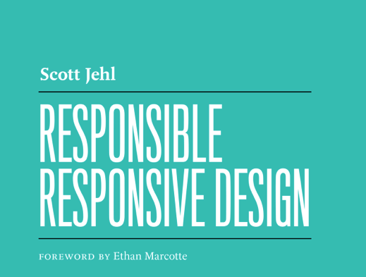 ! The turquoise cover of ‘Responsible Responsive Design’, published by A Book Apart
Sound reasoning and well-explained code examples
So what about the book? I was excited for it to be released, being a fan of all the awesome articles and scripts Scott and the Filament Group have been releasing recently. When the book came out, it was an instant buy, I started reading the same evening.
The most important facets of better responsive websites, according to Scott, are usability, accessibility, sustainability and performance. All four are described in detail in his book, with solid reasoning and handy code suggestions.
‘Responsible Responsive Design’ is a very practical overview of discussions that happened in the past few years, and hands the reader sensible argumentation as per why some responsive strategies are preferable to others. “Finding” breakpoints vs defining them, progressive enhancement vs graceful degradation, ‘web-safe’ gestures vs false assumptions, feature detection vs browser sniffing, FOUT vs FOIT and much more. If technical arguments don’t convince, he also shows examples of big websites that use solutions like Picturefill (Microsoft), responsive source order scripts (The Boston Globe) and Shoestring (Lego).
Secondly, other than explaining why some things are sensible solutions, Scott also explains how to do things with code examples, and walks the reader through the workings of some of the techniques he discusses, like the sizes attribute, cutting the mustard and loadCSS().
Responsible decision making
I found it very useful to read what Scott had to say about why we should do responsive design responsibly. Some benefits of the ‘responsible’ techniques are quite technical in nature, making them difficult to argue for. But they impact people everywhere. Arguing for those people is an important part of being a responsible responsive designer. Things like prioritising loading content over loading the fancy fonts, can be difficult to explain, and Scotts book makes this easier. It is easier to convince management to go for a cutting the mustard type of approach, if you can say that big organisations like the BBC and the Boston Globe do it, too.
Anyway, I can highly recommend ‘Responsible Responsive Design’. If you ever design or build websites, and are unsure whether your responsive strategies are indeed responsible, read this book!
How to get the book
‘Responsible Responsive Design’ is available from A Book Apart.
Originally posted as Review: Responsible Responsive Design on Hidde's blog.
Collaborate 2014: designing with empathy for all
At the lovely St George’s, Bristol-based UX agency Nomensa organised Collaborate, a one day conference about user experience and (interaction) design.
Nick Finck – The nuances of UX
Nick Finck started off with his talk “The Nuances of UX”. He focused on what he regards as the four things that make up a good user experience: details, simplification, process and research and showed various examples of each.
Details
Details like the background colour of a placeholder for an image that is going to be loaded or a descriptive diagram component staying in position when changing the thing it describes, can be great details that improve the UX in a way users would only notice when it is taken out.
Simplification
It is important to keep asking ourselves whether we really need whichever things we want to add to a web page. But we should not over-simplify, as that can lead us to miss important details, the work still needs to be done.
Process
Most of our processes are feature-driven, our world is driven by version numbers. Features and version numbers, though great for marketing, rarely they are a means to improve the user experience.
Research
It is important to look at how people use products. Making things merely understandable and usable is great, but we also need to focus on making them “bring joy and excitement, pleasure and fun, and, yes, beauty” as Don Norman said.
Technology is moving so fast that what we thought was a solution for our business no longer is a couple of years later. The most important variable is, as Charles Darwin found, adaptability.
David Peter Simon – Representing information across channels
One of my favourite talks of the day was the one by David Peter Simon about the future of information architecture and portable content. He emphasised the importance of structured content first, a concept well introduced in Mark Boulton’s article Structure First. Content Always.
David Peter Simon showed the significance of structured content with examples from the ecosystem Amazon Kindle, the create-once-publish-everywhere approach of NPR and the structured content of Facebook stories.
As I talked to a content editor during one of the breaks, I found “structured content” is quite a technical term. The difference between plain text content and structured content is that it is not just text, it has things like headings, emphasised words, links, images and lists. A job ad is usually not just plain text: it can be structured into bits like a job title, a location, a salary indication, a ‘apply before’ date, et cetera. A recipe will have things like a list of ingredients, a photo of the end result and a list of steps to follow. These are all things you could in principle display in a different colour of size, they signify different bits of content.
Structured content is the most portable thing of a website. A job ad will always have a job title, a location, etc, whether it is displayed on a phone, a desktop computer or even a smart watch.
An interesting example David Peter Simon showed was that of Facebook. Facebook, he said, “is the first service that can be used by anyone from very young to very old, because it has succeeded in structuring information in such a way that a mental model of the information is created so that it can be familiarised with, regardless of where it is displayed. It no longer requires cognitive load to recognise the content.”
Thinking about responsive web design can be misleading as it often means thinking about (code) techniques. Thinking about mobile can be misleading as it often means thinking about a specific set of devices we want to support. Thinking about structured content does not have such problems, and therefore it is a perfect first step to create truly device agnostic experiences.
Some links about (structured) content:
- Future-ready content by Sara Wachter-Boettcher on A List Apart
- Sculpting text (slides of Stephen Hay’s talk at Responsive Day Out)
Joshua Marshall – Empathy as a core feature
Joshua talked about what is one of the biggest miracles of the past few years: GOV.UK! Until earlier this year he was Head of Accessibility at the Government Digital Service, the UK government department tasked with ‘leading the digital transformation of government ’.
After describing how the GDS and the new GOV.UK came about, Joshua discussed the place of accessibility in the project and on the web in general. Accessibility, he said, is about making it work for everyone. GOV.UK had 1.2 billion page views in the first year, that are a lot of people to annoying if it is not working right.
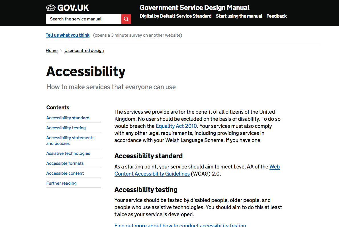 Accessibility guidelines in the GDS Service Manual
An important part of enforcing things work for everyone is established by the Design Principles, which emphasises user needs. It explicitly lists things like making it simple to use and inclusive. There is also the Service Manual, which has a brilliant part about accessibility, very useful for those working on any website, not just government.
The earlier you introduce accessibility in the project, the easier it becomes. In multidisciplinary teams, accessibility can be made the responsibility of each person in the team. With lots of semantics in the HTML standard and beyond (WAI-ARIA), accessibility is part of a modern web stack; old-fashioned looking websites do not follow from it, on the contrary.
Design like you give a damn. A more accessible website is better at enabling users to do what they need to do. It is not about you, it is about what you empower your users to achieve. Focusing on simplicity, usability and accessible UX makes everything better for every one of your users.
UX and accessibility both have empathy as their core value, so they should work together more.
Simon Norris – Digital first: a philosophy
The last speaker before lunch was Simon Norris, who doubled as the MC of the event. He discussed his concept of “Digital First” in three acts: past, present and future.
Simon started off by giving us an overview of major events in the history of the world wide web. Most of these events only took place in the past few decades, great to realise. He then went on to the now and discussed the importance of the ‘in between’. Some UX practitioners tend to think of UX as if it were as series of screens or wireframes, which makes us forget to think about the in between, which, arguably, is more important. He then discussed the future of UX, in which he discussed interesting concepts around ecology, arguing they cannot be designed, only shaped.
Maya Middlemiss – The users’ experience of user experience
Maya Middlemiss, managing director of a company that specialises in recruiting respondents for usability research, shared some insights of this interesting and often less discussed part of usability.
To recruit people to come into a user testing session can be anything from quite easy to very tricky, Maya said. It gets easier if it is for a well known brand and they agree to have their name disclosed to potential candidates, and it gets quite hard if it is for specialised products, especially if it is with regards to finance, as people are often more suspicious answering questions. On the test day, giving respondents simple refreshments, a glass of water or a sandwich, can help a great deal in making them feel welcome and comfortable.
Maya shared various videos of respondents that had experienced a user testing session, and were happy to share what their experience was like.
Dan Healy – Making things totes emosh and dead amaze: engaging millennials online
Next up was Dan Healy, who works as a user researcher at Nationwide building society. In his job he does a lot of research into marketing for millennials, or young adults. In his very energetic talk, he shared some insights.
There are lots of young people in the UK, and so far banks hardly pay attention to them in terms of marketing, usually focusing on their parents instead. Of Nationwide’s 16 million customers, 1.95 million are younger than 18, this is a group twice the size of Bristol’s population, too large to ignore.
An important lesson, said Dan, is not to try and speak young people’s language, that can only go miserably wrong. Instead, be scientific about it and use tools to measure readability of text. On some occasions, a couple of difficult word can make a whole page difficult to understand for (young) readers. Improving such text can improve the site for everyone, not just young people. Don’t underestimate the impact small (copy) changes can make on cognitive load of a text.
Ben Bywater – user research: from full fat to lean
Ben Bywater works at MixRadio, formerly Nokia Music and talked about user research. He had interviewed tens of user researchers to find out where they worked (client-side or agency-side) and how much experience they had in the field.
Ben encouraged us to be more pragmatic, calling pragmatism ‘the sweet spot between insight and resource’. It seems throughout the years the amount of time available for user research has declined, but user researchers have more influence on the end result. The best method to be more pragmatic is to do user testing. It can also be better do adapt more: agencies coaching in-house UX at clients. Increasing input can be good too, by establishing long term communities of users. Lastly Ben discussed measuring UX more, by using data analytics to measure the effectiveness of UX changes.
Thomas Wendt – the broken worldview of experience design
Building on the philosophical foundations of the German philosopher/phenomenologist Martin Heidegger, Thomas Wendt spoke about what he calls “Design for Da-sein”.
Phenomenology can be regarded as the study of human experience. “Dasein” is a Heideggerian term that means something along the lines of an individual’s mode of being in the world.
UX designers often assume users think rationally about their actions, but there can be a non-direction-ness in their behaviour. Websites like Instagram and Buzzfeed gain from this.
Another assumption is that users think, then act, but often that is not the case, said Thomas. Actually, I think we can see that in e-commerce websites: sometimes it can be easy to trick customers into buying something by using emotionally appealing arguments like ‘most other people also bought this’.
Thomas also talked about the importance of a designer’s intention. It is often portrayed as more important than everything else, but, he said, we should not prioritise it above adaptability, we could do without designer gods!
More reading:
Main theme: have empathy with users and design like you give damn
One of the recurring themes at Collaborate 2014 was that user experience is very much about having empathy for users and for all users. As a front-end developer this is a large part of my daily job. But as Joshua Marshall said, accessibility is a responsibility that should be shared across everyone in a team, as it should be part of every aspect of a web project. Not just in code, but also in user experience, visual design and, most importantly, well written content.
Originally posted as Collaborate 2014: designing with empathy for all on Hidde's blog.