Reading List
The most recent articles from a list of feeds I subscribe to.
Some pointers on default cursors
Every so often in a project, the issue comes up of whether cursors on buttons should be ‘the hand’ or default. The spec says they should be default, but many people (myself included, until recently), are unaware. Many designers I’ve worked with want pointer-cursors regardless of what the spec says.
This is the thing: links (<a/>) go to somewhere else, buttons ( <button> s) let users perform actions. The ‘hand’ indicates to a user that their cursor is on a link, which will take them somewhere. And can do so in another tab, copy/paste the link, drag it to another window, et cetera. Other interactive elements on the page (buttons, for example) just get a default cursor. TL;DR: the hand does not mean clickable.
What the standards say
The above is not my personal opinion, it is what the CSS spec says and what all browsers do by default. You can see this when you hover buttons in your OS, or look at the browser buttons to switch tabs. Or on the ‘Search’ button of Google dot com.
Apple’s OS X Human Interface Guidelines also say the ‘hand’ means the content is a URL link.
Microsoft’s guidelines are clear, too:
To avoid confusion, it is imperative not to use the hand pointer for other purposes. For example, command buttons already have a strong affordance, so they don’t need a hand pointer. The hand pointer must mean “this target is a link” and nothing else. (Emphasis theirs)
If we manually add a hand cursor to a button, we suggest to a user that they will be taken elsewhere, while they won’t. We would be breaking an affordance that was put into the web. It’s like taping a sticker that says ”Push me” over a well designed door handle (see also: Don Norman).
Clearly, standards say the hand is just for links. And there’s a great argument to be made to not mess with browser defaults.
Using ‘the hand’ anyway
Many people apply a pointer cursor to their buttons anyway. I have done so, too. I’ve heard many say they add the pointer to improve usability. In addition, Bootstrap and various other CSS frameworks also apply pointer cursors to their button (note that Normalize used to, but recently removed them).
Whether we just did not know about the standard way, or purposefully ignored it to improve things for our users, ‘the hand’ on buttons is somewhat becoming a de facto standard. It is done all over the place, so some users may now expect hand cursors on buttons.
Basically, I think there are now two standards.
There is a further complication: in practice, there is a grey area between buttons and links.
- A “Back to top” link is literally a link to the top of the page, but, especially when it animates the user back to the top, it feels like it performs an action, too.
- In a tabs component I recently built, each tab is marked up as a link to an area in the page. Visually, clicking it, ‘opens’ a tab. That’s an action, right? But what if you use a modifier key and open it in a new tab? That would also still work.
- How about a button that says “Log in”. Sounds like an action, but what if the button is a link and just takes the user to a page where they can login?
- What about a button in a
<form method="POST" />? You can submit in a new tab, which makes it a bit like a link, but it also submits data, which makes it more like a button that performs an action. Or a form withGET, which should have no side effects at all?
I find that in team discussions, we talk about something being a ‘button’, yet in my HTML, I use the <a /> . Or even the other way around, occasionally.
Conclusion
The question is, does apply the ‘wrong’ cursor really matter? When I asked around on Twitter, some said applying hand cursors wrongly is a non-issue, as it confuses no one and it’s non-hand cursors that cause usability issues.
However much I think existing standards are the best to follow, I guess we have pretty much reached a situation where there are two standards, and either one is okay to use. Especially since things on the modern web are often not clearly a link or a button. Striving for consistency, at least within the same website, is probably the best thing we can do for your users.
Originally posted as Some pointers on default cursors on Hidde's blog.
Progressive Web Apps Dev Summit
This week I had the pleasure of attending the Progressive Web Apps Dev Summit, an event organised by Google in the beautiful city of Amsterdam. These are my takeaways from the event.
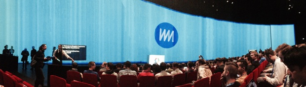 The screen was immense
Progressive Web Apps: what and why?
What an ‘app’ is, depends on who you ask. When we are talking about apps on mobile devices, they are usually things with specific capabilities. They help users do things, integrate well with device capabilities, can be opened from a home screen and are able to work full screen and offline. At the moment, apps with all those capabilities are usually not mobile websites, but app store apps.
From a technical perspective, there are only a couple of things that separate mobile websites from app store apps. But in terms of user experience, these differences are enough for people to prefer app store apps to web apps.
To solve this UX gap between native and web, Google came up with the concept of Progressive Web Apps. It’s a set of open web standards that lets developers turn their ‘website’ into a ’web app’, in a progressive manner.
What’s a progressive manner? If your site already functions as a website, by adding stuff to it, it can become more app-like. Browsers that don’t support this ‘stuff’ will get what they already got before. Supporting browsers, however, will get the benefits. As an extra. The idea is that over time, more browsers will fall in the supporting browsers bracket. It is a bit like using rounded corners in CSS, knowing that some browsers will take advantage of it, others will ignore it. Users will likely not notice they are missing out, but will get a better experience if they aren’t.
With progressive web apps, we can ‘earn our space on the home screen’ (Alex Russell), ‘stop blaming being offline on the user’ (Jake Archibald) and ‘give the user a page they can interact with faster‘ (Surma). Whereas native apps are things you go out, buy and download, PWAs are basically an up-sell: you download them by visiting the page, and keep them if you like to.
The summit
Google have been great hosts! They drove us to the venue with a shuttle bus, let us in for free, provided lots of fancy food and drinks throughout the two days and used exciting intro tunes between speakers, who presented on a huge wall-to-wall screen. They really are serious about saving the web in its fight against native apps.
It wasn’t just a Google party though. Google sent lots of their developer relations people, but so did others: there were people from all major browser vendors (except Apple) and they even did talks. There were also folks from businesses that built PWAs, such as the Nigerian online marketplace Konga and the Amsterdam-based Booking.com. This made the whole event much more like an open web standards event than a Google marketing event.
New technologies
Progressive Web Apps is not one technology. It is one name for a set of technologies that you can use to progressively expose app-like qualities to go with your regular website. A marketing term, if you will. There were talks about most of the different technologies.
- Service Workers give developers control over the network, by exposing the decision process for network activity to JavaScript. What they effectively do, is to enable reliable performance: apps can now deal with Lie-Fi or offline connections by serving alternatives (for instance, a cached site). Service Workers can make your site work offline first, as you get to decide how the network requests from your app are handled.
- The streams and fetch APIs can be used from Service Workers, a good intro to them is Jake Archibald’s blog post or his talk at the dev summit.
- In the majority of supporting browsers, HTTPS is an important part of progressive web apps, as a lot of the tech (geolocation, getUserMedia, HTTP/2, push notifications) requires it to work. Emily Schechter explained HTTPS brings three security properties: identity (be sure this site really is this site), confidentiality (be sure about who can read your data) and integrity (be sure that nothing can modify your data). HTTPS used to be hard to set up, expensive and slow. It’s now easy to implement, cheap and fast, Emily showed.
- Push Notifications can provide great benefits for users if applied properly. Owen Campbell-Moore discussed do’s and don’ts: good notifications are timely, relevant and precise. He also discussed the flow of asking users for permission to send notifications. It is important to do this at a good time.
- By having a manifest file and matching some other criteria, you can now make your app quality for Add to homescreen notifications. What the heuristics are differs per browser / platform. Interestingly, if a user sees ‘Add to homescreen’, they have already downloaded the site. So, as Alex Russell pointed out, the question really means: ‘would you like to keep it?’
Making it better for users
Progressive Web Apps seem to be about making it better for the users, and many of the talks discussed how to do that.
- UI performance is important, Paul Lewis talked about using things like
will-changeand debugging by knowing when your code triggers repaints. - Surma talked about improving network performance by using Service Worker and HTTP/2.
- Accessibility is an essential part of delivering a good user experience, as well. Rob Dodson discussed three steps to ensure accessibility: nail the WebAIM WCAG checklist, always be managing focus and provide proper semantics (either with meaningful native elements, or with ARIA). Look at WAI-ARIA best practices.
- Daniel Appelquist shared an interesting principle about URLs, “the one web principle”: “content provided by accessing a URI yields a thematically coherent experience when accessed from different devices”. It’s useful for all (not the least users) to let a URL always present the same thing, regardless of which device it is accessed from. See also: responsive web design.
Other browser vendors
The event did not just feature speakers from Google, other browser vendors were invited to the stage as well.
- Ben Kelly from Mozilla talked about how they joined the Service Worker effort in 2014, and focused on parts like security, improving the spec, documenting PWA technologies on the Mozilla Developer Network and making the Service Worker Cookbook.
- Patrick Kettner shared Microsoft’s perspective. They, too, are very excited about Progressive Web Apps. He also showed how to make a fallback using AppCache (‘it is a douchebag, but it can be a useful fallback’) and talked about IndexedDB and Dexie.js.
- Opera’s Andreas Bovens showed that Opera already support lots of PWA features and will support more in the near future. He also talked about UX patterns that relate to Progressive Web Apps, considerations to make, and choices to give to (or hide from) users.
- Junkee Song and Daniel Appelquist from Samsung Internet, who make the default browser on Samsung devices (almost 10% market share in Europe) and are a major committer into the Chromium project. They also work on browser experiences for GearVR, Samsung’s virtual reality goggles and try to provide a ‘continuous browsing experience’ between phone and VR.
Examples in the wild
Throughout the two days, we saw some presentations by people who have actually released progressive web apps ‘in the wild’. It was inspiring to see how they made those apps work for their organisation. PWA tech gives developers tools to do stuff, but it will not make your decisions for you (that’s a good thing).
- Jesse Yang showed how Booking.com made their confirmation page work offline. They did not tell users, giving the team opportunity to play with it without a lot of risk. They also experimented with ‘Add to homescreen’ and found most people ignored it.
- Andreas Bovens mentioned pwa.rocks, a site by Opera that tries to list interesting Progressive Web Apps (pull requests welcome).
- The Washington Post made a PWA that downloads lots of text to the user’s cache , to make that available offline, and downloads images later.
- The team at Konga, Nigeria’s largest online market place, recently built a PWA using custom web components. They use background sync for analytics, tracking offline events and an offline checkout experience. Major obstacles are making things modular, getting Safari support and the learning curve for new developers.
Concerns
This whole post may sound like everything is peachy, but there are also concerns about Progressive Web Apps.
iOS support is a concern. Apple were invited to the event, but other than Microsoft, Opera, Mozilla and Samsung, they did not attend (because of other commitments, and they really want to attend future events). Their absence was noticeable: they are a large player and we all would have liked to know what they think about these new standards.
And what about the URL? They are an integral part of the web, as it is what people use to point to stuff and share things. However, for apps to get a ‘Add to homescreen’ prompt on Chrome and others, the ‘hide URL bar’ setting is compulsory. In apps that run full screen, URLs cannot be copied. Opera Mobile are experimenting with a gesture that lets you ‘pop out’ of an app, back to the browser, so that users can see, copy and hack URLs. Great idea, I think!
Another matter is the risk of heavy reliance on complex JavaScript. Admittedly, complex JavaScript is not compulsory for something to be a Progressive Web App, but it is what all of the apps demonstrated at the summit were using as their tool of choice. I’m not sure if this concern is a concern with PWAs, or with the let’s-do-it-all-with-JavaScript trend. Service Workers can be added to super simple websites like this blog, too (why not?).
The event was actually great at addressing many of these concerns, and culminated in a panel session moderated by Jeremy Keith (who published the brilliant Regressive Web Apps) .
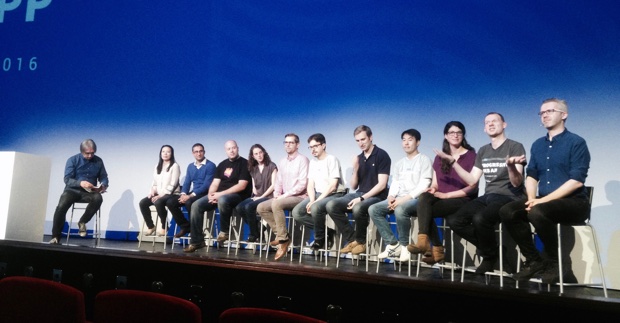 Panel discussion moderated by Jeremy Keith
The future
Two things are important about PWAs: firstly, they are a set of open web standards, which means all browsers can implement them in somewhat the same way and developers can be fairly sure things will work inter-operably. Secondly, browser vendors seem to be very excited about adding support for these standards, which increases their chance of being a safe bet.
It was exciting to hear about the technologies, and to see that a lot of them already work on a great deal of platforms. Most of the major browser vendors expressed how much they liked the idea, so it is realistic to say support will increase in the short term. This, and the fact that all PWA techniques can be regarded as a ‘progressive enhancement’ (with some leniency as to what that term means), entails that we can build Progressive Web Apps today.
Hopefully, we will do so responsibly. Native apps really only work on their particular platforms. PWAs, in theory, can be built to work universally. For everyone with a web enabled device. This is awesome! Major browser vendors are behind the idea, and I think as developers we should be, too.
To keep this post somewhat concise, I did not do each talk right here. If you’ve had to miss the event, it was recorded and videos are available on YouTube.
Originally posted as Progressive Web Apps Dev Summit on Hidde's blog.
The internet does forget
Although it may be very exciting to make new things for the web, it’s important to think about archiving what we have made before. This requires one to think about the long term, and about whom we trust with our content.
Last week, Jeremy Keith held a lecture about digital preservation at Amsterdam’s university of applied sciences. This is a write-up of his talk.
Why keep old websites?
“This is for everyone” is the message that appeared behind Tim Berners-Lee, the inventor of the web, when he made a surprise appearance during the London 2012 Olympics ceremony. The web is meant for everyone. It is there not just to consume, but also to create for, Jeremy said.
Geocities used to be where people with hobbies hosted websites to share with the world what they did. Over 30 million of them. Websites about pets, football clubs, fan sites, you name it. From a web designer’s point of view, they were not necessarily the most beautiful or user-friendly websites. But, Jeremy said, “an ugly website that we find ugly today, may be the first website made by the future president of the United States“.
When Geocities shut down, no backup plans were made. We were looking at the removal of over 30 million websites, to be gone forever. This was a threat. It would have been where archeologists of the 2090s would have found what we were up to in the 1990s.
Other than their cultural significance, existing websites can also break the web if they are removed from it. This is because links to them will break.
Luckily, in the case of Geocities, the Web Archive team stood in and managed to save a large part of these websites.
Third parties
If recent history is an indication, trusting your content to third parties only is not a good idea, Jeremy emphasised. Geocities was bought by Yahoo!, so was Tumblr. Many websites that offer to host your content for you are bought by some big internet company at some point. We trust our content to these start-ups. But rarely, when they close, they offer a way to export the data. They do usually thank you for being on their incredible journey.
Indieweb type of solutions can help here: there are tools that let you publish on your own platform as well as on third parties, so that you always have your own content.
Hard work
The good news is that the web, Jeremy said, is actually very suitable for being preserved. Apps you build now will likely not work on devices from 5 years in the future, whereas websites probably will (as long as someone pays the web hosting bill).
The saying “the internet never forgets” is not actually true, Jeremy explained. The internet does forget, a lot of things get deleted and are then gone forever. One has to work hard to keep things online, preferably on their own URLs (to not break the web).
Preserving your websites requires one to think about the long term: you will have to make sure to keep paying your hosting bills, for one thing. But what about when you pass, are there any hosting companies that will let you include hosting fees in your will? Some compelling questions to think about!
Originally posted as The internet does forget on Hidde's blog.
Reasons to make digital products accessible
Yesterday I attended NCDT, the Dutch conference for digital accessibility. Hundreds of people whose work somehow involves digitally exposing information gathered in Utrecht.
The interesting thing about NCDT, I found, is that many attendees work in roles that require them to organise accessibility within their organisations, having to convince management and stakeholders of accessibility benefits. As a front-end developer, I usually only have to convince designers and interaction people. Convincing the whole of a company seems lots harder!
Here are some reasons for accessibility that I heard on the day, in no particular order.
Because we ought to put users before egoes
The excellent Gerry “top tasks” McGovern could not have said it clearer in his talk: “we measure production, not consumption. If we want digital excellence, we must measure actual use”. Many organisations put out web pages because some employee made the page and is excited about it. They put out web designs, because the designer made something pretty and the team liked it. They contain web copy that their content marketeers think provides value. But your website should not be about your employees, your designers or your content marketeers, it is about the users and what they want. That’s what websites should invest in, McGovern said. The users on your website should be put before the egoes in your organisation. Therefore: always be user testing.
Because it could be illegal not to
Users who cannot access your website, could potentially sue you. Eric Velleman of the Accessibility Foundation explained how. He showed there are currently a number of Dutch laws and regulations that make it illegal for companies to have an inaccessible website. Important to note: in The Netherlands, no one actually got one of those laws to be applied to them by a judge. In America however, judges have ordered large companies to pay sums of money and/or make their website more accessible.
More legislation is coming: an EU wide Directive is being implemented by EU member states. The Netherlands also recently agreed it will ratify the 2006 United Nations Convention on the Rights of Persons with Disabilities. The “College voor de rechten van de mens” was appointed as the regulator for this convention, and this will be where people can go to complain if they cannot access a particular site. At this time, it is not clear what the Dutch authorities will do in terms of fines or sentences. It is unlikely, Velleman said, that companies will get sued for inaccessibility.
Because our organisation has embedded inclusive design
Jonathan Hassell talked about embeddding accessibility throughout organisations (he was the main author of BS 8878, the British standard / code of practice on this subject). He said what’s more important than making accessibility checklists mandatory, is valuing accessibility as an organisation. To do this, the top needs to be on board, training needs to be in place (staff might leave), it should be embedded in company policies and it should be in a process that can be used over and over again.
Having accessibility is embedded in all those different ways, can really make it part of an organisation, which can ensure the organisation makes more accessible products, now and later.
Because there is passion for #a11y at the top
Jake Abma, head of accessibility of a major Dutch bank (the orange one) held a talk about how he got support for his radical idea to embrace digital accessibility practices. It was a truly inspiring story. He convinced his manager to get him 2 hours a week to spend on accessibility, this later became 4 hours, a day and even two days. Later others got time too, and currently, the bank has a dedicated accessibility team. They have their own accessibility guidelines (which is a superset of WCAG and other standards), do lots of accessibility testing and have “accessibility champions” across teams. They ensure doing the accessible thing is part of their process (in scrum terms: it’s in their definition of done). At a bank!
Part of what worked is that there were some people in the top of the hierarchy who had visual impairments: there was a passion for accessibility at the top. Otherwise, to get support for spending time on accessibility, Jake explained, is a matter of small steps. Focus on those people who do like the idea and most importantly, do not give up.
Conclusion
I am just a front-end developer. For me, accessibility is usually about practical things like checking the colours that come in from designers, getting my markup semantics right and providing alternatives (in all kinds of ways).
At NCDT, I saw that it is not just about single team members (“we not me”, said Jon Hassell). This makes sense. Especially for large organisations, there can be a lot of company politics involved, and it is some people’s job to work these politics every day.
Originally posted as Reasons to make digital products accessible on Hidde's blog.
ConfConf
A conference about conferences, isn’t that super meta? It is, a bit. Most web conferences aim to bring web people together and inspire them to do better work. ConfConf in Bristol did something similar for those who organise conferences.
Having originally been conceived as a joke between two event organisers, ConfConf became a real thing for the first time last year. It turned out that the event provided real value: with all the knowledge sharing, organisers were able to learn a lot from each other.
This year, the event was held in Bristol, and I attended as part of a group representing Fronteers Conference. The audience was small enough to have group discussions and not need mics, but big enough to have lots of conf-organising experience between them. These are my notes of the day.
The human side of event organisation
Marc Thiele, organiser of the Beyond Tellerand conference in Düsseldorf, gave the first talk. He walked us through his process and the tone of voice he tries to convey.
If one thing stood out from his talk, it is that communication plays a huge role in everything he does. It sets the tone of the event, Marc explained.
He makes a point of being very friendly to every single person involved with his event: attendees (including previous attendees), speakers, suppliers, even the venue staff. Being friendly includes checking in with people, being prepared to patiently answer the same questions over and over and being interested in everyone at the event. This goes a long way. For instance, if you need your A/V to think with you about new ideas, it helps if you get along with them.
Communication is also about being very clear. Marc took us through the various emails he sends to attendees, speakers and others, to make sure everyone has all the information they need.
Getting bums on seats
John Davey, who is responsible for the ‘Reasons to’ conferences, talked about what he does to sell tickets. He recommended selling tickets early, making use of social media (on accounts that matter to your target audience rather than those with huge numbers) and doing so creatively.
John likes people who pull faces and, as his slides confirmed, is quite good at this himself.
He emphasised communication should be provocative (never rude though) and not bland. Creative communication and attention to detail also helps convince potential attendees of the quality they will get.
John gave some tips to increase ticket sales: by setting limits on based on quantity or time, you can create an urgency; you can be loyal to past attendees and email them with a special discount; you can also use the audience of your sponsors for promotion (their coverage/promotion could be more valuable than money).
Panel: all things to all people: striving for the impossible
In the first panel, there were discussions about curating a quality and diverse lineup, single track vs multi track and dealing with criticism.
Some organisers said they think of speaker names first, others think about talk subjects first and then come up with names for each subject. I like content-first, as it makes it much easier to explain to speakers why you want them. This increases your chance of getting speakers to agree to come to your conference.
We also discussed conferences with tracks. Having a single track can sometimes force people to sit in talks they would normally not attend. Marc Thiele said he likes that and tries to play with that. Rachel Andrew recommended that, in multi track conferences, speakers state the experience level at the beginning of their talk, to allow people to leave if the level is not what they were looking for (better for speaker and attendee).
The panel also talked about video: most conference organisers that attended said they had their talks recorded (some said they no longer did for cost reasons). Brief discussion followed on making videos available accessibly. At Fronteers we provide transcripts and captions for all our talks (see my blog post about how we do this).
What do speakers really want?
For her talk, Rachel Andrew did a survey amongst conference speakers and shared her results. She illustrated those brilliantly with personal experiences (she speaks at a lot of events) and gave a huge number of tips. There was a lot more in her talk than I can cover here, but I will try my best.
She talked about how important it is to be clear to speakers. What it is you do, what you expect a speaker to do where, when and for which audience and what you offer in return. Speaking is expensive, especially for those speakers who are freelancers / run a business. If your event makes a profit, you should pay speakers; only if you organise a community event you may get away with not paying.
Another thing Rachel talked about is to be helpful: make sure they have your contact details (and make sure there is always someone on phone duty), have professional audio/video people (‘agressive A/V people are a thing’, Rachel’s survey showed) and try to get post talk feedback to them (best filter it for constructive notes).
Rachel also said all speakers should be treated equally (rockstars and newcomers). That means they require equal pay, but also equal taking care of and being friendly to. If you are going to differentiate, best be extra helpful to newcomers rather than rockstars. If you have newcomers, inexperienced or vulnerable speakers (in any way), covering expenses can make a huge difference: paying their expenses and fees can empower them.
Panel: the future of conferences
In the ‘future of conferences’ panel, we discussed structure, and techy vs creative events.
Thomas van Zuijlen of Fronteers asked whether the “Fronteers model” (2 days of ‘just’ 45 minute talks) is going to die out in favour of newer models like the “responsive day out model” (1 day with sessions of three 20 minute talks followed by a panel discussion). Most of the panel agreed that the old model is likely there to stay, but new structures are interesting and bring in new benefits: more concise talks, easier to cover subjects that are too new to be suitable for a full length talk, etc).
The panel touched on the difference between events about technology and those about creativity. Some noted that the ones about creativity and inspiration are much harder to sell tickets for. One reason for this, the panel concluded, may be that it is easier to get management approval for attending a conference, if it is easier and more tangible what the conference covers (Angular vs creativity).
The conference survival handbook: extreme edition
Cat organises the international Smashing Conference as well as ConfConf itself. Cat’s talk was about a subject that will be familiar to anyone who has organised an event before: conference nightmares. There is so much that could potentially go wrong! Cat talked about known knowns, known unknowns and unknown unknowns.
Known knowns are things that can be planned for, like not running on time, slow registration process, speakers illnesses and poor WiFi. To avoid running off schedule, Cat recommended planning time for getting everyone seated without gaps, factor in welcomes and introductions and being very clear to speakers about how long they are on for. To make registration smoother, she said events should avoid requiring ticket print outs and have one person available to investigate in case someone shows up and their badge is not there. She also mentioned preregistration, which can be good, but requires extra plain badges as people tend to forget theirs on the conference day.
Unknown knowns are things that happen on the day: a speaker oversleeps, someone is angry or rude on Twitter or a complaint is made. The crux of solving such issues is being ready for them when they happen: having people available that can react quickly is important. Cat mentioned at Smashing, she asks speakers to be on site a minimum of 3 times the travel time between hotel and venue.
Unknown unknowns are things that almost never happen: the projector’s bulb blowing (ask A/V staff if they have a spare), power cuts (again, ask venue for their backup plan) or natural disaster (take insurance).
Wrap-up
If there is one thing that I learned from this day, it is that taking care of all the little details, being very friendly and communicating clearly are very important additions to your main conference organising duties. Probably thanks to having had an experienced speaker (hi PPK!) and a very friendly personality (hi Krijn!) amongst our founding organisers, I realised during some of the talks, many of these things have been in the FronteersConf handbooks for years. But I also heard many things we could improve on.
It’s been great to hear from some seasoned organisers and a speaker. And it was very useful to exchange knowledge on the day and in the pub afterwards. ConfConf showed me that there are many types of events, as well as styles of organising. Recommended for all (web) conference organisers!
Originally posted as ConfConf on Hidde's blog.