Reading List
The most recent articles from a list of feeds I subscribe to.
Accessibly labelling interactive elements
All interactive elements should have accessible names, says the W3C about using ARIA. They can also have descriptions. Names and descriptions can help your users figure out which elements they are interacting with, and what they are for. In this post I will explain implicit and explicit labelling methods and discuss how to future-proof your labels.
Accessibility tree
Besides a DOM tree, browsers build an accessibility tree when they render pages. It contains all interactive elements, so that it is easier for assistive technology (AT) to expose a page and its controls to their users. Being aware of how your markup influences the accessibility tree helps a great deal in making your app work for those users.
Interactive elements are things like links, buttons, form inputs and <details> with a <summary> and <audio> with a controls attribute.
An accessibility tree contains accessible objects, which can have these name-related properties:
- accessible name
- accessible description
The properties that result in an accessible name are often called label, this is why from the next section I will be calling them labels.
Name vs description
Both the accessible name and the description can provide text alternatives for interactive elements. The difference between the two is that the description is more detailed than the name, and that it is additional, where a name is essential. Generally, it is more useful to provide a name and no description rather than the other way around.
Inspecting the tree
If you want to look at the accessible objects in pages you are building, install the Accessibility Dev Tools in Chrome. With those turned on, go to a website of choice, inspect an element and look at the properties under the Accessibility tab. If you’re on Windows, aViewer lets you browse what accessibility APIs of multiple browsers are exposing.
Labelling with standard HTML
Most of the time, browsers can compute these things from your HTML structure. To make this work, just use standard HTML conventions. With those, your accessible names and descriptions are implicitly exposed.
Labels
This structure, for example, uses a <label>:
<label for="element-1">Phone number</label>
<input type="tel" id="element-1" />
The browser infers the accessible name for the input from the label, so no extra work is required, the input will appear in the accessibility tree with a sensible name.
You can also label an interactive element without rendering the label on screen, with a title attribute:
<audio src="great-song.mp3" title="Great song" controls></audio>‘Great song’ will be used as this audio fragment’s accessible name, so a user trying to figure out what this audio file is, will be presented with a label.
Descriptions
There are various native ways to associate a description with an element, for example:
- a
<legend>in a<fieldset> - a
<caption>in a<table>
None of the above are interactive elements, though. This is because for interactive elements, there is no implicit method to add a description without ARIA.
Labelling with ARIA
For some elements there are no labelling methods that use standard HTML. The <label> element, to name one, is just there for form controls. WAI-ARIA allows for more explicit association of labels, with these two properties: aria-labelledby and aria-describedby .
Labels
With the aria-labelledby attribute, you can use another element as the label for your interactive element. This is for cases where no native labelling method is available.
The value of aria-labelledby should be the ID of the element that labels it. You can even add multiple IDs (separated with spaces). Use with care, as in many cases this would cause the label to be unhelpfully long.
Example:
<h2 id="label-lasagna">Lasagna recipe</h2>
<p>To make this lasagna, just follow these
10 simple steps! <a href="/posts/name-change"
aria-labelledby="label-lasagna">Read more</a></p>
“Read more” is not a useful label, as you can imagine what would happen if this component is repeated a couple of times on a given page. A screenreader user tabbing through the links on the page would just hear:
Link Read more Link Read more Link Read more
As the title above the text, I have chosen something that would work well as a label for the link text. I’ve associated it with aria-labelledby . In many screenreaders, a user that tabs over the link will hear ‘Link Lasagna recipe’ instead of ‘Read more’ (PowerMapper have comprehensively tested this technique).
Another example:
<h3 id="label-song-4">4: It never entered my mind</h3>
<p>The fourth song, “It Never Entered My Mind” is a show tune from the 1940 Rodgers and Hart musical Higher and Higher (1940), where it was introduced by Shirley Ross. The Miles Davis recording was used in the movies Runaway Bride (1999) and the Lenny Bruce biopic Lenny (1974).</p>
<audio src="4-mind.mp3" controls aria-labelledby="label-song-4">
This exposes ‘4: It never entered my mind’ as the accessible name of our audio fragment. When a user tabs onto the audio button, a screenreader should read out the title (this is in theory; in practice, support for aria-labelledby on <audio> is actually quite bad).
If, for some reason, your label is not visible on screen and you want to add it for screenreaders only, you can also use aria-label with the actual label text as its value. I would not recommend this in most cases — if a label is helpful, why only show it to some of your users?
Descriptions
The aria-describedby lets you associate an element with another element as its description.
Example:
<input type="checkbox" id="accept-terms" aria-describedby="small-print" />
<label for="accept-terms">Accept our terms</label>
<p id="small-print">Note that upon accepting our terms, you also agree to us calling you with offers for beautiful kitchens, mortgage plans and magazine subscriptions.</p>
The small print text will display, but by associating it with aria-describedby you make it easy for assistive technologies to provide a description for the input to their users.
This can help screenreader users that are tabbing through the form, to make a better choice about whether to accept the terms.
Future-proofing labels and descriptions
Arguably, the best labels and descriptions are the ones that are up to date. The ones that have been added properly and provide useful, sensible text, explaining what a control is for.
This is harder than it may sound. As Mark Pilgrim concludes in his post about longdesc, a theoretical solution does not necessarily provide ease of use to your users. He cites statistics that say that “less than 1% of images that provide a longdesc attribute are actually useful”. Wow!
Risk of breakage
One way less useful labels can make their way into your product, is because of human error or even unintended sloppiness. By yourself, by another team member, by a team member 3 years from now. A developer could add the proper associations now, only for someone later in the process to break it unintentionally.
Maybe one of the content editors forgot that a heading was associated as a button’s label, and changes it into something that no longer labels it. Or it could be that a developer isn’t aware of the latest aria-* attributes and breaks something. Note that such breakages can happen without anyone noticing.
Avoiding breakage
An approach to get most out of your labels in the long run: make sure the labels and descriptions can be seen by everyone on your product team and by all of your users. It then happens where everyone can see it, which helps fixing any breakage as it happens.
Another thing that can help is to have a component based approach. In a component, you would usually associate variables rather than actual values (i.e. aria-labelledby="" instead of aria-labelledby="might-forget-this-is-here" .)
Lastly, I would recommend making sure the labelling approach is addressed in documentation and that all testers / reviewers in your team(s) are aware of what the attributes do, so that they can spot any issues before they go live.
In conclusion
To help all users make sense of your page, ensure all interactive elements are properly labeled and have descriptions where appropriate. There are several native techniques to do this, as well as ARIA attributes.
To associate labels with interactive elements, always prefer native methods as they will have the best browser support and there is most chance your users and other developers are familiar with them. If native labelling really is not possible, use aria-labelledby (if label is rendered on screen) or aria-label (if label is not rendered on screen). To associate descriptions with interactive elements, use aria-describedby .
Further reading
- The Browser Accessibility Tree
, article by The Paciello Group with examples of accessibility trees in Firefox, IE and Chrome for
videoelements - Web Accessibility with the Accessibility API by Léonie Watson and Chaals McCathie Nevile on Smashing Magazine
- Labels and identification at Web Usability
- The spec on how labels and descriptions are computed
Originally posted as Accessibly labelling interactive elements on Hidde's blog.
How to customise a file upload control
If your website lets users upload files, you have probably compared the default file upload control with custom solutions. In this article I will show you can have both, using a method that uses the default input, but looks completely custom.
The default file upload
This is a default file upload:
<input type="file" id="file-upload" />
<label for="file-upload">Upload a file</label>
It is one of those HTML elements that has a lot of usability and accessibility built in.
To name a few things that you get for free when using the native <input type=file> :
- it can show the file name of the upload file
- it can be used with just a keyboard
- on phones, it will let your user take a photo or choose to select files from specific apps
- on desktop browsers, it will let your user browse the file system
- it can be set to allow
multiplefiles to be selected - it can distinguish between file types with its optional
acceptattribute - it exposes a useful
filesDOM attribute for usage in your scripts (as well as a slightly less usefulvalue) - it integrates with your browser’s built in error mechanism
File input that matches your brand
Something you probably don’t get for free is a smooth integration with your brand’s design guidelines. They might prescribe buttons to be blue or rounded corners everywhere.
The HTML example above related the input with a corresponding label. I used corresponding for and id attributes, but wrapping the input inside a label works just as well.
In all browsers, you will find that you don’t actually have to click the input to activate it: clicking the label will do. Because of this, the trick, which I learned from Krijn, is simple: hide the <input/> and style the <label> .
Hide the input
You want to hide the input, but do that in a way that screenreaders don’t assume it does not exist. The method for hiding is to make it ‘visually’ hidden, but not actually hidden to assistive technologies.
This is one way:
input[type="file"] {
  opacity: 0; /* make transparent */
  z-index: -1; /* move under anything else */
  position: absolute; /* don't let it take up space */
}
There are various different approaches to this, the important thing is that the method does not render the input unusable (as visibility: hidden would, for example), or move it off screen (as left: -9999em would), as that would move any native error messages off screen as well.
Style the label
Now, only the label is visible and you can style it however you like. You can make it look like a button, add background gradients, drop shadows, whatever your heart desires.
Add focus styles
It would be good to add the focus styles that your input had to the label. You can select this in CSS as follows:
input[type="file"]:focus + label {
  outline: 2px solid;  /* example focus style */
}
TL;DR
To make a custom file upload control, use a standard file upload and label, then visually hide the input and style the label.
Update: On Twitter, Phil pointed out that if you use the above example, users can’t see the file name of what they’ve uploaded. This is a great point; in my own implementation I’ve used some JavaScript to access the input’s files property onchange of the input, which I then inserted into the page if it had changed (I’ve created a Codepen to show how to do this)
Originally posted as How to customise a file upload control on Hidde's blog.
Where focus goes when following in page links
Today I learned about the sequential focus navigation starting point, which helps browsers decide what to do with focus when you link to content that is not focusable.
Finding out which element has focus
In a given web page, there can only be one thing that ‘has focus’. As most working with focus management problably know, this is how to find it (roughly speaking):
document.activeElement(Type this into your Dev Tools’ console or console.log it from scripts).
When you tab through a page and check document.activeElement in between each tab, you will see it is always set to the thing that has focus.
Similarly, if you build a custom widget with JavaScript and manually shift focus, you can use the above to verify that focus has shifted the way you expected. If that thing is in view, you should also see the focus outline visually (assuming you have not set outline to none).
What happens when you follow an in page link
This is what I mean by an in page link mechanism:
<a href="#the-hague">The Hague</a>
<!-- lots of HTML -->
<div id="the-hague">
  <h2>Our stores in The Hague</h2>
  <p>We have two stores in The Hague, one is at De Passage</p>.
</div>When you follow the link to “The Hague”, focus does not shift to the “The Hague” div, as the console will tell you after activating that link:
> document.activeElement
< <body></body>
Focus was moved to body, not to div#the-hague. The reason is that div#the-hague is not a focusable element (divs, by default, are not), so the browser returns focus elsewhere, in this case the body.
The focus navigation starting point
Something interesting happens with the above example in some browsers. When you TAB after following the link, it does go to the next focusable thing from div#the-hague.
I wasn’t sure what was going on, so I asked on A11Y Slackers, where Alice pointed me at the following. There is a browser feature called the sequential focus navigation starting point, which is a position in the document from which the browser decides where to go when the user presses TAB or SHIFT TAB.
What happened after activating the link in my example is that, though the focus did not move, the focus navigation starting point did.
I’ve made a Codepen to illustrate the above, and the situations in which the linked content have implicit and explicit tabindex.
Other ways of shifting the focus navigation starting point
Browsers don’t just shift this navigation starting point when you following internal links. The spec also recommends browsers to do this when users click somewhere in the document.
Browser support
Not all browsers support the sequential focus navigation starting point. In my tests, it worked in Opera, Chrome and Firefox, but not in Internet Explorer 11 or Edge.
Further reading
- Rob Dodson on removing headaches from focus management
- Sequential focus navigation starting point in the HTML spec
Originally posted as Where focus goes when following in page links on Hidde's blog.
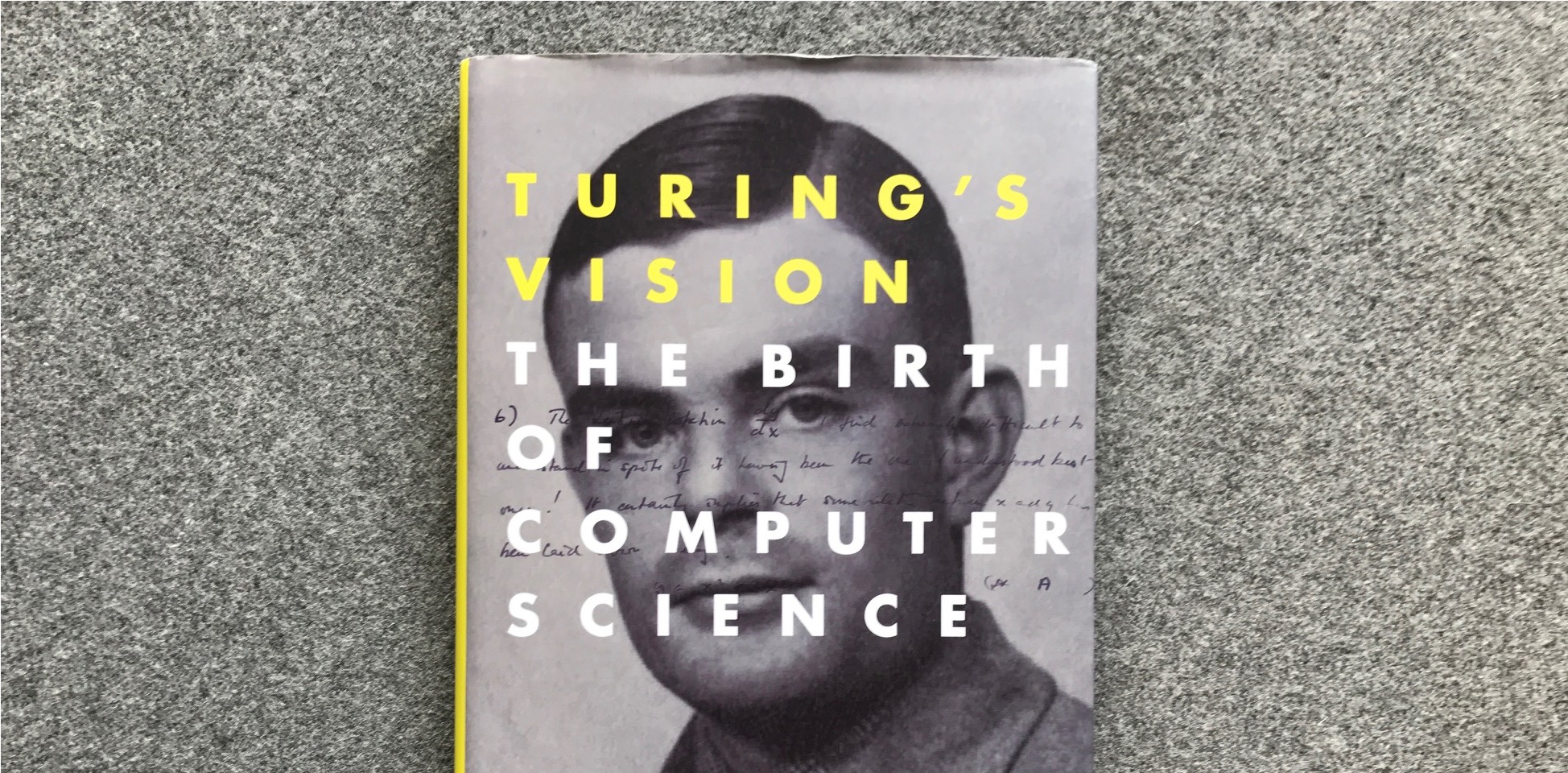
Book tip: Turing’s vision
When I visited New York last year, I picked up a copy of Chris Bernhardt’s book Turing’s Vision: The Birth of Computer Science, which dissects one of Alan Turing’s most interesting papers. I’ve been recommending it to various people since, so I thought I would write about it here.
 The book
The book aims to explain a number of complex ideas from computer science and mathematics to the general public. “The reader doesn’t have to understand much mathematics — high school provides enough”, Bernhardt explains.
Personally, I’ve had to skip over bits and pieces, but generally, I’ve found it quite accessible. It takes us back to the historical and philosophical basis for many concepts that are still there in modern-day programming: encoding, regular expressions, Lambda calculus, recursive functions, functions that break on certain input, arrays…
On computable numbers
Turing is well known for his leading role in decrypting messages from the German’s Enigma devices for the allied forces, a history recently turned into a film worth watching. He also came up with the Imitation Game thought experiment to tell humans and computers apart, now known as the ‘Turing test’ (and familiar to all internet users as CAPTCHAs). This book does not focus on those things.
The paper central to this book is called ‘On computable numbers, with an application to the Entscheidungsproblem’. Entscheidungsproblem is German for ‘decision problem’: it is the question whether we can write algorithms that can decide if certain mathematical statements are true or false. The problem was defined by Hilbert, one of the biggest mathematicians of his time. He thought such algorithms did exist. The book goes into various examples of decision problems.
Turing wanted to prove Hilbert wrong. To do this, Turing had to define what an algorithm was; he explained this by breaking complex calculations down into simpler parts. He also defined the very concept of computation, using the concept of ‘Universal Machines’, machines that, he proved, can compute anything that is computable. In 1936, this was all still as theoretical as it gets. We have modern computers now; at the time a computer was the job title of a person hired to do calculations.
Conclusion
Turing’s Vision is quite theoretical, but it is a great read for people who are interested in the early days of computing. It’s a good mix of mathematics, philosophy and computer science, and helps to understand in detail the paper that started it all.
Want to hear more about this book? There’s an interview with the writer (mp3, 8MB).
Originally posted as Book tip: Turing’s vision on Hidde's blog.
Mom-jokes as part of corporate culture
Dutch retail giant Coolblue showed the world this week that they have a new meeting room, named ‘Your Mom’. They explained in a blog post how this name sets the stage for all sorts of mom-jokes. I think this is not really OK.
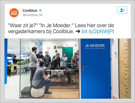
The tweet
Personal context versus corporate culture
Before I continue: I am just commenting as a member of the tech community on a situation in a company that does a lot of recruitment in the tech community. Why do I do this as I don’t even work there? What’s my business here? In all modesty, I am just a developer that would like the tech community to be inclusive. I am trying to figure out which things get in the way of this (and how).
The problem, I think, is not with jokes or even inappropriate jokes. Fun is fine! Have fun at work. Banter. As a person, between you and other people. Cross the line, or choose not to. Be as politically correct as you like, I guess. Be childish if you like. Your jokes reflect on your person, they get you in trouble (or don’t). Person-to-person gives context for judging whether lines are being crossed. Unless you are in higher management, on a stage, in public: your jokes likely don’t harm that much.
If you are a company (or manage/represent one), this is different. Companies should be wary of jokes that have sexual aspects in them, because their language creates a corporate culture. You can see this in the example: they’ve painted a mom joke onto a meeting room, their corporate blog explains why this is funny. It has gone from a joke between people who work there, to a joke that is part of the company’s culture.
What’s wrong with a mom-jokes culture
If a joke that crosses the line is on a wall and on a corporate blog, it no longer reflects on one person. Leaving taste out of this discussion, there are problems with getting your corporate culture wrong: it is not good for recruitment, it is not good for your employees and it is not good for the tech industry.
For recruitment
In terms of recruitment, you will likely change the set of people you can pick from. Maybe you will get to pick from more people who like mom-jokes (and, sure, they could be excellent at their work), but you will likely also miss out on people who see them as a red flag. Especially in tech, and especially in the light of recent scandals. You will end up with a less diverse company. Diversity is a good thing (there’s loads written about this elsewhere; the recent film Hidden Figures illustrates how diversity got NASA into space).
For employees
A mom-jokes culture can make the environment less welcoming and possibly less safe for your employees. If you have an issue you’d like to report to HR, let’s say with regards to something horrible like harassment, can you still be sure it is going to be taken seriously? The HR department being part of the management of a company that has mom-jokes in its corporate culture seriously changes this. If one colleague made an inappropriate comment, you can report to the company. If the company itself makes inappropriate comments part of its DNA, where can you go?
For the tech industry
This is the one where my worries are probably most appropriate, as I don’t recruit or work for the company, but I do work in tech: a tech giant with a mom-joke culture makes the tech industry look less professional. It makes the tech industry look less attractive to a diverse group of people. Like I said above, diversity is a good thing. The industry should be cautious not to miss out.
Conclusion
I have nothing against jokes, but as an industry I think we owe it to ourselves to make sure that inappropriate jokes don’t become part of company cultures, as this can harm those companies as well as the tech industry as a whole.
Mom-jokes get in the way of diversity, by attracting people who like such jokes, and repelling those who don’t. This isn’t necessary. There is so much fun to be had in the world without such side effects, we really can do better!
Originally posted as Mom-jokes as part of corporate culture on Hidde's blog.