Reading List
The most recent articles from a list of feeds I subscribe to.
Coherence, Lego and how naming things is hard: Patterns Day 2017
Pretty much all of my projects in recent years have involved pattern libraries: setting them up, promoting their usage and coding actual patterns. So when Jeremy Keith of Clearleft announced he would host a Patterns Day, I bought a ticket instantly. A full day of design system nerdery sounded like a great thing to travel to Brighton for. And it was definitely worthwile…
Pattern libraries can be hard to get right: not only do you need to gather patterns and put them in a library, you’ll likely also want to avoid code repetition, make sure they integrate with your application code, get others in your organisation to care for and use the library and find a way to make the distinct modules you’ve created form one sensible whole. Patterns Day conference covered all of these subjects and more.
Audio of the day is available as podcast on Huffduffer, videos have also been recorded and will probably follow soon.
The talks
The conference had a fantastic start with Laura Elizabeth, who talked about selling design systems. She said they are great as they ensure consistency, shared vocabulary and understanding of the medium for less technical people. They also have problems: keeping them maintained is hard, they are a lot of work (often underestimated), and there is a chance they won’t be worth the investment. Laura explained that making the case for design systems can be a two step process: first, find a common pain, then gather data. According to her, a pattern library works when the need for it is equal to or larger than the effort require to build it (and that effort is usually huge). My main takeaway from this talk was: if you want to do well at selling your pattern library, be aware of potential shortcomings and gather data to support your claims.
The second talk of the day was by Ellen de Vries (we’re not related, not as far as I know anyway). Her talk was lots more theoretical and went into what it means for a system to be coherent. One way to improve coherence, and this is something we can learn from architecture, is to look at more than just the parts and consider the usage of our designs by people and the larger world around the design (when a performance area is designed for a park, the designer could consider what the charge for attending concerts should be). A story in books or films can be defined as personal experience in space over time. A story in books is a more fragmented experience: content guidelines can help users make more sense.
After the break, Sareh Heidari took the stage. She works at BBC News and told us about both their design language (GEL) and their approach to CSS architecture (Grandstand). Turning things into a pattern helps avoiding the repetition of CSS. Grandstand has namespaced objects and utilities, but also mixins to aid localising typography and grids. These mixins effectively turn direction-dependent properties into direction-agnostic ones, so that one rule can be used in generation of stylesheets for both left-to-right and right-to-left languages. Sarah also emphasised how important communication is, if you want to keep your codebase lightweight (challenge those who want to add new variations, they might not be absolutely necessary).
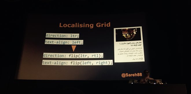 Sareh Heidari explaining mixins for localisation
In the next talk, Rachel Andrew discussed two bits of software I use almost daily: Fractal (a component library tool) and Perch (the CMS this website runs on). She recommended making your pattern library the single source of truth for UI styles (as the Perch one is for Perch’s UI), and choosing a pattern library approach that makes renaming trivial (as Fractal does) so that you don’t need to worry too much about naming. A pattern page is like a reduced test case, Rachel said, and they’re great for experimenting in isolation. I had never thought of it like that, but realised that is certainly something I use pattern pages as.
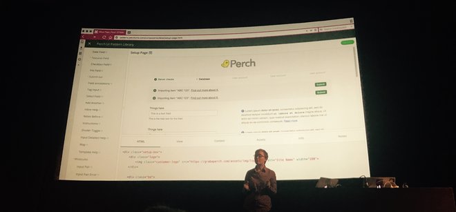 Rachel Andrew showing Perch’s Fractal instance
After the lunch break, Alice Bartlett talked about the Financial Times’ Origami pattern library, specificly about what’s next when you’ve built your actual library. She explained templating is ok for a specific stack, but hard (impossible?) to do right if your organisation has multiple stacks. No templating at all is likely a bad idea that causes duplication and makes simple changes like classnames hard. Serving CSS/JS is easy if you serve everything always (can work if your site is not too complex), but separation can be done. Origami has a repo for each individual pattern so that projects that use it can use just what they need (or include just that from the Origami CDN if they don’t want to bother with asset management). Rule for all of this: choose the simplest for the job (the best tooling is no tooling!). Alice also went into non-technical aspects of pattern library success in big organisations: have fantastic documentation, put effort in making sure people in your organisation are aware the pattern library exists (so: do marketing, basically) and have a support channel and incident reports.
Jina Anne did something completely different and read a story to us, which was beautifully illustrated on the slides that complemented it. I’l have to refer you to the videos for this.
Paul Robert Lloyd let us look at the bigger picture, with some interesting examples from architecture. He asked a number of thought-provoking questions about how our choices are informed: is there room for irrationality when our design systems embrace mathematical precision, do the tools we use dictate our approach to design systems (like Photoshop’s ’New File‘ screen asking for dimensions), does culture affect our decisions and do we serve the interests of the organisation we work for or those of the people affected by our work?
The last talk of the day was by Alla Kholmatova, who has spent years researching design systems and how companies use them. For her forthcoming book, she interviewed style guide people from various large companies. Her talk was about three aspects where design system implementations can differ: strictness, modularity and organisation. The first is about how strictly the system is enforced: are there rules that no one can differentiate from and strict processes for new pattern addition? Or is the system quite loose, and do you rely on your people’s familiarity with the design principles and allow for flexible and expertimental use of those? Modularity then: do you stictly separate everything into modules (high investment, but potentially cost saving in the long term) or is it acceptable to produce designs that are quite specific (and potentially easier to build, but harder to scale)? And lastly, organisation: is it centralised or distributed? Is there one team that creates and vets everything (more reliable, but potential bottleneck), or can people across all teams contribute (more autonomy, but potentially dilutes creative direction)? These three aspects provide a great way to think about what kind of design system works for your organisation. With examples from AirBnB to TED, Alla showed that different companies make different choices on these scales, and she recommended us to make our own choices: ’the right design system is probably not someone else’s design system‘, she concluded.
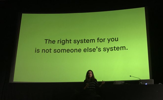 Alla Kholmatova: the right system for you is not someone else’s system
Takeaways
These are some of my takeaways and things I felt recurred across the different talks:
- Moving from a static page comp approach to working on pattern libraries can completely change our way of thinking about making websites. A pattern page as an isolated test case is one of those things.
- Wholes are just as important as parts: it’s great we spend time on isolated components, but the end user experiences however they’ve ended up being used together, it is important not to lose sight of that.
- There are many complex solutions (like static asset APIs, versioning, templating to serve multiple stacks), but your organisation’s problems may not require them. Keep it simple if you can, introduce more complex solutions if your research shows you have to.
- Marketing your pattern library is a thing, especially in bigger organisations. People can also build web products using their own code or Bootstrap. It’s unlikely for others to promote your pattern library, so if you want it to be success you’ll have to put your sales hat on.
- We aren’t the first people to solve these kind of problems: architects (of buildings) have long worked with modules and wrote at length about making them work in wholes.
In his closing remarks, Jeremy asked if he should do another Patterns Day next year. For what it’s worth, I would love to attend another one! There’s lots more to discuss and a year later, more of our shared problems will have likely been solved by people. I would love to hear more about, for instance, how to test for accessibility in a pattern library world.
I’m looking forward to bringing some of the stuff I learned into practice when coming back to work next week!
Originally posted as Coherence, Lego and how naming things is hard: Patterns Day 2017 on Hidde's blog.
Pseudo classes vs pseudo elements
Something I thought I knew, but found out this week that I did not: the exact difference between pseudo classes and pseudo elements in CSS.
Pseudo classes let you style an element based on its state, says MDN (:checked, :valid, :disabled). This also implicates that they refer to an existing element: something that is already in the DOM available to style.
As a rule of thumb, what a pseudo class offers, you could have achieved with a classname. Not that that would be very practical – for most pseudo classes you would need to detect some stuff with JavaScript to work out the state and add that class; so yay CSS for providing this!
Pseudo elements let you style things that are not actually elements. They can be parts of existing elements (::first-letter, ::first-line), including parts that exist temporarily (::selection). Generated content also falls within the pseudo elements bracket (::before, ::after).
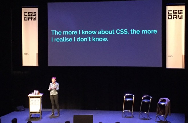 Rachel Andrew said it beautifully at CSS Day 2017: “The more I know about CSS, the more I realise I don’t know” (photo: Bernardo Baquero)
Thanks Krijn for pointing me to this.
Originally posted as Pseudo classes vs pseudo elements on Hidde's blog.
Browser API Special and CSS Day
This week, the 5th edition of the yearly CSS Day took place. It was preceded this year by something called Browser API Special: a full day about JavaScript APIs.
I’ve done a quick writeup below, with some of my takeaways and some things I thought were quite brilliant. If you’re interested in more of CSS Day, the organisers have announced there will be another edition next year, updates for which are available through the newsletter. If you want to experience more of this year’s edition, there will be videos!
Access to almost everything through JavaScript
The general theme of Browser API Special was that browsers are starting to expose so much stuff via JavaScript. Animation, virtual reality, payments… more and more is made available through useful (and some less useful, see below) DOM APIs.
The day started with Rachel Nabors, who explained how CSS transitions, CSS animations and SVG animation standard SMIL are now combined into one Web Animations API. This API provides a bunch of methods to let us animate stuff on the web more efficiently. Her examples were helpfully based around Alice in Wonderland. This made the code examples much easier to understand (cake.animate() instead of foo.animate()).
Then Peter-Paul Koch counselled us (PDF) on the usefulness of :valid/:invalid in CSS and the Constraints Validation API. The latter is a standard that, in theory, lets us offload the logic of dealing with form validation and requiredness onto the browser. It and the CSS pseudo classes contain some helpful stuff, but there are issues with timing (errors on keypress or submit, where blur would make more sense), customisability (can’t change what the error message is) and stylability (can’t style error messages).
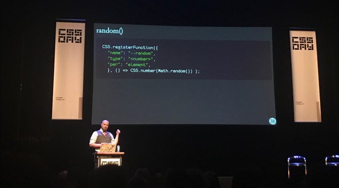
Philip Walton then went into how to polyfill stuff in CSS, or in other words: add custom functionality to it. Wait, wut, extending CSS via JavaScript? Yes! Suppose you would like to have a random() function in CSS that you could use within calc(), what would you need to do to make it work? Browsers let us access the CSS Object Model, but using that to then try and replicate cascading and media queries and what not after the browser has already evaluated all its stuff raises the question: why doesn’t the browser help us a bit here? Houdini has a set of low-level JavaScript APIs that let us access the stuff browsers do when parsing CSS (paint, layout, parsers, etc), which is awesome as it lets us interact with our custom functionality right in the browser dev tools.
Ruth John showed us that websites that are enhanced with audio aren’t always an awful thing: wonderful experiences can be made with it as long as we’re considerate and subtle. She also showed what the code looks like to interact with fragments of audio. From creating a new AudioContext to using that to do all sorts of wonderful things. You can use Web Audio API to create your own sounds or do so with the help of MIDI devices. Very inspiring!
Ada Rose Edwards asked us all to put on the VR headsets that had been handed out during the breaks, and showed us some cool demos of WebVR. There was even one that had ourselves in it, which was an interesting experience. At some point it had 178 of us logged in at the same time.
Mike Taylor shared all sorts of weird things that are now in browsers and probably will be in browsers for the foreseeable time, for all kinds of weird and usually historic reasons. He explained it is good if functions don’t have all sorts of side effects, and that window.showModalDialog does. How stuff gets capitalised is complex and various mistakes have slipped into browsers regarding this. Vendor prefixes can be hard to get out of browsers once they are no longer needed.
Patrick Kettner went into Progressive Web Apps and kind of showed how turning your app into one can benefit your app’s potential: it can show up in the Windows app store (as Bing indexes PWAs and can automatically add them into the store if you want that), and lets you access platform APIs for things like Bluetooth and media keys from the browser.
Chris Wilson, who was the first to implement CSS in a browser (way back), talked about both managing credentials of users (and ways to make that easier for users) and the Web Payments API. This lets the browser be aware of a user’s payment methods and allow users to pay from their browser. Lots of food for thought, i.e. what sort of new payment providers will come up, and will it be useful if the Dutch iDeal system hooks into this (I think it already works very well on mobile, but this may vary per bank)?
There was so much stuff in today’s talks that, had you asked me five years ago, I would have thought could only be done in native apps. Native apps have traditionally been able to do more with hardware than web apps, but that seems to have rapidly changed. This is a good time to be a web developer.
The history, current state and future of CSS
Day two had everything in it from the history to the future of CSS. Generally speaking, I was very pleased to see into how much detail many of the speakers went. As someone who writes CSS almost daily, I benefit a lot from its simplicity. A lot of things happen automatically and ‘just’ work. To make that possible, specifications and browsers do tend to get quite complex and detailed. CSS Day 2017 was a great chance to learn more about those details, and will likely help me get even more out of CSS.
CSS-inventors Bert Bos and Håkon Wium Lie opened the day. I had seen both talk before, but never in the same room. They used their session to reflect on stylesheets: what would they have done differently, what are they happy with? The syntax, absolute positioning, collapsing margins and scrollbars were some things the two would have liked to have a second chance at.
 Bert and Håkon looking at the first proposal for “Cascading HTML stylesheets”. “HTML” was dropped from the name, as there were other markup languages around and stylesheets seemed fit for those, too.
An interesting aspect in the discussion: CSS was meant for documents, which is what Bert and Håkon had a history in, as opposed to UIs. There has been talk about a second language to do UI styles. An example of a difference: documents benefit from collapsing margins and text flowing the way it does, but that kind of stuff can get frustrate styling UIs.
Another fascinating topic was that they would have loved CSS to consider wholes rather than parts. In order for something like ‘make all p’s display in italics’ to work, an alghoritms can do this thing by thing. In order for something like grid to work, an alghorithm needs to consider the whole (sub)tree and place stuff.
A general theme I took from Bert and Håkon’s discussion was that so much effort was put into keeping CSS as simple as possible. Stuff like the cascade: it was put in so that authors can write a lot less CSS. Food for thought!
After this magnificent opening, Rachel Andrew talked to us about CSS Grids. I loved how the talk really went into the nitty gritty, and I have lots to look up at home: blockification and inlinification for example, and the difference between outer and inner display types. Rachel also went into why subgrid is not happening (yet) and what makes it hard to replicate with other CSS properties. She also explained how CSS Grid’s writing mode awareness impacts its syntax. Lastly, a great tip she gave: if you’re confused about what your Grid is doing: try and use longhand syntax to make debugging easier.
After the break, Mark Boulton gave us an introduction in grid design for the web. After a bit of graphic design history, and making the argument against just using 12-column grids for everything (hello Bootstrap!), he explained a grid design method: start with a constraint, base units on that constraint and then create a grid based on those units. All of this, he emphasised, fits the best order to grid design: start with content and base a grid around that, not the other way around.
Jen Simmons talked about Writing Modes in CSS: a standard that lets us build websites with content in all modern (spoken) languages, whether they are written horizontally or vertically, left to right or right to left. There are major differences here in languages: Arabic (rtl), Mongolian (vertical, ltr) and Han-based languages (vertical, rtl or horizontal, ltr). Inline direction and block direction are important aspects in understanding Writing Modes (check the spec for details). If you’ve switched writing modes (with lang and dir attributes), the browser will then do its stuff (create space for elements; apply cursors, etc) with the correct writing mode in mind.
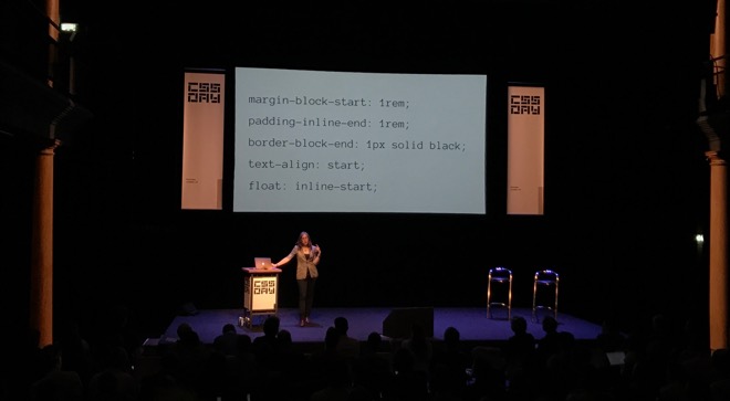 Jen Simmons with her slide that shows examples of ‘logical properties’ in CSS: rather than ‘left’ and ‘right’, ‘start’ and ‘end’ are more meaningful as they are direction-agnostic.
Variables may be a thing most CSS developers know from preprocessors, but they have become a (well-supported) thing in CSS. With --foo: bar we can set custom properties, and Gregor Adams showed some amazing examples of what can be done with that. A supports table where properties were updated within @supports queries so that they only got the true value when the feature is supported (this works because they are scoped), as well as an actual working calculator. Awesome stuff!
The author of many modern CSS specs, Tab Atkins, was in today to tell us all about Houdini, which is a set of JavaScript APIs (and some CSS stuff) that makes CSS extendible by its users. If the community goes ‘we’d like masonry in CSS’ or ‘can we have a random() function?’, it will soon be able to add those things to CSS themselves, using JavaScript. His talk contained near future stuff like methods to register custom properties, as well as new things that are yet to be finalised, like custom units and custom paint functionality. And then there was stuff that really does not (yet) exist: a CSS.parseRule() method so that we don’t have to reimplement all stuff browsers do with CSS in our own JS libraries, custom functions and custom @- rules.
 Tab Atkins introducing what could be quite a simple way to define custom functions in CSS (does not exist yet)
The last block of talks started with CSS-Tricks and CodePen founder Chris Coyier. In a talk full of questionable pop music, but also many tasteful examples, he showed us best practices for making a fan site for our favourite band. Four properties were central to his talk: shape-outside, offset-path, clip-path and d. He demoed how they can help making a lyrics page have more interesting visual effects. All four are awesome properties well worth checking out, but d stood out to me: its value is a path() function that lets you override a path in an svg. I had no idea this sort of stuff could be done!
Closing this wonderful day was Stephen Hay. He talked about various things that people with bad intentions can do to exploit security issues caused by bad (but also good) CSS. Who would have thought that using classnames could lead to vulnerabilities? Some stuff is luckily no longer possible, like adding JavaScript into the url() method of CSS backgrounds and looking into a user’s browsing history with getComputedStyle on visited links. Stephen also discussed dark patterns, like unsubscribe flows that lure you into resubscribing.
I’ve had a blast! After having worked as conference staff for the first 4 editions, this year I had the honour to work on the design part of CSS Day, doing poster, slide and badge designs with silly CSS jokes on. I was happy (almost) all of it worked out well. And that I got to watch all the talks!
The talks were just fantastic. There are a lot of specs and APIs that I will have to read up on, but I’ve also learned plenty of practical stuff to use at work straight after this weekend. It was awesome to see how much effort spec writers and browser makers put into making stuff easier and simpler for both end users and web developers. They also do more complex stuff: Houdini comes to mind. Although that might not be fair: Houdini will help people extend CSS, and although the extending itself may be complex for people who normally write CSS, making use of extensions can be made very simple. Just like existing CSS properties and functionalities.
For those who have missed this year’s edition, as I said before, there will be a UX Special and CSS Day next year: 14-15 June 2018 is the date to save!
Originally posted as Browser API Special and CSS Day on Hidde's blog.
ICONS: five questions about screen readers
This week I attended the last ICONS meetup of this academic year, which had as its speaker Léonie Watson. She shared five questions related to screen readers.
ICONS is an event organised by the design department of the Hogeschool van Amsterdam. They invite (web) design related speakers, as well as students and people working in the web industry, so that they can meet each other and learn stuff. Awesome! I took some notes of Léonie’s talk, please find them below.
 Léonie Watson in Amsterdam
Five questions
Who
Some might think screen readers are just used by blind people. Léonie explained they have a broader audience: people with impairments in the autistic spectrum use them (screen readers provide a way to navigate information with less distraction) and people with some forms of dyslexia (as listening may be easier for them than reading). In the future, many others may use audio to navigate information: think about digital assistents like Siri and Cortana, or voice interfaces in the car.
What
A screen reader, Léonie explained, ‘translates on-screen content into synthetic speech’. Some can also do braille, but equipment for this can be costly. They are available on most platforms, including mobile platforms. Some are free (NVDA, VoiceOver), others can be quite expensive (JAWS). They don’t read the whole page as if it were plain text (as they used to do in the old days), they interpret a page structure and let their users benefit from shortcuts. For instance, a screen reader user could navigate through just headings, or press the ‘read next paragraph’ shortcut.
Where
Most of the interpretation for screen readers happens on the OS level. Things in the OS expose their role, name and state, and through platform level accessibility APIs, this information is referred to the screen reader. There exist accessibility mappings between the OS and the browser. Note that browsers don’t always support all accessibility features: they sometimes support a new web platform feature, without also accessibility supporting it. Which means:
(…) it is usable by people who rely on assistive technology, without developers having to supplement with ARIA or other additional workarounds.
(source: HTML5 Accessibility, a website that holds information on accessibility support in browsers)
When
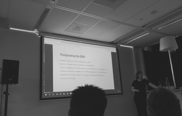
In the browser, an accessibility tree is generated based on information in the DOM tree. This process basically means that the browser is figuring out what the role, name and state of things are, and puts them in a tree. Screenreaders use platform APIs to access information in this tree, and then make all the shortcuts possible for their users.
A quick note on this: as a front-end developer, you can directly influence what information gets exposed by making sure you use a semantic HTML structure and get your labelling right (see also: Accessibly labelling interactive elements). States are harder, but there are native HTML attributes available for this (i.e. hidden and open, as well as ARIA polyfills).
Why
Then, the last question: why? This was mostly aimed at designers and developers making websites: why would they support screen reader users? Léonie gave lots of reasons: it feels good, it’s fun to work on something others enjoy using (isn’t that why we add subtle animations, choose good looking and nicely readable fonts, make our stuff load fast etc). Secondly, it is a professional responsibility to ensure what you make is usable. Thirdly: as a designer or developer, you have a choice (as opposed to the users that rely on screen readers to access your product).
These five questions are certainly something to think about when you are making websites that are used by people who rely on screen readers. And that’s very likely to be every website or web application.
It was a pleasure, as always, to hear Léonie talk about using screen readers and share her knowledge. Thanks to the HvA for setting up this event!
Originally posted as ICONS: five questions about screen readers on Hidde's blog.
I, Daniel Blake
In what was a truly inspiring afternoon at the client last week, we watched the English film I, Daniel Blake. It is about a carpenter of nearly the pension age, who applies for income support following a heart attack.
The client is a semi-government organisation that builds software for citizens to manage income support applications online. When I first watched I, Daniel Blake when it came out in November last year, I was moved, but also inspired. This film was about the very thing we were working on, and there was so much to be learned from it.
The plot of the film, which won the Palme d’Or at Cannes in 2016, is fairly simple (spoilers ahead). Mr Blake wants to apply for income support, as his doctor has told him he should not work. For some reason, his application gets denied. A mountain of bureaucracy follows soon after. The staff tell him he could appeal, but as an appeal could take months, they recommend him to apply for job seekers’ allowance instead. He does so, but is then asked to prepare a CV and apply for jobs, which he ends up getting offered but cannot take because of the aforementioned doctor’s advice. Mr Blake patiently jumps through all the hoops the system forces upon him, until the point he does not want to take it anymore.
 Stills from the film
People as numbers
In the film, Mr. Blake often tells staff he engages with about his heart condition. He’s the example of a perfectly reasonable person. Yet he finds they ignore what he says, and are only willing to look at what the system says about him (which is: ‘application denied’).
The film shows a bureaucratic system that regards people as applicants, service users or ‘clients’: like numbers. I don’t think that is inherently good or bad. All software that deals with people represents them as fields in a database. I guess this aids efficiency: if all people are in a database, it is easier to make estimates, identify people and their details, et cetera. This only turns into a problem when people are also reduced to numbers. If the number are the only thing the system is interested in.
What happens to Daniel Blake is an example of the latter. Was he treated humanly, a heart attack and a doctor’s recommendation would be plenty of indication for the system to just give him the income support he applied for. Now that he is treated only as a number, the system forces him to jump through hoops needlessly.
Human judgment
Services that used to be mostly physical are transforming to their mostly digital equivalents. Although I am just a front-end developer, I am often involved in teams that realise such transformations. Most of my work revolves around trying to make interfaces easier to use and being inclusive to all who need to use them. I, Daniel Blake was a good reminder that those ambitions can still leave people frustrated.
However user-friendly we try to make our interfaces, a digital service is not going to help everybody. Sometimes the best interface is an actual human being that helps people. Machine judgment is great and efficient, but the system needs human judgment. Equipped with appropriate authorisations, humans trump digital services: the very person sending Mr. Blake to a cv workshop could have just authorised his income support (and gotten on with the next applicant – now that’s efficiency). To help him skip the hoop-jumping.
It was fantastic to get the chance to watch this film with colleagues, and I can’t recommend it enough to peers who work on digital services (government or otherwise). I’ve heard some say it is overly dramatic. It may be, but I found it realistic and close to reality, too. Looking forward to hearing what others think about it!
Originally posted as I, Daniel Blake on Hidde's blog.