Reading List
The most recent articles from a list of feeds I subscribe to.
Enabling people with accessible technology and positive thinking
Yesterday I attended the Inclusive Design and Accessibility meetup (“idea11y”) in Rotterdam. The central theme of the evening, I think, was that accessible technology has the unique ability to enable people.
Last night’s meetup marked the first anniversary of idea11y (congrats!), it has been running regularly since the first one. Recently, I have been attending regularly, too. These meetups are always full of interesting content from different perspectives.
First, UX designer Dean Birkett (of AssistiveWare) talked about undertaking usability testing for the products his company makes: products that enable people with impairments. He specifically explained products that enable people to communicate. The users of these products are people who can not or no longer talk, some literate, some illiterate. He showed examples of people using their tools for anything from editing movies in Final Cut Pro to simply saying ‘I love you’ to their loves ones. He talked about the challenges of usability testing: he did a lot of that remote, and sometimes they involved the user’s support network. Main takeaways: don’t let people tell you that you can’t do usability tests, there are always ways; and do tests your products with users, as it is their problems you’re trying to solve.
The second speaker was Bob Offereins (of Microsoft), who talked about what he calls “Inclusive Life Design”: it is all about looking at people around us in terms of impedements rather than impairments. They’re really two labels for one thing: an impairment mostly sounds like an impossibility, ‘impedement’ makes one think of something that can be overcome, it’s a much more positive label. Bob shared his story: at a younger age he was diagnosed with an eye disease, which meant at the time he was labelled by the authorities and people around him. He explained how important it is to believe in the power of people, and encouraged us to believe in our own power, be unafraid of making mistakes and open to new ideas. Which in his case meant: don’t believe in boundaries or labels put onto you by others, think in possibilities! Very inspiring.
Dean showed how his company’s technology enables people, Bob explained how we can enable ourselves (and others) by being open minded and believing in what we can do. Some great food for thought!
Originally posted as Enabling people with accessible technology and positive thinking on Hidde's blog.
Testing the accessibility of pattern libraries
When assessing how accessible your website or app is, auditors will likely want to look at whole pages. But perhaps most of what you are working on is individual components. I mean, this is how lots of companies work nowadays. Can pattern libraries be tested for accessibility? And if so, what do we test? In this post I will address those questions and look at accessibility testing in different levels of pattern library driven development.
Note that this post is mostly about whether it can be done, as opposed to how, which is a subject all of itself. I may do a post about that later.
A pattern is a reusable piece of your user interface, also known as component or module. It often documents the UI design and is made of code that runs in the browser. Examples of patterns: buttons, messages, accordions, headers, sliders, breadcrumbs and tooltips. A pattern library is a collection of such patterns and slightly more than that. As Alla Kholmotova says in her upcoming book Design systems, it is “a tool to capture, collect and share design patterns and guidelines for their usage.”
With our interface separated into building blocks, it would be great if we can do our accessibility testing pattern by pattern, too. Can we? Well, yes and no.
Let’s start with the bad news. To be able to say something about how accessible your whole site is, you need to assess whole pages, WCAG2 says:
2. Full pages: Conformance (and conformance level) is for full Web page(s) only, and cannot be achieved if part of a Web page is excluded.
But there’s good news, too: there are heaps of accessibility issues that can be spotted on a pattern level, or criteria that can be marked as sufficiently met. Let’s look at how that would work.
What auditors test your site for
When deciding whether something is easy to access for as many people as possible, auditors will make sure four things are the case. They’ll want your site to be:
- Perceivable
- Operable
- Understandable
- Robust
In WCAG2, the accessibility guidelines, there is a number of criteria categorised under each of these main principles. Knowing those criteria is a great way to learn about making more accessible interfaces. There are quite a few. The actual spec is a good place to read about them and it is also the official norm. There is also the WebAIM checklist, which has slightly more developer-friendly wording and (opinionated) recommendations on how to meet the criteria — it’s a great resource!
Although you cannot formally claim your site’s WCAG2 conformance based on audits of just its components, as we’ve seen above, you can look at many of the criteria on a component level. This can have advantages in comparison with testing whole pages.
Patterns as isolated test cases
At the Patterns Day conference last month, Rachel Andrew mentioned something interesting about patterns. She said that working with reusable interface components, where each one has its own page, made her realise that those work quite well as isolated test cases. I feel this also goes for some accessibility tests: there is a number of criteria where isolation aids testing.
Component-specific guidance is available
Not only can isolating patterns be useful in the testing phase, there is also lots of documentation for accessibility-proofing components specifically. WAI ARIA Authoring Practices describes of common patterns how to get them accessible, with examples of keyboard operability and what should happen to focus. There is also Heydon Pickering’s Inclusive Components Club, which describes in detail what optimisations can be made and how they help whom.
Individual patterns
Let’s look at some things that can be tested when looking just at individual patterns. In order to avoid this to become too high level, I will give some suggested questions for specific, real-world-ish use cases.
Collapsible (“Show/hide”)
- Is it visually clear where the focus is? (Focus visible)
- Is information about the state of the collapsible exposed to the accessibility tree?
- Is there enough colour contrast between background and foreground? (Contrast minimum)
- Can the collapsible be expanded using a keyboard only? (All functionality operable through keyboard interface)
Form field
- Does the field have a label? (Provide descriptive labels)
- Is the label properly associated with the input?
- Does the icon that appears next to the input when there’s an error have a text alternative? (Provide text alternatives for non-text content)
- Are error messages conveyed to assistive technology (Identify and describe errors)?
Video player
- Is it easy and clear how to stop the video?
- Is there a way to display transcripts and include captions? (Provide alternatives to time-based media)
- Can the video player controls be used with just a keyboard? (Make all functionality available from a keyboard)
Assuming your final page only has pattern libary markup, CSS and JS, all of the above things will yield the same test result in isolation and when used in a page. This is what makes them suitable to test on a component level.
I think for most components, there’s a whole lot of accessibility criteria that can be tested. There is also a number of things where we need whole pages, and in some cases, whole pages with the real data. So let’s look at those next.
Whole pages
Some criteria can only be tested in the context of a full page. Some examples:
Headings
- Are no heading levels skipped?
IDs
- Do skip links refer to existing IDs? (Have a mechanism to bypass blocks of content that are repeated on multiple pages
- Are there no duplicate IDs in the page?
Tab order
- Can we tab through the page and does tabbing make sense?
Whole pages with real data
Lastly, there are also some aspects that can only be tested when pages are composed and they have real content in them. For instance:
Language
- Is the language comprehensible?
- Is it identified which language the page is in? (and, if different: parts of the page) (Make sure human language is programatically identifyable)
Video player
- Are all the people in the video identified in the transcript?
- Do the captions appear at the correct times?
Alternative content
- Can I find out what’s happening in that graph without seeing it?
- Does the
altattribute of that image describe what’s in the image (if it is not decorative)?
TL;DR
Although claiming a site meets the WCAG2 criteria has to be based on research of full pages, there are lots of things you can figure out and tackle while working on components with mock data. Above, I have given some examples of such things. I’ve also shown some examples of criteria that would require full and/or finished pages to be properly assessed.
As always, your mileage may vary! I would recommend checking the components you have against the WCAG2 criteria to see which ones can be checked on component level and which require full pages. Hopefully, the examples give an idea of what kind of things can be tested on which level, and when to run (automatic) accessibility tooling through patterns or full pages.
Originally posted as Testing the accessibility of pattern libraries on Hidde's blog.
This website now uses Grid Layout
Ever since the Grid Layout spec review workshop in Amsterdam last year, I’ve been wanting to try this stuff out on a real project, in a real browser. Now that the spec is rapidly gaining browser support, I thought this blog would be a good place to practice with it. I’ve jotted down some of my findings and thoughts.
So, it is really happening! Earlier this year, most major browsers shipped Grid Layout into their browsers in one month. It was awesome, never has a major new CSS feature been adopted this fast across browsers.
Before, we recreated grids with tables, floats and flexible boxes. For some developers, frameworks were helpful when trying to do that on scale. With grid, those things are no longer needed. Grid is great, because, contrary to older grid systems that use CSS to come to layouts, CSS Grid Layout is the lay-out system.
So why would you not use it? A fallback lay-out will either cost lots of time and limit your creativity, or look different from your grid-based lay-out, the most important question to ask here is: can you live with the “websites do not need to look exactly the same in every browser” philosophy? This philosophy has become more and more popular. It was always a wise strategy, but the multi-device world kind of forced us into it. Which is good, I think. There are already lots of viewports and lots of different ways to access the same structured content. For this website, it was an easy choice to make, because it’s only my own website. For client websites, it’s a developers role to look at which compromises are worth making.
Good places to learn more about Grid Layout are the spec and the examples, blog posts, tweets and presentations by Jen Simmons’ and Rachel Andrew, they have both done way more interesting stuff wit Grid Layout than you can find in this post (I mean, Monopoly, Mondriaan and more). Rachel has a full workshop on CSS Grid Layout.
 The Grid on this site as viewed through Firefox’ Dev Tools
My implementation
These are some things I found interesting when I worked on this website’s Grid Layout implementation:
A lot less markup
Markup-wise, I have mostly been removing things. I had containers in place for layout reasons, most of those are gone now. The reason: when you define a grid on an element X, the things you can lay out on the grid are the direct children of X. If those are container elements, you’re placing containers onto the grid. This can be useful if you want to group things (make divisions, if you like), but often you want to lay the content itself out against your grid lines. In that case, best remove containers, or use display: contents, which lets elements behave as if the container that wraps them does not exist (little browser support at the time of writing).
Numbered and named grid lines
With Grid Layout, you can name your ‘tracks’ (areas formed of multiple rows/columns), but also the lines that surround them. I did not name all my lines, but I did name the ones surrounding my main content area. Named lines are very helpful: they make the grid-*-start/grid-*-end declarations much easier to read.
The body as the grid
I declared my grid on the body element, because I figured that I wanted to align everything that is in the body onto the grid. On more complex websites, I think grids could work well for just one component/composition, for example an overview of products.
Grouping starts/ends
Not all grid locations are unique. In fact, I found that I ended up aligning a lot of the items to similar places, so I grouped them by location. Many appear in my ‘main content’ column, others are elsewhere. For locations other than main, I used the line numbers to declare where the content should go.
.page-title,
.page-meta,
.entry-content,
.bio {
 grid-column-start: main-content-start;
 grid-column-end: main-content-end;
}

.comments,
.about {
 grid-column-start: 2;
 grid-column-end: main-content-end;
}
Above I set the title, meta info, entry content and bio to appear in my main-content column (lines on either side are identified with -start and -end, respectively). Then I set the comments section to start after the first column (so on the second grid line) and to end where the main-content column ends.
Larger grid gaps on larger screens
For larger screens, I’ve decided to increase the grid-gap, so that my content can make more use of the available space. I found too much increase made things look weird, so I have only gone from 1em (on small screens, where I don’t use grids) to 2em and then to 4em. In layouts that are more exciting than this one, I can imagine changing these values can have more dramatic effects.
A low-fi fallback
My fallback is a very simple and plain lay-out, focused on having readable content. Anyone who comes to the fallback should have no problem to read posts, find out about me or my background or get to my contact details. But they will not always see the optimal lay-out for their screen (in my case, this goes for users with a screen width larger than 50em). The percentage of people seeing the lay-out as intended will grow over time.
Width of main content based on characters
My main content area uses the ch unit for sizing: depending on your viewport you will see about 50, 60 or even 70 characters on a line. Typographer Robert Bringhurst recommends 45 to 75 characters in his classic Elements of typographic style, and suggests increasing leading (line-height) with line length. This is trivial in CSS if you use unitless line-heights: they grow with the font-size.
Still quite specific
Grid allows you to not be specific and let the browser decide stuff for you. For instance, you can leave the sizes of the grid as well as placement onto the grid to the browser. The Grid Layout spec opens with an example of a game board that makes use of all available space, using just fractions and auto values.
There are other functions too, like the minmax() that lets you declare minimum and maximum sizes, leaving everything else for the browser to figure out.
In the grid on this site, I have still been quite specific about sizes, as one of my main components is a blog entry, and I wanted to base its width on an amount of characters per line.
Where to define how content flows
As you can see above, I’ve grouped things together that are unrelated, for the sole reason that their position on the grid is the same. It still feels a bit odd to be doing this, but it works well for me and for this blog.
I’m not sure how it would work on Big Websites where components can appear anywhere. Some could probably decide on fixed templates where the template name (this could be a classname on the body) determines the page’s positioning of items (.page--dashboard, .page-product, page--insurance-detail).
Other sites will require more flexibility. Maybe on those, you could determine the grid-column-start/grid-column-end values somewhere in the CMS, which would then generate an inline style (or maybe CSS-in-JS could help (?)).
Websites do not need to look exactly the same across breakpoints
With Grid Layout, not only can your website look quite different depending on Grid support, you can also choose to have completely different layouts across breakpoints. This way, you can really make sure your content has the right widths so that it is easy to read and navigate. And you can make those choices differently depending on the screen size that is available.
Previously, layout was quite intertwined with the structure of HTML documents and the classnames within them. With Grid, structure is still important, probably more important, but in a different way. Content still flows in the order of your HTML document, but you no longer need to depend on HTML to do things like laying two items out next to each other.
Conclusion
I’ve had fun experimenting with Grid Layout on this website and look forward to making use of its features in other projects. Stuff like min-content and named grid areas look incredibly useful. I also look forward to letting more stuff be automatically handled by the grid algorithms that browsers now ship with. And to use all the alignment stuff that came to CSS with flexbox and is available in Grid too. Oh, the possibilities!
I hope to see many more websites adopting grid layouts (ones that look more interesting than this one) and documenting their findings. As Jen Simmons said: this truly is a revolution in graphic design on the web. Lots to explore!
Further reading:
- CSS Grid 1.0, the official spec by Tab Atkins, Elika J. Etemad and others
- Grid by Example by Rachel Andrew
- Learn CSS Grids by Jen Simmons
- Getting to know CSS Grid Layout by Chris Wright
- Playing with CSS grids by Marco Barbosa
Originally posted as This website now uses Grid Layout on Hidde's blog.
Professional developers
The other day I watched a talk in which the speaker criticised PPK for trying to come up with a definition of a ‘real developer’. Many people have said it is ridiculous to frame developers with words like that. The wording is probably inapt. But is there much inherently wrong with setting standards for what a real/good/professional/sufficient way to exercise our trade is? In this post I will look into that question.
For me personally, ‘real’ feels ok to use in the context it was used in, but then I am not a native speaker of the English language and I only know some connotations of the adverb. Obviously, its opposite is ‘fake’, which isn’t a nice thing to call anyone. I think the intended meaning of ‘real’ in that particular talk is similar to ‘professional developer’, which is the word I will use here, hopefully not being overly controversial.
We need diversity! With ‘our industry’s diversity needs’, I mean that a large part of us web developers, myself included, think it is very important that the web industry welcomes all, should strive to be as diverse as possible and possibly have mechanisms in place to ensure it is very attractive for newcomers to join the industry.
The web is for everyone
The amazing thing about the web is, it is for everyone. This is a phrase that applies to having a place on the web, as well as working on websites. Nobody should be stopped from running their own Vengaboys fan page, or their website with hiking tips in Seoul. Or with their search engine, or their social medium, although those arguably do require some legal framework to operate in. My point is: you don’t need anyone’s permission. Everyone can make and have a website.
The web technology community should also be a welcome environment to everyone. Everyone should be welcome to contribute stuff, no matter whether you’ve played with Service Workers or CSS animations on your Vengaboys fan page or while working for Facebook.
 At the London 2012 Olympics opening ceremony, Tim Berners-Lee tweeted “This is for everyone”. The letters simultaneously showed on the big screen. Source: Telegraph / PA.
Are standards acceptable sometimes?
However, if someone is a web developer and is doing paid web development work, I don’t think it is unreasonable to have some expectations. If a web developer is working on the system that lets me download my bank statements, a system that lets me apply for a new parking permit at the local council or a system that shows me the latest news, I think they should know what they are doing.
This is because I want to make sure my bank information is transferred securely, my parking application is treated confidentially, my news site is not hacked and filled up with fake news, and my public television’s live TV thing streams fast and in HD.
Critical websites should be:
- secure with data
- accessible
- fast
- solid
So, everyone can do stuff on the web, by all means. But if they’re doing this professionally, especially on society critical systems, we can expect them to have a certain skill level.
Other industries do have standards
What if someone said:
- that dentist is not a professional dentist, as she does not know what the side effects of her anaesthetics are
- that pizza chef is not a professional pizza chef, as he buys ready-made dough
- that accountant is not a real accountant, as he is unaware of the legal obligations that are involved with running a Limited company
- that mortgage advisor is not a real mortgage advisor, as she does not know the implications of a 5 year fixed interest rate as compared to a 10 year fixed interest rate
Would the above statements be offensive or scare new people from the respective industries? I beg to differ, I don’t think they are.
Note that when I say dentist, pizza chef, accountant or mortgage advisor, I am talking about those who do it as their profession and charge their clients for their services. Needless to say, all of those people could have interns or apprentices for whom it is absolutely fine to not know all the tricks of the trade.
But which standards?
Who knows what ‘knowing what you’re doing‘ means? What’s the industry body that prescribes what the good and the right is? I think this is a question that is extremely hard to answer, especially for the web, as there are many ways to do things. But let’s not give up there, at least not for this thought experiment.
Let’s look at some other industries first. Pizza makers, dentists, accountants and financial advisors all have industry bodies that decide for the whole industry what’s right and what’s wrong.
Pizza makers have the Associazione Verace Pizza Napoletana, and I quote:
Its mission is to promote and protect in Italy and worldwide the “true Neapolitan pizza“ (“verace pizza napoletana“)
Accountants have the body of Chartered Accountants:
Chartered Accountants were the first accountants to form a professional accounting body, initially established in Scotland in 1854. The Edinburgh Society of Accountants (1854), the Glasgow Institute of Accountants and Actuaries (1854) and the Aberdeen Society of Accountants (1867) were each granted a royal charter almost from their inception.
Now I’m not saying a member of a royal family needs to get any say in this, I just want to point out that for other industries it is quite acceptable to have some form of standard.
Lawyers in The Netherlands have to go on courses yearly and if they do not show up or fail to collect all the credits the bar prescribes, they could lose their license.
I think it would be okay to have expectations of professional developers, and looking at other industries, there are ways to establish them. Web technology changes a lot, and there are many specialisations, but the same goes for law and accountancy.
How to do this for front-end developers?
Who should do this and how they should go about it? Can a team of, say, 5 people just come in and make a list of requirements that will be taken seriously by the community? Are basic HTML, CSS and JavaScript like the tomato sauce for pizza chefs, or is it understanding of MVC and two-way data binding? These questions are beyond the scope of this article, but they are certainly difficult problems that would have to be solved. I think we can all agree it will be a huge challenge for the web industry to find people as well as ways to establish standards for professional exercise of our trade.
In conclusion, I think having certain expectations of developers that build critical systems seems sensible. If we want to have high quality things on the web (in terms of security, performance, accessibility, etc), having standards could help. When it comes to critical systems like banks, government and news, we even should!
As I said above: the web is for everyone, it is relatively easy to start making stuff for it and I don’t think that should ever change. For most websites.
Originally posted as Professional developers on Hidde's blog.
Did CSS get more complicated since the late nineties?
The first hour of CSS Day 2017 was truly memorable, as the very inventors of the language took the stage. They brought back memories of the early days of CSS. It was the year 1994. There were lots of documents and they needed styling.
One of the things that stood out for me was their discussion of what they wanted CSS to be: as simple as possible. This is a thing today’s CSS language still resembles. Want something to have a red color? something { color: red; } is all you need. But while the language itself is simple, the structures we build with it today are often not.
Really, ‘simple’ is not a qualification suitable for the CSS codebases I have worked on in the recent past. The same might go for you. Near the end of the session, someone mentioned Internet Explorer has a maximum of 6000 or so CSS rules allowed (4095, actually). Bos and Lie wondered whether anyone would need that many rules. With some embarrassment, I’ll admit that I once worked for a large Dutch consumer brand where we encountered this maximum, and ended up splitting our stylesheet into two separate stylesheets.
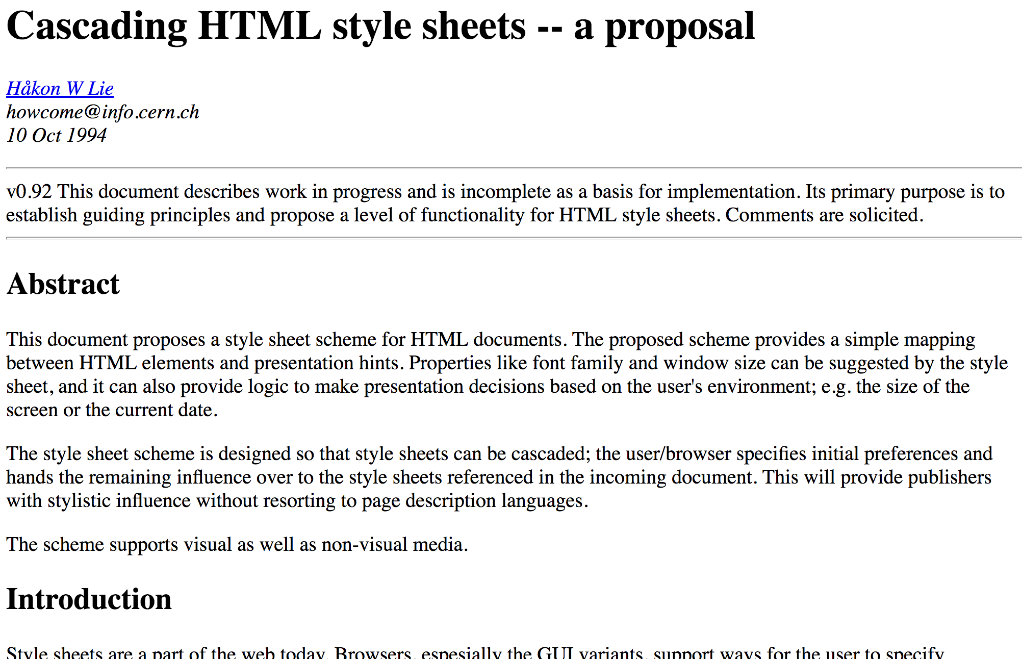 Screenshot of the proposal for Cascading HTML Style Sheets
Simplicity was a core design principle
From the early mailing lists and the proposal of Cascading HTML Style Sheets to Håkon Wium Lie’s PhD thesis about stylesheets, which reads as a detailed account of CSS’s genesis: there is quite a bit of information on the web about how CSS was designed. Keeping it simple was a core principle. It continued to be — from the early days and the first implementations in the late nineties until current developments now.
Authors can specify as much or little as they want
CSS authors can use the language to just set a font and line height for a document and leave it at that, or they can completely change the appearance of it. The cascade ensures this: even if no rules are applied by the CSS author, there is still the browser stylesheet or even user stylesheet to provide hints as to what the page should look like. Yes, the cascade is a principle that provides simplicity, not complexity.
It is not a programming language by design
CSS is a declarative language on purpose. It could have been a Turing-complete programming language, which would have been more powerful, but bad for simplicity: difficult to read and expensive to maintain. As Bert Bos mentioned in the session: ‘we wanted it to be so simple that everyone would be able to use it’.
They are agnostic as to which medium they are used for
From the early days, CSS has had @media constraints, so that authors could write different CSS rules for media like print and screen. All optional; if not specified, the rules would apply to all. They came up with ways to specify which medium some style rules are for, but most importantly, they thought about the applicability of the language outside the medium they were looking at then.
It is stream-based
Browsers can do progressive rendering, which means they show the document incrementally, while it is still downloading. It was important for CSS not to break that principle, which is the reason CSS is “stream-based” (as opposed to being a transformation language, which would allow more features, but also increase complexity).
To summarise: CSS itself was kept simple, and it was designed to support unknown as well as existing stuff (and to not break that). It is non-intrusive, which I think is a characteristic that is hard to find in complex systems.
What has changed since?
So, let’s look at what makes modern CSS complicated. With modern, I mean after the late nineties. I think there are a couple of things.
Websites have become more than documents
CSS was made to style documents. At the time, they were things like a long Word document — think academic papers, reports and the like. Early CSS features aided those kind of documents: there was generated chapter and section numbering, ability to style the first line and page margins.
Although we still call web pages documents, (I mean, who doesn’t document.querySelectorAll ?), they are often more than that. We now have loads more websites where you do stuff, rather than just read things: from transferring money to booking travel.
Tooling
I think hardly anyone still writes CSS by hand, I mean, in a .css file. I do it on some sites that I run myself, but it’s been a long time since I’ve seen it in my client’s codebases.
Often, the reason is that CSS is written per component, with different files, and tooling is used to combine them into one file (@import would be too many HTTP requests). Other reasons are variables and mixins that are used with the goal of DRYer code (the latter, I think, can be quite problematic).
Graphic design for the web professionalised
Early web pages often hadn’t a dedicated or professional designer. Most modern websites do. There are specialised teams caring in detail for branding and user experience, and this demands a careful approach to writing CSS. Front-end development teams adjusted their practice, they sometimes agree upon a systematic approach to classnames. They often prefix classnames with the project name (for this site, I could start all classnames with hv-). Some companies distinguish between objects and utilities and prefix those (hv-o-thing, hv-u-thing). Also, they have agreed on mostly using classnames as selectors, not IDs or tags. Attribute selectors are controversial in some companies (I personally love them).
Control over content and markup
CSS has always been able to work on unknown markup, but things have gotten more complicated in the sense that more content is now user generated, content changes faster (i.e. on news websites) and more markup has been abstracted by powerful and complex CMSes.
Component based architecture
Lots of companies have switched to a component-based approach, where they design and build components that can then be put together in whichever way they see fit. For CSS, this means that elements can be inside different parts of the DOM tree. This is why many CSS authors that work on component libraries choose to create different ‘scopes’ (in classnames, with something like BEM).
Although things have changed, the basic idea is still that values/properties apply to things, and as an author, that’s the only thing you need to worry about. You don’t have to have build steps and you still don’t have to specify how styling, including complex grids, should be computed. You don’t even have to specify what everything looks like, as there are defaults and your own settings cascade. However, if you want to have build steps or have more fine-grained control, you can! Houdini will provide the latter, while keeping the basic ideas of CSS, like the cascade and media constraints, for you to use.
I think lots has changed since the early nineties, but not really things that touch on how we apply CSS to structured markup.
Today
Most of the early-day thinking about CSS still applies today (and is still very much there in more recent additions to CSS specs). That is kind of amazing to me, because it is over 20 years old. In the world history, that does not seem like much. But looking at what kind of devices and browsers existed then, it is quite astonishing.
I like to believe that the simplicity of CSS as a language is one of the reasons that it still works so well. Efforts to componentise CSS (to get programmatic scope) and bring CSS into JS can bring huge benefits and make things more manageable. But they definitely also increase complexity. Increasing complexity is a choice, and in the early days, the web community chose simplicity over complexity. They had good reasons for that choice, and it is a choice that has served many for over 20 years.
Modern websites are different and so are our coding practices, but in the grand scheme of things, not a lot has changed. If we are to willingly increase complexity of our CSS code with shiny new tools, that’s fine, and CSS is quite suitable to build tooling on top of. But, we should have good reasons for introducing complexity (and definitely read more about CSS’s making of).
Originally posted as Did CSS get more complicated since the late nineties? on Hidde's blog.