Reading List
The most recent articles from a list of feeds I subscribe to.
On recruiting for specific technologies
I recently had a conversation with a recruiter that went more or less like this:
- He: Are you available for a project?
- Me: What kind of project?
- He: I have one React project and one Angular project
In my head, I have trouble classifying projects in terms of the specific front-end frameworks that power them. We’re using technology, sure, but what are we using it for?
My ideal client knows the answer to the latter question and leaves implementation mainly to the team. The longer I’ve worked as a front-end developer, the more I’ve realised that specific technologies don’t matter that much, especially in projects that run for more than a couple of months.
Anyone can learn how to operate a gearbox or figure out how to reverse in a specific type of car. But where are we driving to? Ok, silly metaphor, but hopefully it gets my point across. We’re putting stuff on the people’s screens. It’s mostly about what and making stuff that matters, but those are (mostly) not front-end things.
Front-end wise, I think these things are probably key:
- are we making a fast website, i.e. do we optimise assets and avoid sending unnecessary bytes to the client?
- are we making a usable website, i.e. have we provided ease of use, rather than confronting our users with problems resulting from our complex business logic?
- are we making a website that doesn’t exclude people, i.e. do we have all users in mind when hiding and showing content and is our interface keyboard accessible?
I don’t want to be all millennial and display overly unrealistic idealism, but these things seem quite basic to me. Why strive for less? Of course, in actual interviews, it would be interesting to gloss over technologies to use to reach those goals, but I can’t see how filtering for them works as a recruitment strategy.
In order to find good people to solve your development problems, problem-solving and people skills are probably going to help much more than previous experience with specific tricks of the trade.
Originally posted as On recruiting for specific technologies on Hidde's blog.
Brique: a conference about challenging reality
This week I attended Brique, a design conference by the lovely people of Fabrique in Rotterdam’s Kunsthal. It felt like a Dutch dConstruct for designers, like Creative Mornings meets This Happened. I had a great day!
The programme was extremely well-curated, with a great variety of talks, but an overlapping theme as well. Every talk approached the subject of reality. Some were about how to experience it, through inquiry, investigative journalism or photography. Others talked about how to shape reality to tell a story, with animation, graphs, VR or even classic cars. And then there were talks about how to change reality for the greater good, to decrease income gaps and make solar power work.
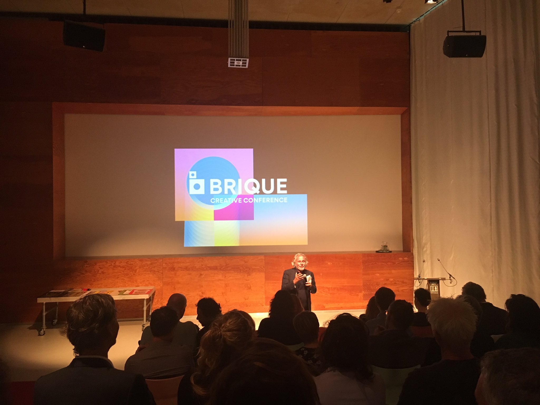 Photo credit: Fabrique on Twitter (original)
Stop motion filmmaker Rogier Wieland showed some of his work and the process it involves. He makes animation films, mostly with stop motion. The attention to detail was nothing more than impressive, and it shows in the result. It did seem like a lot of work, but lots of fun too (see also the photos on their website.
Philosopher Bas Haring talked about the daily life curiosity that brings him so much: when he encounters something he just does not understand, he investigates the thing. Whether it is the history of the Panama Channel, the economy or why someone would claim that homosexuality is not natural. This attitude of inquiry often brings him to more questions and answers. Interestingly, it also inspired him to write multiple popular philosophy books.
Jeffre Jackson explained that asking ‘seriously?’ is his “standard mode”. Reality isn’t always what it seems, he said, and part of why is that we don’t know everything. We need to inquire, ask questions and realise we don’t know everything. Withhold judgment, he advised. Throughout his talk, he referenced the humanist Michel de Montaigne, whom he said “would have loved the web”. Great stuff! Still in doubt whether I should get Montaigne’s essays.
Ionica Smeets, mathematician and professor in explaining scientific research to the world. She talked about the fascinating subject of a language used by experts talking to non-experts. She explained that one way to make sure your word usage is accessible is to ask the people you talk to for a summary of what you’ve just said. It might appear they misunderstood. Or filled in blanks wrongly. She also showed how graphs can be extremely misleading, and how some use them to tell stories their way.
Storyteller Steye Hallema did the first VR talk that overwhelmed me, mostly because of the meaningful examples. I had seen VR talks at tech conferences before, Steye’s talk had a different angle: he talked about what kind of stories can be told with VR and how. VR, he said, is a bit like extracting consciousness from your brain and passing it around the room. He showed us how VR was applied to swap genders, make a music video, and experience a peep show. VR is hard, he said, from which I concluded: only use it when it improves how the story is told. He showed many examples where VR adds a new level and lets the public experience stories in ways that aren’t possible in traditional film.
Lawyer Aernoud Bourdrez enlightened us about conflict resolution. He talked about Shapiro’s five emotional aspects: appreciation, affiliation, autonomy, status and role, and ensuring to cover them all in every negotiation move. He also showed how to use this to obtain art, with some entertaining examples, such as how he managed to get the original x-rays of a car that is stuck in the Jackass’ Ryan Dunn’s buttocks.
Martijn Kieft of tv programme Tegenlicht told us how his tv programme looks at things that aren’t typically in the news, but have a huge impact with how they shape the world. Some of these things are very abstract, such as the process of creating money or negotiating for disinvestment in companies that harm the earth. For something to make the news, it requires images, but one needs creativity to find imagery if your subject is an abstract process.
Architect Kristian Koreman talked about how his team challenge reality with the projects they do. They don’t always do projects because clients ask for them, they sometimes give unsolicited advice. I like the idea of that. He showed how they helped the city of New York with a project around gentrification – quite a problem here, but a much bigger problem there. They studied differences between poor and rich and tried to come up with ways to challenge that reality.
Photographer Otto Snoek talked about his Europa project: he left his home city of Rotterdam to travel Europe and photograph people there. With his photos rotating in the background, he shared his thoughts about photography, Rotterdam and the world, and read three short stories.
Closing the day was the technologist, designer and philosopher Koert van Mensvoort. He showed some product designs to make us think about the future of our society: new technological possibilities arise, but are we comfortable with what can be achieved? He showed us the ‘speculative products’ he developed to start a discussion, and different kinds of in vitro meat products, some real and some imagined. He also talked about what ‘nature’ is, and argued the traditional definition should be widened to include hard to control human-made systems (such as financial markets and the internet). And that we should have the ambition for technology to become part of our nature, rather than just to the job they were invented for. More about how technology becomes part of nature in this TED Talk Koert gave.
Originally posted as Brique: a conference about challenging reality on Hidde's blog.
ICONS: work on stuff that matters
This morning I attended ICONS, an event to kickstart the new term of Communication and Multimedia Design, which is a course given in Amsterdam. The event was for students, but they invited others to tag along. So I did. Three speakers shared their views on what I can only paraphrase as: to do something that matters.
Marrije Schaake (eend) explained how not to lose your job in digital to robots. Robots will find it most challenging to take over jobs that require creativity, humanity and leadership. So, a good way to keep your job is to focus on making digital products more human. One needs human skills for that. One needs empathy: the skill to put yourself in someone else’s shoes. So that you can solve their problem. The good thing, Marrije told us, is that we can train our empathy skills: you can interview people to find out about their problems and study them in their natural habitat (like the practice of ethology). Find out what it is they want to do, what impediments they have and what they would not want to happen. This way, it gets easier to find real solutions to solve real problems. Problems that matter.
Johan Huijkman (Q42) talked about digital accessibility. He showed lots of examples of actual users that benefit from accessibility optimisations. And he explained that those users are everywhere and that they could be you (now or at an older age). He demonstrated how important it is to do the basics (according to Derek Featherstone, 80% of accessibility issues can be resolved by keyboard testing and proper markup), to work together, to test with real users and to keep things straightforward and usable (to avoid cognitive overload). By designing inclusively, we can make our digital products matter for people.
The multi-award-winning Astrid Poot (Familie van Fonk) taught us how to be successful, and showed the students that the common cliches about being successful as a digital creative person make no sense at all. You don’t need to be a man, overly rational, extremely confident, focused, disruptive or good looking to be extremely successful. Being professional is about other things, do something that matters. Why launch a new brand of tonic water if you can help children visit art museums or prepare for going to the hospital?
This idea of making stuff that matters is something I have been thinking about for a while. So many good designers and developers work on products that solve problems of big corporations, not of society. I don’t have much against big corporations, we probably need them, but using technology to improve people’s lives seems like the best way to spend our time. Whether that’s for a government or some big corporation, or with a trendy design or fancy framework, those questions are secondary, I think.
What a cool event, and what a great way for CMD students to start their year! I hope they were as inspired as I was, and employ the critical intuitions during their term.
Originally posted as ICONS: work on stuff that matters on Hidde's blog.
Accessibility Design Drive
Last week, for roughly one hour each day, I participated in the Accessibility Design Drive, organised by Stanford University and Mozilla to make Firefox more inclusive by collaborating in diverse teams. It was a fun thing to be part of, and great to learn from others!
The people who joined this were a very varied bunch, over 100 in total. There were lots of people from the States and India, but also a number from Europe and elsewhere. Some had impairments, some were accessibility practitioners and some were both. A lot of students joined, too!
They grouped us into teams by time zone, and during the week, some of us were moved around to other teams, so that we could meet and work with more different people. We were working in a decentralised design process, with as its goal the inclusion of more perspectives in the design process.
Time-wise it was challenging. Many of us, myself included, had to squeeze the time into our after work hours, and the one hour wasn’t always enough.
What did we do?
Identify roadblocks
On the first day, we got some links for reading and got to know our fellow team members. The first team exercise was to figure out what kind of roadblocks each of us (or people close to use) experienced when accessing the web.
I read How people with disabilities use the web for inspiration.
Find patterns
The day after, our team had become slightly bigger by this point, we were asked to identify patterns from our observations from the day before.
Think of solutions
The third day, I was moved to another team by now, was all about thinking what we could do about the problems we had identified. And mainly, how could something in Firefox help solve the problems. So the question, really, would be: ‘what can a browser to improve accessibility?’
I found it difficult to come up with many solutions and decided to ask some friends, as well as Twitter:
If you could add a feature to a browser to improve accessibility to the web for people, what would it be? #a11y
Lots of great responses came in, a couple I liked in particular:
- auto fix color accessibility issues (Bob)
- allow for styling of form elements like radio buttons, checkboxes and selects (Karl and Anneke)
- make it easy and obvious for users to change the appearance of a site to personal preferences (Alistair)
Prototype
On the fourth day, we were asked to choose three ideas and turn them into a storyboard, which, I learned, is an unpolished visual representation of how an interface idea could work in the real world. We started by describing the approach in steps, as a sequence of actions.
Test
The fifth and last day was all about testing. We were asked to communicate our thoughts to someone from their target audience, ask them about their thoughts, learn from this and then refine. In our team, this was the day we failed to do the main thing and did not test with users because we were time constrained. We did work on fine tuning the descriptions of our most important ideas.
Problems that browsers could solve
I’m a lazy front-end developer and happy with anything I don’t need to build myself. I’ll gladly leave things to the browser. Browsers are much better than I could ever be at interoperability, ensuring keyboard access and providing information to platform accessibility APIs. Over the past week, I realised there are even more things the browsers could improve for users regarding accessibility.
One thing I noticed in the discussions we had in our team, is that some accessibility issues follow from poor decision making by people who make websites. Browsers could theoretically resolve many of those. Examples: too little color contrast (browser could autocorrect), removal of focus outlines (browser could let the user override) and too much motion (the latter has been resolved with a media query for reduced motion).
Problems people have with forms could be solved by browsers, too. What if they provided native methods to style form elements like select and radio/checkbox inputs? Developers currently resort to non-native ways, which are not necessarily the most accessible, hence making forms harder to use for some users.
The above suggestions may be nothing more than public daydreaming, but I think it’s awesome that browser makers like Mozilla are so serious about accessibility. I am looking forward to seeing some feature ideas from this Accessibility Design Sprint make it into Firefox.
Originally posted as Accessibility Design Drive on Hidde's blog.
Small steps
Last Friday, De Volkskrant exposed how much trouble the Dutch tax office has had in recent years to build software and manage its IT projects. Below I’ve listed the four main things they lack according to the article.
The responsible State Secretary, Eric Wiebes, admitted publicly that IT is “the tax office’s Achilles’ heel”. The report goes into the tax office’s 600 plus (!) IT systems and the estimated 750 million euros of tax that isn’t collected due to outdated technology. That is just sad!
They based some of the story on internal review documents, and interviewed a contractor, who gave details of a number of things many developers will recognise as serious red flags.
So, what did they lack, what should they have done differently? I thought I’d summarise some findings on this blog. Note that these might come across as common sense if you work for a fairly modern digital company.
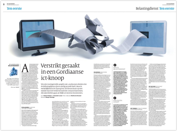 The article in De Volkskrant, 18 August 2017
Take small steps
Some managers at the Tax Office preferred a rather traditional way of working: to build a fully featured product at once. All or nothing.
The alternative to this approach is to build a simple, minimum viable product first and then extend that with relatively small features when and if they are needed. It is the de facto standard for software development and what all modern, successful companies do in some way or another.
There is a difference in the two approaches from a management point of view: the modern approach requires active involvement, decision making and taking responsibility. When new stuff is added feature by feature, someone, whether it be a project manager or product owner, needs to know what the features are and take bold decisions about priorities. It also takes honesty and putting yourself in a vulnerable position: you’re sharing your work more often and give people the chance to comment. For the greater good!
Distribute responsibilities
The article also gives details of how management repeatedly made uninformed decisions. Tax Office managers ‘made decisions about IT without any technical insight’, which lead to non-vulnerable systems being replaced unnecessarily, and critically vulnerable systems being left without a replacement. ‘Often, the directors didn’t know for which part of the new technology they were responsible’, an external auditor said. Another issue is that no one seemed to know what systems were for and how they were supposed to save money.
In big IT projects, I think it is not inherently bad if management is not aware of all the technicalities involved. This stuff can easily get complex. It’s not uncommon in technical meetings that a majority of the room does not understand what is being discussed (sadly, this really happens). Because of that, people can say nothing and make it sound like something. Given all that, management, if not technically inclined themselves, should have themselves informed by other people who understand the full, technical picture.
Test early, test often
Software wasn’t regularly tested with reality (as in: the IT reality wasn’t checked with the real world reality). There was hardly any contact between the developers and the case workers that were the intended audience for the software. Nobody kept an eye on whether the systems being built did what they thought they would do.
As an organisation that produces software, if you don’t regularly test your stuff for bugs, with users, for accessibility, for security or with reality… you are just being overly confident — delusional, perhaps. Pride goes before destruction, and haughtiness before a fall. Software needs to be tested, and this needs to be done as early and often as possible. This is to verify that stuff does what it should do, and also that stuff still does what it used to do.
Work together
Another thing the article goes into is that the more traditional members of the team were less prone to come into work, they worked from home most days, some came in only once every fortnight, for meetings. From an employee point of view, this might sound like a fantastic benefits package. But to be fair, if it leads to bad software that you are partly responsible for, I’m not so sure I would go for it.
Communication (with team members, with management, with clients) is arguably the most important skill in modern software development. This is not impossible when working from home, with the right A/V and good internet speed you can do your dailies from a distance. However, especially in large and complex organisations, it is essential to be on site regularly, to make it easy to verify assumptions.
Conclusion
The above principles are extremely common in almost all modern and mature digital organisations. Companies like Amazon, Google and my bank seem to effortlessly produce interfaces that are easy to use, have few bugs and are able to disrupt people’s lives in a way that is often so positive. I think aspects like taking small steps, distributing responsibilities, testing early and working together help these companies to have success.
The Dutch Tax Office has a long way to go, but I am really hoping it will manage to shift into this direction, too. In the meantime, I try to be vigilant of the above symptoms when they occur at the projects I work on. I am also curious to hear if you have worked in any organisations that had problems like these, and if so, how you tried to solve them.
Originally posted as Small steps on Hidde's blog.