Reading List
The most recent articles from a list of feeds I subscribe to.
aria-expanded does not require a fallback
When building a control that toggles content in a web app, we can use aria-expanded to let the control know whether the content is shown or hidden. Expanded or not expanded. In assistive technologies (AT) that support this attribute, AT users can figure out whether the element was expanded.
The other day, a website I worked on was audited for accessibility compliance. The auditor suggested we would add a fallback for aria-expanded, so that it would work for more users. After some discussion back and forth, we decided against this and went with no fallback.
For those who don’t know the attribute, aria-expanded is an attribute you can put on a button that toggles content. When toggling the content, you update the attribute to be true of false. This lets browsers, accessibility APIs, platform APIs and ultimately your end users know that the thing is now open or closed. It is the mechanism that powers the details element in HTML, but you can also use it on your own controls, for example a hamburger menu or in a questions and answers sections.
Providing a fallback
For users of AT that does not support the aria-expanded, a fallback can be implemented. One way to do this is to simply add visually hidden text that conveys the control’s state:
<span class="visually-hidden">
 (expanded)</span>
I would not recommend this. Yes, if we add this text like this to the control, it will get conveyed to users of AT. With it, potentially more users can use and understand the control. However, it might cause more problems than it solves.
No fallback
These are some reasons not to provide a fallback for aria-expanded.
A string that needs maintenance
There is now a string of text that needs to be maintained. It sits in your markup, it requires time to explain to new team members and you’ll have to decide whether you want it managed by a CMS.
Non-standard text
If you add this text yourself, you or your colleagues may end up picking different text across the site. Or text that is different from what users hear on other sites that have expandable elements in them. And if someone new starts on the team, they may not understand what this is and can’t look it up in a spec, as it is not standard.
No automagic localisation
Screenreaders that support aria-expanded, will read out the status of the control: when it is collapsed, it says ‘collapsed’, when it is expanded, it says ‘expanded’. This is if your screenreader speaks English. If it speaks Dutch, it adapts and will say ‘ingeklapt’ or ‘uitgeklapt’, respectively. It’s up to the screenreader and its settings what it says, but we can be sure it will be consistent and free of maintenance.
Redundant for most users
Users that use AT with aria-expanded support, will hear the status twice. Ok, this can be mitigated by using hidden text instead of the attribute, but then the other points still stand.
So what is AT support like?
The question this might leave you with: what is AT support for aria-expanded like? It is well supported across platforms, and works in screenreaders like JAWS, NVDA, VoiceOver and Narrator. This means a fallback would leave most AT users to hear the status twice, to solve a problem for very few.
So, in conclusion: it is now best to use aria-expanded without fallbacks.
Originally posted as aria-expanded does not require a fallback on Hidde's blog.
Making password managers play ball with your login form
Secure passwords are long and unique. Therefore, remembering them all is impossible for most human beings. Hence the popularity of password managers. If you’re building a login form, these are some tips to improve the experience for password manager users.
With ‘playing ball’ in this post, I mean that password managers recognise your login form and let you use their features on your fields. Things like password generation, offering to save credentials for a host name and filling in the password for you in a secure way. Ideally, password managers work in both of these cases: on first time visit (when they offer to store credentials) and on recurring visits (when they let you use stored credentials).
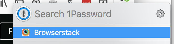 1Password recognises it has a pair of credentials for this site
Password managers come with all sorts of heuristics to detect username and password fields. Yet, they sometimes still fail to recognise them. For this reason, Firefox’s password manager complements its heuristics with a recipe system, where users can describe specific instructions for specific hosts. I believe some password managers have hard-coded field recognition for popular websites in order to make them work.
You might think, isn’t recognising my fields the job of a password manager? Isn’t this their problem? I have good news. Mostly, yes. Password managers are built to work with all login forms that follow best practices. Doing nothing special is an option. It will often give you a form that performs well across password managers. But if things don’t play out, this post may contain some pointers to look at.
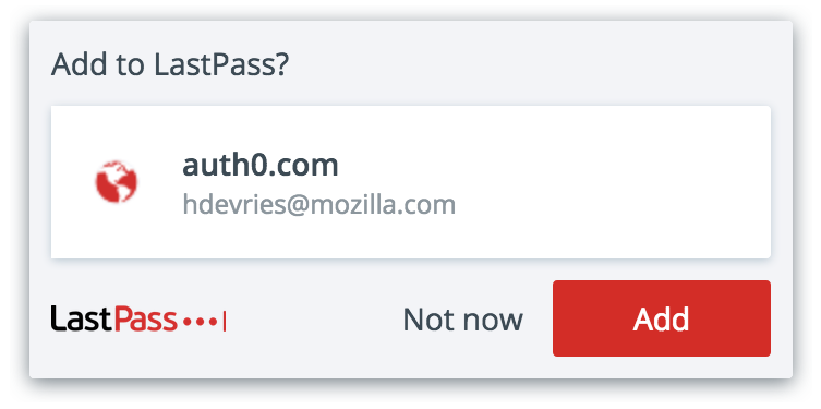 Last Pass playing ball
Security considerations
Password managers that automatically fill in credentials can be prone to coffeeshop hacker attacks (over HTTP) , as shown by Silver, Jana et al in their paper Password Managers: Attacks and Defenses (pdf). They also provided a number of measures that password managers can take to prevent this, including only allowing filling in passwords after user interaction.
There is also a risk of leaking password information to third party scripts. The article explains actions against this include having the login form on a separate domain, ad blockers, and disabling autofilling altogether (as Safari will do by default). At the same time, more transparency could be provided with browser warnings or permission requests before autofilling.
Use standard HTML form practices
Make sure your form fields are in a <form> element that has an action and a method attribute defined on it.
Another think to look for, is that input elements are associated with a label through their ID (with for) or by being wrapped in one.
Using the right input type can also help: type="text" or type="email" for the username / email address, and type="password" for the password.
The autocomplete attribute
The autocomplete attribute on your username and password inputs can help password managers or browsers figure out what your fields are for. Actual autocompleting, as mentioned above, could be a security risk, if it is done by password managers on page load, rather than after user interaction, or if it happens on pages where protocol or host name are off.
Major browsers ignore autocomplete=”off”, some do this specifically for username and password fields, as they deem it more secure than users using very easy-to-remember passwords.
Google recommend using autocomplete attributes, and their advantages also appear in the spec (yes, there’s a spec!):
The
autocompleteattribute offers a declarative mechanism by which websites can work with user agents to improve the latter’s ability to detect and fill sign-in forms by marking specific fields as “username” or “password”, and user agents implement a wide variety of detection heuristics to work with websites which haven’t taken the time to provide this detail in markup.
(Source: Credential Management spec)
For usernames
For the username field, you can add autocomplete="username".
For passwords
For new passwords, for example during account creation or in a password reset process, it’s autocomplete="new-password". For current passwords, for example in a login form, it’s autocomplete="current-password".
No funny stuff
Both 1Password and LastPass have various recommendations related to unexpected behaviour. Well-built login screens:
- try to stay away from dynamically adding and removing fields
- don’t regularly change names or IDs (or, worse, populate them dynamically)
- have the form on the page on first render from the server
- avoid
method=GETand XHR requests for logging in (it can work, but it is harder) - use the
placeholderattribute as it is intended - steer clear from mimicking a password field with a regular field so that you can do things like showing the last character
The message here is: keep it as simple as you can. This helps both users and password managers.
Multi-page login forms
Multi-page login forms can make sense, for example if there are different login options based on the type of user. With this kind of login pages, some password managers, including LastPass, may not play ball. I’ve found that LastPass will not work on first time visits, when your password field is hidden or in a hidden element (more on the hidden attribute). In others, including 1Password and the built-in managers of Chrome and Firefox, this problem does not exist.
In my situation, ‘pages’ were just divs on the same page, with only one of them not hidden. That caused LastPass to not do its first time visits thing. I consider this a bug in LastPass, or overly enthusiastic heuristics at the very least. I found out that if I used something like opacity: 0; it did not fail. This would cause a weird user experience, as opacity only visually hides elements, leaving them available to access by keyboard or Assistive Technologies (AT). Sometimes, and in this case, accessibility is about making something inaccessible to all, at the same time (i.e. when temporary hiding certain screens in a flow).
What I ended up going for is this: I used data-hidden instead of hidden, with CSS that only visually hides. In addition, I added the inert attribute (and its polyfill, as it has no browser support), to make sure the elements are not only invisible, they are also unavailable to use (until they should). Unavailable not only visually, but also for keyboard and AT users. It’s hacky, but it did circumvent LastPass’ bug.
Conclusion
Password managers are essential to secure internet usage, so making our login fields work with them is extremely important. This will mostly happen automatically if you follow best practices. The autocomplete attribute can make it easier for password managers to recognise your fields. Using hidden attributes can make password managers fail altogether. This can be hacked around, but I do not recommend doing so, unless absolutely necessary.
Many thanks Job, Krijn, Mathias and Henrik for suggestions and feedback
Originally posted as Making password managers play ball with your login form on Hidde's blog.
My ideal newspaper app is not very smart
For about 6 years, I have mostly stopped reading my daily paper physically, unless sipping lattes in a coffee shop. I used its app instead. In those years, they released various updates, and these updates got me thinking about what I want from a newspaper app.
My app-based news consumption was somewhat of a necessity. I was abroad and kiosks abroad very rarely sell Dutch dailies. I’ve since really come to like reading digitally, and it also saves paper and sending screenshots to friends is useful.
My ideal
Ideally, the app just downloads a PDF and lets me browse through that page by page. A screen that has all pages would be useful, too, so that it is easy to jump to that one cartoon that I know will be on the last page. Yup, that doesn’t contain links and isn’t easily updated, and it doesn’t peruse some of the unique features of the web platform. It’s boring, simple and not very smart. To read articles you even need to zoom in, as the text is not HTML, it’s not responsive, it’s literally a PDF (it does contain plain text for users who need or prefer this).
Two things I like about the PDF-style newspaper reader: first, it looks like the newspaper everyone else buys from the kiosk, second, this formatting is the one a editing team of smart people have chosen over the course of their night. Up until moments before the thing really needs to go to press, they can still tweak things. After that time, that’s it: the paper of that day.
The good thing about producing one paper a day rather than a continuous stream of news is that the daily deadline forces decisions about what’s most important. Even if that means the occassional ‘when this went to press, we only knew 80% of the election results’. I can live with that. It is good for my sanity to take in one thing a day rather than continuous streams of news.
I like artificial intelligence, but for some things human judgment clearly wins. Let alghorithms calculate my fastest route to work or what the best way is to distribute food droppings in a war zone. For news, I think intentional prioritisation and placement in the page are best left to humans.
Their innovations
Two things De Persgroep have added to their Volkskrant app:
- ads that take over the whole screen
- animated page switch
I probably don’t need to explain what’s underwhelming about the addition of ads. This doesn’t belong here.
An animated page switch is cool, it keeps the interface fresh, but my tablet is too old to do the animation, causing it to freeze for a few seconds halfway an animation.
Both the ads and the animation slowed down the app considerably. This meant that, over the years, my digital paper became harder to read. That is remarkable for what is essentially a PDF reader.
What I’m not looking forward to
What I’m mostly concerned about is that my news will be displayed like it is on the newspaper’s website. This is great when one wants to see the latest news at a glance, but, with the bath water, it would throw away the daily carefuly curated prioritisation that news physical papers offer.
With CSS Grid Layout, the kind of layouts that are mostly unique to newspapers, are now possible in browsers. But until the process of filling a web based newspaper grid becomes a process similar to filling the physical paper with content, and I think having one daily thing that doesn’t change (much; small updates could be useful), I’m hoping the PDF-viewer version will stay on offer. Otherwise I would likely switch back to paper.
Originally posted as My ideal newspaper app is not very smart on Hidde's blog.
Form events when submitting with keyboard
The other day I was building a form, and I was surprised how event firing works when you press ENTER on the keyboard.
When you’re on a form field in most browsers, pressing ENTER on the keyboard triggers the browser to submit the form. This is called implicit submission (thanks Tim). I suspected pressing ENTER would cause a submit event to be fired on the form, but it is more nuanced than that.
‘ENTER’ submits the form, even if it contains no submit button. If the form does contain one or more submit buttons:
- pressing
ENTERresults in aclickevent on the submit button of the form - when the submit button is clicked, it submits the form, which triggers a
submitevent on the form
In the above, “the submit button” is the first submit button that exists in your form, the HTML spec calls this the form’s default button.
What surprised me, is that functions that listen to the click event on your default button, run before the form’s submit event is fired. Running event.preventDefault() on the form’s submit event will not stop that click handler from running (thanks Matijs for helping me figure this out).
Originally posted as Form events when submitting with keyboard on Hidde's blog.
2017 in review
Inspired by Nienke, I’d like to share some of my highlights and learnings of 2017.
Highlights
Projects
2017 was the first full year working via my Dutch company, after I had hiddedevries.nl Limited struck off the English companies registry as part of my personal Brexit. The Dutch company was there since January 2007. It’s been over ten years now, but it feels so much shorter.
This year, I really, really wanted to focus on work with social impact (in government, culture or non-profit). How millennial! But really. In a world that is more and more powered by technology, choosing what kind of technology to work on and which people benefit from that technology seemed super important. This was not easy per se. If I’m honest, as a contractor, the kind of work I can do largely depends on what kind of projects I am approached for. Recruiters usually laughed when I mentioned my preference. But I feel it would be sad if all the bright minds of our industry helped some webshop create a better checkout flow and sell more tvs, if we could have helped citizens get the support they need. I tried being proactive, but luck and chance were probably as important. Anyway, I got to do some pretty impactful projects this year.
- At Wigo4IT I worked on a web page where people can apply for income support from their local government (for the cities of Amsterdam, Rotterdam, Utrecht and The Hague)
- At Logius I worked on a website where Dutch governmental organisations can generate an accessibility statement
- At KOOP I worked on the redesign of various data-heavy websites, like overheid.nl and wetten.nl
- For Web Conferences Amsterdam, I worked on visual design for the CSS Day and PhoneGap Day EU conferences (building upon Stephen’s designs)
- I made various small changes to websites of Xander Publishers, Trio42, Stichting Piet de Vries and others
- I joined Mozilla’s Open Innovation team as a contractor, and my contract was extended until far into 2018
Conferences and events
I have attended a couple of conferences this year:
- CSS Day, which this year was a two day event about CSS and Browser APIs (write-up)
- PhoneGap Day EU
- Brique, a design conference by Fabrique
- Patterns Day, about pattern libraries (write-up)
- Fronteers 2017, its tenth edition and the first where I had no responsibilities whatsoever, great catching up with people
- the year opening of Communication & Multimedia Design in Amsterdam, which I thought had a ‘work on stuff that matters’ theme to it (write-up)
- Web Accessibility Live (which has no website, but it was great to see Job and Bruce speak)
Speaking
This year I also stepped out of my comfort zone and did my first public speaking, thanks to Niels and Léonie for encouraging me.
- I talked about hiding content (slides) and the basics of accessibility (slides, video), at meetups.
- At Fronteers Jam Session, I did an even shorter version of my talk about hiding content
- At Inclusive Design 24, I spoke about the argument for accessibility from philosophical ethics (slides, video)
- For Fronteers, I hosted two workshops about CSS Layout, which, to my own surprise, sold out. It’s awesome to see so many people excited about new lay-out techniques
Also to my own surprise, I thoroughly enjoyed preparing and giving talks. So much, that I would love to do more in 2018. Nothing much planned so far, but the CSS Layout workshop is running again and there may be another workshop in the first half of 2018.
Writing
On this blog I published 32 posts, some longer than others, some more interesting than others. There were also many posts that did not make it past the Draft stage, I guess that will always be the case. Writing can take up a lot of time, but I can recommend it to everyone working in the web field. It helps understand stuff better, can expose what you don’t know yet and also just to align thoughts.
These are some of the most read:
- Did CSS become more complicated since the late nineties?
- This website now uses Grid Layout
- How to make inline error messages accessible
- Accessibly labelling interactive elements
- On hiding content
Volunteering
On April 1st this year I stopped volunteering at Fronteers, after over 8 years. It’s been a lot of fun and I learned a lot, yet it felt very good to step down.
The decision has given me a lot of free time, which was good. But I couldn’t really help myself and did organise a small event with Sharon: a film screening of Hanzi the movie, its European premiere. Responses were great, some people even suggested we could do a monthly design documentary meetup in Rotterdam. That would be very cool.
Things I learned
Finally, some random things I learned:
- In two projects I was involved in we had official WCAG 2.0 audits, it was great to get feedback on our accessibility efforts. Before the auditor came I had done all I could to be 100% compliant, but they found several issues anyway, most of which we were able to resolve, others we could use as leverage to convince people of different prioritisation. Because accessibility is, as many things, team work.
- I presented a couple of sprint review demos. It was fun to try and explain our technical projects to an audience with various less technical people in it. I learned to switch quickly between more and less technical narratives.
- Remote working can be tiresome, especially working across time zones. I’ve had to force myself to do some non work things in my days to balance stuff out. Knowing when to ignore notifications late at night is acceptable and also key.
- I wrote a lot of vanilla JavaScript, I owe a lot this year’s progress to Matijs, his patience is A+
- Learned loads about how big organisations manage projects and how to be political about getting accessibility to be a priority. For example: be nothing but positive and constructive in meetings (this is a skill I’ve had to get much better at). I owe a lot of this year’s progress in that part of work to Jeroen. who is very good at this stuff
- It’s been good to plan for holidays. However much it might seem like they’re not necessary, they absolutely are.
Some resolutions for the next year:
- More reading of books and newspapers, less looking at my phone
- More public speaking if I can
- Better time management
- Help other people get started with a personal blog like this one (get in touch if you need proofreading/advice)
I am looking forward to 2018. Happy new year!
Originally posted as 2017 in review on Hidde's blog.