Reading List
The most recent articles from a list of feeds I subscribe to.
More accessible markup with display: contents
CSS Grid Layout lets you turn an element into a grid, and place the element’s direct children onto it. Given that, it might be tempting to use flatter markup, but less meaning is usually less accessibility. With display: contents, we can place grand children on a grid, which lets us have accessible markup and beautiful layout. Let’s dive into the details!
Below, I will explain in more detail what I mean by children and grand children, and then show how we can use display: contents to improve this. Note: this caused an accessibility bug in all major browser engines, which has been addressed partially in all major engines since May 2022, with open issues, see below for details
Grid works on direct children
In Grid Layout, when a grid is defined on a given element, only direct children of that element become grid items and are layed out on it. To refresh for those not familiar with the syntax, let’s look at an example and write a recipe. With this HTML:
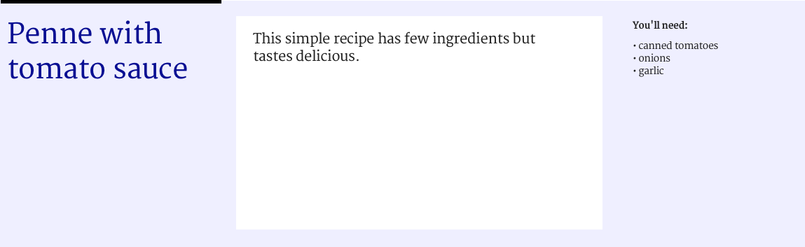
<div class="container">
  <h1 class="item">Penne with tomato sauce</h1>
  <p class="item">This simple recipe has few ingredients but tastes delicious.</p>
  <div class="item ingredients">
    <h2>You'll need</h2>
    <ul>
      <li>canned tomatoes</li>
      <li>onions</li>
      <li>garlic</li>
    </ul>
  </div>
</div>
we can have this CSS:
.container {
  display: grid; /* element is now a grid container */
  grid-template-columns: repeat( 4, 1fr );  /* grid now has 4 columns */

.item:nth-child(1) {
  grid-columns: 1 / 2; /* Place item between grid line 1 and 2 */
}

.item:nth-child(2) {
  grid-columns: 2 / 4; /* Place item between grid line 2 and 4 */
}

.item:nth-child(3) {
  grid-columns: 4 / 5; /* Place item between line 4 and 5 */
}
I’ve used .container and .item as classnames, because that’s core to Grid Layout: there’s grid containers and grid items. Obviously, use any naming convention your projects require.
The reason we can position these items on the grid, is that they are direct children of the grid container. But look at what happens if we’d like to add a list of sponsors, like this:
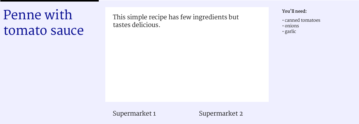
We could add the list to our markup:
<div class="container">
  <h1 class="item">Penne with tomato sauce</h1>
  <p class="item">This simple recipe has few ingredients but tastes delicious.</p>
  <div class="item ingredients">
    <h2>You'll need</h2>
    <ul>
      <li>canned tomatoes</li>
      <li>onions</li>
      <li>garlic</li>
    </ul>
  </div>
  <ul class="item sponsors">
    <li>Supermarket 1</li>
    <li>Supermarket 2</li>
  </ul>
</div>
But we won’t be able to position each sponsor onto the grid. This is because only the <ul> is a direct child of the container element and therefore a grid item. The <li>s are not: because they are not direct children of our grid container, they don’t get to participate in its grid game. But what if we really want to align the sponsors onto the grid?
Flatter markup
One obvious method of making the sponsors participate is to remove the <ul> and use a <div> for each sponsor. But what we would then do, it ‘flatten’ our markup. That’s throwing away the baby with the bathwater.
The benefit of using the <ul> (unordered list) element are plenty:
- it will stay a list outside the context of our page, for example in Safari Reader mode, it will show as a list
- when printed with stylesheet turned off, it will show as a list
- for people who use screenreaders, it is a list (screenreaders can announce things like ‘list, 3 items’).
If we would make our markup flatter, we lose those benefits.
display: contents to the rescue
With display: contents, we can have our markup and our grid placement. This property makes the element so that it no longer seems to exist. It does not generate a box, so backgrounds, borders and other box-related properties will no longer work on it. Grid placement properties will also no longer work. But all of these things will work for the element’s children. The spec says the element behaves ‘as if it had been replaced […] by its contents’. If that sounds weird, I can recommend Ire Aderinokun’s detailed explainer.
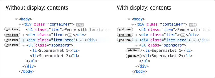
Effectively, for our purposes here, using display: contents on an element does this: the element stops participating in the grid, and its contents start participating in it. It lets us specify our sponsors onto the grid, instead of the list they are contained in.
There’s some interesting edge cases listed in the spec, for if the property is used on elements like img and video.
Accessibility concerns with current browser implementations of display: contents
For people who use assistive technologies (AT), browsers expose accessibility properties, including the role of elements on the page. This is so that their AT knows what’s what on the page. Many elements come with a built-in role, for example lists have a role of list.
This is where it goes wrong in current browsers that support display: contents. They do not interpret display: contents as a lay-out thing only, they also derive meaning from it. This is problematic and a bug according to the spec’s comment on display affecting layout:
The display property has no effect on an element’s semantics: these are defined by the document language and are not affected by CSS. Aside from the none value, which also affects the aural/speech output and interactivity of an element and its descendants, the display property only affects visual layout: its purpose is to allow designers freedom to change the layout behavior of an element without affecting the underlying document semantics.
(emphasis mine)
Looking at our sponsor list example, it means that the item is no longer seen as a list, but as something else (test case in CodePen).
I’ve added my test results per browser below. In each of them, our <ul> gets the correct role without display: contents, but once the property is set, it loses its role.
Firefox 61
The list gets a role of text leaf (Firefox bug). Update: this is now fixed; it will ship in Firefox 62 in August 2018
Chrome 66
The list shows as ‘accessibility node not exposed, element not rendered’ (Chromium bug). Update: this is now fixed; it has shipped in Chome 89 in March 2021
Safari
The list shows as ‘no accessibility information’ (Safari bug, Webkit bug #185679, Webkit bug #237834 that they did more work in)
Update 13 June 2022: this was reported fixed in Safari TP 144 / Safari 16
Update 9 July 2022: Adrian Roselli reports work is still needed in Safari
Related to this issue is that display properties in CSS have impact on table semantics, as Adrian Roselli explains; see also Steve Faulkner’s explanation of where the responsibilities lie.
Conclusion
With display: contents, you can place grand children of a grid container on the grid. This allows for more semantic mark-up, which is great for accessibility. The more meaningful your mark-up, the more detail an assistive technology can provide to its users. However, there is one caveat: none of the browsers that currently support display: contents expose elements that have the property to the accessibility tree with their original role.
I believe the accessible roles should not disappear when setting display: contents, as that defeats a lot of the purpose of display: contents. I have filed bugs with Firefox, Chromium and Safari for this. I really hope we will be able to use display: contents while keeping the accessible roles of elements intact, so that we can have great layouts and great accessibility. To be continued, I hope!
Originally posted as More accessible markup with display: contents on Hidde's blog.
For everyone
At accessibility talks, I love to show a photo of Sir Tim Berners-Lee and the words he made appear on enormous screens during the 2012 Olympics opening ceremony in London: ‘This is for everyone’.
 Copyright: Martin Rickett/PA Wire, from The Guardian
With ‘this’, he meant the web, I assume. I like to ponder what the other bit means, ‘for everyone’. It’s probably a number of different things:
- Everyone can have a website. As in, you can register a domain, get hosting and put your site on. All at low cost and sometimes free. You do not need permission and are free to put whatever content on: your corporate mission statement or your love for the Vengaboys. Anything.
- Everyone can go to websites, there’s no entry fee or barrier to the web —although there is to some sites and in some countries— the web is open to access by default.
- Everyone can access the web, it is built to work for lots of different users, including those with visual, auditory or motor impairments, those with slow connections, those with new and those with old machines.
I think ‘this is for everyone’ refers for a large part to the universal accessibility of the platform. It is what makes the web awesome.
A different ‘for everyone’
During a meetup that took place at Uber Amsterdam’s offices this week, I learned about that company’s mission statement. Before I continue, it is very kind of them to host meetups, they are a great way for the web community to meet each other. I admire the hospitality that makes this possible.
Anyway, the statement:
Uber’s mission is to bring transportation — for everyone, everywhere.
I’m sorry, but it struck the wrong chord with me. Their everyone (and indeed their everywhere) means something else. Admittedly, this may come across as extreme cynicism, but let’s try and think about what it means for them. What Uber mean by making transport available to everyone, is that they want everyone’s transport transactions to run through their systems. So that they can get their financial cut.
This is, of course, a perfectly fine strategy and it is how economies work. It isn’t inherently wrong for companies to try and increase market share and profit, but it is definitely a different ‘for everyone’. It’s the same language with a different meaning. As the web-style ‘for everyone’ wouldn’t break sensible laws that protect vulnerable people, it wouldn’t monetise people in distress, it would not order fake rides to beat competitors, it would not deny users with guide dogs and it would not use its data to spy on ex-girlfriends, track one night stands and… well, the list goes on.
This is for themselves, not for everyone. Uber wouldn’t do those things if its for everyone was really about people and not about profits. They make Uber’s ‘for everyone’ sound hollow. And I don’t like that, because the web’s ‘for everyone’ is not hollow, it is built into how the platform technically works, in web standards, in all of that.
Conclusion
It appears ‘for everyone’ can have different meanings and I think it is important to see the difference between them, so that we are not fooled by for-profit companies that present themselves as charities. The web itself is a place where people are put first, and a place where power is not exercised on people, it is given to people.
Surely, it is great that so many companies are now using that platform for commercial purposes. Arguably that has helped with the platform’s popularity. It’s been pretty good for many of the world’ s economies too. But I can’t help but think about what the web could look like if we would make more things that really solve problems for everyone… let’s ask this: ‘what is the problem and who are we solving it for?’
Originally posted as For everyone on Hidde's blog.
A Dutch version of the Inclusive Design Principles
I love the Inclusive Design Principles and often refer to them in discussions about accessibility. I also like language, so I thought why not translate them into Dutch?
The Inclusive Design Principles are written by the good people of The Paciello Group. They give guidance on how to make your websites and apps work for more people and make user-centered choices. The document urges makers of websites to think about context, consistency, choice and control, and emphasises that our products should add value, offer the same to all users and make primary content and tasks the first thing on a page.
If you would like to read or share them in Dutch, you now can, as Principes voor Inclusive Design is now live.
Originally posted as A Dutch version of the Inclusive Design Principles on Hidde's blog.
Donuts and Fronteers
At the Open Innovation team at Mozilla, I learned about Donutbot. It is a Slack bot that randomly matches people from the team to each other, so that they can then go on and enjoy donut together. They are usually just metaphorical donuts, you could totally go for bubble tea or lunch. It doesn’t even have to be together, in person. You could use video conferencing software. But if you do meet IRL, selfie-sharing is appreciated.
Random donuts are a fun way to meet people you don’t directly work with. Or people you, for whatever reason, never talked to. It is also like a water cooler for remote workers. I really like the idea, so I suggested it to Fronteers, the Dutch professional association for front-end developers. It has a large-ish Slack community of mostly Netherlands-based front-end developers.
The way Donutbot works is as follows: it lives in a specific channel, which everyone in a Slack community is invited to join. Every two weeks, it matches everyone in the group with a random other person. To do this, it will start a group conversation with itself and the two people. That’s it. They can then sort out a date and time to physically or digitally meet. After two weeks, it will ask if you have had a chance to meet.
As of this week, Donutbot exists on Fronteers Slack. To be part of it, join the #meetandgreet channel, and who knows who you’ll meet next.
Originally posted as Donuts and Fronteers on Hidde's blog.
You don't always need alternative text
In a project I worked on recently, I noticed almost everything in the page had alternative text. Sometimes this can be redundant, for example if there is already text on the page that says what the thing is. Let’s look at some examples.
Why alternative text
A lot of the web is text. This is great. As a medium, that makes the web super parseable for external tools like search engines and assistive technologies (AT). It makes it even a better medium than the real world, where such parsing still requires a lot more effort. Until machine learning is ubiquitous, I guess, the fact that we have so much text on the web, makes the web the ultimate medium for accessible content.
When it is needed
Whenever we include non-text elements on a page, it is a good practice to add alternative text. For example, when adding an image, whether it is a photo or something with three words of text in it, we can use the alt attribute to convey what’s on the image to anyone who can’t see it. We’ve all seen this:
<img src="delirium.jpg" alt="A pink elephant" />Or when adding a video, it is useful to add subtitles, for users who cannot hear the people talking in the video:
<video src="instruction-video.mp4">
  <track src="instruction-video.vtt" />
</video>
When it is not needed
Sometimes, alternative text is redundant. Look at these examples:
Speaker photos on a conference website
A page is divided in sections, with sections for each speaker. The heading in the section is the name of the speaker. There is also a portrait of the speaker. The photo does not require alternative text here, as it would be the same as the section heading, and that would be redundant. Note that the alt attribute is required, so in this case I would recommend an empty alt attribute: alt="".
I only learned when I was involved with Fronteers Conference, which follows this pattern on its speaker pages (thanks Krijn).
Labelled icons
Here’s a close button:
<button type="button">
  <img src="close.svg" alt="Close" />
</button>
In this case, there is only an icon, it exists on its own. An alternative text would be useful here, especially since it is used as an interactive element (like <a> or <button> ). If a button is just an icon, it does not have text that can function as the element’s ‘name’. So when, for example, a screenreader announces ‘button’, it doesn’t announce what the button is (as it doesn’t know). Adding a text like ‘Close’ helps with that, so that the screenreader can announce ‘button - close’
But when an icon has a word next to it, for example ‘Log out’, the icon itself is decorative and does not need an alternative text:
<button type="button">
  <img src="close.svg" alt="" />
  Close
</button>
In this case we can leave the alt attribute empty, as otherwise a screenreader would announce ‘button - close close’.
When captions describe photos
Sometimes, photos come with visible captions that describe them. In these cases, it is not necessary to add text into the alt of the photo, as the alternative text is already out there, the description has fulfilled the need.
Conclusion
Alternative text is a great opportunity to make the non-text parts of the web accessible. However, look out for redundancy, and only add it when it conveys something that isn’t already there.
Originally posted as You don't always need alternative text on Hidde's blog.