Reading List
The most recent articles from a list of feeds I subscribe to.
An AI reading list
Having been long interested in artificial intelligence, it was one of my focus areas in university, I looked for theoretical background beyond the hype. If it is also summer where you are, you may have some extra reading time, too. So, I present you: an AI reading list.
This list is mostly about the philosophy of AI: what intelligence means, how it can be represented, what the ethical implications are of teaching machines, those kinds of questions. Expect to read about psychology, mathematics, linguistics, philosophy and computer science. It’s all of those things together that the field is made up of.
A common theme in these books is that AI application aren’t that intelligent yet or anywhere near ready to replace human intelligence. Phew. I discovered this myself looking for recent books on philosophy and AI. Online bookstore search engines (or category pages) were not that helpful for finding what I was looking for. Look in the ‘philosophy’ department and a book by Plato is listed first. Who reads Plato just by themselves? Book review pages in newspapers, blogs and humans in book stores helped more. Yes, humans!
The New Dark Age
In The Guardian’s review of this book they said enjoyment of it depends on whether you are a glass half full or half empty kind of person. Very much true, I think. The New Dark Age describes a lot of dark consequences of what Bridle calls ‘computational thinking’, the idea of throwing tech at every problem. This thinking seems prominent in Silicon Valley and it is dangerous, Bridle explains, because our problems are less about what we know (data) and much more about what we do and think. This book is not just about AI, it is also a lot about the impact of technology on society. We should think twice if we want to outsource decision making to systems, Bridle warns. Buy from the publisher to get a free e-book with your hardback.
Plato and the Nerd
Is AI ‘our biggest existential threat’, as Elon Musk once claimed? Edward Ashford Lee, writer of Plato and the Nerd doesn’t think so. What is more likely to happen and what we should want to happen, he explains in this book, is that humans and machines complement each other. We are creative, they can crunch lots of data at mesmerising speeds. We may not be more than just neurons (Lee isn’t a dualist), but it is unlikely we’ll ever be able to reconstruct human brains and minds in machines. If we’re making abstractions, like Plato did with his theory of Ideas, we should be careful not to confuse the map with the territory. This book brilliantly explains machines from semiconductors to programming languages to mathematical possibilities. It gets very technical and mathy at points. Lee shows how engineers are creative rather than technical: the most technical layers are abstracted away from them. He also talks about the relationship between tech and society: ‘I do not see how a true humanist today can understand society without understanding technology’, he says and I could not agree more.
From Bacteria to Bach: The Evolution of Mind
From Bacteria to Bach by philosopher Daniel Dennett is about evolution, what it means to (not) understand something (explained with the interesting notion of ‘competence without comprehension’) and how that changes our view on artificial intelligence, language, culture, consciousness and much more. The book is full of anecdotes and side steps, which for me at some point started to prevent Dennett from clearly getting his point across, it was a bit overwhelming. But then again, the book is full of interesting analysis of where the fields of philosophy, psychology and computer science have overlap. See also The Guardian’s review, who said this about the book:
This is an infuriating book – too long and self-referential – but underlying it all is an interesting argument
Common sense, the Turing test and the quest for real AI
In 2018 many of us think of adaptive machine learning (AML) if we think about AI. In Common sense, the Turing test and the quest for real AI, Hector J. Levesque takes us back to what it all started with: good old-fashioned artificial intelligence (GOFAI). It goes into detail about what can’t really be learned by machines: common sense. He explains Winograd Schemas, which is his modern equivalent of the Turing test: they can be used to figure out if a machine is ‘making it or faking it’. I liked how concise and lucid this book is.
Turing’s Vision
Turing’s Vision, which I raved about before, is about one of Alan Turing’s most interesting papers, in which he tries to prove the mathematician Hilbert wrong. That paper shines new light on something called the ‘decision problem’ (‘whether we can write algorithms that can decide if certain mathematical statements are true or false’). This book is fairly technical, I had to skip parts because I had not enough intelligence. Your mileage may vary.
That’s all for now, happy reading! I’d love to hear what others are reading in comments or e-mail.
Originally posted as An AI reading list on Hidde's blog.
Accessible page titles in a Single Page App
According to WCAG 2.4.2 pages should have titles. How to go about this in a single page world?
What are titles for?
Pages have titles so that people can recognise where they are. They are like a plaquette on a meeting room door, signposts that mark the platform in a train station or the signage for a supermarket aisle. They help people figure out where they are.
Additionally, page titles also signify uniquely what’s on a URL. This is helpful for search engines, they display the title. Or for social media platforms, they display it when you share a link. People using screenreaders hear the title, it lets them figure out what a page is when they land on it.
Titling pages, the traditional way
In a site with multiple pages, you can put different content in the <title> element for each different page. This is trivial if you build each page separately, it is a little more work when the value comes out of a CMS, but still fairly straightforward.
Titling pages in Single Page Apps
In a Single Page App (SPA), the user never leaves the page. There is no new page with a new title. Instead, you’ll have to update this manually by changing the value or document.title , which is where the page title is in the DOM.
Changing pages in SPAs is often done with routers like react-router and vue-router . I was surprised to see that, by default, those two only update content and the URL, not the document title.
You can update the page title manually, though. In React, you can do it in the componentDidMount() of a route, and there is a react-document-title package that does it for you. If you want to update more meta info than just the title, there is React Helmet.
In Vue, I had luck doing it in beforeEach of the router:
router.beforeEach((to, from, next) => {
  document.title = `${to.name} - Your site`;
  next();
});
But if you’d like to abstract this further and update the page’s title along with other things in the head of your document, there is Vue Helmet or Vue Meta.
(Update 2 June 2020) In Svelte, you can set page titles using the special <svelte:head> element in the components that you use as a route, like so:
<!-- MyPage.svelte -->
<svelte:head>
  <title>Page Title goes here</title>
</svelte:head>
Announcing titles
In screenreaders, when a user goes to a new page, it will read out the title of that page. In a Single Page App world, you can update the title with document.title , but, sadly, that change does not trigger a screenreader announcement. It is helpful to do this manually, for example by putting content into a live region (the on demand live region abstracts this).
There are different strategies as to what to read out on a route. In an SPA, you could choose to set focus to the top of the document when you do a route, this would make it feel like a multi page application. Users would have to use skip links to get back to the content, just like in multi page applications. But maybe you only update one section, and your strategy is to move focus to the new content. In this case, you could ensure the title of whatever is new is read out, rather than the updated page title. For example, if you replace the main by something new and then focus the new content, convey to assistive technologies what the title of the newly focused content is, for example by having its first heading announced.
Does this mean the title is irrelevant in SPAs? Not really, it is still useful to have an up to date title , for example for people switch between tabs or when you turn on Server Side Rendering.
TL;DR
Giving pages unique titles aids accessibility and is compulsory if you are after WCAG 2 AA compliance. If you build a single page app, update the title manually, but also look at having something useful announced when new content is inserted. It could make more sense for this to be a section title than the document’s title, depending on what you’re building.
Originally posted as Accessible page titles in a Single Page App on Hidde's blog.
What kind of ethics do front-end developers need?
Now that the technology sector of the world is rapidly transforming all of the world’s things into digital things, many have called for more ethics in our field. That is in many instances quite a vague goal, so let’s apply it to one part of digital: front-end development. How can we be more ethical as front-end developers, what kinds of things can we do? I thought I’d try and make a list.
I don’t know what is good for us. I mean, I have ideas about that, but this post is not about those ideas, it is about what kinds of things front-end developers can think about if they want to apply ethics to our field.
What and why
In my talk for Inclusive Design 24, I said that ethics is about how we want our world shaped. But ethics has many definitions, another one is that it answers the question ‘what should I do?’ In that question, note the word ‘should’. It’s about what you’re obliged to do. It also implies taking a moral stance and choosing between different paths. It is about coming up with reasons based on what is considered the right thing, based on a set of rules. An example of such a rule is ‘only act according to rules that you would want to apply to everyone’ (said Kant). And there is The Golden Rule: treat others as you would want to be treated.
The ethics described above is roughly what the literature would refer to as duty-based ethics, it is based on the idea of a moral obligation. There is also consequence-based ethics. Consequentialists look at the outcome of their decisions and actions. They consider how decisions or actions impact the world, for example whether they increase or decrease the total amount of happiness in the world. It doesn’t matter how you get to an increase of total happiness, it matters that you do.
When trying to apply ethics to technology, it should be fine to be pragmatic and combine both approaches. Do things because they are right and do (or leave) things because of their consequences.
The reason that ethics can make an important contribution to the web is its focus on why and how we do things rather than just what we are doing. That focus has the unique chance to make our choices more human, because arguably without ethics we could just leave our decision making to machines. It takes a human to make ethical decisions, said the awesome Laura Kalbag. Thinking ethically about decisions also makes them more human. It works both ways.
Tim Berners-Lee already talked about how ethics is important for the web at the first WWW conference in 1994. He describes this in his book Weaving the web (2000, 86):
I finished by pointing out that, like scientists, people in the Web development community had to be ethically and morally aware of what they were doing
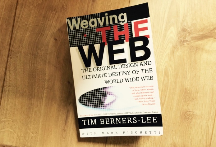 This, about the origins of the Web, is recommended reading, by the way. Don’t judge it by its cover design…
Ethics is important for everyone who makes things for the web: people working on design, product and management. But also for front-end developers. We drive a lot of how modern web products are built and uniquely know of weird details and consequences of products decisions. If ethics is about consequences, we are part of it. So let’s worry about what decisions are made. Rather than just using our expertise to build products, we can think about decisions and then build products. Because it is also our duty and we can help increase (or not decrease) total happiness in the world.
Ok, so do I just npm install ethics?
Admittedly, I’m stretching it a bit, but I would like to show what ethics is not. I should stress that ethics can’t be just added to something that exists, it has to be in the decision process before. Automating ethics won’t work either, trying to do it would also sort of miss the point of ethics. Package managers like npm can install most things that a web project could possibly depend on, but it should be clear by now that ethics is not one of them. Computers can automatically foresee consequences sometimes, they can use statistical analysis see how big your JS bundle will be. Or, more real-world, use facial recognition to see that someone is cheating on their partner. But the point is, ethics is the assessment that can start after metrics like these. It requires humans.
There are plenty of situations in our jobs where we can apply ethical thinking to what we do. Let’s look at some real-world examples.
Front-end developer impact
Ensure accessibility
The web is accessible by default, but as a developer it’s easy to break that in the flow of getting features shipped. I sometimes do this myself, and I specialise in accessibility. There are ways to improve though, for example by focusing (part of) your personal development on learning about making accessible products. By being aware of how to meet the Web Content Accessibility Guidelines and generally accessibility good practices, you can directly contribute to letting more people enjoy the web through code.
Analytics with Do Not Track
You’re asked to implement trackers in a site. You are aware that technically, this will allow some megacorporation to spy on people. You are also aware that modern browsers support Do Not Track. It will likely be your choice to honour your user’s Do Not Track settings, and otherwise your duty to convince the people in the company who prefer more metrics over more valuing user preferences. Or maybe you research a way to completely anonomise the data. This combines duty and consequences.
Impact on society at large
This is a more general example, applying to what you work on and where you choose to work. There’s a degree of ‘but not everyone is so privileged that they have choice’ to this, but I still believe we can all choose to some degree. When working as a front-end developer, it is likely that what you work on will somehow shape the world, sometimes even disrupt it. Should you build the front-end for a product that ‘disrupts’ an industry, but also introduces more inequality and makes the lives of other people harder?
Code of conducts in open source
If you released some of your code as an open source project and it attracted a bit of a community around it, considering community values would make a huge difference. Things like how you want people to feel empowered to make suggestions, feel included in the community, participate and show empathy to each other. A Code of Conduct (for example, a CODE_OF_CONDUCT.MD) could help make these values explicit, and heck, you could even npm install one (just note that this only adds value if you also have a plan for getting incidents reported and responding to them).
Diversity in hiring
As a front-end developer you may sometimes be involved in hiring new team members. This is also a great opportunity to influence how the world is shaped: be aware of possible biases in order to give good recommendations to HR.
Recognising dark patterns
If you don’t like to be tricked into buying services you don’t actually need or want, then your users likely feel the same. Learn to recognise dark patterns and start the discussion if you’re asked to implement one.
Keeping users secure
By being aware of common security risks we can ensure our users are safer online. Most of the responsibilities fall within front-end (and back-end) development scope. The Golden Rule applies here: if you surf the web as a consumer, you would also like the developer who has built the site to have done so securely.
These are all things where an ethical attitude and contemplating why and how we do things can be helpful in creating a better web. They’re not all easy things, some of them are hard to get right. But if we’re going to play a role in making all the things digital things, let’s do it responsibly.
Conclusion
As front-end devs, we can apply ethics to our work by having an ethical mindset when doing our work. Practically we could do this by applying the Golden Rule and thinking about consequences of our code for users and our colleagues, for example by ensuring accessibility, security and a safe and welcoming working environment.
Originally posted as What kind of ethics do front-end developers need? on Hidde's blog.
How I learned to stop worrying and love CSPs
To gain precise control over what styles, scripts and other assets do on your site, you can serve pages with a Content Security-Policy. What does that mean for the front-end, and for those of us building user interfaces in browsers? Well, it can be tricky to set up, but there are useful benefits.
Why CSPs?
CSPs basically work like a whitelist of asset domains that the browser will accept for your site. This is great, as browsers have no notion of benevolent or malicious assets. Only website owners do. By telling browsers where the good stuff is located, website owners can rest assured users of modern browsers won’t get bad assets executed. They are one out of many security headers.
CSPs have been around for ages (see for example the Twitter blog in 2011), but usage numbers seem to be quite low. It seems to me they have recently gained more traction though, as more people get interested into website safety and content integrity. See also how Mozilla Add-Ons did it.
How they work
Technically, a CSP is a string that contains key-value pairs, served as a header with the response (or via a meta element in the page). They describe for each type of content how it can be used within your page. To be more precise: where it can be loaded from. Definitions for each type of asset are separated with semicolons, the definitions themselves have spaces in between.
Here’s an example:
script-src https://hidde-cdn.com; style-src https://hidde-cdn.comThis will only allow scripts or styles if they are served from https://hidde-cdn.com.
There are also a number of keywords.
selfwill allow assets from the same domain that the page is served fromunsafe-inlinewill allow inline assets
See for example, this policy:
script-src 'self' https://hidde-cdn.com; style-src 'unsafe-inline' https://hidde-cdn.comThis allows scripts only from the current domain or from https://hidde-cdn.com, and allows styles inline or when served from https://hidde-cdn.com.
There are also directives: font-src for fonts, img-src for images,connect-src for fetching/requests and default-src if you want to set a default. Best set default-src to none, so that you already have a policy for any asset types you don’t or forget to define.
The unsafe-inline directive is interesting: it has the word ‘unsafe’ in it, because inline assets are considered harmful. I should clarify: inline assets aren’t harmful because they are inline as such, but it is the case that whenever malicious scripts or stylesheets are injected, they are likely to be inline. Blocking their execution altogether mitigates their risk. If that feels like too much, it is also possible to allow some inline scripts: identify one script with a nonce (a number used once) and whitelist that nonce.
In summary, a CSP lets you whitelist locations to load assets from. Although these whitelists themselves are simple when you grasp the concept, their consequences can be unexpected and, for front-end devs, rather inconvenient.
Some side-effects
When I recently implemented a CSP in a project I was working on, I found a couple of surprises that were inconvenient, some of them related to disallowing inline assets. Note that those specific issues will be go away if your setup has a different, less stringent CSP locally.
Adding styles via Developer Tools
Sometimes when I’m working on some CSS, I’ll inject CSS via the Dev Tools, so that I can see what the effect of my changes are without actually making them just yet. If your CSP disallows inline styles, you are out of luck as this feature will stop working.
Browsersync
If your local development environment uses script to reload the browser when you’ve changed a file, this likely uses inline scripts that will be blocked when your policy forbids inline scripts.
Analytics
If you’re using external analytics scripts, don’t forget to add the domains that they load from, if they are different from your own domain. This is the case for Google’s Analytics and Tag Manager products, for example.
Polyfills that inject CSS
The inert polyfill injects some CSS into the page in order to prevent user selection on inert elements. Injected CSS counts as inline CSS (obvs), so that will not work.
Inline styles in SVGs
Double-check that SVGs that you are including in your page do not contain style attributes, as some browsers can deem those to be a violation of unsafe-inline.
The good and the bad
What I love about CSPs
The great thing about CSPs is that, if implemented well, you know exactly where to expect attacks. Without a CSP, the ‘attack vector’ is unknown and likely big or of infinite size, with a CSP you know where it can come from.
If you work in a large organisation where the marketing team can insert scripts via Tag Manager(-like) solutions, which is quite common these days, CSPs are also a useful treshold. Scripts that are useful for gaining marketing insights could at the same time be risky from a security standpoint (not to mention privacy).
There are some design choices that make CSPs a joy to work with, for example the built-in report-uri directive, that lets you specify a URL to report CSP violations to, which can be used to track violations using a service like Sentry.
What I slightly dislike
If your site is served over SSL and you sanitise all the things (in other words, you avoid Little Bobby Table scenarios), your CSP does not actually make it more secure. Note that this is a huge if. If you’re healthy, a health insurance isn’t going to make you more healthy, but it is extremely sensible to have one in place anyway. This is kind of the point of CSPs, they provide extra cover for if things like SSL and XSS protection aren’t (correctly) in place. Mistakes can be easy to make in the security space. So I’ve learned to love this: CSPs don’t harm if you can work around the side-effects.
Something else I don’t really like is the usability of error reports for CSP violations in browser Dev Tools. They will make clear that there is an error, but aren’t too helpful in pointing towards the right direction. Browsers could be clearer about which exact bit of your policy is stopping an asset from working.
TL;DR
CSPs can nullify what XSS attackers can do once they’ve managed to attack. This is great, although implementing it can make some things harder on the front-end. But that’s ok, it is our job after all. For help with implementing a CSP for your site, check out Mozilla’s Laboratory Add-On and Google’s Web Fundamentals page on CSP.
Originally posted as How I learned to stop worrying and love CSPs on Hidde's blog.
Vague, but exciting…
Last week I saw Sir Tim Berners-Lee, inventor of the web and receiver of the Turing Prize, give the ACM Turing Lecture. He spoke about redecentralising the web.
In less than an hour, Tim Berners-Lee talked us through the history of the web, its current state and what we need to do to have a healthy future for the web. Redecentralisation, he phrased this. The web was invented as a decentralised thing, but that model is currently under threat. Large portions of the web have become walled gardens from within which it is hard to exchange with others: data is kept within its own garden.
A universal and decentralised web
The decentralised web, Berners-Lee explained, started at CERN, a research institution that brings together lots of different people, from different universities, with different preferences for both natural and programming languages and, of course, lots of documentation that was stored on computers.
Berners-Lee worked at CERN as a software engineer and he had this idea for making documents easier to access by having unique identifiers for them. When talking about this idea at the coffee machine, a colleague said he should write it down. He did and when his boss read the proposal, he wrote the now so famous words ‘Vague, but exciting’ on the memo. When he later had some time in between projects, what an impactful coincidence, he started to develop this idea further.
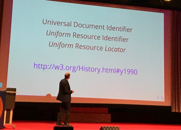 URI vs UDI vs URL
A key component of the initial idea was that everything on the planet should be named so that it has something to be accessed by universally — or uniformly, there was plenty of debate around the distinction, he explained.
The universality of the web, Berners-Lee said, is that it works independent of:
- hardware and software, including browsers
- the type of network access (e.g. mobile or cable)
- whether you want the data to be publicly or privately available
- the polish of the content: it works equally well for polished publications and scribbled ideas (or Vengaboys fansites)
- language and culture
- disability
- whether the data is to be consumed by people, machines or a combination of both
A web that has the above independencies is one worth fighting for, Berners-Lee explained. The W3C famously does great work in this, but less well known is that Berners-Lee found another organisation: the World Wide Web Foundation. It wants to make the web a better place for more people. He argued that if people spend 98% of their time on the web, they might as well spend 2% defending it.
We might be going in the wrong direction
Berners-Lee first showed a virtuous circle: if all goes well the web lets people publish, which inspires conversation and more publications. This is the utopian scenario and we’ve seen a lot of this actually happen. The web community itself it s a great example of this, we teach each other stuff and good blogs inspire other people to start blogging, this very blog is an example of that effect.
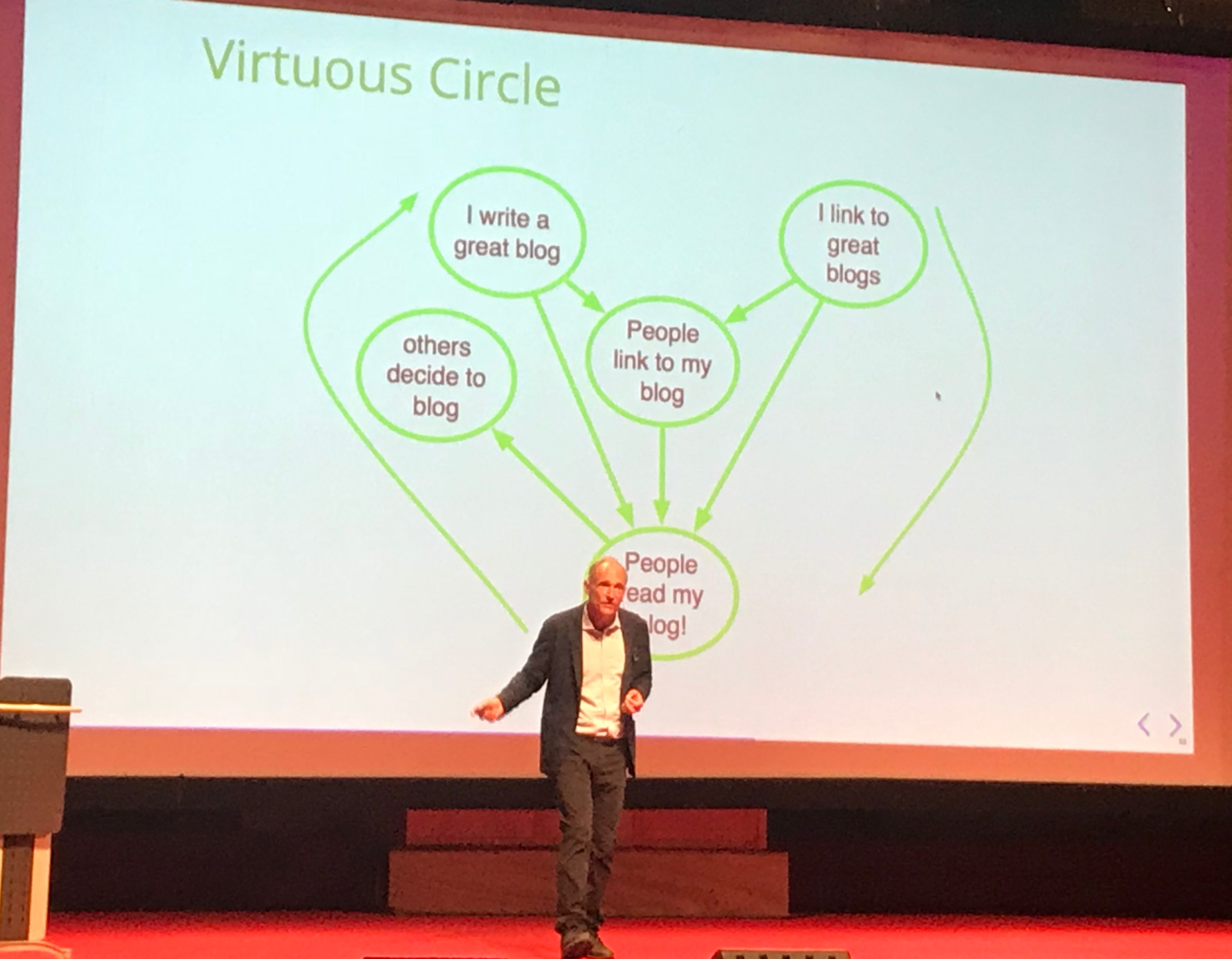 The ideal web is a virtuous circle
However, if we’re not careful, Berners-Lee warned, there can also be a vicious circle, a dystopian scenario. This happens when algorithms cause people to meet more people like themselves, narrows down their circle and alienates them from people who are different. Or when websites are used to harvest people’s personal data that are then used for political gain. Or when falsehoods are presented as facts. These seem pretty much like the things that Mozilla identify as issues concerning internet health.
Towards more decentral web
There’s all sorts of things we can do to make better things for the web, and perhaps, consequently, make the web better. Berners-Lee urged us to build things that facilitate open dialogue and discussion, not flame wars. Human rights should be at the center of such things, and it would probably only work if it was not a centralised solution: we might need new (social) networks altogether in order to get what we need. Solid is an initiative led by Tim Berners-Lee aimed at building social websites that are not centralised and let people have control of your own profile and data.
It was an inspiring morning and great to see Berners-Lee speak in person (for what was my second time). The principles that the web was built on are strong and the lecture was a great reminder of how we can make better things on the web. We should make good things!
Originally posted as Vague, but exciting… on Hidde's blog.