Reading List
The most recent articles from a list of feeds I subscribe to.
Calm tech, platform abuse and reality
This week I attended the Digital Design Ethics conference in Amsterdam. I learned about calm technology, how platforms are abused, what our options are and how to try and prevent abuse earlier. My write-up of the day.
Calm technology
Amber Case started off. She explored the kind of technology she wants to see more of: calm technology. In this age, she explained, attention is more scarce than technology. So we ought to be critical of how we want our tech to interrupt us. Does it really need to talk? Often quieter signals are just as effective. Our industry replicates voice assistants we saw in films, instead of informing solutions by social norms and human needs. Humanity is important in general, Amber explained. For instance, if we make smart machines, let’s consider how to include human intelligence to contribute to that smartness. She mentioned an algorithm that helps find cancer cures, and complements raw data with input from PhD students, instead of figuring out everything alone. Or if we make a smart fridge that refuses to operate if the wrong human stands in front of it, let’s consider they may require food for their diabetic brother. Let’s take reality into account, said Amber.
Slightly shorter version of Amber’s talk: Calm Technology on YouTube
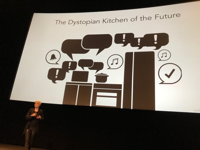 Amber Case on the dystopian kitchen of the future
Indifferent platform executives
The theme of reality continued in talk two. I’m not sure if I’ve ever seen a web conference speaker so furious on stage. Mike Monteiro talked about Mark Zuckerberg of Facebook and Jack Dorsey and Biz Stone of Twitter. The thing is: people use their platforms to spread fake news and declare nuclear war (the US president did). In response to the latter, Twitter did not kick the president off their platform and hid behind corporate speak. Mike finds this problematic, because there is insincerity in pretending to fairly apply rules, if instead, you bend them to keep profitable accounts online. It doesn’t take much cynicism to conclude these decisions are about money. Monteiro backed this up with an analyst’s valuation of what removing Trump from Twitter would cost the company: 2 billion dollars, or a fifth of its value.
 We should not look away. Photo: Peter van Grieken
It isn’t just the executives, Mike explained: everyone who works at a company like Twitter should ask themselves why they are still there. Paying a mortgage, he said, is not enough. He warned us: if you work as a designer or developer at a company that has terrible effects on the world, be mindful of not “slowly moving your ethical goalposts”. I cannot help but think there’s quite some space between moving ethical goalposts and completely quitting your job. Mike mentioned the Google walkout: they try to move stuff from the inside.
If you’d like to watch Mike’s talk, see How to Build an Atomic Bomb - Mike Monteiro - btconfDUS2018. Warning: contains a lot of swearing and Holocaust references.
Design as applied ethics
According to Cennydd Bowles, we should regard design as applied ethics. In his recent book Future Ethics, he explains that in detail (go read, it is great). At his Amsterdam talk, he gave a fantastic overview of his book’s themes. Cennydd talked about when ethics comes into play: always. When you invent a thing, it’s extremely likely it can be used for bad things. So, worrying about avoiding bad consequences should be intrinsic to our design processes.
Cennydd’s talk had good advice for mitigating the issue that Mike mentioned earlier: if you create a platforms that is abused, how should you respond? Cennydd went into concrete actions that help take abuse into account in the design stage.
One of the actions Cennydd mentioned: add people who would potentially suffer from your product to the list of stakeholders. Another one: the persona non grata: design for the persona of someone with bad intentions as a strategy to make your product less bad. And he talked about Steve Krug’s well known ‘don’t make me think’: if we want to give users agency, Cennydd explained, sometimes the opposite, making them think, is preferred. For example, if you give people privacy settings, a ‘consent to all the things’ button requires less thinking, but a more fine-grained control yields more privacy and shows you view people as people.
The veil of ignorance
Both Mike and Cennydd mentioned the veil of ignorance, a thought experiment by the political philosopher John Rawls. I used this concept in a talk I gave a couple of weeks ago (Trolleys, veils and prisoners), please allow me to quickly reiterate that here. The idea is: imagine a group of people that you ask to come up with all the rules that govern our world. But there’s one trick: you strip them away from their position in society. Whether they were Uber’s CEO or an Uber driver, from a rich or a poor family, haves or have-nots… they are now none of those things. They wear a ‘veil of ignorance’. They are in what Rawls called the ‘original position’. After they made up the rules, they’re randomly distributed into positions in society. If they are put in the ‘original position’, the theory goes, these people will distribute rules fairly. This is simply because they don’t know how they’ll get them applied to themselves. It’s a powerful concept, and I believe something that applies brilliantly to tech. In quite practical terms, it means if you build or design something, would you want to be the person using that product?
If I had to summarise the event in four words, they would be ‘take reality into account’. Amber Case said we should do so in the opening talk. Mike Monteiro said we should not let ourselves get away with ignoring reality. Cennydd Bowles offered some great tips for getting bringing reality into our design process. Hearing these three useful perspectives on bringing ethical thinking to our design processes, I had great day at the Digital Design Ethics conference.
Originally posted as Calm tech, platform abuse and reality on Hidde's blog.
Up to speed with web performance
On Thursday and Friday I learned all sorts of things about making sites faster at the performance.now() conference in Amsterdam. I frantically took notes at each talk, so here’s my summary of the event.
Performance has always been one of my main interests in web development: if you want a good user experience, speed is essential. The performance.now() conference was two days, with eight talks on each day. Some had lots of theory, others were case studies. The balance between different types of content was excellent. I thoroughly enjoyed learning more about resource hints, HTTP/2, rendering performance of UI and fonts, the web itself and how performance works in large organisations.
See also: the conference videos on YouTube.
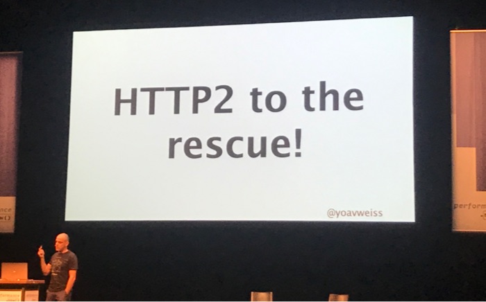 HTTP/2 was a recurring theme
Day 1
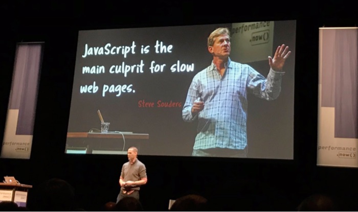
Steve Souders - Making JavaScript fast
The conference kicked off with the grand… eh godfather of web performance: Steve Souders. He talked about the issues that stand in the way of everything (the ‘long poles in the tent’), based on data from the HTTPArchive. The longest pole: JavaScript fatigue. Scripts are not just bad news for performance because of download time, but also because parsing them costs CPU time on our user’s devices. Steve recommended reducing it (check code coverage, budget 3rd parties), and for what is left: load it async (or better: defer), use <link rel=preload as=script> (or better: as a header) and double-check your assets are actually compressed.
Harry Roberts - Third-party scripts
Harry Roberts discussed third party scripts in four stages: understanding what the problem is, auditing for it, talking to internal teams and vendors and reducing the problem where possible (Harry’s slides). Third party scripts can affect user’s security, they can slow things down (or even be a single point of failure). For auditing, Harry mentioned Request Map, a tool that takes a Web Performance Test as input and creates a map. With the data in hand, he explained, you can go talk to the vendor or the scripts (note: they might lie). Or you can go to the department responsible for the scripts and have a polite meeting with them (‘ask questions, don’t demand immediate removal’). This sparked some discussion at the drinks afterwards: polite is probably good, but shouldn’t developers really be quite strong about reducing tracking? To mitigate third party performance issues, Harry recommended self-hosting, async loading where possible and preconnect to ‘warm up’ the connections to origins that are most important and that you’ll need frequently.
Anna Migas - Debugging UI perf issues
Anna Migas showed us how to impove what she calls ‘perceived load performance’ (Anna’s slides). If we want smooth interactions, we have to do our calculation work between frames. This is because we should ensure our users get not only 60fps, but possibly also 120fps, it’s a thing on iPad Pro and Razer devices. She exposed step by step how a browser builds a frame and shared great tricks for avoiding jank (offload tasks outside the main thread) and diagnosing its cause in Dev Tools (Performance, Rendering and Layering tabs). She also explained issues with certain interaction patterns, like animations (janky if wrong properties or too many), parallax scrolling (‘paint storms’), fixed elements (lots of repainting) and lazy loading images (content jumps). A great trick for improving performance of fixed or sticky elements: try to get browsers to load them in their own layer (can be forced by using will-change or transform: translate3D(0,0,0)). She did warn here: be mindful that more layers consume more memory, use them wisely.
Adrian Holovaty – Geeking out with performance tweaks
Adrian created Soundslice, which is a cleverly built web interface for sheet music. Because it displays sheet music, it displays complex combinations of notes. Hard to get performant, one might think. Soundslice works with a canvas that can (has to) do redraw very often. It has clever things like that it will highlight the currently played note. You can get kind of stuff super performant with very careful coding, Adrian showed. You do just the things required, not too often, etc. Being the co-creator of a famous library himself, Django for Python, he surprised some by saying he recommends not to use frameworks, as they are often full of things your app doesn’t need. Specifically this is true for front-end frameworks, as their redundant code gets shipped to and parsed by users. Food for thought, I heard many say in the break after. So, no big library, but a small set of 8 utility functions in vanilla JavaScript. Adrian also showed how requestAnimationFrame helped to not redraw too often. Google Dev Tools and Google’s Closure Compiler helped him ship better code. Other cool tricks: one global tmpList that gets reused every time a function requires a temporary array, singleton functions where possible to allow for a cache of fractions to avoid memory overuse, caches for expensive calculations and bitfields to use less bytes for saving meta information of notes (one byte per boolean instead of the default 8). Mind. Blown.
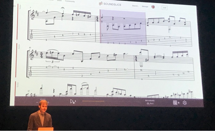 Adrian shows sheet music
Zach Leatherman - Fonts
Those who had hoped to walk out of Zach Leatherman’s talk with the one, ultimate, bullet-proof solution to loading fonts fast, were out of luck (Zach’s slides). There is just too much to think about. Most solutions will be a trade-off in some way. But there’s lots to tweak. Zach walked us through improving font loading in a default WordPress theme. He showed lots of tools that can help us deal with what he called the biggest enemies of font loading: invisible text (because font not yet loaded) and moving text (because of fallback font getting replaced by the real thing). Reflowing content is annoying, so Zach proposed a new performance metric: ‘web font reflow count’. Good web font implementations try and keep this number low, while no web font implementations have it at zero. Waiting endlessly for final versions of all fonts is also not ideal. Reflow could also be avoided if fallback fonts look a lot like the webfonts, or if bold webfonts are fallbacked by synthetically bolded regular weights (which, Zach showed, Safari can do). He also talked about how to use preconnect (in some cases), self hosting, font-display (can have sensible results without JS), the Font Loading API (full control over what and when) and subsetting, with clear and helpful examples. I loved it and will review this site’s web font choices.
Natasha Rooney - Protocols
As someone who is just an ordinary front-end developer, I always find people who understand all about networking a bit intimidating. So was Natasha Rooney, even though she said ‘protocols are easy’. She works on protocols and networking standards at the W3C and IETF. In one of her first slides, Natasha showed the absolute boundaries of network speeds on a map. They are dictated by physics, ‘you can’t beat the speed of light’. To optimise that part of the web stack, the advice is to serve content from servers physically closer to your users (think CDNs). With awesome supermarket metaphors, she explained pipelining. She then went into the details of SPDY, Google’s protocol that later was the basis for HTTP/2, and QUIC, again a Google invention. QUIC may help solve head of line blocking issues by reducing latency. It could end up becoming standardised as HTTP/3. Both SPDY and QUIC run on existing protocols (TCP and UDP respectively), because middle boxes often disallow other protocols.
Andrew Betts – Fun with headers
When Andrew Betts worked in the Technical Architecture Group (TAG), he had to review proposals for new HTTP Headers, amongst, presumably, lots of other tasks. For this talk, he looked into the HTTPArchive to show us some headers. Those we should want and those we should not want. The ones to keep were restrictive headers like Content-Security-Policy, Strict-Transport-Security and Referrer-Policy (all for security) and permissive ones like Access-Control and client hints (full overview in Koen Kivit’s tweet). Andrew also looked a bit at the future. Particularly Feature-Policy looked pretty interesting and the idea of setting some of these headers in a JSON file served from a well-known endpoint.
Tammy Everts - What’s the best UX metric?
Tammy Everts shared with us what she thinks works best as a performance metric focused on user experience (Tammy’s slides). She started by sharing some history of performance metrics and what their problems are, then went into current metrics that aid UX. More modern metrics often start with ‘First’ (First Paint, First Interactive, etc), and SpeedCurve introduced metrics for important things on the page (like ‘largest background image rendered’). Tammy also said you can define your own custom metrics. Some companies do, like some social media (‘Time to First Tweet’). Collecting measurements is one thing, but what to do with them? Tammy talked a bit about per page performance budgets, based on some of the metrics she showed before.
Day 2
Tim Kadlec - The long tail of performance
Tim Kadlec’s talk opened day two and it was about ‘the long tail’. That isn’t always the same people: it could be you on a flight, you who forgot to charge or you visiting a rural area. In other words: the real world. Tim showed how he worked with the MDN team to reduce loading times. A large part of page size was fonts. Choosing a system font instead of Mozilla’s brand sans-serif and subsetting their slab serif helped heaps. Talking more generally, Tim explained he had, in years and years of audits, never seen a case where the site couldn’t have improved making the core user tasks faster. There’s always assets, old code or other stuff that could be removed. And we can choose to do that, Tim explained, we can be proactive and provide a resilient and solid experience. Truly inspiring opening words. Practically, he recommended us to test on older devices and slower connections.
 Speakers quoting speakers: Tim Kadlec refers back to what Steve Souders said the day before
Yoav Weiss - Resource Loading
Yoav Weiss talked about what makes resource loading slow, how we can solve it today and how it will be better in the future. The problems: establishing a connection has many roundtrips, servers take time to process requests, starts are slower than necessary, browsers sometimes have idle time while figuring out which resources to load, when they’re loading they go in turns and then we sometimes load more than necessary (bloat). HTTP/2 helps with a lot, not everything. In the future, we’ll be able to use the wait time by using HTTP/2 Push, we should unshard domains (as it is an antipattern in HTTP/2) and take advantage of preload and preconnect headers (responsibly; adding it to everything messes with prioritisation and make things worse) and we can turn on BBR (See also: Optimizing HTTP/2 prioritization with BBR, via Tammy Everts).
Kornel Lesiński - Optimising images
Did you know JPEG images don’t contain pixels? Kornel Lesiński explained they have layers of abstract patterns instead. Together they form the image. Some parts contain details and others don’t, and by moving all non-detail data to the beginning of the file, you get this effect of low res slowly becoming hi-res, they load ‘progressively’. Progressive JPEGs have one issue: if you have multiple, they load one by one. In other words, as a group they’re not progressive. This can be mitigated by configuring nginx to send just the first 15%, then wait so that the network can do other things, then send the rest of the file. The doesn’t work on CDNs, they’ll serve static from cache, unless you use Edge Workers. Kornel also showed different future image compression techniques, the best of which just exist in browsers as video codecs. The trick to that? Load hero images in a <video> and you’re good to go, Kornel explained. Clever. And probably not for production.
Katie Sylor-Miller - Performance archeology
Katie Sylor-Miller (Katie’s slides) had this fantastic approach of marrying archeology (her background) with web performance, and with… Indiana Jones. The talk was, at the same time, a case study of Katie’s work at Etsy. The team’s hypothesis was that listing page performance improvements would lead to more conversion, so they surveyed, found the culprits and acted on them. It involved manual JS removals at first, but that was later replaced by a very nifty looking (in-house) solution called ‘Vimes’. It automatically finds which parts of the JS are never or rarely used. To avoid having to do this, Katie recommended to ‘architect for deletion’. Interesting findings from the research were that before/after difference got much larger on slower connection speed and that, yes, performance definitely affected conversion.
Jason Grigsby - Progressive Web Apps challenges
It’s been a couple of years since the idea of Progressive Web Apps was introduced. Jason Grigsby talked about some challenges in 2018 PWA land (Jason’s slides). One such challenges is the definition, it would make sense to have different definitions for developers (like Jeremy’s) and marketeers (Alex and Francis’ original definition, or Google’s, that has gone through a couple of iterations). If anything, the acronym is not for developers. There’s plenty of FUD around Progressive Web Apps, Jason explained, and they can do more than we think. Geolocation, Web Payments, an app shell architecture and offline support can all be part of a good PWA experience. Hidden challenges include appearing to use more storage than expected (security measures in browsers dealing with opaque responses) and designing for the intricacies of a seamless offline experience.
Scott Jehl - Move fast and don’t break things
While most speakers talked about how to make existing sites faster, Scott Jehl recommended us all to not make them slow in the first place. His technique of choice for this: progressive enhancement. It as effective many years ago and it is effective still, Scott explained. For performance, but also for accessibiliy and SEO. He discussed various techniques that fit well within this mindset: HTTP/2 Server Push (Filament already use it in PROD), inlining CSS (or the most critical subset of it if there’s a lot), the lazyload attribute that is in experimental Chrome (PR for lazyload against the HTML specification) and Service Workers on the CDN level so that you can A/B test without bothering users (if you do it on the client, consider this new metric: second meaningful content). Great conclusion: it is easier to make a fast website than to keep a website fast.
Michelle Vu - Performance at Pinterest
Michelle Vu runs the performance team at Pinterest. Her fantastic talk gave us insight in how they got and keep their site fast. The results were very positive: 30% faster got them 10% more sign-ups. Michelle explained that what worked for them is to pick a key metric, which in Pinterest’s case was a custom metric. She said it is helpful to tie performance metrics into business metrics. When measuring, it is helpful to look both at synthetic data (test runs) and RUM data (real users). Michelle showed they each serve a need: synthetic results are consistent and you can run the tests before deploying (e.g. upon code merge) and RUM data shows impact on real users. Michelle also showed a bit of their performance tooling: regressions are measured and there’s performance regression pager duty. So cool! The most important lesson I learned from this talk is that education is very important. Pinterest do this in their pattern library and document things like the experiments (how they were ran, results, etc) and the details of optimisations. Besides documentation, communication and in-person training was just as important to educate others.
Paul Irish - Closing keynote
Closing of the last day of the conference was Paul Irish. He talked about the state of metrics, specifically two kinds: visual metrics and interactivity metrics. Visual metrics are things like First Meaningful Paint, Visual Completion, Layout Stability (a.k.a. ‘layout jank’) and something Paul called Last Painted Hero, a measurement for the last paint of most important content (see also: Rendering Metrics by Steve Souders). Interactivity metrics are things like First CPU Idle and First Input Delay. Paul also showed how to measure these metrics with real users using a PerformanceObserver. The flow he recommends for this is to write code, test it synthetically (‘in the lab’), ship it, then validate it with real users (‘RUM’).
Originally posted as Up to speed with web performance on Hidde's blog.
My first MozFest
This weekend I attended my first Mozilla Festival in North Greenwich, London. It was great. In this post I’ll share some takeaways from my favourite sessions.
Ever since I started working for Mozilla, I learned more about their communities. They have wide interests, ranging from Rust to machine learning to WebVR. Sometimes related to Firefox, but often not. People from these and other communities come together at MozFest, to talk, learn and think about what Mozilla calls internet health. Internet Health is an umbrella term for various issues related to what’s happening to the web. They include (de)centralisation of power, online harassment, privacy, security and how people understand the web works (e.g. distinguish sponsored content from journalism). There’s also an Internet Health Report.
Mozilla Festival 2018 was 9 floors of internet health goodness, each with its own theme. The spaces had lots of meeting spaces that hosted small-scale workshops and talks.
 There was also a photo opportunity with a fox
Targeted advertising and human rights
“Targeted advertising is used as a delivery mechanism for propaganda”, said Nathalie Maréchal. She is a researcher at Ranking Digital Rights, a non-profit that tries to find out how much some of the world’s largest corporations respect their user’s privacy online. It did not take long for me, to realise how this is indeed a human rights issue. We can ask questions about enabling companies to know all about us in order to sell us products. It gets worse, though, when political parties use the same mechanisms in order to win elections. Or when the algorithms automate discrimination or create dangerous bubbles.
Design for renaming
This session was about the problems trans people face when there is a mismatch between their official identity documents and what they self identify as. It was heartbreaking to hear some real-world experiences of trans people. After an introduction, we broke out in groups to define the problem space and then worked on finding solutions. We found we can do a lot if we avoid using a birth name as someone’s unique identifier in a system. In general, we should stop assuming names are fixed. This is easier said than done, because a lot of the systems banks an governments use are very old and not so flexible.
Fooling AI
I also attended a session about a special sticker that fooled a machine learning algorithm, presented by Anant Jain. When fed a picture of a banana, the algorithm correctly classified it as such. When said special sticker was applied to the banana, the algorithm confidently classified it as… wait for it… a toaster. That’s a funny example, but the idea that machine learning systems can be fooled is not. There are lots of situations where this could lead to dangerous situations, like a self-driving car’s ML that fails to recognise a human crossing the street.
AI’s collateral damage
In the AI’s collateral damage panel (video), four very smart people shared their thoughts around potential consequences of artificial intelligence on our society. They talked about the danger of algorithms and our lack of understanding how they work. Guillaume Chaslot, who worked on YouTube’s machine learning algorithms, admitted he did not fully understand how they worked. And then there was the question of what to optimise algorithms for. If tech companies optimise for engagement, which they often do as it is good for ad-selling, this drives the content in a certain direction. Algorithms optimised for engagement are likely to recommend content that outrages people, fueling polarisation online. A third aspect the panelists discussed was legislation. Is it likely our governments are equipped to legislate AI, looking at how Mark Zuckerberg’s Senate hearing painfully exposed the senators’ tech illiteracy?
The content of MozFest was often pretty dark, but, surprisingly, people were pretty positive. They were looking for ways to bend the bad things into positive results. I had a great time and learned plenty of new things. I was even able to do a round of guerilla user testing a new product I am working on at the moment.
It was super cool to be among people that care about an open, inclusive and decentral web. Yup, I realise that makes me sound like my thoughts were re-programmed with Mozilla marketing speak. But being there, hearing about these issues and seeing people from all sorts of organisations care, it was brilliant. Would attend again!
Originally posted as My first MozFest on Hidde's blog.
Grids in cards
Paddings in cards are great, but how about using grids in cards? Using columns and rows for whitespace can give great flexibility, and lets us have optional padding: we can turn it off when we want to.
Note: this is an exploratory post, not something I necessarily recommend to apply to all the things.
A card with padding everywhere
Most card-type components will have a padding set across all dimensions, so that the content does not stick to any of the sides of the box:
.card {
  padding: 1em;
}
An example card with 1em of padding around. Source: Wikipedia - Gelada
This is a very effective way of doing things, especially with box-sizing set to border-box. But what if you wanted to have something like this:
On the left hand side, the padding works, but on the right hand side, we want the background of the content to stretch to the sides of the box, which will not work if it had a padding. Let’s see if CSS Grid Layout can help!
A card with some padding turned off
So here’s CSS for a card that looks the same, it has 1em of whitespace all around, but this time it is built with Grid.
.card {
display: grid;
grid-template-columns: 1em auto auto 1em;
grid-template-rows: 1em auto 1em;
}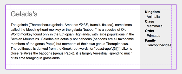 Grid tracks for padding!
(Example on CodePen, recommended to view with Firefox Grid Inspector)
We create a grid and make the first and last column, as well as the first and last row, exactly 1em. In this example, there is two auto grid track in between, there could be more if you wanted.
When we used padding, that was all we had to do to make the content stay inside the padded area. With grid, we have created an ‘optional padding’ situation so we will have to explicitly place the content inside the padded area.
If we want a piece of content to be in the padded area:
.card__content {
  grid-column: 2 / 3;
  grid-row: 2 / 3;
}
If we want the content to have a background that extends to the boundaries of the box, we position it to take up the first to the last row, and position it to take up space until the last column:
.card__meta {
  grid-row: 1 / 5;
  grid-column: 4 / 6;
  padding: 1.5em;
  background-color: #eee;
}
You could, of course, style .card__meta with negative margins, but I feel that method is less intuitive. I’m curious to hear how people think about using Grid instead.
Originally posted as Grids in cards on Hidde's blog.
Accessibility wars and the state of talking to machines
This week I attended Accessibility London. It took place at Sainsbury’s headquarters, who were kind enough to host the event.
The Accessibility Peace Model
Glenda Sims talked about what she and Wilco Fiers like to call the accessibility interpretation problem: people disagree about how (much) accessibility should be implemented and tested. There are normative guidelines (WCAG), but experts have different views on what complying to the norm means. Glenda explained that this is ok, ‘there are multiple valid ways to use WCAG’.
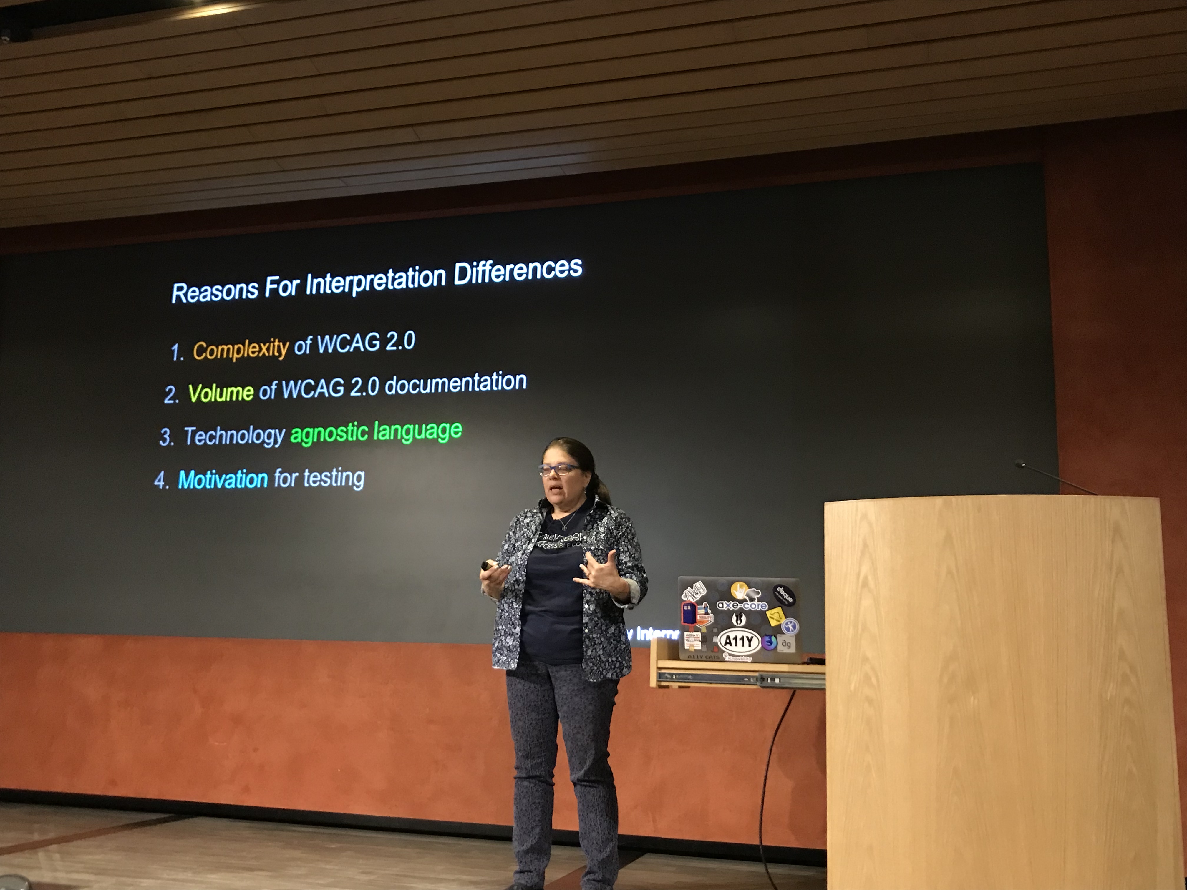 Glenda Sims on why interpretations differ
She explained a scale of interpretation styles:
- bare minimum (only where WCAG says ‘this is normative’)
- optimised (beyond strictly normative, also tries to act in spirit of the whole document and look at the Understanding and Techniques pages)
- idealised (tries to look beyond what’s currently possible and maximises accessibility).
Different people at your team or your client’s teams will be on different places of that scale. Knowing this is the case can help think about expectations. I found this a super refreshing talk, it resonated a lot with my experiences. The full whitepaper can be found on Deque’s website.
The history and future of speech
Léonie Watson walked us through the history and future of people talking to computers (Léonie’s slides). From synthetic voices that existed way over 90 years ago to modern computer voices that can sing reasonable covers of our favourite pop songs. There are various W3C standards related to speech, Léonie explained, like Voice XML and the Speech Synthesis Markup Language, and there is a CSS speech spec (‘why should I have to listen to everything in the same voice?’, Lèonie asked. A great point.) As far as I know, nobody works on CSS Speech anymore, sadly.
Léonie also explained how we can design for voice with the Inclusive Design Principles in mind, with useful do’s and don’ts. At the end, she left us with questions about embedding privacy, security, identity and trust in voice assistants.
This was an excellent event with great speakers, I was so glad I was able to attend.
Originally posted as Accessibility wars and the state of talking to machines on Hidde's blog.