Reading List
The most recent articles from a list of feeds I subscribe to.
Hello W3C!
In June, I will start working at the W3C as a Web Front-end Accessibility Specialist in the WAI team. This also means I’m leaving Mozilla and the City of The Hague, where I currently contract. Goodbye is never easy, but I’m very excited for this next challenge.
With 1¾ years, my freelance contract at Mozilla is my longest since I started contracting. Being a contractor is never forever, but I’m still sad to leave. I learn a lot and feel I am able to contribute a lot, too. I like this balance. It is great to work with Mozilla’s Open Innovation team, and specifically the IAM Project. I feel at home. It is difficult, too, at times, as our team is distributed across the globe in an ever-changing organisation (some of that is fun, too).
The majority of my time in the last year was spent on a project codenamed DinoPark, where people can browse other people’s profiles and edit their own. This is currently in Staff-only beta. Technically it is a Vue-based front-end which talks to back-ends using GraphQL. It is even more exciting from a human perspective. It fits Mozilla’s Manifesto in many ways, for example in privacy (how it lets users control who can see their data), security (designed with security at the core) and accessibility (we tackled accessibility challenges early in the process). I like and very much align with the Mozilla stance in the web, which is well captured in the manifesto… this makes me want to continue my relationship with Mozilla as a contributor. I’m still figuring out where that could be (there’s some ideas).
I will also leave the City of The Hague, where I rewrote the existing front-end code into a component-based system, exposed as a pattern library. I also worked on the accessibility throughout this system and the web pages it powers. Working for the government is something I had wanted for a long time, because governments have lots of IT problems, and solving them right can provide incredible value to people’s lives.
I will certainly miss working with both of these teams.
But really, the web is not accessible enough, and I feel like I’ve developed a passion for helping people get it right. At work, but also through talks and workshops. I’m delighted that I’ll get to spend more time on accessibility work.
In the last 10 years, I was often the “accessibility person” on the team. In my role at W3C, I am excited to become a person who is part of an “accessibility team”. I’ll be a Web Front-end Accessibility Specialist, working on WAI-Guide, that’s mostly what I know and can share right now. I’m equally nervous and excited for what awaits me.
Originally posted as Hello W3C! on Hidde's blog.
Baking accessibility into components: how frameworks help
Complex components like date pickers, custom selects and modals can be tricky to get right. They can be tricky to make accessible. They need good internals, like sound semantics, keyboard usability and focus management. All well tested, preferably with a diverse set of real users. Once that is done, once a complex component is built to a high standard, frameworks or Web Components could help make that component very reusable.
Well, what’s new, you might think? Isn’t reusability of components the whole point of UI frameworks and Web Components? Yes, probably. But that is often pointed out as an advantage that increases developer convenience. I’ve heard that phrased as ‘if the developer has convenience, the user will, too’. Meanwhile, component framework-powered websites have a somewhat negative connotation among accessibility experts. This post tries to explore how component frameworks help. How they, too, can make the web a much better place for users, especially in terms of accessibility and usability. (Disclaimer: conclusions in this post may be trivial to declarative framework developers)
When I had to build a custom select
The longer a project goes on, the bigger the chance that someone will want a custom select to be built. I usually try and resist, because these are very hard to get right. Native selects have a lot of thought put into them. They work across platforms in a way that matches each platform (see native select behavior on Android, iOS). But sometimes there are good reasons. Really.
What I’m talking about, just to be clear, is not just a custom trigger (those are relatively easy), but also custom options within them. Everything custom!
The use case that initially triggered this piece of work, was a Mozilla project that had a component where someone could set field level privacy settings. There was a number of fields, like ‘First Name’ and ‘Last Name’, each with their own privacy setting. It was designed to have just the icon in collapsed state, and icons plus labels in the expanded state. An interface with all options spelled out for each field, would likely cause mental overhead. This is not a setting people set often, but we want it to be there, easy to find, because it is important to have control over your data privacy. With that in mind, it would make sense to show just an icon in the collapsed state.
No ARIA this time
ARIA is a fantastic initiative that essentially lets developers polyfill semantics. It involves adding attributes to an HTML element, in order to set accessibility-related meta information like the names, descriptions, roles and states of that element. It is specifically aimed at rich internet applications. Something to remember about it is that, while the ARIA suite adds new semantics to use in HTML, it is not a successor to the existing set of HTML elements. Those elements are still there and often very appropriate to use. The first rule of ARIA is not to use it.
Yep, it’s usually fine and appropriate to use existing semantic HTML elements.
The problem with the existing HTML element that is select, is this: browsers provide no way to customise what the options look like. But a select is not so different from a group of radiobuttons, right? Either let users pick one out of many. (I’m leaving the multiple attribute out of this, but let me just say they could map to checkboxes).
One big advantage of radiobuttons is that they are easy to customise, because you can visually hide them and then do whatever you like with their associated label element.
This is the basic version of a custom option:
<input type="radio" id="option-1" name="option-set" />
<label for="option-1">Rotterdam</label>
With this, you can apply a visually hidden technique to the input, use the name to associate multiple options to be one thing. You could wrap the group of options in a fieldset and give that a maximum height. And probably a sensible (max?) width. Also, you’ll want to ensure it opens where there is space (and not outside the viewport).
Then, if your list of options is all done, there is one piece left: the thing that toggles the options. For this, I would suggest a button:
<button type="button">
  Choose city
</button>
If you want, you could use some ARIA to convey that this button controls your fieldset. This can be done with aria-controls, with an ID as its value (use the ID of the element you expand):
<button
  type="button"
  aria-controls="custom-select">
    Choose city
</button>
In Using the aria-controls attribute, Léonie Watson explains that although support is inconsistent, creating a “controls” relationship in the DOM can make a component more robust, while not getting in the way of users:
The presence of aria-controls won’t damage the User Experience (UX) for people using UA that don’t support it, but it will enormously improve the UX for those people whose browser/screen reader combinations do.
Another thing you can do to the button is set the expanded state, with aria-expanded. This takes a boolean:
<button
  type="button"
  aria-controls="custom-select"
  aria-expanded="false">
   Choose city
</button>
The aria-expanded needs to reflect the actual expanded state, so when the custom select is open, set it to true, if not, set it to false.
So… say, you’ve done all this work, and you start using these custom selects across your website. One risk of reusing through copy/paste is that the code ends up in many places, and only in some of the places, all the markup is used as intended. This could be detrimental to the user experience. Maybe we could actually benefit from an abstraction here.
When component abstractions aid accessibility
If we do the above and make it available as a declarative component, perhaps React, Vue or an actual vanilla Web Component, one benefit is state. As we’ve seen in the above example, there are some things that rely on state, like the setting of aria-expanded. Declarative component frameworks make such settings trivial (once you’re up and speed with using the framework, that is, we’ll get into that later).
A second big advantage, is that it becomes one whole at the point of usage. Let’s say it is called custom-select.
Whenever we want to use custom-select, we do (pseudo code):
<custom-select options="options" />In which options is some JavaScript object of options.
We declare it, we say what the options are, and in the DOM, it becomes a custom select with those options. This “becoming a custom select” might worry front-end folks, but it is not some sort of magic. We have described exactly what this means, how it should be done. With which semantics, keyboard behavior, focus styles and usability. These things are very important metrics for quality, they require careful consideration. The advantage of using some sort of component abstraction is that only one person or one team has to do this thinking. Others then ‘just’ use it, without worrying about the internals.
In my case, I’ve gone for a button that toggles a fieldset, but if there is a better way, custom-select can become whatever that better way is in the future. We need to come up with excellent internals, even be ready to improve them after a user test or accessibility. But all in all, I find this separation between internals and actual usage helpful.
A good example of a similar separation of concerns, from existing HTML, is the <video> element. It has a couple of internals that developers don’t need to worry about at the point of usage. We just need to tell it where our video and subtitles live. It then deals with internals for us: play buttons, closed captions, even multiple video formats… all the good stuff.
I’m more and more convinced that containment of ‘the good stuff’ can make the web better for users.
Increased complexity
There is a disadvantage to this nice containment of components using a framework: it’s complex. I mean, the tooling required to ship code is, because it requires advanced knowledge of JavaScript. That potentially scares people away. Complexity could reinforce privilege and moving all of a component into JavaScipt can turn full-stack developers into gatekeepers. Heydon Pickering describes there is a problem with full stack:
if you put someone in charge of all [the full stack], it’s highly likely they are going to be much weaker in some areas than others
In his post, Heydon identifies that what I call a component’s “internals” above are often built poorly. For two reasons: because improving internals now requires knowledge of complex frameworks and because the people specialising in them get undervalued. People who are good at writing front-end code that improves accessibility, but not at advanced JavaScript, might give up, at which point the web could lose out on accessible functionality. That’s sad.
I really like working on the detailed stuff that affects users: useful keyboard navigation, sensible focus management, good semantics. But I appreciate not every developer does. I have started to think this may be a helpful separation: some people work on good internals and user experience, others on code that just uses those components and deals with data and caching and solid architecture. Both are valid things, both need love. Maybe we can use the divide for good?
Conclusion
Modern websites commonly contain complex interaction patterns that aren’t default on the web. We may dislike that or prefer simplicity, but that’s a different (and also interesting) discussion. If we are going to code these complex interactions, it makes sense to contain the result in a component. Let’s assume we’ve worked hard on very accessible and usable ‘internals’, ran user tests and are confident that they are good. Then re-usability is a great thing, because the people who reuse, don’t need to worry about the internals. Like they wouldn’t worry about the internals of a video element when they use that. This is how I think frameworks can help make the web more accessible to users. And, ultimately, pave the way for more user convenience.
Update 31/1: In this post, I regard framework components and Web Components as one group for lack of a better word, but as Šime Vidas notes in the comments: if we make accessible components it makes more sense to do it in framework-agnostic Web Components than in a framework. To add to that, it might not only be tool-agnostic, but also more future proof.
Originally posted as Baking accessibility into components: how frameworks help on Hidde's blog.
Naming things to improve accessibility
One thing you can do to improve the accessibility of your work is to always ensure things have accessible names. Unique and useful names, ideally, so that they can be used for navigation. In this post I’ll explain how browsers decide on the names for links, form fields, tables and form groups.
This post is based on part of my talk 6 ways to make your site more accessible, that I gave at WordCamp Rotterdam last week.
Accessibility Tree
When a user accesses your site, the server will send markup to the browser. This gets turned into trees. We’re probably all familiar with the DOM tree, a live representation of your markup, with all nodes turned into objects that we can read properties of and perform all sorts of functions on.
What many people don’t know, is that there is a second structure that the browser can generate: the accessibility tree. It is based off the DOM tree, and contains all meta information relation related to accessibility: roles, names and properties. Another way to say it: the accessibility tree is how your page gets exposed to assistive technologies.
Assistive Technology
Assistive Technology (AT) is an umbrella term for all sorts of tools that people use to improve how they access things. For computers and the web, they include:
- alternate pointing devices, like a mouse that attaches to a user’s head
- screen magnifiers, they enlarge the screen
- braille bars, they turn what’s on the screen into braille
- screenreaders, they read out what’s on the screen to the user
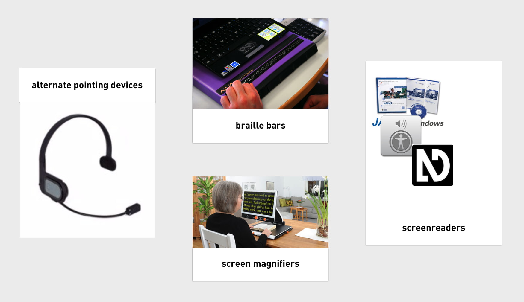
All of these tools, to work efficiently, need to know what’s happening on the screen. To find out, they access Platform APIs, built into every major platform, including Windows, Mac and Linux. The APIs can expose everything in the OS, so they know about things like the Start Bar, Dock or the browser’s back button. One thing they don’t know about, is the websites you access. They can’t possibly have the semantic structure of every website built into their APIs, so they rely on an intermediary — this is where the Accessibility Tree comes in. It exposes your website’s structure. As I said, it is based on the DOM, which is based on our mark-up.
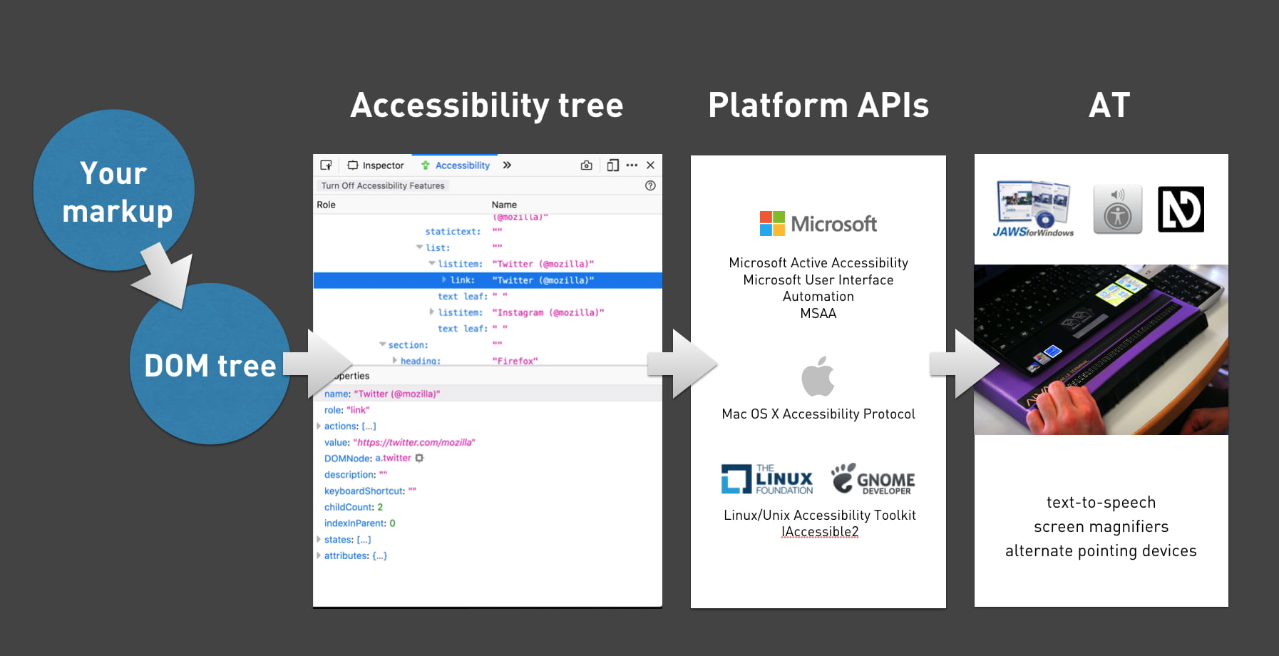 A handy flow chart
The accessibility tree exposes roles (is this a header, a footer, a button, a navigation?), names (I’ll get into those in a bit), properties (is the hamburger menu open or closed, is the checkbox checked or not, et cetera) and a number of other things.
If you want to see what this looks like on a site of your choosing, have a look at the Accessibility Panel in Firefox Developer Tools, or check out the accessibility info boxes in Chrome, Safari Tech Preview or Edge developer tools.
Accesssible name computation
Names are one of the things the accessibility tree exposes for its objects. What a thing’s name is, gets derived from markup. There are many aspects that can influence this. If you want to know this in detail, check out the Accessible Name and Description Computation Specification.
Unique names help distinguish
Before going more into how to expose names, let’s look at which names we want. What the names are is crucial for whether they are accessible or not.
What if your family has four cats, and each of them is named ”Alice”? This would be incredibly impractical, as it would make communication difficult. “Has Alice been fed yet?”, you might wonder. “Is Alice outside?”, you might ask your partner. Ambiguity is impractical. Yet, this is what we do when our homepage has four news items, with each “Read more” as its link text.
 Imagine all of your cats were named Alice (photo: stratman2 on Flickr)
This is very common, sadly. In the WebAIM Million project, in which WebAIM looked at over a million sites and ran automated accessibility checks, they found:
24.4% of pages had links with ambiguous link text, such as ‘click here’, ‘more’, ‘continue’, etc.
Reusing “Read more” as the link text for each news item makes our code and content management simpler, but it provides bad usability for screenreader users. When they use the link shortcut to browse through links on the page, they will have no idea where each links leads them. In the example above, when you ask an AT to read out all links, it will read “Link Read more, Link Read more, Link Read more, Link Read more”.
Naming things
So, unique and descriptive names are useful to AT users. Let’s look at which HTML can help us provide names. As I said before, the heuristics for determining names are in a spec, but with just HTML providing names for most things is trivial. The following section is mostly useful for people whose HTML is rusty.
Links
The contents of an <a> element will usually become the accessible name.
So in:
<a href="/win-a-prize">
Win a prize</a>
the accessible name would compute as “Win a prize”.
If there’s just an image, its alt text can also get used:
<a href="/win-a-prize">
  <img src="prize.png" alt="Win a prize" />
</a>
And, to be clear, if there’s nothing provided, the name would be null or empty string, so some people would be unable to win any prize.
Form fields
Form fields get labelled using the <label> element. In their aforementioned research, WebAIM also found:
59% of form inputs were not properly labeled.
Let’s look at what a labelling mistake could look like:
<div>Email</div> <!-- don't do this-->
<input type="email" id="email" />
In this example, the word “Email” appears right before the input, so a portion of your users might be able to visually associate that they belong together. But they aren’t associated, so the input has no name— it will compute as null or '' in the accessibility tree.
Associating can be done by wrapping the input in a <label> element, or by using a for attribute that matches the input’s id attribute:
<label for="email">Email</label> <!-- do this-->
<input type="email" id="email" />
Tables
To give a table a name, you can use its <caption> element. This is used as the first element in a <table>.
Groups in a form
Within forms, you sometimes want to group a set of form inputs, for example a collection of radiobuttons or checkboxes that answer the same question. HTML has <fieldset> for grouping form elements. To name this group as a whole, use the <legend> element:
<fieldset>
  <legend>Don't you love HTML?</legend>
  <input type="radio" name="yesno" id="yes"/>
  <label for="yes">Yes</label>
  <input type="radio" name="yesno" id="no"/>
  <label for="no">No</label>
If you were to inspect this fieldset in the accessibility tree, you will notice that the group is now known as “Don’t you love HTML?”.
What about ARIA?
Those familiar with the Accessible Name and Description Computation spec might wonder at this point: doesn’t ARIA also let us give elements accessible names? It totally does, for instance through the aria-label / aria-labelledby attributes. When added to an element, they overwrite the accessible name (if there was one).
Good reasons to prefer standard HTML tags over ARIA include:
- better browser support (a lot of browsers support most ARIA, but all support all HTML, generally speaking)
- more likely to be understood by current or future team members that don’t have all the ARIA skills
- less likely to be forgotten about when doing things like internationalisation (in your own code, or by external tools like Google Translate, see Heydon Pickering’s post aria-label is a xenophobe)
Sometimes ARIA can come in handy, for example if an element doesn’t play along well with your CSS (like if you want a Grid Layout in a fieldset), or if your (client’s) CMS is very inflexible.
It’s the markup that matters
In modern browsers, our markup becomes an accessibility tree that ultimately informs what our interface looks like to assistive technologies. It doesn’t matter as much whether you’ve written this markup:
- in a
.htmlfile - in Twig, Handlebars or Nunjucks
- as the
<template>in a Vue Single File Component - exported in the JSX of your React component
- outputted by a weird legacy CMS
It is which markup that determines if your site is pleasurable to experience for AT users. In short: it’s the markup that matters
There’s good chance your site already uses all of the above HTML elements that name things. They have existed for many years. But I hope this post explains why it is worth the effort to always ensure the code your site serves to users, includes useful names for assistive technologies. Markup-wise it is trivial to assign names to all things on our site, the real challenge is probably two fold. It’s about content (do we come up with useful and distinguishable names), and about tech (can we ensure the right markup gets into our user’s DOMs).
Originally posted as Naming things to improve accessibility on Hidde's blog.
Content and colour at #idea11y in Rotterdam
Last night I joined the ‘inclusive design and accessibility’ meetup (idea11y) at Level Level in Rotterdam, to learn more about optimising content and colors.
When I talk about accessibility, I often approach the subject from a front-end code perspective, and I make a point of disclaimering: this is only one of the many aspects to ensure the accessibility of a website. Content and colours are two other very important aspects that are essential to get right, so it was great to hear Damien Senger and Erik Kroes talk us through those subjects.
Content
Damien Senger, designer and accessibility advocate at Castor EDC, talked about cognitive impairments: ‘they are interesting, because they are often invisible’ (Damien’s slides). This is a great point, it also implies that these aspects are harder to catch in automated tests. Lighthouse can’t warn about them like it can about ill-formatted ARIA. Cognitive impairments we can optimise for include dyslexia, autistic spectrum disorder and ADHD. Users with such impairments benefit from less content, better organised content and more readable text.
Damien explained we read not by word but by ‘saccade’, jumping between parts. He also showed how shapes are important, and lack thereof bad for readibility, for instance all caps or justified text. These four C’s help, Damien said: continuity (repeat same information for reassurance), conspicuity (make it obvious), consistency (use same wording for same things) and clarity (ensure copy is understable).
Damien gave lots of tips for designing, on four levels:
- micro typography: too much contrast can make letters dance for dyslexics, so dark grey is preferred to black; breaking highlighting is bad at people use that to see where they are
- macro typography: think about heading hierarchy and group related things
- layout: ensure consistency of layout and always offer multiple ways to find content
- global: avoid distracting users with things like autoplaying videos; reduce content
Colour
Erik Kroes, accessibility specialist at ING, talked about colour, specifically what colour contrast means and how to create a for-screen colour palette for your brand that can be used with black and white accessibly.
Most people will know that colour contrast is important and use tools like Lea Verou’s awesome Contrast Ratio. For AA-level conformance, WCAG 2.1 prescribes contrast ratios of 3:1 (large text) and 4.5:1 (all text). These tools simply tell us whether our colours are within the range. Erik wanted to know more than just the numbers and had great feature requests (‘why do none of these tools show contrast with black and white at the same time?’).
Most of the talk was about creating colour schemes that lead to sufficient contrast ratios. Erik showed how HSL doesn’t really help when working out a contrastful scheme… to really get into finding colours with enough contrast, we need to look at ITU-R Recommendation BT.709, a standard from the 90s that describes colors for television screens that takes the human eye’s workings into account (‘useful luminence’, Erik called it). I had no idea, that this is what WCAG colour contrasts ultimately are based on. The reason this 30 year old standard is still somewhat suitable, is that screens still use sRGB and human eyes are still the same.
Erik explained that in WCAG 2.1, ratios range between 1:1 (zero contrast) and 21:1 (black on white). What I never realised, and am still unsure if I fully get how, is that when a colour has a ratio of 3:1 on a white background, it has a 7:1 ratio on a black background, because 21 divided by 7 equals 3. The maximum of 21 makes that the set of accessible colour combinations is limited.
To help with finding colour schemes that work well with black and white texts, Erik recommended the Contrast Grid tool. He also works on his own tool to meet his contrastful color needs, this looks very exciting (and is Web Components based).
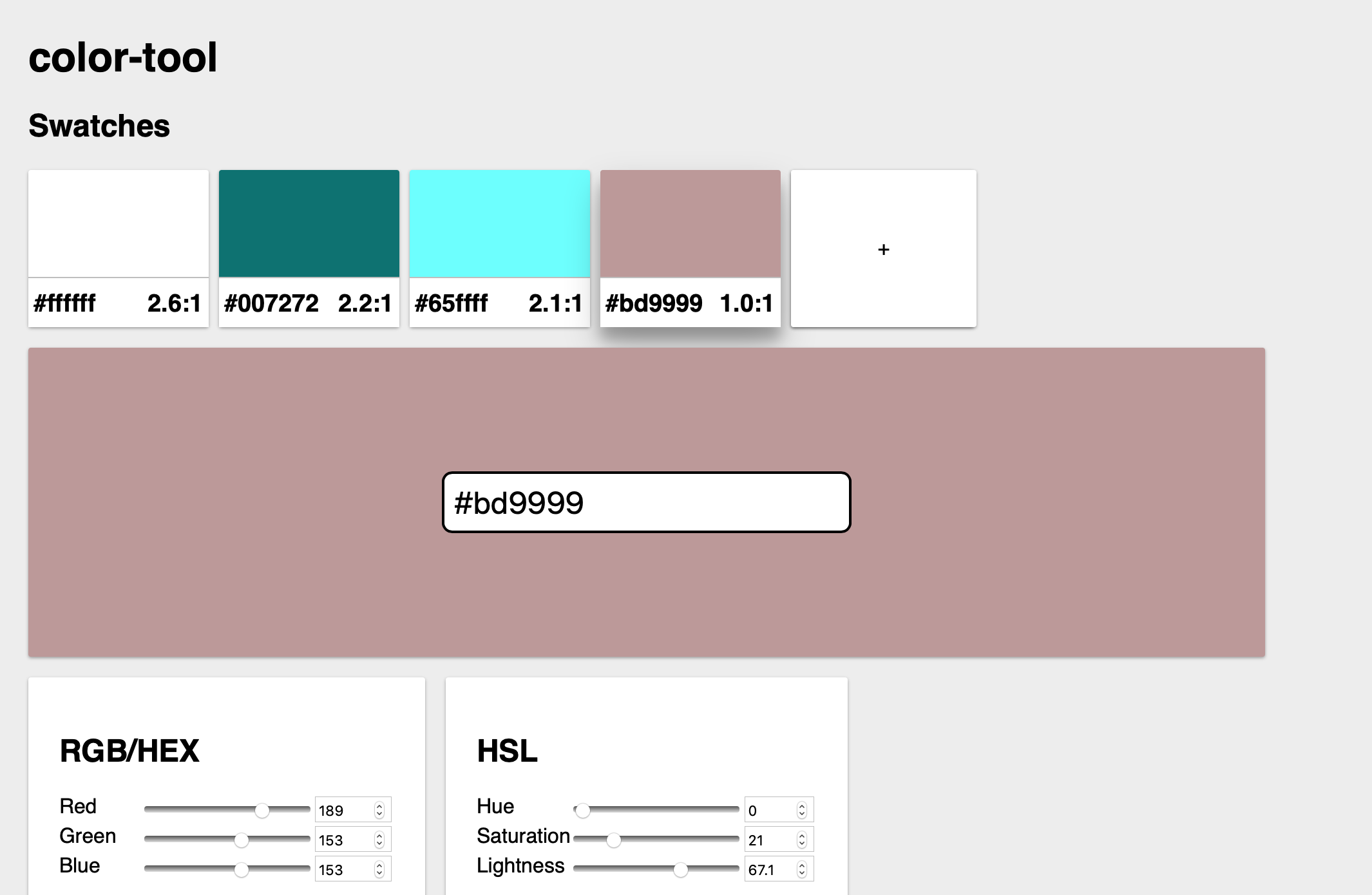 Erik’s tool
Wrapping up
This was a great evening, thanks to Job. Rumour has it that there will be another one next month, so I am looking forward to that!
Originally posted as Content and colour at #idea11y in Rotterdam on Hidde's blog.
Book review: The age of surveillance capitalism
This week I read The age of surveillance capitalism by Shoshana Zuboff, an enlightening book about how big tech companies are watching what we do, and what their end game might be. I thought I had heard all of this, but, of course, I couldn’t be more wrong.
Beyond “You are the product”
You’ve likely heard people say ‘if a product is free to use, you are not the customer, you are the product’. It’s a bit of a cliché now, that Zuboff completely reframes in The Age of Surveillance Capitalism. We aren’t exactly the product… we, or the data that describes our behaviour, to be more precise, are the raw material of a whole new iteration of capitalism.
 The book is huge, but only just over 500 pages, the rest is footnotes
The Age of Surveillance Capitalism explains this new iteration in the context of early capitalism (Ford’s, and even the age of gilds). Zuboff explains how the founders of Google, and later Facebook and others too, set the scene: how they found use for data that previously looked useless, their secrecy about exposing the size of their data collection and their lobby against rules. Yup, they prefer to make their own rules. And will insist that their way is the only way, which the world just needs to accept: Zuboff coins this ‘inevitabilism’.
This attitude of setting their own scene is a recurring theme throughout the book. For instance, when Facebook does behavioral research, they don’t follow “The Common Rule“, Zuboff explains, that academic experimenters apply to themselves to avoid power abuse. This abuse in a corporate setting could be much worse than that in an academic one, as there is more conflict of interest in play (in the corporate setting there is a need to earn profits for shareholders).
A new iteration of capitalism
So what’s this new iteration of capitalism? Zuboff explains that in this new paradigm, data is the raw source or ‘commodity’, extraction of it the production process (a supply route that the big tech companies work hard to protect) and predicting people’s behaviour is the product.
The production process (‘extracting’ data from people) has expanded massively over the past years, as tech corporations found new ways to get behavioural data (‘behavioural surplus’, as Zuboff calls it). They offer more and more services, sometimes increasing their speed by purchasing other companies (Facebook bought WhatsApp and Oculus, Google bought YouTube). And it isn’t just online either. Tech companies discovered there is lots of data to be gathered in the real world, through physical things with internet connections. Google Maps cars that ‘accidentally’ take WiFi hotspot data. Hotel rooms that come with Alexa built-in. And sometimes they give rewards in exchange, like an insurance company that offers a lower rate in return for replacing a monitoring device in your car.
There is this notion in the book that we accept too much without foreseeing the full picture. At some point Zuboff describes the nature of contracts online: legally they likely cover all they need to do, but might it be unreasonable to assume that anyone ever reads them? What if they refer to other contracts? The large scale data extraction operetion, that Zuboff later calls Big Other, may be a case of the horseless car syndrome, she suggests. When the first car was invented, we were used to horses and carriages, and thus that was how we tried to name and understand this new phenomenon: as a horseless carriage.
The dystopia of a data-driven society
The latest big thing isn’t just studying behavior, it is influencing behavior, too. Experimenters at Facebook found they could hugely influence people in whether they would go vote or not by using techniques from behavioral psychology. With these techniques, humans become merely tools. Zuboff introduces the notion of instrumentarialism, which she compares do and notes is quite different from totalitarianism. They both overwhelm society and do some sort of social domination, but for different reasons, the market vs the political realm.
Zuboff shows how the world in which surveillance capitalism plays the role it plays in ours, is somewhat dystopian. She compares it to Orwell’s and Skinner’s. One of the aspects that makes it dismal is that humanity gets reduced away. The tech leaders are utopians and believe in a “data-driven society”, Zuboff says. They insist that that is ’practical and feasible but also a moral imperative in which the benefits to the collective outweigh all other considerations’ (438). People like Pentland don’t believe in individuals with opinions and attitudes to live… if we see others do something, we’ll copy, we are easily conditioned.
Is this a conspiracy theory?
I have to ask, as last week a group of Dutch actors accused of hyperbolic complot theories held up the book in a talkshow as their bible. It contains some strong claims and assumptions about people’s intentions, but overall Zuboff’s book is very thorough. Her claims and statements are consistently supported by extensive footnotes.
A lot of the practices she asks questions about, actually happen. Tech leaders don’t deny them, and sometimes even boast about them, Zuboff shows. This is in the realm of private companies. What if the instruments of these private companies get used by authoritarian governments? Zuboff talks about how private companies helped American intelligence agencies with all sorts of technology. China’s Sesame Credit systems rates people’s character and gives or denies them perks, including things like purchasing rail tickets and using dating apps. The numbers are staggering. Again, these are not conspiracies, they actually happen.
It is also important that this argument isn’t against capitalism, it is against systems that break basic principles of democracy and human autonomy.
Conclusion
The age of surveillance capitalism is a great read, be sure to get a copy if you want to understand what surveillance capitalism is and could become. It does a great job at demonstrating what she presumes are the dynamics behind the internet economy. It’s convincing, and thought-provoking. It has gotten me worries, but also strangely positive about which world I want to fight for. It’s not an easy or quick read, as it is an academic book and sentences tend to get long and detailed. Alternatively, you can hear Shoshana Zuboff talk about surveillance capitalism at The Intercept or her interview with Mozilla’s IRL podcast.
Originally posted as Book review: The age of surveillance capitalism on Hidde's blog.