Reading List
The most recent articles from a list of feeds I subscribe to.
Meaning without markup: Accessibility Object Model
Meaningful markup is essential for accessibility, because it brings semantics. In short, it tells the browser what things are. Proposals for the Accessibility Object Model include a new way to convey semantics: without markup, directly in JavaScript. In this post, we will look at the proposals and their current status.
Beyond the scope of HTML
To get a more detailed overview of how the quality of our markup impacts end users, see my previous post How accessibility trees inform assistive tech. To summarise: our markup gets used to construct accessibility trees, which inform assistive technologies (AT) about what things are on our pages. With this information, AT can offer features like ‘browse by heading’ and advanced table navigation.
There are plenty of semantic elements to choose from when we build a component. The set of HTML elements is enormous. Even if you build a new thing for which no semantic element exists, custom components that combine existing HTML elements let you have at least some of your semantics for free.
Sometimes the set of HTML elements really does not cut it. You’ve created an interface concept for which reasonably no semantic tag exists in HTML. This is where WAI-ARIA comes in: it lets you provide accessibility-relevant information to the browser using standardised attributes, including semantics, states and labels.
Some examples of effective ARIA:
- with
aria-expanded="true|false", you can set the state of a button that expands/collapses content - with
role="alert"you can turn an element into a live region: when content is updated, the update is announced to AT users
There is also ARIA that can turn elements into elements for which there are already existing HTML equivalents, such as buttons and links. This is not recommended, because apart from changing semantics, it also makes affordances like keyboard behavior the developer’s responsibility. For instance, instead of <span role="button">, it is much safer to use <button type="button"> and get the keyboard behaviour for free. In 2019, styling native buttons is no longer a problem. Certainly not one that warrants accessibility bugs like reduced keyboard support.
How AOM will help
So, let’s say you are making something that passes the first rule of ARIA (paraphrased: “don’t use ARIA if it is not needed”). You could use markup for this: just add the appropriate attributes. Once the Accessibility Object Model is implemented, you could also apply ARIA without markup.
The proposed Accessibility Object Model (AOM) will be “a JavaScript API to allow developers to modify (and eventually explore) the accessibility tree for an HTML page”. In other words: it gives developers direct access to the accessibility tree. In a way, that’s a bit like what Service Workers do for the network and Houdini for style: give developers control over something that was previously done only by the browser. All in the name of an extensible web: control over these low-level features enables developers to experiment and create new things without waiting for the standards process. Perhaps, with AOM, people could define Web Components that don’t exist in HTML just yet.
Having access to low-level features like these, gives developers power (yay!). But at the same time, they also give developers more direct responsibility, regarding aspects like security, performance and accessibility. It can be tricky and time-consuming to implement best practices and fulfill all those responsibilities. Admittedly, is it easier, and often sensible, to use browser defaults. Extending the web like this is probably most practical for teams that are able to invest the time.
AOM is currently developed by people from across Mozilla, Google and Apple. They’ve defined four phases for the project. Let’s look at some of the plans and how they help.
No more ‘sprouting’
Interfaces with a lot of advanced controls can quickly become a sea of attributes, which the HTML spec calls “sprouting”. Even a simple disabled button might require role, aria-label and aria-disabled attributes. That’s a lot of attributes, not just to add, but also to maintain (in markup). To solve this, AOM will let developers set accessibility attributes of an element directly in JavaScript.
For example, to set aria-expanded on an element, you could do it on the element directly:
el.ariaExpanded = true;Previously, we could only set this attribute to expanded by switching the value of the attribute in the markup. With AOM, the set of ARIA attributes will also exist as properties that DOM nodes can have, so called IDL (Interface Definition Language) attributes. The IDL attributes are said to reflect attributes in the markup. In the above example, that means that upon setting el.ariaExpanded to true, an attribute (if it does not yet exist) is added to el and it is set to true.
The mapping of ARIA attributes to IDL attributes is defined in the ARIA 1.2 specification.
Note that in applications that have some form of virtual DOM, like those built with frameworks including React and Vue, best practices prescribe “don’t touch the DOM, let the framework deal with DOM changes”. In those applications, defining semantics in the markup or a template will probably still be the go-to approach.
Relationships without IDs
In HTML, the id attribute uniquely identifies an element. Form labels make use of this: we associate label attributes with their corresponding input by pointing the label’s for to the input’s id. In ARIA, there are a number of properties that need to point to an id (or multiple ids), like aria-controls (this element controls that element) and aria-describedby (this element is described by this element/these elements).
With AOM, one can associate elements with other elements directly, by assigning them like this:
formField.ariaLabelledBy = formLabel;Non-DOM nodes in the accessibility tree
In some very specific cases, a web application may contain content that does not exist as DOM nodes. For instance: drawing a train station’s map of available elevators on a canvas. Each elevator has a label, and also a informational popup that can be expanded. This information would currently be lost to assistive technologies. With AOM, you could define an accessibility tree containing all the labels and expanded states. These would then be conveyed to AT, so that users can understand them.
Good for testing
The AOM also aims to bring reading accessibility attributes. The intended use case: testing! With AOM, you would be able to access the names, roles and states of your HTML nodes directly in tests.
Tests can already access an element’s ARIA information by reading out attributes today. With AOM, they would read out what something has actually computed to in the browser’s accessibility tree. This functionality has the potential to make tests better.
Accessibility Events
In JavaScript, we have a number of useful events that let us act on user input like clicks, keyboard presses and touch. In some cases, there is a discrepancy between such events and input from users of assistive technologies.
In her talk Web Components and the AOM at JSConf Asia 2019, Léonie Watson explained that actions like “swipe up” and “swipe down” mean different things to users of VoiceOver on iOS:
When you have a screenreader running on a touch screen, the flick up and flick down gestures [developers] would probably use for adjusting the value of a slider, are already used for screenreader specific commands.
Because screenreader users already use “swipe up” and “swipe down” gestures to trigger screenreader specific commands, it would be impossible for them to use the same gestures for something else in the app you’re developing.
This is why AOM aims to bring events that are specific to assistive technologies, so that AT can design consistent ways to let the user perform certain actions. Apple calls these semantic events.
Some examples of accessibility events:
incrementanddecrementfor going to the next item in a custom slider (like using up and down arrow keys)dismissfor closing a modal overlay (like pressingESCkey)
There is a large privacy concern associated with AT-specific events: malicious site owners could use them to detect if someone has a visual or mobility impairment.
Current status
The specifications for AOM are still in progress, and so are implementations. Various browsers have implemented (parts of) AOM). The part that seems to have most implementations is attribute reflection. This feature works for most attributes in Chrome and Edge (enable via about:config) and Safari (pick ‘Accessibility Object Model’ from Experimental Features setting in Developer menu). There is currently no AOM support not in Firefox.
If you look at the IDL tests with AOM flags enabled, you can see how much your browser supports of the attribute reflection part of the specification.
Wrapping up
Simple solutions are often the easiest way to get your product to work for as many people as possible. For example, when for a date of birth field, you decide against a fancy, complex datepicker and rely on a clearly labelled input[type=text] instead. Standard, boring HTML goes a long way. Chances are it will work well for users and make your accessibility auditors happy. But if your product has custom controls that just don’t exist in HTML, you will want to convey the right accessibility properties to assistive technologies.
AOM is an interesting new proposal in which accessibility information gets its own APIs beyond existing DOM methods like setAttribute and getAttribute. Those methods set and get out values that compute into properties of accessibility trees, but they don’t deal with those properties directly. It’s a subtle difference. With direct access to accessibility info, we could set accessibility properties without markup, we could create accessibility trees for things that don’t exist in the DOM (like for contents of canvas elements) and testing accessibility may improve.
Originally posted as Meaning without markup: Accessibility Object Model on Hidde's blog.
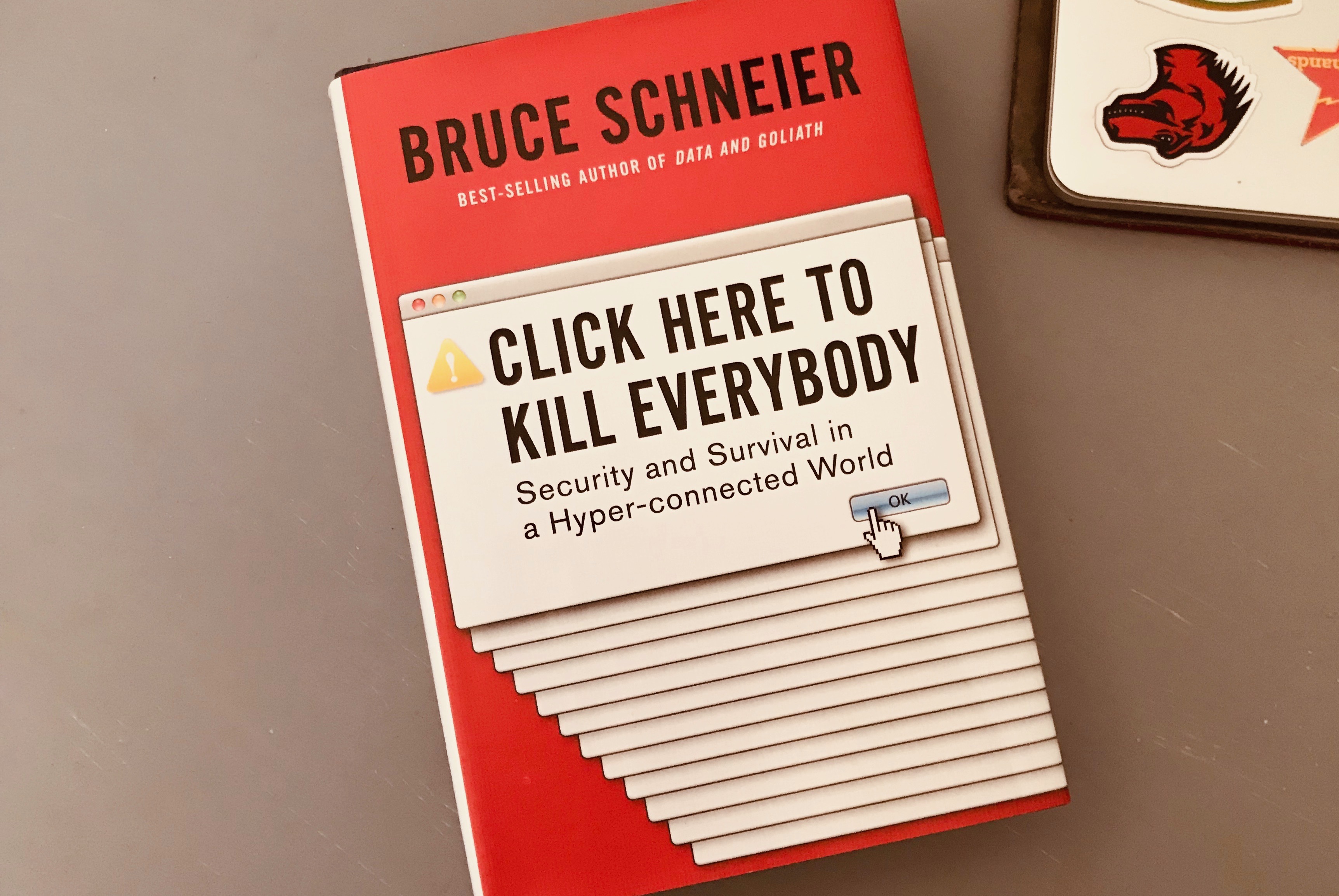
Click here to kill everybody: a review
This week I read Click here to kill everybody, a book that is at the same time worrying and encouraging. A security nightmare is waiting to happen, but there is still time to save the world. Yeah, the book is a tad dramatic, but generally a great read that I can recommend.
 The book
More and more devices are connected to the internet, and it is not just traditional devices with browsers, like desktop computers, laptops, tablets and smartphones. It’s also things like washing machines and fridges. Even in mission critical things like thermostats, pacemakers and nucleair power plants. We, humans, are in the middle of this new world: we give input to and accept output from our devices. In his book Click here to kill everybody, security expert Bruce Schneier coins the phrase Internet+ for this new reality (the internet, things and ourselves). He worries about Internet+, as it is grows rapidly and is a lot less secure than we should want it to be. With your car on the network, a hack could mean turning off its breaks while on the highway. With internet enabled medical devices in our body, a hack could mean turning you off. Yup, lots to worry!
The book gives a good overview of security risks that we can find in internet connected devices and how villains could exploit them. Many of those devices have problems that we technically already know how to fix. Encryption exists, but companies produce baby monitors that don’t encrypt voice data, to name just one example. Some of this sounds oddly familiar to accessibility: WCAG is over 20 years old now, but it is not implemented as widely as one would hope.
There’s lots of reason for pessimism, Schneier explains, if you think about the incentives of companies and governments. Companies focus on maximising profits, and lack of security is often no threat to those profits. This is because usually customers face the consequences. Surveillance capitalism also gets in the way, because you cannot trust companies to keep you secure if their business model is surveillance. In short, and the book goes into a lot more detail, we should not expect a lot from companies. Governments sometimes work against security: they try to keep security protocols weak and keep certain vulnerabilities secret, to make the work of intelligence agencies like NSA and FBI easier. Or they propose to ban encryption altogether (Cameron and May in the UK). Schneier questions whether such attempts are going to help: real criminals will find their way around, so it won’t stop them, but it will certainly make the world a lot less secure for ordinary consumers. Can we afford that?
Still, Schneier looks at the government for solutions. Because they could actually do something about companies’ lack of security, by legally forcing companies into making their products more secure. Earlier in the book, Schneier talks about how useful it would be if security and detailed aspects of it become metrics by which products get compared. I could imagine that to be policy, too: force companies who make Internet of Things devices to disclose whether or not they have certain security features. Does this particular baby monitor encrypt data, and with which algorithm? Oh, this other one does not encrypt at all. It fits well in Schneier’s call for transparancy: more transparancy about data breaches and security implementation is essential for a more secure future, he says.
One of the risks in governments getting policy about technology right, is that policy makers often lack technological understanding, Schneier explains. Last year’s Mark Zuckerberg hearings in the US Senate were probably a good example of that, although that was about privacy, not security. It was sad to watch many of the Senators ask the wrong questions, because they clearly did not get what they should have worried about. Many policy makers don’t seem to realise the risk of storing so much personal data on corporate servers, Schneier concludes. So he ends with a call to action. There is a huge need for people with an engineering background to be interested in policy, and get involved. Schneier also points at some experts who are already doing this, like Latanya Sweeney (“probably the best analyst in de-anonymysation”, now professor of government and technology) and professor Susan Landau who testified before US Congress about ubiquitous encryption.
I like the book. It is a bit sensational, has a click-baity title and focuses too much on the US and Europe, but it gives a really good overview of the stakes across companies, ethics and politics with regards to internet security. Its mostly about stakes, and not so much about practical security advice, which I’m sure you can find in one of Schneier’s other books. Click here to kill everybody ends positively: we can get this right, let’s take action now.
Originally posted as Click here to kill everybody: a review on Hidde's blog.
How accessibility trees inform assistive tech
The web is accessible by default. It was designed with features to make accessibility possible, and these have been part of the platform pretty much from the beginning. In recent times, inspectable accessibility trees have made it easier to see how things work in practice. In this post we’ll look at how “good” client-side code (HTML, CSS and JavaScript) improves the experience of users of assistive technologies, and how we can use accessibility trees to help verify our work on the user experience.
People browse differently
Assistive Technology (AT) is the umbrella term for tools that help people operate a computer in the way that suits them. Braille displays, for instance, let blind users understand what’s on their screen by conveying that information in braille format in real time. VoiceOver, a utility for Mac and iOS, converts text into speech, so that people can listen to an interface. Dragon NaturallySpeaking is a tool that lets people operate an interface by talking into a microphone.
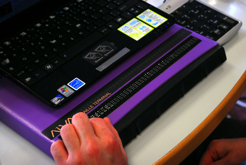 A refreshable Braille display (Photo: Sebastien.delorme)
The idea that people can use the web in the way that works best for them is a fundamental design principle of the platform. When the web was invented to let scientists exchange documents, those scientists already had a wide variety of systems. Now, in 2019, systems vary even more. We use browsers on everything from watches to phones, tablets to TVs. There is a perennial need for web pages that are resilient and allow for user choice. These values of resilience and flexibility have always been core to our work.
AT draws on these fundamentals. Most assistive technologies need to know what happens on a user’s screen. They all must understand the user interface, so that they can convey it to the user in a way that makes sense. Many years ago, assistive technologies relied on OCR (optical character recognition) techniques to figure what was on the screen. Later they consumed markup directly from the browser. On modern operating systems the software is more advanced: accessibility APIs that are built into the platform provide guidance.
How front-end code helps
Platform-specific Accessibility APIs are slightly different depending on the platform. Generally, they know about the things that are platform-specific: the Start Menu in Windows, the Dock on the Mac, the Favorites menu in Firefox… even the address bar in Firefox. But when we use the address bar to access a website, the screen displays information that it probably has never displayed before, let alone for AT users. How can Accessibility APIs tell AT about information on websites? Well, this is where the right client-side HTML, CSS and JavaScript can help.
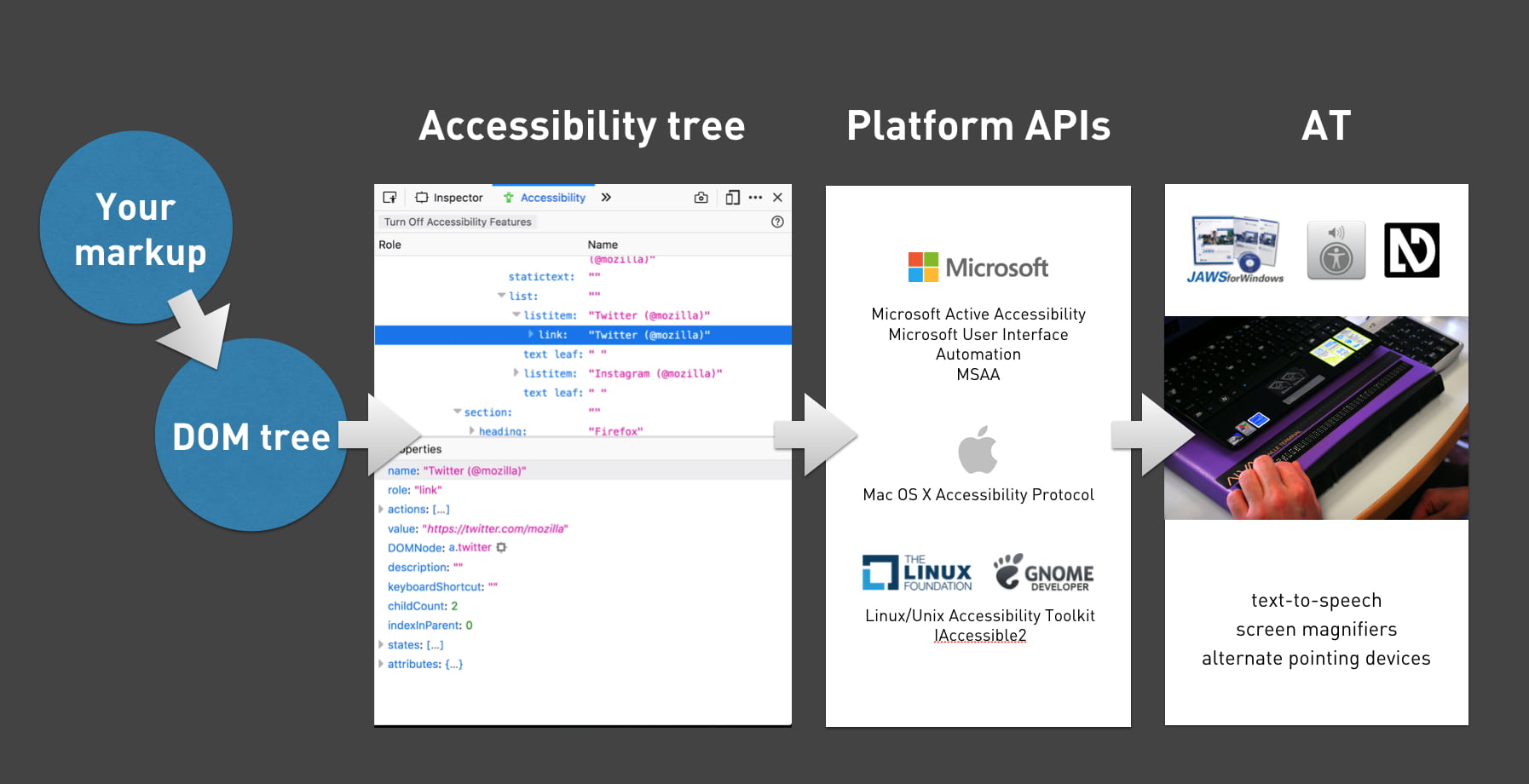
Whether we write plain HTML, JSX or Jinja, when someone accesses our site, the browser ultimately receives markup as the start for any interface. It turns that markup into an internal representation, called the DOM tree. The DOM tree contains objects for everything we had in our markup. In some cases, browsers also create an accessibility tree, based on the DOM tree, as a tool to better understand the needs and experiences of assistive technology users. The accessibility tree informs platform-specific Accessibility APIs, which then inform Assistive Technologies. So ultimately, our client-side code impacts the experience of assistive technology users.
HTML
With HTML, we can be specific about what things are in the page. We can define what’s what, or, in technical terms, provide semantics. For example, we can define something as a:
- checkbox or a radio button
- table of structured data
- list, ordered or unordered, or a list of definitions
- navigation or a footer area
CSS
Stylesheets can also impact the accessibility tree: layout and visibility of elements are sometimes taken into account. Elements that are set to display: none or visibility: hidden are taken out of the accessibility tree completely. Setting display to table/table-cell can also impact semantics, as Adrian Roselli explains in Tables, CSS display properties and ARIA.
If your site dynamically changes generated content in CSS (::before and ::after), this can also appear or disappear in accessibility trees.
And then, there are properties that can make visual layout differ from DOM order, for example order in grid and flex items, and auto-flow: dense in Grid Layout. When visual order is different from DOM order, it is likely also going to be different from accessibility tree order. This may confuse AT users. The Flexbox spec is quite clear: the CSS order property is “for visual, not logical reordering”.
JavaScript
JavaScript lets us change the state of our components. This is often relevant for accessibility, for instance, we can determine:
- Is the menu expanded or collapsed?
- Was the checkbox checked or not?
- Is the email address field valid or invalid?
Note that accessibility tree implementations can vary, creating discrepancies between browsers. For instance, missing values are computed to null in some browsers, '' (empty string) in others. Differing implementations are one of many reasons plans to develop a standard are in the works.
What’s in an accessibility tree?
Accessibility trees contain accessibility-related meta information for most of our HTML elements. The elements involved determine what that means, so we’ll look at some examples.
Generally, there are four things in an accessibility tree object:
- name: how can we refer to this thing? For instance, a link with the text ‘Read more’ will have ‘Read more’ as its name (more on how names are computed in the Accessible Name and Description Computation spec)
- description: how do we describe this element, if we want to add anything to the name? The description of a table could explain what kind of info that table offers.
- role: what kind of thing is it? For example, is it a button, a nav bar or a list of items?
- state: if any, does it have state? Think checked/unchecked for checkboxes, or collapsed/expanded for the
<summary>element
Additionally, the accessibility tree often contains information on what can be done with an element: a link can be followed, a text input can be typed into, that kind of thing.
Inspecting the accessibility tree in Firefox
All major browsers provide ways to inspect the accessibility tree, so that we can figure out what an element’s name has computed to, or what role it has, according to the browser. For some context on how this works in Firefox, see Introducing the Accessibility Inspector in the Firefox Developer Tools by Marco Zehe.
Here’s how it works in Firefox:
- In Settings, under Default Developer Tools, ensure that the checkbox “Accessibility” is checked
- You should now see the Accessibility tab
- In the Accessibility tab, you’ll find the accessibility tree with all its objects
Other browsers
In Chrome, the Accessibility Tree information lives together with the DOM inspector and can be found under the ‘Accessibility’ tab. In Safari, it is in the Node tab in the panel next to the DOM tree, together with DOM properties.
An example
Let’s say we have a form where people can pick their favourite fruit:
<form action="">
  <fieldset>
    <legend>Pick a fruit </legend>
    <label><input type="radio" name="fruit"> Apple</label>
    <label><input type="radio" name="fruit"> Orange</label>
    <label><input type="radio"  name="fruit"> Banana</label>
  </fieldset>
</form>
In Firefox, this creates a number of objects, including:
- An object with a role of grouping, named Pick a fruit
- Three objects with roles of label, named Apple, Orange and Banana, with action Click, and these states: selectable text, opaque, enabled, sensitive
- An object with role of radiobutton, named Apple, with action of Select and these states: focusable, checkable, opaque, enabled, sensitive
And so on. When we select ‘Apple’, checked is added to its list of states.
Note that each thing expressed in the markup gets reflected in a useful way. Because we added a legend to the group of radio buttons, it is exposed with a name of ‘Pick a fruit’. Because we used inputs with a type of radio, they are exposed as such and have relevant states.
As mentioned earlier, we don’t just influence this through markup. CSS and JavaScript can also affect it.
With the following CSS, we would effectively take the name out of the accessibility tree, leaving the fieldset unnamed:
legend { display: none; /* removes item from accessibility tree */ }This is true in at least some browsers. When I tried it in Firefox, its heuristics still managed to compute the name to ‘Pick a fruit’, in Chrome and Safari it was left out completely. What this means, in terms of real humans: they would have no information as to what to do with Apple, Orange and Banana.
As mentioned earlier, we can also influence the accessibility tree with JavaScript. Here is one example:
const inputApple = document.querySelector('input[radio]');
inputApple.checked = true; // alters state of this input, also in accessibility tree
Anything you do to manipulate DOM elements, directly through DOM scripting or with your framework of choice, will update the accessibility tree.
Conclusion
To provide a great experience to users, assistive technologies present our web pages differently from how we may have intended them. Yet, what they present is based directly on the content and semantic structure that we provide. As designers and developers, we can ensure that assistive technologies understand our pages well writing good HTML, CSS and JavaScript. Inspectable accessibility trees help us verify directly in the browser if our names, roles and state make sense.
Originally posted as How accessibility trees inform assistive tech on Hidde's blog.
CSS Day 2019: some things I learned
Last week I joined over 400 web nerds at CSS Day 2019, which took place once again in the lovely Compagnietheater in Amsterdam. These are some of the things I learned.
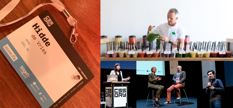 The badges were beautiful and there were smoothies (
scroll-behavior: smoothie)! Speakers from left to right: Natalya Shelburne, Rachel Andrew, Tab Atkins, Heydon Pickering. Photos on the right by Joyce Goverde, the event’s awesome photographer
When I attended the first installment of the conference, I had not expected that there would be more. I mean, there’s only so much you can say about CSS. Of course I was wrong and more happened… every year. Last week was the 7th (!). The 2019 edition was not, as tweets may have suggested, a day for bashing JavaScript or the people who write it. Apart from the occasional tongue in cheek comment on people’s motivations to pick React (React?), this conference was full of interesting tidbits on what CSS can do now, how it is being developed (in specs and in browsers) and how we can, as CSS developers, be effective team members, able to sell CSS as the serious language that it is. With all due respect for our colleagues who write JavaScript (I and many others do both, too).
Note, I missed the first talk (the good thing about a conference nearby is: can do some daughter time in the morning). Luckily Rachel Andrew’s video and Rachel’s slides are already online, I just watched the video and it is very, very good. One great point she makes in it is that we should stop talking about CSS as if it is a hack, because if we do we reinforce the idea that CSS is weird, quirky and a series of hacks. She said this in the context of using auto margins for alignment, which she said is simply using CSS as it is specced, not a hack.
What CSS can do now
Something you might not think about daily: when should lines break? Florian Rivoal showed how whitespace between words works on the web, and what some of the challenges are in deciding when to break a line to the next (Florian’s slides, Florian’s video). This is specifically interesting within tables, as a cell that contains a long line of content increases the whole table’s size, unless the line breaks. The same happens in Grid Layout cells, by the way. Breaking is defined in Unicode, annex 14, you can automate with auto hyphens (always set a lang and star the Chromium bug to express interest in support) or manually influence with <wbr> or a soft hyphen character.
Steve Schoger showed tips and tricks to make websites look better (Steve’s video). No actual CSS was shown, but it was interesting to see how small visual changes can make a big difference. Think about how to choose the right colors, create visual hierarchy and design good tables. A great tip regarding tables was: they don’t have to represent your database structure: often you can show less columns by combining or omitting some information, and make the core information easier to find. It was good to see that in many of his tips, Steve also took accessibility into account.
Heydon Pickering introduced how smart CSS can let flexbox layouts resize between linear one column things and multiple columns, without that weird in between state where the last item takes double space and therefore looks more important, and, importantly, with no media queries (Heydon’s video). They depend on window width, which is not helpful in a world where components can exist in all sorts of containers. His solution is aptly (?) named the holy albatross, and in his talk he revealed a project called Every Layout where that technique and others will be made available as custom elements, built together with Andy Bell.
How it is being developed
Line boxes have existed for ages in CSS, Elika J. Etemad a.k.a. fantasai explained, they ensure content does not overlap (fantasai’s video). But, non-overlapping content could mean a less ideal vertical rhythm, and this annoys typographers working with CSS. The definition of ‘fits within linebox’ may need to be redefined, Elika explained, there may be a switch between this old and new model for how lines are sized. What if you have a graphic or heading on a page that is not as tall as exactly X amount of lines? That would interrupt the vertical rhythm. To deal with that, CSS might get a block-step-size property that could insert extra space above and/or below that graphic, to fill the gap between the space the graphic needs and the space the vertical rhythm offers. You would even be able to choose whether to add it as margin or padding (with block-step-insert), and where to align it (block-step-align: auto | center | start | end). This is all defined in CSS Rhythmic Sizing, currently open for feedback. Elika also went into linebox trimming with leading-trim-over/leading-trim-under, which gives better control over leading in the top and bottom of a text, to allow for alignment without magic numbers (see #3240). Interestingly, for this to work, it’s not just CSS, but also font foundries, who need to add the required metrics. Font metrics are also important for baselines (in future CSS you can set a dominant baseline with dominant-baseline (TIL there are multiple baselines)) and drop caps. For all of these things, languages beyond English (including CJK: Chinese-Japanese-Korean), are very much taken into account by spec writers, because the web is for everyone.
Manuel Rego Casasnovas showed how CSS is developed as features inside browsers: what the steps are to follow, what kind of actual C++ code goes where in the code base and how features go from existing behind flags to stable browser features that will forever exist because backwards compatibility (Manuel’s video). One of the many interesting things I learned in this talk is that it takes hours to compile a browser.
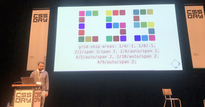 If we had
 grid-skip-areas, we could choose to autoplace grid items in all areas, except some. Then we could create the word CSS out of a grid.
Being a CSS developer
It is unlikely for a question to attract as many trolls online as: ‘is CSS a programming language?’ Lara Schenck decided to do the research and shared her results with us in a talk that was excellent in so many ways (Lara’s slides, Lara’s video). CSS fits right into one of the programming paradigms, domain-specific declarative programming languages, Lara explained. There are lots of criteria sceptics could come up with, like that programming languages should be Turing complete, suitable to write algorithms in and ‘have consequences’. She addressed these brilliantly in a sort of Socratic dialogue. Yes, you can replicate rule 110 in CSS with :checked and :not(), ok and a user and HTML, you can (and probably should) write CSS algorithms that are groups of declarations to produce a specific output, and yes, CSS has consequences, that can be addressed with programming methodologies. A great serious note she ended with is that a consequence of labeling CSS as “not programming” is that it renders companies unable to hire people who are good at CSS. People see it as not a skill worthy, and this is a problem, because without good CSS developers, companies lose out on well-built front-ends. To add a data point: I see this phenomenon almost everywhere I work (sadly).
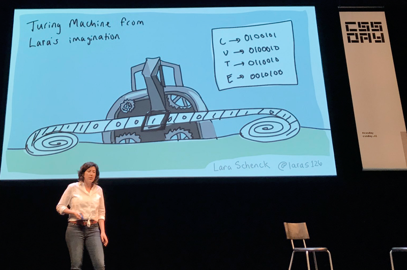 Lara’s Turing machine
Natalya Shelburne talked about the mindset of people who write CSS and how it combines different mental models (Natalya’s talk). She talked how CSS developers can bridge the gap between designers and the actual application’s you’re working on. One tool that helps is design systems: it can bridge domains, enforce shared vocabularies. Another cool thing she showed was a special ribbon like menu that she deploys just on staging. It has tools to help designers understand grids and, amazingly, the boxes that exist in the CSS reality, as compared to the boxes that are in the designer’s software. What an awesome way to collaborate! Natalya also discussed technological barriers: by moving a lot of our code into React components that are written in a way that’s mostly optimised for reading the JavaScript that exists around it, highers the bar for pure CSS people to contribute. She suggested having a pure HTML/CSS version to allow designers to contribute. Rather than thinking about or sticking to certain technologies, we should think about how to enable people, Natalya said. She celebrated that there are lots of people in the web community doing great work in this space.
Wrapping up
It was really good to see some new CSS that is coming up (seriously. watch fantasai’s video) and learn about how to use existing CSS. Another recurring theme throughout the day was: as a community of CSS people, we should demand this language we love to be taken much more seriously. If not for our own sanity and valuation, then for the companies we are writing CSS code for. I urge you to watch Lara’s video and Natalya’s talk.
One call to action that a couple of speakers mentioned in talks and in the hallways: please have a say in how CSS develops, all discussions happen on GitHub, everyone should feel free to comment. Blogging about things you’d like to see or use is also encouraged.
The CSS Day organisers have once again set the bar very high for the next edition, let’s hope there will be another one in 2020!
Originally posted as CSS Day 2019: some things I learned on Hidde's blog.
Indicating focus to improve accessibility
It’s a common, but fairly easy-to-fix accessibility issue: lack of indicating focus. In this post I will explain what we mean by focus and show you how focus outlines make your site easier to use.
What is focus?
Focus indicators make the difference between day and night for people who rely on them. Let’s first look at what they are, and which people find them useful.
Focus is something that happens between the interactive elements on a page. That’s the first thing you should know. (See the focusable elements compatibility table for a more detailed and nuanced definition.) Interactive elements are elements like links, buttons and form fields: things that users can interact with.

On a page, at any given time, there is one element that has focus. If you’ve just loaded a page, it is probably the document, but once you start to click or tab, it will be one of the aforementioned interactive elements. The currently focused element can be found with document.activeElement.
By default, browsers convey which element currently has focus by drawing an outline around that element. The defaults vary between browsers and platform. With CSS, you can override these defaults, which we’ll get to in a bit.
Who benefits
Focus outlines help users figure out where they are on a page. They show which form field is currently filled in, or which button is about to be pressed. People who use a mouse, might use their cursor for this, but not everyone uses a mouse. For instance, there are many keyboard users: a person with a baby on one arm, people with chronic diseases that prevent the use of a mouse, and of course… developers and other power users. .
Beyond keyboards, there are other tools and input devices that rely on clearly indicated focus, like switches. Focus indication also helps people who have limited attention spans or issues with short term memory, for example if they are filling out a lengthy form.
If the idea of indicating the current element in a website seems weird, consider TV interfaces. Most people use them with a remote control or game controller, and therefore rely on the interface to convey what’s currently selected.
Never remove them
Not everyone likes how focus outlines look, some find them ugly. But then that’s the case with street lights, too. They are unlikely to win design awards, but if you have to walk home in the dark, you are glad they help you see where you are.
Removing focus styles, as some websites do, is as detrimental for keyboard users as removing the mouse cursor would be for mouse users.
Nobody would override the browser’s default cursor, effectively removing the cursor altogether:
body {
  cursor: none; /* you wouldn't do this */
}
So we shouldn’t do this either, which removes the browser’s default outline:
:focus {
  outline: none; /* so, please don't do this */
}
Or, as Laura Carvajal put it at Fronteers 2018:
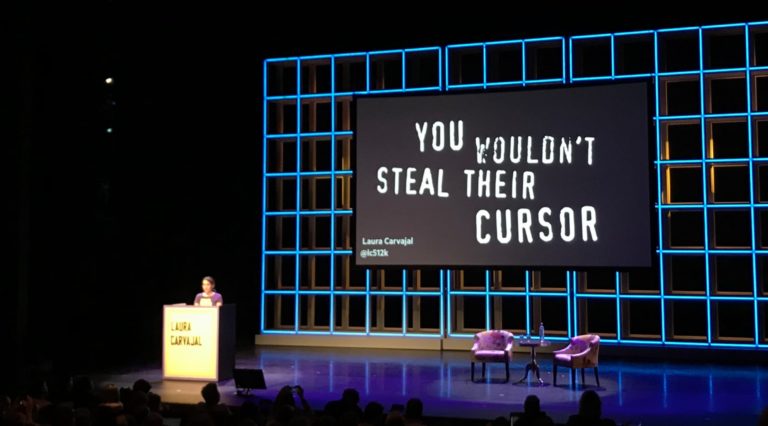
Even if you provide an alternative with something like box-shadow, best set outline to solid transparent, because box-shadow does not play well with high contrast modes.
Good focus indicators
One way to indicate focus is to rely on browser defaults. It works, but I would recommend designing your own focus outlines. This gives you maximum control over how easy they are to see, and lets you integrate them with brand colours or the style of your site. Usually, thicker outlines (from 2px onwards) are better, as they are simply easier to see.
The :focus pseudo class takes CSS rules like any other selector, so you could style it however you like. In some cases a background color or underline could indicate that something is active.
Examples
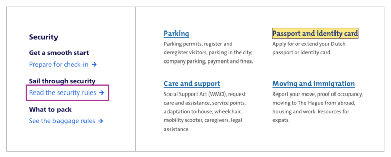
Below are focus outlines as seen on Schiphol.nl and the City of The Hague websites. They make it easy to distinguish in a list of links which one is currently active.
Transitions
Focus outlines do not have to be boring. The outline property can be transitioned with CSS, so why not add a subtle animation? Make it pop!
Contrast
In WCAG 2.1, focus indicators are bound to the same contrast rules as other parts of the content, as per 1.4.11: Non-text contrast. This means a contrast of 3:1 between the outlines and their background is required.
On websites that have both light and dark parts, it is quite common to have a dark and a light focus style. For example, if your focus outline is blue for parts with a white background (for instance, the main content area), you could make it white for parts with a black background (for instance, the footer).
Special cases
Focusing non-interactive elements
As mentioned earlier, focus works on interactive elements. In special cases, it makes sense to focus a non-interactive element, like a <div> , if that element is a piece of expanded content or a modal overlay that was just opened.
Any element can be added to focus order with the tabindex attribute in HTML. Best use it with 0 or -1:
tabindex="0": element can be focused with keyboard and through JavaScripttabindex="-1": element can be focused through JavaScript, but cannot be tabbed to
A tabindex with a number larger than 0 is best avoided, as this sets a preference of where the element goes in the tab order. If you set it for one element, you will have to set and maintain (!) a tabindex value on all interactive elements on the page. See also: It rarely pays to be positive by Scott O’Hara.
Only for keyboard users
If you are a developer and the design team is unwilling to apply bold focus styles, you could propose to show them to users who need them, for instance only to keyboard users.
There are two caveats to this notion of “users who need them”:
- Not all people who rely on focus styles use a keyboard. We mentioned switches earlier, but that’s only one use case. As a general rule, keep in mind that you can’t predict all the ways your visitors choose to browse the web.
- Making focus styles keyboard-only takes away an affordance for mouse users too, as focus also indicates that something is interactive.
For these reasons, we should be careful making decisions about when and how to show focus styles. Luckily, there is a CSS property invented to help us out here: focus-visible. According to the spec, it lets us:
provide clearly identifiable focus styles which are visible when a user is likely to need to understand where focus is, and not visible in other cases
In other words: it aims to let you indicate focus only for people that need it. It is preferable to avoid such heuristics and convey focus rings to everybody, but if you have to, focus-visible is ideal. Especially if the alternative is nothing at all.
Focus styles as keyboard accessibility
A focused element that isn’t highlighted has a big impact on usability for keyboard users. You could make keyboard checks part of your development workflow to ensure that you don’t forget focus indicators. For instance, you could include “Can be used with a keyboard” in your definition of done. This is a check that most people in the team should be able to do before a new feature goes live. As we’ve seen above, focus styles don’t just benefit keyboard users, but keyboard operability is a good way to test them.
When testing, you might find that not all browsers and platforms let you tab through interactive elements by default. Here are some of the most common settings across platforms and browsers:
- macOS: under System Preferences > Keyboard > Shortcuts set ‘Full keyboard access’ to ‘All controls’
- Safari, macOS: in
Safari > Preferences, under ‘Advanced’, check ‘Press Tab to highlight each item on a webpage’ - Chrome: in chrome://settings, under ‘Web content’, check ‘Pressing Tab on a webpage highlights links, as well as form fields’
Summing up
Hopefully this post inspires you to try out your (client’s) site with just a keyboard. Maybe it is a pleasure to use already. If not, perhaps this post convinces you or your team to address the problem and design some on-brand focus indicators. Together we make the web more friendly to users of keyboards, sticks and switches. Together we make the web work for everyone.
Focus outlines are one of many ways to design for accessibility. For more tips on design with accessibility in mind, see Accessibility Information for UI designers on MDN and Tips for designing with accessibility at the W3C.
Originally posted as Indicating focus to improve accessibility on Hidde's blog.