Reading List
The most recent articles from a list of feeds I subscribe to.
Can components conform to WCAG?
We can build UI components with accessibility in mind. We can also document accessibility specifics alongside them, or review them for obvious barriers during development. All helpful and recommended. What about claiming conformance? In this post, I'll talk about how WCAG technically doesn't allow for that, and why I believe WCAG is right.
This post is partially based on a series of talks I've been doing called “Built-in accessibility: blessing or curse?”, that also goes into “accessible web platform features” and authoring tools. A video from JS Heroes 2025 on YouTube is available .
As usual, opinions are my own, they do not represent those of my employer or Working Groups I am in.
Why components can't conform
In WCAG 2, components (like the React/Angular/vanilla/HTML components in your design system) cannot formally conform to WCAG, because one of WCAG's conformance requirements says:
conformance is for full web page(s) only, and cannot be achieved if part of a web page is excluded.
Of course, you could put an isolated component on an HTML page, or in some kind of Codepen or Storybook situation, but I don't think that makes a difference (even if you now technically created a ‘full web page’). We want to know if people can access a thing, and people (end users) access end products, specifically full pages and processes (eg they want to buy a thing, or submit a review).
The requirement was written before 2008, the year WCAG 2.0 was published. At that time front-end components weren't a thing, not as installable packages, but also not really as copy-pasteable snippets (it seems Natalie Downe pioneered this as a practice at Clearleft in 2009).
The requirement could be reconsidered. Design systems have matured a lot in the last decade. Multi-brand, multi-framework and automatically tested components are the norm now. Maybe I'm biased as an accessibility specialist, but I've seen a lot of teams name accessibility as a or the major driver to develop their design systems. And I've seen many be super effective in creating more accessible end products, because of how they're able to get best practices in the hands of many and their role in centralising useful documentation.
We should definitely test how accessible components are and document what they can and can't contribute to a website's accessibility. And WCAG requirements can help with this. However, I think claiming WCAG conformance about pages or sets of pages, as we do today, approaches it at the right level. I don't think we should want to claim conformity of components by themselves (we can of course review them, optimise them, document them, have accessibility specialists evaluate them). We shouldn't want to claim conformance specifically, because of two risks: overpromise and not capturing actual accessibility.
Risk of overpromise
Allowing for conformance claims on components makes it too easy for “component sales people” to make promises that they can't keep.
I don't mean “component sales people” derogatorily. I used to be one, mind. By this word, I mean specifically people involved in:
- promoting the design system with people who can use the components in their product (or buy them commercially)
- promoting the design system and its merits with decision makers and budget holders
The concept of a component that is WCAG-conformant sounds really good, I think. As a developer, I would npm install it straight away. As a budget holder, I would allocate vast sums of money towards it. Even as an accessibility person, I would like for it to exist, but I'm pretty convinced… there's no “it”. It isn't something that's actually feasible or meaningful (see below).
There's a real risk in overpromising the value of a component if we say it is accessible or conforms to some accessible standard. It could make people believe that they no longer need to worry about accessibility once they use or buy the component. That creates the wrong expectations: accessibility is a continuous process. Like we want to always iterate on user experience, we want to always iterate on accessibility.
Risk of not capturing actual accessibility
Claiming a component is conformant would not be as meaningful as it may seem. It would likely fail to capture actual accessibility of users, for many reasons. Below, I'll go into three: customisability, combinability and context.
Customisability
Most modern components have options, tools like Storybook exist for web developers to list, demo and test component options.
Many such options can easily have an impact on WCAG conformance at the point of usage, meaning we can only establish whether the usage meets WCAG in the final product. Conformance can't be decided in the “demo” component.
For example:
- if we can change colours in a component, we need to know what the colours are to decide if the end product meets WCAG (1.4.3, 1.4.11)
- if we can change buttton text in a component, we need to know what the text is in the end product to decide if the end product is accessible (eg no to “click here”, yes to descriptive text) or meets WCAG (eg 2.5.3)
- if we can pass alternative text to an image component, we need to know if the passed in text describes whatever the image is… we'd need to look at both the image and the text, to decide if the end product meets WCAG (1.1.1)
- if spacing is customisable, we need to know what the number is in the end product to decide whether it meets WCAG (2.5.8)
Combinability
Sometimes, we need to combine components in the right way in order to create something that is accessible or meets WCAG.
For instance, many design systems have separate label components and input components. To create an input situation that meets WCAG (1.3.1, 4.1.2), the person creating the end products may have to combine two components. And at that point, the “conformance” wouldn't really be in that one component, it would be in the effective combination of multiple (Many systems offer helpers or use one component to make this easier, but that's not my point).
Context
Lastly, context matters too. In the isolation of a test suite, there is only so much we can see. Looking at accessibility in lab conditions is undeniably useful, but for actual accessibility, we need at context: what people would actually be using.
My skip link component isn't meaningfully accessible if it is used in a page that doesn't contain the ID that it is set up to skip to. Or if there are no blocks of content that are repeated. Surely, it could contribute to meeting 2.4.1 Bypass Blocks , but only in the context of a page where it lets a user actually bypass actual blocks.
The focus indicator on my calendar component isn't meaningfully accessible if the picker sits inside a element that cuts it off halfway. It can contribute to meeting 2.4.7 Focus Visible, but only in the context of a page that doesn't then break it.
Accessibility that can be built in
There are some aspects of accessibility that mostly “survive” customisability, combinability and context.
This is what you should definitely try to build into your components, where possible:
- keyboard accessibility, eg how to move between dates in a datepicker, or how to select an option from a list, or what is the order of elements.
Note: this can still be broken by page level keyboard interjections (like any use of positivetabindex, or via script). - semantics (specifically roles) that don't depend, eg a button component that uses the button element.
Note: a lot of semantics do depend, eg for popovers there are many suitable roles. - states and relationships, eg the
aria-expandedstate in something that can expand. - sensible reading order.
- zoom and reflow support.
Note: this can still break with content and context. - user preference support, eg dark/forced color mode, text spacing.
- support for accessibility features, eg caption and audio description support in a video player component.
There are many other ways to make components robust. I definitely see a lot of value in doing that. Over the last few years I've seen a number of examples where serious investement in accessibility at the design system level yields fewer and less severe issues in end products.
Another major benefit of working with components in a design system: there is a lot of opportunity to show the way. Document how to use the component well, what was tested, what needs to be tested in the end product, et cetera. Help well-meaning developers get it right (we can do a different post on what to do with ill-meaning developers).
Specs that components can meet
Added 13 August, based on Peter's thoughtful comment
While I say components can't meet the WCAG specification, they can absolutely meet other specifications. I don't think it makes sense to claim a button meets WCAG, but it does make sense to me to say a button meets a button-specific spec.
For any component you could make a list of things of requirements to make that component accessible (or good). A component could meet all of those requirements. This is not a fantasy.
The NL Design System project (disclaimer: I used to work there) incubates components from a community of government design system makers. As part of the incubation process, they makes lists of requirements for each component, see for instance their list of requirements for Skip Link (Dutch, should work with a translate service of your choice).
The US Web Design System has checklists too, like their Button checklist. They explain what things were tested when the component was made, and what you should be test for each component upon implementation.
Wrapping up
Officially, we can't claim accessibiliity conformance on components. But I'd also argue about wanting to make such claims, as we risk overpromising. Yet, there is lots of value in optimising components. There's lots of value in attempting to build in what can reasonably be built in. And to provide documentations that explains how you've gone about building and testing. As long as we never forget who interacts with what (and how). The goal should be that people can use the end product.
Originally posted as Can components conform to WCAG? on Hidde's blog.
Conformance vs compliance, accessibility standards edition
Two words that are often confused: conformance and compliance. What do they mean?
Listening to this Muse song while reading is optional.
Conform to a standard
When something conforms to a standard, it “meets” or “satisfies” specific requirements in a standard.
For instance, in the case of WCAG, those requirements include that:
- the requirements in a specific Level are met (eg Level A or Level AA).
- the claim is about full pages only, not parts of them (eg not components).
- technologies are only used in accessibility-supported ways, or there must be alternatives with technologies that are (in that case, those technologies may not interfere by having unstoppable audio (1.4.2), keyboard traps (2.1.2), unstoppable moving content (2.2.2), or flashes (2.3.1).
Additionally, to claim conformance on a page that is part of a process, every other page in that process must also be conformant.
Examples:
- “this website conforms with WCAG”.
- “this website meets the 55 WCAG success criteria of WCAG 2”.
Examples of what wouldn't make sense:
- “this component conforms with WCAG” (it cannot, as it is not a full page; you could say something like “this component is built with accessibility in mind” instead; see Can components conform to WCAG?).
- “this website complies with WCAG” (see compliance below).
How conformance in WCAG works is likely to change in WCAG 3, which is still many years from being released. It's one of the things we're currently discussing on in the Working Group.
Comply with a regulation
Then compliance. Organisations can comply with regulation, for instance the laws and regulations that EU Member States adopted following Directive (EU) 2019/882, the European Accessibility Act.
Sometimes they show that they do, by showing that they conform to a standard. The European Commission sometimes commissions standards for this very purpose, via “standardisation requests”. For instance, the next update to EN 301 549, currently in the works, was mandated under M/587. It is likely to become what provides “presumption of conformity with the essential requirements” for the requirements of the European Accessibility Act, once published in the Official Journal of the European Union.
Other languages
In Dutch, we speak of “conformeren aan een standaard” (conform to a standard) and “naleven van een wet” (comply with a law).
In German, conformance and compliance are both called “Konformität”. One could distinguish between “Standardkonformität” (with a standard) and “Gesetzeskonformität“ (with a law).
That's it, I hope this post helps folks. More translations welcomed!
Originally posted as Conformance vs compliance, accessibility standards edition on Hidde's blog.
We should listen to the philosophers more
A few thoughts on the philosophical perspective, which I'd rebrand here as a useful perspective.
When I studied AI and then philosophy in university, pretty much every course prepared me to be annoyingly critical of AI. Sometimes I wish I wasn't aware of any of it.
Ethics, philosophy of language, epistemology and philosophy of science, aesthetics, history of philosophy, medieval philosophy, logic, philosophy of mind, metaphysics… that's roughly the list of areas my degree covered, plus some machine learning, neuroscience, functional programming and maths (those were not my strengths). For all of these research areas, it's trivial to draw lines to what we make computers do today. In many cases, the subject matter has been studied for for decades, sometimes for millenia.
I'm not really an expert in any of them. Just over four years in a university let me merely scratch the surface. I know where to find more information, roughly who the influential thinkers were and, in some cases, what they believed and how it contrasted with others. I learned not to accept things at face value, to consider perspectives and look for middle grounds.
But it's made me into someone who values the philosophical perspective. Mostly that of others, as, again, I barely scratched the surface. I value the philosophical perspective on the world, specificially on the role of technology in it. It is one that asks questions, carefully considers what's the right course of action, takes into account what actually constitutes knowledge and isn't afraid to go all meta on things.
The philosophical perspective seems daunting to some, but really, it's mostly an attitude. It's like a, method or series of methods, to make sense of things. Reasonably, carefully and evenly.
I find the lense of money much more daunting. I've never ran a multi billion dollar company, so maybe it is lack of familiarity and magnificent naivety… but it seems daunting to me to always try and fit everything into the scope of shareholder value.
The money lense forces one to value things that may not have value. With little room to question that. It's a lense that values hype and pretense over substance, that labels careful consideration as ‘hate’ or ‘blocking innovation’. A lense that brings prosperity, but also makes it really hard to make the downsides go away. Or even talk about them. The money lense avoids inconvenient meta questions.
Philosophers, in pretty much all areas of philosophy, are worth your attention. In general, people from the humanities bring much needed and more wide perspectives. They may not have ready made answers, but they can help ask the interesting questions, and call out inconsistencies.
Personally, I don't know if I'm always able, as it takes some mental toll to be the person in the room pointing out the concerns when others are excited about opportunities. I don't want to be the “hater” or the one “stiffling innovation”. Optimism is better for business, and the sceptical perspective is a needle I, and many others, want to carefully thread. I only scratched the surface, but I wish as technologists, we'd listen to the philosophers more.
Originally posted as We should listen to the philosophers more on Hidde's blog.
How to avoid that your post about AI helps the hype
If we're not cautious, we may accidentally feed the AI hype by talking about it in specific ways.
When we hype up the technology, we mostly help the people who put money into it. This post isn't about those people or that money, maybe they could use the help… my point is, they are irrelevant when we want to understand the merits of AI. They muddy the waters and overshadow the important questions.
There's plenty of questions to consider. Are LLM's helpful, can they solve specific problems well, should we use them? Sometimes the answer is yes, sometimes it is no. There are grey areas, some find use and others don't.
Do they increase productivity, can they do what humans do? It really depends. And that means we should weigh the options before we hype.
When we hype up and discuss merely what is or seems great, we help the powerful billionaires who consistently pour money into the technology. In addition, we might forget to do justice to the many ethical problems inherent to the technology. Especially around the implementors and implementations it has today, where there are problems from sourcing rare metals for chips to traumatising human data classifiers, from magnitudes larger climate footprint during training and use, to the mass theft of people's creative works.
So, when do we risk accidentally overhyping AI?
Forget that it's a machine
We might say things like ‘I'll ask [tool]’, ‘he/she said’, ‘he/she came up with’, ‘he/she told me’. Or ‘he/she thinks’.
Such phrases humanise the machine. When we humanise our pets, that's cute (and not just, animal cognition is a genuine field of philosophical enquiry). When we humanise machines, we help the billionaires.
This is too important to not be pedantic: an LLM can respond to words with words based on statistical likelihood, and while that's sometimes incredibly impressive and can seem human-like, any intelligence that reveals itself is an illusion. It's unlikely to let billionaires do scientific discoveries in fields outside they don't have a background in
The term “artificial intelligence”, was made up as a way to make a branch of scientific research more attractive to potential funders. A lot of the tech we see today is neither artificial, nor intelligent. It's powerful and impressive technology, sure, but it's machines.
Say “it is inevitable”
Those who've put endless amounts of cash into the tech, like Microsoft, who put 100 billion into OpenAI, may feel AI is inevitable. They invested, they need returns and they use everything in their power to get there, including their dominance in the market.
Inevitability suggests some kind of universal appetite for the tech. And there's appetite, for sure. But the fact that a lot of software today is begging users to start using their AI features, suggests otherwise.
Like Google Workspace, that will not let you have any smart features if you don't also use their AI.
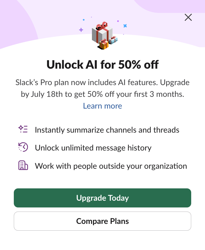 Slack offers a 50% discount if you enable AI.
AI is not inevitable for us, the people. Not at home, but also not at work, when we're making decisions about technology.
Again, AI could be helpful. Granted, AI could be the only way to achieve something. But AI could also be an unnecessary, unsuitable or needlessly extravagant solution to a specific problem. We've seen a lot of that too.
Mandate the use (without qualifying how or why)
Increasingly, C-suite is demanding AI use, without qualifying how or why (maybe they never hear no). Without substantiation and doing proper analysis of AI vs non-AI usage on a case by case basis, this is merely hype.
At Shopify, developers must use AI, their CEO said:
Before asking for more Headcount and resources, teams must demonstrate why they cannot get what they want done using AI
(From Shopify CEO Tobi Lütke's memo “Reflexive AI usage is now a baseline expectation at Shopify”, posted on 7 april 2025, on a social media site I won't link to)
The CEO of Axel Springer, the company that owns Politico and Business Insider said his employees need do explain when they don't use AI.
Microsoft President of Developer Division and GitHub, Julia Liuson, said “AI is no longer optional” and should be used in performance evaluations, emailing top management to say:
AI should be part of your holistic reflections on an individual's performance and impact.
Anecdotally, I'm hearing from friends all over big tech that they are rewarded if they do more with AI. Not doing so could be seen as bad performance and therefore threaten their jobs, especially in countries where employees aren't protected well.
Predict that “it saves time”
You'll only really know if it saved time afterwards. Predicted time savings is purely marketing, if it's not also tested in and applied to real world scenarios.
Clearly, writing a 1000 word essay takes longer than asking a chatbot to generate it, but most organisations would require a lot of editing and review before they can publish the end result. Vibe-coding a business critical app may take a few days instead of months of years, but cleaning up the (security) bugs could take longer, and cost more.
An experiment from METR, a non-profit founded by a former OpenAI researcher, showed developers who thought they were saving 24% time with AI, actually took 19% longer when using AI. Simon Willison suspects it may be due to learning curve, it will be interesting to see their next findings.
The prospect of time saving may well warrant the time and effort spent experimenting, and hearing about actual savings from organisations who did, seems valuable. Claiming time savings based on predictions alone, however, merely adds to hype.
And even with time saved… “productivity isn't value”, as Salma explains in her post The promise that wasn't kept. Like Salma says in her post, real value is where it's at.
“You'll stay behind”
Some AI marketing suggests that those who don't use it (or not a lot), will be left behind, miss the boat. While the rest of the world moves on and enjoys technological bliss, you'll struggle without.
First, it's doubtful that the technology is just bliss, or that missing out is a struggle. Salma's post explains that, and so does Heather Buchel's thoughtful reply, asking when she can move to the more creative and fulfilling parts of her job.
Second, financially, an organisation could ‘win’ by avoiding AI (if we want to go as far as to see the world as a tournament). Third party AI prices are likely to go up, as those who invested billions will want returns.
It's unclear what level of AI adoption will get folks to stay ahead or behind. Time will have to tell. Before we know, these suggestions mostly help the hype.
Wrapping up
I agree with Declan Chidlow that we need constructive AI criticism. I'm hoping to offer that here, and, as always, I am very much open to hear what others have to say.
Originally posted as How to avoid that your post about AI helps the hype on Hidde's blog.
We tend to overestimate computing
I love computers, and I love what they can do. The possibilities are endless. At the same time, tech leaders like to make big promises. They don't always come true. As humanity, we tend to overestimate computing. While underestimating things that matter more, arguably.
In 2013, Elon Musk said he'd build a hyperloop connection between two US cities within 5 years. “If it was my top priority, I could probably get it done in one or two years”, he added. His hubris isn't unique. Also in 2013, Jeff Bezos promised same day package delivery by autonomous drones, in “four, five years”. In 2004, Bill Gates promised to end spam “in two years”. Nike promised NFTs that would last forever. Ten years ago, Geoffrey Hinton said AI would replace radiologists within 5 years. If you've worked in tech for a while, you've probably seen your fair share of examples of technology that got overpromised by its creators.
More than a decade later, we don't have hyperloops or autonomous drone delivery. Spam still exists. Nike's NFTs return an error message as the project switched to a cheaper hosting plan. We are facing history's largest shortage of radiologists, while they've not been replaced by machines. Even while some of the most resourceful people and companies on the planet tried.
Overpromising is part of the toolkit of business people. It can serve purposes like marketing and fundraising. Business goals aren't bad per se, but we owe it to our human intelligence to judge merits with a wider lens. Or we risk undervaluing what makes life special, including creativity and the arts. We're capable of more than transactions.
The undervaluing of arts is often monetary. When Mark Zuckerberg was asked if he didn't think creators should be paid for their work, he said:
I think [creators] tend to overestimate the value of their specific content in the grand scheme of this.
(From: Why Mark Zuckerberg thinks AR glasses will replace your phone (The Verge, 2024))
And sometimes it all seems a big misunderstanding. In an interview, Sam Altman said “creativity has been easier for AI than people thought”.
What could he mean by that? And what output did he see… the “creative” things I've seen LLMs produce, I found dull, bland, unsurprising and not creative. Which made me think… what exactly has been easier for AI? Do we have a different definition of creativity?
In the interview, Altman continued:
You can see Dall-E generate amazing images, write creative stories with GPT-4, whatever…
(From: interview with Sam Altman at WSJ Tech Live (2025))
Ah, okay. This positive remark isn't as much about AI in principle, or about creativity. It's about that the output of products he sells. Fair enough. But do you see how, for his purpose, he diverges quite a bit from what creativity really is?
We'll talk more about creativity in the other posts, let's focus on computing first. What is computing?
Computing numbers
For long, “computing” has merely meant the manipulation of numbers. This activity goes back to 2000 BC, when in Babylonia (~present-day Iraq) calculation happened on clay tablets, like this one:
if that looks like a pie-chart, this kind of resembles an Excel-sheet:
This comparison isn't far fetched, computer science started as mathematics, which started as philosophy. Today, computing is much more about the manipulation of data. Computing is often completing tasks, automatically. Computing is, more generally, to throw technology at a problem.
Computing provability
Throughout computer science history people set out to compute a lot of things. Charles Babbage wanted to make an engine to compute mathematical equations and, after that, a machine that could also store information, the Analytical Engine. They existed as concepts in essays only, and later were documented and use case-ified by Ada Lovelace. She warned:
it is desirable to guard against the possibility of exaggerated ideas that might arise as to the powers of the Analytical Engine
Years later, people tried to solve more mathematical problems with machines. Alan Turing wanted to make a machine that could decide for any mathematical equation whether it was provable or not (see Turings' Vision for more on that).
A few years later, then assistant professor John McCarthy at Dartmouth College in the US, decided to propose a summer project on a new field that he, in that proposal, called “artificial intelligence”, allegedly because it would be more intriguing than “automata studies”. A marketing phrase, in other words, as Karen Hao explains in Empire of AI.
McCarthy suggested 10 men should get together (yeah, I know). They got together for six weeks and some didn’t even stay the full six weeks. The plan was to solve computer science and some of its major problems. They listed 7 in the proposal, the 7th being “creativity” (true story).
They made some progress, but of course, the field wasn't done. Decades more research would follow. Grace Hopper invented COBOL and compilers, Karen Spärck-Jones invented inverse-document-frequency (used by search engines), and we're still in the middle of it.
Throughout the history, there's been plenty of overestimation. Maybe it is
Today, when some claim artifical intelligence is going to this or that, I think about what Ada Lovelace said: ideas about capabilities may be exaggerated. This still happens.
Originally posted as We tend to overestimate computing on Hidde's blog.