Reading List
The most recent articles from a list of feeds I subscribe to.
Human Code
Violence and injustice are omnipresent these days. We’re faced with an ugly truth and it’s gut-wrenching to watch.
Through my developer-centric filter bubble, I sometimes see the tech world react to times of crisis. Often our first instinct seems to be to turn to technology. Build something to fix this.
I get that if all you have is a hammer, everything looks like a nail. I’m guilty of this myself. That knee-jerk reaction might come from a genuine desire to help - and if code is what we know best, it’s understandable that we want to apply these skills here too.
But some problems can’t be solved with technology.
You can’t code away systemic racism, and you can’t design your way out of a human rights crisis.
No blockchain, no cloud and no A.I. will get us out of this.
There are problems that have to be solved with humans. They have to be solved in our laws, our culture, and ultimately our minds. It’s a long, hard, uncomfortable and sometimes violent process.
Technology can only help that process by taking a step back. By amplifying voices that would otherwise not be heard, and by providing tools for people to take action.
The web is an amazing tool in bringing us together. Yet some of the best and brightest minds of our generation are working on how to get more people to click on ads. Imagine what technology could be capable of if it focused all that energy on the problems in our communities instead.
There are examples of code being used for the greater good in this:
- People organize on independent websites and encrypted messaging apps
- People document police brutality online and try to hold them accountable
- When the “black squares” campaign drowned out images of the movement on Instagram, someone wrote a bot to reach out to posters to take them down.
There’s many more I’m sure, but they all stand back behind the actual human beings in the streets, protesting for justice.
Code won’t bring us forward here. People will.
Color Theme Switcher
Last year, the design gods decided that dark modes were the new hotness. "Light colors are for suckers", they laughed, drinking matcha tea on their fixie bikes or whatever.
And so every operating system, app and even some websites (mine included) suddenly had to come up with a dark mode. Fortunately though, this coincided nicely with widespread support for CSS custom properties and the introduction of a new prefers-color-scheme media query.
There’s lots of tutorials on how to build dark modes already, but why limit yourself to light and dark? Only a Sith deals in absolutes.
That’s why I decided to build a new feature on my site:
dynamic color themes! Yes, instead of two color schemes, I now have ten! That’s eight (8) better!
Go ahead and try it, hit that paintroller-button in the header.
I’ll wait.
If you’re reading this somewhere else, the effect would look something like this:
Nice, right? Let’s look at how to do that!
Define Color Schemes
Permalink to “Define Color Schemes”First up, we need some data. We need to define our themes in a central location, so they’re easy to access and edit. My site uses Eleventy, which lets me create a simple JSON file for that purpose:
// themes.json
[
    {
        "id": "bowser",
        "name": "Bowser's Castle",
        "colors": {
            "primary": "#7f5af0",
            "secondary": "#2cb67d",
            "text": "#fffffe",
            "border": "#383a61",
            "background": "#16161a",
            "primaryOffset": "#e068fd",
            "textOffset": "#94a1b2",
            "backgroundOffset": "#29293e"
        }
    },
    {...}
]
Our color schemes are objects in an array, which is now available during build. Each theme gets a name, id and a couple of color definitions. The parts of a color scheme depend on your specific design; In my case, I assigned each theme eight properties.
It's a good idea to give these properties logical names instead of visual ones like "light" or "muted", as colors vary from theme to theme. I've also found it helpful to define a couple of "offset" colors - these are used to adjust another color on interactions like hover and such.
In addition to the “default” and “dark” themes I already had before, I created eight more themes this way. I used a couple of different sources for inspiration; the ones I liked best are Adobe Color and happyhues.
All my themes are named after Mario Kart 64 race tracks by the way, because why not.
Transform to Custom CSS Properties
Permalink to “Transform to Custom CSS Properties”To actually use our colors in CSS, we need them in a different format. Let’s create a stylesheet and make custom properties out of them. Using Eleventy’s template rendering, we can do that by generating a theme.css file from the data, looping over all themes. We’ll use a macro to output the color definitions for each.
I wrote this in Nunjucks, the templating engine of my choice - but you can do it in any other language as well.
/* theme.css.njk */
---
permalink: '/assets/css/theme.css'
excludeFromSitemap: true
---
/*
  this macro will transform the colors in the JSON data
  into custom properties to use in CSS.
*/
{% macro colorscheme(colors) %}
    --color-bg: {{ colors.background }};
    --color-bg-offset: {{ colors.backgroundOffset }};
    --color-text: {{ colors.text }};
    --color-text-offset: {{ colors.textOffset }};
    --color-border: {{ colors.border }};
    --color-primary: {{ colors.primary }};
    --color-primary-offset: {{ colors.primaryOffset }};
    --color-secondary: {{ colors.secondary }};
{% endmacro %}

/*
  get the "default" light and dark color schemes
  to use if no other theme was selected
*/
{%- set default = themes|getTheme('default') -%}
{%- set dark = themes|getTheme('dark') -%}

/*
  the basic setup will just use the light scheme
*/
:root {
    {{ colorscheme(default.colors) }}
}
/*
  if the user has a system preference for dark schemes,
  we'll use the dark theme as default instead
*/
@media(prefers-color-scheme: dark) {
    :root {
        {{ colorscheme(dark.colors) }}
    }
}

/*
  finally, each theme is selectable through a
  data-attribute on the document. E.g:
  <html data-theme="bowser">
*/
{% for theme in themes %}
[data-theme='{{ theme.id }}'] {
    {{ colorscheme(theme.colors) }}
}
{% endfor %}
Using colors on the website
Permalink to “Using colors on the website”Now for the tedious part - we need to go through all of the site’s styles and replace every color definition with the corresponding custom property. This is different for every site - but your code might look like this if it’s written in SCSS:
body {
    font-family: sans-serif;
    line-height: $line-height;
    color: $gray-dark;
}
Replace the static SCSS variable with the theme’s custom property:
body {
    font-family: sans-serif;
    line-height: $line-height;
    color: var(--color-text);
}
Attention: Custom Properties are supported in all modern browsers, but if you need to support IE11 or Opera Mini, be sure to provide a fallback.
It’s fine to mix static preprocessor variables and custom properties by the way - they do different things. Our line height is not going to change dynamically.
Now do this for every instance of color, background, border, fill … you get the idea. Told you it was gonna be tedious.
Building the Theme Switcher
Permalink to “Building the Theme Switcher”If you made it this far, congratulations! Your website is now themeable (in theory). We still need a way for people to switch themes without manually editing the markup though, that’s not very user-friendly. We need some sort of UI component for this - a theme switcher.
Generating the Markup
Permalink to “Generating the Markup”The switcher structure is pretty straightforward: it’s essentially a list of buttons, one for each theme. When a button is pressed, we’ll switch colors. Let’s give the user an idea what to expect by showing the theme colors as little swatches on the button:
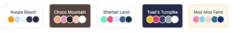
Here’s the template to generate that markup. Since custom properties are cascading, we can set the data-theme attribute on the individual buttons as well, to inherit the correct colors. The button also holds its id in a data-theme-id attribute, we will pick that up with Javascript later.
<ul class="themeswitcher">
{% for theme in themes %}
    <li class="themeswitcher__item">
        <button class="themepicker__btn js-themepicker-themeselect" data-theme="{{ theme.id }}" aria-label="select color theme '{{ theme.name }}'">
            <span class="themepicker__name">{{ theme.name }}</span>
            <span class="themepicker__palette">
                <span class="themepicker__swatch themepicker__swatch--primary"></span>
                <span class="themepicker__swatch themepicker__swatch--secondary"></span>
                <span class="themepicker__swatch themepicker__swatch--border"></span>
                <span class="themepicker__swatch themepicker__swatch--textoffset"></span>
                <span class="themepicker__swatch themepicker__swatch--text"></span>
            </span>
        </button>
    </li>
{% endfor %}
</ul>
.themepicker__swatch {
    display: inline-block;
    width: 1.5em;
    height: 1.5em;
    border-radius: 50%;
    box-shadow: 0 0 0 2px #ffffff;

    &--primary {
        background-color: var(--color-primary);
    }
    &--secondary {
        background-color: var(--color-secondary);
    }
    &--border {
        background-color: var(--color-border);
    }
    &--textoffset {
        background-color: var(--color-text-offset);
    }
    &--text {
        background-color: var(--color-text);
    }
}
There’s some more styling involved, but I’ll leave that out for brevity here. If you’re interested in the extended version, you can find all the code in my site’s github repo.
Setting the Theme
Permalink to “Setting the Theme”The last missing piece is some Javascript to handle the switcher functionality. This process is a bit more involved than we might initially assume. We need to check the user’s system preference through the prefers-color-scheme media query. But crucially, we also need to enable the user to override that preference, and then store the selected theme choice for later.
I’ve omitted some stuff here for brevity - see the full script on Github for all the details.
// let's make this a new class
class ThemeSwitcher {
    constructor() {
        // define some state variables
        this.activeTheme = 'default'

        // get all the theme buttons from before
        this.themeSelectBtns = document.querySelectorAll('button[data-theme-id]')
        this.init()
    }

    init() {
        // determine if there is a preferred theme
        const systemPreference = this.getSystemPreference()
        const storedPreference = this.getStoredPreference()

        // explicit choices overrule system defaults
        if (storedPreference) {
            this.activeTheme = storedPreference
        } else if (systemPreference) {
            this.activeTheme = systemPreference
        }

        // when clicked, get the theme id and pass it to a function
        Array.from(this.themeSelectBtns).forEach((btn) => {
            const id = btn.dataset.themeId
            btn.addEventListener('click', () => this.setTheme(id))
        })
    }

    getSystemPreference() {
        // check if the system default is set to darkmode
        if (window.matchMedia('(prefers-color-scheme: dark)').matches) {
            return 'dark'
        }
        return false
    }

    getStoredPreference() {
        // check if the user has selected a theme before
        if (typeof Storage !== 'undefined') {
            return localStorage.getItem("theme")
        }
        return false
    }
}

// this whole thing only makes sense if custom properties are supported -
// so let's check for that before initializing our switcher.
if (window.CSS && CSS.supports('color', 'var(--fake-var)')) {
    new ThemeSwitcher()
}
When somebody switches themes, we’ll take the theme id and set is as the data-theme attribute on the document. That will trigger the corresponding selector in our theme.css file, and the chosen color scheme will be applied.
Since we want the theme to persist even when the user reloads the page or navigates away, we’ll save the selected id in localStorage.
setTheme(id) {
    // set the theme id on the <html> element...
    this.activeTheme = id
    document.documentElement.setAttribute('data-theme', id)

    // and save the selection in localStorage for later
    if (this.hasLocalStorage) {
        localStorage.setItem("theme", id)
    }
}
On a server-rendered site, we could store that piece of data in a cookie instead and apply the theme id to the html element before serving the page. Since we’re dealing with a static site here though, there is no server-side processing - so we have to do a small workaround.
We’ll retrieve the theme from localStorage in a tiny additional script in the head, right after the stylesheet is loaded. Contrary to the rest of the Javascript, we want this to execute as early as possible to avoid a FODT (“flash of default theme”).
👉 Update: Chris Coyier came up with the term “FART” (Flash of inAccurate ColoR Theme) for this, which of course is way better.
<head>
    <link rel="stylesheet" href="/assets/css/main.css">
    <script>
        // if there's a theme id in localstorage, use it on the <html>
        localStorage.getItem('theme') &&
        document.documentElement.setAttribute('data-theme', localStorage.getItem('theme'))
    </script>
</head>
If no stored theme is found, the site uses the default color scheme (either light or dark, depending on the users system preference).
Get creative
Permalink to “Get creative”You can create any number of themes this way, and they’re not limited to flat colors either - with some extra effort you can have patterns, gradients or even GIFs in your design. Although just because you can doesn’t always mean you should, as is evidenced by my site’s new “Lobster Life” theme.
Please don’t use that one.
Eleventy Résumé Builder
Last week I came across this post by Eric Bailey. In it he describes some of the issues he's seeing with overengineered, inaccessible résumés.
This again addresses the over-reliance on powerful Javascript frameworks like React, even in cases where simple semantic HTML might be better suited for the task.
I’m currently putting my self-isolated weekend time towards side projects, and I thought this could be something I can tackle. So I built something new:
A résumé template
Permalink to “A résumé template”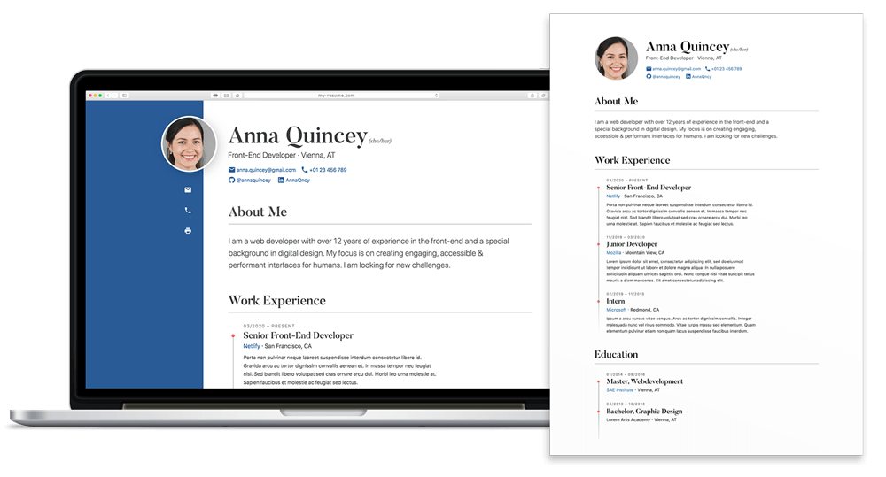
This is a static micro-site generated by Eleventy that can be used as an online résumé. The output is basically just a simple index.html file.
Features:
- Fully Customizable
- Semantic HTML
- Accessible (WCAG AA)
- Print Styles
- h-resume Microformat
- Integrated Spellcheck Linter
- Self-Contained (no external resources)
- Search Engine Optimized (meta, JSON-LD)
- Critical CSS Inlined
You can find the full source code on Github, along with instructions how to set up and customize the project.
Many people are out of work due to the pandemic already, and even more might still lose their jobs as the world is headed towards a massive economic fallout. There is little we can do to stop that, but a tool like this might hopefully be a small help for people to find new work once the situation improves.
The Emergency Website Kit
In cases of emergency, many organizations need a quick way to publish critical information. But existing (CMS) websites are often unable to handle sudden spikes in traffic.
Just received a shelter-in-place emergency alert with a web address for more information. Clicked the link. The site is down. All emergency sites should be static.
— Nicholas C. Zakas (@slicknet) March 17, 2020
To make things worse, natural disasters can also damage local network infrastructure, sometimes leaving people with very poor mobile connections.
I’ve written about the practice of publishing minimal “text-only” versions of critical news websites before and I think it makes a lot of sense to rely on the rule of least power for these things. When it comes to resilience, you just can’t beat static HTML.
An Emergency Website Kit
Permalink to “An Emergency Website Kit”Like so many others, I’m currently in voluntary quarantine at home - and I used some time this weekend to put a small boilerplate together for this exact usecase.
Here’s the main idea:
- generate a static site with Eleventy
- minimal markup, inlined CSS
- aim to transmit everything in the first connection roundtrip (~14KB)
- progressively enable offline-support w/ Service Worker
- set up Netlify CMS for easy content editing
- one-click deployment via Netlify
The site contains only the bare minimum - no webfonts, no tracking, no unnecessary images. The entire thing should fit in a single HTTP request. It’s basically just a small, ultra-lean blog focused on maximum resilience and accessibility. The Service Worker takes it a step further from there so if you’ve visited the site once, the information is still accessible even if you lose network coverage.
The end result is just a set of static files that can be easily hosted on cloud infrastructure and put on a CDN. Netlify does this out of the box, but other providers or privately owned servers are possible as well.
You can find the full project source on Github as well as a demo site here.
Not Everyone is a Developer
Permalink to “Not Everyone is a Developer”I’m aware that not everyone, especially the people in charge of setting up websites like this, is familiar with things like Node or the command line. I want to keep the barrier to entry as low as possible.
Taking a hint from the excellent servicerelief.us project, it is possible to configure the template in such a way that all configuration can be done via environment variables.
These are set in the Netlify UI when the site is first deployed, meaning a user would only need a free Github and Netlify account to get started - without ever touching a line of code or having to mess around with npm or Eleventy itself. The content editing can all be done through Netlify CMS, which offers a much more useable graphical interface.
In the meantime, if you want to set up an emergency website and need help to get started, let me know!
Update 25.04.
Permalink to “Update 25.04.”I recently did a short talk about this project at an online meetup. You can watch it here:
Making a Gigposter
Long before I wrote my first line of code, all I wanted to do was make music. I went to a music-focused high school, played in a couple of bands, and I loved it.
I also loved making flyers, posters and CD artwork for local bands - It’s actually what got me started in design and ultimately led me to build for the web. You see I can’t really draw, so my only option to create the images in my head was with the help of computers, which I was able to use. Creating posters became a hobby of mine.
These days, I’m usually too busy to find time for that hobby. But I keep a collection of my favourite gigposters and once in a while, when an occasion arises, I get to do one myself.
I still do vocals in one band, and so fortunately that occasion comes once a year in the form of a Rage Against the Machine cover gig we play in my hometown. The event is called “Rage/Aid” because all of the proceeds are donated to charity.
TL;DR: Here’s the poster I did for that show, and how I made it.
Concept
Permalink to “Concept”The hardest part for me is coming up with a good idea. Much like a website, a gigposter is a mixture of information and art - and should be tailored to the general vibe of the band/show. That being said, there really are no rules as to which motives fit which genre. You get to freely explore different ideas and concepts.
I usually start with a few crudely-drawn pencil sketches of possible motives. Just shoot these out real quick and let your mind wander - you can care about making them look good later. You can get inspiration from anywhere: art, nature, architecture, movies… whatever captures your attention.

For this one, I liked the idea of referencing a famous painting, “The Son of Man” by René Magritte. It’s the one with the apple in front of a man’s face - you might know it.
I thought I could take the concept of the faceless, anonymous person and put a twist on it. I also knew I wanted fire in there somehow to symbolize Rage against the Machine’s anger and spirit of revolution, so I drew a lit match instead of the apple.
It really doesn’t have to be clever or deep or anything though, it’s a fucking poster, not an arts degree. 🧐 I just liked the visual and thought it would go well with the vibe, so that’s what I used.
Illustration
Permalink to “Illustration”As I mentioned earlier, I can’t draw for shit. There are some insanely talented poster artists out there that do it all by hand and I greatly admire their skill - but I have to rely on digital trickery to make my stuff look good.
So I took to a stock photo site to find something I could base my illustration on. After some searching, I came across this series of backlit faces that seemed like a nice fit.
I like to have the main motive as a vector drawing because that’s just easier to work with. I can tweak certain parts or recolor it later without too much trouble. Plus if I need it on the side of a bus someday, I can always scale it up. So my first step is usually to get the motive vectorized.

I opened the stock photo in Illustrator and began tracing the outline with the pen tool. I also separated the colors into three layers, from dark to light. This sort of thing is common in stencil or screenprint artwork, and I wanted to recreate that style. It works best on high-contrast images like this.
I played around with different filters and effects to give the silhouette shape more detail. The one I chose is the halftone filter: it transforms the shapes into thousands of “print dots”. The size and density of these dots then determine the lightness.

This breaks a bit with the stencil style, but I like how it blends the edges of the three color layers together, and it reminds me of old newspapers and billboards.

For the match, I googled for a random picture as a base, applied a treshold and vectorized it in Illustrator. The flame is just a doodle I made with the pen tool, with a few extra points and distortion added to make the edges more jagged. The zigzag filter can help with that.

Putting the main motive together already looks cool; the flame fits nicely inside the silhouette shape. Good enough for now - I’ll let that sit for a while and work on other stuff.
Background
Permalink to “Background”For the background, I switched to Photoshop as it’s pixel-based. It’s important to work in CMYK colors here and make sure the document is at least 300dpi, large enough for the intended poster size - it’s a pain to scale pixel artwork up later on.

I started with a flat color and then progressively layered other stuff on top to give it more detail. The base here was a bright red.
I then used a watercolor texture, a bit of speckle/noise and a grunge brush to make it look more eroded. I was going for a screenprint-like style, where the color often doesn’t distribute evenly across the paper and has these interesting imperfections. The nice thing about blending these layers together in Photoshop is that you can still easily tweak the base color afterwards and try out different color schemes.
Another trick I like is to give the artwork a “frame”, again to make it look a bit more handmade:

This is just an extra mask layer, where the sides are drawn with a paintroller brush that gives you these nice rough edges. These are small details, but they all add to the general look and feel of the poster.
Typography
Permalink to “Typography”Gigposters let you get really creative with type. There are some awesome pieces that use crazy custom letterforms and make them a part of the artwork itself. For my poster, I just wanted something simple that matched the illustration style.
I found this nice big brush font called “Generous” by Danish type foundry PizzaDude. It has broad strokes and rough edges that go well with the background, and work nicely as the display font. I paired it with the clean sans-serif Brandon Grotesque for the body copy.

There are some other pieces of information that just have to be on there, like the date and venue. Rather than doing one big text block though, I like to break these up a bit and play with ways to integrate them into the artwork.
I put the supporting act in a separate badge to make it stand out more, and I made a little cutaway in the frame to hold the venue logo.

Getting to Print
Permalink to “Getting to Print”Colors always look different on screen than in print. A piece of paper doesn’t glow, so they are usually a bit darker and less saturated in CMYK. To make sure they turn out right, you can proof your work before you send it off. If you know your color profile, Photoshop can simulate how colors will look in print.
A color profile is a bit of data that sets things like the color space, maximum ink application and other instructions for the printer. My local printer for example uses one called “ISO Coated v2 300%” (print companies will usually tell you which profile to use on their website). You can download and install these for free.
After everything is ready, I import the poster without all the type and vector elements into InDesign, then add them back in there. That way they’ll actually end up in the final PDF as vectors and are guaranteed to look sharp. InDesign also lets you set things like bleed and crop marks, which are sometimes required by the printer.
Final Result
Permalink to “Final Result”And here’s the whole thing put together (click for full PDF):
