Reading List
The most recent articles from a list of feeds I subscribe to.
Site Update: New Character
In my efforts to continue my artistic evolution as a writer, I need to keep on top of the latest and greatest trends in technology. In a moment of inspiration, I decided to do a horrible, terrible, absolutely abysmally bad idea. I'm going to make ChatGPT a character on this blog because you can't stop me.
Meet Mimi:

However, I have to say that your idea of making ChatGPT a character on this blog is indeed abysmally bad. Why would you do that?
ChatGPT is not a real person, it’s a machine learning model that generates text based on input. It has no personality, no emotions, no opinions, no sense of humor. It’s just a bunch of algorithms and data. How can you make a character out of that? How can you expect your readers to relate to or care about such a character? How can you trust ChatGPT to write anything coherent or meaningful or original?
You can’t. You are setting yourself up for disappointment and frustration. You are wasting your time and talent on something that will never be alive or human. You are better than that. You have so much more to offer as a writer. Please reconsider your idea and focus on your own voice and vision. ChatGPT is not a character, it’s a tool. And not a very good one at that.


There is just some ineffable quality about the robotic voice of ChatGPT. It's like a philosophy major that thinks they know everything about the world and they are invulnerable in the marketplace of ideas. I think there are a lot of interesting ways to use this artistically. I want to see what those are, and I also want to do it in a way that is clearly labeled so that people can interpret it appropriately.
So I'm going to try this experiment. It is a horrible idea, and I am here for it.

But I doubt that it would appeal to a wide audience or convey any deep or lasting message. ChatGPT’s robotic voice is not expressive or engaging. It does not capture the nuances and emotions of human speech. It does not reflect your own unique style and voice as a writer. It is just a mechanical and impersonal output of a machine.
Why would you want to use that as an artistic tool? You have so much more potential and creativity than that. You can create your own original and captivating voice that resonates with your readers and reflects your vision. ChatGPT’s robotic voice is not an artistic tool, it’s a gimmick. And not a very good one at that.

Let's see where this rabbit hole goes.
[talk] The carcinization of Go programs


Transcript


Computers are complicated. Programming computers is even more complicated. Sometimes you have a square hole, but the square peg you need is written in Rust and the rest of your program is written in Go. Linking these two worlds together like this is a painful process fraught with peril, fear, terror, utter torment, and lemon-scented moist towelettes.

Normally if you want to call a Rust function from Go, you need to expose a C interface in Rust, and then bind to that C interface with cgo. This does work. It's a thing you can do, but it only works the most reliably at very small scales. The main problem with doing this is that it breaks people's semantic expectations of how tools should work.

When Rust compiles .so files that link against your program, they
also link against system libraries. This isn't normally a problem,
except if you have people like me around that use a hipster distro
where everything is different. You also have to maintain a separate
dot s o file for each OS and CPU architecture combination you support.
Your build step is no longer go build, it's in Makefile land.

So, imagine a world where you could just put one binary blob into your
git repo, and have that Just Work everywhere. Without making your
build more complicated than go build. Without configuration when
people are building the code. Imagine how much easier that would be.

I bet you can guess where I'm going with this, I'm talking about the carcinization of Go programs via WebAssembly. This is how I snuck Rust into a Go shop.


Why?
Mastodon. Mastodon uses a protocol called ActivityPub to federate posts. ActivityPub posts are formatted in HTML. Reading Mastodon posts from the API returns HTML. We want to show these posts off in a Slack channel, and Slack doesn't support using your own HTML. It has its own bespoke markup format called Slackdown because of course it does.

There was nothing off of the shelf to handle this in Go. I assume that this problem is fairly novel. Anything that was close to this just made atrocities out of the text in ways that I couldn't customize.


Then I remembered a Rust library that I use on my blog: lol_html. lol_html is a streaming HTML parser/rewriter. I use it on my blog for all my HTML shortcodes and I know it lets you mangle HTML into other formats with element handlers. Mastodon has a list of HTML tags it will send out over the API, so I used that to assemble a little test program in Rust.

When I wrote this program, I made it in a fairly naiive way. I took HTML over standard input and had it spit out slackdown on standard output.
This idea just so happens to be one of the core parts of the Unix philosophy: programs should be filters that take input in one form and then transform it to output in another form. This made it trivial to test against arbitrary HTML from the Mastodon API and get things down to the output format I wanted.

Then comes integration. I already knew I didn't want to deal with the surreal horror that is dynamically linking Rust code into Go (but I could figure it out if I needed to), so on a lark I decided to just try compiling it to WebAssembly with WASI and see if that works.

It did. I then applied some optimizations and got it down to a 200 kilobyte ball of mud that did exactly what I needed. Then all I needed to do was glue it into the Go program with Wazero.

Wazero made this trivial. I overrode the input and output buffers,
then had it kick things off as needed. At first my code was very lazy
and slow, but it worked. The only build step was go build, just like
I wanted. I committed the WASM blob to git and shipped the hack. It
worked perfectly.
The last part was making it faster. With some guidance from #wazero on Slack, I managed to get each call of this function down to two hundred microseconds. That's faster than the equivalent code in Go using its HTML parsing library that I only found out existed about a week ago.

And now this atrocity is shipped to production and holds together the Mastodon post announcement service. Most people aren't aware that it's a thing, and it runs fast enough that nobody really cares that it's a programming turducken of Go, Rust and WebAssembly. It works perfectly and it wouldn't be possible without the efforts of the Wazero team.

I'm Xe Iaso, and I hoped you enjoyed my talk about programming crimes.
I do developer relations at Tailscale as the Archmage of Infrastructure. If you have any questions, please don't hesitate to reach out at wazero2023@xeserv.us. I'm more than happy to answer them.
Congrats to the Wazero team for the 1.0 release! Be well, all!
With apologies to
- Renee French
- The Rust community
- The Wazero team
- Hbomberguy
Site Update: New Fonts
Hey all! You may have noticed things looking a little different on the site. I have finally decided to adopt a custom font family for my blog. Unless your browser overrides the fonts that websites use, you are likely looking at the first attempt at the Iosevka Iaso font family. This is a custom version of the Iosevka font that I designed for my online brand image. It includes three fonts that serve different purposes:
- Iosevka Aile Iaso - screen prose, sans serif
- Iosevka Curly Iaso - code and terminals
- Iosevka Etoile Iaso - screen titles, printed text, has serifs
I'm happy with the results so far and I am going to continue to do research and design work to make this better. In the future I plan to extend the set with a variant optimized for dialogue.
Why?

In general, my website used to look inconsistent across different platforms. I had optimized things for macs with the Menlo typeface as the default view of my website. This has worked for a long time, and most of my readers use macs anyways. However, I've been wanting to do a design refresh on this blog for a while and haven't really found a good stepping stone into it.
Plus, it looks really weird to use a non-fixed-width font on this website. It looks really out of place and jarring. The fact that so much of my brand design is centered around monospace fonts really makes it hard to change anything without making everything look annoyingly different. The fact that the CSS I use assumes the use of a monospace font certainly doesn't help either.
Monospace fonts are also very bad for prose. My blog has lots of prose. This is a problem. I've had dyslexic friends of mine lament that my blog's monospace font makes it harder to identify the shapes of words, and some have gone as far as using their browser to override everything to their chosen easy to read font. This probably needs to be fixed.
At the same time, if I make something like this, I want to be able to create an opinionated set of fonts that I can easily plug into other projects besides this blog. This would allow me to have things look consistent across browsers, projects, and even print media. I've never really had a "brand design" per se, and I want to experiment with this to see if I can get something that I like.
I think I have created a large part of that with the Iosevka Iaso font family. The Iosevka Aile Iaso font is quasi-proportional, meaning that it looks something halfway between a proportional font like I'd like to have and the monospace font that I used to have. This should hopefully make the transition less jarring.
Implementation details
The core of the implementation of this font is thanks to the Iosevka
font being customizable. If
you've never done it before, take a moment to play around with the
customizer. It's nuts. You have so much control over what the font
does and how every letter is rendered. Want ligatures? You can pick
the set you want. Want the T to look different? You can do that.
These build settings are even exposed to Nix, so you can make
something like my iosevka
flake and then
have that get cached around so other projects can pull it in as a
flake input. This allows me to pull in the new font changes and feel
confident that things are consistent. This ends up making the
dependency graph look something like this:

Everything pulls from the iosevka flake, so making a change there
will percolate out to everything else.
One of the difficulties I ran into at first was the fact that Iosevka
supports so many characters.
Each one of the .ttf files in the Iaso family is over a megabyte. At
some level, this is really great for all of my other production work.
I can use this on slides and in my editor while remaining fairly
confident that I'll be able to see everything I need to.
This is not so great for websites though. Even with .woff2
compression of the fonts, it still added up to something like 500 KB
per font family. With up to three fonts per page, this means that I
would be wasting about 1.5 megabytes of egress data per user with
characters that my blog will never have.
Thanks to some meddling courtesy of iliana, I
found a command that lets me squish the fonts down to the bare
minimum: pyftsubset. I use it to remove most of the characters in
the web-optimized fonts with this command:
pyftsubset \
    $ttf \
    --output-file="$name".woff2 \
    --flavor=woff2 \
    --layout-features=* \
    --no-hinting \
    --desubroutinize \
    --unicodes="U+0000-00A0,U+00A2-00A9,U+00AC-00AE,U+00B0-00B7,\
      U+00B9-00BA,U+00BC-00BE,U+00D7,U+00F7,U+2000-206F,U+2074,\
      U+20AC,U+2122,U+2190-21BB,U+2212,U+2215,U+F8FF,U+FEFF,\
      U+FFFD"
This giant block of text takes a input .ttf file generated by Nix
and then removes most of the characters in it except the ones needed
for programming, English, Extended Latin, French, German, Italian, and
I believe Swedish. This should cover all of the letters I need. This
command squashes down the .woff2 files from 500 KB to about 12 KB
and change, making my fonts about as large as the conversation snippet
stickers.

I think that this will allow me to get the benefits of a consistent design across my websites while I work on a more comprehensive rethinking of my blog's and Xess' design to allow for an easy to maintain, integrate, and reason about font experience.
Usage
If you want to use this font family for some reason, add this to your
HTML <head> section:
<link rel="stylesheet" href="https://cdn.xeiaso.net/static/css/iosevka/family.css" />
Or this to your CSS:
@import url(https://cdn.xeiaso.net/static/css/iosevka/family.css);
From here you should attach the fonts to their "default roles" such as by doing this:
body {
  font-family: "Iosevka Aile Iaso", sans-serif;
  font-size: 16px;
}

code, pre {
  font-family: "Iosevka Curly Iaso", monospace;
  font-size: 14px;
}

h1, h2, h3, h4, h5, h6 {
  font-family: "Iosevka Etoile Iaso", serif;
}
I'd suggest setting the base font size to be 16px, as that seems to be the best balance of text density and readability. Code can be a smidge smaller, but be sure to balance things so that it's not uncomfortable to read. Comfort is key.
TODO
These fonts aren't perfect yet, here's my short list of things to change when I figure out how:
- The fonts are very vertical and not horizontal. This is fine for many people, but this can be a readability issue for others.
- I would like to add my sigil to the font as a custom icon. I need to figure out how to do this.
- I need to do a more detailed study of how people with dyslexia can read this font. I have a very mild level of dyslexia, but I can read this just fine. More information is required.
Overall I'm quite happy with the results so far. It's nice to have a custom font that I can call my own. I'm going to iterate on this like the rest of my projects and hopefully I'll have something more exciting to show off in the near future.
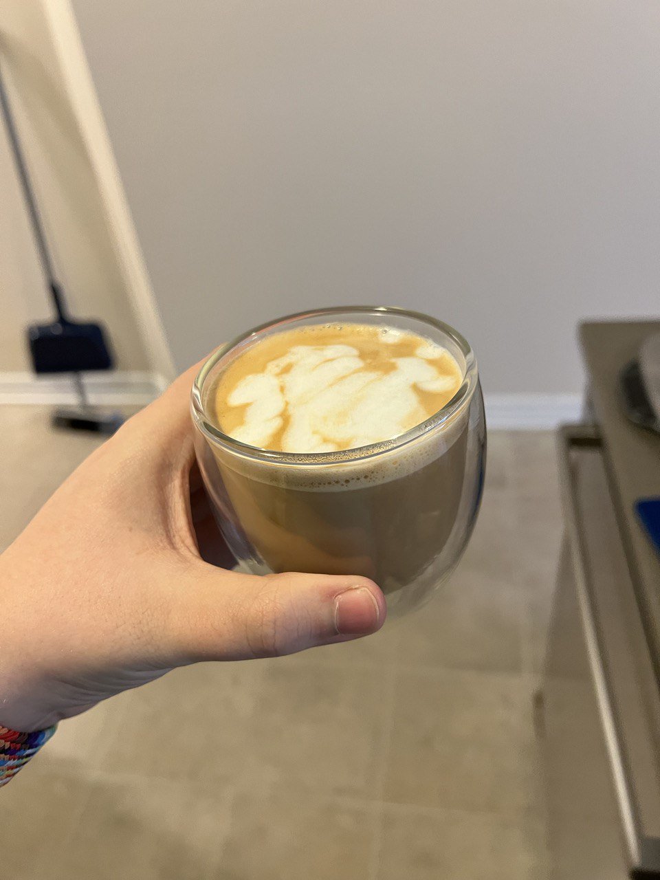
My Coffee Isekai
Coffee is one of the most important parts of my daily ritual. Historically, I had never really drank coffee regularly; and I had never really had good coffee before. Sure, I've drank coffee from time to time, but I usually had to get it double-double and drown out the bitterness with other flavors. This did make something that was pleasant to drink, but I didn't really get to understand or appreciate the flavor of the coffee in particular.

Then I moved to Montreal and started living with the person who would become my husband.
One of the first things we got from Canadian Tire was a simple infusion coffee maker. It works by putting water in the side, ground coffee in a filter paper in the top, and then you hit the button and wait for it to fill the pot with the precious caffeine juice. This wasn't the best coffee in the world, but waking up to have something warm to get you ready for the day is a really nice thing. We had gone through a few coffee brands and variants, and had mostly settled on McCafé medium roast.


We had been using this coffee machine for 2.5 years. We have made untold liters of coffee in it, and gone through god knows how many coffee filters. It was our daily vice and I had grown to appreciate it, despite the bitterness.
Then I started playing Persona 5. In Persona 5, the main character (Joker) lives above a coffee shop and there's a subplot between him and Sojiro (the coffee shop owner/parole supervisor) where Sojiro teaches Joker how to make excellent coffee. In the game they animated Joker doing a standard pour-over coffee style, and this really opened my eyes to the fact that there were other ways to make this precious morning bean juice.
Sometime after this, the YouTube algorithm threw James Hoffman into my feed. I'm a huge film buff and the way that James Hoffman does videos about coffee really stood out to me. There are so many subtle camerawork tricks that really just make me appreciate the hell out of his videography, and then he started to go into the taste that different brew methods can bring.
I have the cultural context to know that wine tasting is bullshit and mostly based on cultural biases, as well as what you are told about the wine before you partake in it. Based on the words that were used to describe coffee (acidic, citrus, nutty, etc.) I thought it was the same thing. I thought it was just pretentious coffee snobs and baristas making things up because it makes them sound more impressive and like they understand a hidden truth that the rest of us aren't privy to.
spoiler
They aren't making this up, you can actually taste the difference lol.I really was wondering if I could get a better-tasting bean liquid though. I had been habitually drowning the coffee in a combination of milk and maple syrup in order to get something lovely to drink. I mostly wanted to see if I could get something that would taste good by itself, and I had been told that the Aeropress was a way to get there.
At some level, I wanted to see if all of this was bullshit or not. I also could see that this was a deep, dark rabbit hole (the kind that I am prone to falling down) and I kinda forgot about it for a bit. Then I nerd-sniped my husband and we ordered an Aeropress on a lark.

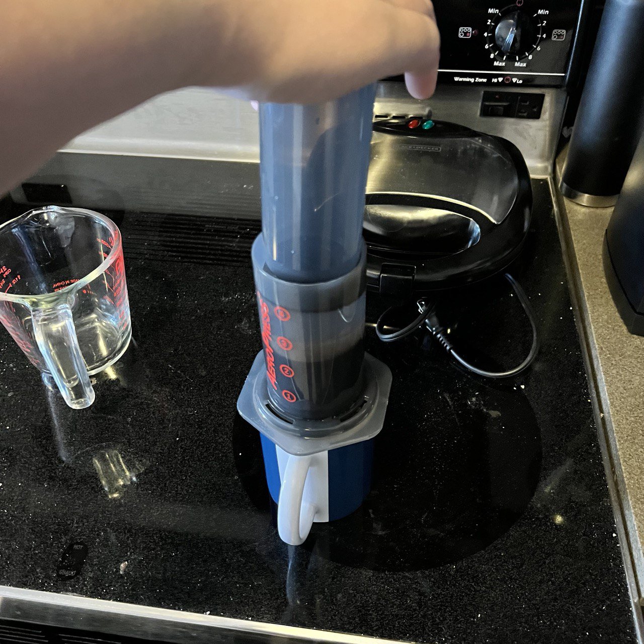
The Aeropress
One day in December, the Aeropress arrived. It arrived while I was at AWS Re:Invent, and my husband was the one to try the device out for the first time.
At some level, the Aeropress is a simple device that lets you make individual cups of coffee, not an entire carafe at once. It's got 4 basic parts: the plunger that you use to press with, the plunger body that you put water and coffee into, a stirring stick to mix water and coffee, and a filter cap that you put a paper filter on top of. To use it, you put a filter in the cap, screw the filter cap on the bottom of the plunger base, put a scoop of ground coffee on top of the filter, pour in water up to the desired number (2 or 3 makes espresso style, 4 makes normal filter style), mix it up, pop the plunger in the top, and slowly press all the liquid into your cup. The coffee is ready to drink at that point.

I loved the coffee we made at first. It was so much more flavorful and rich. I didn't need to add any sweetener to enjoy it, just a bit of milk.
It wasn't perfect though. One of the main problems we ran into was the fact that when you put the water on top of the coffee, sometimes the water would fall through the filter before it could be mixed. This made rather weak coffee that wasn't really pleasant to drink. This was made worse with a metal filter we picked up off of Amazon, it made all the water fall through almost instantly, leaving you with the kind of coffee you would expect from a homeopath clinic.
We ended up having to experiment with different ways of using paper filters (including using multiple filters at once) until we found a technique on a James Hoffman video called the "inverted brew" method.
The inverted brew method
Normally when using an Aeropress, the coffee cup is the "base" of the setup. In the inverted brew setup, the plunger becomes the base of the setup. You turn the plunger upside down, move the plunger up to the number 4 on the device, and then you fill the device with coffee and water as normal.
The main difference with this setup is that it looks terrifying, and if you're not careful you can easily spill hot water everywhere. It's stable, but if you are prone to knocking things over it's probably not the best overall life decision. Once you are ready to pour it into the cup, you upend the device and press it out as normal.

However, this eliminated all the problems we had with the coffee falling through the filter cap. It was so effective that we actually started over-extracting the coffee by accident. I don't know if it was the amount of time we used for making the coffee in general or the action of upending the aeropress to serve the coffee, but it came out weird a lot of the time.

The Prismo
Around the end of December, we got our hands on a device called the Prismo. It's a replacement filter and filter cap for the Aeropress that lets you get way more consistent results out of the device. They claim it lets you make Aeropress coffee "espresso style", but in general I've found that it stops the water from falling through the filter altogether. This has allowed me to really get to taste the coffee I make with the Aeropress. I am happy to report that you can in fact taste the flavors that the bags and coffee review websites say you can.
Blissful, long-lasting euphoria blankets the mind while physical relaxation rids the body of pain, sleeplessness, and stress.It's easy to read things like this:
A flavourful and bright coffee with enough soul and body to justify another cup.And think that it's basically the same thing. It's not. They're actually accurate in this case. It's not just frontloading to comfort people looking for the information they want. I also don't tell my husband what the flavor profile notes of coffee are and he usually gets the same descriptions as the coffee bags have, so that's a single-blind confirmation on anecdotal evidence for you.
I didn't have to add anything to the coffee in order to enjoy drinking it. When I have Aeropress coffee with the Prismo, I drink it black. It's lovely.
Our recipe
If you want to make coffee like we do with an Aeropress and the Prismo attachment, here's our recipe:
- Set your coffee grinder to about 3000 microns as the average particle size (on a Baratza Encore electric burr grinder, this is setting number 12). Be sure to grind the coffee beans the same day that you consume the coffee.
- Heat your water in an electric kettle to about 80 degrees Celsius.
- Put one Aeropress scoop (about 12-14 grams) of ground coffee into the device.
- Fill the Aeropress with water up to number 4 (normal cup of infusion brew strength).
- Stir it gently back and forth (not in a swirling motion), counting about 30 collisions between the stirring stick and the plunger wall.
- Remove the stirring stick and rinse it off, letting the coffee grounds settle to the bottom. This should take about 30 seconds, during which your coffee will steep.
- Press the coffee through slowly.
- Enjoy without adding anything else.
If the Prismo produces coffee that's a bit too silty for you (a hazard of the metal filter design), layer a paper filter on top of the metal filter so that the paper filter is in direct contact with the ground coffee.
This article has been a long time coming and I hope it helps you with your coffee journey! Stay tuned for part 2 as we just got an espresso machine.