Reading List
The most recent articles from a list of feeds I subscribe to.
Some notes on upgrading Hugo
Warning: this is a post about very boring yakshaving, probably only of interest to people who are trying to upgrade Hugo from a very old version to a new version. But what are blogs for if not documenting one’s very boring yakshaves from time to time?
So yesterday I decided to try to upgrade Hugo. There’s no real reason to do this – I’ve been using Hugo version 0.40 to generate this blog since 2018, it works fine, and I don’t have any problems with it. But I thought – maybe it won’t be as hard as I think, and I kind of like a tedious computer task sometimes!
I thought I’d document what I learned along the way in case it’s useful to anyone else doing this very specific migration. I upgraded from Hugo v0.40 (from 2018) to v0.135 (from 2024).
Here are most of the changes I had to make:
change 1: template "theme/partials/thing.html is now partial thing.html
I had to replace a bunch of instances of {{ template "theme/partials/header.html" . }} with {{ partial "header.html" . }}.
This happened in v0.42:
We have now virtualized the filesystems for project and theme files. This makes everything simpler, faster and more powerful. But it also means that template lookups on the form {{ template “theme/partials/pagination.html” . }} will not work anymore. That syntax has never been documented, so it’s not expected to be in wide use.
change 2: .Data.Pages is now site.RegularPages
This seems to be discussed in the release notes for 0.57.2
I just needed to replace .Data.Pages with site.RegularPages in the template on the homepage as well as in my RSS feed template.
change 3: .Next and .Prev got flipped
I had this comment in the part of my theme where I link to the next/previous blog post:
“next” and “previous” in hugo apparently mean the opposite of what I’d think they’d mean intuitively. I’d expect “next” to mean “in the future” and “previous” to mean “in the past” but it’s the opposite
It looks they changed this in ad705aac064 so that “next” actually is in the future and “prev” actually is in the past. I definitely find the new behaviour more intuitive.
downloading the Hugo changelogs with a script
Figuring out why/when all of these changes happened was a little difficult. I ended up hacking together a bash script to download all of the changelogs from github as text files, which I could then grep to try to figure out what happened. It turns out it’s pretty easy to get all of the changelogs from the GitHub API.
So far everything was not so bad – there was also a change around taxonomies that’s I can’t quite explain, but it was all pretty manageable, but then we got to the really tough one: the markdown renderer.
change 4: the markdown renderer (blackfriday -> goldmark)
The blackfriday markdown renderer (which was previously the default) was removed in v0.100.0. This seems pretty reasonable:
It has been deprecated for a long time, its v1 version is not maintained anymore, and there are many known issues. Goldmark should be a mature replacement by now.
Fixing all my Markdown changes was a huge pain – I ended up having to update 80 different Markdown files (out of 700) so that they would render properly, and I’m not totally sure
why bother switching renderers?
The obvious question here is – why bother even trying to upgrade Hugo at all if I have to switch Markdown renderers? My old site was running totally fine and I think it wasn’t necessarily a good use of time, but the one reason I think it might be useful in the future is that the new renderer (goldmark) uses the CommonMark markdown standard, which I’m hoping will be somewhat more futureproof. So maybe I won’t have to go through this again? We’ll see.
Also it turned out that the new Goldmark renderer does fix some problems I had (but didn’t know that I had) with smart quotes and how lists/blockquotes interact.
finding all the Markdown problems: the process
The hard part of this Markdown change was even figuring out what changed. Almost all of the problems (including #2 and #3 above) just silently broke the site, they didn’t cause any errors or anything. So I had to diff the HTML to hunt them down.
Here’s what I ended up doing:
- Generate the site with the old version, put it in
public_old - Generate the new version, put it in
public - Diff every single HTML file in
public/andpublic_oldwith this diff.sh script and put the results in adiffs/folder - Run variations on
find diffs -type f | xargs cat | grep -C 5 '(31m|32m)' | less -rover and over again to look at every single change until I found something that seemed wrong - Update the Markdown to fix the problem
- Repeat until everything seemed okay
(the grep 31m|32m thing is searching for red/green text in the diff)
This was very time consuming but it was a little bit fun for some reason so I kept doing it until it seemed like nothing too horrible was left.
the new markdown rules
Here’s a list of every type of Markdown change I had to make. It’s very possible these are all extremely specific to me but it took me a long time to figure them all out so maybe this will be helpful to one other person who finds this in the future.
4.1: mixing HTML and markdown
This doesn’t work anymore (it doesn’t expand the link):
<small>
[a link](https://example.com)
</small>
I need to do this instead:
<small>

[a link](https://example.com)

</small>
This works too:
<small> [a link](https://example.com) </small>
4.2: << is changed into «
I didn’t want this so I needed to configure:
markup:
  goldmark:
    extensions:
      typographer:
        leftAngleQuote: '<<'
        rightAngleQuote: '>>'
4.3: nested lists sometimes need 4 space indents
This doesn’t render as a nested list anymore if I only indent by 2 spaces, I need to put 4 spaces.
1. a
  * b
  * c
2. b
The problem is that the amount of indent needed depends on the size of the list markers. Here’s a reference in CommonMark for this.
4.4: blockquotes inside lists work better
Previously the > quote here didn’t render as a blockquote, and with the new renderer it does.
* something
> quote
* something else
I found a bunch of Markdown that had been kind of broken (which I hadn’t noticed) that works better with the new renderer, and this is an example of that.
Lists inside blockquotes also seem to work better.
4.5: headings inside lists
Previously this didn’t render as a heading, but now it does. So I needed to
replace the # with #.
* # passengers: 20
4.6: + or 1) at the beginning of the line makes it a list
I had something which looked like this:
`1 / (1
+ exp(-1)) = 0.73`
With Blackfriday it rendered like this:
<p><code>1 / (1
+ exp(-1)) = 0.73</code></p>
and with Goldmark it rendered like this:
<p>`1 / (1</p>
<ul>
<li>exp(-1)) = 0.73`</li>
</ul>
Same thing if there was an accidental 1) at the beginning of a line, like in this Markdown snippet
I set up a small Hadoop cluster (1 master, 2 workers, replication set to
1) on
To fix this I just had to rewrap the line so that the + wasn’t the first character.
The Markdown is formatted this way because I wrap my Markdown to 80 characters a lot and the wrapping isn’t very context sensitive.
4.7: no more smart quotes in code blocks
There were a bunch of places where the old renderer (Blackfriday) was doing
unwanted things in code blocks like replacing ... with … or replacing
quotes with smart quotes. I hadn’t realized this was happening and I was very
happy to have it fixed.
4.8: better quote management
The way this gets rendered got better:
"Oh, *interesting*!"
- old: “Oh, interesting!“
- new: “Oh, interesting!”
Before there were two left smart quotes, now the quotes match.
4.9: images are no longer wrapped in a p tag
Previously if I had an image like this:
<img src="https://jvns.ca/images/rustboot1.png">
it would get wrapped in a <p> tag, now it doesn’t anymore. I dealt with this
just by adding a margin-bottom: 0.75em to images in the CSS, hopefully
that’ll make them display well enough.
4.10: <br> is now wrapped in a p tag
Previously this wouldn’t get wrapped in a p tag, but now it seems to:
<br><br>
I just gave up on fixing this though and resigned myself to maybe having some extra space in some cases. Maybe I’ll try to fix it later if I feel like another yakshave.
4.11: some more goldmark settings
I also needed to
- turn off code highlighting (because it wasn’t working properly and I didn’t have it before anyway)
- use the old “blackfriday” method to generate heading IDs so they didn’t change
- allow raw HTML in my markdown
Here’s what I needed to add to my config.yaml to do all that:
markup:
  highlight:
    codeFences: false
  goldmark:
    renderer:
      unsafe: true
    parser:
      autoHeadingIDType: blackfriday
Maybe I’ll try to get syntax highlighting working one day, who knows. I might prefer having it off though.
a little script to compare blackfriday and goldmark
I also wrote a little program to compare the Blackfriday and Goldmark output for various markdown snippets, here it is in a gist.
It’s not really configured the exact same way Blackfriday and Goldmark were in my Hugo versions, but it was still helpful to have to help me understand what was going on.
a quick note on maintaining themes
My approach to themes in Hugo has been:
- pay someone to make a nice design for the site (for example wizardzines.com was designed by Melody Starling)
- use a totally custom theme
- commit that theme to the same Github repo as the site
So I just need to edit the theme files to fix any problems. Also I wrote a lot of the theme myself so I’m pretty familiar with how it works.
Relying on someone else to keep a theme updated feels kind of scary to me, I think if I were using a third-party theme I’d just copy the code into my site’s github repo and then maintain it myself.
which static site generators have better backwards compatibility?
I asked on Mastodon if anyone had used a static site generator with good backwards compatibility.
The main answers seemed to be Jekyll and 11ty. Several people said they’d been using Jekyll for 10 years without any issues, and 11ty says it has stability as a core goal.
I think a big factor in how appealing Jekyll/11ty are is how easy it is for you to maintain a working Ruby / Node environment on your computer: part of the reason I stopped using Jekyll was that I got tired of having to maintain a working Ruby installation. But I imagine this wouldn’t be a problem for a Ruby or Node developer.
Several people said that they don’t build their Jekyll site locally at all – they just use GitHub Pages to build it.
that’s it!
Overall I’ve been happy with Hugo – I started using it because it had fast build times and it was a static binary, and both of those things are still extremely useful to me. I might have spent 10 hours on this upgrade, but I’ve probably spent 1000+ hours writing blog posts without thinking about Hugo at all so that seems like an extremely reasonable ratio.
I find it hard to be too mad about the backwards incompatible changes, most of
them were quite a long time ago, Hugo does a great job of making their old
releases available so you can use the old release if you want, and the most
difficult one is removing support for the blackfriday Markdown renderer in
favour of using something CommonMark-compliant which seems pretty reasonable to
me even if it is a huge pain.
But it did take a long time and I don’t think I’d particularly recommend moving 700 blog posts to a new Markdown renderer unless you’re really in the mood for a lot of computer suffering for some reason.
The new renderer did fix a bunch of problems so I think overall it might be a good thing, even if I’ll have to remember to make 2 changes to how I write Markdown (4.1 and 4.3).
Also I’m still using Hugo 0.54 for https://wizardzines.com so maybe these notes will be useful to Future Me if I ever feel like upgrading Hugo for that site.
Hopefully I didn’t break too many things on the blog by doing this, let me know if you see anything broken!
Red Button
My 3-year-old daughter Tavie and I made a time-travel movie for the inaugural Belvedere Home-Made Film Festival. Watch the four-minute film here on YouTube:
This project was fun on so many dimensions (get it, time travel). But watching Tavie watch herself on the big screen at the festival was the highlight for me. "Core memory," as they say on Instagram.
Rails World 2024
TIL: Variables in custom VSCode snippets
Terminal colours are tricky
Yesterday I was thinking about how long it took me to get a colorscheme in my terminal that I was mostly happy with (SO MANY YEARS), and it made me wonder what about terminal colours made it so hard.
So I asked people on Mastodon what problems they’ve run into with colours in the terminal, and I got a ton of interesting responses! Let’s talk about some of the problems and a few possible ways to fix them.
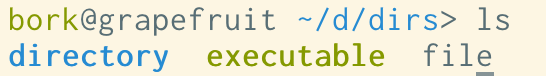
problem 1: blue on black
One of the top complaints was “blue on black is hard to read”. Here’s an
example of that: if I open Terminal.app, set the background to black, and run
ls, the directories are displayed in a blue that isn’t that easy to read:
To understand why we’re seeing this blue, let’s talk about ANSI colours!
the 16 ANSI colours
Your terminal has 16 numbered colours – black, red, green, yellow, blue, magenta, cyan, white, and “bright” version of each of those.
Programs can use them by printing out an “ANSI escape code” – for example if you want to see each of the 16 colours in your terminal, you can run this Python program:
def color(num, text):
    return f"\033[38;5;{num}m{text}\033[0m"

for i in range(16):
    print(color(i, f"number {i:02}"))
what are the ANSI colours?
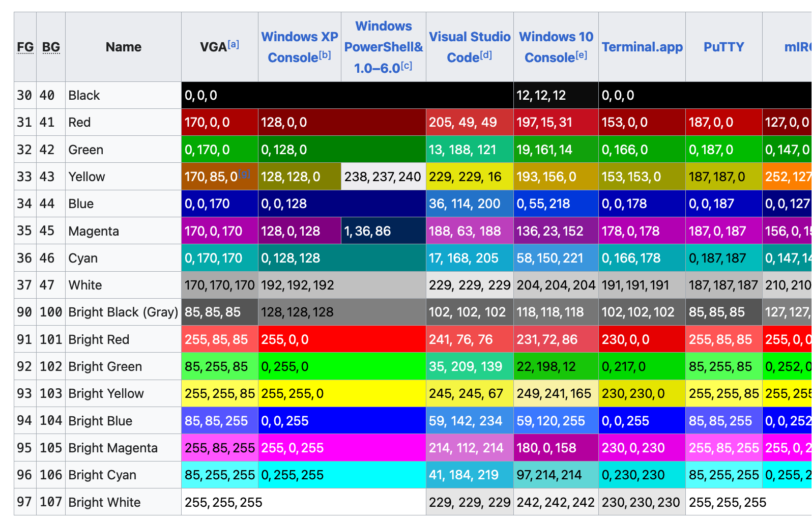
This made me wonder – if blue is colour number 5, who decides what hex color that should correspond to?
The answer seems to be “there’s no standard, terminal emulators just choose colours and it’s not very consistent”. Here’s a screenshot of a table from Wikipedia, where you can see that there’s a lot of variation:
problem 1.5: bright yellow on white
Bright yellow on white is even worse than blue on black, here’s what I get in a terminal with the default settings:

That’s almost impossible to read (and some other colours like light green cause similar issues), so let’s talk about solutions!
two ways to reconfigure your colours
If you’re annoyed by these colour contrast issues (or maybe you just think the default ANSI colours are ugly), you might think – well, I’ll just choose a different “blue” and pick something I like better!
There are two ways you can do this:
Way 1: Configure your terminal emulator: I think most modern terminal emulators have a way to reconfigure the colours, and some of them even come with some preinstalled themes that you might like better than the defaults.
Way 2: Run a shell script: There are ANSI escape codes that you can print
out to tell your terminal emulator to reconfigure its colours. Here’s a shell script that does that,
from the base16-shell project.
You can see that it has a few different conventions for changing the colours –
I guess different terminal emulators have different escape codes for changing
their colour palette, and so the script is trying to pick the right style of
escape code based on the TERM environment variable.
what are the pros and cons of the 2 ways of configuring your colours?
I prefer to use the “shell script” method, because:
- if I switch terminal emulators for some reason, I don’t need to a different configuration system, my colours still Just Work
- I use base16-shell with base16-vim to make my vim colours match my terminal colours, which is convenient
some advantages of configuring colours in your terminal emulator:
- if you use a popular terminal emulator, there are probably a lot more nice terminal themes out there that you can choose from
- not all terminal emulators support the “shell script method”, and even if they do, the results can be a little inconsistent
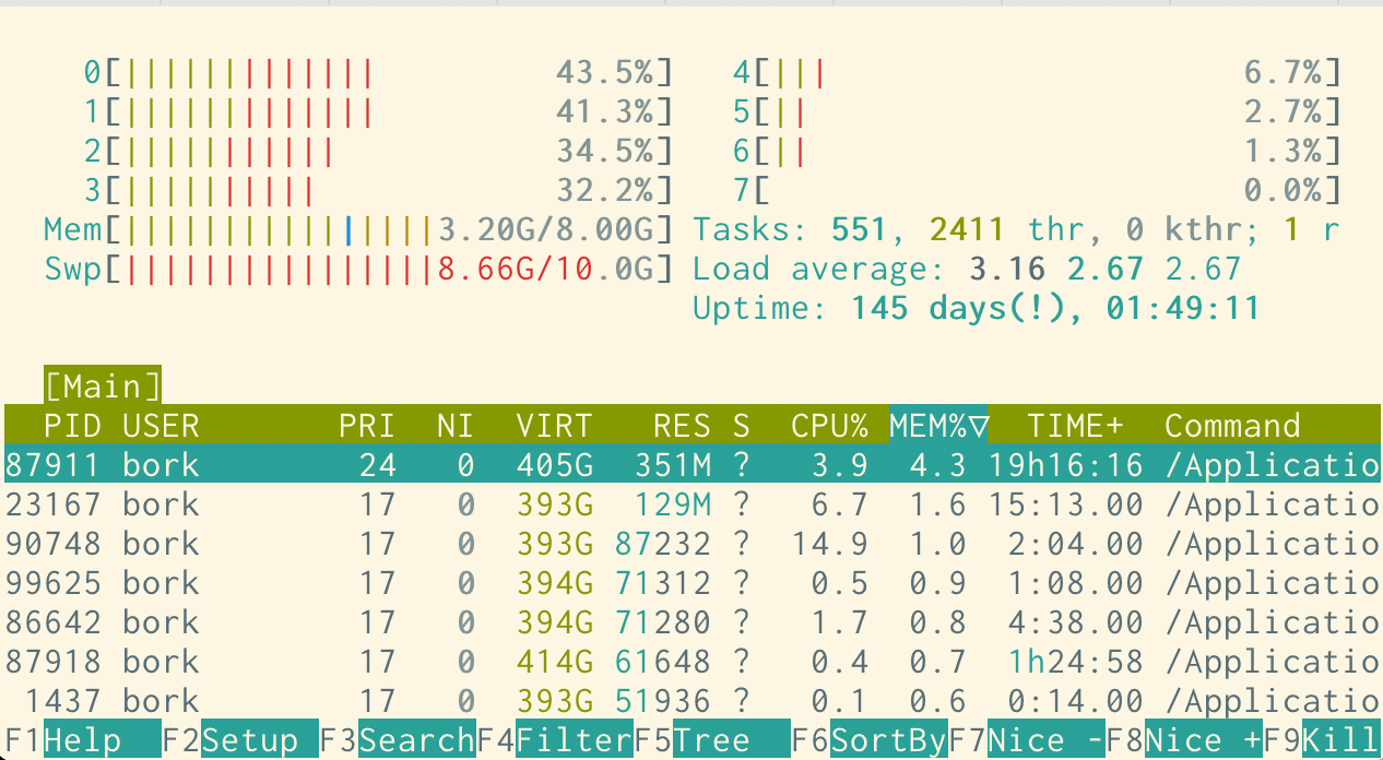
This is what my shell has looked like for probably the last 5 years (using the
solarized light base16 theme), and I’m pretty happy with it. Here’s htop:
Okay, so let’s say you’ve found a terminal colorscheme that you like. What else can go wrong?
problem 2: programs using 256 colours
Here’s what some output of fd, a find alternative, looks like in my
colorscheme:
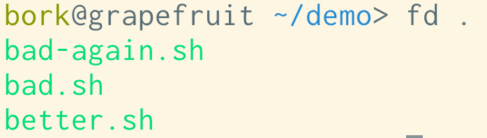
The contrast is pretty bad here, and I definitely don’t have that lime green in my normal colorscheme. What’s going on?
We can see what color codes fd is using using the unbuffer program to
capture its output including the color codes:
$ unbuffer fd . > out
$ vim out
^[[38;5;48mbad-again.sh^[[0m
^[[38;5;48mbad.sh^[[0m
^[[38;5;48mbetter.sh^[[0m
out
^[[38;5;48 means “set the foreground color to color 48”. Terminals don’t
only have 16 colours – many terminals these days actually have 3 ways of
specifying colours:
- the 16 ANSI colours we already talked about
- an extended set of 256 colours
- a further extended set of 24-bit hex colours, like
#ffea03
So fd is using one of the colours from the extended 256-color set. bat (a
cat alternative) does something similar – here’s what it looks like by
default in my terminal.
This looks fine though and it really seems like it’s trying to work well with a variety of terminal themes.
some newer tools seem to have theme support
I think it’s interesting that some of these newer terminal tools (fd, cat,
delta, and probably more) have support for arbitrary custom themes. I guess
the downside of this approach is that the default theme might clash with your
terminal’s background, but the upside is that it gives you a lot more control
over theming the tool’s output than just choosing 16 ANSI colours.
I don’t really use bat, but if I did I’d probably use bat --theme ansi to
just use the ANSI colours that I have set in my normal terminal colorscheme.
problem 3: the grays in Solarized
A bunch of people on Mastodon mentioned a specific issue with grays in the Solarized theme: when I list a directory, the base16 Solarized Light theme looks like this:
but iTerm’s default Solarized Light theme looks like this:
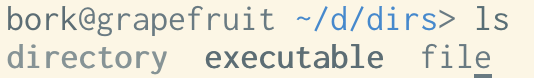
This is because in the iTerm theme (which is the original Solarized design), colors 9-14 (the “bright blue”, “bright
red”, etc) are mapped to a series of grays, and when I run ls, it’s trying to
use those “bright” colours to color my directories and executables.
My best guess for why the original Solarized theme is designed this way is to make the grays available to the vim Solarized colorscheme.
I’m pretty sure I prefer the modified base16 version I use where the “bright” colours are actually colours instead of all being shades of gray though. (I didn’t actually realize the version I was using wasn’t the “original” Solarized theme until I wrote this post)
In any case I really love Solarized and I’m very happy it exists so that I can use a modified version of it.
problem 4: a vim theme that doesn’t match the terminal background
If I my vim theme has a different background colour than my terminal theme, I get this ugly border, like this:
This one is a pretty minor issue though and I think making your terminal background match your vim background is pretty straightforward.
problem 5: programs setting a background color
A few people mentioned problems with terminal applications setting an unwanted background colour, so let’s look at an example of that.
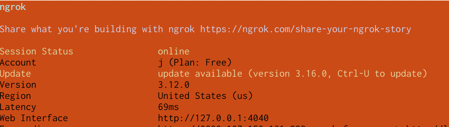
Here ngrok has set the background to color #16 (“black”), but the
base16-shell script I use sets color 16 to be bright orange, so I get this,
which is pretty bad:
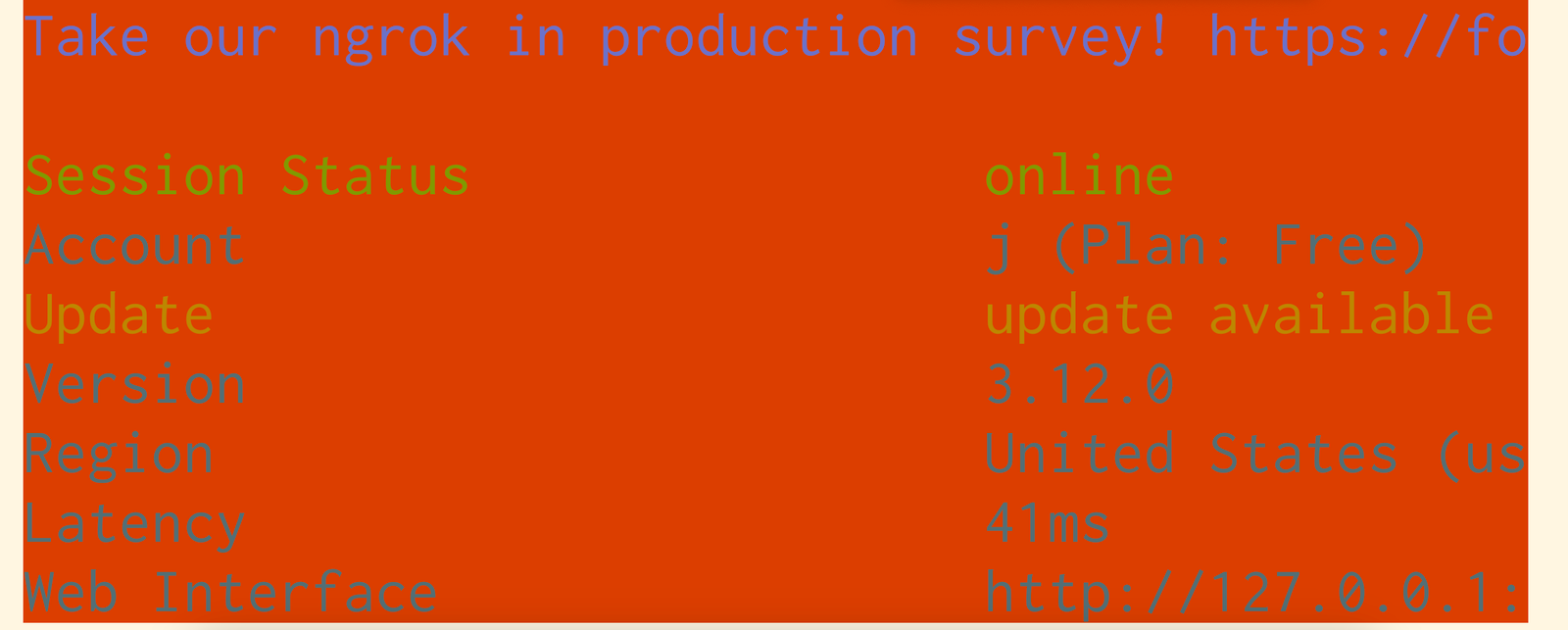
I think the intention is for ngrok to look something like this:
I think base16-shell sets color #16 to orange (instead of black)
so that it can provide extra colours for use by base16-vim.
This feels reasonable to me – I use base16-vim in the terminal, so I guess I’m
using that feature and it’s probably more important to me than ngrok (which I
rarely use) behaving a bit weirdly.
This particular issue is a maybe obscure clash between ngrok and my colorschem, but I think this kind of clash is pretty common when a program sets an ANSI background color that the user has remapped for some reason.
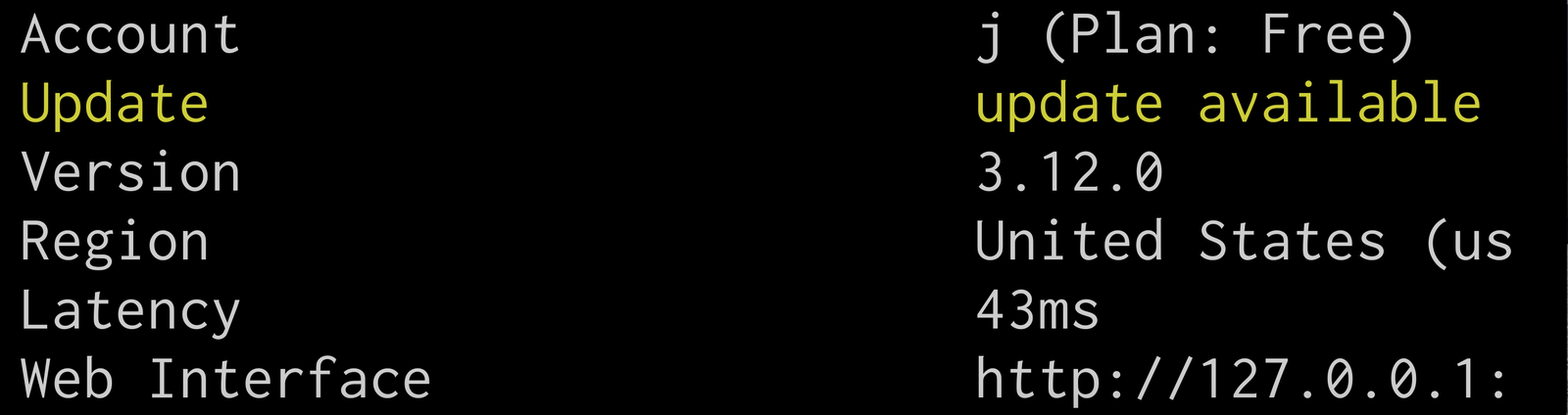
a nice solution to contrast issues: “minimum contrast”
A bunch of terminals (iTerm2, tabby, kitty’s text_fg_override_threshold, and folks tell me also Ghostty and Windows Terminal) have a “minimum contrast” feature that will automatically adjust colours to make sure they have enough contrast.
Here’s an example from iTerm. This ngrok accident from before has pretty bad contrast, I find it pretty difficult to read:
With “minimum contrast” set to 40 in iTerm, it looks like this instead:
I didn’t have minimum contrast turned on before but I just turned it on today because it makes such a big difference when something goes wrong with colours in the terminal.
problem 6: TERM being set to the wrong thing
A few people mentioned that they’ll SSH into a system that doesn’t support the
TERM environment variable that they have set locally, and then the colours
won’t work.
I think the way TERM works is that systems have a terminfo database, so if
the value of the TERM environment variable isn’t in the system’s terminfo
database, then it won’t know how to output colours for that terminal. I don’t
know too much about terminfo, but someone linked me to this terminfo rant that talks about a few other
issues with terminfo.
I don’t have a system on hand to reproduce this one so I can’t say for sure how
to fix it, but this stackoverflow question
suggests running something like TERM=xterm ssh instead of ssh.
problem 7: picking “good” colours is hard
A couple of problems people mentioned with designing / finding terminal colorschemes:
- some folks are colorblind and have trouble finding an appropriate colorscheme
- accidentally making the background color too close to the cursor or selection color, so they’re hard to find
- generally finding colours that work with every program is a struggle (for example you can see me having a problem with this with ngrok above!)
problem 8: making nethack/mc look right
Another problem people mentioned is using a program like nethack or midnight commander which you might expect to have a specific colourscheme based on the default ANSI terminal colours.
For example, midnight commander has a really specific classic look:
But in my Solarized theme, midnight commander looks like this:
The Solarized version feels like it could be disorienting if you’re very used to the “classic” look.
One solution Simon Tatham mentioned to this is using some palette customization ANSI codes (like the ones base16 uses that I talked about earlier) to change the color palette right before starting the program, for example remapping yellow to a brighter yellow before starting Nethack so that the yellow characters look better.
problem 9: commands disabling colours when writing to a pipe
If I run fd | less, I see something like this, with the colours disabled.
In general I find this useful – if I pipe a command to grep, I don’t want it
to print out all those color escape codes, I just want the plain text. But what if you want to see the colours?
To see the colours, you can run unbuffer fd | less -r! I just learned about
unbuffer recently and I think it’s really cool, unbuffer opens a tty for the
command to write to so that it thinks it’s writing to a TTY. It also fixes
issues with programs buffering their output when writing to a pipe, which is
why it’s called unbuffer.
Here’s what the output of unbuffer fd | less -r looks like for me:
Also some commands (including fd) support a --color=always flag which will
force them to always print out the colours.
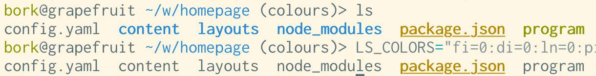
problem 10: unwanted colour in ls and other commands
Some people mentioned that they don’t want ls to use colour at all, perhaps
because ls uses blue, it’s hard to read on black, and maybe they don’t feel like
customizing their terminal’s colourscheme to make the blue more readable or
just don’t find the use of colour helpful.
Some possible solutions to this one:
- you can run
ls --color=never, which is probably easiest - you can also set
LS_COLORSto customize the colours used byls. I think some other programs other thanlssupport theLS_COLORSenvironment variable too. - also some programs support setting
NO_COLOR=true(there’s a list here)
Here’s an example of running LS_COLORS="fi=0:di=0:ln=0:pi=0:so=0:bd=0:cd=0:or=0:ex=0" ls:
problem 11: the colours in vim
I used to have a lot of problems with configuring my colours in vim – I’d set up my terminal colours in a way that I thought was okay, and then I’d start vim and it would just be a disaster.
I think what was going on here is that today, there are two ways to set up a vim colorscheme in the terminal:
- using your ANSI terminal colours – you tell vim which ANSI colour number to use for the background, for functions, etc.
- using 24-bit hex colours – instead of ANSI terminal colours, the vim colorscheme can use hex codes like #faea99 directly
20 years ago when I started using vim, terminals with 24-bit hex color support were a lot less common (or maybe they didn’t exist at all), and vim certainly didn’t have support for using 24-bit colour in the terminal. From some quick searching through git, it looks like vim added support for 24-bit colour in 2016 – just 8 years ago!
So to get colours to work properly in vim before 2016, you needed to synchronize
your terminal colorscheme and your vim colorscheme. Here’s what that looked like,
the colorscheme needed to map the vim color classes like cterm05 to ANSI colour numbers.
But in 2024, the story is really different! Vim (and Neovim, which I use now)
support 24-bit colours, and as of Neovim 0.10 (released in May 2024), the
termguicolors setting (which tells Vim to use 24-bit hex colours for
colorschemes) is turned on by default in any terminal with 24-bit
color support.
So this “you need to synchronize your terminal colorscheme and your vim colorscheme” problem is not an issue anymore for me in 2024, since I don’t plan to use terminals without 24-bit color support in the future.
The biggest consequence for me of this whole thing is that I don’t need base16
to set colors 16-21 to weird stuff anymore to integrate with vim – I can just
use a terminal theme and a vim theme, and as long as the two themes use similar
colours (so it’s not jarring for me to switch between them) there’s no problem.
I think I can just remove those parts from my base16 shell script and totally
avoid the problem with ngrok and the weird orange background I talked about
above.
some more problems I left out
I think there are a lot of issues around the intersection of multiple programs, like using some combination tmux/ssh/vim that I couldn’t figure out how to reproduce well enough to talk about them. Also I’m sure I missed a lot of other things too.
base16 has really worked for me
I’ve personally had a lot of success with using
base16-shell with
base16-vim – I just need to add a couple of lines to my
fish config to set it up (+ a few .vimrc lines) and then I can move on and
accept any remaining problems that that doesn’t solve.
I don’t think base16 is for everyone though, some limitations I’m aware of with base16 that might make it not work for you:
- it comes with a limited set of builtin themes and you might not like any of them
- the Solarized base16 theme (and maybe all of the themes?) sets the “bright” ANSI colours to be exactly the same as the normal colours, which might cause a problem if you’re relying on the “bright” colours to be different from the regular ones
- it sets colours 16-21 in order to give the vim colorschemes from
base16-vimaccess to more colours, which might not be relevant if you always use a terminal with 24-bit color support, and can cause problems like the ngrok issue above - also the way it sets colours 16-21 could be a problem in terminals that don’t have 256-color support, like the linux framebuffer terminal
Apparently there’s a community fork of base16 called tinted-theming, which I haven’t looked into much yet.
some other colorscheme tools
Just one so far but I’ll link more if people tell me about them:
- rootloops.sh for generating colorschemes (and “let’s create a terminal color scheme”)
- Some popular colorschemes (according to people I asked on Mastodon): catpuccin, Monokai, Gruvbox, Dracula, Modus (a high contrast theme), Tokyo Night, Nord, Rosé Pine
okay, that was a lot
We talked about a lot in this post and while I think learning about all these details is kind of fun if I’m in the mood to do a deep dive, I find it SO FRUSTRATING to deal with it when I just want my colours to work! Being surprised by unreadable text and having to find a workaround is just not my idea of a good day.
Personally I’m a zero-configuration kind of person and it’s not that appealing to me to have to put together a lot of custom configuration just to make my colours in the terminal look acceptable. I’d much rather just have some reasonable defaults that I don’t have to change.
minimum contrast seems like an amazing feature
My one big takeaway from writing this was to turn on “minimum contrast” in my terminal, I think it’s going to fix most of the occasional accidental unreadable text issues I run into and I’m pretty excited about it.